Beyond Basic: 14 Coping and Tile Ideas That Turn Pools into Showpieces

Welcome to our curated collection of pool coping and tile ideas, where we believe that a swimming pool is more than just a place to swim—it’s the heart of your backyard. As experts in landscape design, we know that the right combination of materials can transform a simple space into a luxurious retreat that reflects your unique style.
From the clean lines of a minimalist modern pool to the rustic charm of a natural stone oasis, the possibilities are endless. We’ve compiled some of our favorite designs, each with its own character and design principles, to help you envision the perfect outdoor escape. Let’s dive in and find the inspiration for your dream pool.
Mediterranean Magic: Infinity Pool with a View

This stunning poolside retreat showcases a perfect example of a timeless design principle: harmonious material selection. The seamless integration of the pool coping and the light-colored tile creates a serene and inviting space.
This is a design approach we’ve seen experts in landscape architecture use to great effect. The natural stone coping provides a tactile contrast to the shimmering mosaic tile, while their complementary tones tie the entire look together.
This elegant style is perfect for a backyard that serves as a tranquil getaway, especially one with a scenic view like a hill country or open field. To recreate this look, we recommend using high-quality materials and paying close attention to the grout color, which should blend in with the tile to maintain a smooth, uninterrupted feel.
Minimalist Poolside Retreats

For those who love clean lines and a minimalist aesthetic, this pool design is a perfect fit. The use of large-format stone pavers for both the coping and the surrounding pathway creates a cohesive and modern feel. This design principle, focusing on simplicity and uniformity, is a hallmark of contemporary landscape architecture.
The limited color palette, combined with the subtle texture of the pavers and river stones, gives the space a sense of tranquility and order. We find this look works exceptionally well in a small urban backyard where space is at a premium. The clean layout makes the area feel larger and more intentional.
A key tip for recreating this is to choose a high-quality paver with a matte finish to prevent slips and ensure longevity. The contrast of the smooth stones and green lawn adds visual interest without cluttering the space, a testament to thoughtful and expert design.
Tropical Oasis: Infinity Pools and Ocean Hues

This breathtaking pool design perfectly captures the essence of a tropical getaway. The stunning infinity edge creates the illusion of a seamless connection between the pool and the vast ocean beyond, a design principle that maximizes visual impact.
The rich, vibrant blue tile reflects the sky and water, enhancing the sense of a luxurious, natural setting. We believe this type of aesthetic is a testament to the fact that well-thought-out material choices, like these mosaic tiles, can truly define a space. This style is ideally suited for a backyard with a sprawling, scenic view, whether it’s an ocean, a lake, or even a lush valley.
If you’re looking to recreate this, the key is to choose a tile color that complements the natural surroundings. We also advise consulting with a specialist to ensure the infinity edge is constructed properly. An expert tip we’ve learned is that the pool’s interior surface finish, not just the coping, significantly impacts the water’s color, so choose wisely for that perfect shade of blue.
Rustic Charm: Blending Natural Stone and Mosaic Tile

This pool design offers a beautiful example of how rustic elements can be combined with a playful, checkered tile pattern for a truly unique look. The use of natural, irregular-shaped stone pavers for the coping and surrounding deck creates a charming, earthy feel.
This design principle, known as contrast and texture, introduces an interesting visual dynamic between the raw, organic stone and the structured, geometric pattern of the pool’s interior tile. This style is a perfect fit for a backyard that aims to feel like a hidden, exotic grotto or a secluded sanctuary.
It works well in a space with lush landscaping, where the natural stone can blend seamlessly with the surrounding flora. For those looking to replicate this idea, we recommend choosing a durable stone with a non-slip surface for safety. A useful insight is that the tile’s color and pattern can be customized to your taste, whether you prefer a more subtle or bold checkerboard, allowing you to put your own spin on this creative design.
Modern Contrast: A Play with Light and Dark Tones

This pool design demonstrates a sophisticated use of color and texture contrast, a core principle of modern design. The light, large-format pavers of the deck create a bright, expansive feeling, while the dark, textured tile used for the pool’s interior and steps adds depth and drama.
This creates a visually appealing “frame” that makes the water pop and draws your eye into the space. We’ve seen this approach used by landscape designers to make a statement and define different zones within a backyard. This idea is perfect for a modern or contemporary home where the architecture itself is clean and structured.
It’s a fantastic way to extend that aesthetic into the outdoor living space. To achieve this look, we recommend choosing a light-colored coping that has a non-slip, natural texture and a dark tile that is durable and easy to maintain. A helpful insight is to ensure the coping is slightly lighter than the surrounding deck to subtly outline the pool’s edge, adding another layer of expert design detail.
READ MORE >> “8 Small Pool Designs That Feel Like a Resort“
Coastal Vibe: Merging Wood Deck and Blue Tile

This pool design evokes a serene, coastal feel, perfect for a relaxed and sunny backyard. The natural wood deck provides a warm, organic contrast to the cool, shimmering blue tile of the pool. This design principle—the marriage of warm and cool materials—creates a balanced and inviting atmosphere, making you feel as though you’ve stepped onto a seaside resort.
The elegant, curved lines of the pool steps and the contrasting blue stripes add a touch of artistic flair that breaks up the straight lines of the deck. This style is an excellent choice for a backyard that aims to be a bright and airy retreat, whether you live near the coast or simply wish to bring that feeling home. When we advise on recreating this, a key tip is to use a durable, slip-resistant wood for the deck, such as ipe or composite wood.
The tile choice is crucial; we recommend selecting a shade of blue that feels refreshing and clear. A great insight is to add subtle details like the shell motifs and curved tile lines to enhance the coastal aesthetic without being overpowering.
Striking Contrast: Dark Coping and Light Tile

This pool design is a fantastic example of a high-contrast aesthetic that creates a bold and elegant statement. The dark, slate-colored coping provides a strong, grounding frame for the pool, making the bright, light-blue tile of the interior pop with a refreshing vibrancy.
This design principle, where a darker element is used to highlight a lighter one, is often used by professional designers to create visual interest and define a space with a sense of sophistication. The curved edge softens the look, creating a harmonious blend of modern and organic shapes. This style is particularly well-suited for a backyard that features a mix of textures and colors, such as a garden with varied foliage and stone accents.
It is a perfect choice for those who want their pool to be a focal point. To recreate this look, we recommend choosing a coping material that is not only dark but also non-slip, such as slate or a similar natural stone. A great insight is that this design allows you to experiment with different shades of blue or green for the tile, as the dark coping will make any color stand out beautifully.
Mediterranean Charm: Adding Pattern with Accent Tile

This pool design brings a touch of Mediterranean charm with its use of patterned accent tiles. While the interior features classic, light blue tiles, the bold, intricate border tile is what truly defines this look. This design principle, focusing on a statement detail, adds character and a sense of place without overwhelming the space.
It’s a design choice that speaks to craftsmanship and a love for artistic expression, transforming a simple pool into a vibrant piece of art. This aesthetic is perfectly suited for a backyard that serves as a lively, sun-drenched courtyard, ideal for outdoor entertaining or simply relaxing in a vibrant setting.
To recreate this look, we recommend using a durable, patterned ceramic or mosaic tile for the waterline, as it’s the most visible part of the pool from above. A helpful insight we’ve gathered is to choose a coping stone with a neutral color and texture, like the one pictured, to ensure the beautiful patterned tile remains the star of the show.
✨ Stay Inspired! Get the Best Home Decor Tips Straight to Your Inbox ✨
The Perfect Pair: Wood Decking and Natural Coping
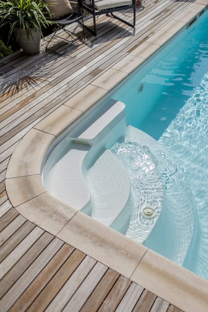
This pool design highlights the timeless and elegant combination of a natural wood deck with stone coping. This pairing works so well because of the fundamental design principle of material harmony. The warm, linear texture of the wood creates a soft, inviting space, while the cool, solid stone coping provides a durable and classic frame for the pool.
It’s a versatile look that feels both relaxed and refined, a testament to thoughtful and enduring design. This style is an excellent choice for a backyard that aims for a natural yet polished aesthetic. It’s perfect for creating a resort-like atmosphere where the goal is to feel comfortable and at ease.
To replicate this look, we advise choosing a high-quality, weather-resistant wood for the deck, such as teak or ipe. For the coping, opt for a natural stone like travertine or limestone with a sealed, non-slip finish. A key insight is that the curved edges of the steps and coping soften the overall look, making the space feel more organic and inviting.
The Textured Oasis: A Blend of Stone and Checkered Tile

This pool design showcases a beautiful combination of contrasting textures and patterns. The rustic stone wall and matching coping create a warm, organic backdrop, while the checkered tile on the pool’s interior adds a modern, graphic element.
This design principle, known as juxtaposition, creates a visually intriguing space that feels both earthy and stylish. The deliberate choice of materials—raw stone and smooth tile—makes the pool a distinct feature in the landscape. This idea is perfect for a small, cozy backyard or courtyard, where it can serve as a focal point. It’s especially suited for a home that leans into a Mediterranean or bohemian aesthetic.
To recreate this look, we suggest using a natural stone like flagstone or slate for the wall and coping. The checkered tile can be customized with different shades of blue, gray, or green to match your personal style. An important tip is to ensure the grout color for the checkered tile blends well, allowing the pattern to take center stage.
READ MORE >> “9+ Above Ground Pool With Deck Ideas You Want to Copy”
A Touch of Class: Personalizing Your Pool with Custom Inlays

This pool design demonstrates a sophisticated way to add a personal touch to your poolside space. The use of a custom inlay on the coping, spelling out “AQUA VISTA,” instantly elevates the design from a simple swimming pool to a personalized retreat.
This design principle, where subtle branding and personalization are incorporated, is a fantastic way to make your backyard truly unique. Combined with the elegant checkered tile and natural stone coping, it creates a luxurious and thoughtful aesthetic. This idea is perfect for a backyard that serves as a high-end, personal sanctuary or a private resort. It’s a great option for those who want their pool to reflect their personality or the name of their property.
To recreate this look, we advise consulting with a stone engraver or a pool company specializing in custom inlays. The checkered tile adds another layer of texture and pattern, which we think is a perfect complement to the natural stone. A good tip is to ensure the coping material is durable enough to handle engraving and regular use, ensuring your custom touch lasts for years to come.
Artistic Flair: Mixing Mosaic and Solid Tiles

This design showcases a bold and creative approach to poolside aesthetics, using a striking multi-colored mosaic tile on the coping and steps. This a fantastic example of a design principle that uses color and texture to create an artistic statement.
The lively, checkered mosaic provides a playful contrast to the solid, light-blue tile of the pool interior, making the steps a dynamic and eye-catching feature. This style demonstrates how a simple change in material can completely transform the look and feel of a pool. This vibrant idea is perfect for a backyard where the goal is to create a fun, personalized space with a touch of whimsy.
It’s an excellent choice for those who aren’t afraid to use color to express themselves. To achieve this, we recommend working with an expert to source high-quality mosaic tiles that are durable and easy to maintain. A useful insight is that this design allows you to bring in a wide range of colors, giving you the freedom to match the tile to existing decor or surrounding garden elements.
Bohemian Chic: Patterned Waterline and Wood Decking

This pool design captures a delightful bohemian aesthetic, combining intricate patterned waterline tiles with the warm, natural look of a wood deck. The decorative tiles provide a beautiful focal point, showcasing a vibrant and artistic design principle that adds personality to the space.
The contrast between the bold pattern and the simple, clean lines of the wood decking creates a dynamic yet harmonious feel, perfect for a lively and inviting outdoor living area. This style is ideal for a backyard that serves as a cozy, eclectic sanctuary, where the goal is to create a space full of character and charm.
To recreate this look, we advise choosing a porcelain or ceramic tile with a pattern that speaks to your taste. A helpful tip is to ensure the coping is a light, solid color to let the patterned waterline shine. This design works exceptionally well in smaller spaces where a single, bold design choice can have a big impact.
Sleek & Moody: Dark Tiles and Coping

This pool design presents a sophisticated and moody aesthetic, using a deep, dark palette to create a chic and modern look. The charcoal-colored coping and dark tiles on the interior work together to make the water appear deep and reflective.
This is a great example of a design principle that uses tone-on-tone color to create a feeling of luxury and elegance. The dark materials provide a strong, clean line that separates the pool from the green lawn and wood deck, making it a powerful focal point. This style is perfectly suited for a contemporary backyard, especially one with a minimalist or urban-inspired design.
It’s an excellent choice for those who want their pool to feel less like a tropical oasis and more like a high-end, architectural feature. To replicate this, we recommend choosing a dark, slip-resistant stone for the coping, such as basalt or slate. A key tip is to use a high-quality tile that will hold its color, ensuring the rich, dark tones remain for years to come.
Ready to Dive In? Your Dream Pool Awaits!
We hope this journey through diverse pool designs has sparked your imagination. As you can see, the choice of coping and tile is a powerful tool for defining the character and feel of your backyard. Whether you’re drawn to the elegant contrast of a dark frame, the timeless charm of natural stone, or the artistic flair of patterned tiles, the perfect design is within your reach.
We believe in creating spaces that are not only beautiful but also built to last. Remember, the key is to choose materials that speak to your personal aesthetic while providing durability and safety. Now, take these ideas and begin the exciting process of bringing your vision to life.