
How to Choose the Right Exterior Color Scheme for a Red Brick House

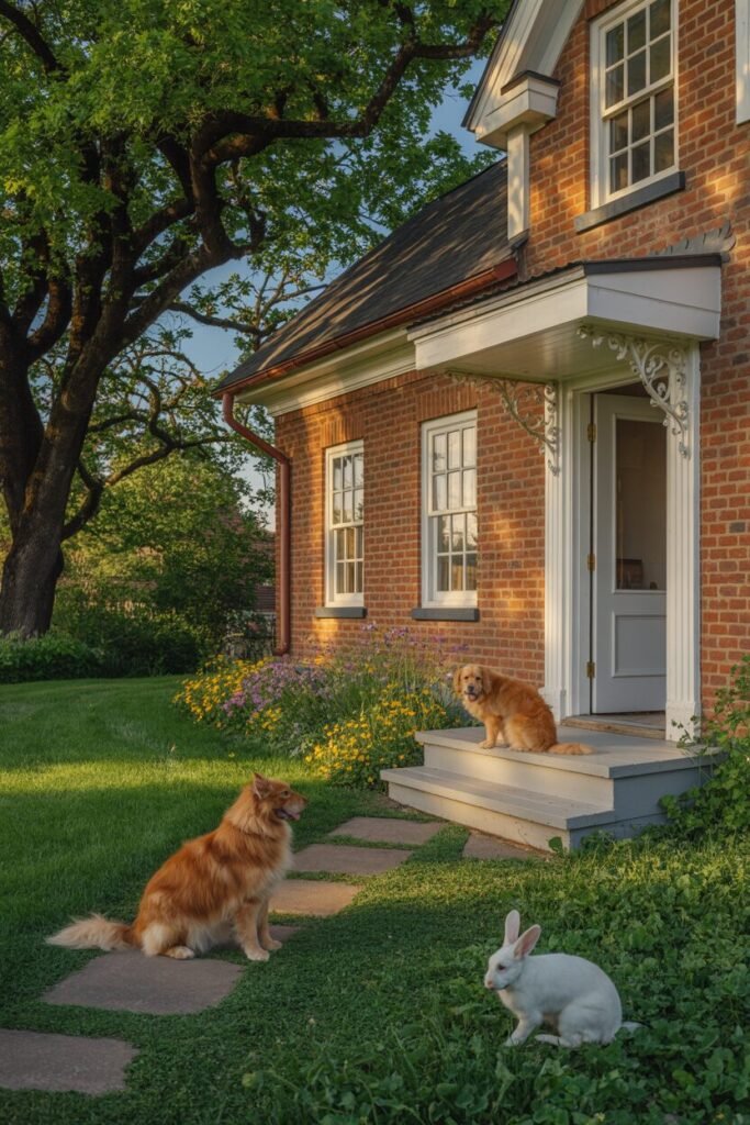
Oh, the old problem: your trusty old red brick home, looking back at you, almost begging to be touched up with something, anything, that won’t result in it appearing like a used Christmas decoration or a regretful party face paint. We’ve all been there, nervously agonizing over whether white is too “blindingly obvious” or that blue and green will bring you an out-of-season holiday hell.
Why Red Brick Isn’t Just Red — Understanding Its Undertones
Warm vs Cool Brick — What’s the Difference?

Before you even consider picking up a can of paint, there’s one teeny secret that most people overlook: red bricks, such as our exes, aren’t all created equal. Some are wearing a warm personality, and others are clubbing with a cool personality. And let us promise you, that secret personality will totally interfere with how your preferred paint prefers to throw its party.
Red bricks that are warm are actually sun-kissed, with a hint of orange, terracotta, or brown. They’re the warm, rugged kind you’d see on a colonial or classic home – the one that urges you to grab a cup of hot cocoa. For these, we recommend being kind to warm-neutral tones such as creamy whites, greige (that wonderful non-committal color), pale beige, or a subdued olive green. It’ll make your home feel like a warm hug, not a style mistake.
Cool red bricks, however, are slightly more dramatic, more towards the burgundy, plum, or dark violet-brown. They’re the moody, high-brow sorts, usually seen on old or city excavations. These darlings like to date charcoal gray, slate blue, clean white, or dark forest green. Think of it like a power couple: they’re opposite without declaring all-out war.
Style tip: We’ve seen it all, so here’s an insider’s tip that’ll be your breakdown lifesaver: paint a test next to dry and damp brick, then—gasp! —take a look in natural light. Brick, bless its sponge-like little soul, can perform a total chameleon trick depending on light and how much water is absorbed.
Picking paint without knowing the undertone of your brick is like courting someone based on their LinkedIn profile and nothing else – it doesn’t work, honey.
How Texture and Mortar Lines Affect Color Perception
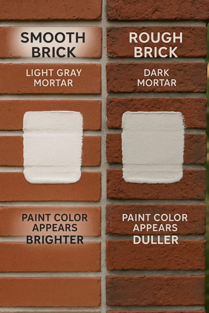
So now you’ve got the ideal paint chip. It’s a creamy soft white, perhaps, or that über-trendy greige. You pin it onto the side of your red brick house, patiently wait for the sun to beam down upon it with its rays, and then. silence. It just doesn’t look, well, quite right.
Newsflash: it may not be the paint’s fault. It may be your brick.
See, red brick isn’t this tidy, flat canvas. No way, it’s a bristly, irregular beast, covered with visual texture. This natural texture has the devil of a time fooling the light, particularly when the sun is hot or the shadows are dark. It’s like a conjurer of the visible, making some hues look duller, darker, or more faded than they would on that fine, smooth siding or those deceitful color cards.
But wait, there’s a crazier, larger card in its hand: mortar lines. Mortar is not a few forgettable filler; it’s actually the outline of your brick work. Off-white or light gray mortar is like the friend who makes all your faults shine – it provides stark contrast and definition, sometimes accentuating exterior colors to appear sharper and bluer.
Dark mortar (such as charcoal or brown), on the other hand, is your buddy that assists you in softening edges and evening out your overall appearance – even causing you to tone down bright paint a little… demure.
So how do you adjust?
Consider your brick and mortar a dynamic duo, a surface mixed together that must be appreciated as one.
Are they a high-contrast pair (light mortar + red-orange brick)? Then you’ll want a soft, warm trim – something that whispers sweet nothings to the eye, rather than yelling.
Is the texture bold and the mortar dark? Go for light, high-contrast colors to stop your house from feeling like a heavy, flat brick monster.
Style tip: For goodness’ sake, don’t, we repeat, don’t try out your paint on shiny test boards. We’re begging. Just slap it right out onto the brick – and onto both brick and mortar. Then back away, and we mean way back (as in, 10–15 feet), and see how it looks at different times of day. Because let’s face it, what is beautiful at noon can look like a crime scene at twilight.
7 Tried-and-True Color Schemes That Work With Red Brick
Okay, now that we’ve had our quickie therapy session regarding undertones, texture, and how light is just so likely to play tricks on red brick, let’s jump into the meat: what really works.
We’re not going to be talking some New-Age hooey here. We’re going to be talking real houses, real outcomes, the kind that leave your neighbors stewing with silent envy.
These seven schemes have endured longer than that dodgy casserole on your countertop because they do one thing absolutely right: they allow the brick to be the Beyoncé of the design, but complement its warmth, depth, or contrast. No matter how classic and charming, or subtle and refined, or loud and flash, a look you’re searching for is in this set of schemes.
Let’s break them down individually with all the wealth of context, character, and color rationale you’d ever want.
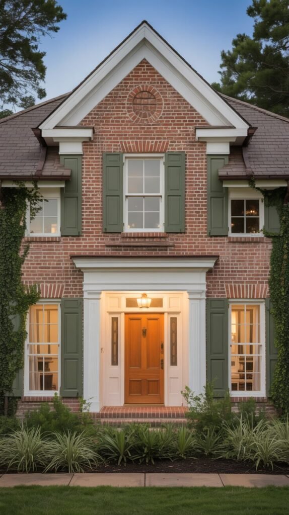
Classic White Trim with Black Shutters
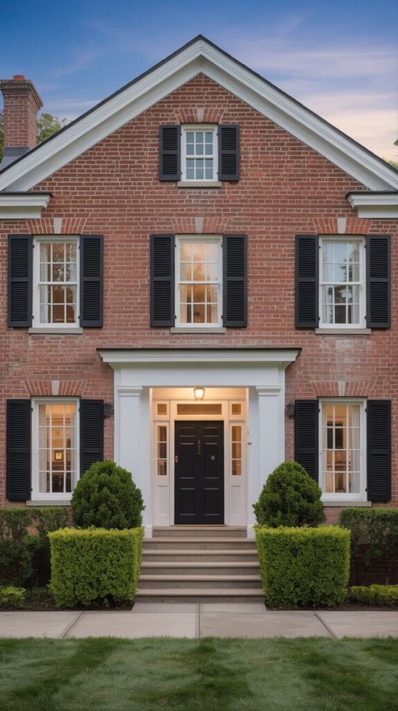
This house is essentially the “straight-A student” of outside design, executing the basics so well it hurts. The red brick is wonderful, even, and just waiting for a high-contrast complement. So what do we add? Crisp white trim and dark black shutters. Chef’s kiss.
The white trim isn’t boxing in the house; it’s more like a fairy godmother spotlight. It bounces sunlight, and it neats up the geometry of the house tighter than a tack, particularly about the windows and roofline. On houses with richer, bluer-hued bricks like this one, a crisp white (not that wishy-washy creamy or off-white claptrap) keeps the look fresh, not old-fashioned.
And of course, there are the black shutters – perfectly proportioned, flush-fitting, and exquisitely matched to the front door. Black is the dependable buddy who introduces gravity and balance, anchoring the face without screaming, “Hello, world! Notice me, I’m overcompensating!” That flowing music of dark and light provides a sense of intentionality, as though it was all supposed to be.
Here’s the clincher, the bit that everyone usually skips over: this style only cuts it if your lines are crisp. Laser-sharp. Slightly askew shutters or ridiculously thin trim will destroy the entire effect, and your “classic” will soon be “tragic.”
Soft Greige with Off-White Accents
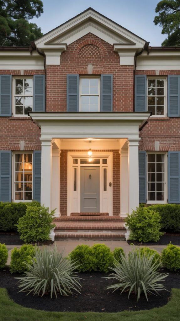
This house is a lesson in restraint, a study in what occurs when you turn down the theatrics and crank up the intent. Rather than dramatic contrast, it selects a soft color scheme in cool neutrals that are subdued, peaceful, and so elegant.
The front door has on a cool-skewed greige – that annoying combination of gray and beige that won’t commit to either side’s camp. It’s like the “it’s complicated” status of colors. It succeeds here because the red brick has a warm undertone, and this greige softens it without seeking to upstage it. Meanwhile, the off-white interior trim to the windows, columns, and cornices is crisp but not coarse. It shimmers with light softly so that the architecture is sharp but welcoming, like a considerate, well-behaved guest.
And then, the twist: the subdued blue-gray shutters. They are not greige, but they deliver the same visual information – subdued, serene, and eternality. They bring in a hint of gentle, purifying freshness that prevents the house from falling too far into beige or, we reddeningly confess it, formulaic.
Charcoal Gray with Crisp Lines
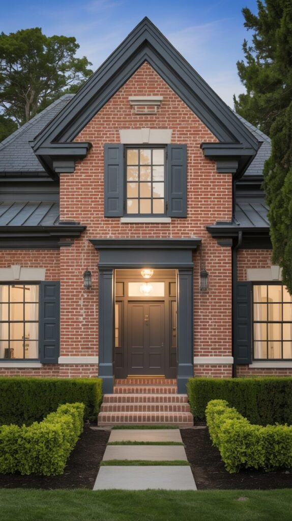
If you’re going for a red brick house that’s screaming “grounded,” “intentional,” and “I’ve got my life together” (with a dash of architectural pizzazz), charcoal gray is your solution.
Here, in this house, every line is a declaration – from the shriekingly pitched roof line to the classically proportioned shutter placement – and the color palette is its faithful sidekick, upholding all that regarding that clarity. Charcoal trim hems all edges so that warm red brick is a chic backdrop and not cacophonous center stage. The color doesn’t fight the brick; it builds it.
See how the front window and front door coordinate with the same depressing charcoal that provides the super-sleek, modernized colonial appearance. The mortar is incredibly light, which is absolute genius because it makes the brick legible and clean and prevents the entire facade from appearing like a huge, choking mausoleum. Add to that angular, low bushes and a sterilized paver sidewalk, and your front is instantly swamped and modern without completely abandoning its roots. Lo, critics.
Olive Green with Natural Wood
Some colour combinations just need to be experimented with. This one does have a lot of primal attraction to it, though.
There’s always – and almost-vintage, like venerable old – something about combining olive green shutters with woods. It’s not attempting to shake your red brick into the 21st century. Rather, it has a certain respect for its texture, tone, and age with a color scheme that’s pretty much plucked straight out of the ground itself.
Here, the muted green shutters are a soft earth color, a soft breath. They flirtatiously echo the greens they frame and provide just enough contrast to the brick to encapsulate the windows without ugliness. But the coup de grâce? The wood front door – a honey midcolor that wolfishly soaks up the porch light and radiates a warmth you can literally feel from the curb.
What holds this couple together is raw restraint. The white trim is the light, fluffy sidekick, adding color scheme without ever attempting to hog the limelight. And the landscaping? It wraps it in with airy light grasses and winding ivy – a friendly reminder that some curb appeal doesn’t require a ruler-straight edge. Occasionally, a little bit of wild is just what the doctor ordered.
Slate Blue Accents and Warm Beige Siding
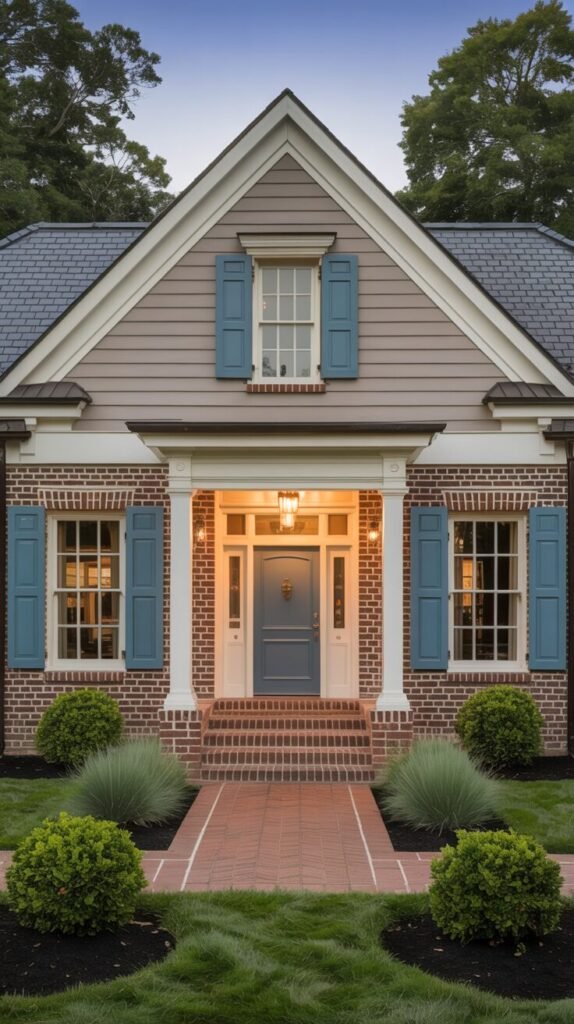
A surprise twist of fate: the lower foundation is vintage red brick, plunked low on the house to rely on gravity. But topping that, a bombshell: horizontal warm beige siding is the norm – not bare, not chartreuse, but sun-faded just so. The siding is pure genius, breaking the weight of the brick and setting the stage for something flat-out gorgeous: slate blue shutters and a front door trending toward soft without losing its backbone entirely.
Why it succeeds is that the color scheme is so beautifully harmonious. The slate blue trim doesn’t flash and shriek, a la sugar-buzzing baby, but is hold-back, near dusty, with the faintest suggestion of gray to give depth without overpowering. Carved by the deep richness of the beige siding and the organic shape of the red brick, they’re a couple that has been inhabited, and adjudged to be pieced out, and softly honed. It’s a house that possesses all that it desires without screaming about it.
Taupe and Cream with Copper Lighting
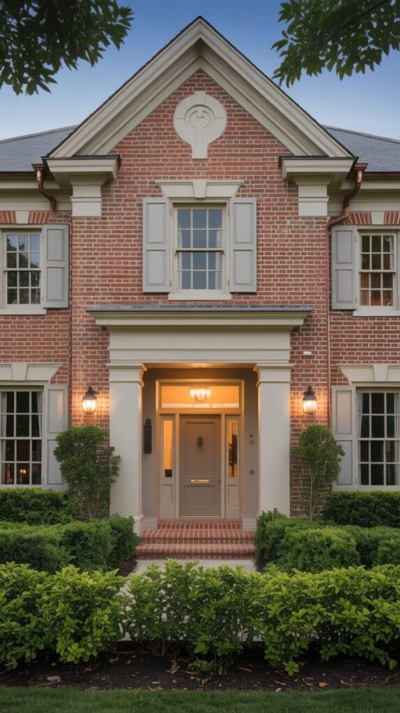
Contrast is not something every home needs; sometimes a home simply radiates from the inside out, like an inside-hatched inside secret. This is an exercise in subtle layering and soft definition, and the payoff is neat, neat, forever looking curb appeal.
Here the red brick has been zen-ed but not cool and aloof yet by the brush of a couple of wise neutrals: taupe and cream. Shutters and door front are taupe dusted – calmly peaceful, earthy, softly, elegantly put together. They don’t fight the brick; they are lovely with it, calling on texture and form to hold their own. The interior is gilt-trimmed with luscious cream, holding the architecture together from falling apart at the seams, as in being hugged.
But what really makes this scheme “wow” rather than “nice” is lighting design. How copper lanterns sail past the amber glow of the front door and become decidedly domesticated. Draping themselves over taupe, they glow like booty; draping themselves over cream, they’re a background modestly – a symphony of restraint and warmth.
Deep Forest Green Trim for a Bold Traditional Look
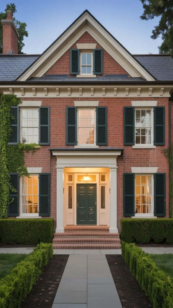
Behold, that stately red brick face which also hijacks center stage – and dark forest green trim is the one hijacking center stage and sending the entire shebang to sleep. Dark and dark, and near black in good light, this green possesses a gravitas which is simply plain impossible to overlook. The front door and shutters are the same green color, and the symmetry places that which works to place the focus on the old-fashioned aspect of the house, i.e., a warm family portrait.
What is so courageous and so timeless appeal in this work is the use of color. Instead of green as accent only, it’s used near the way material is used for signification – flowing-open space, draping over the front door, and guiding the eye. White trim is a gentle, unobtrusive divider, defining every border without ever trying to be the point.
Achieved through the use of exact landscaping and cautious positioning of walkway, the whole unit is a piece of era sophistication with honesty. It’s the kind of home which simply works.
3 of the Most Common Mistakes to Avoid When Painting Around Red Brick
Using Bright White Paint on Cool-Tone Brick
That’s the default, that default look just to have super-white trim as default. The hideous reality, though: if your brick is cool, that super-white’s gonna be disconcerting like an unanticipated pop quiz. Rather than sophisticated and silky, it’s chilly, kinda clunky, and annoyingly tacky.
Cooler red bricks (the ones with those subtle purplish or blue undertones) actually prefer a warmer white – think soft ivory or antique cream. It still offers that satisfying “pop,” but in a way that blends, not battles. The goal here is definition, not drama. We’re not trying to start a fight with your house.
Ignoring the Roof and Landscape Colors
Listen up, paint isn’t just about the brick. Oh dear, it must be a considerate teammate and respectful to the other thing on and around it. Hip gray roof? Or mulch party of dimension and oodles of blue-green greens? Newsflash: color does matter.
A trendy greige trim can be completely aspirational on Pinterest, but it might not have the mettle to be a good team player ugly with what’s actually going on on your real house. Always, always, always think big picture – roofline, yard, heck, even that house next door (they’re looking up to you anyway). Color isn’t a vacuum, however much we might think it should be.
Forgetting to Test in Natural Light
Soft, warm, kitchen-style light samples? No. That is even not even in the ballpark. Surface paint sun-fades and weather, and that sun, mood swings or not, changes in a day. Something to hug your arms around in the morning and crumble or powder to muck or chalk in the evening but when you are busy about in the middle of an identity crisis, your house will seem tightly closed. The trick, and we can hardly express this strongly enough? Test samples literally on your brick.
The other faces of this edifice, other seconds in the hour. Stand there in opposition. Let the illumination reveal the straightforward fact – for, we promise you, it always will.
Color Isn’t Just Paint—It’s a Conversation With the Brick
If anything can be taken from this small bite of conversation, it’s this: red brick already has opinions. And the most suitable hues? They don’t try to shout over its head; they scream back. High-contrast or subdued hues of concord, however your trim will be, it’s a disagreement with subtext, texture, light, and landscape.
It’s what makes brick so phenomenally satisfying – and, come on, so phenomenally frustrating. It’s not being safe, anyway; being smart. Test in the sun. Read the roof. And for goodness’ sake, listen to the house. Because when color and material do finally talk the same language, you don’t just see – you feel. What will your house tell you next?