Designing a Mid Century Modern Kitchen Without Turning It Into a Time Capsule
Mid century modern kitchens are not just about aesthetics; they are about clarity. They strip away the unnecessary and spotlight what actually matters: proportion, material honesty, and intentional flow. When we think about this design era, we think flat-panel cabinetry, warm walnut tones, sculptural lighting, and a seamless connection between indoors and outdoors. But more importantly, we think balance.
The real formula is contrast with control. Sleek cabinetry paired with organic textures. Bold tile grounded by natural wood. Statement lighting softened by warm ambient glow. Mid century modern design works best when every element has breathing room. Negative space is not empty; it is strategic.
If we want our kitchens to feel authentic instead of trend-chasing, we focus on materials first, color palettes second, and decor last. Let wood grain shine. Let stone speak. Keep hardware minimal. When we design with restraint and intention, the result feels timeless, not themed.
Sunlit Wood and Indoor Garden Glow
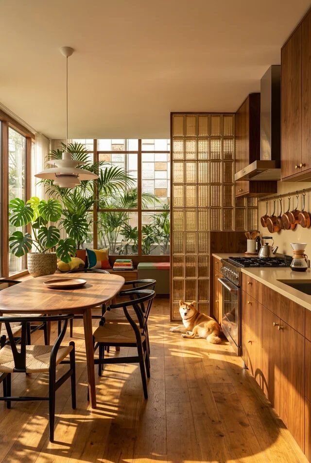
This kitchen is basically mid-century modern flirting with a greenhouse, and honestly? We’re here for it. The warm walnut cabinetry paired with full-height windows creates that classic MCM harmony between indoors and out. Mid-century design is obsessed with connection to nature, so maximizing natural light is not optional—it’s the whole mood. If we’re recreating this, start with flat-panel wood cabinets in a medium-to-warm tone and keep hardware minimal so the grain can shine.
Notice how the dining table echoes the cabinetry color. That’s color repetition doing the heavy lifting. It keeps the space cohesive without feeling staged. Add sculptural plants like monstera or palms to soften all the straight lines. The key is contrast: sleek cabinetry versus organic foliage.
Lighting matters too. A layered pendant over the table anchors the zone and creates intimacy within an open layout. When we define zones using lighting instead of walls, the space feels larger but still intentional. Bonus points for warm bulbs to enhance that golden-hour wood glow.
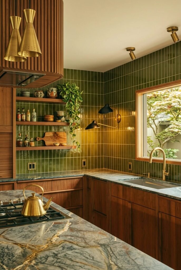
Brass Accents and Functional Warmth
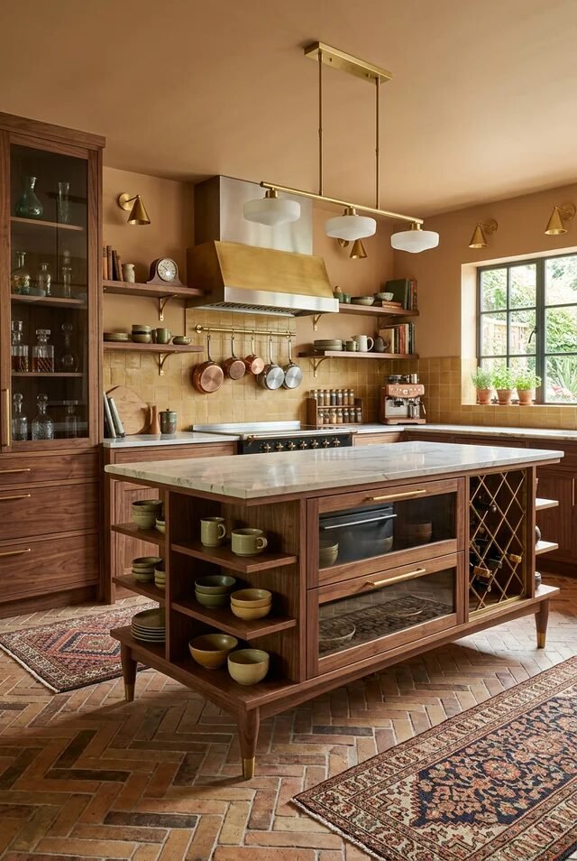
If mid-century kitchens had a love language, it would be brass and walnut. This space leans into both, but what makes it work is proportion control. The marble-topped island feels substantial, yet the open shelving below keeps it visually light. Balancing solid and open elements prevents heavy materials from overwhelming the room.
The brass hood and matching hardware create a visual triangle with the pendant lights. That repetition builds rhythm, which is a core MCM principle. We don’t just randomly sprinkle metals; we echo them strategically. If you’re recreating this, commit to one dominant metal finish and repeat it at least three times for cohesion.
The herringbone brick floor adds texture without fighting the cabinetry. Texture layering is subtle but critical here. Smooth stone, warm wood, matte tile—each surface contrasts the other. Mid-century modern kitchens thrive on controlled contrast, not clutter. Keep styling minimal and let materials be the decoration.
Sculptural Island with Retro Tile
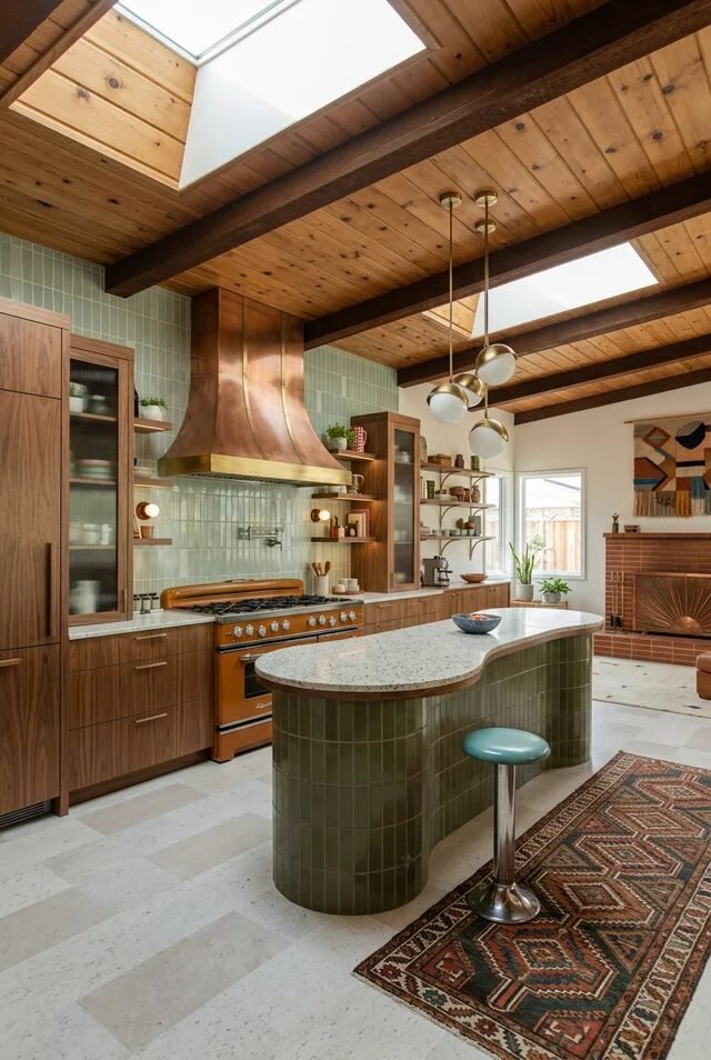
This kitchen understood the assignment: curves, color, and confidence. The rounded green-tiled island instantly softens the boxy cabinetry and beams overhead. Curves are a secret weapon in mid-century modern design because they counterbalance all the linear architecture. If we want this look, consider a curved peninsula or even rounded countertop edges.
The vertical green tile backsplash adds texture while staying tonal. Notice it doesn’t scream for attention; it hums in harmony with the wood. That’s color discipline. Stick to a tight palette—wood, muted green, brass—and repeat it throughout the space for visual flow.
Exposed beams and skylights elevate everything. Natural light bouncing off warm wood ceilings makes the green tile glow instead of darken. Always test tile colors in daylight before committing, because undertones shift dramatically. Finish with globe pendants to reinforce that retro vibe without going kitschy.
Glass Walls and Statement Pendants
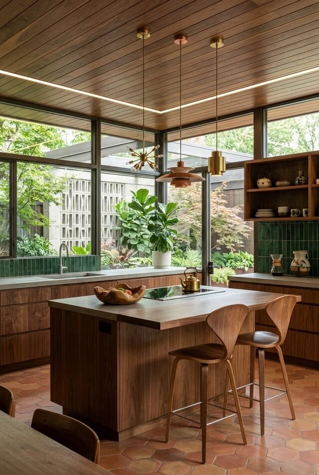
Okay but this kitchen? It’s giving architectural main character energy. Floor-to-ceiling glass blurs the line between kitchen and garden, which is peak mid-century philosophy. Transparency and sightlines are design tools—when we remove visual barriers, spaces feel expansive and calm.
The wood-paneled ceiling wraps the room in warmth, preventing all that glass from feeling cold. That’s contrast at work again: hard surfaces balanced by rich texture. The simple slab cabinetry keeps the architecture in focus. If we’re copying this, avoid busy hardware and let silhouettes speak.
Pendant lights here are sculptural, not just functional. Mid-century lighting doubles as art, so choose pieces with shape and presence. Also notice how the island aligns with window frames. Alignment creates subconscious order. When architectural lines and furniture placement echo each other, the space feels effortlessly composed.
Moody Walnut with Ribbed Glass
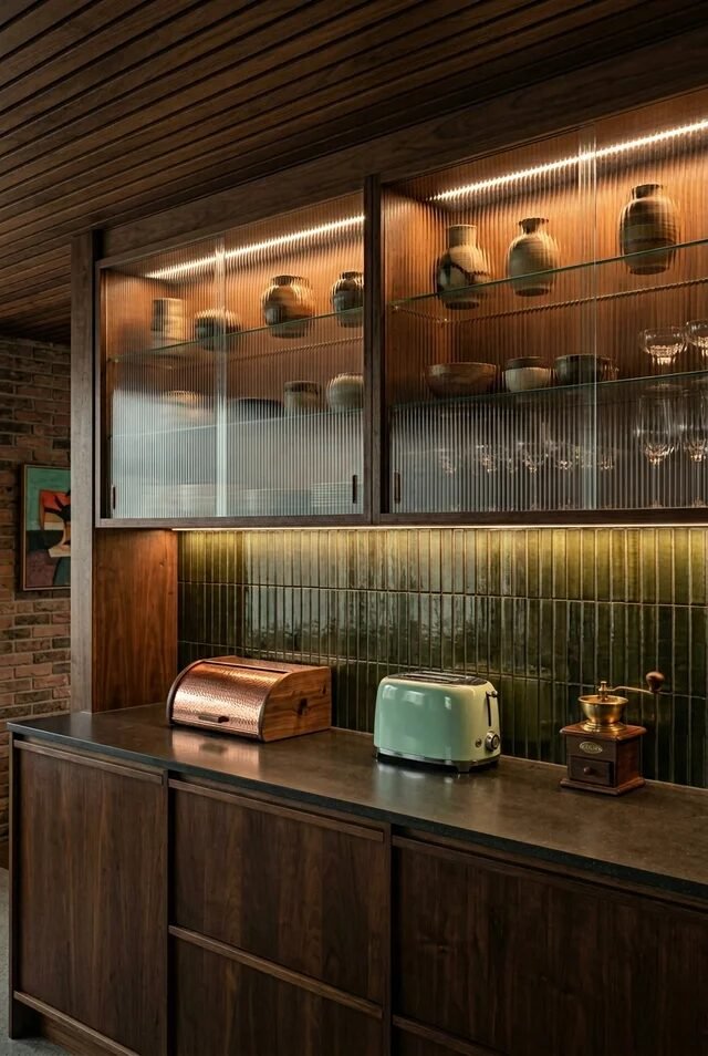
This one is for the mid-century purists who like their kitchens a little dramatic. Dark walnut cabinetry paired with ribbed glass fronts creates depth without chaos. Ribbed or fluted glass adds texture while subtly concealing clutter, which is genius for upper cabinets.
The deep green vertical tile backsplash keeps everything grounded and moody. Instead of contrasting sharply, it blends tonally with the wood. That’s sophisticated layering. If we’re recreating this, stick to earthy undertones so materials feel collected, not random.
Integrated lighting inside the cabinets is the quiet hero here. It highlights ceramics and glassware like a curated gallery. Layered lighting—task, ambient, and accent—is essential in darker kitchens to avoid flatness. Add under-cabinet strips and warm LED strips inside glass cabinets for that cozy glow. Suddenly the kitchen feels intimate, elevated, and very “we actually planned this.
Fluted Island Meets Classic Millwork
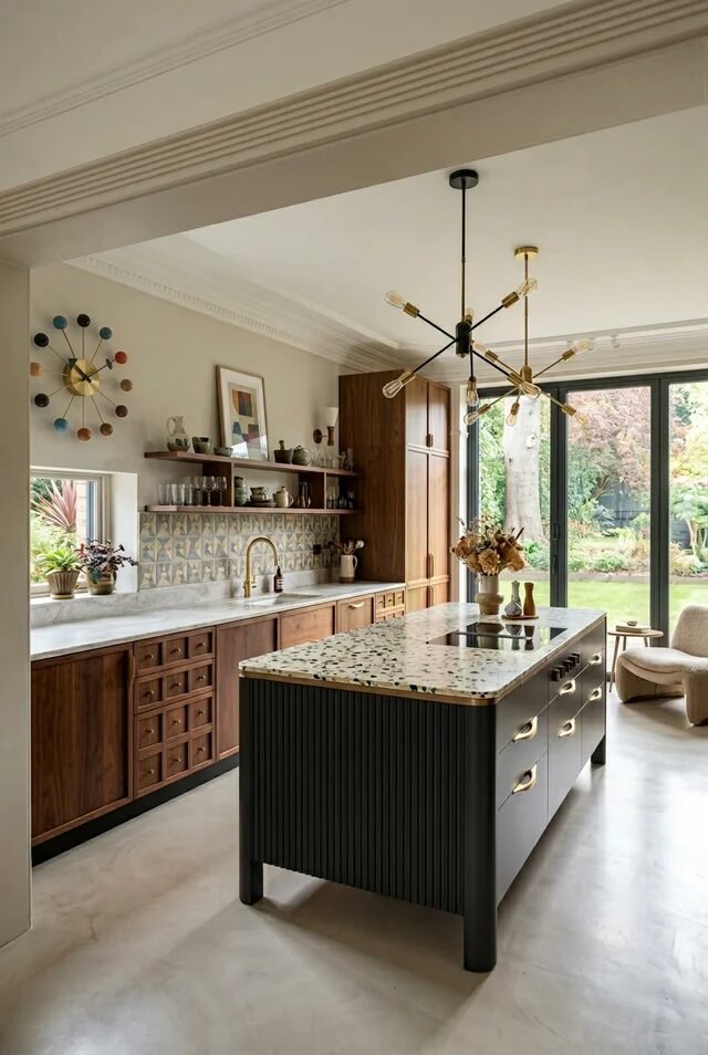
This kitchen is what happens when mid-century modern politely shakes hands with traditional architecture. Crown molding and wall clock? Classic. Fluted island and sputnik chandelier? Pure MCM drama. The magic works because contrast is intentional, not accidental. The dark ribbed island grounds the space, while walnut perimeter cabinetry keeps everything warm and cohesive.
If we’re recreating this look, focus on hierarchy. Let one element be bold, like a fluted island in a deep charcoal or forest tone. Keep surrounding cabinetry flat-front to avoid visual chaos. Notice how brass hardware and lighting repeat throughout. That repetition creates rhythm and makes the mix feel curated instead of confused.
The terrazzo-style countertop adds playful texture without overpowering. When mixing eras, unify them through material repetition and consistent undertones. Warm woods plus warm metals equals harmony. Add one sculptural light fixture, and suddenly your kitchen feels collected, not chaotic.
Blue Cabinets Under Wood Beams
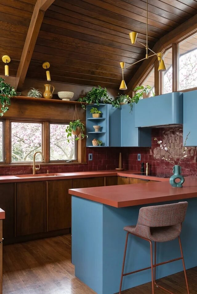
Okay but this ceiling? It’s the main character. The dark wood planks and exposed beams instantly create warmth and architectural presence. Mid-century modern kitchens rely on strong horizontal lines, and wood ceilings amplify that effect beautifully. Pairing them with matte blue cabinetry keeps the palette grounded yet playful.
The red tile backsplash might sound risky, but it works because it’s earthy, not neon. This is color theory in action. Cool blue cabinets balance warm wood and brick-red tile, creating tension that feels intentional. If we’re copying this, stick to muted, dusty tones instead of high-saturation brights.
Open shelving near the window softens upper cabinetry and allows plants to spill over slightly. That organic movement offsets the strong geometry. Always balance bold color with natural materials so the space doesn’t feel flat or cartoonish. Add brass cone sconces to echo the warmth overhead and tie everything together.
Marble Waterfall With Forest Views
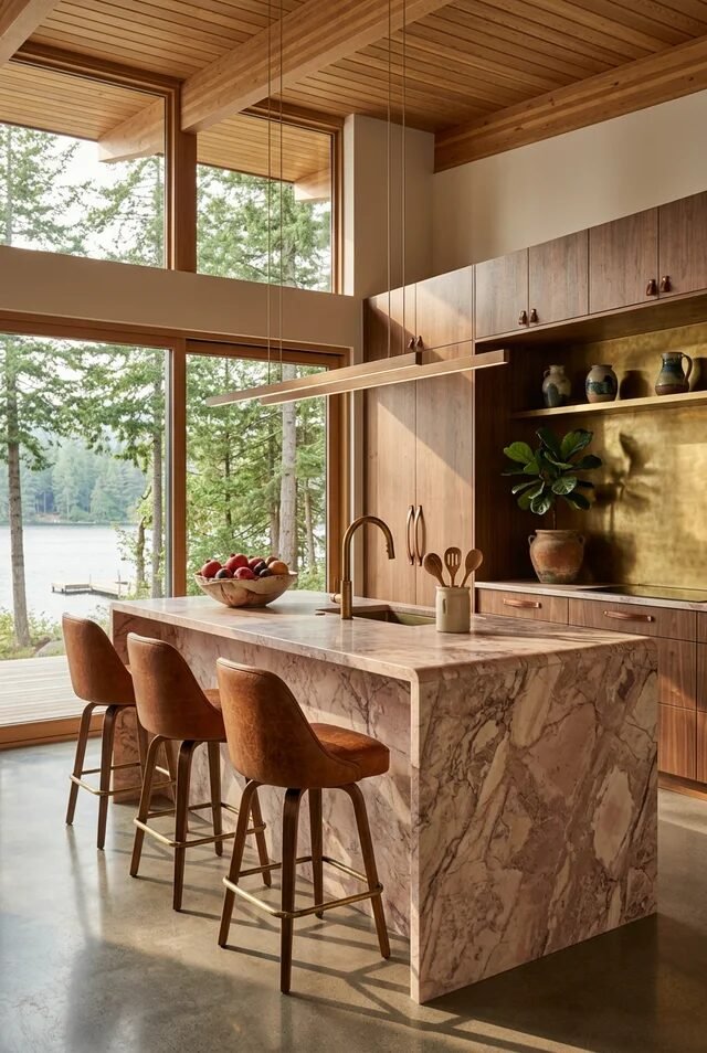
If your dream kitchen involves pretending you live in an architectural magazine spread, this one’s for us. The waterfall marble island is sculptural and luxurious, but what makes it mid-century is the simplicity of surrounding cabinetry. Clean slab doors allow statement materials like marble to shine without competition.
Floor-to-ceiling windows frame the outdoors like living artwork. That’s biophilic design at its best. When recreating this look, prioritize sightlines. Keep upper cabinets minimal or eliminate them on window walls to maintain openness.
The brass backsplash niche adds depth and a reflective glow behind the walnut cabinetry. It’s subtle but impactful. Layering matte wood with polished stone and warm metallic surfaces creates dimension without clutter. Choose bar stools in cognac leather to repeat warm tones and soften the stone’s coolness. Suddenly the space feels balanced, grounded, and ridiculously photogenic.
Teal Cabinetry in Cozy Nook
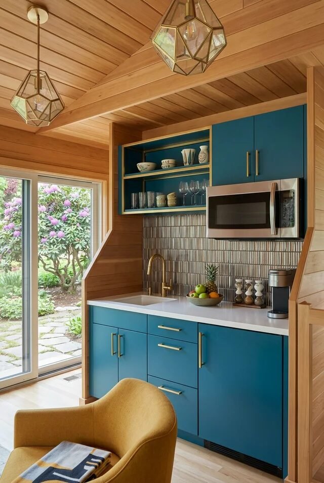
Small kitchen? No problem. This teal setup proves mid-century modern works even in compact layouts. Color can define a zone, especially in open-plan homes where walls are minimal. The rich teal cabinetry pops against honey-toned wood paneling, creating a cozy but intentional contrast.
Notice the flat-panel doors and streamlined brass pulls. That simplicity is key. In smaller kitchens, too much detail feels busy. Keep lines clean and let color do the talking. The vertical tile backsplash adds subtle texture without stealing attention.
Glass pendants overhead bring sculptural interest while maintaining visual lightness. And that mustard accent chair? Strategic color echo. Repeating warm tones in furniture or decor prevents bold cabinetry from feeling isolated. If we’re recreating this, commit fully to one statement color and balance it with wood and warm metals for that authentic MCM energy.
Sage Green and Walnut Harmony
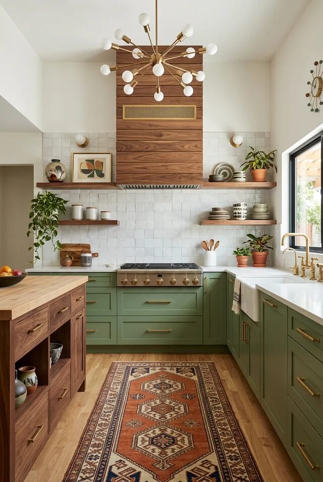
This kitchen feels like mid-century modern grew up and started buying houseplants in bulk. The sage green lower cabinets ground the room while walnut uppers and range hood add depth. Two-tone cabinetry works best when one color is earthy and the other is natural wood. It keeps contrast soft and livable.
The white square tile backsplash acts as a neutral canvas, allowing the green and wood to stand out. Floating shelves break up upper cabinetry and create breathing room. When styling shelves, keep it curated. Think ceramics, plants, and negative space.
That patterned runner introduces warmth and subtle pattern underfoot. Textiles are underrated in kitchens. Layering hard surfaces with soft elements like rugs instantly adds warmth and acoustic balance. Finish with a sculptural chandelier for drama, and suddenly we’ve created a space that feels collected, calm, and completely mid-century without trying too hard.
Design With Intention, Not Just Aesthetic
A mid century modern kitchen should feel effortless, but we all know effortless actually requires discipline. The key is editing. We choose one dominant wood tone, one or two accent colors, and a single metal finish. We repeat them consistently. That repetition builds rhythm, and rhythm builds cohesion.
Layout matters just as much as looks. Open sightlines, strong horizontal lines, and defined zones through lighting instead of walls create that architectural calm we love. When furniture placement aligns with architectural features, the entire kitchen feels composed and purposeful. It is subtle, but powerful.
Before adding decor, we evaluate scale. Are pendants proportional to the island? Does the backsplash compete with cabinetry? Mid century spaces thrive on harmony, not overload. When we prioritize material balance, thoughtful lighting, and clean silhouettes, we create kitchens that feel grounded, warm, and quietly iconic for decades.