What Your Sofa Color Reveals About Your Living Room Vibe
When you picture a living room, come on, the couch gets to be front and center, right? And not necessarily because it’s the biggest furniture piece in the room; it’s because it sort of effortlessly sets the tone. This is where you’re not crashing home after work, or where you’re plopping down for those lengthy questioning conversations; this is also where your eyes just drift as soon as you come in. But other than being comfortable and practical, that couch is a very powerful emotional anchor for the whole room.
Its color and the material it covers over don’t simply take up space; not on your life, they’re off doing something else, setting the mood, creating the tone, and even dictating how subtly the room felt emotionally. And this is where interior design tacky formalism meets the fascinating realm of human psychology.
A sofa selected with a bit of consideration will either set you off to a flying start or drag you down to a state of slumber, fill the room with an aura of openness or snugly cozy. And that enchanted effect? It starts a very long time before your bum even gets the opportunity to kiss the pillow – it starts with its color, its feel, and where you position it precisely. Very important for something to sit on, isn’t it?
Setting the Tone – Choosing Sofa Colors That Reflect Your Mood Goals
Embracing Warm Neutrals – Creating a Soft, Grounded Ambience
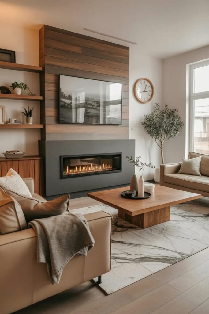
Beige? Oh, the trusty standby. Everyone’s always all, “Oh, it’s just simply ‘safe,'” but believe us, in the proper situation, beige is a total low-key achiever. What’s amazing about it isn’t even that it goes well with everything; it’s that it wears light like a pro and still retains all that fuzzy, warm vibe.
For living rooms lucky enough to get that pretty, natural light, a beige sofa can actually make your room feel like, you know, everything just matches or something – no strange gaps between the walls and the mood, yadda yadda. Here’s a little-known secret that most designers totally forget: don’t even consider using just one plain beige! That’s having plain toast when you can have avocado toast. Hide the beige away in the storage, baby!
Consider: your couch is a richer, deeper beige, your curtains are a soft whisper pale beige, and then you throw in a gorgeous, textured woven rug just so your room doesn’t feel like a beige-y wasteland. This whole tone-on-tone business isn’t about sacrificing all of that clinical, “hospital waiting room” feel; it really adds some real depth without ever making anything fussier or less welcoming.
Taupe? Taupe’s the hipster of the neutral bunch. It can add tremendous depth without losing any of that lovely softness we love. Unlike its warmer counterpart color beige, taupe possesses this cool, elegant undertone which also happens to be absurdly adaptable and earthy. And the best part: taupe just works wonders in rooms with a touch of flair. Pair it with crisp white walls or sleek black fixtures – taupe just belongs, somehow acting as the ultimate peacemaker between the two.
Dying to modify a design element that makes your friends all of a, “Ooh, where’d you get that idea?” Do it with the taupe sofa and adding warm brass or antique gold. Voila! Those metals really bring out the earthy-gray of taupe nicely while making the whole thing feel very high-end.
And a teeny weeny little secret from your friendly interior design whisperer: don’t get daft with the grey and put too much of it right next to taupe, or your bedroom will be a chilly depressive wee cave. The golden rule is in place to keep subtle contrast. Taupe really does sing the high note when it’s given the space to simply hum in the background, a smooth harmony background of sorts, as richer textures move in as the real headliners.
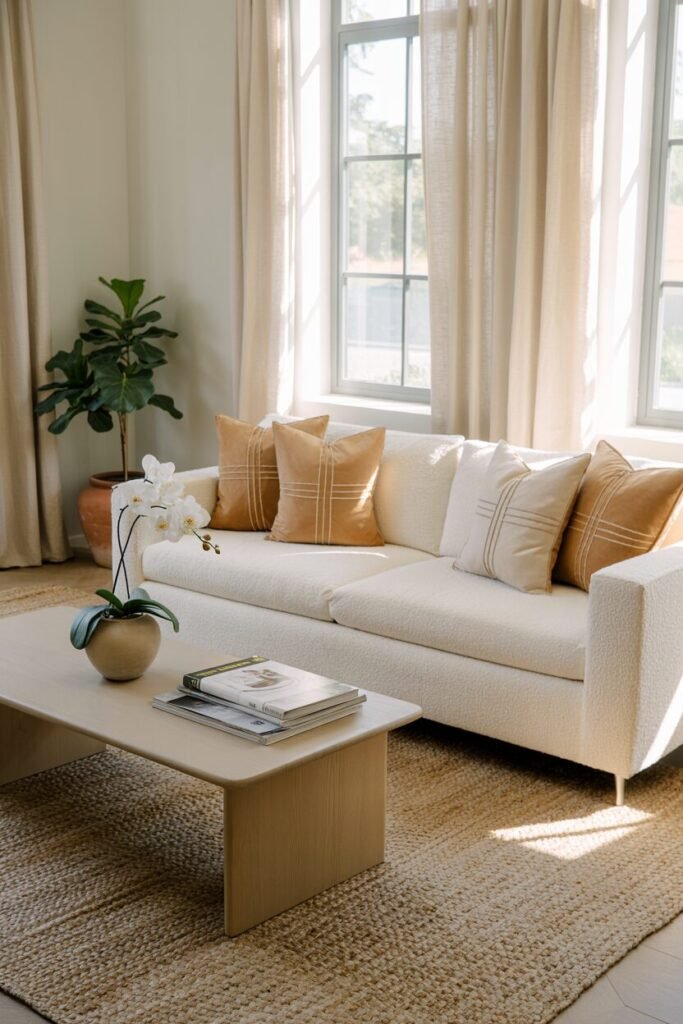
Cream or ivory sofas? Magic, instant! They bellow “airy” as soon as they arrive, especially if your living room is on the snuggle side. They’re tiny light magnets, catching and bouncing light about like a pesky puppy, so they’re the complete winners for spaces that need an actual visual pick-me-up. But hold on, cream isn’t just for all those minimalists who adore everything crisp white; really, though, it does get seriously, seriously interesting when you add some texture to the party!
So go on and play along, if you can: pair a cream sofa with summertime boucle or rugged linen upholstery. And then do a play of throwing in camel and off-white. It’s the texture contrast that creates this color combination without making your eyes look like they are crossing your fingers and hoping to be able to read through static on an incredibly old TV screen.
And one hint you might want to save: couple matte finishes with cream, not gloss. Cream just wants your room to be light and natural, like the spring morning, not some waxy flashy show-room.
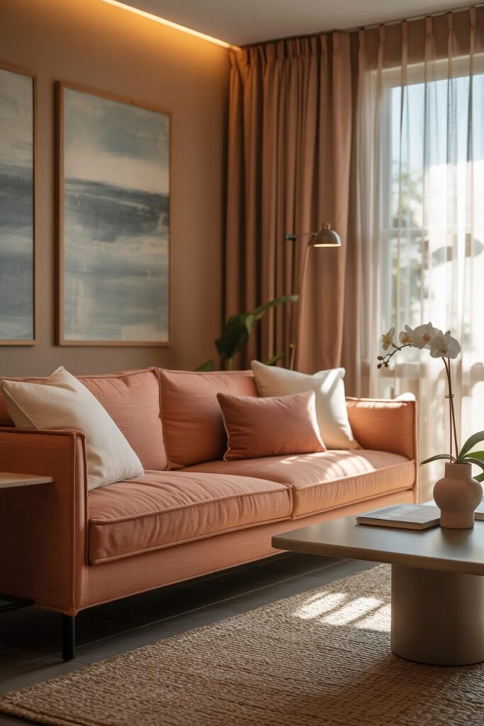
The rest of us who adore the earthy texture but just a bit more pizzazz, you have only to look to warm greige or those gorgeous pale terracotta shades. They are the hip teens who exist solidly on the edge between “neutral” and “OMG, that’s so evocative!” They provide the warmth with this strange sense of a story. Pale terracotta, for example, can bring in this small, teasing movement to your bedroom, but it is still hyper-relaxed neutral if you add enough dressing.
To actually bring this tone to life, give it a try with some cooler neutral artwork or those lovely muted blue-grey tones. That type of counterpoint is the ideal balance to add visual interest without completely ruining the calm atmosphere. And here’s a hack secret for you: nighttime, when dark, utilize warm, indirect LED lighting. It just makes all of that wonderful richness in the terracotta become, creating your room this wonderful, warm “golden-hour” feel year-round!
READ MORE >> “How to Pick a Luxury Living Room Color Palette—Using Designer-Approved Tricks“
Making a Statement – Bold Colors that Define the Room
A navy sofa is not only yelling “bold!” — it’s actually whispering “sultry drama” with a wink. Compared to those brighter, yell-y blues, navy brings this incredible heft and seriousness to a room without ever being too much. It’s almost the perfect bespoke suit for your living room. And take a look! It’s completely fantasy with the off-white walls, the warm cool brass accents, and some of the old-timey dark wood furniture. Here’s a little reminder that most folks (and definitely most AI models) always seem to forget: use navy to anchor a room full of warm colors. It creates this incredible contrast that just feels really high-tech and really classy.
Need to make navy look high-end without inadvertently transforming your living room into a ship’s cabin? Top it off with textural pillows in clay, ivory cream, or a saturated ochre. These earthy, warm tones actually ground the entire color palette and keep the room from looking chilly or, worse, overly corporate. Oh, and a word of advice from your friendly neighborhood light guru: experiment with soft spotlighting walls to highlight that richness of fabric to maximum effect. For goodness’ sake, don’t even contemplate using hard overhead white lights – they’ll extinguish the atmosphere!
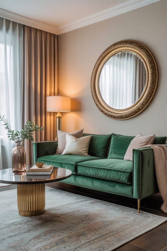
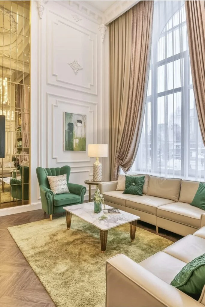
Emerald green? Now that is a deep rich smart color all in one, perfect for spaces that want to feel decadent and luxurious but nowhere near the same ballpark as flashy or showy. It’s wonderful with all those neutral building textures like light taupe or ivory on walls, so the green can truly sing and have its moment of victory. Here’s another teeny secret: throw in some retro gold or vintage brass touches – such as a cool mirror frame or some out-of-sight table legs. It makes emerald’s jewel tone croon ever more vibrantly.
Tip: don’t marry emerald to a roster of other über saturated colors. Allow this queen to reign solo while the remainder of the palette hums softly in tonal harmony. And here’s a bonus principle you’ll thank me for: a velvet or suede finish just works so much better than leather for emerald. Why? Because those matte textures diffuse light more gracefully, giving the whole room this wonderfully plush, inviting atmosphere. You’ll want to sink right in.
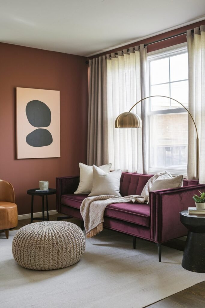
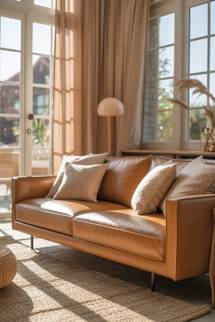
Burnt orange or terracotta sofas are available to add expressive style without a whiff of chaos. These warm, rich brownish colors are wonderful in spaces where you must encourage dialogue, inspire creativity, or just wrap everyone in warmth visually. Burnt orange can be completely earthed, compared to an inferno red, especially when you pair it with pale greige walls, black accent frames with a very low profile, and some brilliantly textured earthy accents.
So what’s the trick here? It’s about fighting back against that bright orange with goods that mute it down – stone, raw linen, or chilly matte black metal, to mention but a few. It makes the room bold, yes, but also completely curated and buffed. And with lighting, use bulbs that are partially golden-colored to truly emphasize all of that stunning depth in the terracotta without causing the area itself to look like it’s about to get hot or over-saturate.
Cooling Down with Serene Hues – Calm Tones for a Reflective Space
Sage green? Oh, it just so happens to be one of the most jaw-droppingly versatile calming colors that you’ll ever have the opportunity to put your hands on. It so happens to fall into that space where naturalistic tranquility meets upscale sophistication, so it ends up feeling completely earthy and completely light at the same time. I love what sage does, though, as much as its almost magical ability to shift a little warmer or cooler depending on whatever else you have it paired with.
If you happen to be lucky enough to be wearing a sage couch, try this insider trick: see how cool it is when paired with pale beige or a subdued greige on walls rather than harsh white. This small trick maintains that gorgeous mellow atmosphere without ever letting it slip. And for a totally great tip, ground out the entire room with some new, black-framed wall decor. This prevents this room from becoming too squishy, naturally. The black simply adds this subtle confident form without having sage take center stage.
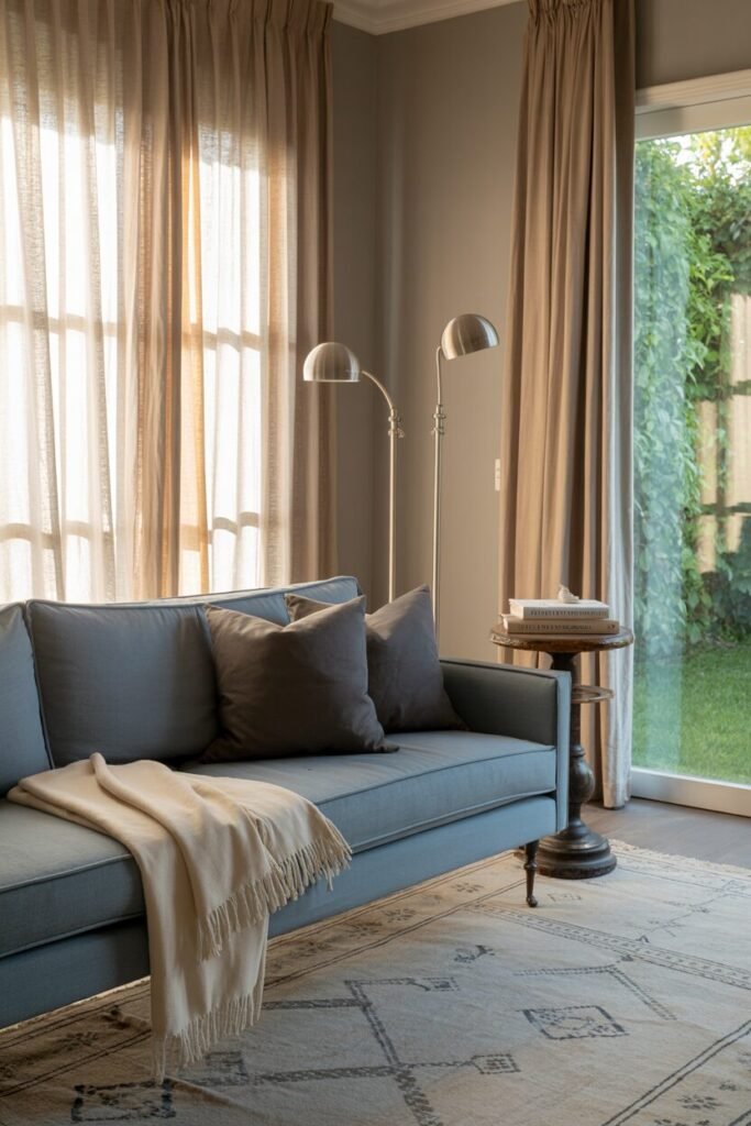
Dusty blue is due more affection than it receives, but believe me, it is a little-understood trick for achieving total visual calm. The color does have a cold lean in its nature, but in life does it appear sterile-looking – it instead catches light softly and just looks lavishly gorgeous, not something frivolous. A dusty blue color upholstered blue sofa is just perfect in an ice white or super-light gray walls-painted area and with the appropriate metallic accenting, like brushed nickel or glossy matte steel.
For some extra depth, try layering with cozy charcoal grey throw pillows and a beautifully washed-out vintage rug. And a crucial piece of advice: steer clear of shiny surfaces here – too much sheen will totally disrupt that lovely softness you’re trying to build. The big idea here is to create a room that breathes, like that perfect, quiet exhale after a really long day. Ahh.
READ MORE >> “10+ Stunning Living Room Fireplace Design Ideas“
Misty grey possesses this über subtlety of equilibrium – not really hot, not really cold, but precisely in the middle. It’s the colour one grabs when one needs neutrality without ever getting close to dull. Misty grey furniture is optimally paired only with cool, natural elements like light oak, well-groomed stone, or even some laid-back rattan.
To avoid that flatness grey can sometimes get, here’s a clever trick: layer multiple grey intensities within the same palette – from your sofa to your pillows and even your wall art. You’ll be amazed at how those subtle variances build incredible richness. And a key move that makes all the difference? Introduce some greenery, but not just any bright plants. Opt for olive-toned or elegant eucalyptus arrangements to keep that perfect tonal harmony flowing.
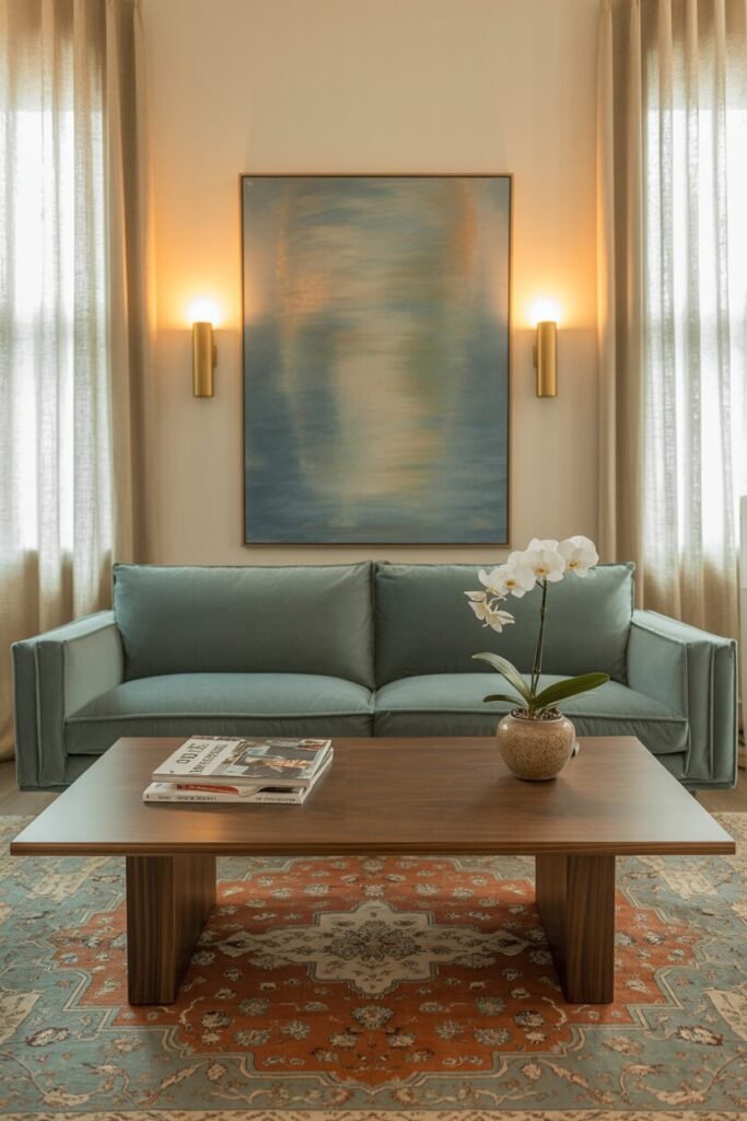
Muted teal or blue-gray sofas are perfect for those who want serenity with a little depth. These colors create a peaceful retreat, especially when styled in rooms with medium-toned wood furniture and soft, diffused lighting. Unlike more saturated blues, these hues act like visual slow breaths—they don’t overwhelm, they expand.
To elevate the design, try pairing muted teal with creamy off-white walls and subtle brass lighting fixtures. It’s a way to introduce luxe elements without breaking the tranquility. Avoid cool LED bulbs—warm lighting is essential to prevent teal from reading too chilly.
Designing Emotionally, Living Intentionally
So in reality, selecting a color for a sofa isn’t about what is “pretty” to look at or what’s fashionable; it’s about purpose. Sincerely, every color we introduce to our family room contains this hidden potential to subtly affect our mood, steer our conversation, and even influence how we really do relax. When we create on that emotional level of precision – really, striking the sweet spot between looking good and feeling it – we are left with results that don’t merely pass the test, but feel downright right.
It’s NEVER about wildly chasing each fleeting shade trend or trying to recreate that exquisitely taught Pinterest board you can’t get out of your head. Nope. It’s about finally hearing what your living room is screaming for, and better yet, what you’re screaming for from it in return. Because, honestly, the best living rooms are not necessarily always the ones that just blow you away in that first instant; they’re the ones which then somehow make their way deep into your soul in time.

