The Colorful Apartment Guide: Bold, Playful, and Totally Recreatable
Color can completely change the emotional temperature of a space, and the best part? You don’t need a renovation budget to feel that shift. Most people assume colorful interiors require full commitment, but in reality, it’s about layering small elements with intention.
When we strategically repeat a color through furniture, art, or accents, our brains read the space as styled, even if only a few items are actually colorful. This is the core principle behind visual rhythm — letting color appear in multiple touchpoints so it feels like part of a bigger narrative rather than a random pop.
We don’t paint rooms just to be dramatic; we do it to create mood and micro-zones that match how we want to live. Whether it’s a statement door, a bold ceiling, or just a chair that refuses to be beige, every intentional color moment becomes a piece of personality. That’s how apartments start feeling like yours, not just a rented box.
Blush Vanity Glow-Up Corner
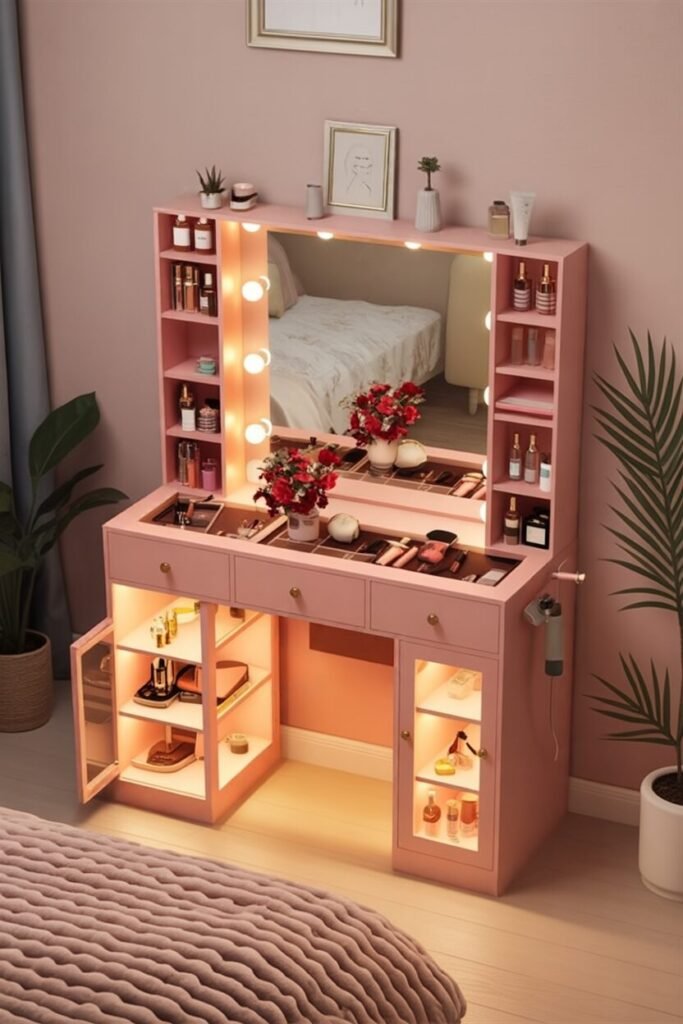
If your vanity area doesn’t make you feel like a movie star getting ready for a dramatic plot twist, what are we even doing? This pink setup is a masterclass in color coherence — everything from the drawers to the lighting carries the same warm undertone, which keeps it from looking chaotic despite being visually “extra.”
To recreate this, stick to one dominant color family (like blush or terracotta) and echo it through storage, accessories, and even lighting warmth. Adding built-in lighting or LED strips behind shelving instantly makes it feel designer-level without a designer budget.
Pro tip: use vertical shelving to frame the mirror — it visually elongates the space and gives you extra storage for skincare, perfumes, and the 27 lipsticks we “only use sometimes.” Bonus hack: a statement rug in a similar tone will anchor the area and make it feel like its own little glam zone.
Get The VANITY Now 👇

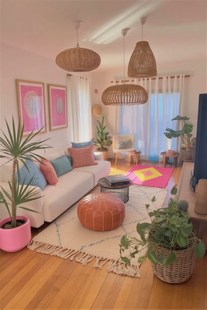
Playful Pop Art Living Zone
This space is giving… “graphic designer who drinks iced coffee year-round.” The trick behind this loud-but-balanced look is color blocking with intention — everything is in clear, confident tones like mustard, cobalt, and orange. Avoid pastels or muddy shades here; bold palettes work best when they’re pure and saturated.
The round rug softens all the straight lines from the sofa and shelves — mixing shapes is a core design principle to keep bold spaces from feeling stiff. To recreate this vibe, choose 3 statement colors max, then repeat them through art, textiles, and even book spines or décor accents so the palette loops around the room.
And please, if you’re adding wall art — scale matters. Go oversized or grouped; small frames on a big wall are the equivalent of sending “…” in a text. We want energy, not hesitation.
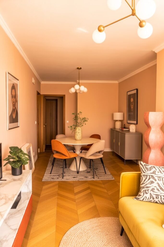
Warm Retro Kitchen Glow

This kitchen feels like the set of a retro rom-com where everyone wears cute sweaters and makes soup. The secret sauce here is tone layering — everything sits in the warm spectrum (oranges, soft woods, muted yellows), which creates harmony even with multiple elements happening.
Match your ceiling or trim color with an accent piece (like they did with the pendant lights and ceiling) — it’s a pro decorator trick to make a space feel intentional and custom. Wood tones? Keep them consistent or mix only within the same warmth level so they don’t clash.
Want instant retro energy? Swap out cool bulbs for warm white or amber-tinted lighting. It changes everything. Add small matching accessories (like mugs or placemats) to softly reinforce the color story without cluttering. We’re not hoarders — we’re curators.
Soft Sage Earthy Lounge
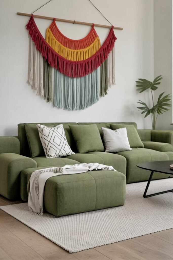
This setup said calm but make it aesthetic. The big design principle at play here is low-profile furniture + oversized textile art — it draws the eye upward and makes the space feel taller and more styled.
Sage green works beautifully because it sits as a neutral in colorful design, meaning you can pair it with terracotta, rust, cream, or mustard and it still feels cohesive. To recreate this, stick with chunky modular seating to ground the room, then add texture contrast — soft rug, linen throw, carved décor, and of course that fiber art wall hanging (bonus points for DIY).
Keep accessories minimal but intentional — large shapes, fewer pieces. This is how you keep earthy design looking elevated and not like a botanical-themed Airbnb.
Get The SOFA Now 👇

Peachy Pastel Cozy Nook
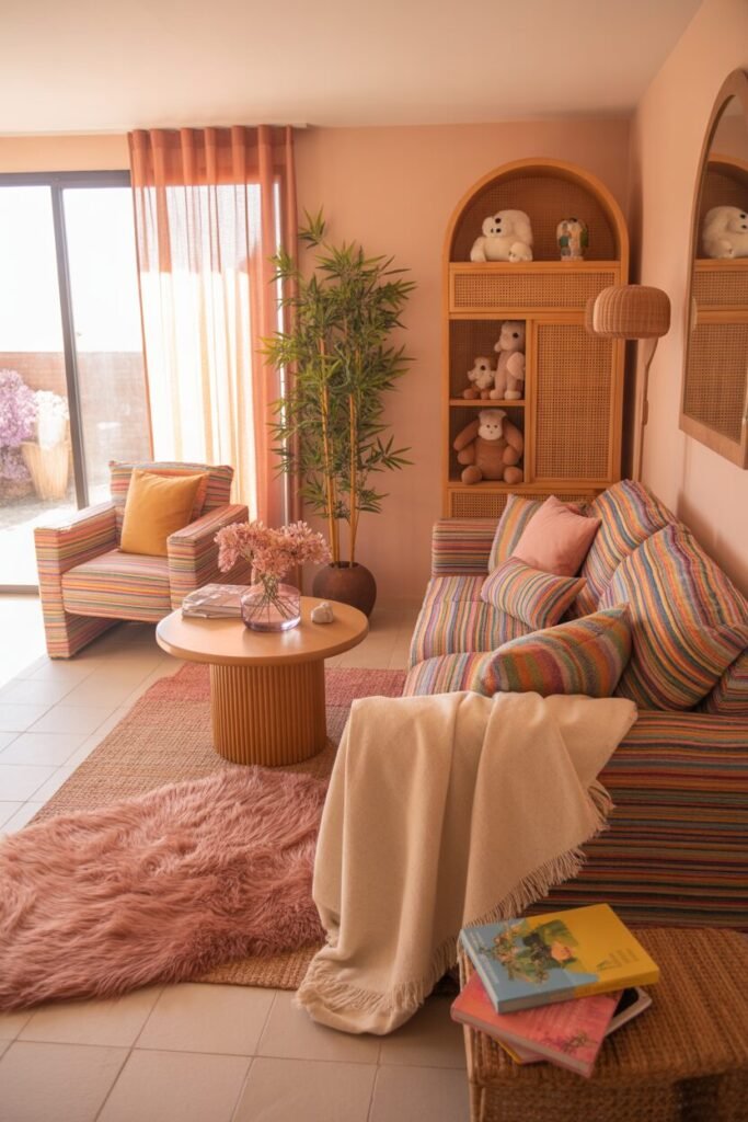
This room is like living inside a Pinterest board captioned “soft life.” The palette stays dreamy because everything is filtered through a warm peach undertone — even the striped sofa, even the rug. Monochrome doesn’t mean one color — it means one temperature vibe.
To recreate: choose your base shade (peach, lilac, buttery yellow) and layer patterns within that family, like stripes, subtle checks, or tone-on-tone textures. The rounded furniture edges instantly soften the room and make it feel cozy and playful rather than minimalist and cold.
Add one hero texture piece like a fluffy rug or boucle ottoman to amp up the tactile feeling — because visual color is one thing, but texture is what makes a room feel “expensive soft.” Finish with plants or rattan elements to keep it grounded.
READ MORE >> “9+ Colorful Kitchen Ideas You’ll Want to Copy Immediately“
Bold Door, Bold Personality Vibes
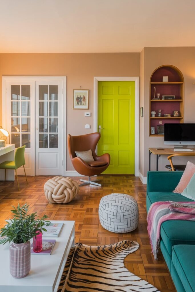
If the thought of using bright color in your apartment feels intimidating, start with one unexpected surface: the door. Painting the door in a vivid, highlighter-style tone instantly transforms it into a confident visual anchor without overwhelming the entire room.
The magic happens when you let that single bold moment guide the rest of your palette. Instead of matching the exact shade, repeat variations of that energy through accent furniture like a mossy green sofa or playful poufs. Designers call this trick color echoing, and it makes a space feel intentional instead of chaotic. The key is to repeat the color family at least three times within your styling — one dominant moment, one supporting piece, and one small, almost sneaky detail like a vase or book spine.
That simple repetition convinces the eye that everything belongs together. Pair all of this with creamy neutrals to soften the look, and suddenly, the apartment feels fun, confident, and curated — without a full makeover.
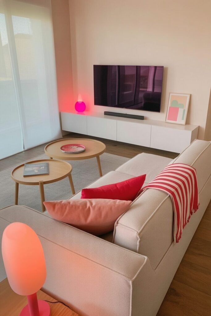
Ceiling Pop for Instant Wow
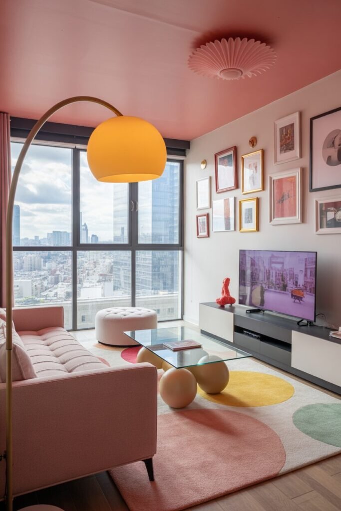
Painting the ceiling in a rosy pink might sound like a bold move, but it’s actually a clever visual illusion that designers use to draw the eyes upward and make a small apartment feel taller and more styled. By keeping the walls and larger furniture pieces neutral, the ceiling becomes a soft wash of personality rather than an overpowering statement.
The trick to making this look curated instead of random is to subtly repeat that blush tone somewhere lower in the room — maybe through a patterned rug, a throw pillow, or even artwork that features hints of the same color family. This repetition balances the vertical weight, so the ceiling doesn’t feel disconnected.
Think of it like applying a color filter over the entire space, giving everything a warmer, more cohesive glow. Soft pinks, peach, or muted terracotta work beautifully because they bring warmth without feeling too sugary. Suddenly, your rental doesn’t just look decorated — it looks intentionally designed, like something straight off a moodboard.
Color-Blocked Reading Nook Goals

Color-Blocked Reading Nook Goals — 165 kata
A colorful reading nook is one of the easiest ways to inject personality into your apartment without committing to a full-room color scheme. The secret is to pick one hero piece, like a vibrant green armchair, and let it claim the spotlight. Then, introduce a contrasting accent — such as an orange side table — to create visual tension. This contrast is what makes the space feel energetic instead of safe.
To avoid the look becoming chaotic, keep the backdrop neutral and let color live mostly in your seating, textiles, and one or two decor items. Books add natural visual noise, so grounding the area with a rug or a cushion in a tone that links both colors helps soften everything.
This trick is called visual bridging, and it makes bold pairings look curated. Add a small lamp or art print that echoes one of the colors, and suddenly the corner feels designed rather than just furnished. It becomes a personality moment, not just a chair in a corner.
Muted Meets Spicy Palette Balance
This dining setup proves that playful color doesn’t have to scream to be effective. The peachy wall acts like a warm neutral, setting a soft foundation that allows the spicier tones — mustard, terracotta, or muted coral — to shine without clashing.
Everything feels cohesive because every element shares the same warm undertone. That’s a design principle known as undertone harmony, and it’s the difference between “random colors” and “curated palette.” To recreate this in your own space, build your color choices like a gradient rather than a contrast chart — think of tones that could live in the same sunset.
Keep the table and larger furniture in wood or beige textures to add grounding warmth. Then, layer in color through seating, placemats, or even just a single vase to set the tone. By playing with finish — matte upholstery against glossy ceramics — you introduce depth without adding clutter. Everything feels intentional but still relaxed and lived-in.
Gallery Wall But Make It Punchy
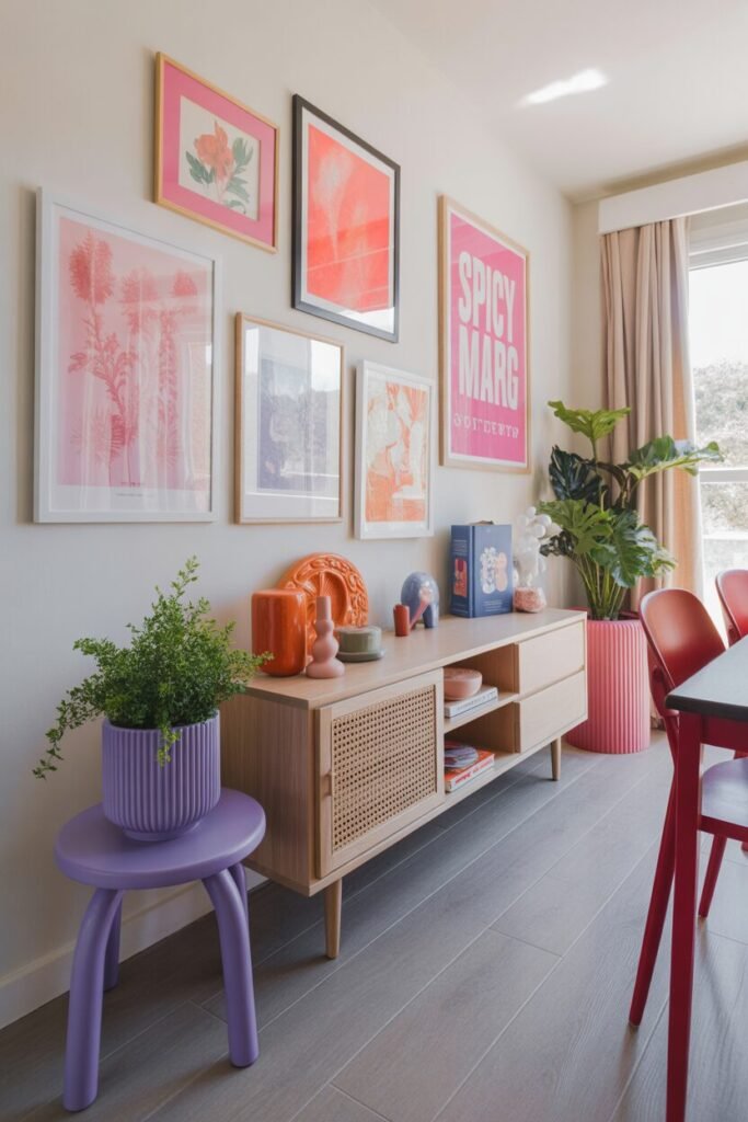
A gallery wall is more than a collection of prints — it’s a tool to distribute color across a room without needing bold furniture. The trick to making it look elevated is repetition. Pick one dominant accent color, like hot coral, and let it appear in multiple frames, a small decor piece, or even a single chair nearby.
This creates visual rhythm, guiding the eye in a smooth flow rather than a chaotic scan. Mixed frame sizes add personality, but aligning one visual line — like the bottom edge — keeps the wall feeling intentional. Keep your base furniture neutral in tone, allowing the art to carry the mood.
If you want a designer trick, place one real object, like a vase or lamp, that matches a color in the artwork — it blurs the line between decor and function. This small styling choice makes the room feel like a styled shoot rather than a rental apartment. Suddenly, your wall isn’t just decorated — it becomes the heart of the whole color story.
READ MORE >> “9+ Best Home Coffee Bar Designs of All Time“
Design Isn’t Perfect, It’s Playful And Personal
Here’s the truth: the best colorful apartments aren’t the ones that follow strict rules — they’re the ones where you play. When we stop trying to make everything match and instead focus on repetition, undertones, and mood, color becomes less scary and more like a tool.
The goal isn’t perfection; it’s vibe cohesion — that feeling when everything looks different but still somehow belongs together. Start with one bold move, let it breathe, then echo it again in smaller ways. That’s how design confidence grows. And remember, nothing is permanent. A painted stool, a swapped rug, a daring piece of wall art — these tiny choices stack up and create identity.
Apartments are temporary, but style doesn’t have to be. Think of your space as an evolving moodboard rather than a final product. It’s not about getting it “right.” It’s about creating a home that feels like your personality got comfortable and decided to stay.