Color, Texture, Chaos—Perfected: A New Way to Do Boho Kitchens
Boho kitchens aren’t just design—they’re a whole personality, a little rebellious, and definitely the fun friend in the house. In this guide, we explore nine ideas that show how color, texture, plants, and pattern can turn a kitchen into a space that feeds your soul as much as your stomach.
What makes boho so addictive is the freedom: we get to mix materials, break rules strategically, and lean into pieces that feel collected rather than purchased in one trip. The key is intentional layering, where every element adds warmth, story, or movement.
Whether you love saturated jewel tones, soft neutral textures, or “plants as roommates” energy, each idea teaches you how to recreate the vibe using real design principles—not just vibes alone. By the end, you’ll know how to play with contrast, scale, color harmony, and material repetition like a pro. Basically: welcome to your boho awakening.
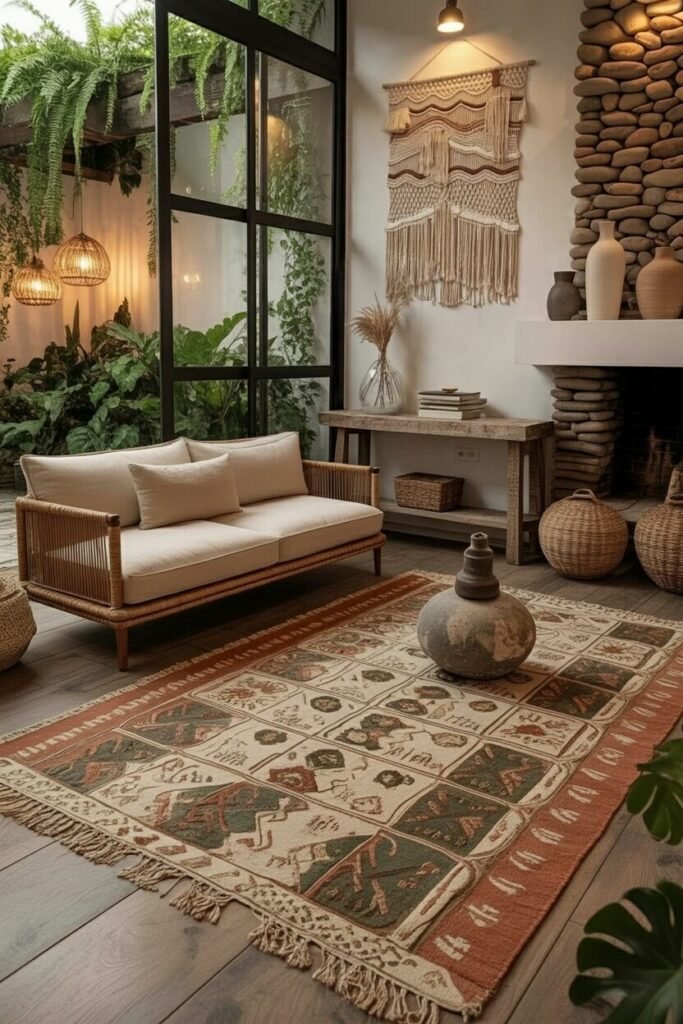
Soft Neutrals With Textural Layering
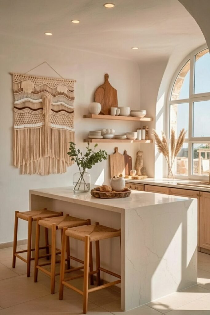
If your dream boho kitchen feels like a warm hug, this is your inspo. The magic of this look comes from neutral tones doing the heavy lifting while textures steal the spotlight. Think: woven stools, a chunky macramé wall hanging, soft curves, and matte finishes. In a neutral palette, texture is basically color, so we want contrast—smooth stone counters beside nubby fibers, sculptural ceramics next to soft woods, all working together for that cozy-boho energy.
Notice how everything sits in the beige–sand–wheat family? That’s intentional. A tight color palette keeps the space calm even when we layer lots of materials. To recreate this, use three anchor textures: (1) natural wood, (2) woven fiber, (3) plaster or stone. Then sprinkle in handmade pieces so nothing feels too “store-bought.”
Design tip: prioritizing negative space around shelves keeps boho from becoming visual chaos.
Décor tip: vary heights + silhouettes for ceramics to create that effortless-but-calculated styling vibe we all pretend we didn’t plan.
Maximalist Color With Playful Chaos
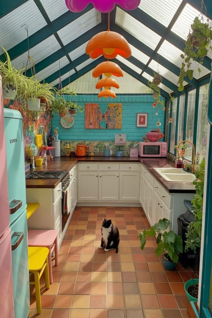
This kitchen is for the people who say “I’ll just add one more color” and then suddenly live inside a kaleidoscope. The vibe is boho maximalism, but in a strategic way—not the “I own everything ever made” direction. Here, color zoning is doing the real work. The turquoise walls, candy-colored appliances, and warm-toned tile floor all hit different notes while still harmonizing because they sit across from each other on the color wheel.
To recreate this, use one grounding texture (like wood countertops) and two dominant colors, then let a few accent shades join the party. Plants and hanging décor break up the vertical space so the eye keeps moving—aka the trick to making maximalism feel intentional.
Design principle: repeat colors at least three times in the room to avoid “random pop of color syndrome.”
Décor tip: quirky pendant lights? Absolutely yes. They act like visual exclamation points—loud, fun, and impossible to ignore.
Sun-Kissed Warmth With Retro Boho Touches
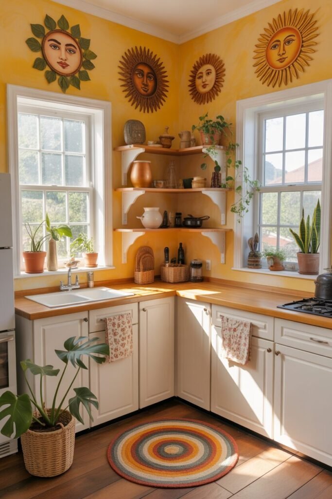
If sunshine had a kitchen, it would look exactly like this. The golden walls instantly set the tone: warm, cheerful, and a little nostalgic in a 70s boho way. What grounds all the brightness is the white cabinetry—it keeps the space from becoming a full sun explosion and gives the eye quiet spots to rest.
The sun motifs lining the walls? They’re not just cute—they’re visual rhythm, repeating circular shapes that help guide your gaze around the room. The shelving uses a soft arc shape, which subtly supports the theme of warmth and roundness.
To recreate this, pick a dominant warm hue (mustard, saffron, tangerine) and then mix in curved décor pieces to reinforce the concept. Add terracotta, wood, and greenery to bring earthiness back in.
Pro tip: round rugs are powerful—they soften angular layouts and create a “center” in kitchens that don’t have islands.
Boho secret: embrace imperfect, hand-painted strokes on walls; they add authenticity instantly.
Greenery-Forward Boho With Biophilic Design
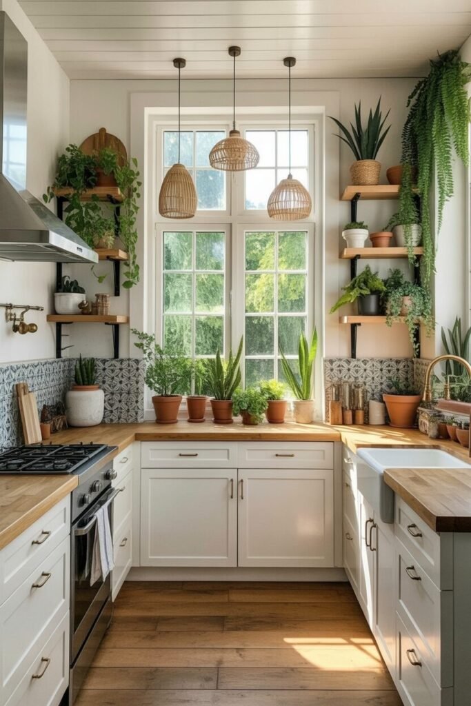
This is where boho meets “I am one with nature.” If you’ve ever wanted your kitchen to feel like it’s breathing with you, welcome to the biophilic boho universe. Plants are doing 70% of the aesthetic work, but what makes this design—not just décor—is the way the greenery interacts with lines, light, and scale.
Vertical plants draw the eye up, expanding the perceived height of the kitchen. Smaller pots line the windowsill, creating depth and keeping light flow intact. The patterned backsplash acts as a visual divider between the organic shapes of plants and the crisp cabinetry, giving balance to all the softness.
To recreate this, use a mix of three plant categories: trailing, upright structural, and low-growing. This gives height variety and prevents the space from feeling flat. Also, cluster plants in odd numbers—because even numbers feel too formal and we’re not trying to host a board meeting.
Design tip: choose warm-toned woods to prevent green-heavy spaces from feeling cold.
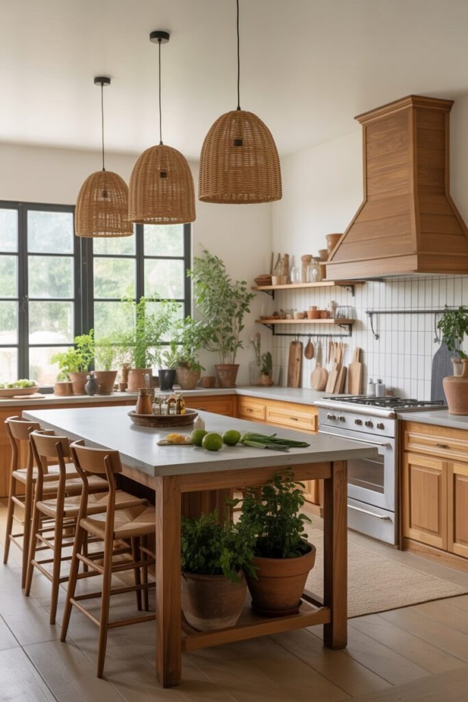
Rustic Boho With Woven Accents Everywhere
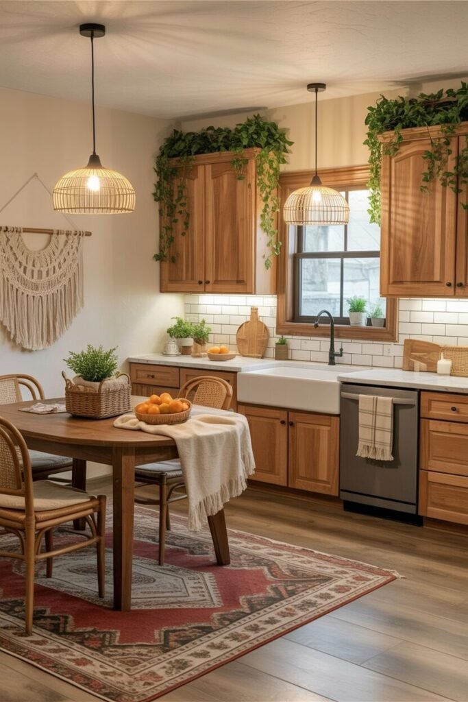
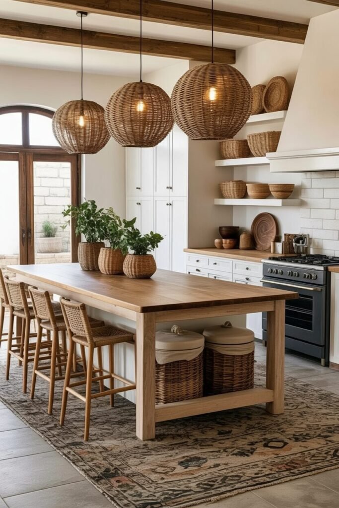
This kitchen screams, “I collect baskets and I’m proud of it.” And honestly? Same. The beauty here is the harmony between rustic structure (wood beams, chunky table, textured rug) and boho softness (wicker pendants, woven stools, natural fibers). The design works because everything stays in the warm-neutral spectrum—no cool grays to break the vibe.
What’s really clever is how the woven elements repeat across multiple scales: tiny bowls, medium baskets, giant pendants. This creates hierarchy, which keeps the space visually organized even with a lot of pieces around. The long dining table also acts as an anchor—big mass, simple lines, zero fuss—so the decorative items can shine without overwhelming.
To recreate this look, choose one hero material (rattan or wicker) and repeat it throughout the room in at least four different forms. Mix in black metal accents if you want a more modern edge.
Pro tip: textured rugs under kitchen tables instantly warm up big open spaces without clutter.
Earthy Jewel Tones With Global Accents
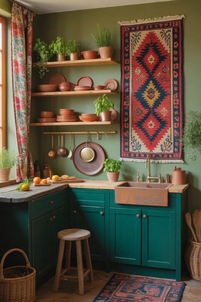
This kitchen is basically the Pinterest definition of “cozy but cultured.” The deep green cabinetry anchors the whole palette, letting the terracotta dishes, copper pans, and the bold kilim rug pop without chaos. The reason this mix works is color temperature harmony—everything leans warm even when the tones are bold.
When we use saturated hues like emerald or paprika red, pairing them with warm metals and clay textures keeps the story cohesive instead of dramatic-for-no-reason.
The hanging textile is doing a LOT of work here. It adds vertical color, introduces pattern, and creates a focal point so the space doesn’t feel bottom-heavy. Terracotta pottery also adds repetition—aka the secret weapon of good styling. When we repeat shape, material, or tone across a room, our brain goes “oh, this makes sense.”
Design tip: pair jewel tones with matte finishes for instant richness.
Décor tip: herbs in clay pots = functional, pretty, AND smell like you’re cooking even when you’re… not.
Cheerful Color Pops With Soft Sage Cabinets
This kitchen is giving “boho but make it cheerful and responsible,” and we love her for it. Sage green cabinets already bring serenity, but when we add those sunset-colored curtains? The space comes alive without feeling chaotic. This is a masterclass in controlled color pops—the curtains introduce pattern and multiple hues, but they sit in a clean vertical plane so they don’t compete with the countertops.
The terracotta pots sprinkled around the room provide visual balance and tie the color palette back to earthiness. The gold hardware and faucet warm everything up and prevent the sage from reading too cool under natural light. If you’re recreating this, stick to one hero pattern (like the curtains) and let the rest of the space stay calm.
Pro tip: soft woods + sage green = a no-fail pairing.
Design principle: introduce bold color only in swappable items—curtains, rugs, pottery—so your kitchen can evolve without drama.
Casual Boho Dining With Copper Highlights
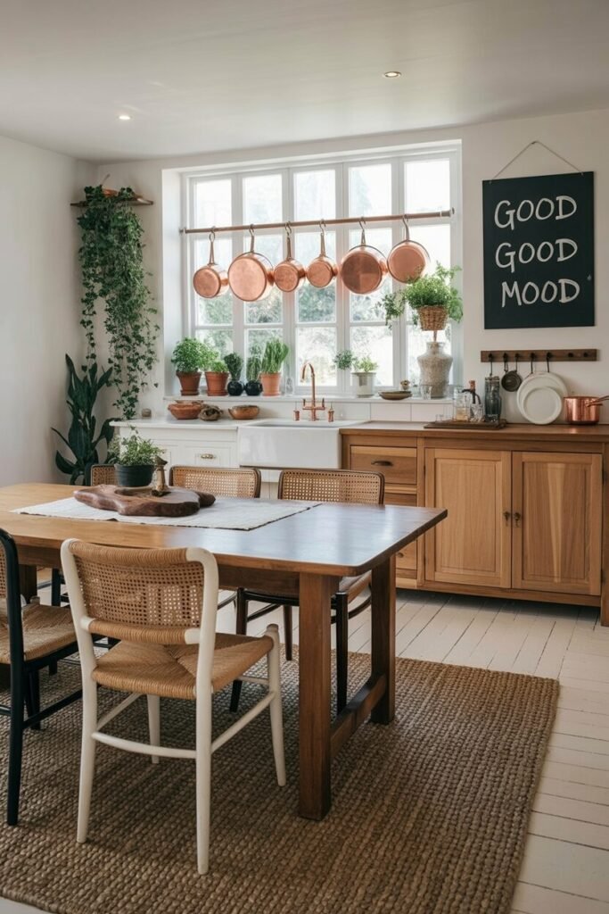
This kitchen-dining hybrid is the friend who always looks effortlessly stylish but promises they “just threw something on.” The copper pots are the star here—they add shine, warmth, and material contrast against all the soft woods and greenery. Hanging them in a straight line creates order in a space that’s otherwise full of relaxed textures. It’s basically functional art.
The cane dining chairs introduce woven texture, which is essential in boho design to prevent the room from feeling too flat or too polished. Meanwhile, the oversized rug grounds the table and defines the dining zone without building physical walls. This is how we create spatial zoning in open layouts.
If you want to recreate this vibe, mix light woods, copper finishes, and greenery. Keep shapes simple so the materials can shine.
Décor tip: repeat metal finishes at least twice (ex: pot rail + faucet) to avoid the “accidental mix” look.
Styling secret: handwritten chalkboard art? Elite boho energy.
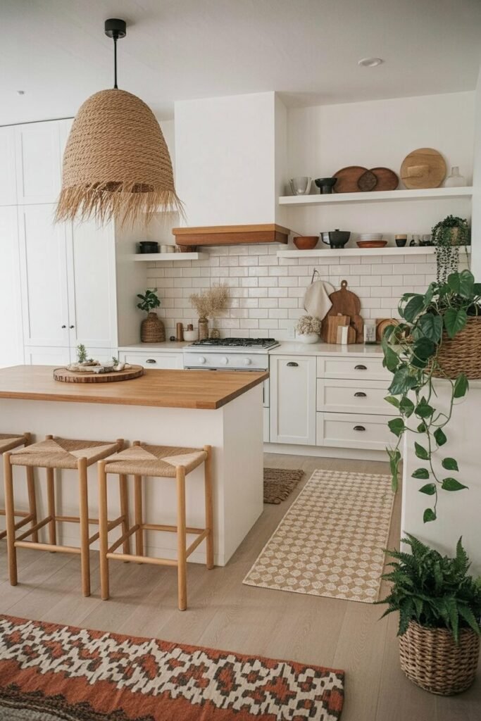
Light-Filled Minimal Boho With Cozy Layers
This kitchen is for the people who love neutrals but still want a little personality. The white cabinetry creates a fresh blank canvas, while the woven pendants and textured stools bring in warmth and dimension. The reason this room feels cozy instead of sterile is layering—multiple rugs, mixed baskets, ceramics, and plants all stack visual softness without clutter.
Open shelving works here because the palette is tight: whites, tans, browns, and a few greens. When you keep your color family limited, you can display more items without overwhelming the space. The patterned runners also add length to the room, making it feel bigger and guiding the eye deeper into the layout.
To recreate this, stick to three core materials: natural fiber, warm wood, and matte ceramic. Use them repeatedly in different forms to create cohesion.
Design insight: boho minimalism isn’t about owning less—it’s about owning things that visually agree with each other.
Your Boho Kitchen Journey Starts And Evolves Here
If there’s one thing we love about boho kitchens, it’s that they never stop evolving—and honestly, that’s the whole point. Your space should shift with your mood, your travels, your thrift-store wins, and your “I suddenly needed another plant” moments.
These ideas aren’t rigid rules but springboards that help you understand how color, texture, and layout can work together to create a space that feels warm, expressive, and beautifully lived-in. The real magic happens when you start experimenting: adjusting shelf styling, swapping rugs, mixing metals with intention, or giving your cabinets a fresh hue.
Remember, boho design thrives when things feel collected—not perfect. Use what you’ve learned about balance, repetition, and visual rhythm to guide your updates. And above all? Have fun with it. When your kitchen feels like you, every meal tastes just a little better.

