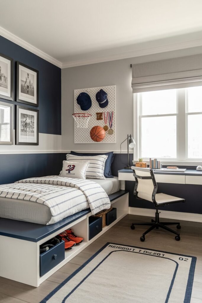
Dorm Room Ideas That Don’t Look Temporary or Try-Hard

Dorm rooms get a bad reputation for being boring, cramped, and temporary, but we’re calling that out as a design myth. A dorm is actually one of the best playgrounds for smart interior decisions because every inch matters. When space is limited, design principles stop being theory and start being survival tools.
Across these ideas, we see the same pattern: lighting defines mood, zoning creates clarity, and texture replaces square footage. The best dorm rooms don’t rely on expensive furniture. They rely on intention. From vertical layouts to layered lighting, each setup proves that comfort and function can coexist without visual chaos.
We’re not decorating for guests. We’re designing for real life, real routines, and real messes. That’s why hidden storage, soft materials, and controlled color palettes show up again and again. A good dorm doesn’t just look good online. It supports how we live, rest, focus, and reset every single day.
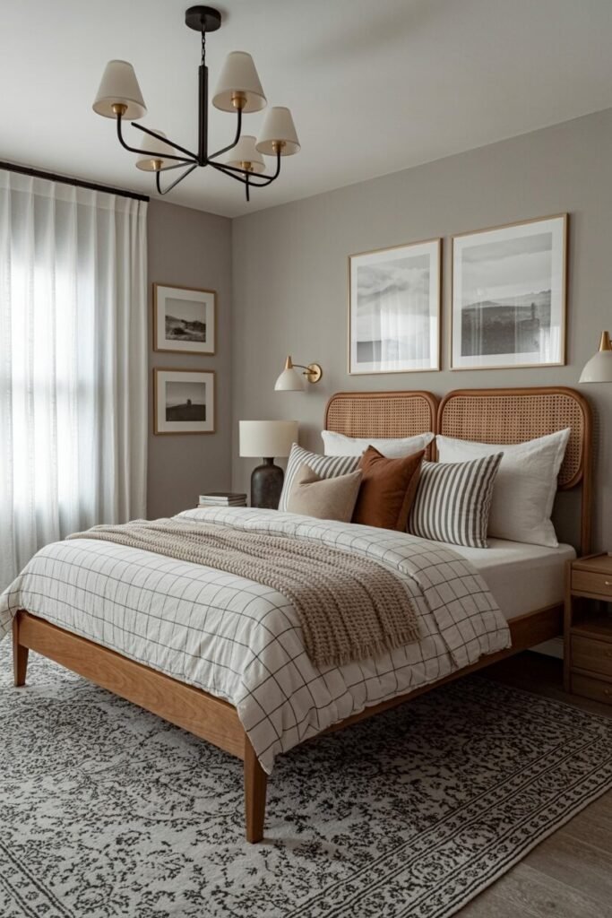
Blush Canopy Dorm That Feels Like Home

This dorm idea leans hard into soft layering and vertical emphasis, which is why it feels cozy instead of cramped. The canopy does more than look cute for Instagram. It visually raises the ceiling and creates a “room within a room,” a classic spatial zoning trick for small spaces. The blush palette works because it stays within one color family, letting texture do the heavy lifting.
Faux fur, velvet, and sheer fabric add contrast without visual chaos. When color variation is subtle, texture becomes your best design weapon. Under-bed storage keeps clutter invisible, which protects the calm aesthetic. We love how warm lighting wraps the space instead of blasting it; string lights soften edges and reduce harsh shadows.
The vanity mirror doubles as functional lighting and a focal point, proving one piece can work overtime. If we’re recreating this, the key rule is restraint. Choose one statement moment, like the canopy, and let everything else quietly support it. Cozy isn’t about more decor. It’s about better decisions pretending to be effortless.
Neutral Boho Storage-First Dorm Setup

This room nails the function-first design principle without looking like a storage catalog exploded. The neutral palette works because it reflects light evenly, making the space feel larger and calmer. Earth tones ground the room while woven textures add warmth, preventing it from feeling flat or temporary.
Under-bed drawers are a masterclass in hidden utility; when storage disappears, visual stress disappears with it. Good dorm design always separates “seen” from “used.” Wall art stays lightweight and clustered, creating rhythm without overwhelming the bed area. The macramé adds vertical softness, breaking up hard corners and guiding the eye upward.
Natural wood furniture brings visual stability, which helps the room feel permanent, not borrowed. If we’re copying this look, keep decor off the floor and let negative space breathe. Boho works best when it’s edited. Calm rooms aren’t empty. They’re intentional, and this one proves organization is a design feature, not a compromise.
Warm Glow Dorm With Study Balance

This setup understands one thing most dorms ignore: lighting controls mood more than furniture ever will. Warm string lights soften the room’s geometry, turning sharp corners into inviting zones. The bed placement respects flow, keeping walkways clear and the desk functional.
That balance matters because a dorm has to multitask. Neutral walls act like a blank canvas, while amber lighting adds emotional warmth without repainting anything. The layered textiles keep the bed visually anchored, which stops the room from feeling like a hallway with a mattress. Task lighting at the desk prevents eye strain while ambient lighting handles the vibe. That division is smart design, not decoration.
The wall decor stays minimal and personal, giving personality without visual noise. If we recreate this, remember: lighting should be layered, not random. One light sets the tone, another does the work. That’s how cozy and productive stop fighting each other and start coexisting peacefully.
Mini Living Room Inside Dorm

This idea flips the script by creating distinct zones through furniture scale and alignment. A low-profile sofa keeps sightlines open, making the room feel wider than it is. The glass coffee table reflects light and visually disappears, which is a classic small-space trick designers swear by.
Soft pastel accents keep the palette light, preventing the space from feeling boxed in. When furniture feels “lighter,” rooms feel bigger. The bed placement turns vertical space into opportunity, not obstruction. Art stays centered and proportional, reinforcing balance and symmetry. Every piece has breathing room, which is rare in dorms and incredibly effective.
If we’re recreating this, the secret is restraint. Fewer pieces, smarter placement. Treat the dorm like a studio apartment, not a bedroom with extras. When zones are clear, the room feels intentional. And when it feels intentional, it stops feeling temporary.
Loft Bed Workspace With Personality

This dorm thrives on vertical optimization, the holy grail of small-room design. The loft bed frees up floor space, instantly doubling functionality without adding clutter. The desk below benefits from focused lighting, while string lights above keep the sleeping area cozy. That separation supports better mental boundaries between rest and work.
Design that respects behavior always feels better to live in. Personal decor clusters keep the walls expressive but controlled, avoiding visual overload. The color palette stays consistent, letting personality shine through objects, not chaos. Even the dog fits the vibe, which honestly means the design passed the comfort test. Storage stays integrated, keeping daily essentials within reach but out of sight.
If we’re recreating this, measure first and decorate second. Vertical layouts demand precision. Done right, they make a dorm feel custom-built instead of cramped. This is proof that small spaces don’t limit creativity. They just demand smarter design choices.
Playful Neon Dorm With Cozy Layers

This dorm works because it balances visual excitement with emotional comfort, which is harder than it looks. Neon signs act as focal points, giving the eye something intentional to land on instead of bouncing around the room. The trick is keeping everything else soft.
Pastel bedding, plush pillows, and a thick rug absorb the intensity of bright lights. High-contrast elements always need soft counterweights. The wall collage follows a loose grid, which keeps playful decor from turning chaotic. String lights around the ceiling create perimeter lighting, making the room feel larger by outlining its boundaries.
Under-bed storage supports the design principle of containment, hiding clutter so personality stays front and center. We love how color repetition ties everything together, from pillows to wall art. If we’re recreating this, choose one neon color and echo it subtly. Fun dorms still need structure, otherwise cute turns chaotic fast.
Warm Study Nook With Natural Glow

This setup proves that lighting can define function without walls. The warm amber glow clearly separates the sleep zone from the study zone, helping the brain switch modes more easily. That’s environmental psychology doing the heavy lifting.
The tapestry behind the bed softens the wall and adds visual depth, preventing the corner from feeling flat. Plants introduce organic shapes, which reduce stress and make workspaces feel less rigid. Natural textures counteract screen fatigue. The desk stays minimal, allowing focus while still feeling personal through small decor moments.
Vertical shelving keeps essentials accessible without eating floor space, following the principle of upward expansion. We love how the color temperature stays consistent, which avoids visual whiplash. If we’re recreating this, keep lighting warm and indirect. Harsh overhead lights kill vibes and productivity. This room understands that comfort and focus aren’t opposites. They’re roommates.
Soft Blue Elevated Dorm Elegance

This dorm nails visual calm through symmetry and restraint. The elevated bed instantly creates hierarchy, making the space feel intentional instead of improvised. Soft blues work because they sit in a low-saturation range, which relaxes the eye and supports better rest.
Matching lamps establish balance, a classic design principle that makes rooms feel stable. Symmetry signals order, even in small spaces. The skirted bed hides structural bulk, letting the room feel lighter and more refined. Wall art stays minimal and aligned, reinforcing vertical flow rather than competing for attention.
The neon sign acts as a subtle focal point, adding personality without overwhelming the palette. We love how textures stay smooth and layered instead of chunky. If we’re recreating this, edit aggressively. Elegant dorms succeed because nothing fights for attention. Calm isn’t empty. It’s curated with confidence.
Moody Modern Dorm With Contrast

This room thrives on contrast as a design strategy. Dark walls ground the space, while light bedding keeps it from feeling heavy or closed in. That push and pull creates depth, making the room feel larger than it is. The neon sign becomes a statement because everything around it stays restrained.
Bold elements need quiet neighbors. Textured throws soften the sharp edges of modern furniture, preventing the room from feeling cold. Wall sconces replace bulky lamps, freeing up surface space and improving flow. The limited color palette keeps the room cohesive, which is essential when working with darker tones.
We love how negative space is respected instead of filled. If we’re recreating this, choose contrast intentionally. One dark surface is enough. Too many and the room shrinks emotionally. This dorm feels confident, grown, and designed on purpose.
DIY Pallet Bed With Raw Charm

This dorm shows how material choice can define character. The pallet bed introduces raw texture, instantly adding warmth and authenticity. It works because the rest of the room stays simple, letting the wood be the hero. String lights underneath create visual lift, preventing the bed from feeling heavy or grounded.
Lighting can visually reduce mass. The low profile supports a relaxed, grounded vibe, ideal for smaller spaces. Wall art stays eclectic but spaced, following the principle of visual breathing room. The layered bedding adds comfort without hiding the structure, which keeps the DIY element honest.
We love how storage integrates naturally under the bed, reinforcing function-first design. If we’re recreating this, sand everything properly and seal the wood. Raw doesn’t mean unsafe. This room proves personality beats polish when design principles still lead the way.
Design Your Dorm Like You’ll Actually Live There

The biggest mistake people make with dorm rooms is designing them like a photoshoot instead of a habitat. These ideas show that good dorm design starts with behavior, not trends. Where do we drop our bag? How do we wind down at night? Where does clutter go when life gets busy? The most successful rooms answer those questions visually.
Lighting is layered so our brain knows when to focus or rest. Furniture works vertically so the floor can breathe. Decor stays personal but controlled, avoiding overstimulation in small spaces. Even bold styles succeed because contrast is intentional, not accidental. When we design this way, rooms feel calm even when they’re full.
That’s the goal. A dorm shouldn’t feel temporary just because the lease is. With the right principles, it becomes a space that supports growth, creativity, and comfort. And honestly, that’s a glow-up worth investing in.