The Mid Century Modern Bathroom Playbook Designers Don’t Spell Out
Mid century modern bathrooms are not about nostalgia for the sake of nostalgia. They’re about intention. Clean lines, warm woods, geometric moments, and just enough bold color to make the space feel alive. When we think about designing one, we’re not copying a 1960 catalog page. We’re translating core principles into a bathroom that actually works for our daily routines.
The magic formula is balance. We pair organic shapes with structured grids. We combine warm walnut with crisp white tile. We let one material or color become the hero, then allow everything else to support it. Mid century design thrives on restraint paired with confidence. That’s the sweet spot.
Lighting also plays a starring role. Skylights, globe sconces, and layered illumination create warmth instead of harshness. When we design through proportion, repetition, and material harmony, the result feels architectural, timeless, and quietly bold. Not trendy. Just smart.
Skylit Wood-Framed Indoor Garden Bath Moment
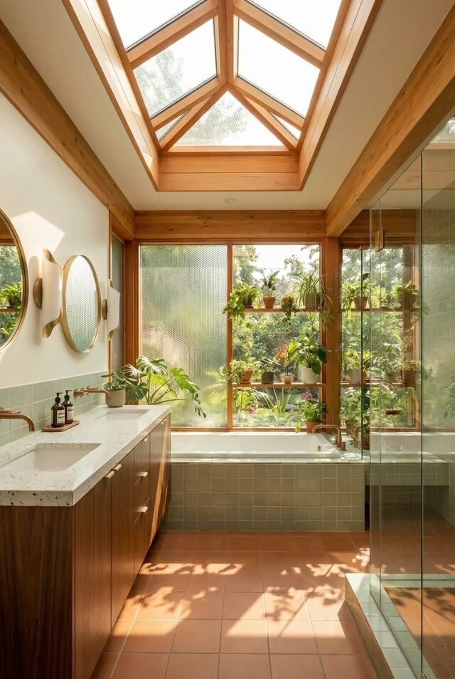
This bathroom is basically what happens when mid century modern meets greenhouse energy and says, “Let’s romanticize our morning routine.” The vaulted skylight framed in warm wood instantly establishes vertical drama, a classic MCM move that celebrates architecture instead of hiding it. Notice how the wood beams visually guide the eye upward, creating height and balance in a narrow layout. That’s not accidental — it’s spatial choreography.
The built-in tub under the massive window anchors the back wall, while the floating vanity keeps the left side feeling light. That asymmetry works because the material palette is tight: warm wood, soft sage tile, creamy walls. If we recreate this, we commit to three core tones max. Too many finishes and the calm disappears.
And let’s talk biophilic layering. Plants aren’t decor here — they’re structure. Cluster greenery at different heights to soften hard lines and blur indoor-outdoor boundaries. Add unlacquered brass for warmth, and suddenly we’re bathing in architectural serenity, not just soap.
Playful Pastel Tile With Walnut Vanity
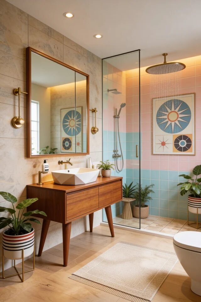
If mid century modern had a flirty side, this would be it. The pastel split tile in the shower instantly creates a horizontal color block — very 1950s, very intentional. Color blocking is powerful because it visually lowers or raises ceiling height depending on placement. Here, the softer pink above and cool aqua below feel airy but grounded.
The walnut vanity with tapered legs keeps things authentic. Those legs matter — they introduce negative space underneath, which makes smaller bathrooms breathe. Pairing it with a geometric vessel sink adds sculptural contrast without overwhelming the room. We’re balancing clean lines with personality.
Lighting also deserves applause. The backlit mirror plus warm brass sconces create layered lighting instead of that harsh overhead glow we all fear. If we’re recreating this vibe, we stick to one wood tone, repeat brass twice minimum, and let tile do the talking. Mid century design works best when color feels deliberate, not random.
Olive Vertical Tile Spa Nook
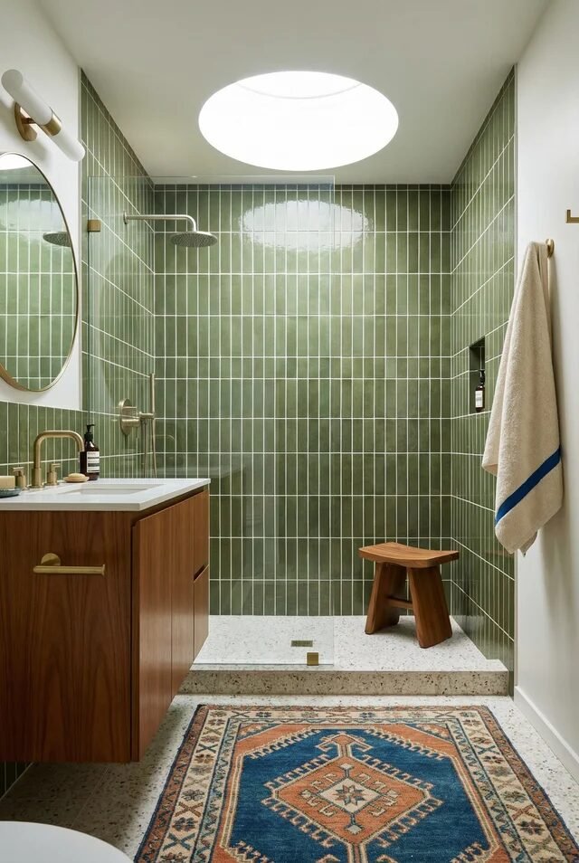
Vertical olive tile is doing the heavy lifting here, and honestly, we love to see it. Running tile vertically elongates the wall and makes compact showers feel taller. That’s a subtle optical illusion straight out of smart design school. The monochromatic approach also keeps the space cohesive, which is crucial in smaller footprints.
The terrazzo shower base adds texture without competing. In mid century interiors, texture replaces clutter. Instead of adding decor, we layer materials: glossy tile, matte terrazzo, warm walnut vanity, brushed brass fixtures. That contrast creates depth without chaos.
The circular skylight above? That’s a statement moment. Organic shapes soften all those straight grout lines and echo the round mirror and curved hardware. If we’re copying this look, keep grout lines thin and consistent — chunky grout would ruin the sleekness. Add one warm textile like a patterned rug for balance. When color is bold, restraint everywhere else is the flex.
Warm Cedar Ceiling Soaking Retreat
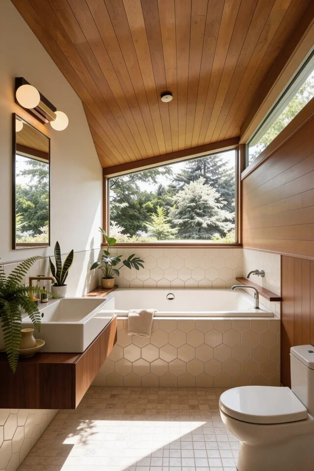
This bathroom leans into warmth, and we are not mad about it. The cedar plank ceiling draws the eye diagonally, creating movement and architectural interest without extra decor. Wood on the ceiling is a mid century power move because it visually wraps the space and adds intimacy. It’s cozy but still structured.
The large horizontal window behind the tub reinforces that indoor-outdoor connection. Notice how the hex tile remains subtle and neutral — that’s intentional restraint. When the architecture is strong, finishes should support, not compete. The floating vanity continues the wood story but stays minimal, keeping visual weight balanced across the room.
Lighting is layered through natural daylight and globe sconces, which nod to vintage design without going theme-y. If we’re recreating this, match wood undertones carefully — warm with warm, never mix random stains. Consistency in undertone is what keeps warmth from turning muddy. Add greenery sparingly and let geometry do the rest.
Emerald Tile And Graphic Floor Contrast
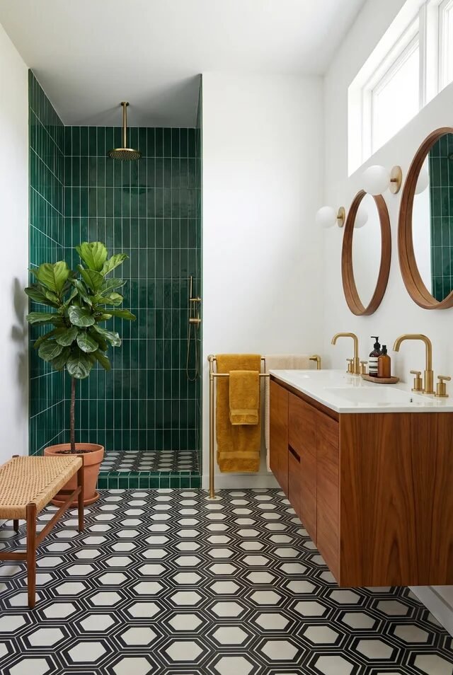
Okay, this one is bold in the best way. The deep emerald vertical tile in the shower instantly creates a focal zone. In mid century design, strong color often defines function. By isolating the shower in saturated tile, the rest of the bathroom can stay crisp and minimal. That’s strategic zoning through color.
Then we hit that black-and-white geometric floor and suddenly the energy shifts. Pattern on the floor grounds the space and keeps the eye moving. The trick is scale: the pattern is medium-sized, so it doesn’t overwhelm the narrower footprint. Balance is everything.
The walnut floating vanity with brass hardware warms up the high contrast elements, preventing the room from feeling cold. And those round mirrors? Soft repetition that echoes the circular light globes. If we recreate this, limit bold tile to one wall and keep adjacent walls white for breathing room. Drama works when it has negative space to shine.
Mustard Tile And Graphic Floor Energy
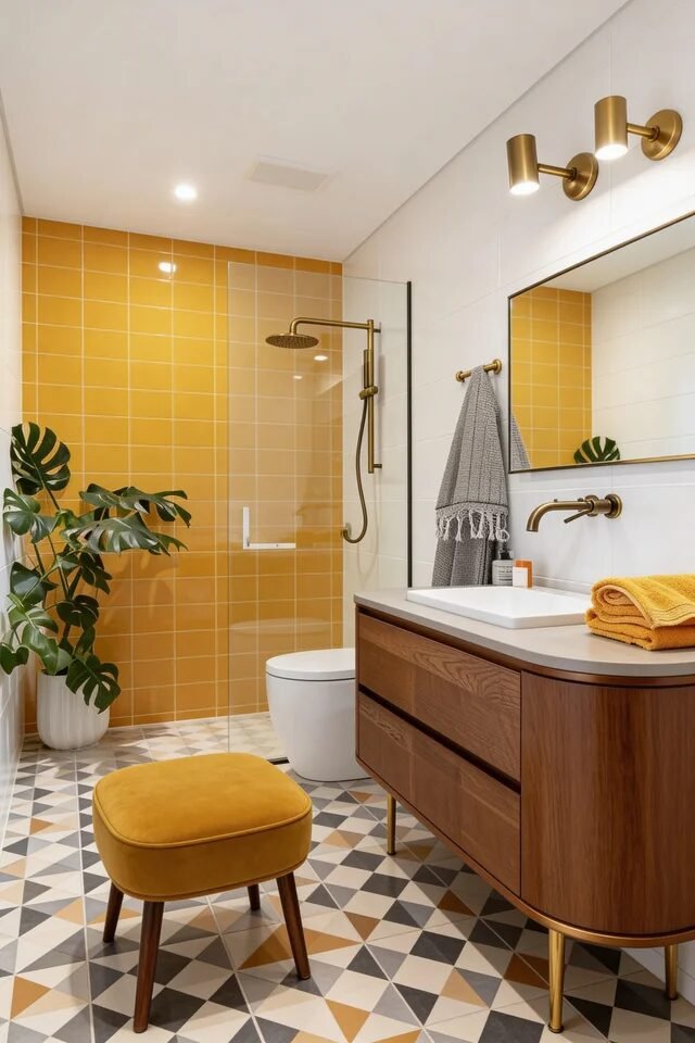
If sunshine could tile a shower, this would be it. The saturated mustard wall instantly becomes the focal point, and that’s intentional zoning at its finest. When we commit to one bold wall, we let it define the function of the space. Everything else can calm down and support it. The clear glass panel keeps sightlines open so the color reads expansive instead of boxed in.
Now look down. The geometric floor pattern anchors all that warmth with rhythm and repetition. Mid century design loves geometry, but scale matters. Medium-scale patterns prevent visual chaos in tighter footprints. Pairing it with a walnut vanity keeps the palette grounded and cohesive.
Brass fixtures repeat across lighting and plumbing, which creates harmony. If we’re recreating this vibe, limit statement colors to one or two and echo them subtly in textiles. Contrast feels chic when it’s controlled, not chaotic.
Atomic Art And Stone Statement Tub
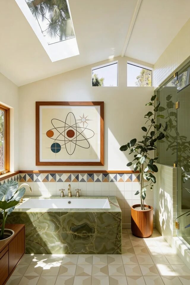
This one feels like a Palm Springs daydream in bathroom form. The green stone tub surround becomes a sculptural anchor, and it works because it’s balanced by creamy walls and structured geometry. Large-scale material moments need breathing room around them. That negative space keeps the stone from overpowering the room.
The horizontal band of geometric tile wrapping the walls is a quiet nod to classic mid century motifs. It creates visual continuity and subtly lowers the wall height, making the vaulted ceiling feel even taller. Architectural contrast at its best.
Skylights flood the room with natural light, enhancing the green tones and making the space feel expansive. If we’re copying this energy, mix organic elements like plants with strong lines in art. Mid century spaces thrive when structure and softness coexist. Keep fixtures streamlined and let statement materials do the storytelling.
Round Window And Mosaic Drama
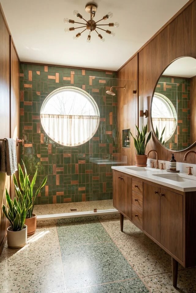
A circular window instantly changes the vibe. Straight lines dominate most bathrooms, so introducing a round opening softens the geometry and creates a natural focal point. Organic shapes are essential for balancing rigid tile grids. Here, the green mosaic wall feels dynamic but controlled because the palette stays earthy.
Full-height wood paneling wraps the side walls, creating warmth and visual cohesion. When materials wrap continuously, the space feels intentional rather than pieced together. The double vanity adds symmetry, which counterbalances the playful mosaic.
Notice the terrazzo floor — subtle speckling adds texture without competing with the wall. That’s restraint in action. If we’re recreating this, repeat green at least twice and keep secondary tones warm. Repetition builds harmony faster than adding new colors ever will. Add layered lighting overhead to keep mosaic from feeling too heavy.
Starburst Vanity And Skylight Glow
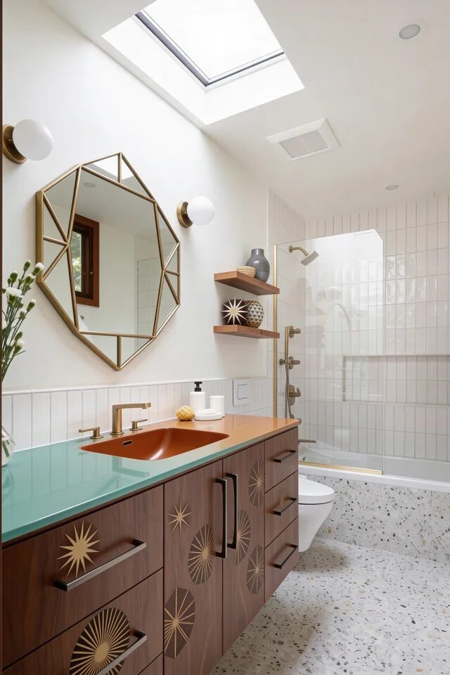
Okay, this vanity is serving personality. The starburst inlay detailing nods directly to mid century motifs, but the clean lines keep it modern. Statement cabinetry works best when the surrounding finishes stay simple. Crisp white tile and terrazzo flooring give the eye a break.
The aqua countertop introduces a retro pop without overwhelming the room. Pairing it with warm brass hardware keeps the palette cohesive and elevated. Notice how the geometric mirror echoes the starburst theme subtly. That’s design continuity, not coincidence.
Skylights bring in top-down light, which prevents bold details from feeling heavy. If we’re recreating this, choose one signature motif and repeat it in small ways. Too many graphic elements and it becomes costume-y. Mid century is about edited boldness, not maximal overload. Keep storage integrated so decor can stay minimal and intentional.
Arched Nook With Starburst Floor
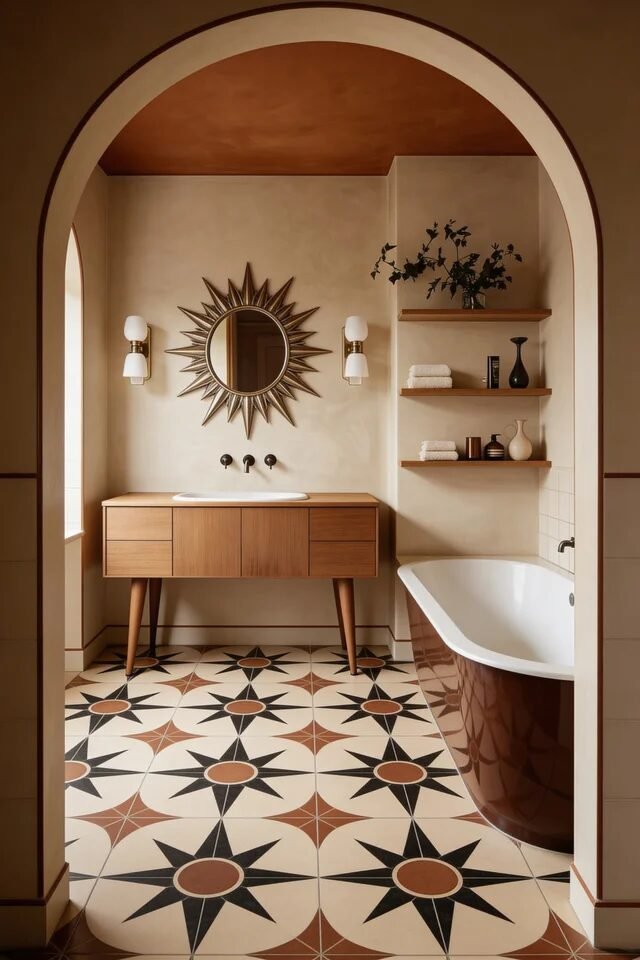
This bathroom leans into architectural framing, and we’re obsessed. The arched opening instantly creates depth and separation, even in a compact layout. Framing a vanity within an arch turns it into a built-in focal point. That’s spatial hierarchy done right.
The starburst floor pattern pulls the eye inward, guiding movement through the room. Because the walls stay neutral and warm, the floor can take center stage without overwhelming. Balance between pattern and plain surfaces is what keeps it elevated.
Floating shelves add vertical layering, while the tapered-leg vanity keeps things light. Warm beige tones and soft lighting maintain that cozy mid century glow. If we’re recreating this, match wall color to grout tone for cohesion. When color, pattern, and architecture align, even small bathrooms feel curated and intentional.
Timeless Geometry, Warmth, And Architectural Intention
A mid century modern bathroom should feel considered from floor to ceiling. Every line, curve, and finish has a purpose. The goal isn’t to fill the room with retro objects; it’s to create visual rhythm. We use geometry on floors, vertical tile to elongate walls, and floating vanities to introduce negative space. Good mid century design always respects proportion and breathing room.
Color works best when edited. One saturated tile wall, one sculptural mirror, one bold stone moment. That’s usually enough. Repetition of brass, wood tones, or a specific shape builds cohesion without overcomplicating the layout.
Most importantly, the space should feel warm. Natural materials, soft lighting, and layered textures prevent the clean lines from feeling cold. When we design with clarity and confidence, the bathroom becomes more than functional. It becomes architectural. And honestly, that’s the energy we’re keeping.