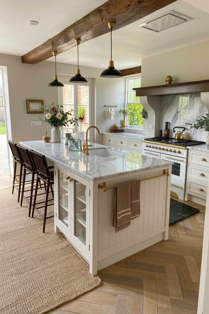
How to Mix Chaos and Charm in a Perfectly Colorful Kitchen
Color is more than a design choice—it’s an emotional language that speaks to how we feel in our homes. This season, kitchens are no longer just functional spaces; they’ve become canvases of self-expression.
Whether it’s the pop of citrus yellow that energizes your morning coffee, or the calm of sage green that makes your evening tea taste better, each hue tells a story. Think of color as mood architecture—it can transform even the smallest kitchen into a sanctuary of joy, creativity, or calm.
The key lies in balance: mixing vibrant tones with grounding neutrals and adding textures that make the space feel alive. From dopamine-bright tiles to pastel serenity, these 10 kitchen ideas will show you how to design with feeling, not just aesthetics. It’s time to cook, create, and color your world with intention.
Retro Tile Magic with a Modern Twist
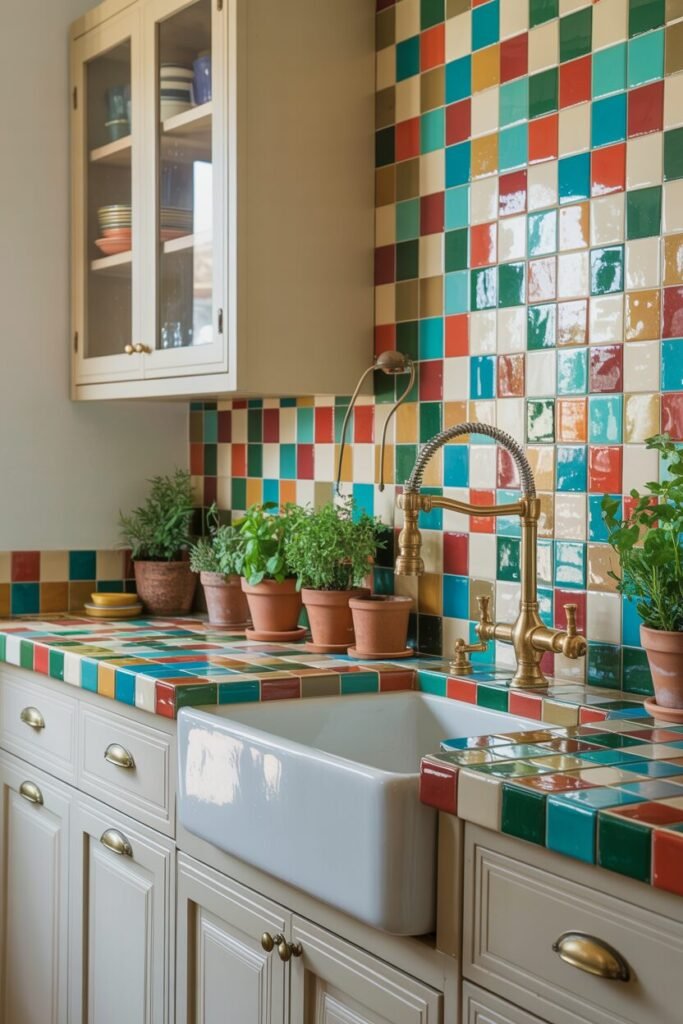
If your kitchen feels like it’s missing personality, say hello to this retro tile revival that mixes art, nostalgia, and pure serotonin. The combo of teal, mustard, red, and cream is no accident—it’s a deliberate color psychology balance. Warm colors like red and orange stimulate appetite and energy, while cool hues like teal and green bring calm and harmony.
Together, they create a space that feels alive but not chaotic. The trick? Let the tiles do the talking. Keep cabinets neutral and go for gold or brass fixtures to add a hit of glam that ties everything together. Throw in terracotta pots with fresh herbs to balance the boldness with texture and life.
Design-wise, this setup uses visual rhythm—alternating colors in a consistent pattern keeps the look cohesive, not messy. It’s the kind of kitchen that says, “I know design theory, but I also make great pancakes.” We love a balance of brains and beauty.
Green Tiles and Pops of Citrus Joy
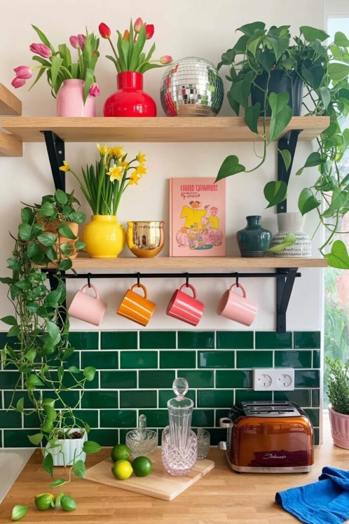
This cheerful space proves that color therapy is real. The emerald green subway tiles create a deep grounding backdrop while those citrusy accents—orange, pink, and yellow—add instant dopamine. Green represents freshness and renewal in color psychology, so it’s perfect for the heart of the home.
The contrast with wooden countertops adds warmth and balance, making the kitchen feel inviting rather than clinical. Here’s a sneaky designer trick: use complementary colors like pink and green to make both tones visually pop. The open shelving and colorful mugs act as little personality anchors, drawing your eye upward and keeping the mood playful.
To recreate this, keep your base tone solid (like green) and layer small accessories in varied brights. Plants, ceramics, and fresh fruit bowls complete the vibe. It’s proof that you can have a Pinterest-worthy kitchen without sacrificing coziness. Think of it as “organized chaos”—the chic kind that makes your guests instantly smile.
Hot Pink and Sunshine Yellow Power Combo
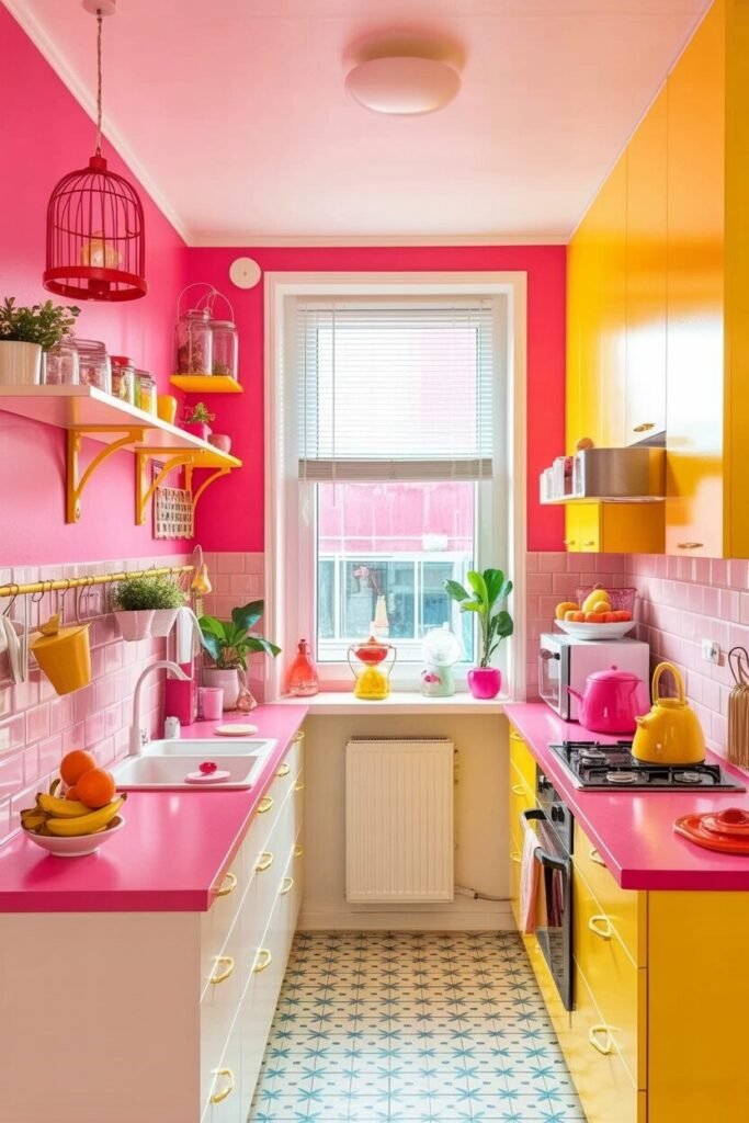
Warning: this kitchen is not for shy souls. This bold blend of hot pink and yellow feels like pure happiness in physical form. Pink evokes creativity and playfulness, while yellow triggers optimism and light—together they’re a design power duo that can make even Mondays fun.
To make the color balance work, notice how the white backsplash and geometric flooring break up the saturation. This is called color zoning, and it keeps bold palettes from overwhelming the eye. Keep hardware and accents minimal so the tones can shine. Adding glassware, small plants, or metallic details can bring texture and depth.
Here’s a color theory tip: pair warm brights with neutral flooring or wall patterns to stabilize the visual temperature. The result? A kitchen that feels like an energy drink but with taste. It’s unapologetically loud, deeply happy, and ideal for people who want their home to scream, “Yes, I have main character energy.”
Moody Blue Kitchen Meets Jungle Energy
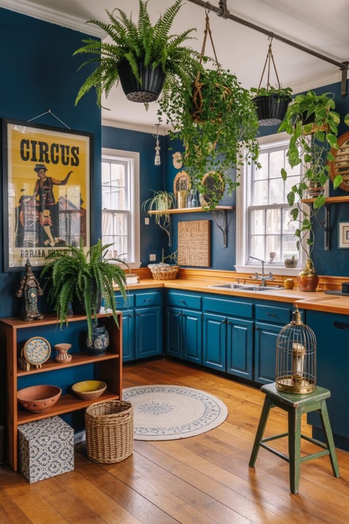
This kitchen is giving “artist retreat with espresso machine.” Deep navy cabinets paired with natural wood and greenery create a perfect yin-yang balance. Blue evokes peace, reliability, and calm, while the wooden tones inject warmth so it doesn’t feel too cold or serious. Hanging plants add height and visual rhythm, softening those dark blocks of color with organic flow.
The secret design principle here is contrast and repetition—notice how the deep hues repeat subtly across decor and trim, anchoring the entire space. Want to recreate this vibe? Start with one dark hero color, then layer in mixed textures: plants, woven baskets, or vintage prints.
Add metallic finishes (brass or bronze work beautifully) for visual balance and light reflection. The result feels moody but alive—a space that whispers creativity and comfort in equal measure. It’s the kind of kitchen that makes you want to sip red wine while pretending you’re writing your next novel.
READ MORE >> “9+ Colorful Apartment Decor Ideas That Scream Pinterest-Worthy“
Pastel Playhouse with a Modern Edge
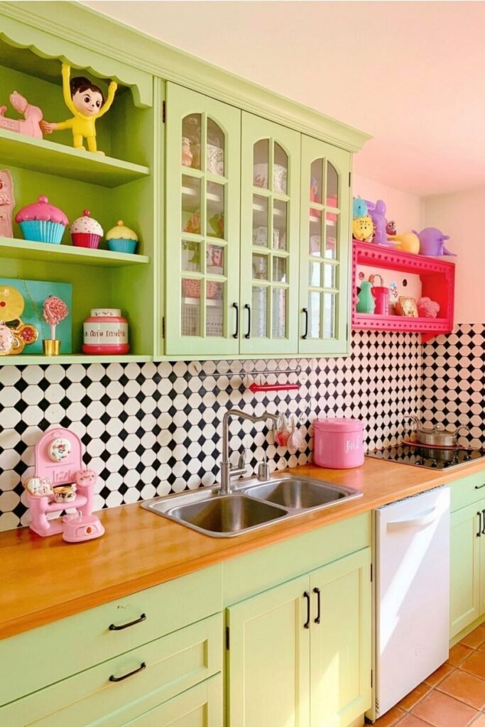
This mint-green and bubblegum-pink kitchen is proof that pastels can be powerful. In color psychology, green brings calm and renewal, while pink boosts happiness and warmth. When used together, they create a balanced, feel-good energy that’s ideal for a compact kitchen.
The black-and-white checkered backsplash adds necessary structure and breaks the sweetness with graphic confidence—because even a cute space needs a little edge. The key here is contrast in both color and material: wood countertops introduce warmth, grounding the otherwise airy palette. Want to copy the vibe? Choose one dominant pastel and one accent color, then add touches of natural wood or metallic hardware for dimension.
Display playful items—like vintage jars, toys, or cupcake-shaped décor—for personality that doesn’t feel cluttered. It’s a smart mix of fun and function. The result? A kitchen that feels nostalgic yet modern, where every cooking session starts with a smile and ends with a happy sigh.
Coral Cabinets + Red Tile Fusion
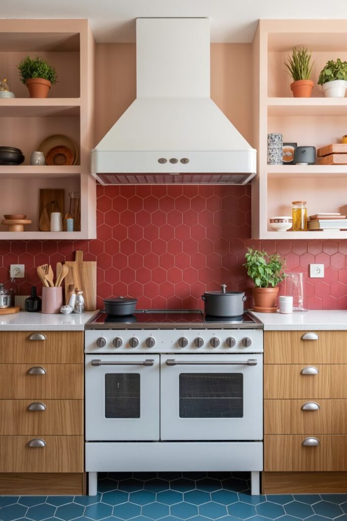
This kitchen proves that color blocking can be both warm and sophisticated. The coral cabinetry softens the intensity of the red hexagonal backsplash, creating a layered warmth that feels comforting but energetic. Red is known to stimulate appetite and confidence, while coral adds a friendly, nurturing tone that softens its boldness.
Together, they form a visual rhythm that feels like an instant mood booster. Notice the blue hexagon flooring—it’s the unexpected twist that balances the warm palette with calm contrast. In color psychology, blue brings focus and serenity, grounding the passionate red above it. Wooden drawers add texture and warmth, keeping the whole look cohesive.
The design trick here is harmony through temperature contrast—pairing warm and cool tones in one visual plane creates energy without chaos. Add potted herbs or terracotta accents for organic depth. The result? A modern Mediterranean vibe that says: “I cook with love and a little drama.”
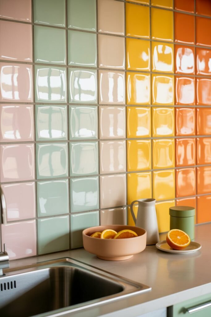
Candy Stripes and Lemon Pop Kitchen
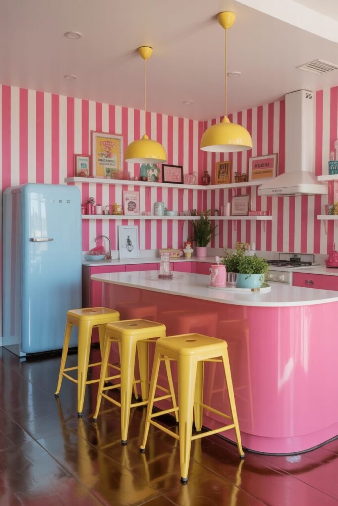
This kitchen is what happens when happiness gets interior design training. The pink-and-white striped walls instantly transport you to a retro candy shop, while the bold yellow stools and pendant lamps inject sunshine energy. Pink, psychologically, represents creativity and warmth, while yellow sparks joy and boosts optimism— they create a dopamine décor moment that feels alive and nostalgic.
The pastel blue fridge adds a cool retro contrast, balancing the sweetness with calmness. To keep this kind of look stylish (not overwhelming), designers often rely on tone repetition—notice how every shade appears in small doses across the space, creating flow.
The key to pulling this off? Keep the background pattern clean and symmetrical, then sprinkle accent items like mugs, posters, or cookbooks in your chosen colors. It’s playful, brave, and a total serotonin generator. This kitchen doesn’t whisper “good morning”—it yells it, but in the nicest way possible.
Sage Green Cabinets + Floral Tile Charm

If coziness were a color, it would look exactly like this. Sage green cabinets pair beautifully with a hand-painted floral tile backsplash, creating a space that feels nostalgic yet intentional. Green symbolizes harmony and restoration, making it ideal for the kitchen—the heart of every home.
The floral pattern adds a soft, cottagecore energy that brings life and warmth without overwhelming the eye. Notice how the wooden countertops and open shelves keep the vibe grounded, while brass fixtures add a subtle sparkle. This palette works because it plays with biophilic psychology—incorporating natural tones and organic shapes that subconsciously calm our minds.
To recreate this aesthetic, choose muted greens, warm woods, and a small-scale patterned tile. Add flowers or herbs to reinforce the natural theme. It’s the kind of kitchen where baking bread feels therapeutic and morning coffee tastes just a little more peaceful. Comfort meets elegance, wrapped in sage and sunshine.
Abstract Tiles + Violet Drama
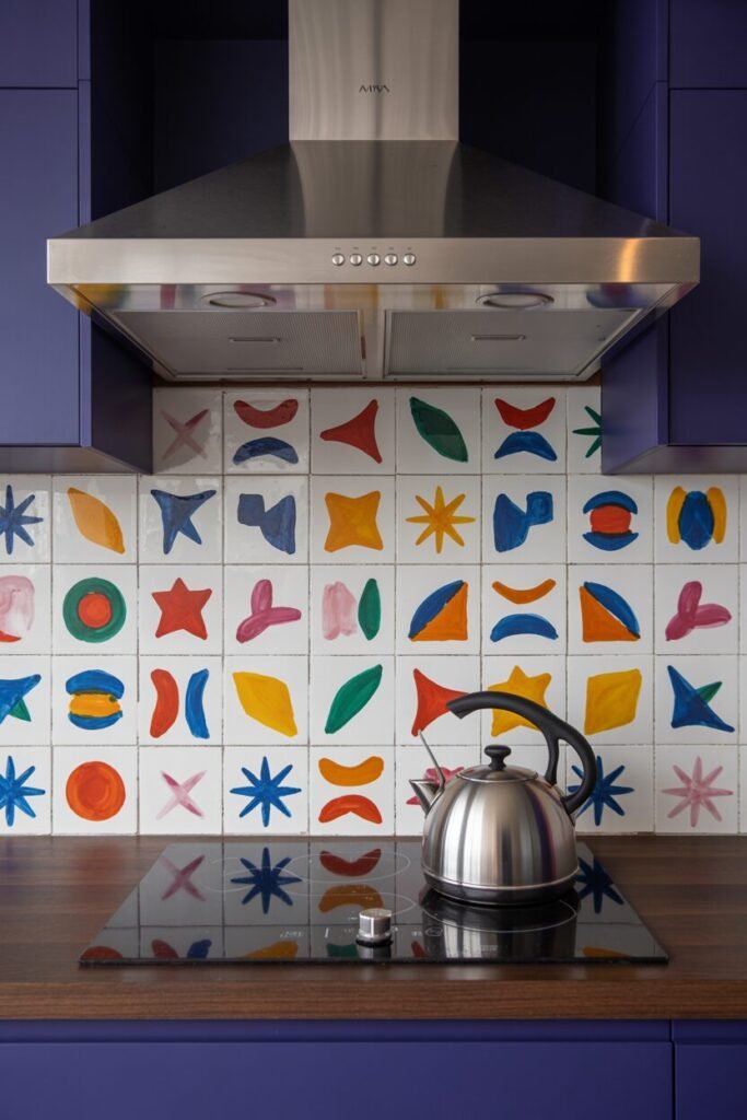
Welcome to the artsy kitchen that doesn’t follow rules—it creates them. These hand-painted, abstract tiles bring energy and individuality into the space, while the deep violet cabinetry acts as a luxurious anchor. Violet stimulates creativity and represents sophistication in color psychology, while the playful shapes and bright tones (orange, blue, red, yellow) invite joy and spontaneity.
This combo proves that bold design doesn’t need to shout—it can sing. The secret here is controlled chaos: keeping the base tone dark and grounding, while letting the backsplash express artistic flair. Pairing these elements with a simple wooden countertop adds texture and balance, ensuring the space feels alive but never messy.
To bring this look home, mix structured lines with free-form elements, like handmade tiles or irregular art prints. It’s part mid-century, part gallery wall, and 100% confidence. Basically, this kitchen says, “I paint outside the lines—and it works.”
READ MORE >> “9+ Colorful Apartment Decor Ideas That Scream Pinterest-Worthy“
Glossy Pink Tile + White Cabinet Glow
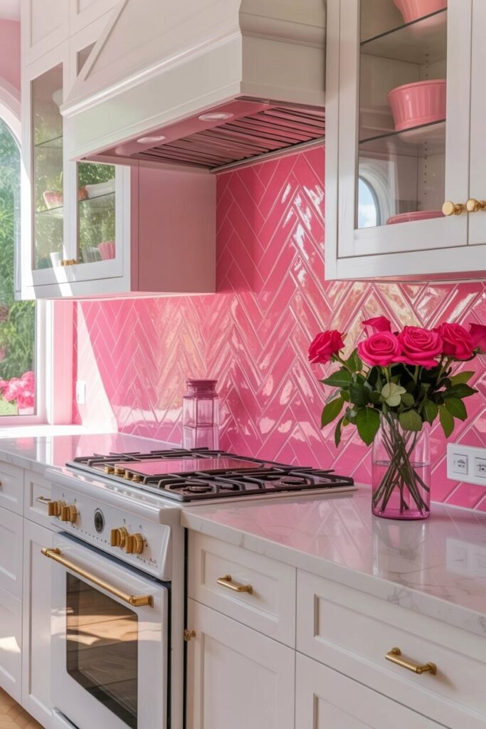
Here’s proof that pink can be powerful and polished at once. This glossy herringbone tile backsplash catches light beautifully, adding both texture and movement to a clean white kitchen. Pink, often associated with joy and comfort, feels surprisingly elegant here thanks to the high-shine finish and gold hardware.
The white cabinetry amplifies brightness, making the color pop even more, while the rose bouquet ties it all together with natural warmth. Design-wise, this setup nails tone layering—the subtle differences in pink intensity create depth without clutter. The result is feminine but fearless, romantic but crisp.
For balance, add metallic accents (brass or gold) and transparent glassware to reflect light. The psychology behind this look is simple: the space uplifts your mood while keeping your mind calm. It’s the perfect kitchen for anyone who loves a little glam with their morning espresso. Think Elle Woods, but make it timeless.
Let Your Kitchen Radiate the Color of You

At the end of the day, your kitchen should feel like an extension of your energy—not a catalog display. The most inspiring spaces aren’t just about perfect symmetry or trendy finishes; they’re about emotion and personality. Maybe your heart beats faster for bold red tiles, or maybe peace finds you in soft pink pastels.
The goal isn’t to copy—it’s to curate a mood that mirrors who you are. Start small: a statement backsplash, a bold cabinet hue, or even colorful dishware can shift the whole vibe. Don’t fear contrast; contrast is what gives rooms character. These color-infused kitchens remind us that design isn’t about rules—it’s about resonance.
So play, experiment, and follow the shades that make you feel most alive. Because the best kitchen isn’t the one that looks perfect—it’s the one that feels perfectly you.