Smart Ways to Style a Single Wide Trailer Living Room
Single wide trailer living rooms get underestimated all the time, and honestly? We’re not doing that here. Designing a narrow space isn’t about shrinking your style—it’s about sharpening it. When square footage is limited, every decision matters more. Layout becomes strategy, color becomes psychology, and storage becomes non-negotiable.
The good news is that single wide living rooms are actually easier to control once we understand proportion, flow, and visual balance. In these spaces, we focus on symmetry to calm the eye, vertical styling to elongate walls, and layered lighting to prevent flat, shadowy corners.
Rugs define zones. Furniture with visible legs creates airflow. Repeating materials builds cohesion. The goal is not to make the room look bigger—it’s to make it feel intentional. When we design with purpose instead of panic, even the narrowest trailer living room can feel curated, cozy, and completely custom.
Soft Neutral Built-Ins For Visual Expansion
This single wide living room proves that built-ins are basically cheat codes. Instead of bulky furniture, we’re framing the walkway with symmetrical shelving, which instantly creates structure and makes the space feel intentional. Symmetry is your best friend in narrow layouts because it visually balances tight proportions.
The soft beige palette keeps everything airy, while layered textures—carpet, upholstered ottoman, linen sofa—prevent it from feeling flat. If we want to recreate this, focus on vertical storage first. Tall shelving draws the eye upward, subtly exaggerating ceiling height. Keep decor curated: stack books horizontally, mix framed photos with vases, and vary heights for rhythm.
The ottoman coffee table is genius here. In compact rooms, choose soft-edged pieces to maintain flow and avoid visual heaviness. Stick to one cohesive color story (warm neutrals + soft greens work beautifully) so the room feels cohesive, not chaotic. Cozy, intentional, and zero wasted space.
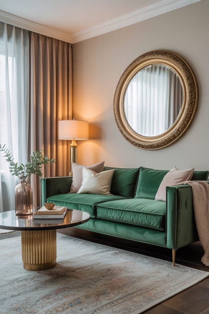
Moody Accent Wall With Balanced Lighting
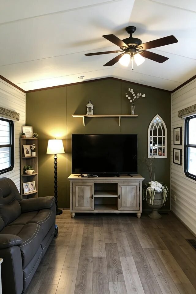
Okay but can we talk about this green accent wall moment? A single bold wall in a single wide instantly anchors the room. Dark colors add depth when they’re balanced with proper lighting and lighter surrounding walls. Notice how the olive backdrop makes the TV console and decor pop without shrinking the space.
If we’re recreating this, lighting is non-negotiable. Pair a ceiling fixture with a floor lamp to create layered light. That mix prevents shadows from closing the room in. Keep furniture low-profile and streamlined to avoid blocking sightlines. The floating shelf above the TV is smart too. It fills vertical space without cluttering the floor.
For decor, follow the triangle principle: shelf decor centered, flanked by taller elements like the mirror and plant. Balance weight visually from left to right so nothing feels lopsided. Moody doesn’t mean heavy. It means controlled contrast.
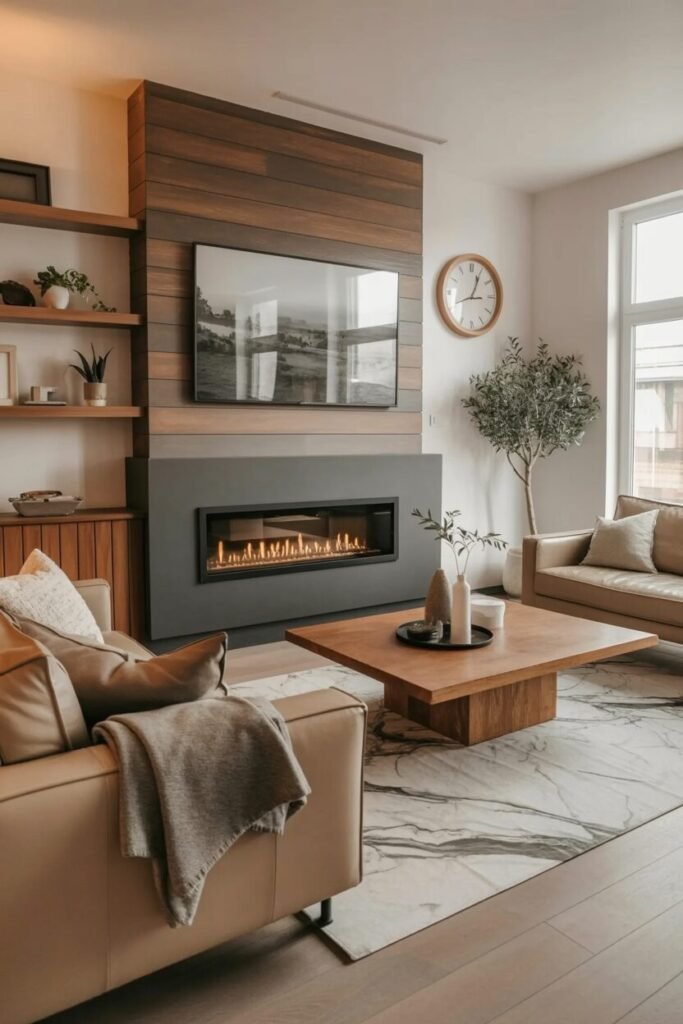
Bright Farmhouse Layers With Warm Wood
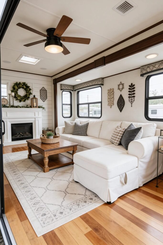
This layout screams “single wide but make it Pinterest.” The white sectional keeps the footprint open, while warm wood floors and beams add grounding contrast. Contrast is key in long narrow spaces—light upholstery plus rich wood equals visual harmony.
The fireplace acts as the focal point, and everything orbits around it. That’s zoning done right. In single wides, we need clear functional anchors so the room doesn’t feel like a hallway. Use an area rug to define the seating zone. Make sure at least the front legs of your sofa sit on it to unify the grouping.
Layer throw pillows in varying patterns but similar tones to maintain cohesion. And that wood coffee table? Perfect scale. Always match coffee table width to about two-thirds of your sofa length for proportional balance. Add greenery for softness and repeat wood tones throughout to keep everything tied together.
Rustic Beams And Linear Flow
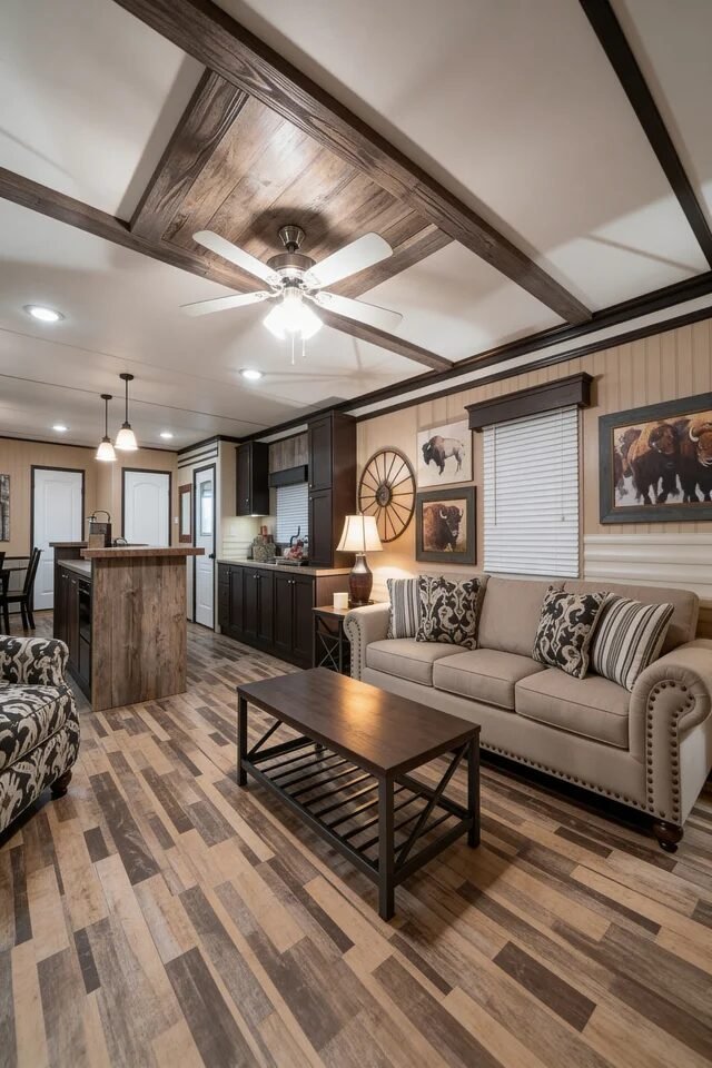
Now this one is giving cozy cabin energy but still polished. The exposed ceiling beams visually break up a long ceiling plane, which is crucial in single wides. Horizontal elements like beams can define zones without adding physical walls. Genius, right?
The open kitchen-to-living flow works because the color palette stays consistent. Dark cabinetry, warm wood flooring, and neutral upholstery repeat tones across spaces. That repetition creates unity. If we’re recreating this, pick three core colors and repeat them at least three times each.
The buffalo artwork adds personality without overwhelming the room because it’s scaled properly above the sofa. Scale is everything. Too small and it looks accidental. Too large and it swallows the wall. Aim for art that covers about two-thirds to three-quarters of the sofa width. Keep furniture legs visible to maintain airiness and choose streamlined silhouettes to avoid visual clutter.
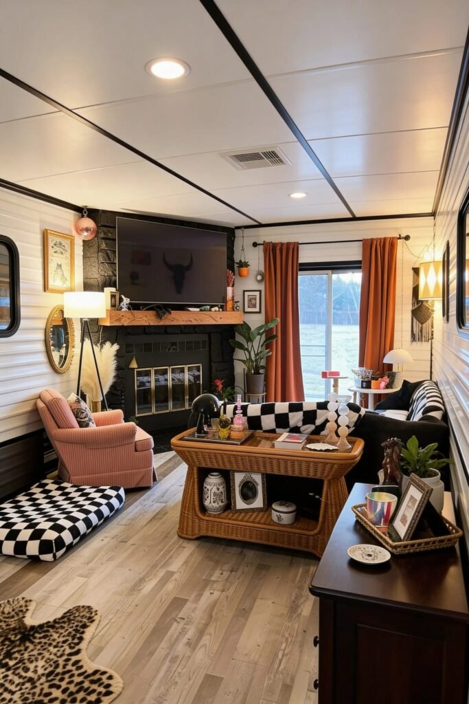
Black Accent Nook With Cozy Contrast
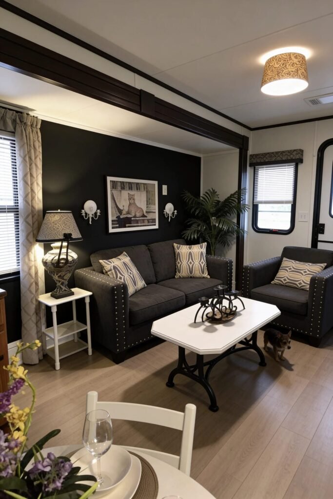
If you think black walls can’t work in a single wide, think again. This setup proves that dark can feel intimate, not cramped. The trick? Contrast and containment. Using black on one recessed wall creates a defined conversation zone without shrinking the entire room.
Notice how lighter flooring and adjacent white walls offset the dark paint. That contrast keeps everything breathable. The studded sofa detailing adds subtle texture, while patterned pillows prevent the palette from feeling flat. When working with dark paint, layer lighting intentionally. Wall sconces plus table lamps create a warm glow that softens harsh edges.
The white coffee table pops against the darker seating, providing visual relief at center. Keep decor minimal here—black already makes a statement. When you go bold with color, simplify accessories so the room feels curated, not chaotic. Cozy, dramatic, and totally recreatable.
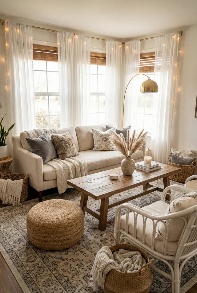
Farmhouse Symmetry With Soft Texture Layers
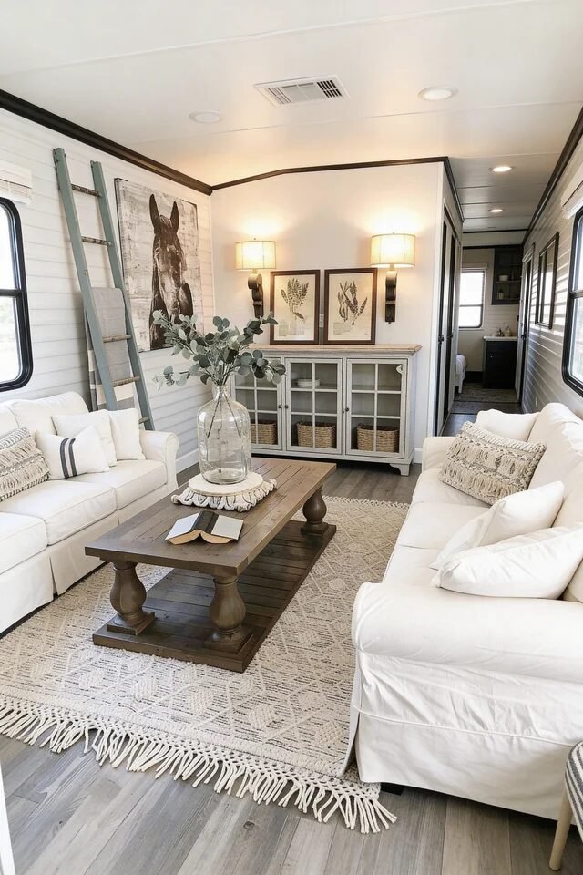
This single wide layout is serving calm, collected, and low-key designer energy. We’ve got two sofas facing each other, which instantly creates conversation flow and visual symmetry. In narrow trailer living rooms, symmetrical seating keeps things structured instead of chaotic. The neutral palette—creamy whites, warm wood, soft beige—makes the space feel wider because nothing visually interrupts the eye line.
Let’s talk layering. The textured rug anchors the furniture grouping and adds softness underfoot, which is crucial when you’re working with hard flooring. The wooden coffee table grounds the room with weight, balancing out the light upholstery. If we’re recreating this, keep your color story tight. Choose three neutrals and repeat them across pillows, art, and decor.
Notice the ladder and oversized wall art pulling the eye upward. That’s vertical styling doing its job. When square footage is limited, we decorate up, not out. Add warm sconces for layered lighting and suddenly your trailer feels custom-built.
Warm Leather And Heritage Pattern Play
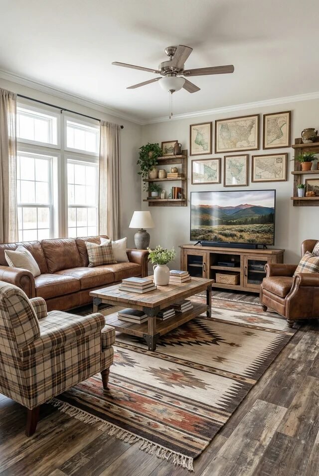
Okay but this one? Cozy cabin meets modern single wide. The leather sofa and chair instantly bring warmth and durability—perfect if we actually live here and not just photograph it. Natural materials like leather and wood add depth without adding clutter. The key is balance. The large patterned rug anchors the seating zone and introduces color in a controlled way.
Gallery walls can easily overwhelm a narrow space, but this one works because the frames are consistent in size and tone. Repetition equals harmony. If we’re recreating this look, choose artwork with a shared color palette so it feels curated, not random.
The coffee table shelf adds functional storage without bulk. That’s smart zoning. In trailer living rooms, every piece should either store something or visually define a space. Keep furniture legs visible to create airflow underneath. Warm woods, structured seating, layered textiles—this is how we make narrow feel intentional.
Compact TV Wall With Smart Zoning
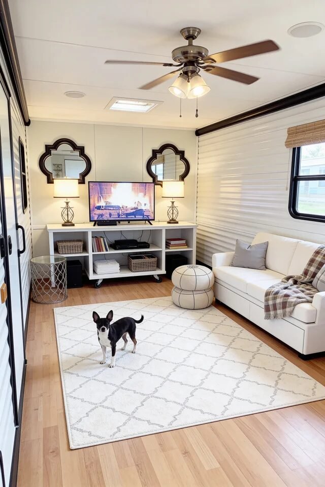
First of all, the dog understood the assignment. But let’s focus. This layout is proof that small single wide living rooms can feel organized, not cramped. The low media console keeps the wall visually light, while matching lamps on either side create symmetry. Symmetry tricks the brain into seeing order, and order makes spaces feel bigger.
The mirrors above the lamps bounce light and subtly widen the wall. That’s strategic reflection, not just decoration. The area rug defines the seating zone so the room doesn’t feel like a hallway. If we’re recreating this, make sure your rug is large enough for at least the front legs of your sofa.
Notice the neutral palette with subtle contrast in pillows and throw blankets. In compact spaces, limit high-contrast color shifts so the eye flows smoothly. Add baskets underneath for hidden storage and keep surfaces minimal. Clean lines equal visual breathing room.
Minimal Neutral Layout With Center Focus
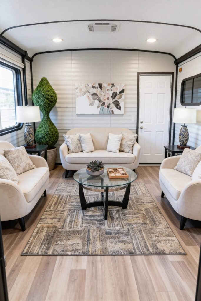
This setup is basically a masterclass in balance. Two chairs flanking a loveseat create a perfect U-shape, which makes conversation natural and keeps traffic flow open. Furniture placement matters more than furniture size in a single wide. The round glass coffee table is genius because transparent surfaces reduce visual weight.
The patterned rug anchors everything without overwhelming the room. When choosing rugs in narrow layouts, go for subtle patterns that add texture but not chaos. The topiary-style plant adds height and shape contrast, breaking up horizontal lines from panel walls.
Lighting here is evenly distributed with matching lamps on both sides, creating balance. That repetition calms the space. When in doubt, mirror elements left and right for instant polish. Stick to a warm neutral palette and vary textures—linen, glass, wood—so it feels layered, not flat. Small space, big intentional energy.
Cozy Earth-Toned Sectional Sanctuary
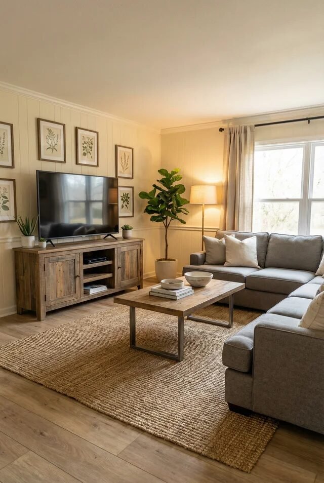
Now this is how we do comfortable without clutter. The L-shaped sectional maximizes corner space, which is prime real estate in a single wide. Using corners effectively frees up walking paths and keeps the layout open. The large jute rug grounds the room and adds organic texture that contrasts beautifully with the smooth sofa fabric.
The wood media console ties into the coffee table, creating material repetition. That repetition is what makes the room feel cohesive instead of pieced together. If we’re recreating this, keep artwork aligned and centered above the TV to avoid visual imbalance.
Layered lighting from the floor lamp and natural window light softens the space. Add a tall plant in an empty corner to draw the eye upward and prevent dead zones. In narrow living rooms, every corner should either glow, store, or grow. Warm neutrals, smart zoning, and texture layering win every time.
Design Smart, Live Large Anyway
At the end of the day, styling a single wide trailer living room is about working with the architecture instead of fighting it. Narrow footprint? Great—now we create strong focal points. Lower ceilings? Perfect—let’s use vertical decor and balanced lighting to stretch the eye upward. Constraints don’t limit creativity; they refine it.
When we prioritize proportion, repeat materials for harmony, and keep color palettes cohesive, everything starts to click. Sectionals hug corners. Coffee tables stay scaled. Accent walls add depth without overwhelm. Every piece should either define a zone, add function, or build visual balance. That’s the rule.
The magic happens when layout, lighting, texture, and storage all support each other. Suddenly, the space doesn’t feel like “just a trailer.” It feels styled. It feels thoughtful. It feels like home. And honestly? That’s the real glow-up.