Luxury Living Room Colors, Decoded: Pro Tricks You Need to Know
Color isn’t just what you see—it’s how a room makes you feel.” And when it comes to luxury living rooms, the right palette is everything. We often think luxury is about expensive furniture or rare art pieces, but honestly, color does the heavy lifting. It sets the mood, defines the vibe, and even tricks the eye into believing your space is larger, cozier, or brighter than it really is. Interior designers know this well—they don’t pick shades randomly; they use psychology, contrast, and balance.
The great news? We can do the same without a design degree. By learning a few smart, designer-approved tricks, you’ll know exactly how to build a palette that feels timeless, expensive, and welcoming. Think of it as your living room’s personal style signature.
Cream + Taupe + Gold
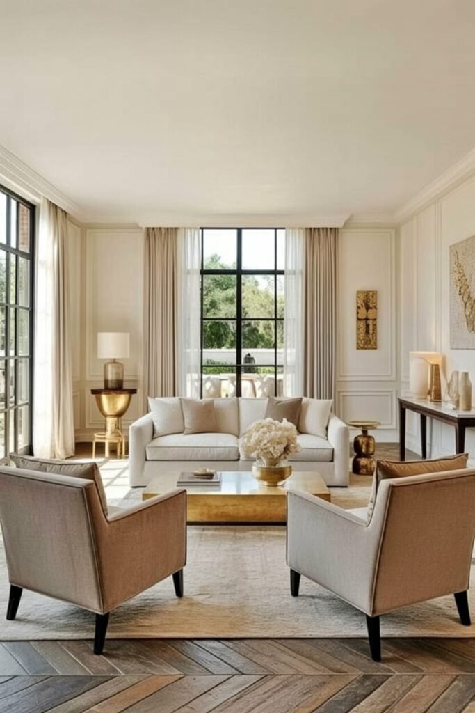
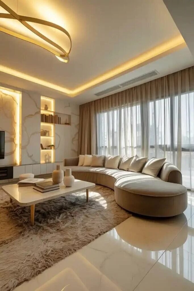
There’s a reason designers keep coming back to cream + taupe + gold—it’s basically the “little black dress” of living room palettes. Timeless, versatile, and endlessly chic. Psychologically, cream tones give off a sense of calm and safety (think: cozy hotel suite vibes), while taupe adds that grounded, earthy balance.
Then comes gold, the instant mood lifter. Gold taps into the brain’s association with warmth, prestige, and a touch of celebration—without feeling like you’re living inside a jewelry store.
When we layer these colors, we’re not just painting walls; we’re building a mood. The cream backdrop keeps everything open and inviting. Taupe introduces depth so the room doesn’t feel flat. And gold? That’s your exclamation point. Even a slim brass lamp base or a pair of gilded frames can flip the switch from “pretty nice” to “effortlessly luxe.”

Here’s a tip if you’re recreating this combo: let the gold be your accent, not your base. Too much metallic and suddenly you’ve wandered into Liberace’s lounge. Instead, keep 70% cream, 20% taupe, and 10% gold. That balance keeps things sophisticated.
Tthis palette has been used by luxury hotels and top designers for decades—it works because it’s rooted in both psychology and practice. And honestly, we’ve tested it in real rooms; the transformation is immediate. So if you want a living room that says “relax, but make it first class,” cream + taupe + gold is your go-to.
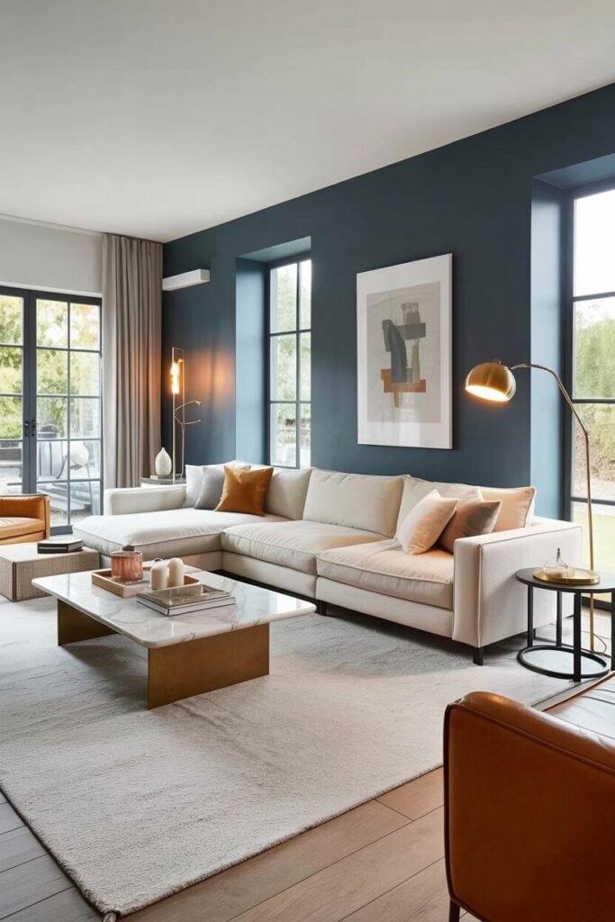
Navy + Gray + Brass
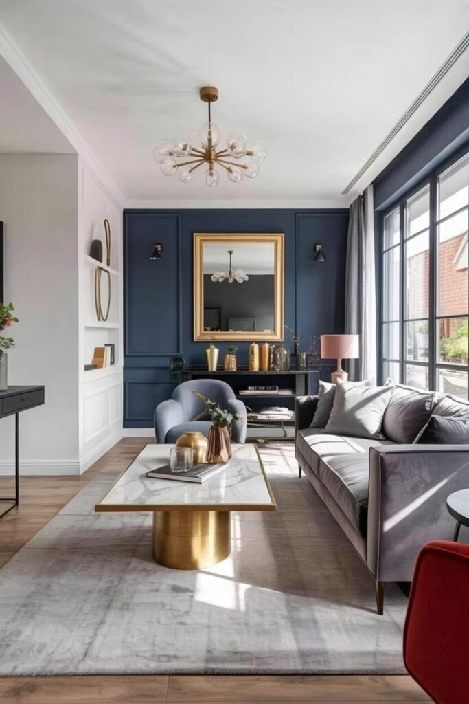

There’s something magnetic about navy + gray + brass—it’s the kind of palette that says, “Yes, I read design magazines, and no, my sofa didn’t come from the clearance aisle.” Navy, from a color psychology perspective, symbolizes stability and sophistication (basically, the color version of a glass of Merlot after a long day).
Gray works as the calm, neutral mediator, keeping things grounded. And brass? That’s your sparkle. Humans naturally associate brass with warmth, prestige, and timeless craftsmanship, which is exactly why designers love sneaking it in.
When we combine these three, we’re building contrast with character. Navy walls or even a single accent wall set a bold backdrop. Gray sofas or rugs tone things down, so the space doesn’t feel like a stormy sea. Then a few brass accents—think coffee table legs, a chandelier, or even a lamp base—immediately elevate the room from “moody modern” to “designer-approved elegance.”
Here’s a tip if you want to try this: keep brass in small but intentional doses. Too much, and you risk your living room looking like a trumpet convention. Stick to about 15% brass accents in the overall space—it’s enough to catch the eye without overwhelming the palette.
This combination isn’t a Pinterest fantasy—it’s rooted in psychology and heavily used by top interior designers. We’ve seen it work across modern apartments and even luxury hotels. Bold yet balanced, navy + gray + brass is your shortcut to a living room that feels both powerful and inviting.
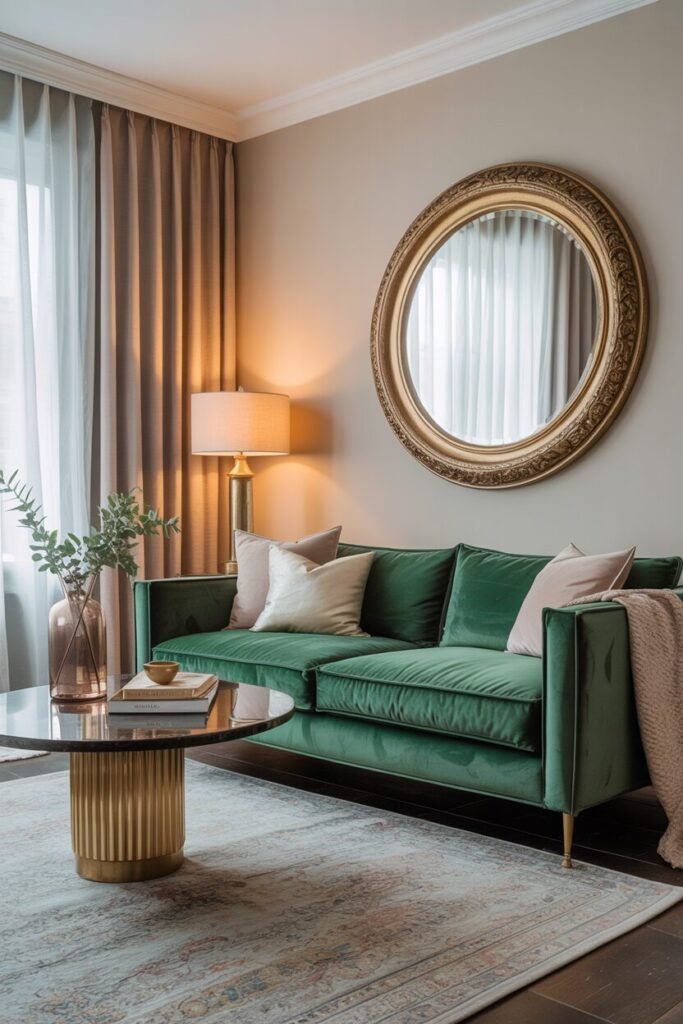
White + Beige + Emerald
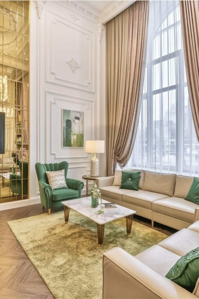

If you’ve ever wanted your living room to feel like it just stepped out of a glossy lifestyle magazine, white + beige + emerald might be your new obsession. White, psychologically, signals purity and openness—it tricks our brains into thinking a space is bigger and brighter than it actually is.
Beige, on the other hand, acts as the quiet anchor, offering warmth without stealing the spotlight. And then emerald enters like the star guest, commanding attention with its rich, jewel-toned confidence.
When we put them together, the magic is all about contrast and freshness. White walls or ceilings create that crisp backdrop, beige keeps things grounded through sofas, rugs, or wood accents, and emerald becomes the dramatic highlight. Imagine a velvet emerald armchair or oversized throw pillows—suddenly the whole room feels curated, not accidental.
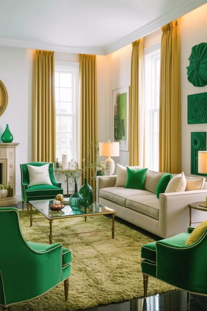
Here’s a practical tip if you’re recreating this look: think of emerald as your “seasoning.” Too much and it overwhelms; too little and it feels like you forgot the flavor. Keep it to a few statement pieces—pillows, art, or a chair—and let the neutrals do the heavy lifting.
This trio is a designer go-to, especially in luxury apartments and boutique hotels. It works because emerald doesn’t just decorate—it energizes. So, if your living room feels a little flat, this palette says: “I’m serene, but I’ve also got personality.”
READ MORE >> “10+ Stunning Living Room Fireplace Design Ideas“
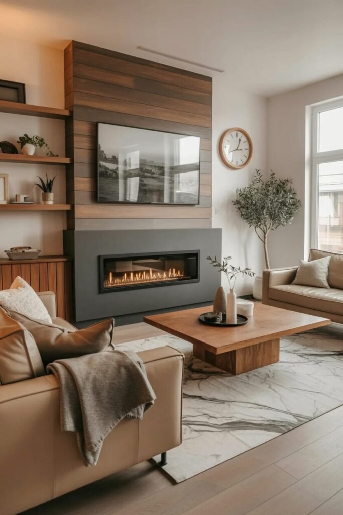
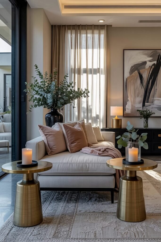
Charcoal + Ivory + Bronze
Some palettes feel like candlelight dinners in color form, and charcoal + ivory + bronze is exactly that. Charcoal carries weight and depth—it’s dramatic without being loud, almost like the friend who speaks softly but commands the room. Ivory softens the edges, giving the eye somewhere calm to rest. Then bronze arrives as the finishing note, radiating warmth with its subtle metallic glow. Color psychology tells us darker shades like charcoal create intimacy, while bronze cues comfort and prestige.
When blended, the result is a room that feels moody yet welcoming. Imagine a charcoal accent wall behind an ivory sofa, with bronze floor lamps adding just the right amount of shimmer. The effect is layered, not flat—like a symphony where each instrument knows its place. It’s luxurious without being overbearing.

Here’s a tip if you want to try this yourself: treat bronze like candlelight. Use it sparingly but strategically—light fixtures, coffee table details, or even curtain rods. That way, it doesn’t overpower the palette but enhances it. Pair matte charcoal finishes with softer ivory fabrics to keep the balance.
This trio has long been favored in boutique hotels and luxury homes because it works across seasons. It feels cozy in winter and sleek in summer—a versatility designers love. So if you’re chasing a living room that whispers sophistication instead of shouting it, charcoal + ivory + bronze might just be your quiet showstopper.
Soft Blush + Stone + Champagne
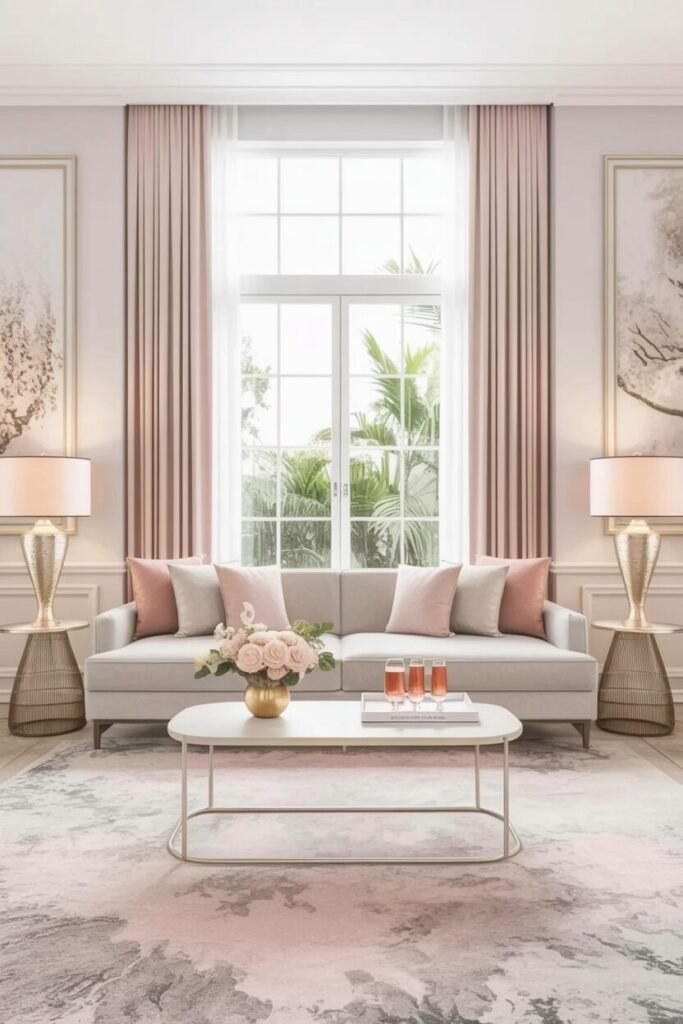
There’s a certain poetry in pairing soft blush + stone + champagne—it’s like the living room equivalent of sipping rosé on a rooftop terrace. Blush brings in that gentle touch of femininity without feeling sugary; it’s calm, romantic, and surprisingly versatile. Stone, with its grounded neutrality, keeps everything balanced and prevents the palette from floating off into “too pretty” territory. And champagne? Well, that’s your sparkle. It’s light-reflective, festive, and forever associated with celebration and luxury.
From a psychological angle, blush tones reduce stress and encourage relaxation, stone provides stability, and champagne accents trigger feelings of warmth and indulgence. Together, they create a mood that’s serene yet elevated—like walking into a spa that just happens to serve cocktails.
Here’s a styling tip if you want to make this palette work: use blush as an accent, stone as the base, and champagne as the shimmer. Think stone-colored sofa, blush throw pillows, and champagne-toned side tables or lighting. Too much blush and the room veers into candy store territory, while too much metallic champagne risks looking over-the-top. Balance is the secret ingredient.
And yes, designers consistently lean on this trio in upscale interiors for a reason: it delivers timeless elegance with just enough personality. We’ve seen it transform both compact apartments and spacious villas into spaces that feel instantly refined. So, if your goal is a living room that whispers “soft luxury” every time you walk in, this palette does exactly that.
READ MORE >> “What Your Sofa Says About You (Color Psychology Edition)“
Luxury Isn’t About Excess—It’s About The Colors You Choose To Live In

Luxury isn’t about how much you spend—it’s about how your space makes you feel.” A thoughtfully chosen color palette can transform a simple living room into a sanctuary of elegance.
When cream softens taupe, or when navy contrasts with gray, it’s more than decoration—it’s atmosphere. These combinations aren’t just pretty; they’re powerful, rooted in psychology and proven by designers worldwide. And the best part? You don’t need endless budgets or custom furniture. You only need the right balance of tones, a few brass or gold accents, and confidence to layer them well.
Whether you’re working with neutrals or bold shades, remember the formula: color equals emotion, and emotion equals luxury. Your living room isn’t just a space—it’s a statement. And with the right palette, it can quietly whisper “effortless sophistication.