The Art of Contrast: Stunning Two Tone Kitchen Cabinets You Haven’t Seen Yet
If one color makes a kitchen beautiful, two make it unforgettable. Two toned cabinets are the secret design trick that instantly elevates your space without requiring a full remodel. It’s the perfect balance between boldness and restraint — blending contrast, light, and personality in a way that feels both curated and lived-in.
Whether you’re pairing creamy neutrals with rich woods or mixing moody blues with crisp whites, this design approach lets your kitchen tell its own story.
The beauty of two toned cabinetry lies in its flexibility. It works for every aesthetic — from rustic countryside charm to sleek urban minimalism. You can express warmth, calmness, or creative confidence just by adjusting your color pairing. Think of it as fashion for your home: timeless, expressive, and always evolving. These ideas are here to inspire your next kitchen glow-up — one tone at a time.
Lime Green + Cream Cabinets That Pop.

This kitchen is literally sunshine with a splash of matcha. The lime green lower cabinets bring instant energy — they symbolize creativity, freshness, and optimism — while the cream uppers balance it out with calm warmth. In color psychology, green represents growth and renewal, but lime says, “I’m bold, happy, and totally okay taking design risks.”
The trick to keeping it chic instead of chaotic? Balance. A black countertop grounds the brightness, while a neutral backsplash with mixed textures creates rhythm for the eyes. The visual contrast between light and dark makes the space feel taller, airier, and full of personality. If you’re scared to go neon, opt for muted chartreuse or olive — you’ll still get that “fresh start” vibe without overwhelming the room.
Style tip: Use natural light to your advantage. Lime green loves sunlight — it glows beautifully during the day and gives your kitchen a lively, modern edge even after sunset.
Warm Taupe + Charcoal Gray = Grown-Up Calm.

Here’s the kitchen that whispers, not shouts. The taupe uppers bring warmth and approachability, while the charcoal gray lowers ground everything with confidence. It’s a pairing that feels sophisticated without trying too hard — kind of like that friend who’s effortlessly stylish in neutral linen.
According to color psychology, gray evokes stability and focus, while taupe adds warmth and comfort. Together, they create a visual balance that feels both calm and intentional. Want to elevate the look? Choose matte finishes for a soft, timeless effect and add brass or champagne-gold hardware for just the right touch of luxe.
Lighting also matters here — warm, diffused light enhances taupe’s cozy undertones, while natural light highlights gray’s depth. This color combo works best in kitchens that prioritize texture over color, so think stone counters, ceramic vases, and woven elements.
Style tip: Keep clutter minimal — this palette shines when everything feels clean and curated.
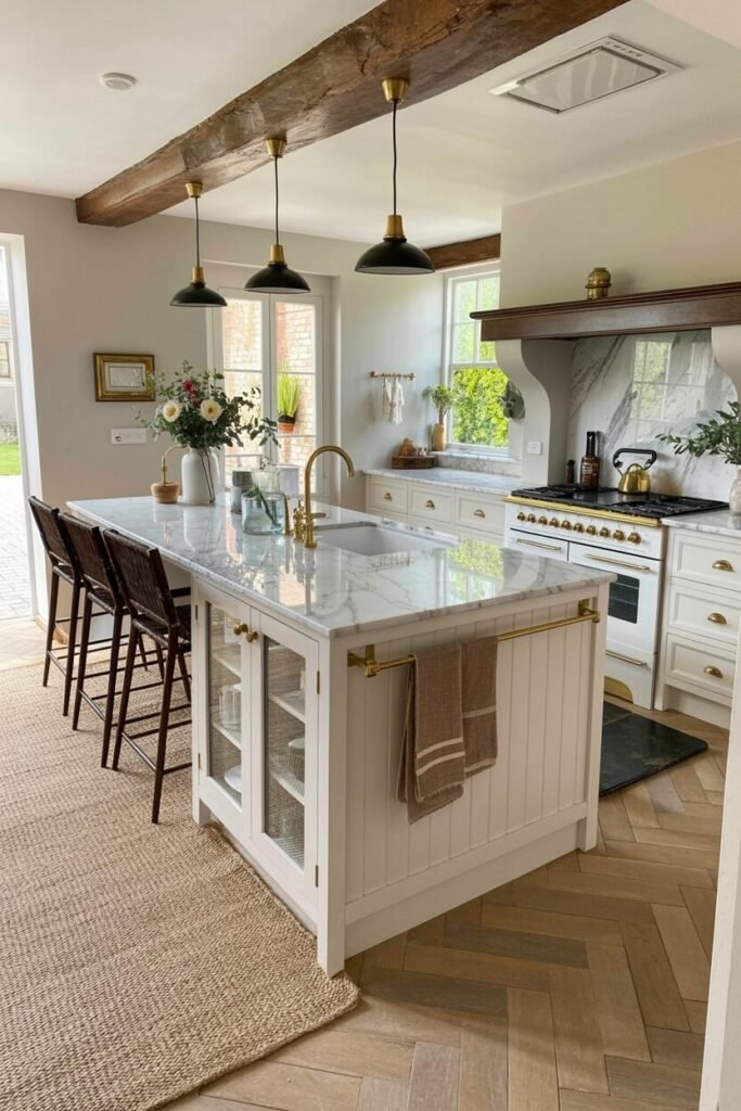
Oak Island + White Cabinets for Fresh Contrast
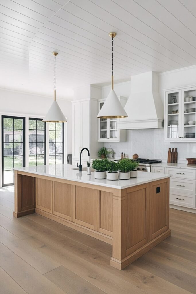
This kitchen feels like Sunday mornings — bright, calm, and full of pancakes. The oak island brings organic warmth, while the white cabinets make the space feel crisp and airy. According to color principles, this duo nails the balance between warm and cool, grounding and reflective. It’s ideal for open-concept kitchens where you want light to bounce freely.
Oak tones naturally soften the starkness of white, preventing that “too sterile” feeling some modern kitchens have. To recreate it, focus on material contrast — matte white paint, marble or quartz countertops, and soft brass accents for warmth. Want to go next level? Add subtle black touches for depth and definition.
This palette works wonders for Scandinavian or modern farmhouse styles where simplicity meets comfort.
Style tip: Layer textures instead of colors — think linen barstools, wooden boards, and woven baskets. That’s what keeps your neutral kitchen looking magazine-worthy, not flat.
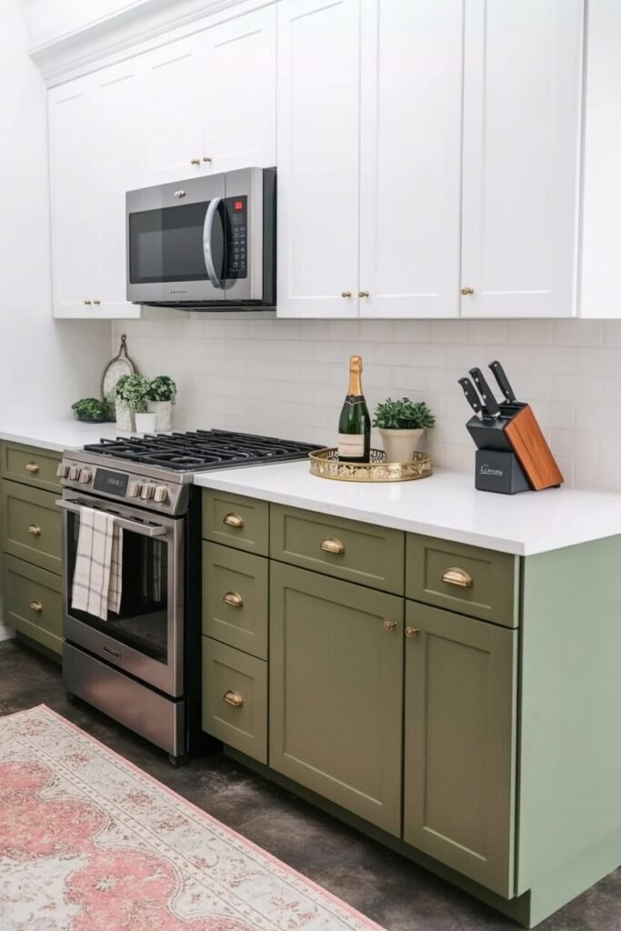
Olive Green + Natural Wood for Rustic Harmony
This is the kitchen that says, “I bake sourdough and talk about it.” The olive green lower cabinets paired with natural wood uppers create a cozy, grounded aesthetic that feels like a warm hug. Olive represents balance and tranquility, while wood symbolizes comfort and authenticity — it’s literally nature’s perfect marriage.
The secret to pulling off this combo is temperature harmony. Keep both the green and the wood in the same undertone family — either warm or cool. Marble or light gray countertops bring brightness, while brass or brushed nickel hardware adds just enough sheen.
If your kitchen gets natural light, olive will subtly shift tones throughout the day, giving the space dynamic depth. Add a vintage rug, some sunflowers, or rustic ceramics to complete the look.
Style tip: Mix finishes! A matte cabinet paint with glossy backsplash tiles adds dimension — and makes your rustic kitchen feel chic, not dated.
Navy Blue + White: Bold Yet Balanced
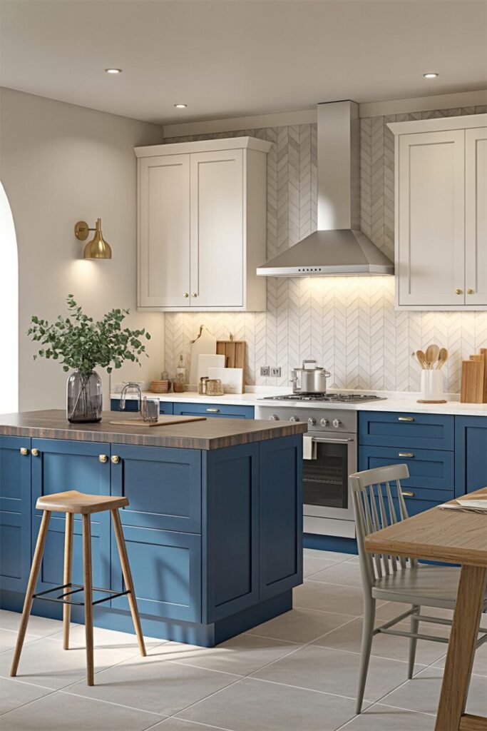
This kitchen deserves its own fan club. The navy blue base cabinets bring serious sophistication, while the white uppers keep things fresh and open. From a color psychology standpoint, blue represents trust, calmness, and intelligence — no wonder it’s trending in modern kitchens.
Navy grounds the space, making it feel structured, while white reflects light to expand visual space. The key is contrast control — don’t let it get too nautical. Add warm metallics like gold or brass to soften the palette, or throw in wood accents for a cozy touch. This combo thrives under warm lighting that enhances the richness of blue without muting its elegance.
For layout balance, keep darker hues below eye level — it gives a sense of grounding while allowing the white cabinets to draw the eye upward.
Style tip: If you’re nervous about commitment, start with a navy island instead of full cabinetry. It’s low-risk, high-impact, and totally Pinterest-worthy.
READ MORE >> “9+ Home Coffee Bar Designs That Look Gorgeous“
Cherry Wood + Cream Cabinets for Warm Vintage Appeal
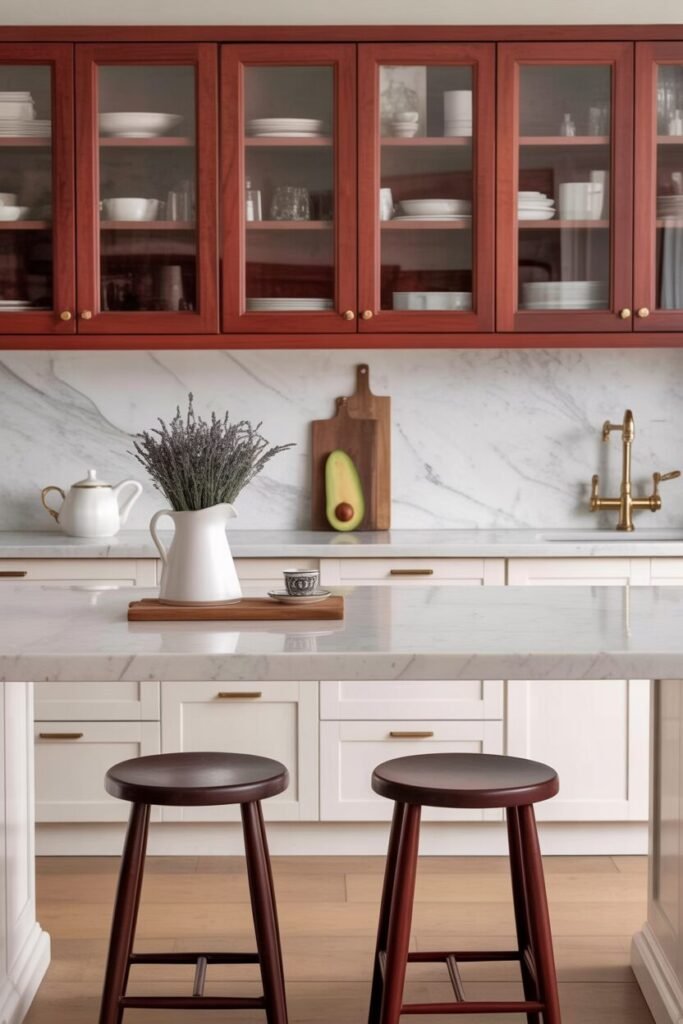
There’s something irresistibly nostalgic about cherry wood and cream. The rich, reddish-brown tones of cherry bring depth and tradition, while the soft cream lowers lift the mood with light and warmth. Together, they create a kitchen that feels elegant yet homey — like a scene from an old movie where the kettle always whistles on time.
Cherry wood has a natural luster that deepens beautifully over the years, giving your space that aged-to-perfection glow. Cream cabinets, on the other hand, prevent the look from becoming too heavy, reflecting light and adding a gentle airiness. The key to nailing this combo is embracing contrast without clutter — choose brushed bronze or antique brass hardware to tie both tones together seamlessly.
Style tip: Add checkered flooring or a subtle marble backsplash for a vintage European twist. The combination of warm wood and creamy softness makes every corner feel rich, comforting, and timeless.
Blush Pink + White Cabinets = Modern Romance
This kitchen looks like a pastel dream come true — the blush pink lower cabinets add a gentle warmth, while the crisp white uppers keep the look light and modern. It’s the perfect blend of romantic charm and clean minimalism, proving that pink can be elegant, not girly.
Blush, in color psychology, evokes calm, comfort, and subtle optimism — exactly what you want from your kitchen space. The white balance above ensures the color doesn’t overwhelm, creating visual breathing room that feels bright and airy. For styling, lean into sleek simplicity: white quartz countertops, soft brass handles, and minimalist décor.
Lighting plays a huge role here — natural light enhances the blush tone beautifully, while warm LEDs bring out its cozy undertones at night.
Style tip: Add texture instead of extra color — a fluted backsplash or woven barstools will keep the palette interesting while maintaining that dreamy, sophisticated vibe.
Olive Green + White Cabinets for Fresh Classic Charm
This kitchen feels like it could belong in an English countryside home — calm, timeless, and impossibly elegant. The olive green lowers ground the space in earthy comfort, while the white uppers add brightness and balance. Together, they hit the sweet spot between traditional and modern, rustic and refined.
In color psychology, olive represents peace and restoration — perfect for a kitchen that’s meant to slow life down a little. White keeps things airy and ensures the green doesn’t overpower the room. For visual flow, use warm brass or muted gold hardware and keep your backsplash neutral — marble or subway tile works perfectly.
The secret is restraint: let the color do the talking, and keep accessories minimal for that classic charm.
Style tip: Introduce woven textures like rattan bar stools or linen curtains for softness. The mix of natural tones and crisp whites will make your kitchen feel timelessly fresh.
Deep Red + Cream Cabinets for Cozy Boldness
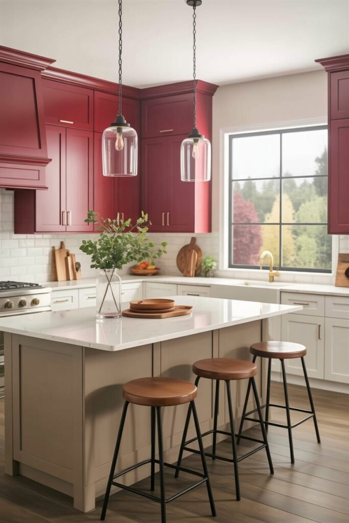
Bold doesn’t always mean loud — sometimes, it’s just confident. The deep red upper cabinets in this kitchen bring passion and richness, while the cream lowers soften the intensity with warmth and light. It’s a palette that feels both romantic and grounded — ideal for anyone who loves a cozy, lived-in atmosphere.
In color psychology, red sparks energy and appetite, while cream balances it with calm neutrality. The result? A kitchen that feels alive but not overwhelming. Add gold hardware or aged copper accents to enhance the warmth, and balance the richness with light stone countertops or pale flooring.
This color duo looks incredible under warm lighting — think vintage-style pendants or soft under-cabinet glow.
Style tip: Keep décor minimal and let the color be the focal point. A bowl of fresh fruit or a single floral arrangement is all you need to bring the palette to life.
READ MORE >> “9+ Home Coffee Bar Designs That Look Gorgeous“
Where Contrast Creates Timeless Character”.
A two toned kitchen isn’t just a design choice; it’s an expression of personality and rhythm. It celebrates contrast — light versus dark, warm versus cool, modern versus nostalgic — yet somehow brings perfect harmony. Each pairing tells a different story, proving that balance doesn’t have to be boring.
What makes this trend so enduring is how adaptable it is. You can create depth in small kitchens, define zones in open layouts, or simply make your cabinets the star of the show. It’s the kind of visual storytelling that turns an everyday space into something remarkable.
As you plan your own transformation, don’t be afraid to mix, match, and play. The right color combination can shift your kitchen’s entire mood — from calm retreat to vibrant centerpiece. After all, the best kitchens aren’t just designed — they’re felt.