Guide to Warm Neutral Colors for a Timeless Kitchen Look
When it comes to kitchen design, color is basically the secret ingredient that sets the entire vibe. Warm neutrals are having their main character moment, and honestly, we’re not mad about it. These tones strike the balance between timeless and trendy, giving your space that cozy yet polished aesthetic we all scroll Pinterest for.
Warm neutrals—think taupe, cream, beige, and soft whites—aren’t just “safe” choices. According to color psychology, they create feelings of comfort, stability, and even positivity, making your kitchen more than just a place to cook. The magic happens when you layer shades, textures, and finishes, turning a simple palette into something chic and dynamic.
Whether you’re channeling rustic farmhouse energy, luxe minimalism, or quiet luxury vibes, the right warm neutral can pull it all together. So let’s dive in—because your kitchen deserves to glow as much as your oat latte.
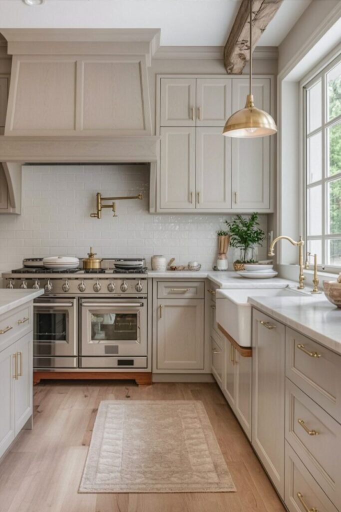
Soft Beige + Light Wood Magic
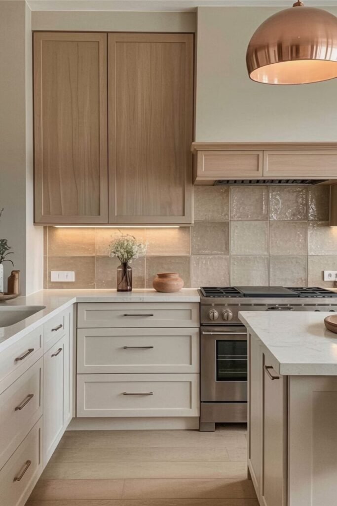
Okay, first off, let’s talk about this soft beige meets light wood combo. It’s basically the skincare routine of kitchens—effortless, glowy, and it just works with everything. Beige gives off warmth and comfort, while the light wood adds a natural grounding effect.
Together, they create a calming vibe that makes your kitchen feel like the Pinterest board you’ve been stalking at 2 a.m. The key here is balance: beige tones on cabinets and backsplash, paired with wood accents that don’t overpower. Pro tip? Add metallic touches like a copper pendant or brushed nickel handles to break up the neutrals and give that low-key luxe effect.
Psychologically, beige promotes calmness (perfect for post-work wine nights), and wood tones keep things earthy and inviting. If you’re someone who thrives in cozy but uncluttered spaces, this palette has your name on it. Trust us, beige isn’t boring when it’s styled right.
Taupe Perfection with Golden Accents
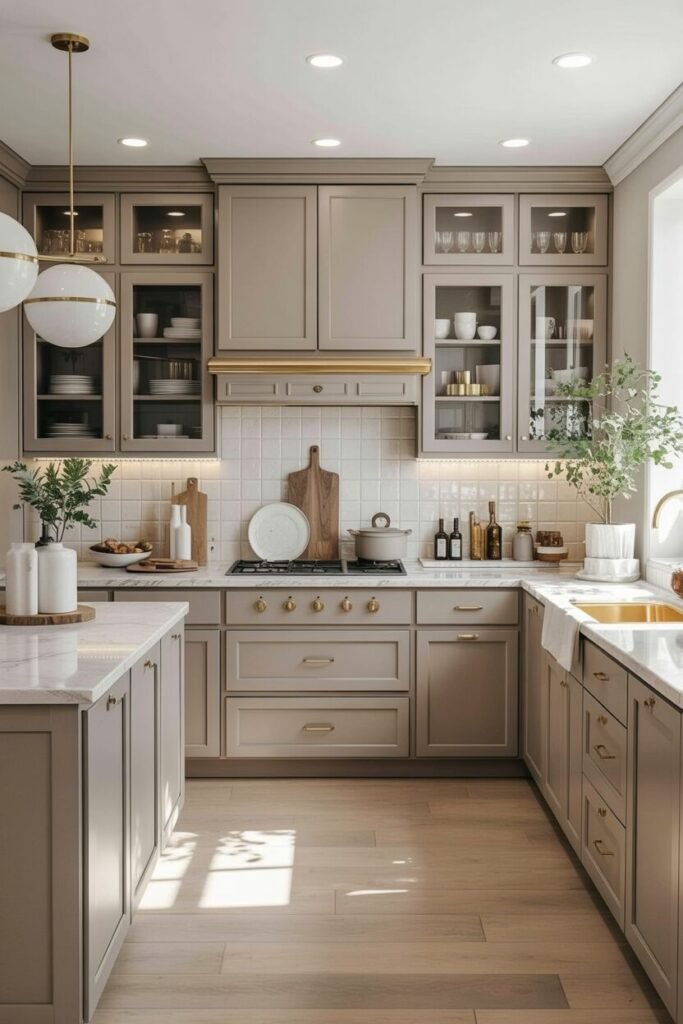
Taupe is like the “quiet luxury” of kitchen colors—it whispers, it doesn’t scream. This shade sits right between brown and gray, which makes it versatile and timeless. Color psychology says taupe gives a sense of stability, so your kitchen instantly feels grounded and put together (even if your cooking skills aren’t).
When you pair taupe cabinets with warm golden hardware, you get that subtle glam without veering into Vegas territory. The gold also works as a reflective accent, bouncing light around and keeping the space from looking too muted. Bonus: taupe plays nice with both warm and cool undertones, so you can easily mix in marble counters, creamy tiles, or even darker wood accents.
This is the palette for anyone who loves sophistication with a side of practicality. Honestly, we’re obsessed because it feels like a forever kitchen—you won’t be itching to repaint in two years.
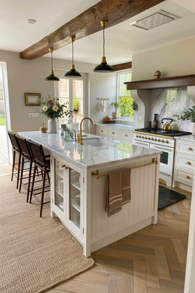
Greige + Brass: Farmhouse Chic Upgrade
Here’s where greige (aka the lovechild of gray and beige) enters the chat. Greige has the calming neutrality of gray but the warmth of beige, making it basically the peacekeeper of color palettes. Pair that with brass hardware and lighting, and suddenly you’ve got “modern farmhouse” that feels intentional, not cliché.
Brass accents bring warmth and sophistication, keeping greige from looking too flat. It’s like adding jewelry to a plain outfit—you instantly elevate the look. The psychology of greige is fascinating because it literally balances warm and cool tones, which helps keep the kitchen feeling timeless and non-trendy.
Want to lean modern? Pair it with sleek quartz countertops. Want a rustic vibe? Expose a wood beam (like in the inspo pic) and go for a farmhouse sink. This combo is your best bet if you want your kitchen to feel cozy and Instagram-ready without trying too hard.
Deep Walnut Drama with Brass
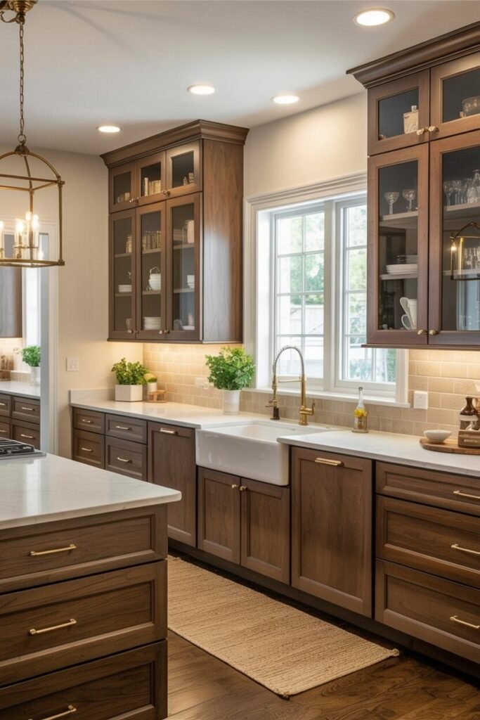
Alright, if the last palettes were “quiet luxury,” this one is full-on rich auntie energy. Deep walnut wood cabinetry brings drama, depth, and character to your kitchen. It’s giving old-money library, but with a stovetop. Dark wood tones create a sense of elegance and stability, while still being warm enough to keep the space welcoming.
Pair it with brass hardware and lighting, and you’ve got contrast that screams sophistication. The magic here lies in the balance—dark cabinetry on its own can feel heavy, but when you mix in bright countertops, white farmhouse sinks, and good lighting, the look transforms into classic chic.
According to color psychology, dark woods encourage a sense of grounding and tradition—so this is perfect for anyone who wants their kitchen to feel timeless. If you’re brave enough to commit, walnut makes your kitchen look instantly designer without even trying.
Sage Green + Creamy Neutrals Vibe
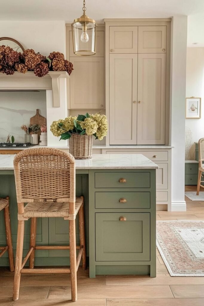
Now, if you thought neutrals had to stick to beige and taupe, let’s spice it up with sage green. Technically, sage counts as a muted neutral because it has gray undertones, which is why it feels so calming. Green is linked to balance, growth, and harmony—basically, it’s the kitchen color equivalent of meditation.
Pair sage cabinetry with creamy whites and warm woods, and you’ve got a palette that feels refreshing but still cozy. The trick is to treat sage as the star (like on the island) while keeping surrounding tones light so the space doesn’t feel closed in.
Brass or bronze hardware adds warmth, while rattan chairs or woven textures keep it approachable and not too formal. If you’re craving a space that feels organic and grounded but still chic enough for entertaining, sage green is your move. It’s earthy, trendy, and way less intimidating than bold greens.
READ MORE >> “9+ Best Home Coffee Bar Designs “
Taupe Cabinets with Brass Glow

Taupe is that girl in the color world—she’s subtle, low-key, and literally goes with everything. Taupe sits right between gray and brown, so it gives you balance, stability, and a sense of calm. When paired with brass handles or lighting, it instantly shifts from “meh” to “modern chic.”
The brass adds warmth and glam, reflecting light in a way that makes the whole kitchen glow. This combo works so well because taupe is a neutral backdrop while brass acts like jewelry—small touches with big impact. From a palette perspective, taupe allows you to layer in darker or lighter accents without clashing.
Throw in white countertops for brightness, or even wooden stools for grounding, and suddenly you’ve got dimension. The secret here is contrast—muted base, shiny highlights. We love how this combo feels timeless but not boring, sophisticated but still approachable. It’s basically the “quiet luxury” trend, but for your kitchen, and honestly, we’re obsessed.
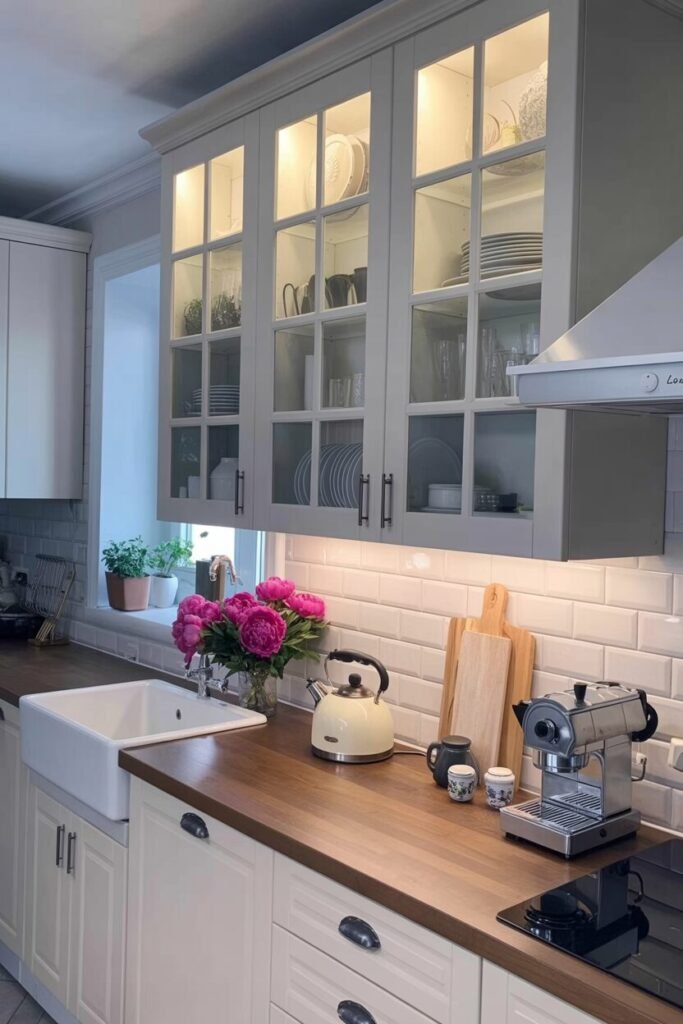
Cream Cabinets and Marble Elegance
Cream is comfort in color form—it’s warm, welcoming, and way less stark than plain white. Cream works wonders in kitchens because it feels timeless and soft, making it perfect if you want a space that never looks cold. Pair it with marble counters and backsplash, and suddenly you’ve got that high-end, “I just remodeled my entire life” vibe.
Marble’s veining adds natural movement and keeps the cream from feeling flat. This palette principle is all about layering neutrals: creamy tones give you warmth, marble brings texture, and metallic accents (like brushed gold or silver) add just enough sparkle.
Color psychology says cream promotes calmness and relaxation, making your kitchen feel like the heart of the home. We recommend pairing this with upholstered bar stools for coziness or even natural wood chairs to keep it grounded. The balance of warm cream and cool marble is what makes this look timeless. Honestly, it’s giving Pinterest goals.
White Cabinets with Rustic Beams
Okay, hear us out: white doesn’t have to be boring. White cabinetry creates openness and light, which is why it’s such a go-to, but pair it with rustic wood beams and suddenly the whole vibe shifts. The wood brings in grounding energy—warm, natural, and a little bit cozy, while white keeps it airy.
From a color psychology angle, white represents clarity and freshness, while wood tones give stability and warmth. Together, they’re basically the yin and yang of kitchen design. Palette-wise, it’s contrast that makes this combo work: crisp white as your base, textured wood for depth, and metallic touches like brass or black hardware to tie it all together.
Add marble counters if you want sophistication, or keep it farmhouse with butcher block. This is the ultimate modern farmhouse palette—refined but still rustic. We love how it feels lived-in without losing its polish. Honestly, it’s the perfect “best of both worlds” kitchen.
White and Gold Luxe Minimalism

This one is pure drama in the chicest way. White cabinetry creates a clean, modern foundation, but pair it with gold hardware and lighting and suddenly it screams “effortless luxury.” White opens up the space and makes it feel fresh, while gold accents warm it up and add glam.
The reason this palette works is all about proportion—keep gold accents minimal so they pop against the white backdrop without overwhelming. Color psychology tells us white encourages clarity and focus, which makes sense in a busy kitchen, while gold symbolizes success and wealth (because who doesn’t want rich-aunt energy while making pasta?).
Add in natural textures like rattan-backed chairs or a wood island for balance so it doesn’t feel too sterile. The key here is contrast: cool crisp base + warm luxe highlights. We love how it feels modern but not intimidating. It’s minimalism with a glow-up, and honestly, it’s serving main character energy.
READ MORE >> “9+ Best Home Coffee Bar Designs “
Elevate Everyday Living With Neutral Kitchen Magic
Here’s the thing: a warm neutral kitchen is more than just pretty pictures on your Pinterest board—it’s a lifestyle move. These palettes make your space inviting, versatile, and ridiculously easy to style. Neutrals are like the ultimate wingman; they’ll support whatever bold accessory, seasonal vibe, or trendy upgrade you throw at them.
From brass hardware to rustic beams to marble countertops, warm neutrals give you the freedom to play without ever feeling mismatched. Color psychology backs it up too: taupes calm the mind, creams bring softness, whites expand the room, and beiges wrap everything in comfort.
The best part? You don’t have to redo your whole kitchen—just swap finishes, add texture, or update hardware, and boom, instant transformation. At the end of the day, warm neutrals aren’t just colors—they’re the canvas for your everyday moments. And trust us, your morning coffee tastes better in a kitchen that vibes.