This Is How You Make an Easter Porch Look Intentional
Easter front porch decor is not just about tossing a wreath on the door and calling it a day. It’s about creating a full-on seasonal experience the second someone walks up to your house. When we design an Easter porch, we’re really designing a first impression. The entry sets the emotional tone for the entire home.
Soft pastels instantly feel welcoming, while symmetrical planters create that polished, intentional vibe we all secretly want. The key is layering. Start with height near the door—wreaths, garlands, topiaries—then balance that weight with grounded elements like planters, baskets of eggs, or sculptural bunnies.
Always distribute visual weight from top to bottom so the porch never feels top-heavy. Stick to a controlled color palette, repeat shapes for rhythm, and mix textures like wicker, moss, ceramic, and florals. When we combine structure with playfulness, Easter decor stops looking random and starts looking styled.
Whimsical Bunny Garden Porch Moment
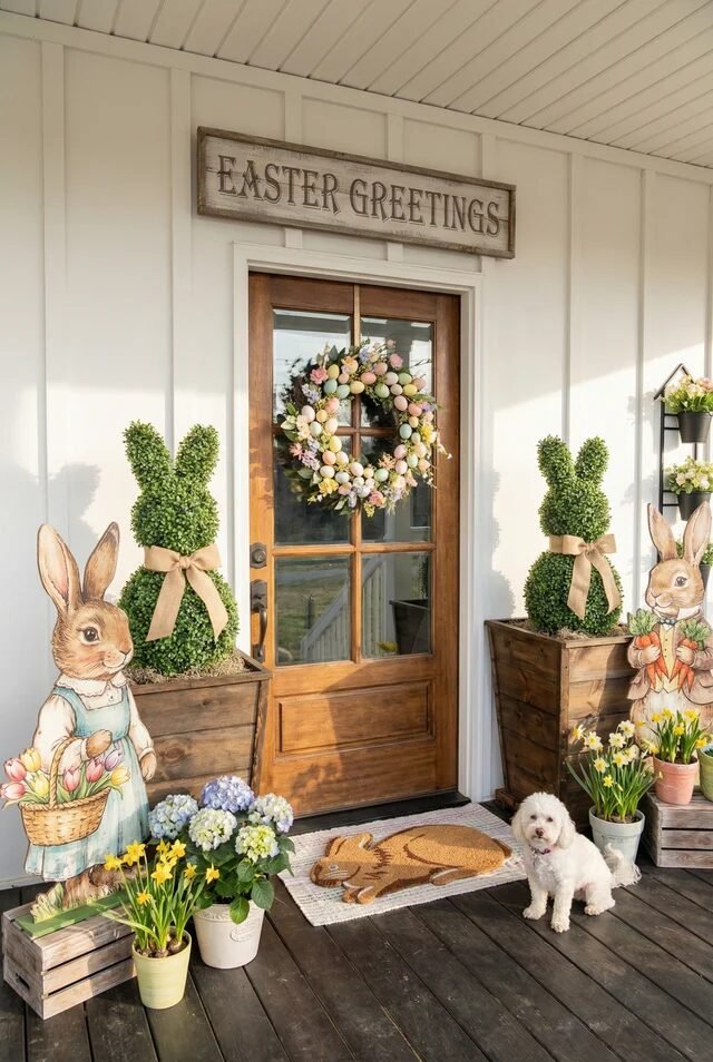
This porch is basically Easter exploded in the best way possible. We’ve got symmetry working overtime here, and that’s exactly why it feels polished instead of chaotic. The two tall planters with bunny topiaries frame the door beautifully, creating a classic visual triangle between the wreath and floor decor. Symmetry instantly makes seasonal decor feel intentional and expensive. If we’re recreating this, start with matching height elements on both sides of the door before layering smaller pieces.
The pastel wreath softens the strong vertical lines of the board-and-batten wall, which is such a smart contrast move. Then we ground everything with low planters of daffodils and hydrangeas to add color weight near the floor. Always balance eye-level decor with something at the base so the porch doesn’t feel top-heavy.
The bunny cutouts add personality without clutter because they’re scaled properly to the door height. And that rabbit doormat? It anchors the whole look with texture. Add one “living” element like fresh flowers to keep it vibrant and photo-ready.
Modern Carrot Door Statement
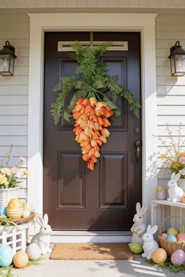
Okay but can we talk about that carrot swag? It’s giving bold, minimal, and slightly unhinged in the best designer way. This is a perfect example of a single oversized focal point doing all the heavy lifting. When we go big on one statement piece, we can simplify everything else. Notice how the dark brown door acts as contrast, making the orange tulips pop dramatically.
This setup uses vertical emphasis. The greenery cascading upward elongates the door, while the clustered tulips create a teardrop shape that guides the eye down. That’s intentional movement in design. If we’re recreating this, secure florals tightly and layer greenery first to create depth before adding blooms.
The surrounding decor stays low and symmetrical, with bunnies and pastel eggs hugging the ground. That keeps the porch balanced without competing for attention. High contrast plus controlled restraint equals modern Easter magic. Keep your color palette tight—orange, green, white—and let texture do the rest.
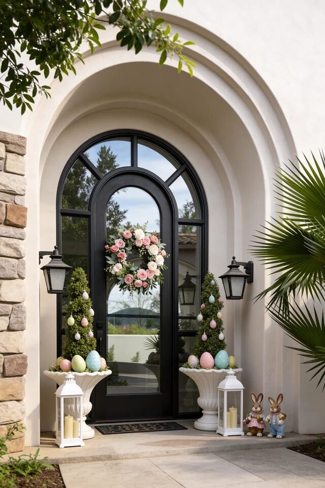
Pastel Egg Topiary Drama
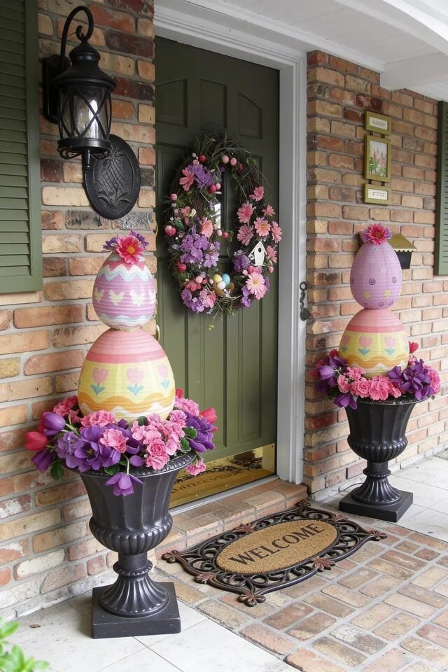
If maximalist Easter had a runway moment, this would be it. Those oversized egg topiaries are pure drama, but they work because of scale and repetition. We’ve got matching urns, matching egg stacks, and mirrored floral bases. Repetition is what keeps bold decor from feeling chaotic.
The brick backdrop adds texture and warmth, which balances the pastel color palette beautifully. When working with loud patterns like painted eggs, grounding them with neutral architectural elements is key. If we’re recreating this, make sure your urns are tall enough to bring decor to eye level. Height equals impact.
The floral rings at the base soften the hard lines of the urns and visually connect the eggs to the wreath. That’s called visual continuity, and it’s chef’s kiss. Always connect top, middle, and bottom elements so nothing feels like it’s floating.
Pro tip: Stick to three to four pastel shades max. Too many colors will compete and dilute the wow factor.
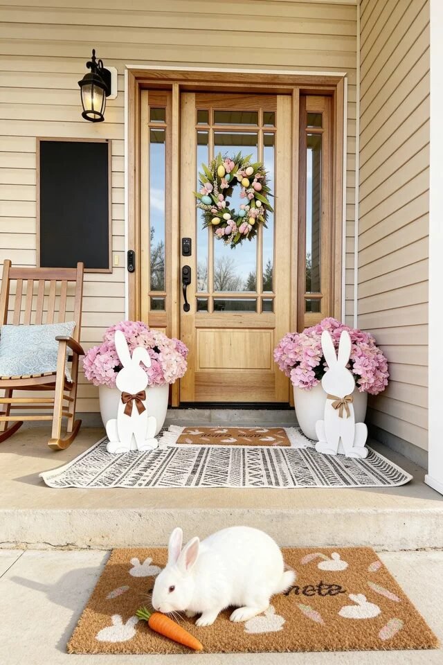
Rustic Bunny Porch Charm
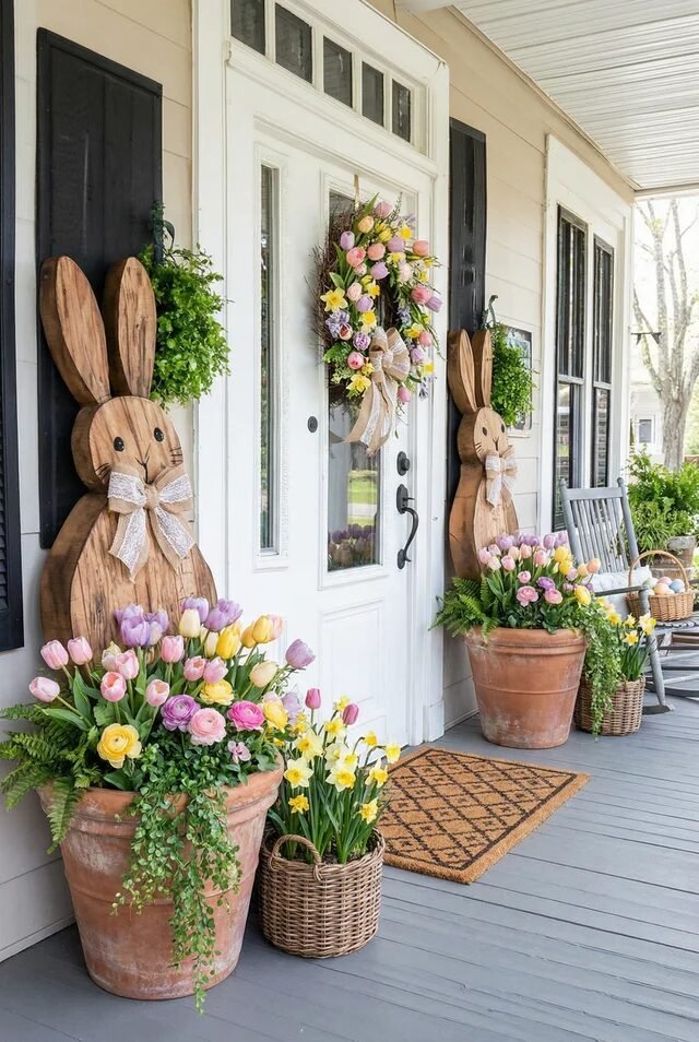
This one feels like Pinterest and farmhouse romance had a baby. The wooden bunny cutouts instantly set a rustic tone, especially paired with terracotta pots and woven baskets. Mixing natural materials creates depth without overwhelming the space. Wood, clay, wicker, and fresh greenery all play nicely because they share earthy undertones.
Notice the layering strategy happening here. Tall bunny silhouettes sit against the wall, medium-height planters flank the door, and low baskets spill flowers near the floor. That staggered height variation creates dimension. If we’re recreating this, always think in thirds: tall, medium, low.
The pastel wreath keeps the look seasonal but doesn’t overpower the neutral base. That’s smart color control. When your foundation is neutral, your seasonal accents can shine without clashing.
Also, repeating tulips in multiple containers creates cohesion. We don’t need twenty different flower types. Pick one hero bloom and echo it throughout for that styled-but-effortless vibe.
Playful Oversized Easter Step Display
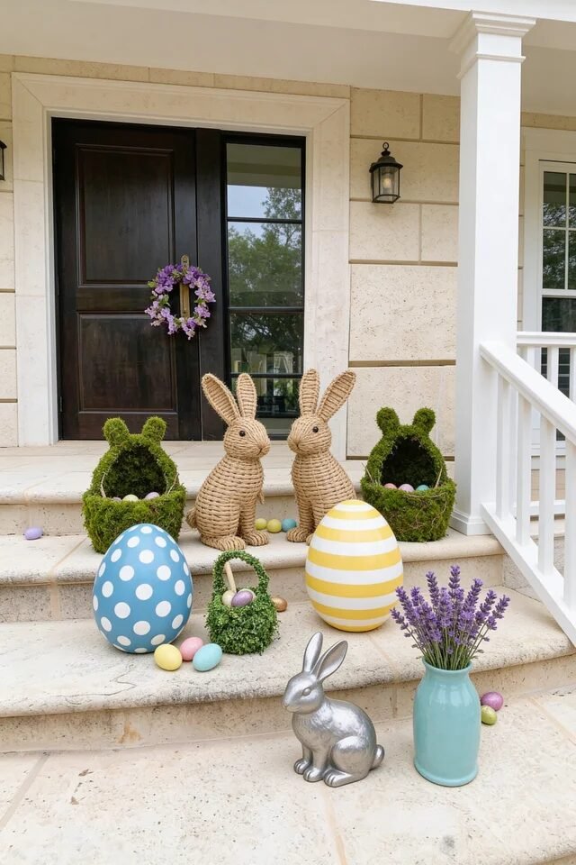
This porch said “go big or go home,” and honestly? Respect. Oversized eggs and woven bunny figures instantly create a focal zone right on the steps. The trick here is scale and grouping. Large-scale decor works best when clustered in odd numbers to feel organic but intentional.
See how the two woven bunnies anchor the center while moss nests and giant eggs flank them? That creates a balanced pyramid composition. The lavender in the vase adds vertical softness, breaking up the heavy shapes with something airy.
If we’re recreating this, keep your base color neutral so the oversized pastel eggs can shine. Too many competing colors on the porch walls would distract from the display. Always let statement pieces breathe with negative space around them.
Also, mixing textures—moss, wicker, ceramic, metal—adds visual interest without adding more colors. That’s advanced styling energy. Keep the palette soft, repeat shapes, and scale confidently. Bigger really is better here.
Enchanted Garden Easter Entryway
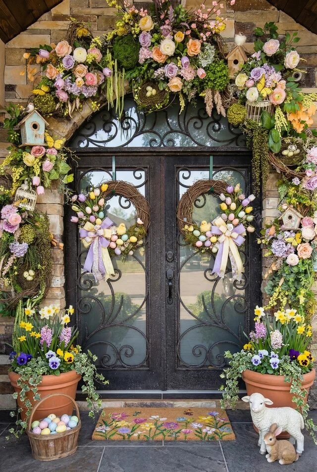
This porch is maximalist magic done right. We’re looking at full arch garland framing, double wreaths, layered florals, and symmetrical planters—yet it doesn’t feel messy. Why? Because repetition and mirroring create visual control even in highly detailed designs. The twin wreaths anchor the double doors, while the oversized floral garland creates a grand architectural frame. It’s basically Easter couture.
Notice how the color palette stays within soft pastels—lavender, blush, butter yellow, pale green. That restraint keeps the abundance feeling cohesive. If we’re recreating this, build your base structure first: secure greenery garland, then insert florals in clusters rather than scattering randomly. Clustered color reads intentional; scattered color reads chaotic.
Ground-level terracotta pots balance the visual weight from above, preventing the design from feeling top-heavy. That’s vertical distribution at work. Add one thematic accent—like birdhouses—to reinforce the garden narrative. When everything echoes the same story, the porch feels immersive, not cluttered.
Playful Bunny Welcome Statement
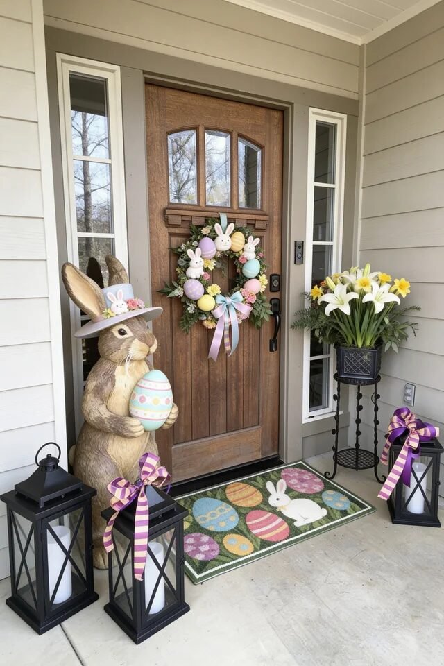
This one is giving “family-friendly but still styled.” The oversized bunny statue acts as the primary focal point, and everything else supports it. A strong focal piece simplifies your decorating decisions instantly. Once we choose a hero element, we just build around it.
See how the wreath repeats the pastel egg theme from the doormat? That’s color continuity. Lavender, mint, and soft yellow appear in small doses across multiple surfaces, which makes the porch feel coordinated. The black lanterns add grounding contrast so the pastels don’t float away visually.
When recreating this, scale matters. The bunny is tall enough to compete with the door height, which prevents it from looking awkwardly small. Always measure your door and choose decor that fills at least one-third of that height for balance. Contrast dark accessories with light seasonal pieces for visual depth.
Keep symmetry loose but intentional—lanterns frame the scene while florals soften the edges.
Bold Carrot Frame Entrance
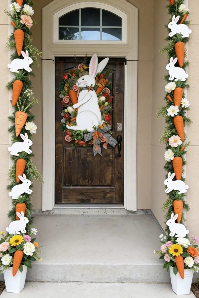
This setup is for the confident decorator, and we respect it. The vertical garlands act like festive columns, pulling the eye upward and emphasizing height. Using vertical lines makes your entry feel grander and more architectural. It’s a smart trick if your porch feels small.
The carrot repetition along both sides creates rhythm. Rhythm in design means repeating shapes at consistent intervals so the eye moves naturally. Then the central bunny wreath becomes the focal pause in that movement. That’s visual storytelling.
When recreating this, secure garlands tightly and distribute heavier decorative pieces evenly to prevent sagging. Florals at the base soften the strong orange accents and keep the palette balanced. Notice how white bunnies are repeated on both sides? That echo keeps it cohesive.
Limit your bold color to one star shade—here it’s carrot orange. One dominant accent color keeps playful decor from turning chaotic. Balance it with greenery and neutral walls for maximum impact.
Soft Pastel Hydrangea Balance
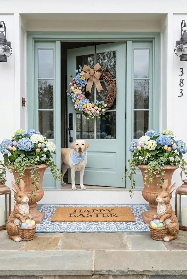
If calm Easter elegance had a Pinterest board, this would be it. The muted mint door paired with hydrangea planters creates a soothing foundation. Soft, desaturated colors instantly elevate seasonal decor into something timeless. We’re not screaming Easter—we’re whispering it.
Symmetry is doing the heavy lifting here. Matching urns, mirrored bunny figures, and evenly spaced lanterns create a balanced composition. When we mirror elements, the brain reads it as organized and luxurious.
The wreath adds diagonal movement with florals cascading to one side. That slight asymmetry prevents the setup from feeling stiff. Pro tip: when working with symmetrical bases, add one subtle asymmetrical detail for interest.
Layered rugs underneath the doormat add texture and depth. Layering textiles outdoors makes the entry feel styled, not staged. Stick to a tight pastel palette—blue, blush, cream—and repeat those tones in florals and eggs for cohesion.
Elegant European Arch Easter Styling
This one feels like Easter in Tuscany and honestly we’re obsessed. The arched doorway already provides architectural drama, so the decor stays refined. When your architecture is bold, your decor should complement—not compete.
The symmetrical topiary trees in pedestal urns frame the doorway beautifully. Adding pastel eggs at the base gives seasonal flair without overwhelming the elegance. Notice how the wreath stays classic with roses and greenery instead of novelty shapes. That restraint keeps it sophisticated.
White lanterns echo the pale stucco walls, creating harmony across the palette. Harmony in design means repeating materials or colors to make everything feel connected. If we’re recreating this, prioritize quality over quantity. Fewer, larger pieces will always look more elevated than many tiny accents.
Keep your palette soft—blush, sage, cream—and let black door hardware provide contrast. High contrast architecture plus soft seasonal accents equals effortless luxury Easter energy.
Style It Once, Impress All Spring
The best Easter front porch decor doesn’t scream holiday clearance aisle. It feels curated, layered, and effortlessly intentional. When we approach decorating with design principles in mind, everything changes. Repetition builds cohesion, symmetry builds balance, and contrast builds depth. Once we understand that formula, styling becomes so much easier.
Think about scale first. Oversized eggs or tall bunny figures create impact because they relate proportionally to your door height. Then refine your palette—three to four pastel shades max—to keep things elevated instead of chaotic. Add texture through greenery and layered textiles so the space feels dimensional. Negative space is just as important as decorative pieces. Let statement elements breathe.
At the end of the day, Easter porch decor should feel joyful but controlled. When we balance architecture, color, height, and texture, we create a look that photographs beautifully and feels welcoming long after the holiday ends.