How Mid-Century Modern House Exteriors Turn Geometry Into Pure Curb Appeal
Mid-century modern house exteriors have a very specific kind of charm. They feel architectural without trying too hard, stylish without becoming fussy, and somehow both retro and timeless at the same time. The magic of mid-century design lives in its balance between bold geometry and natural warmth. Think dramatic rooflines, wide glass panels, and materials that actually look better with age.
What makes these homes especially appealing today is how well they connect architecture with the surrounding environment. Instead of dominating the landscape, mid-century homes are designed to coexist with it, often using horizontal lines, large windows, and organic materials like wood or stone. The goal was never visual noise; it was calm, confident simplicity.
If we look closely at great mid-century exteriors, we start noticing the patterns. Rooflines become focal points. Windows act like framed views. Landscaping supports the architecture instead of competing with it. That thoughtful design logic is exactly what makes these homes feel so effortlessly cool decades later.
Crisp White Angled Mid-Century Modern Facade
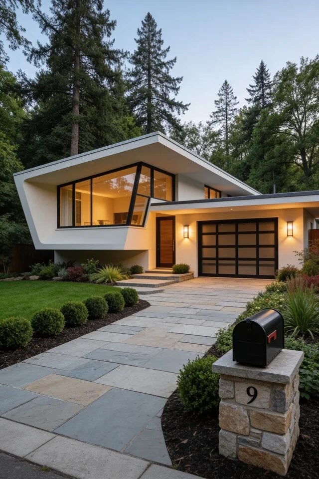
This exterior nails one of the most iconic mid-century tricks: bold geometry paired with extreme visual simplicity. The sharply angled roofline and asymmetrical window wall immediately create a focal point without needing decorative clutter. Mid-century architecture loves letting structure do the talking, and here the clean white stucco amplifies that sculptural effect. When we recreate this look, we want to keep the palette restrained so the architecture stays center stage.
Notice how the black window frames and garage grid subtly ground the design. Contrast is doing heavy lifting here, turning the windows into graphic shapes rather than just openings. If you’re aiming for a similar exterior, stick to two or three dominant materials max. Stucco, glass, and dark metal framing already create plenty of visual rhythm.
The landscaping also deserves credit. Rounded shrubs soften the sharp architecture while the wide concrete pavers guide the eye toward the entrance. Good mid-century design always balances hard geometry with organic forms. When we recreate this idea, we should keep planting structured but minimal so the house still feels like the star of the show.
Warm Wood Entry With Tropical Mid-Century Energy
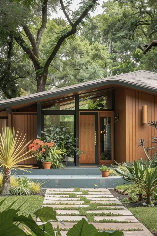
This facade leans into the warmer side of mid-century modern, where architecture blends into the landscape instead of dominating it. Vertical wood siding instantly creates rhythm and warmth, a signature element that makes mid-century homes feel grounded and human. The gentle sloped roofline also reinforces that relaxed, horizontal emphasis that defined the era’s residential design.
What really makes this entry sing is the layering of greenery. Tropical plants, low succulents, and sculptural foliage create a natural frame around the doorway. Mid-century landscaping was never random—it intentionally echoes the architecture’s shapes and proportions. Notice how the spiky plants mirror the sharp roof angle while the softer leaves balance the rigid lines.
If we want to recreate this look, material balance is key. Pair warm wood siding with dark trim or charcoal framing to avoid everything blending together visually. Contrast keeps wood exteriors from feeling flat. Add simple modern sconces and a streamlined front door so the entry feels intentional, welcoming, and very “Palm Springs vacation house energy.”
Dramatic Glass Corner Mid-Century Statement
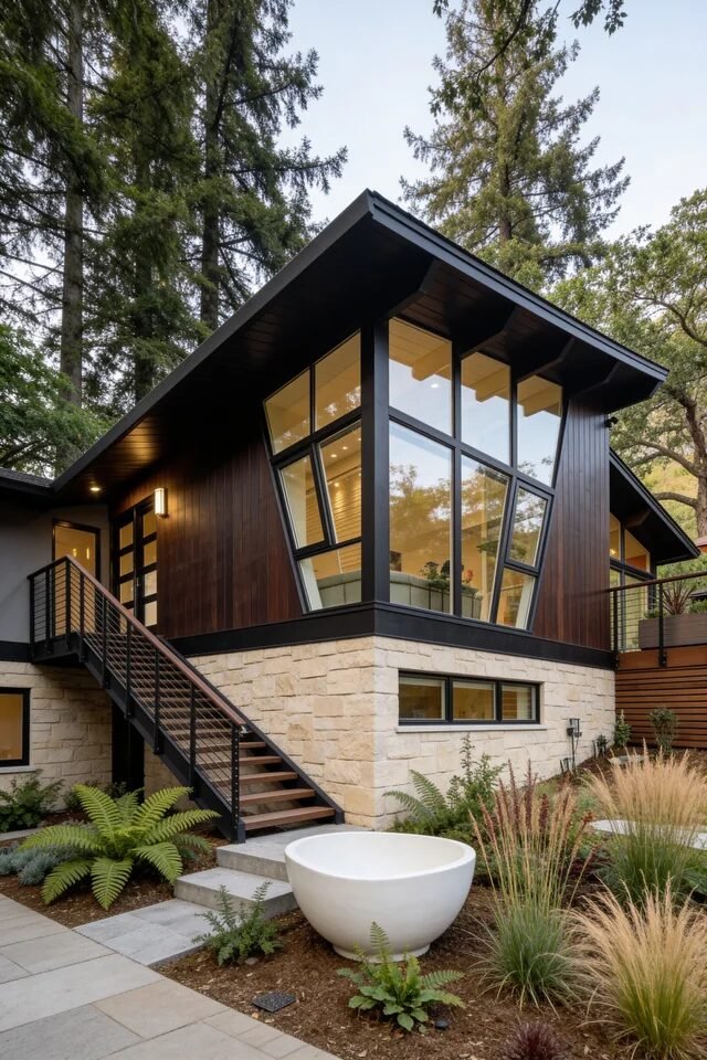
This home shows how mid-century architects turned glass into architecture, not just windows. That dramatic corner glazing instantly becomes the hero element, creating transparency while visually lightening the structure. Because the house sits on a stone base, the glass volume above almost feels like it’s floating, which is a classic mid-century visual trick.
Material layering plays a big role here too. Dark vertical wood siding adds warmth while the pale stone foundation provides weight and texture. Mid-century design thrives on contrast between heavy and light materials. The stone anchors the home to the landscape while the glass opens the interior to nature.
The elevated staircase also contributes to the composition. Instead of hiding circulation, the designers made it part of the exterior aesthetic. Diagonal lines introduce movement and guide the eye upward, which makes the house feel taller and more dynamic. When recreating this style, we should focus on large uninterrupted windows, simple railing systems, and materials that feel honest—wood, stone, steel, and glass doing exactly what they’re meant to do.
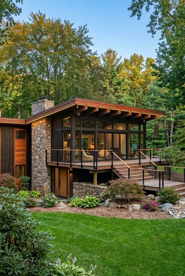
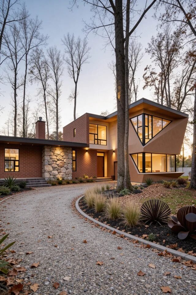
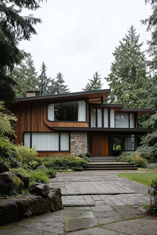
Low Profile Woodland Mid-Century Retreat
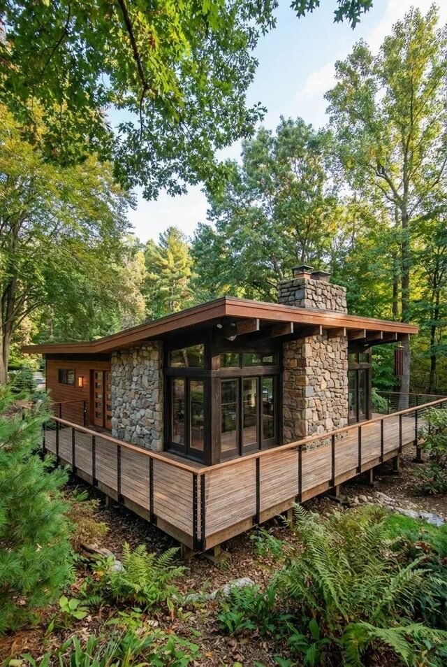
Few architectural styles handle forest settings better than mid-century modern, and this house proves it. The long horizontal roofline visually hugs the landscape, which helps the structure feel integrated rather than imposed. Mid-century homes were famously designed to respect their surroundings, and low silhouettes are one of the easiest ways to achieve that harmony.
The stone chimney becomes the visual anchor of the entire composition. Instead of decorative accents scattered everywhere, the design focuses on one strong vertical element. This “single focal point” strategy keeps minimalist architecture from feeling empty. The surrounding wood siding then adds warmth while still allowing the stone to dominate visually.
The wraparound deck is another smart move. It extends the living space outward and blurs the boundary between indoors and outdoors. Mid-century design always prioritizes connection to nature, so decks, patios, and sliding glass doors are practically mandatory features. If we’re recreating this idea, natural materials and earthy tones will help the house feel like it belongs right where it stands.
Stone Facade Mid-Century With Retro Charm
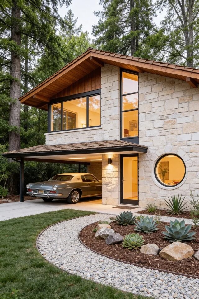
This exterior leans into the more playful side of mid-century modern. The circular window immediately injects personality, proving that geometry was never limited to straight lines in this design era. Rounded elements break up rigid architecture and keep the facade visually interesting without feeling overly decorative.
Stone cladding gives the home durability and texture while maintaining a neutral palette. Mid-century architects often paired stone with warm wood soffits to soften the overall look. Texture layering is crucial when the color palette stays simple. Here, stone, wood, glass, and metal each contribute their own visual depth.
Even the landscaping follows mid-century principles. The curved gravel border and sculptural succulents echo the circular window, creating subtle repetition across the design. Repeating shapes throughout the exterior builds visual harmony. When we recreate a similar look, focus on geometric consistency. If your architecture uses circles or curves, let those shapes show up in the garden beds, pathways, or outdoor lighting too.
Sculptural Stone Columns Framing Mid-Century Entry
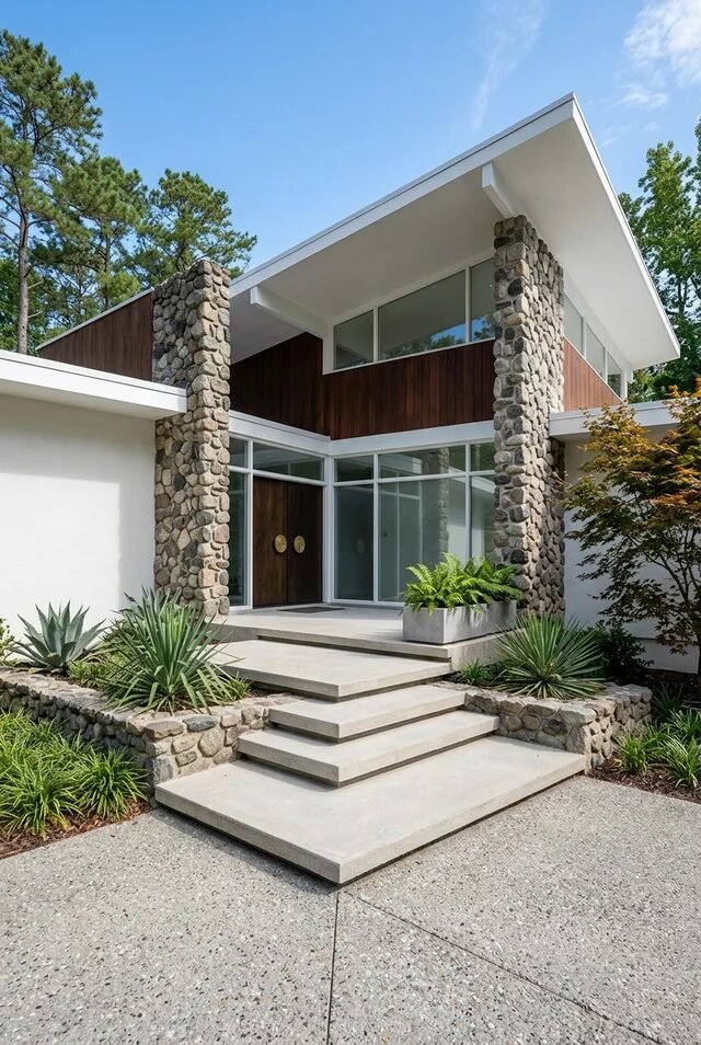
Mid-century homes love a dramatic entrance, and this one absolutely commits. Those tall river-stone columns act like architectural bookends, framing the entry while giving the home serious structural presence. The vertical stone also contrasts beautifully with the horizontal roofline, which is a classic mid-century balancing act. When we recreate this idea, we want at least one material that feels heavy and grounded so the lighter elements can float visually.
The wood cladding between the stone columns is doing quiet but important work. Warm wood instantly softens the rugged texture of stone, creating that perfect mid-century mix of nature and geometry. Large clerestory windows above the entry allow daylight to flood inside without sacrificing privacy, which was a genius design move used heavily in mid-century homes.
Don’t ignore the steps and landscaping here. Wide concrete stairs establish a strong approach axis toward the door. Layering low desert-style plants keeps the entry clean and architectural rather than busy. If we recreate this look, we should prioritize symmetry, material contrast, and a clearly defined path.
Butterfly Roof Mid-Century Glass Pavilion
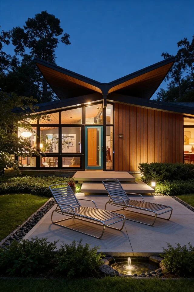
The butterfly roof is basically mid-century architecture showing off, and honestly we’re here for it. This V-shaped roofline instantly creates drama while also channeling rainwater efficiently, which is why many architects loved it in the 1950s and 60s. The sharp roof angles also pull your eyes directly toward the center entry, subtly guiding the composition.
What really elevates this exterior is the glass wall framing the living space. Floor-to-ceiling glazing turns the home into a glowing lantern at night, blurring the boundary between indoors and outdoors. Mid-century architecture thrives on that connection to nature, so transparency is always a key design move.
Even the patio layout follows mid-century logic. Two minimalist lounge chairs and a low fountain keep the space visually open without clutter. Furniture should echo the architecture’s clean geometry, not compete with it. When recreating this look, we should keep outdoor decor low-profile and let the roofline and lighting create the main visual drama.
Sharp Angled Roof With Warm Wood Facade
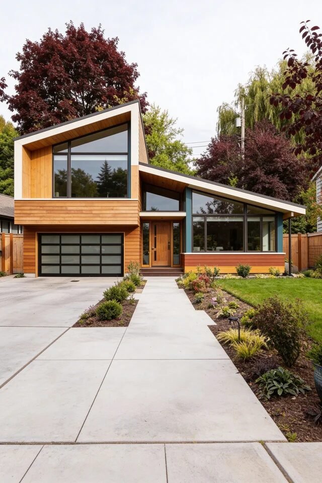
This home demonstrates how mid-century modern can feel both bold and incredibly welcoming at the same time. The sharply angled roofline immediately gives the facade movement, preventing the structure from feeling boxy or predictable. Mid-century architects loved exaggerated roof slopes because they created dynamic silhouettes without needing excessive ornament.
The cedar-toned siding adds warmth that balances the geometric structure. Natural wood plays a huge role in mid-century exteriors because it softens strong architectural lines. Pairing wood with black-framed windows also increases contrast, making the glass panels feel more intentional and graphic.
Pay attention to the landscaping because it quietly reinforces the architecture. Low shrubs and minimal plant groupings maintain clear sightlines toward the house. Mid-century landscaping always prioritizes clean horizontal layers instead of chaotic planting beds. When we recreate this idea, we should keep the palette tight: wood, glass, concrete, and greenery doing the majority of the visual work.
Geometric Glass Corner Modernist Statement
If mid-century homes had a personality trait, it would be “dramatic but sophisticated,” and this exterior nails it. The angular glass corner instantly becomes the architectural star, almost like a sculptural lantern projecting from the house. Mid-century designers loved these bold window geometries because they allowed natural light to penetrate deeper into the interior.
The material palette keeps everything balanced. Brick and stone create a grounded base while the pale stucco volume above feels lighter and more modern. Mixing heavy masonry with smooth surfaces prevents the design from feeling flat. That contrast between textures is a subtle but essential mid-century trick.
The curved gravel driveway also deserves applause. Instead of forcing rigid geometry everywhere, the landscaping introduces softer lines. Curved pathways help guide movement while visually slowing down the approach to the house. When recreating this look, combining strong architectural shapes with organic landscape curves keeps the entire exterior feeling intentional.
Curved Window Mid-Century Organic Modern Exterior
This house proves mid-century design isn’t only about sharp lines—it also knows how to curve when needed. The rounded window frame instantly softens the long horizontal facade, creating a focal point without adding extra decoration. Organic shapes like this became popular later in the mid-century period as architects experimented with more fluid forms.
The rich wood siding is doing most of the visual heavy lifting here. Continuous vertical wood panels create rhythm while emphasizing the home’s length. When paired with the low roof overhang, the result is a calm, grounded composition that feels deeply connected to the surrounding forest.
Even the landscaping mirrors the architecture’s natural vibe. Mossy stones, layered shrubs, and irregular pathways help the home blend into the landscape rather than dominate it. Mid-century design often works best when the house feels like part of the environment. If we recreate this idea, natural materials, soft textures, and subtle curves will keep everything cohesive.
The Timeless Mid-Century Exterior Formula Still Works

By now we can probably see that mid-century modern exteriors aren’t just about aesthetics—they follow a surprisingly logical design formula. Strong geometry, honest materials, and thoughtful landscaping work together to create homes that feel intentional rather than decorative. Every roofline, window placement, and texture has a purpose.
One of the biggest lessons from mid-century architecture is restraint. These homes rarely rely on excessive detailing or trendy finishes. Instead, they focus on proportion, balance, and material contrast to create visual interest. A bold roof angle, a striking glass wall, or a well-placed stone element often does more than dozens of small decorative features ever could.
The best part is how adaptable the style still is today. Whether we lean into warm wood facades, dramatic glazing, or sculptural landscaping, the core ideas remain the same. When clean lines meet natural textures, mid-century modern exteriors almost design themselves.