A Warmer Interpretation of Mid Century Modern Apartment
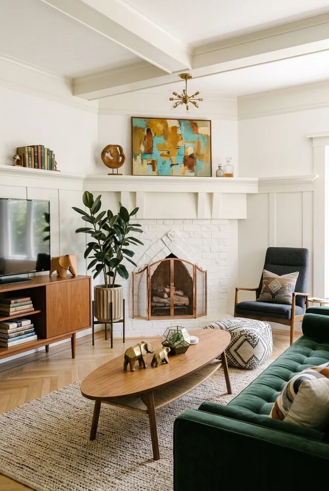
Mid century modern apartments are not about turning our space into a museum. They’re about creating warmth, clarity, and personality inside real-life square footage. Clean lines matter, yes. Tapered legs, walnut tones, sculptural lighting, absolutely.
But the real secret is proportion and intention. We’re balancing low-profile furniture with vertical architecture. We’re layering wood, leather, ceramic, and woven textures so the room feels collected instead of flat.
In apartments especially, every decision carries weight. One bold chair can define a corner. One geometric rug can anchor an entire open plan. Mid century design thrives on restraint paired with confidence. We don’t overcrowd. We don’t over-theme. We let materials speak.
When we approach this style thoughtfully, even a compact layout can feel curated and architectural. It’s not about copying the 1960s. It’s about translating its design discipline into spaces we actually live in today.
Cozy Reading Nook With Warm Wood
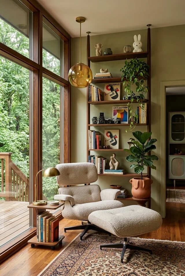
This mid century modern apartment corner proves that great design is really about intentional contrast. We have floor to ceiling wood framed windows bringing in organic views, then we anchor the space with low, sculptural furniture that feels grounded. Notice the balance between vertical and horizontal lines: tall shelving draws the eye up, while the lounge chair and ottoman keep everything visually weighted at the bottom. That’s classic mid century proportion control.
The color palette stays earthy and edited. Olive walls, warm walnut shelving, brass lighting, and creamy boucle create cohesion without looking matchy. Mid century modern thrives on warmth, not stark minimalism, so layering texture is key. Think boucle, wood grain, ceramic, and greenery all in one vignette.
If we’re recreating this, focus on one statement chair with a matching ottoman, open shelving with negative space, and one globe pendant in a warm metal finish. Keep decor curated, not crowded. Let every object breathe.
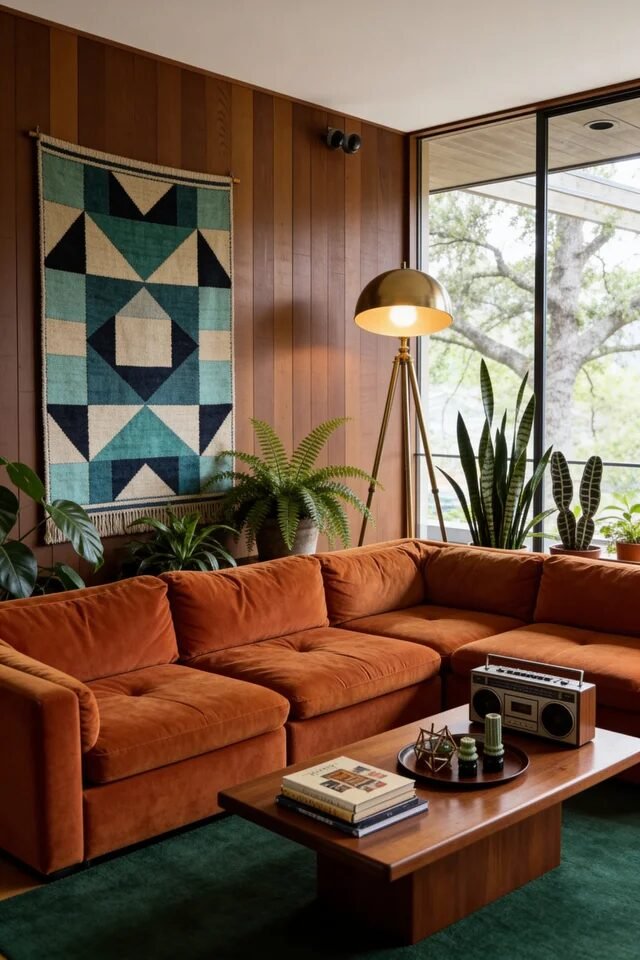
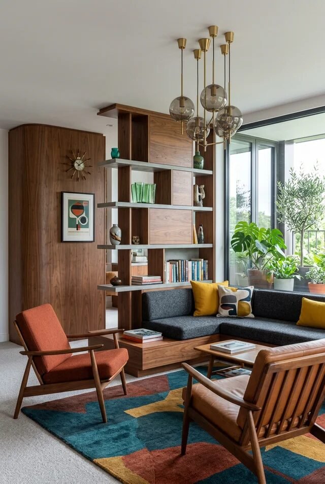
Sculptural Seating And Clean Architectural Lines
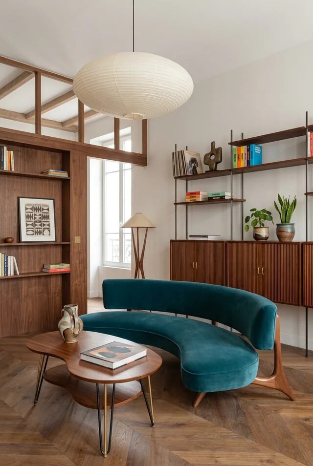
This space is a masterclass in form-forward furniture with architectural restraint. The curved teal sofa is the star, and everything else politely supports it. That’s mid century discipline. We see clean wall planes, warm wood millwork, and thin metal shelving that visually disappears so the shapes shine.
The key principle here is contrast through geometry. We’re mixing curves, rectangles, and slim vertical supports. The rounded paper lantern softens the straight lines, creating tension without chaos. Mid century design works best when one bold shape leads the composition and the rest echoes quietly.
Color wise, it’s controlled but not boring. Teal becomes the saturated focal point against walnut and off white. If we want to recreate this, choose one saturated upholstery piece, keep cabinetry streamlined, and elevate storage on legs to maintain that airy 1960s vibe.
Remember negative space. Don’t fill every wall. Let the architecture breathe.
Warm Wood Bathroom With Graphic Tiles
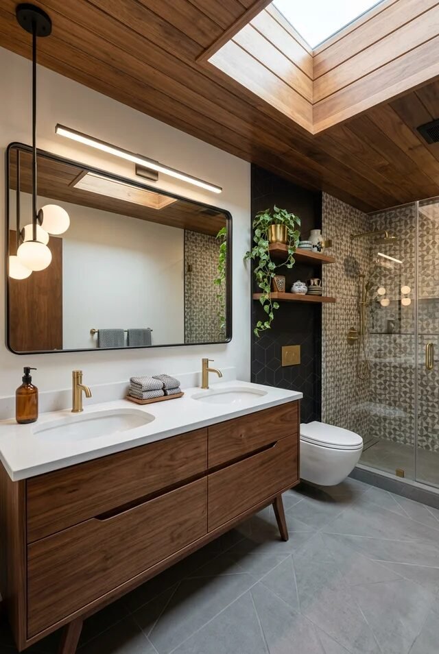
Mid century bathrooms are secretly about drama, just in a calm voice. Here, we get wood vanity warmth, brass fixtures, and geometric tile that adds subtle pattern without overwhelming the eye. The balance between organic materials and graphic detail is everything.
Notice how the wood ceiling and vanity create continuity. Repeating wood tones across horizontal surfaces makes the space feel cohesive. Then we introduce contrast with matte black wall tile and patterned shower tile. That’s controlled tension. Brass fixtures add warmth and prevent the palette from feeling too cool.
Lighting matters here. The linear vanity light keeps things streamlined and modern, while globe accents nod to retro styling. If we’re recreating this look, prioritize floating or legged vanities for visual lightness, mix one bold tile with one quiet tile, and stick to two to three metal finishes max.
Airy Bedroom With Industrial Windows
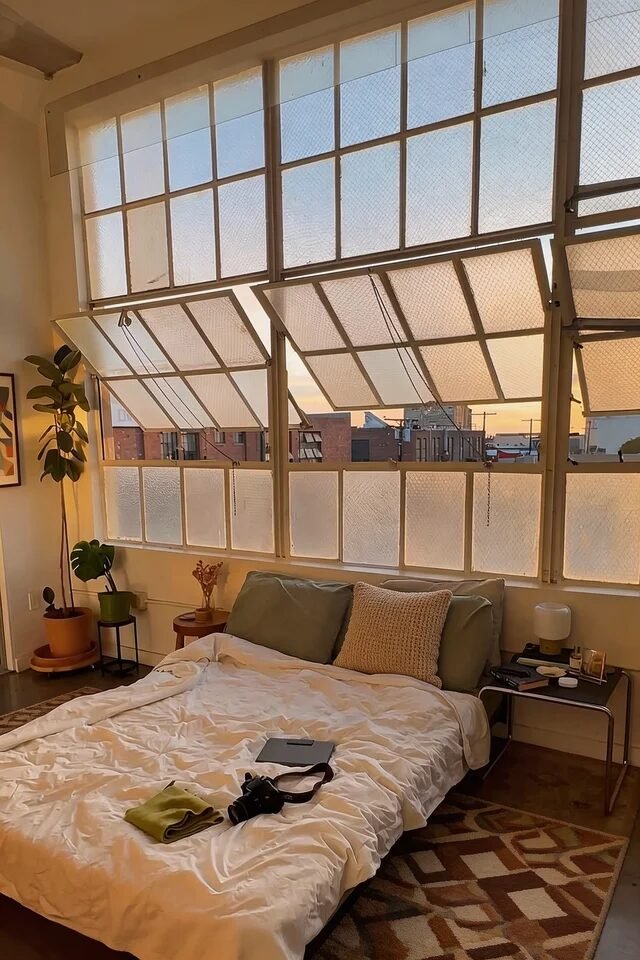
This bedroom proves that mid century modern doesn’t require heavy furniture to feel grounded. The grid windows act as architectural artwork, so the rest of the room stays low and relaxed. That’s smart visual hierarchy.
We’re seeing horizontal emphasis everywhere. The bed sits low, nightstands are minimal, and decor hugs the floor line. This keeps the tall windows from overpowering the space. The color palette leans warm neutral with touches of olive and caramel, which complements sunset light beautifully.
Texture layering is subtle but strategic. Crisp white bedding, a patterned rug, and a few ceramic planters prevent the room from feeling flat. If we’re recreating this, choose a platform bed, keep bedding tonal, and add one large plant for scale. Let natural light be the main character and avoid heavy curtains that block those lines.
Dining Room With Iconic Starburst Details
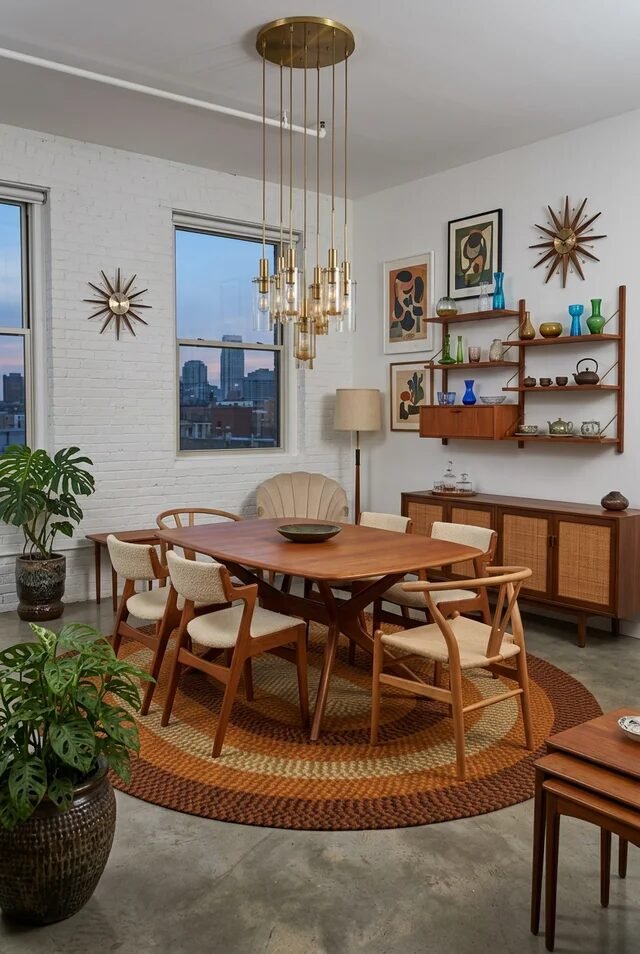
If we want instant mid century credibility, starburst accents are basically the cheat code. But here’s the trick: they’re used sparingly. Iconic details only work when the foundation is timeless. We see warm wood dining furniture, tapered legs, and a simple round rug anchoring the table.
The chandelier becomes a vertical statement that mirrors the wall starbursts without competing. That repetition creates rhythm. Notice the scale too. The rug is large enough to fit all chairs, which maintains proportion and avoids that awkward floating table look.
Shelving stays open and airy, with glassware adding color without clutter. If we’re recreating this, invest in one sculptural light fixture, keep your wood tones consistent, and mix woven textures like rattan or cane for depth.
Mid century dining rooms are about balance between nostalgia and refinement. Keep styling curated, and let craftsmanship speak louder than accessories.
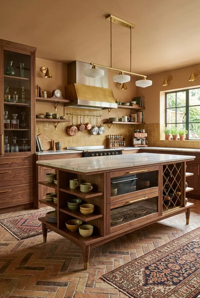
Narrow Galley Kitchen With Playful Color
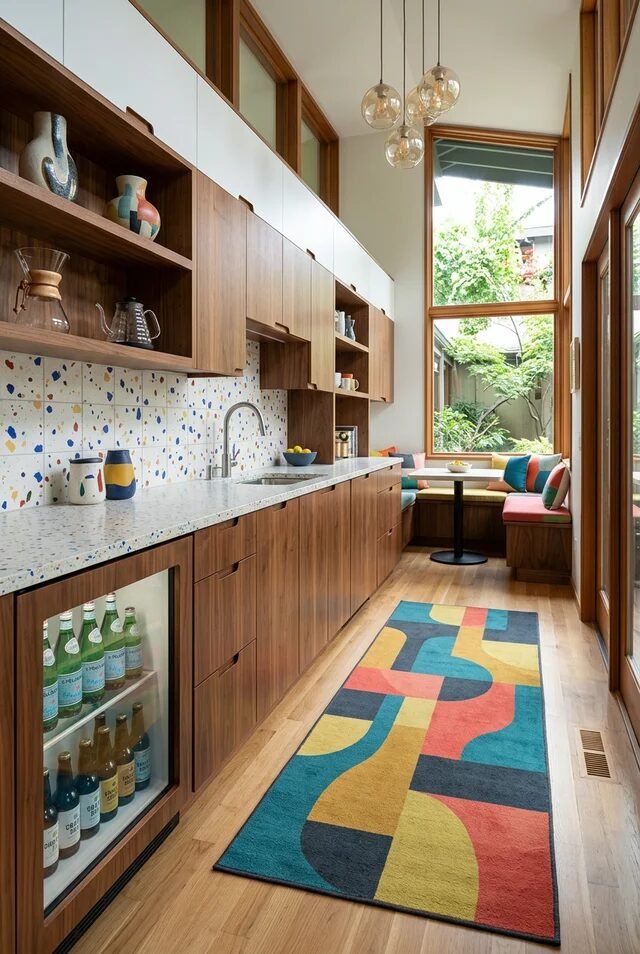
This galley kitchen proves that mid century modern doesn’t have to mean muted or boring. We’ve got warm walnut cabinetry doing the heavy visual lifting, then terrazzo-style backsplash and a graphic runner injecting personality. The design principle here is controlled contrast. Long horizontal cabinets elongate the space, while open shelving breaks up upper mass so it doesn’t feel boxy.
Notice how the palette stays cohesive. Wood grounds everything, white uppers keep it light, and color shows up in small, repeatable hits like the rug and accessories. In small apartments, repetition is your secret weapon. Repeat shapes, tones, and finishes so the eye flows instead of stopping.
If we’re recreating this, keep upper cabinets streamlined, use one statement backsplash, and add under-cabinet lighting to avoid shadowy counters. A built-in banquette at the end maximizes dead space and creates a cozy destination. Small kitchens win when every inch feels intentional.
Green Tile Bathroom With Graphic Flooring
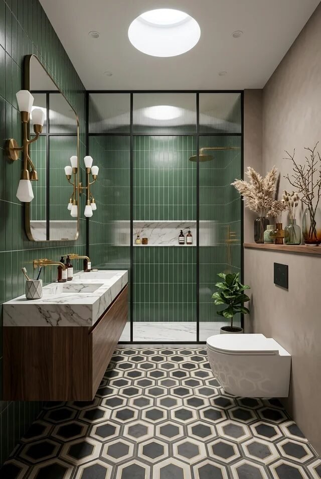
This bathroom is serving bold geometry with zero apology. Vertical green tiles elongate the walls, while hexagonal floor tiles create a strong graphic base. The magic here is directionality. Vertical lines lift the eye up, floor pattern anchors it down. That push and pull creates dynamic balance.
We also see mid century warmth layered in. The floating wood vanity softens the tile intensity, and brass fixtures keep things from feeling sterile. Glass shower partitions maintain visual openness, which is critical in apartment bathrooms. Transparency equals spaciousness.
If we’re recreating this vibe, commit to one dominant tile color and pair it with a neutral secondary surface. Keep cabinetry leggy or floating to preserve floor visibility. Add a skylight or bright ceiling fixture to amplify vertical drama. Mid century bathrooms work best when bold pattern meets disciplined material restraint.
Skylit Living Room With Iconic Chairs
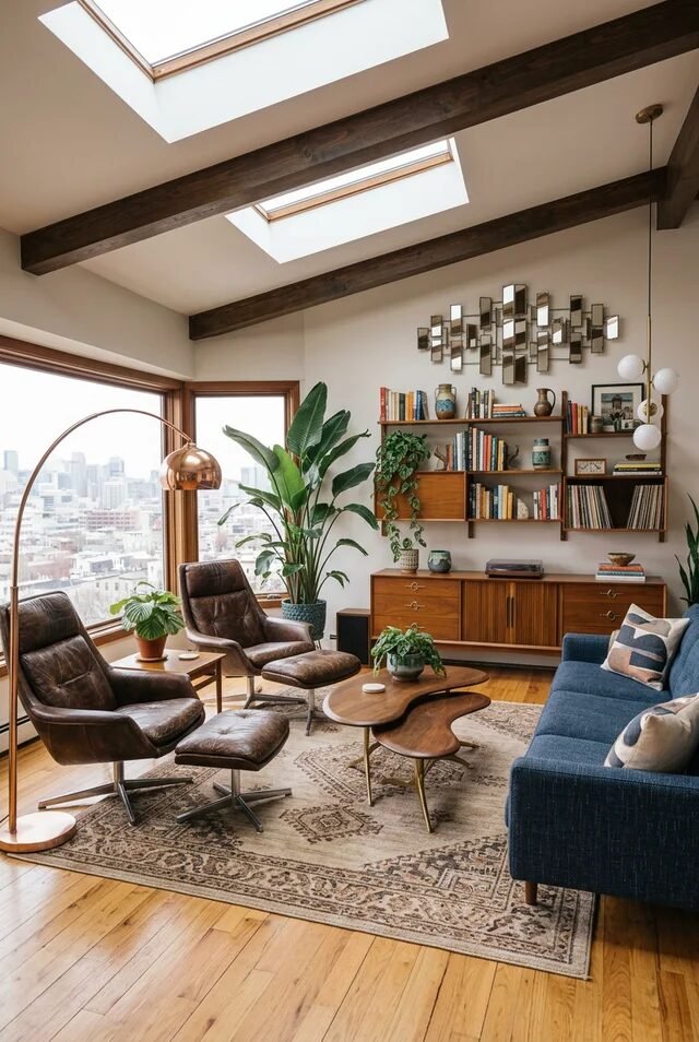
Okay, this is peak mid century energy. Exposed beams, skylights, low slung leather chairs, and sculptural wood tables. The foundation here is architectural emphasis. When the ceiling has beams and natural light pouring in, we keep furniture low to maintain proportion harmony.
The layout centers around conversation. Chairs angle inward, coffee table floats organically, and the rug anchors the zone. That’s zoning done right. In apartments, defining seating areas visually is crucial. Use rugs to outline purpose.
Material layering is intentional. Leather, walnut, brass, wool, and greenery all coexist without chaos because the palette stays warm and cohesive. Mid century modern thrives on earthy saturation, not icy minimalism.
To recreate this, focus on one iconic lounge chair, warm wood storage, and plants for scale. Keep art clustered above eye level to echo vertical beams. Let architecture shine.
Bright Dining Space With Graphic Accents
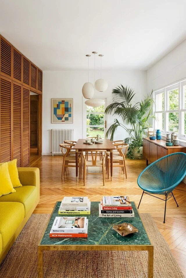
This space nails airy mid century without losing personality. Herringbone floors create subtle movement, while louvered wood doors add texture and rhythm. Texture repetition builds sophistication without clutter.
The dining table is simple and rectangular, letting sculptural chairs and pendant lights take center stage. Notice how color pops are strategic. A teal accent chair, mustard sofa, and geometric artwork add vibrancy but stay balanced through spacing. That’s distribution control. Don’t cluster all color in one corner.
Plants soften sharp lines and introduce organic curves. In apartments, greenery bridges hard surfaces beautifully. If we’re recreating this, stick to light walls, warm wood tones, and one or two saturated accents max. Choose globe pendants for diffused light.
Open Plan Apartment With Retro Framing
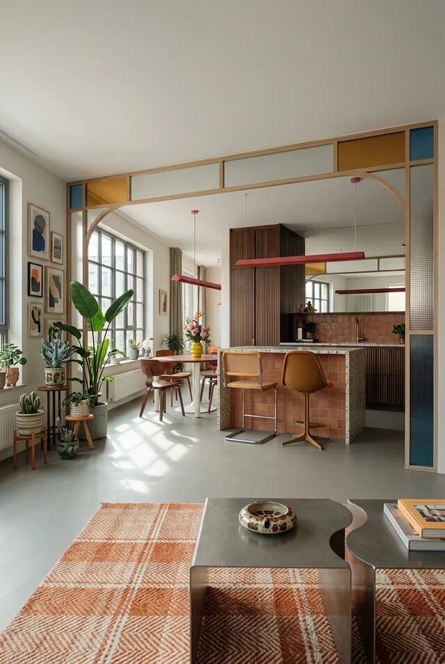
This open plan setup shows how to divide space without building walls. That arched wood partition creates architectural interest while maintaining sightlines. Visual separation without blocking light is elite apartment strategy.
The color palette leans warm with terracotta, mustard, walnut, and soft blue. Notice how tones repeat across different zones. Bar stools echo wood dining chairs. Pendant lights mirror accent colors. That’s cohesion through repetition.
The kitchen backsplash introduces texture, but cabinetry stays streamlined to avoid visual noise. Furniture silhouettes are slim and elevated, which keeps the open plan feeling breathable. In small apartments, bulk is the enemy.
If we’re recreating this, use room dividers with glass or open framing, repeat wood finishes across rooms, and define areas with rugs rather than walls. Mid century open plans succeed when boundaries feel suggested, not imposed.
Design With Intention, Not Just Aesthetic
The beauty of mid century modern apartment design is that it teaches us discipline. Every line, curve, and material has a job. Form follows function, but personality still gets a seat at the table. We focus on visual balance. We repeat wood tones for cohesion. We use geometry strategically so spaces feel dynamic, not chaotic.
In smaller apartments, this approach is powerful. Floating vanities make bathrooms feel bigger. Leggy sofas keep living rooms breathable. Open shelving adds rhythm without heaviness. Even lighting choices, like globes or brass pendants, reinforce the era without screaming retro.
What makes the style timeless is its clarity. There’s structure, but there’s also warmth. There’s boldness, but there’s editing. When we design with intention instead of impulse, our apartments don’t just look good in photos. They feel cohesive, livable, and quietly iconic every single day.