Budget-Friendly Deck Skirting Ideas That Look Expensive

You can lay out a whole lot of money on high-falutin’ deck skirting, and it’ll be as dull as un-buttered toast if it doesn’t play visually. We’ve watched some genius master craftsmen take old reclaimed lumber and pieces of lattice and, through some kind of magic, it appears that it came out of some designer’s mind who cares. The magic trick? It’s not how much you paid; it’s what you do with it.
Consider deck skirting as the base molding of your home – it’s there for more than just hiding the nasty stuff. No, it’s gotta keep everything together, proportion, and – this is where most folks screw up – concord with contrast and color. Whether you have a mere $20 or a generous $200 burning a hole in your wallet, the same design ethos applies: it’s not how much you paid but where you trick the eye into looking. Terrible, we’re sure 🙂
When to Blend, When to Pop—Understanding Visual Intent
High Contrast = Bold and Designed
Contrast, when you sit back and think about it, can turn a boring form something that makes your neighbors drool. In deck design, high contrast is not a function of slapping different colors together like a six-year-old with markers. It’s about being completely in charge: where do you want eyes to go? What do you want to yell, “See me!”? Striking skirting essentially isolates the base from the platform, making what’s otherwise as clear as a dirty sock a design rockstar.
It establishes a pecking order among pieces and imbues the entire silhouette with some much-appreciated definition. That’s why having a high-contrast arrangement tends to look cleaner, more “I meant to do that,” and put-together with real intent. When your materials are cheap and cheerful, contrast is your secret weapon for identity. It’s whispering to each and every passerby, “Honey, this wasn’t just scrap wood – it was meant for greatness.”
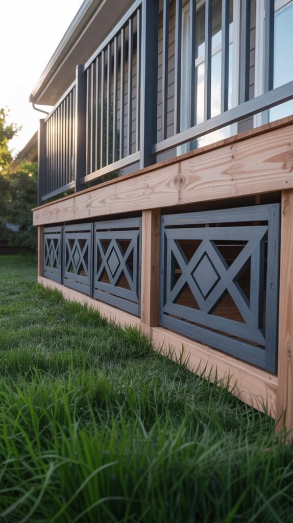
The above photo, goodness gracious, illustrates how a skirting style can basically hit you over the head with just how dramatic it is when contrast is kept in check with a leash. Those diamond-shaded panels of panels, coat painted a menacing deep charcoal, are basically giving the raw pine frame the cold shoulder. But rather than looking like a hot mess, the repetition and keeping it within the bounds of the deck makes it all very clean-looking.
The vacant space where the pattern isn’t is practically begging for sun to pour through, providing texture and a dash of mysterious depth. This, people, is contrast being the know-it-all: aware, suggestive, and completely peaceful. It sets the stage, near shouting “master craftsmanship,” and gets noticed without having you feel overwhelmed. It’s like a visual mic drop.
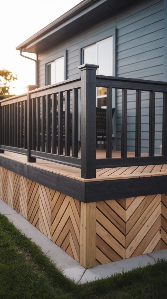
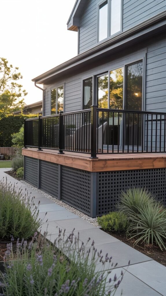
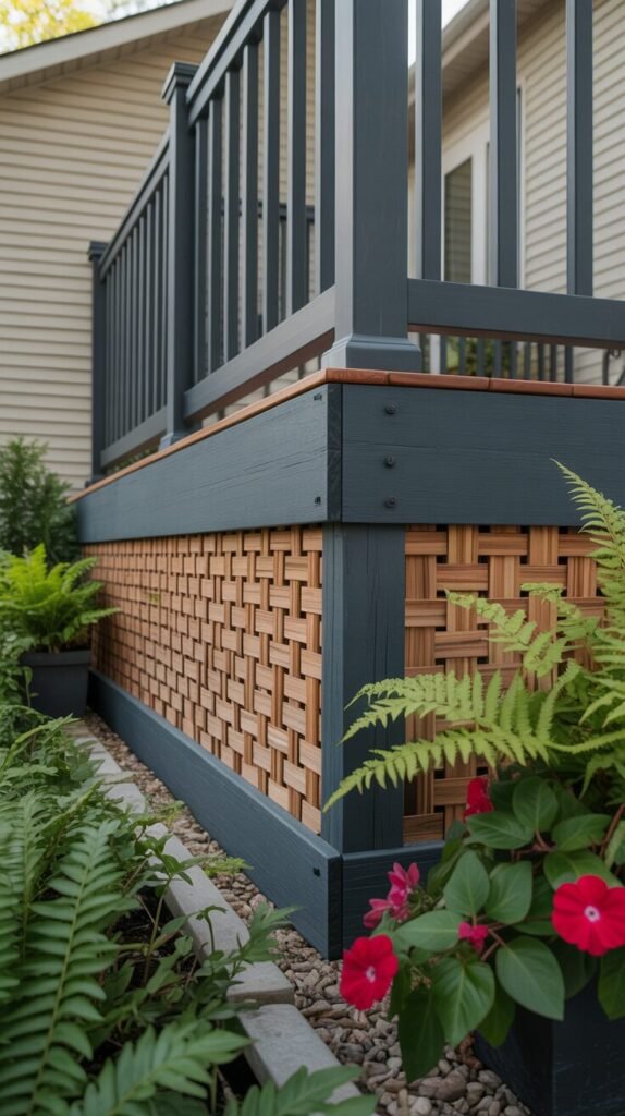
In this second instance, a person went crazy with a herringbone skirting pattern mixed with dark inky black trim, turning the deck base into an ego trip of architecture. The diagonal wood design already has a jazzy look, but edged with black, it’s so graphic that it might be used as a logo.
This type of high-contrast blocking definitely merits a standing ovation and adds character to the deck – completely separate from the house it’s going on. It resembles hand-crafted one-of-a-kind elfwork, though material is most likely the stuff you have sitting in your big box store. Shhh, don’t tell.
Style Tip: Don’t shy away from black or dark tones—use them to outline, frame, or emphasize patterned skirting for a designer-level finish.
Low Contrast = Seamless and Subtle
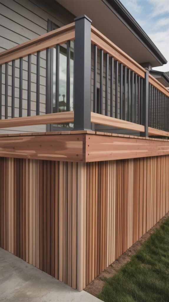
In deck construction, contrast generally takes center stage, but low contrast? That’s where sophistication, elegance magic is. Rather than shouting, “Hey, check out what’s hiding under my deck!” low contrast skirting causes the entire affair to melt together like a master smoothie-maker.
By repeating the colors on your deck boards, skirting, and siding, you establish a visual Slip ‘n Slide rather than a disjointed mess. This illusion is accomplishing more than creating everything to look smoother; it’s making small decks look downright huge and cheap material into something hand-selected by a connoisseur. It’s tone-on-tone layering: light on light, dark on dark, or warm on warm. It’s not concealing anything; it’s about creating with a whisper, not a bellow.
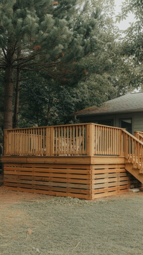
This deck (see, the one in the photo above) is actually a study of material coherence through sheer repetition. The decking, railing, and wood slat skirting are all warbling the same consistent refrain, and there’s not a positive visual dramatic space between the pieces.
With materials probably less expensive than your morning coffee, that deliberate color consistency gives the whole construction the sense that someone actually gave a darn about what they were doing. The spaces at the bottom of every horizontal board are like a restrained rhythm section, not trying to upstage anyone else, and the skirting just vanishes – it’s just part of the deck’s DNA, not some clunky afterthought.
Style Tip: Use warm neutrals or colors filtered through a desaturation filter – fewer eyeball screams equal more design zen. You’re welcome.
READ MORE >> “The Best Deck Stain Color Ideas for a Stylish Outdoor Upgrade”
Color Blocking Tricks That Fool the Eye (and Your Budget)
Two-Tone Deck Skirting—A Designer Move on Dollar Store Budget

Two-tone deck skirting is one of those genius hacks that allows you to copy a designer-level aesthetic without necessarily requiring a designer-level budget. It’s all contrast – and not always the obvious bold against neutral. We’re talking matte against shiny, frame against content, or paint against stain. Be creative.
This multi-layered appearance really adds dimension to a surface otherwise flatter than a pancake, and cost materials such as lattice or plywood become instant architectural successes. Two-tone doesn’t require costly materials – only creative color blocking and some visual balance. It succeeds because our brains can be tricked into believing that contrast = intention. When they do manage to get it right, the base of the deck looks like a distinct, elevated building, not simply an afterthought that they added in there.
The actual deck itself is topped with some retro-looking white vinyl lattice as an underlayment, edged with an inky navy-blue wood trim. That really sharp line where the light and dark meet just makes the eye draw right over it, making the building wider and rooted deeper. The band painted along below deck surface is getting dressed up as a fascia board and forms a solid top line that just exudes “polished.” Using the same white and blue colorations for the railing, the deck now appears as a single front, top to bottom.
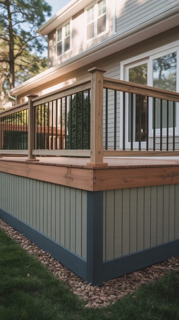
This look is an outlaw; it totally turns the script on its head – placing the lightest color (sage green, why not?) in the field area and then grounding it with dark blue trim on both the base and the upright corners.
The black shadow line is really a visual bodyguard, cinching up the structure and providing crystal-clear definition. The color blocking here transforms mundane vertical planks into something fitted and layered, so the deck feels more “I worked this out” and totally finished. It’s almost too smart.
Style Tip: Use paint or stain in zones: frame pieces dark, infill pieces light—it tricks the eye into thinking the build is more expensive.
Painted Frame, Raw Infill
There is something quietly elegant about simply allowing texture to speak for itself. Framed infill, unadorned works because it’s a bit of a game of the mind – we’re not coloring in the middle of it to draw eyeballs; we’re framing it in order to present the natural content as ginormously significant. That sleight of hand particularly comes into its own when the material of the infill is intriguing enough to hold its own two feet – be that wood grain, some wondrous weave, or a naturally occurring pattern.
The painted border creates borders that cause the raw material to ring as deliberate, not like you used up paint halfway and stopped. It’s an illusion built on control: instead of completely letting go and coloring everything, you guide the eye by working off the way things get handled, not their color. If you do it well, this trick is earthy, a little bohemian, and absolutely sophisticated – without using top-level materials. Relief.
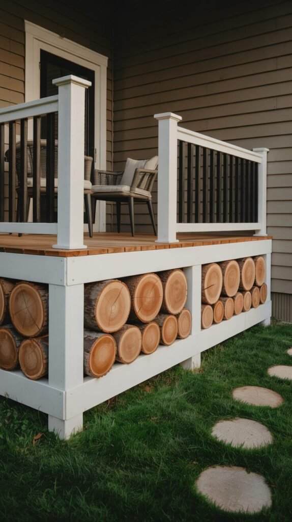
The above is employing a white sparkling frame to feature raw log cross-sections stacked like an amazingly trendy heap of wood. It is technically easy: squared cuts, snug fit, and a standard post-and-beam frame. It is the contrast, however, where the magic lies. The white painted trim simply accentuates the natural lines of the wood, so each cut looks like it should be hanging in an upscale art gallery. The open space between the logs prevents it from looking too much, like it’s on a diet. It’s an economy build, but it reads custom – because the frame essentially says, “Stop and stare, you fool!”
Here we have a painted frame drawn in dark colors sharply defining a warm, woven-pattern infill of strips of natural color. The basket weave texture is snug and tight with an agreeable rhythm, but the real brilliance lies in how it’s all held within that painted framework.
The frame takes raw craft and makes it visual architecture – neat, geometric, and firmly deliberate. This contrast not only establishes borders, but also infuses a bit of class without losing the natural elegance of the wood. It’s kind of like a fashionably dressed wild child.
Style Tip: Choose a matte finish for the frame and leave the infill raw or oiled—this heightens the contrast in both tone and texture.
Faux Contrast via Shadow & Depth

Since we are talking about thrifty deck skirting that will cost you an arm and a leg in your mind, not every trick of the eye has to be achieved with yellie paint or wood that probably cost you more than your first car. Educate yourself on shadow and depth. This little treasure is constructed on the method used to produce the effect of visual depth – but material is as good as pie. You can fake contrast using layering, indenting, or dimensional texture and never lift a finger with a second can of paint.
And that’s why it’s so scandalous on the deal, because you’re literally cutting with shape instead of finish. Those patterns then become sculptural, tall, and just plain designer-approved, but they’re most often simple enough to try doing yourself. It’s not skin-deep difference; it’s in the structural core. And that, people, is a game-changer.
This second illustration is so committed to the idea of depth it’s a next-to method actor – inset wood attempting to introduce that old shadowbox look from trim panel squares. Observe how the black molding isn’t just adding ornament to the face; it’s actually taking up space, creating that relief and contour. What illusion is being attempted here isn’t that you’re working with something more than one color; it’s merely the nature of shadows.
The result is a rich, architectural texture that adds sophistication without hiking up the costs. It mimics the kind of built-ins you’d expect to see on a designer home’s wainscoting or cabinetry, but someone clever decided to repurpose it outdoors. That’s the sheer genius of faux contrast. Your eye automatically translates “dimension” into “expensive” – even when the core material is just humble pine and a bit of paint. Suckers.
Alternating shade and depth vertical slats is the second close living well-layered animal drawing. Wood with varying degrees of shade already has the capability to create something interesting, but the color got darker and cylinder form under the slats is what creates that pinch of magic. No stain – only light and volume alterations at play. It’s hot, it’s fast, and it actually does look like they made an effort because they cared. Imagine that.
Style Tip: Use low-angled sunlight or wall-mounted lighting to exaggerate the shadows—that’s when faux contrast really sings.
READ MORE >> “9+ Unique Home Greenhouse Inspirations You’ll Fall in Love With“
Design Smart, Not Expensive—Let Every Detail Pull Its Weight

It’s not the price, honey; luxury is simply what you gaze at. And since we shamefully borrowed with this book, your tiptoeing across the deck is bound for more brawn than most homeowners ever imagined. By shameless borrowing of strategies such as contrast, depth, repetition, and visual purpose, even your lowbrow do-it-yourselfer can shout, “I’m high-end, baby.”
Whether it’s blending color to create a seamless appearance or employing shadows to deceive the eye into experiencing contrast, both approaches work smarter – not more expensively. It’s merely a matter of getting inside people’s heads and understanding what they perceive spaces to be, then letting that distorted information dictate your styling decisions.
Because when each. single. board. slat. or frame is two-toned – functional, yes, but also aesthetic – your yard is less utilitarian backyard and more architectural mic drop moment. It’s proof positive that budget builds simply can’t be, ahem, a budget.