The Three Essentials of a Well-Designed Fireplace: Color, Space, and Flame
Ever walk into a living room and think, “Wow, this place just feels right”? Chances are, the fireplace was doing its job without you even realizing it.
We’ve all been stuck with fireplaces that felt like that one awkward relative at a party—just… there, maybe holding up a sad-looking decoration or a dusty old doll. But in the world of interior design, especially in your living room, a fireplace isn’t just a decoration.
It’s the main event, the focal point, and the life of the party, controlling the mood and flow of the entire room. Ignoring its potential is like trying to cook a five-star meal without a stove—you’ll just end up with a mess. So, let’s pull the fireplace out of design purgatory and give it the superstar treatment it deserves.
Color as a Communicator: Setting the Emotional Temperature
Earthy Tones, Deep Contrast, or Clean Neutrals?

Earthy colors are pros at making a big, heavy fireplace feel warm and inviting, like a cozy hug for your soul. Think of rich terracottas, soothing olives, or deep browns that feel like they belong there.
They aren’t trying to steal the show; they’re just quietly saying, “Hey, I’m here to soak up all the good vibes.” Pair them with natural textures like rattan, linen, or real wood, and you’ve got this whole cohesive little world of fire.
This palette is perfect for that “rustic-modern-but-not-cheesy” look, or even if you just want to feel like you’re in a cozy cabin. It creates a sense of sophistication and warmth without trying too hard.

On the other hand, if you’re feeling a little dramatic (and who isn’t sometimes?), deep, rich colors like charcoal, espresso, or a mysterious midnight blue can turn your fireplace into a bold statement piece.
It’s a powerful move that says, “I know what I’m doing!” When the rest of the room is light and airy, that dark fireplace acts like a piece of sculptural art, grounding the entire space. The contrast instantly draws your eyes in, bringing a sense of order to the room.
This is a winning combo for rooms with a clean, modern look or when you’re going for a moody, “let’s-turn-the-lights-down-low” speakeasy vibe. We’re not just throwing paint on a wall; we’re creating a visual symphony.

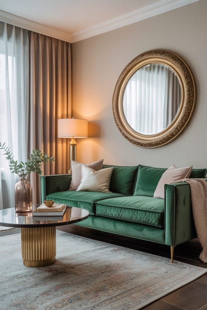
And then there are the “barely-there” tones of clean neutrals: soft ivories, subtle greiges, and crisp whites. They don’t just blend in; they let your fireplace space breathe without disappearing entirely. Add some texture—like smooth plaster, beautiful limewash, or polished limestone—and the whole thing still feels interesting without looking like a bland box.
Clean neutrals are a miracle in smaller living rooms, where a feeling of openness and unclutteredness is key. They let the flame do all the talking, making the fire the only lively thing in the room. It’s a look that says, “I’m poised, I’m elegant, and yes, I’ve mastered the art of quiet balance.”
Working with Material Colors — Stone, Brick, and Painted Finishes

Choosing materials is as much about aesthetics; it’s the nasty, grimy little secrets that its color holds that affect the entire mood of your environment. Natural stone, for example, is basically a workhorse with Mother Nature’s color variation. It’s tough to try to imagine warm travertine sunbathing, cool gray slate clearly too cool for school, or creamy limestone which just wants to snuggle you.
These small things quietly boss the rest of your color scheme into submission. When we choose to incorporate stone in a fireplace, we’re not necessarily being practically practical; we’re actually investing in an already established color scheme that’s too obstinate to monkey around with.
So, yes, it really does generally best to let the stone be boss here, unless you just so happen to like fighting a losing battle. There is the actual harmony, and not where it is a wretched victim.

Brick, though, is a whole different beast. Unlike the upscale snobs of natural stone, brick often comes crashing in with loud, opinionated colors – loud reds that scream “barn,” earthy oranges that whisper “pumpkin spice,” or whitewash neutrals that try to be cool.
It depends on how you mortar it and what types of joints you provide, though. Brick can be a cacophonous mess or the well-composed symphony. It is certainly a grounding element, but a friend who has to be styled around consciously as well.
The secret? Keep its supporting cast in check. Too many jarring colors, and your fireplace will clang like a cacophonous toddler. Rather, let the brick have its turn, tempering its heat with a well-chosen selection of accent pieces, and reserving the remainder of the room for coolness.
READ MORE >> “9+ White Living Room Ideas That Feel Warm and Welcoming“

Then there are painted finishes – the most pliable of them all, but so frequently misinterpreted. Painting a fireplace surround provides you with complete control over the color, such as being a colors crazy scientist. But, twist that you don’t expect, it also removes all of the killer textural stories that stone or brick are able to tell.
This isn’t necessarily a bad thing, but it does mean that you’re having to either do the whole go-big-with-contrast approach or just flat-out accomplish that “less is more” look. A matte-black painted mantel can be the eye-grabber that’s keeping everything cohesive, while a pale white finish can simply merge with the wall like it never happened.
The actual magic is the way this painted chameleon interacts with your neighbors – is it respectfully talking to your trim, blending with your floor, or simply giving you a moment of peaceful silence?
Flame as the Focal Point
Supporting the Flame: Mantels, Sconces, and Lighting Layers

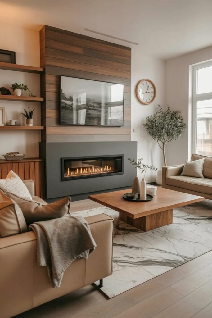
The fire? That’s got a visual warm burden of its own; it’s almost a one-man production. But with good backup singers, it’s a rockstar warbling into the kazoo refrain. A mantel isn’t a memorial facility for your garbage; it’s a handy little ledge curving around the activity and infusing presence into the background and the fireplace, which they so desperately need.
Material does play a role, naturally: slatted wood mantles advertise “light and airy,” but plaster or stone mantels are all about that “solid and for always” vibe. But guys, proportion is just flat-out important. Too thick, and it’ll overpower the flame; too thin, and it’ll get lost. The key to the sauce is not placing the mantel on the shelf duty for your gnomes, but as a sculptural, clean underline – its only function is to hold the flame hand, not rival it.

Sconces? Vertical rhythm along your hearth, and it’s beautiful. Place them either side, and with accuracy, and they appear to sweep your eye on a whizzing tour upwards and outwards, and look, your fireplace is larger without even being a full-size bully.
No matter if you go for retro brass with tales to tell, hot matte black that’s so hip it’s literally not allowed in school or glass fluted that literally can’t help but upstage the rest, sconces have about them an air of even-keelness that literally can’t help but brag about with the warm golden glow of the flame.
They’re also wonderful at adding a bit of drama to darker spaces, so your fireplace wall isn’t vacuumed into a black hole during the evening. And goodness gracious, don’t tamper with the light temperature here – warm white bulbs (around 2700K) and candlelight are old friends, but cold light will have everyone frightened and leaping at shadows.

Other than the mantel and sconces, your whole lighting scheme is actually the mood director. Dimmable recessed ceiling lights, floor lamps which angle just right, and sneaky LED strips behind built-ins can all be part of what we love to refer to as “layered illumination” – a fancy term for “making your fireplace look rad.”.
The idea isn’t to illuminate the room with a burst of light; it’s to dance shadows and illuminate the fire, not glare. By gently leading you through lights and darks, we unmistakably bring the fireplace into focus as the visual and emotional center of the room. It’s not even how much light it is; it’s setting the visual rhythm, creating depth, and giving your eyes a spot to land, not run a marathon.
Embracing Negative Space: Letting the Fireplace Breathe

In an insane era of filling up every nook and cranny in range, we lose sight of the fact that what you don’t have in a ring around the fire is as precious as what you do. There is no such thing as lost space; it is just intentional breathing room so it can exist without the nightmare of cutting lines on an episode of “Hoarders.”. Plunking a fireplace in front of grotesquely oversized artwork, piled bookshelves laden with questionable knick-knacks, or furniture nearly embracing it, we effectively negate its purpose altogether.
Instead, we’d prefer to create a graphic sigh of relief – room to breathe in which your peepers can catch their breath. That can be keeping a lot of bare wall space around the fireplace (gasp!), furnishing pieces that do not look like you’ve gorged on all the pies, or just not feeling like you have to feel compelled to over-accessorize the mantel with your frames and candles.
Good on you, this “void” space is a design success – it honors the fireplace, not the spam-mail-like disrespect for it. It adds a bit of proportion, so the flame is more of an architectural feature than an ornament. Other times, simply allowing it to breathe is what really makes it stand out.
READ MORE >> “9+ Gorgeous Living Room Wall Decor Inspirations You’ll Want to Copy“
Design Lives in the In-Between: Where Color, Space, and Flame Converge

The flames that engulf you with your jaws stretched wide, agape? Those never occur in rehearsal as a result of some flashy, showy trick. They happen as the byproduct of the secret handshake between those things we sometimes call distant cousins.
When the color is the gentle traffic cop, when vacated space can catch its breath, and when the fire is really the true heartbeat of the room, something magical occurs. The fire pit is no longer merely a mere “thing” but rather a rhythm – a hushed dialogue of infinite energy and sophisticated restraint.
Fantastic design is not about solo superstars but about the way those superstars coexist. That high level of space between flame, color, and space is where we don’t necessarily see beauty but rather find balance. And that, people, is where magic happens.