What Actually Makes a Bookshelf Look Styled (Not Just Full)
Let’s be honest—bookshelves are no longer just about holding books. They’ve officially entered their main character era. The way we style them now reflects how we live, what we love, and yes… how aesthetically online we are. A well-designed bookshelf blends function with visual storytelling, turning everyday storage into something that actually feels intentional.
Across these ideas, we’re not just stacking books—we’re layering textures, playing with height, and creating visual flow. Whether it’s color coordination, warm lighting, or sculptural shelving, each approach uses core design principles like balance, contrast, and rhythm. And the best part? None of this requires a full renovation.
What we are doing is shifting mindset. Instead of asking “where do these books go?” we start asking “how do we want this space to feel?” That’s when a bookshelf stops being background furniture… and starts quietly stealing the show.
Color-Coordinated Bookshelf That Feels Effortlessly Styled
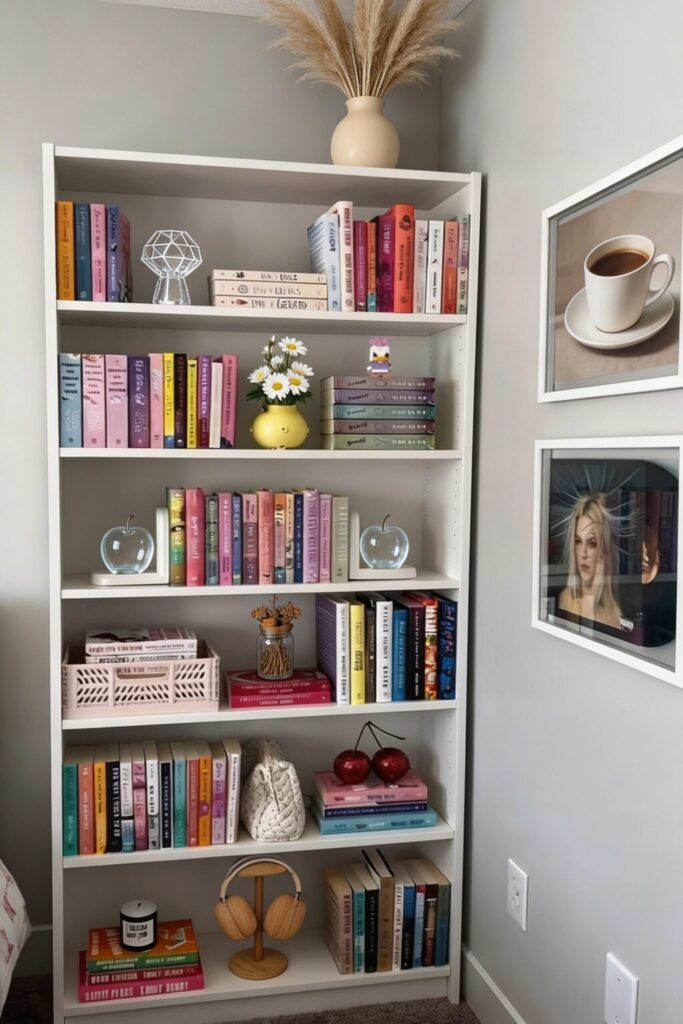
There’s something oddly satisfying about a color-coordinated bookshelf, and no, it’s not just Pinterest brainwashing us. It’s actually rooted in visual harmony. When books are arranged by color, we create a natural gradient that guides the eye smoothly across the shelf. This reduces visual clutter even when the shelf is technically full. We’re basically tricking the brain into seeing order instead of chaos.
To recreate this, we don’t need a rainbow explosion—soft tonal groupings work even better. Try clustering books into warm vs cool palettes or muted pastels like in this setup. Then break the repetition slightly with decor pieces (like a geometric object or a small vase) to avoid it looking too “perfectly staged.” The magic is in controlled imperfection.
Also, let’s talk spacing. Notice how some books are stacked horizontally? That’s not random. It creates rhythm and gives your eyes a place to rest. Add one or two sculptural objects per shelf and suddenly… we’re interior designers now.
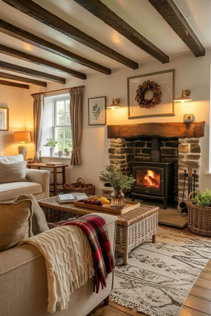
Cozy Library Wall That Feels Like A Hug
This is what happens when we stop treating bookshelves as storage and start treating them as an experience. Floor-to-ceiling shelving instantly creates immersion, making the room feel like a personal library rather than just a living space. The key principle here is enveloping the space to build atmosphere.
Lighting plays a huge role too. Warm string lights layered across the shelves soften the structure and make everything feel intimate instead of overwhelming. Pair that with trailing plants, and suddenly we’ve introduced movement and life into what could’ve been a static wall. Contrast between structure (shelves) and organic elements (plants) is what makes this work.
And let’s not ignore the furniture placement. The seating is pulled close to the shelves, creating a “reading zone” rather than floating awkwardly in the room. If we’re recreating this, anchor everything with a rug and keep tones warm and earthy. Bonus points if a pet casually claims the spot. That’s just good styling.
Floating Shelves That Double As Wall Art
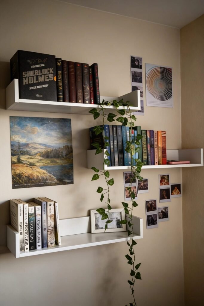
Floating shelves like these are basically the minimalist’s version of a gallery wall—but smarter. Instead of hanging art everywhere, we’re layering books, prints, and objects to create depth. This works because it combines function with visual storytelling.
The layout matters more than the objects themselves. Notice how the shelves are staggered? That asymmetry keeps the wall from feeling stiff or predictable. We want movement. Start by placing your largest books or art pieces first, then build around them with smaller items. Think composition, not decoration.
Trailing plants are doing a lot of heavy lifting here too. They soften the sharp lines of the shelves and draw the eye vertically, making the wall feel taller. If we’re recreating this, keep the color palette tight—neutrals with one or two accent tones max. Otherwise, it can quickly turn into visual chaos (and not the cute kind).
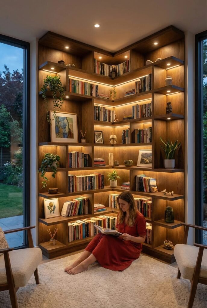
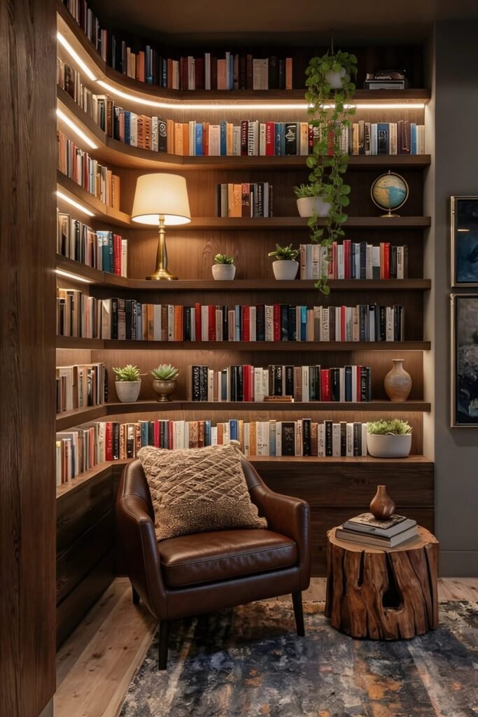
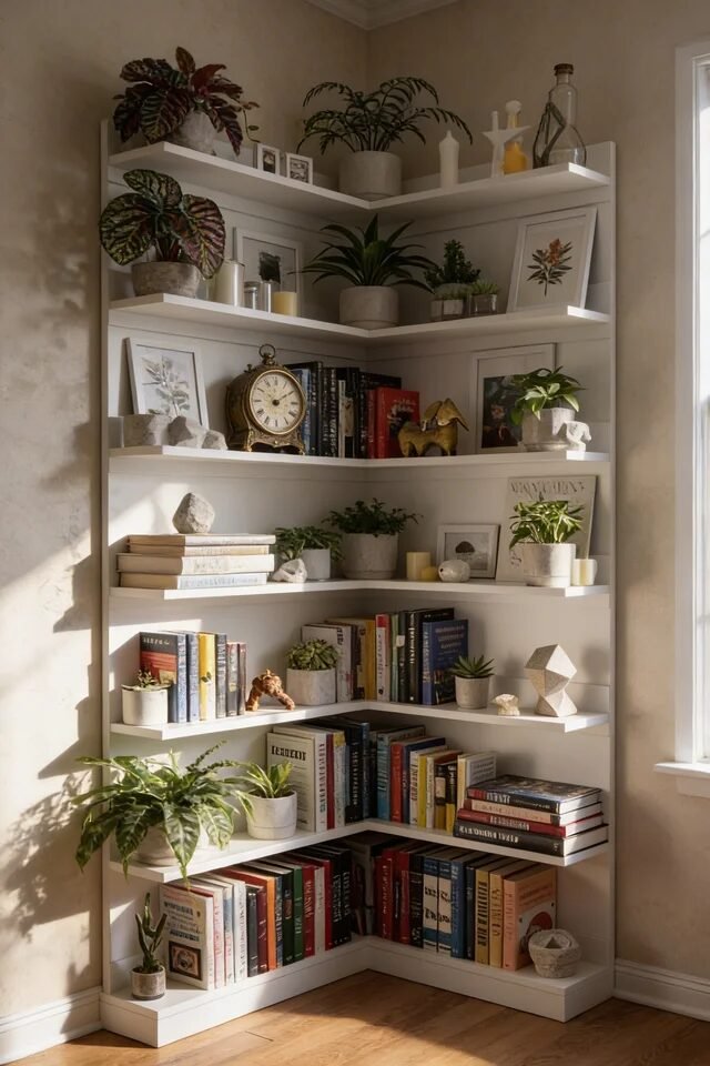
Corner Shelves That Glow With Warm Depth
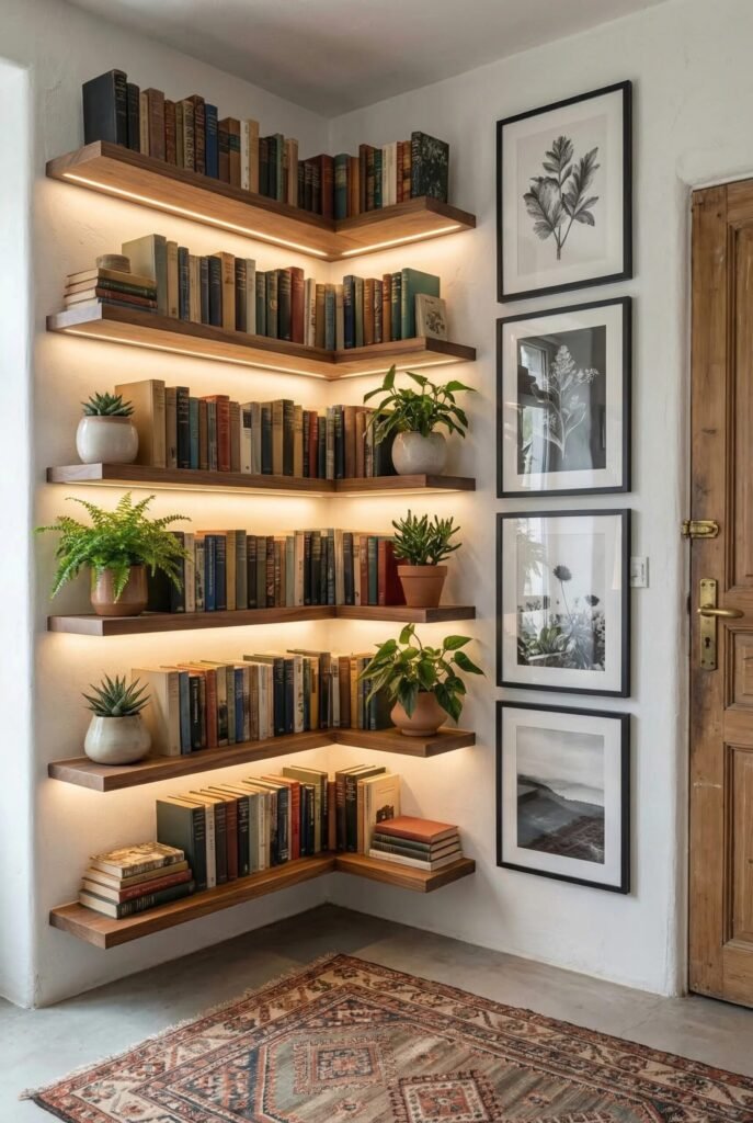
Corner shelving is criminally underrated, and honestly, this setup proves it. Instead of wasting that awkward corner, we’re turning it into a layered focal point. The L-shaped design naturally creates depth and makes the room feel more expansive.
The real star here is the lighting. Integrated LED strips under each shelf create a soft glow that highlights the books without being harsh. It’s subtle, but it adds dimension and makes everything feel curated. Lighting isn’t just functional—it’s atmospheric.
To recreate this look, stick to a cohesive material like warm wood for consistency, then vary what you place on each level. Mix books with plants and small ceramics so it doesn’t feel repetitive. Also, keep heavier items on lower shelves for balance. We’re not just decorating—we’re engineering visual stability (yes, it’s a thing).
Low Bookshelf Styling That Feels Intentionally Minimal
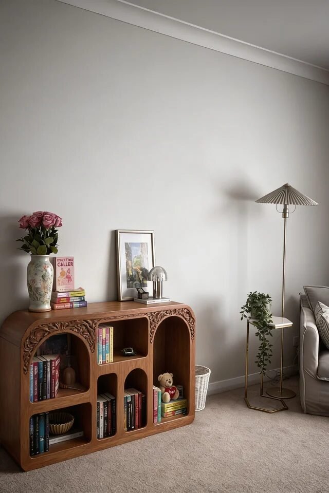
Low bookshelves are tricky because they can either look effortlessly chic or like we just ran out of furniture budget. The difference? Styling. This look works because it embraces negative space instead of fighting it.
Rather than cramming every inch with books, we’re keeping things sparse and intentional. A few stacked books, a sculptural lamp, and a floral arrangement create a balanced composition. The empty wall above actually enhances the setup, making it feel calm and elevated. Sometimes less really does more—annoying, but true.
If we want to recreate this, focus on proportions. Keep objects at varying heights so the eye moves naturally across the surface. Stick to a tight color palette—warm wood, soft neutrals, maybe a muted pop of color. And please resist the urge to overfill it. The whole vibe depends on restraint… which, yes, is the hardest part.
Sculptural Corner Shelf That Maximizes Awkward Space
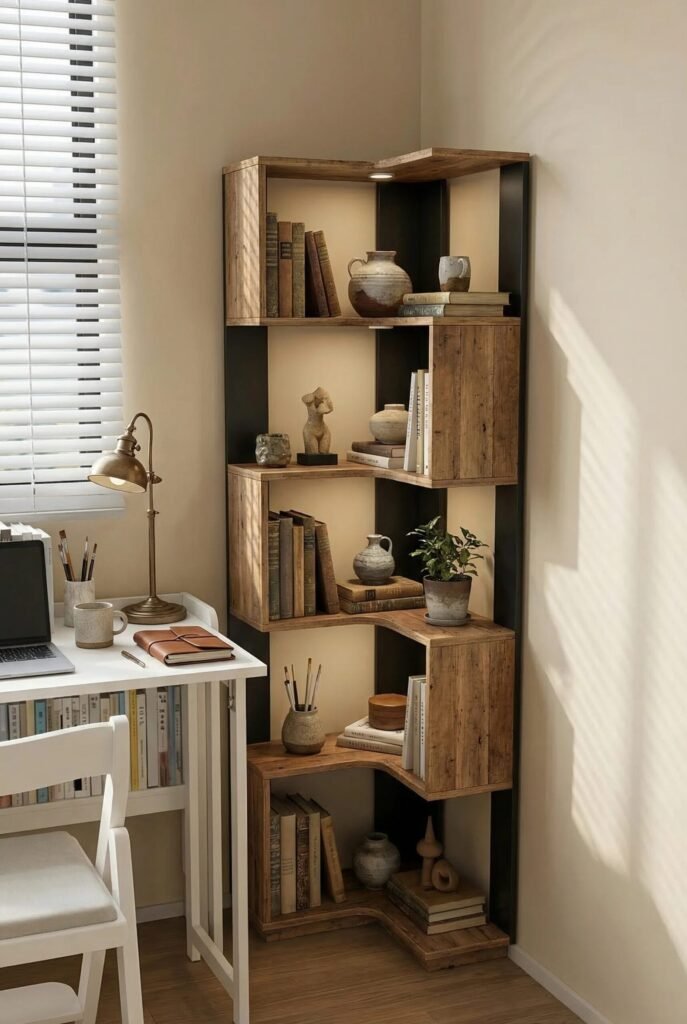
Corners are usually where design dreams go to die… unless we do this. A sculptural corner shelf like this transforms dead space into a vertical feature. The staggered cubbies create movement, so instead of one flat plane, we get dimension and visual rhythm. This works because asymmetry adds interest without overwhelming the eye.
When styling it, think in clusters instead of rows. Mix books with ceramics and small plants so each section feels intentional, not repetitive. Notice how some compartments are fuller while others breathe? That’s negative space doing its job. We don’t fill every slot—we curate it.
Also, keep heavier visual items toward the bottom to ground the piece. Lighter decor and fewer items go up top. It’s subtle, but it keeps the whole structure feeling stable and balanced. Basically, we’re styling… but with strategy.
Built-In Reading Nook That Feels Luxuriously Layered
This is giving “we accidentally became sophisticated,” and we’re not mad about it. Built-in shelves wrapping around a corner instantly create a cocoon effect. The design principle here is enclosure—it makes the space feel intimate and intentional.
The warm wood tones paired with integrated lighting? That’s what elevates it from basic to boutique hotel energy. Lighting tucked under shelves creates depth by highlighting textures and book spines. Layered lighting = layered atmosphere.
If we’re recreating this, don’t just focus on shelves—anchor the space with seating. A leather chair, a small side table, and soft textiles complete the story. Keep decor minimal so the books remain the hero. And yes, adding a trailing plant is basically mandatory at this point.
Rustic Wall Shelves With Soft Ambient Glow
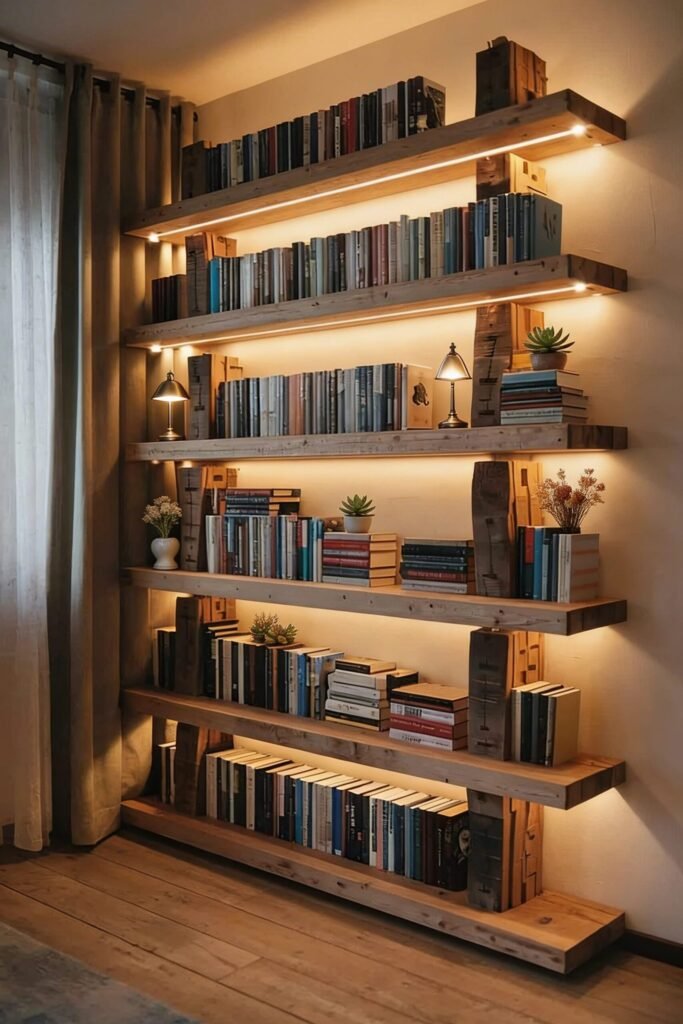
These shelves are proof that simple can still be stunning—if we do it right. Thick wooden planks paired with warm backlighting create contrast between raw and refined. That tension between rustic texture and soft light is exactly what makes this feel high-end.
The spacing between shelves is doing a lot of work here too. They’re evenly distributed, which creates order, but the styling breaks that order slightly with stacked and vertical books. Balance structure with variation so it doesn’t feel robotic.
To recreate this, stick to a consistent wood tone and avoid mixing too many finishes. Then layer in small decor pieces like vases or mini lamps to break the linear look. And keep your color palette tight—this style thrives on restraint, not chaos.
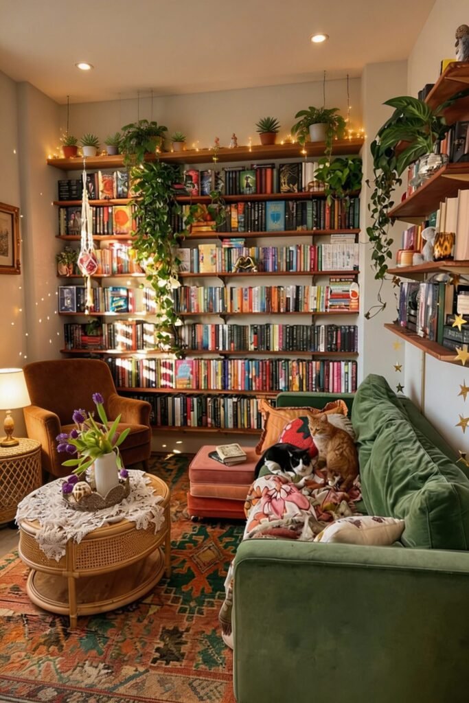
Maximalist Library Wall That Feels Collected
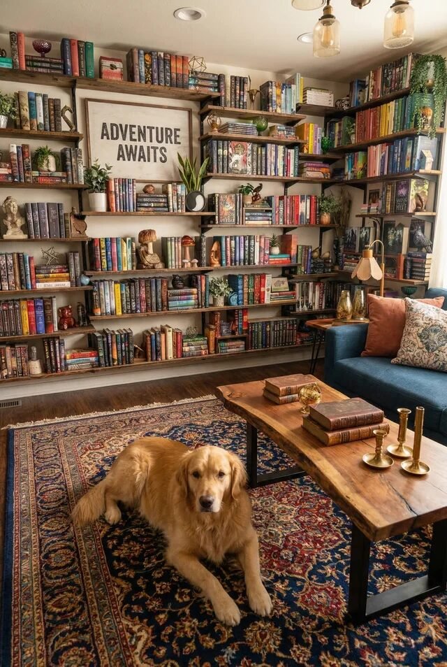
Okay, this one is for the “more is more” crowd—and we fully support it. A full wall of bookshelves like this works because everything feels curated, not random. The key is controlled abundance, not clutter.
Books are arranged in varied orientations, mixed with art, plants, and objects that tell a story. That variety keeps the eye moving across the entire wall. But notice the consistency? Similar wood tones and repeated colors tie everything together. Repetition is what makes maximalism feel intentional.
If we’re recreating this, start with books as your base layer, then slowly add decor. Step back often (yes, literally) to check balance. And don’t forget a focal point—like that large artwork—to anchor the chaos. Also, having a dog casually placed in the scene? Elite styling move.
Sculptural Tree Bookshelf That Doubles As Art
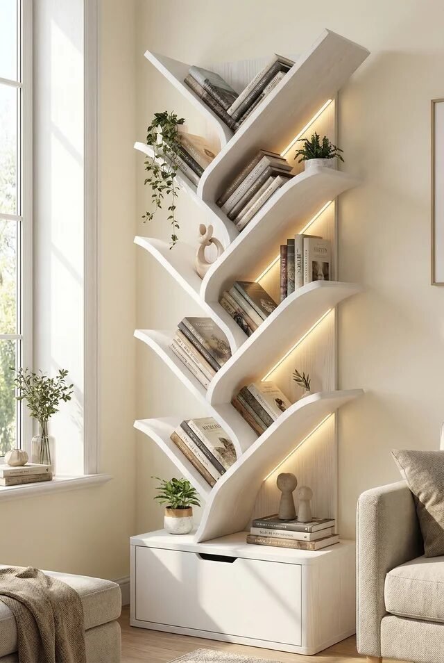
This is not just a bookshelf—it’s a personality trait. A tree-style shelf like this instantly becomes the focal point because of its organic shape. Curved lines break the rigidity of traditional furniture, making the space feel softer and more dynamic.
The diagonal shelving also naturally guides how we place books. Instead of rigid rows, we get a more relaxed, layered look. Keep books slightly angled or stacked to match the flow. We’re working with the design, not against it.
Lighting integrated along the curves adds dimension and highlights the shape, especially in neutral spaces. To recreate this, keep everything else minimal—let the shelf do the talking. Add a few small plants or sculptural decor, but don’t overdo it. This piece is the moment.
When Styled Right, Bookshelves Quietly Steal The Show
After going through all these ideas, one thing becomes very clear—there’s no single “correct” way to style a bookshelf. Minimal, maximal, sculptural, cozy… they all work. What actually matters is how well the elements are balanced within the space.
The secret is in editing. Knowing when to add, but more importantly, when to stop. Negative space, lighting, and variation in object placement are what separate a styled shelf from one that feels accidental. Even the smallest tweaks—like turning a few books horizontally or adding a plant—can completely shift the vibe.
So as we recreate these looks, we don’t need perfection. We need intention. Start with your books, layer in pieces you love, and adjust as you go. Because at the end of the day, the best bookshelf isn’t the most aesthetic one—it’s the one that feels like you, just slightly more put together.