Why Entry Dividers Matter More Than You Think
Entry dividers are basically the unsung heroes of open layouts. They define zones, guide movement, and set the mood the moment someone walks in. The best part? They don’t need to be full walls to work. Great entry divider ideas rely on balance, not blockage.
Whether it’s slatted wood, sculptural curves, shelving, or subtle furniture placement, the goal is always the same: create separation while maintaining flow. Good dividers respect light, proportions, and sightlines so the space still feels open and breathable. We also need to think function, because an entry isn’t just a visual moment. Seating, storage, and lighting turn a divider from “pretty” into “actually useful.”
When design and function work together, the entry becomes more than a transition zone. It becomes an experience. If we design the entry right, the rest of the home instantly feels more intentional. First impressions matter, and entry dividers quietly do the heavy lifting.
Slatted Wood Entry With Hidden Storage
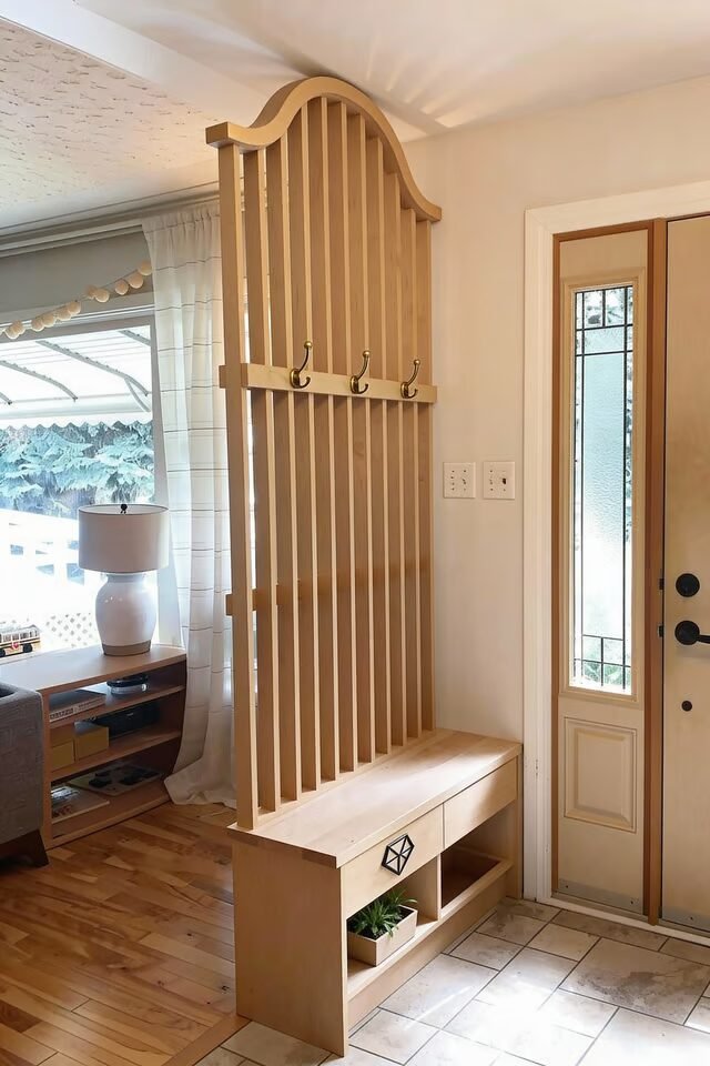
This entry divider is doing three jobs at once, and honestly, that’s elite behavior. The vertical wood slats create visual separation without blocking light, which is a core space-planning principle for small or open layouts. We still feel flow, but the entry suddenly has boundaries.
That bench plus shoe storage underneath? That’s functional zoning done right, not just decor pretending to work. Warm wood tones also psychologically signal “welcome,” which is exactly what an entry should do. The spacing between slats matters more than people think.
Too tight and it feels like a wall, too wide and it loses purpose. Aim for rhythm and repetition so the eye moves smoothly. Built-in lighting under the bench and shelves adds depth and makes the unit float, which visually lightens the whole structure.
Good lighting = instant premium feel, always. If you want to recreate this, keep finishes consistent so the divider feels architectural, not like random furniture stacked together. Yes, this divider is calm, but it’s quietly flexing.
Sculptural Arch Entry Divider Moment
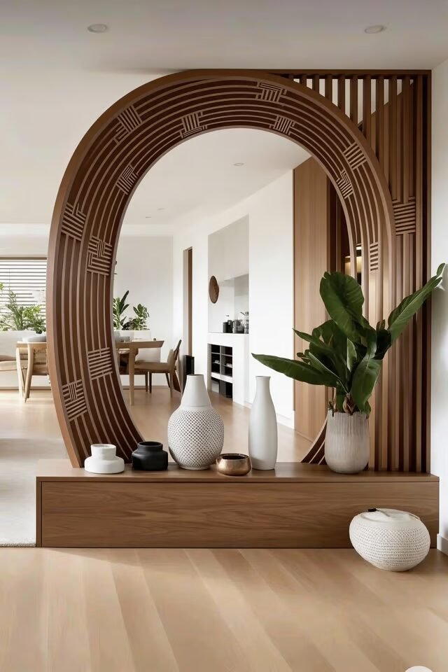
This divider is proof that an entry doesn’t need to scream to be unforgettable. The curved arch instantly softens the space, which follows the design principle of using organic shapes to balance hard lines. Most homes are boxes, so this curve feels fresh and intentional.
We love how it separates the entry visually while still acting as a focal point. The low console anchors the structure, keeping the height from feeling top-heavy. That’s proportion control, not magic. Decor styling here is minimal for a reason. When the structure is bold, accessories should whisper. Let one hero element lead, always. The wood detailing inside the arch adds texture and shadow play, which keeps it interesting throughout the day as light shifts.
If you’re recreating this, make sure the arch aligns with sightlines from the living or dining area so it frames, not interrupts. This kind of divider works best in neutral spaces where form does the talking. Calm palette, strong shape, zero chaos. TikTok-worthy, but also architect-approved.
Curved Wood Divider With LED Glow
This divider is where mood lighting and movement fall in love. The gentle curve breaks rigidity and guides the eye naturally, which is a classic flow-enhancing principle. Add integrated LED strips and suddenly the divider becomes a visual pathway, not just a separator.
We’re obsessed because the lighting highlights the curve, making the design readable even at night. That’s intentional contrast at work. The mirror panel behind it doubles the impact by bouncing light and making the entry feel wider. Mirrors aren’t just for checking outfits, they’re spatial tools. The slim console shelf keeps the divider grounded while still looking airy. Notice how nothing bulky is added here. When a divider is sculptural, weight distribution must stay light.
If you’re recreating this, keep LED temperatures warm to match the wood, not cool white. Cool lighting would kill the vibe instantly. This idea works best in modern interiors craving softness without losing structure. It’s dramatic, but in a calm, “I know design” kind of way.
Open Shelf Divider For Entry Zones
This divider is a masterclass in transparency. Instead of blocking the entry, it filters it. Open shelving lets light pass through while still defining zones, which is perfect for homes that hate feeling chopped up. We’re basically zoning without walls, and that’s smart design.
The vertical slats add rhythm and prevent the shelves from feeling like random storage. Everything here relies on balance. Too many objects and it looks messy. Too few and it feels empty. Stick to odd-number groupings and mix matte with glossy finishes for visual contrast. Built-in lighting turns decor into focal points and adds depth, especially in darker corridors.
The wood tone grounds the space, keeping it warm and inviting. If you want to recreate this, think of the shelves as negative space first, storage second. Let air and light do half the work. This divider is perfect for people who want function, display, and separation without committing to solid walls. Stylish, practical, and quietly confident.
Patterned Screen Entry Divider Statement
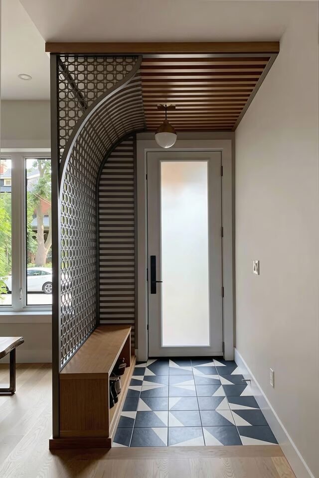
This divider is bold, but it knows what it’s doing. The patterned screen introduces visual interest while still allowing airflow and light, which follows the principle of permeable separation. We love how the curved edge softens the graphic pattern so it doesn’t feel harsh.
Pairing it with a bench anchors the space and gives the entry a purpose beyond “walk-through zone.” Ceiling slats echo the divider’s lines, creating continuity, which is a huge win. When elements repeat, spaces feel intentional, not accidental. The tiled floor adds contrast and signals transition from outside to inside, reinforcing the entry’s role.
If you’re recreating this idea, limit strong patterns to one main surface so the design doesn’t compete with itself. Neutral walls help the divider shine without overwhelming the room. This setup is perfect if you want personality right at the door but still crave order. It’s structured, expressive, and definitely scroll-stopping without being chaotic.
Soft Wood Slats With Built-In Bench
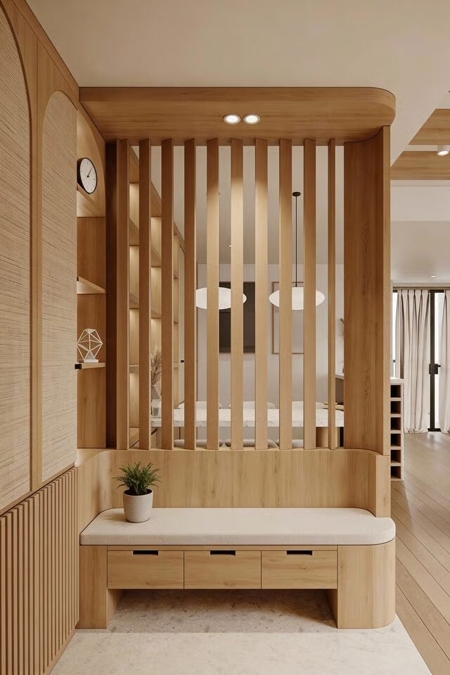
This entry divider is basically a warm hug in furniture form. Vertical wood slats give us separation while still letting light and air flow through, which follows the principle of visual permeability. We’re defining the entry without killing openness, and that’s the sweet spot.
The built-in bench anchors the divider and creates a functional landing zone, so shoes, bags, and tired humans all have a place to pause. Notice the rounded edges on the bench and overhead panel. Soft corners reduce visual tension and make the space feel safer and more inviting. The wood tone stays consistent from floor to ceiling, which is key for cohesion.
Mixing woods here would break the calm instantly. Storage drawers underneath keep clutter hidden, supporting the “calm on arrival” rule. If you recreate this, keep slat spacing even so the rhythm feels intentional, not chaotic. This design works best in open layouts where the entry blends into living space but still needs identity. Calm, practical, and quietly expensive-looking.
Dark Slatted Divider With Mood Lighting
This divider understands drama, but it uses it responsibly. Dark finishes create contrast and instantly define the entry, which is great for homes with light floors and walls. Vertical slats stretch the height visually, making ceilings feel taller. That’s perception hacking, and we love it.
Integrated LED lighting at the top and behind the slats adds depth and highlights texture, turning the divider into a feature wall. The bench base grounds everything, balancing the vertical lines so the space doesn’t feel too rigid. Notice how decor is minimal and sculptural. When lighting is strong, clutter becomes the enemy. If you want to recreate this look, always layer lighting.
Ambient from above, accent behind, nothing harsh at eye level. Also, dark dividers work best when paired with warm light temperatures so the space feels cozy, not cave-like. This idea is perfect if you want your entry to feel intentional and stylish without being loud. Moody, modern, and very “design TikTok approved.”
Glass And Wood Bookshelf Divider
This divider is doing the most, but in the smartest way possible. Using a bookshelf as a divider follows the principle of dual-function design, where one element solves multiple problems. It separates spaces, adds storage, and becomes a visual focal point.
The open grid structure allows light to pass through, preventing the space from feeling boxed in. Glass shelves reflect daylight and visually lighten the structure, while the wood frame adds warmth and stability. Styling is everything here. Negative space matters just as much as books. Mix vertical and horizontal stacks, add plants, and leave breathing room so the divider feels curated, not crowded.
The carved wood panel on the side adds texture and cultural depth, making the piece feel custom rather than store-bought. If you recreate this, keep proportions aligned with ceiling height so the divider feels architectural. This idea works best between living and dining areas where separation is needed but connection still matters. Functional, personal, and design-forward all at once.
Cane Cabinet Entry Divider Feature
This divider is subtle, stylish, and very well-behaved. Instead of blocking the entry, it creates a visual pause using furniture-scale zoning. The cane cabinet introduces texture, which is crucial in minimalist spaces to avoid flatness. Texture replaces color when palettes stay neutral.
The framed artwork above extends the divider vertically, making the setup feel intentional and complete. Integrated lighting around the frame adds a soft glow that elevates the entire entry. The cabinet itself provides hidden storage, which supports the principle of visual calm. When clutter is hidden, the mind relaxes.
If you want to recreate this, keep the cabinet height lower than eye level so it doesn’t feel like a wall. Cane works best when paired with clean lines so it doesn’t feel too vintage-heavy. This idea is perfect for small entries that need definition without sacrificing openness. Soft, modern, and quietly stylish. No drama, just good design decisions.
White Sculptural Divider With Curves
This divider is proof that white doesn’t have to be boring. The curved vertical elements soften the space and guide movement naturally, which follows the principle of organic flow. Straight lines dominate most interiors, so introducing curves instantly adds visual interest.
The bench base anchors the design and adds functionality without cluttering the look. Built-in drawers keep storage invisible, reinforcing the clean aesthetic. Floating box shelves and a mirror break up the vertical rhythm so the divider feels dynamic, not repetitive.
Contrast through form, not color, is what makes this work. If you’re recreating this idea, lighting is crucial. Soft, even lighting prevents harsh shadows that would disrupt the curves. This divider works best in modern or Scandinavian interiors where simplicity is key. It separates the entry without making the space feel smaller. Clean, sculptural, and very scroll-stopping. Minimal effort visually, maximum impact spatially.
Smart Entry Dividers Make Homes Feel Designed
A well-designed entry divider isn’t just decoration, it’s spatial strategy. It tells people where to pause, where to move, and how the home flows beyond the front door. The best entry divider ideas always solve at least two problems at once. They separate without isolating, store without cluttering, and style without overwhelming.
Materials like wood, glass, cane, or sculptural panels bring texture and warmth, while lighting elevates the divider from functional to unforgettable. Consistency in finishes keeps everything cohesive, especially in open-plan homes. We should always think about scale, spacing, and rhythm so the divider feels architectural rather than accidental. When done right, entry dividers create calm, order, and a sense of arrival.
They quietly set the tone for the entire house. So whether you love minimal, modern, or statement designs, remember this: a smart entry divider doesn’t just divide space. It makes the whole home feel intentional, welcoming, and well thought out.

