Open Plan Dining Isn’t About Removing Walls—It’s About Controlling Flow
Open plan dining sounds simple on paper—remove walls, add a table, done. In reality, it only works when flow, scale, and visual balance are intentional, not accidental. The best open plan dining spaces don’t try to be everything at once. They clearly understand what role the dining area plays inside a shared layout.
Sometimes it’s the social anchor, sometimes it’s the visual bridge, sometimes it’s the quiet connector between kitchen and living. What matters is that it feels placed, not dropped. Across these ideas, you’ll notice consistent principles doing the heavy lifting: furniture sized confidently for the room, repeated materials to guide the eye, and lighting used to create invisible boundaries.
We’re not zoning with walls—we’re zoning with rugs, pendants, alignment, and rhythm. Open plan dining works when the space tells you how to use it without instructions. If a room feels calm, intuitive, and social, that’s not luck. That’s design logic quietly doing its job.
Soft Green Kitchen, Seamless Social Flow
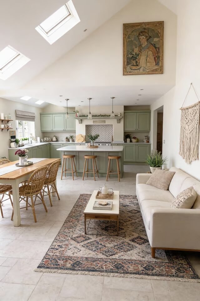
This open plan works because it nails visual continuity without visual boredom. The soft green cabinetry flows into the dining and living zones, so the space feels connected instead of chopped up. That’s a core open-plan rule: repeat one dominant color across zones to keep the eye moving smoothly. The island acts as a social bridge, not just a prep station.
Notice how the stools face outward—that’s intentional. It invites conversation while cooking, which is peak open-plan behavior. We also love how lighting is layered: skylights for daylight, pendants for task, recessed lights for ambient glow. That combo prevents the space from feeling flat at night. The dining table sits close but not cramped because circulation paths are respected.
You can walk around without doing the awkward sideways shuffle. Furniture scale is doing heavy lifting here—nothing too bulky, nothing too tiny. If you want to recreate this, keep finishes matte, textures natural, and clutter minimal. Open plans punish mess brutally, so hidden storage is your best friend.
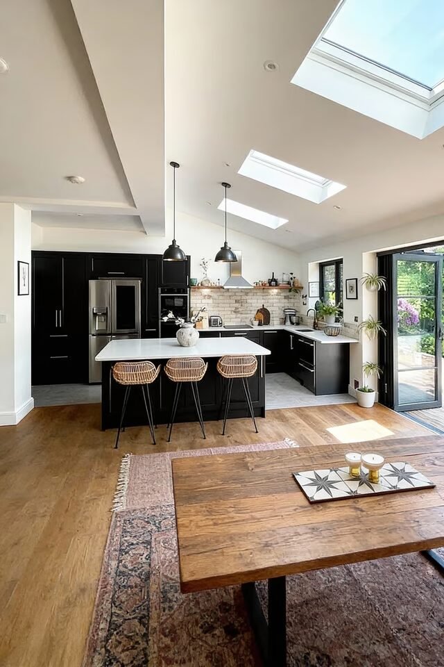
Double-Height Drama, Still Feels Cozy
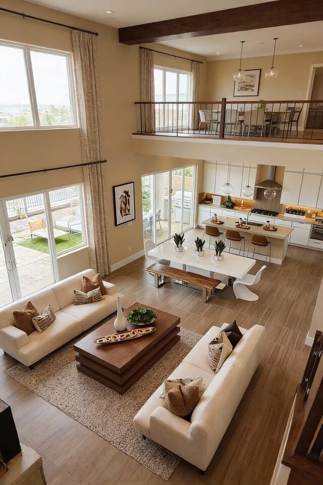
High ceilings can easily turn an open plan into an echo chamber, but this one avoids that trap beautifully. The trick is vertical zoning. Even though the space is tall, the furniture layout pulls attention downward, keeping everything human-scale. Sofas face each other to create a clear conversation zone, while the dining area sits just beyond, visually connected but functionally separate.
That’s open-plan gold. The warm wood floors and ceiling beams counterbalance all that vertical space, adding visual weight so the room doesn’t feel hollow. We also see symmetry doing quiet work here—matching sofas, centered coffee table, balanced lighting. Symmetry calms big spaces, especially when walls are far apart. Another smart move is consistent material use from dining to living.
Same wood tone, same neutral palette, zero visual chaos. If you’re recreating this, resist tiny rugs. Go big or go home. Undersized rugs break open plans instantly. And remember, height needs grounding—low furniture, soft textures, and warm finishes keep things livable, not lobby-like.
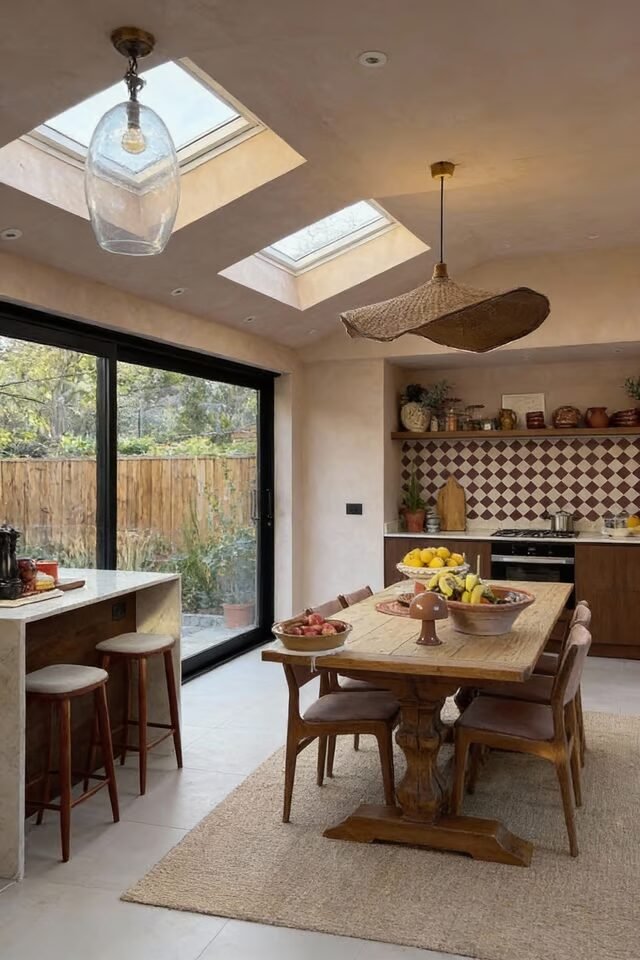
Garden-Connected Dining That Actually Works
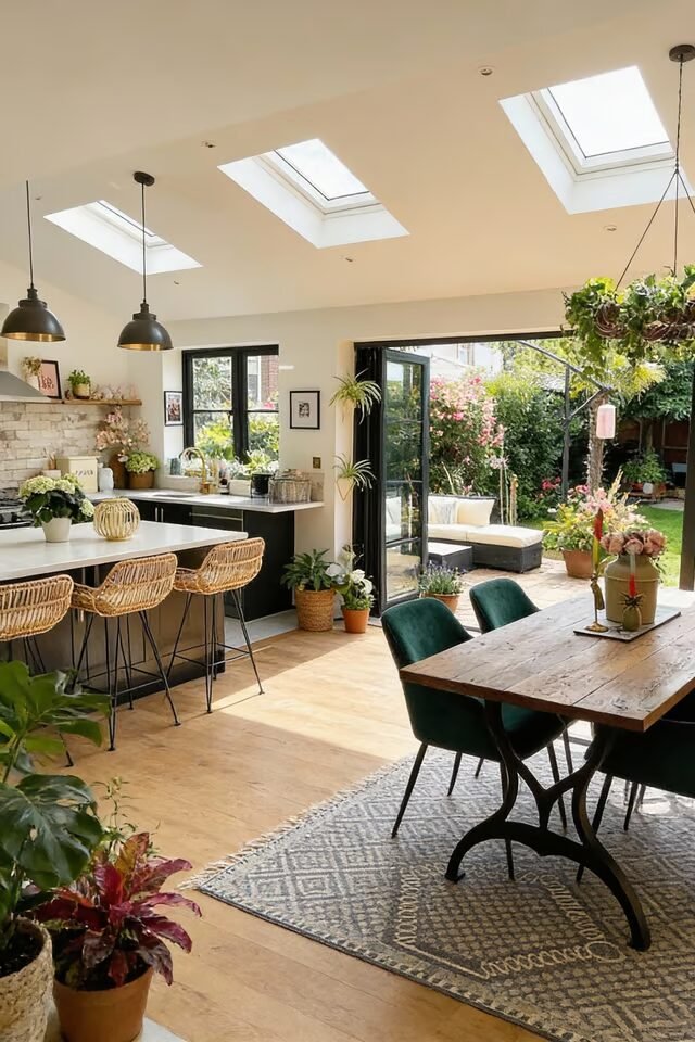
Indoor-outdoor flow isn’t just about big doors—it’s about alignment. This open plan nails it by lining up the dining table directly with the garden view. Your eye moves straight through the space, which makes everything feel larger and lighter. The dining area uses darker chairs to visually anchor the table, so it doesn’t float awkwardly in the room.
Meanwhile, the kitchen stays visually quieter with lighter cabinetry, letting greenery steal the spotlight. That’s smart hierarchy. We also love the ceiling rhythm created by skylights. Repetition overhead mirrors the rhythm below, which subconsciously makes the layout feel intentional. Plants aren’t just decor here; they’re spatial glue. They soften transitions between zones without blocking sightlines.
If you want to copy this vibe, keep flooring consistent from kitchen to dining. Floor changes kill flow instantly. Add texture through rugs and wood instead. And don’t overcrowd the table—negative space matters more in open plans. Let the garden be the drama, not your decor overload.
Warm Neutral Layers, Zero Visual Chaos
This idea proves open plan doesn’t need bold colors to feel rich. It relies on layered neutrals with varied textures, which is way harder than it looks. White cabinetry, light wood floors, soft beige seating—sounds boring, but texture saves the day. Stone, wood grain, fabric, and subtle pattern all work together to create depth without visual noise.
The island placement is strategic: it divides kitchen and living without blocking views. That’s classic open-plan zoning done right. Pendant lights over the island drop the visual ceiling slightly, making the space feel more intimate. We also see furniture orientation doing silent work. The sofa backs toward the kitchen, signaling a boundary without a wall.
Boundaries can be implied, not built. If you’re recreating this, avoid glossy finishes everywhere. Too much shine makes open plans feel cold. Mix matte surfaces with soft textiles. And always anchor seating with a rug—floating furniture is the fastest way to make an open plan feel unfinished.
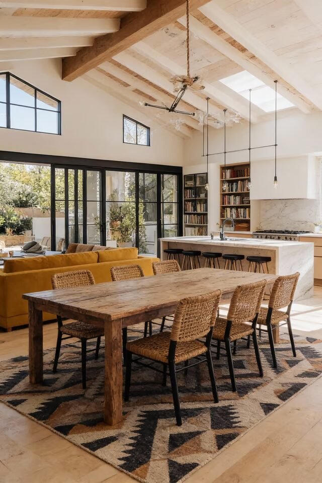
Rustic Beams, Modern Open Plan Balance
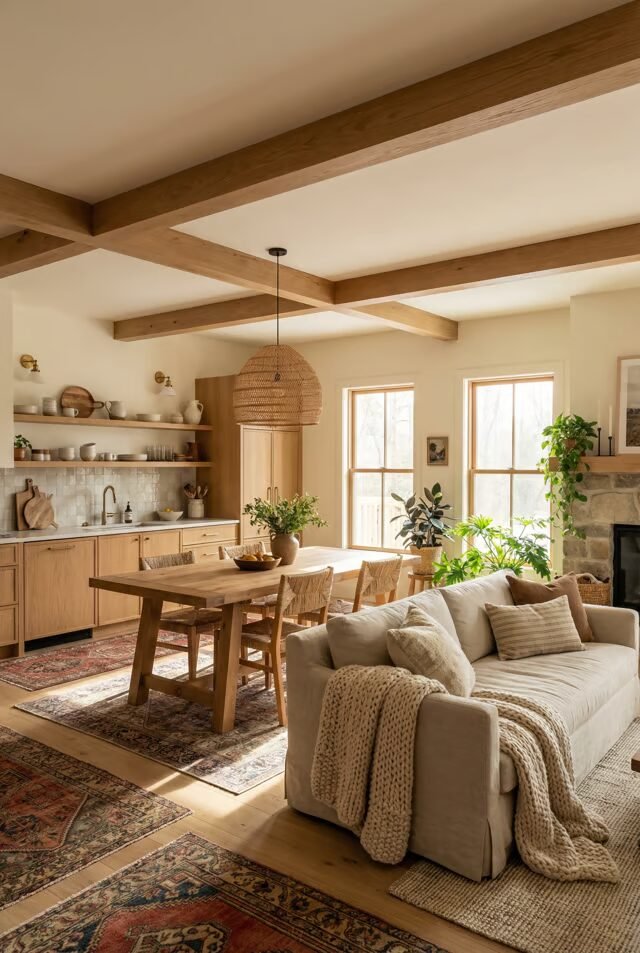
Rustic elements can overwhelm an open plan fast, but this space keeps them on a tight leash. The exposed beams add character without stealing attention because everything else stays visually calm. That’s the balance: one statement feature, many supporting neutrals.
The dining table sits centrally, acting as the heart of the layout, while the kitchen and living zones orbit around it. This radial planning keeps movement intuitive. Notice how open shelving replaces upper cabinets—it lightens the kitchen visually, which matters when everything is visible. Textiles do the softening work here: layered rugs, throws, and cushions absorb sound and warmth.
Open plans need that, or they feel acoustically hostile. We also love the consistent wood tone across beams, table, and shelving. Consistency beats contrast in shared spaces. If you want this look, choose rustic elements with clean lines. Skip anything overly ornate. Let age and texture tell the story, not decorative clutter fighting for attention.
Minimal Mediterranean, Long-Table Living
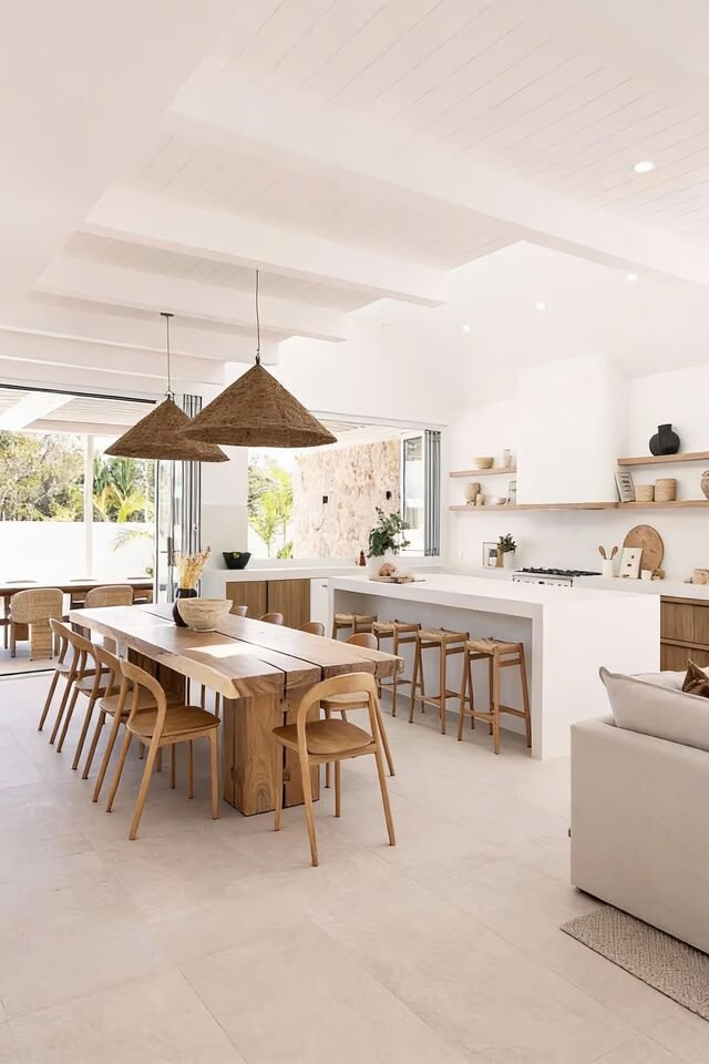
This open plan leans into Mediterranean simplicity with social-first logic. The long dining table isn’t just furniture—it’s the anchor. In open layouts, anchoring with one oversized element keeps the space from feeling floaty. Here, the table visually balances the long kitchen run and wide negative space around it.
The woven pendants matter more than they look; they lower the perceived ceiling height, making the dining zone feel intimate without walls. That’s a classic open-plan trick. The color palette stays intentionally tight—white, sand, warm wood—so the eye rests instead of bouncing.
We also love the continuous flooring. One floor finish equals one uninterrupted visual story, which is essential in open plans. The kitchen island runs parallel to the table, reinforcing linear flow and making circulation intuitive. If you want to recreate this, keep decor minimal but tactile. Texture replaces color here. And resist short tables—open plans thrive on furniture that confidently owns space instead of apologizing for it.
Polished Neutral Open Plan Balance
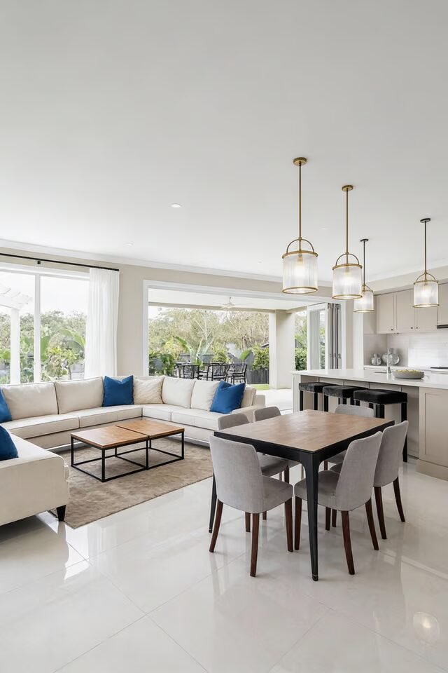
This space proves neutral doesn’t mean boring—it means controlled. The dining table, sofa, and kitchen island are perfectly proportioned to each other, which is why the room feels calm instead of chaotic. Scale harmony is the secret sauce of open plans. Notice how the dining area sits close to the living zone, yet still reads as separate.
That’s achieved through rug placement and subtle lighting shifts, not walls. The glossy flooring reflects light across zones, visually expanding the room, while soft upholstery prevents it from feeling cold. Pendant lights above the dining table act like a visual pin, telling your brain, “This is where meals happen.”
We also see repetition doing quiet work: similar metal finishes, consistent leg thickness on furniture, and matching tones across zones. If you’re recreating this, don’t over-style surfaces. Open plans amplify clutter. Clean lines and breathing room are non-negotiable if you want this polished, high-end feel without trying too hard.
Rustic Modern With Statement Table
This open plan nails contrast without chaos. The rough, oversized dining table grounds the space, while the clean kitchen island keeps things visually sharp. That push-and-pull is intentional. Open plans need contrast to avoid looking flat, but it has to be controlled. The table sits on a bold patterned rug, clearly defining the dining zone without blocking flow.
That’s zoning done right. Exposed beams pull the eye upward, but the low-backed chairs and grounded furniture bring everything back down to human scale. We also love how the dining table aligns with the island—parallel placement creates visual order and makes the layout feel logical.
Glass doors flood the space with light, preventing the darker wood from feeling heavy. If you want to recreate this, commit to one rustic hero piece only. Let everything else stay restrained. Too many statement items will fight each other in an open plan, and nobody wins that battle.
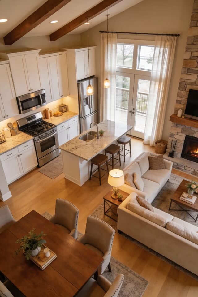
Classic Farmhouse, Smart Open Flow
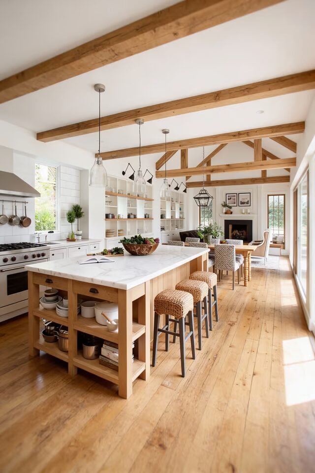
This space proves farmhouse style can absolutely work in an open plan—if it’s edited. The long kitchen island acts as both prep zone and social buffer between dining and cooking. That’s crucial in shared layouts. Islands aren’t optional in open plans—they’re organizers.
The dining table mirrors the island’s wood tone, creating cohesion without matching too literally. Exposed beams visually guide the eye down the length of the room, reinforcing flow instead of breaking it. Open shelving keeps the kitchen light and airy, which matters when everything is visible.
We also see consistent spacing: stools, chairs, and walkways all breathe equally. That’s not accidental. If you’re recreating this look, keep your color palette tight and let materials do the talking. And please don’t overcrowd the island. Negative space is what makes farmhouse feel fresh, not cluttered or dated in an open-plan setting.
Cozy Open Plan With Warm Layers
This open plan leans cozy, not cavernous—and that’s the win. The dining table sits under skylights, which naturally spotlights the area without extra visual noise. Natural light is the best zoning tool you already own. Warm wood tones repeat across table, cabinetry, and stools, creating a loop that visually connects zones.
The rug under the table softens acoustics and prevents that dreaded echo effect open plans love to create. Pendant lights are scaled generously, which helps anchor the dining zone in a tall, open space. The kitchen stays visually calm so the dining area can feel like the heart of the room.
If you want to recreate this, prioritize warmth over contrast. Choose finishes that feel good up close because open plans are lived in, not just looked at. Comfort is a design principle, not a bonus feature, especially when everything shares one big space.
Designing Open Plan Dining With Long-Term Comfort
Great open plan dining isn’t just about looking good in photos—it’s about surviving real life. Noise, clutter, movement, and daily mess all get amplified when walls disappear. That’s why the smartest designs prioritize comfort and clarity over drama.
You’ve seen how consistent flooring keeps spaces visually connected, how islands act as buffers, and how lighting anchors dining zones without boxing them in. Those moves aren’t decorative—they’re functional. We also see a recurring truth: the dining table often becomes the emotional center of the home, not just a place to eat. That’s why scale, placement, and lighting around it matter so much.
When recreating these ideas, resist overdecorating. Open plans reward restraint and punish excess. Let materials, proportions, and flow do the talking. If your dining area feels natural to walk around, easy to sit in, and inviting to gather at, you’ve already won. Everything else is just styling.