
The Case for Letting Your Christmas Tree Look Nothing Like Anyone Else’s
Scroll through enough holiday inspiration and every tree starts to blur together. Same red and gold rotation, same evenly spaced ornaments, same predictable star on top. Somewhere between traditional and trying too hard, there is a version of your tree that actually feels like yours.
The trees below skip that script entirely. Some lean into unexpected materials, others into color, shape, or scale, and a few just commit hard to one bold idea instead of spreading attention across a dozen small details. None of them read as safe.
What we want to do here is break down the actual design thinking behind each one, not just point and admire. Every idea comes with a clear explanation of why it works and how you could bring pieces of it into your own space, whatever that space looks like.
A Tree Built From Reclaimed Wood
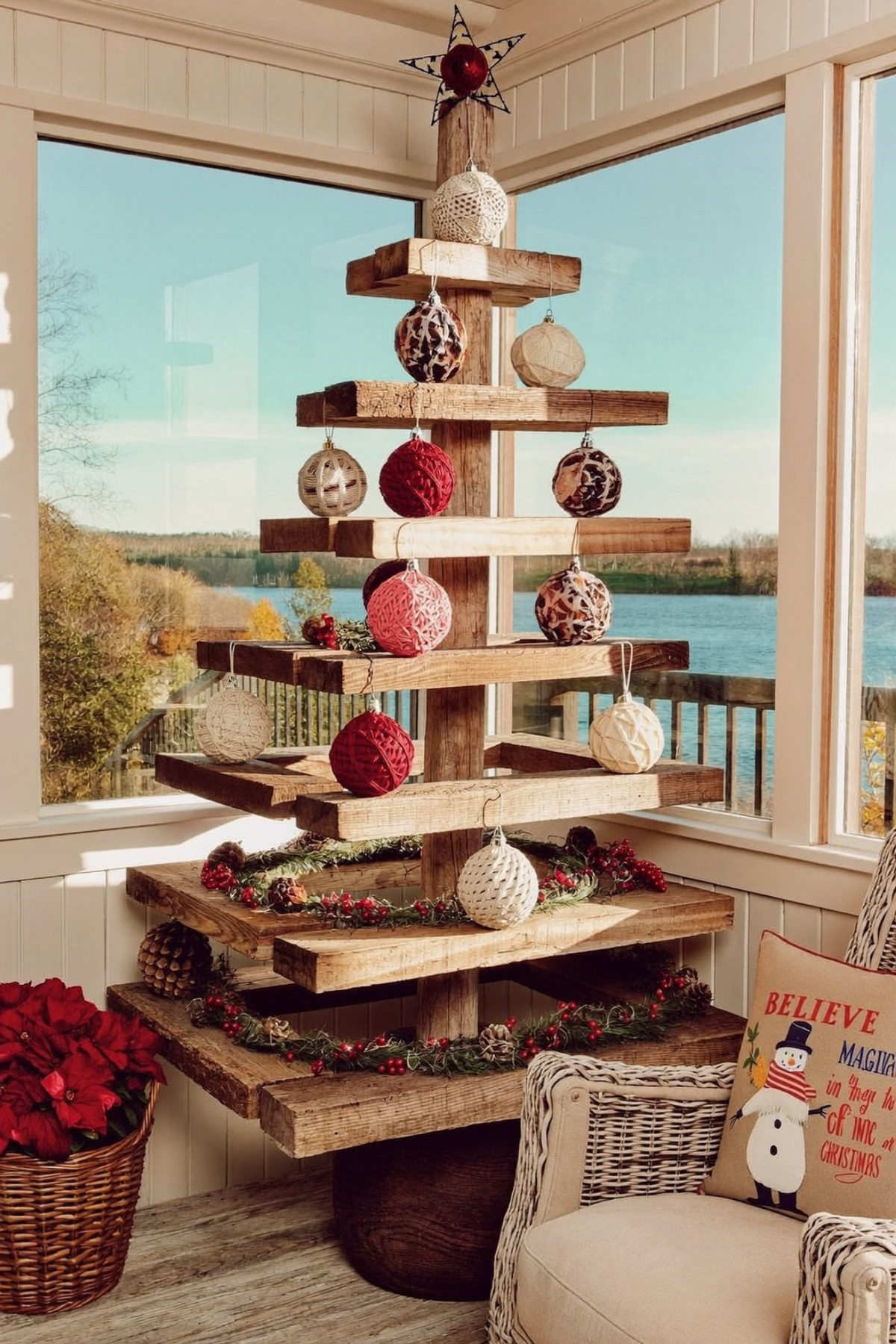
This one throws out the idea that a tree needs to be full or symmetrical to feel like a tree. Instead of branches, it is built from horizontal wood shelves stacked on a single reclaimed post, and the gaps between each level do just as much visual work as the wood itself. The negative space is the whole design, not a flaw to fill in.
If you want to try a version of this, start with rough cut lumber or old shelving boards rather than anything polished. Vary the width and spacing of each tier so it does not read as a shelf unit, and skip the glossy glass ornaments entirely. Yarn wrapped balls, dried pinecones, and a simple star made from wire or scrap metal keep the texture honest.
A tuck of berry garland along the lower tiers softens the hard lines without cluttering them. This kind of build suits a cabin porch more than a formal living room, which is exactly why it works so well tucked into a sunroom corner or somewhere with a view worth framing.
Let Your Pet Steal the Photo

Before you touch a single ornament, think about who is actually going to be sitting in front of this tree every day. A classic red and gold palette with warm white lights and gold ribbon bows reads as instantly welcoming, and it is forgiving of a wagging tail or a kid crawling underneath for the fortieth time.
The gold bows tucked between ornaments and the plaid stockings on the mantel keep things polished, but the real personality comes from a plaid bow on the family dog, sized to actually compete with the tree for attention. That contrast between formal styling and a genuinely goofy accessory is what stops this from feeling like a showroom.
Mix matte and glossy ornaments in the same red and gold family rather than picking one finish, and repeat the plaid from the stockings in at least one wrapped gift. Small repeated patterns like that tie a very traditional palette together without needing anything new.
The Tree That Doubles as Lighting
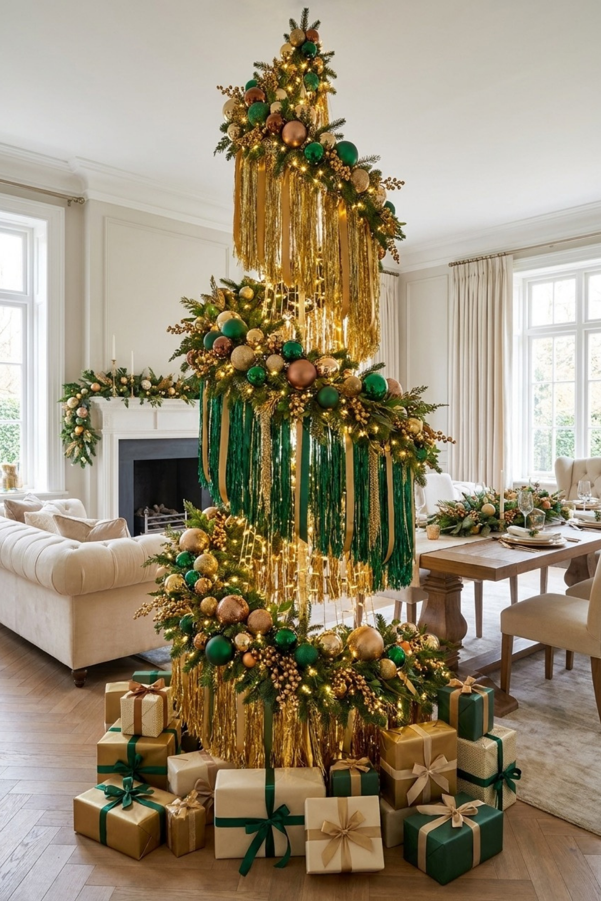
Look past the ornaments for a second and notice what is actually holding this whole thing together: tiers of gold and emerald tinsel fringe, hung heavy enough to catch light like a curtain rather than a single strand of garland. It is less a Christmas tree and more an oversized light fixture that happens to be shaped like one.
Each tier gets its own dense cluster of green, gold, and copper ornaments right at the seam, which keeps your eye moving in stages instead of scanning the whole tree at once. That rhythm is what makes a genuinely busy design still feel organized rather than chaotic.
To try this at home, buy tinsel fringe by the roll rather than pre strung garland, and cut it long enough to hang past the branch line at two or three points up the tree. Bundle your ornaments in tight clusters at each break instead of spacing them evenly, and let the fringe do the rest of the visual work.
A Tree Shaped Like Something Else
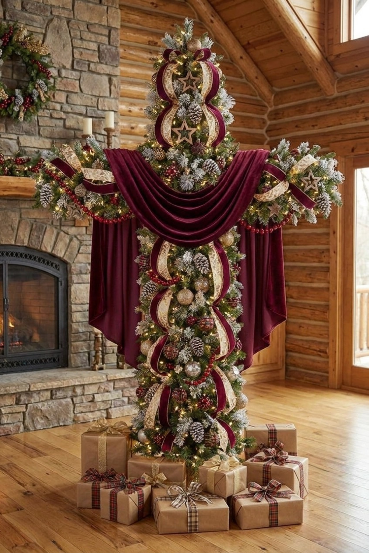
Not every tree needs to be tree shaped, and this one commits to that harder than almost any other idea here. The silhouette reads more like a piece of architectural topiary than a fir, draped in burgundy velvet and cream lace ribbon that fall like fabric rather than ornaments.
Getting a silhouette like this takes a wire frame or a heavily wired artificial tree, since the branches need to hold a shape well beyond a standard cone. Flocked tips, wood star accents, and pinecones add texture without fighting the outline. The velvet swags are really doing most of the heavy lifting for the overall drama, not the greenery underneath them.
This kind of statement piece earns its place best in a room with tall ceilings and natural materials already doing some of the work, like exposed wood beams or a stone fireplace. Kraft paper gifts tied with plaid ribbon underneath keep the base grounded instead of competing with the shape above it.
Treat the Tree as Sculpture
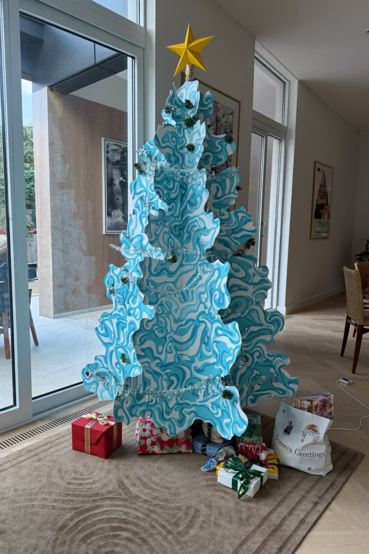
We will say it: this is more art installation than Christmas tree, and it works precisely because it stops pretending otherwise. Swirled panels in blue and white stack into a rough tree silhouette, cut flat rather than shaped like branches, with a single yellow star punching through the palette at the top.
Because the pattern itself carries so much visual weight, there is barely any need for separate ornaments at all. A few sprigs of real greenery and a single strand of warm lights tucked between the panels are enough, since anything more would just compete with the print instead of adding to it.
Trying something like this without commissioning custom panels means looking at painted plywood cutouts or even large flat foam board pieces layered front to back. Keep the color palette to two or three tones so the shape stays legible from across the room.
One Color Taken All the Way
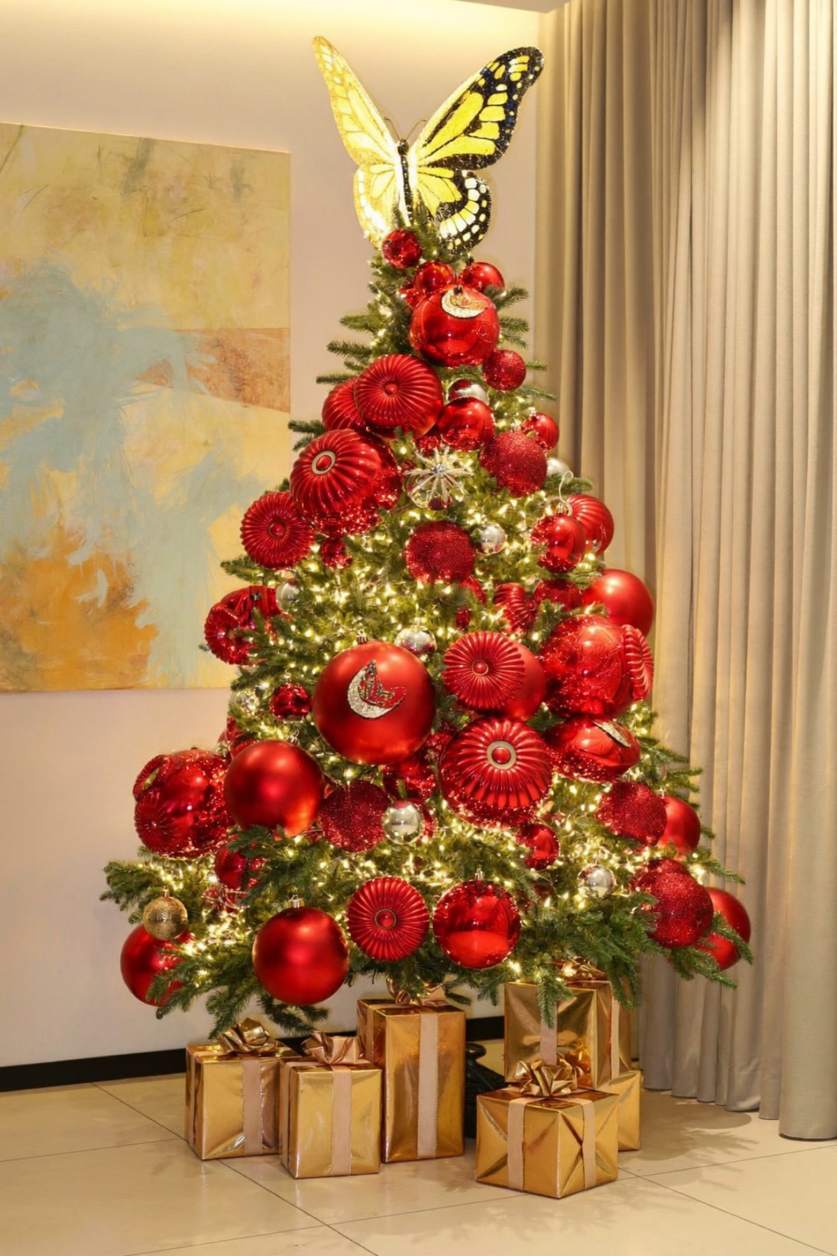
What happens when you stop mixing colors on a tree entirely? You get something like this: nearly every ornament in some shade of red, from matte to glossy to ribbed glass, with just a hint of silver breaking things up here and there.
Sticking to one color only works if the textures do enough of the talking, and that is exactly what is happening here. Fluted glass, high shine, and soft matte finishes all sit next to each other so the tree never feels flat, even without a second color to lean on.
The oversized butterfly topper is really the whole punchline, giving one enormous shape a reason to stand out against all those small round ones. If you go this route, buy your ornaments in at least three finishes within the same color family, and save your budget for one genuinely oversized topper instead of spreading it across a dozen small pieces.
Black and White, No Compromise
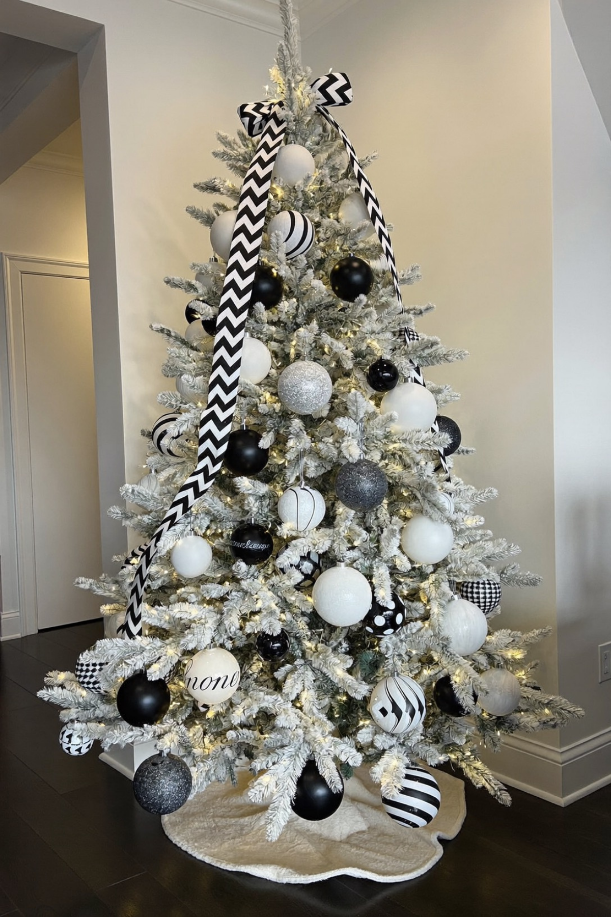
Flocked branches already read cool and wintery on their own, and this tree pushes that further by keeping every single ornament strictly black or white, no warm tones allowed in at all. Polka dots, houndstooth, stripes, and solid finishes all get mixed together, which keeps a two color palette from feeling flat or corporate.
The oversized black and white chevron ribbon cascading down the front is doing more compositional work than it looks like. It gives your eye a clear path to follow top to bottom, which matters a lot when every ornament is competing for attention within the same two colors.
Recreating this at home means buying patterned ornaments on purpose rather than only solid ones, since pattern is what keeps a monochrome tree from reading as plain. A wide graphic ribbon, hung loosely rather than wrapped tightly, adds that same sense of movement without much extra cost.
A Blue and White Story
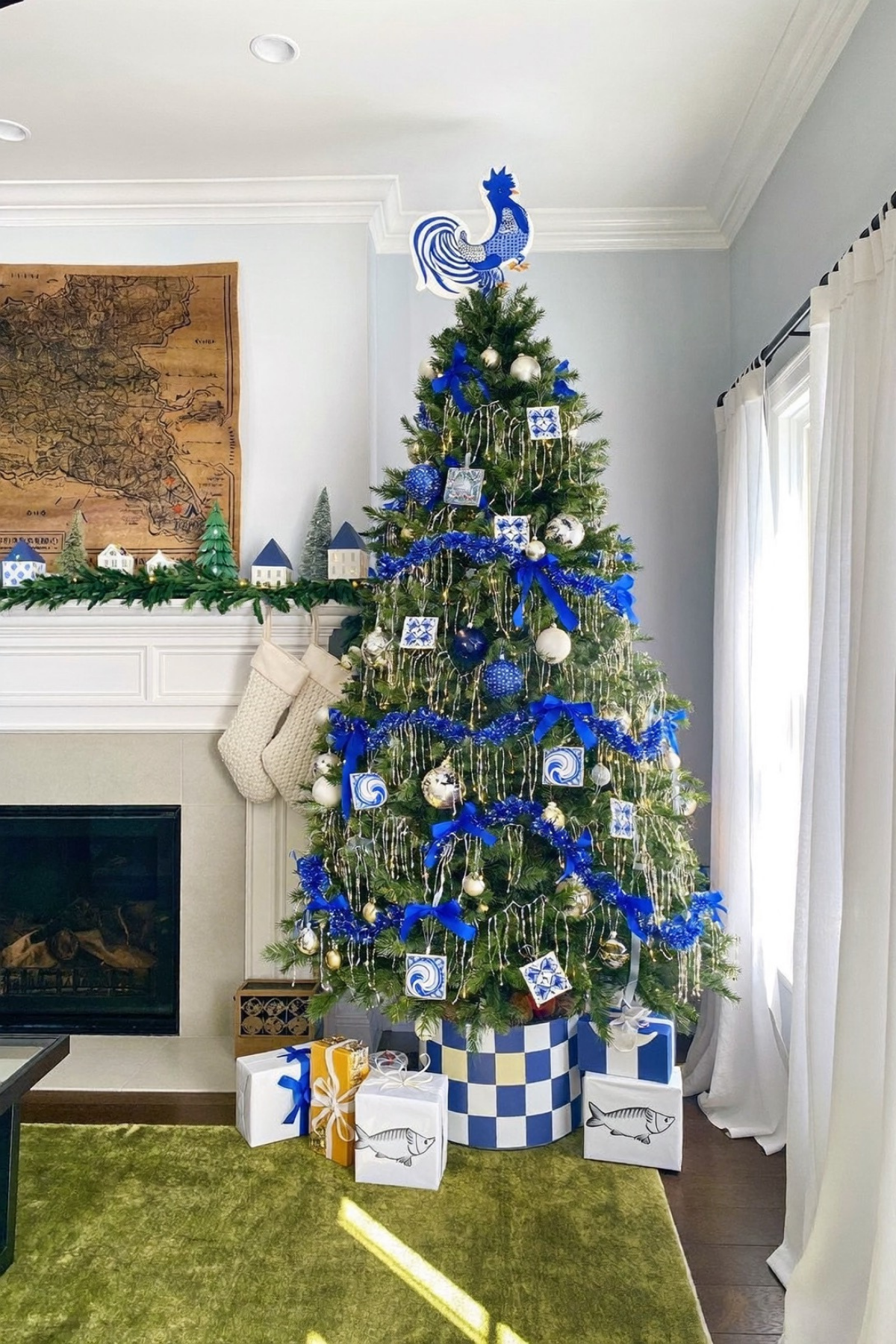
Where the last idea leaned on pattern for contrast, this one leans on a full narrative instead. Blue and white tile ornaments, a checkered tree skirt, and a hand painted rooster topper all pull from the same coastal, almost Mediterranean palette, so the whole tree reads like one cohesive story rather than a mix of pretty pieces.
Notice how the fish motif shows up again on the wrapped gifts underneath, and the blue and white checker pattern repeats from the skirt to the ribbon. Repeating a motif across at least three different elements is what turns a color scheme into an actual theme.
To build something similar, pick one motif you genuinely love, whether that is tile patterns, a specific animal, or a place, and find three or four ways to work it in beyond just the ornaments. Blue ribbon woven loosely through the branches ties everything back together without needing to match perfectly.
When Lights Do All the Work
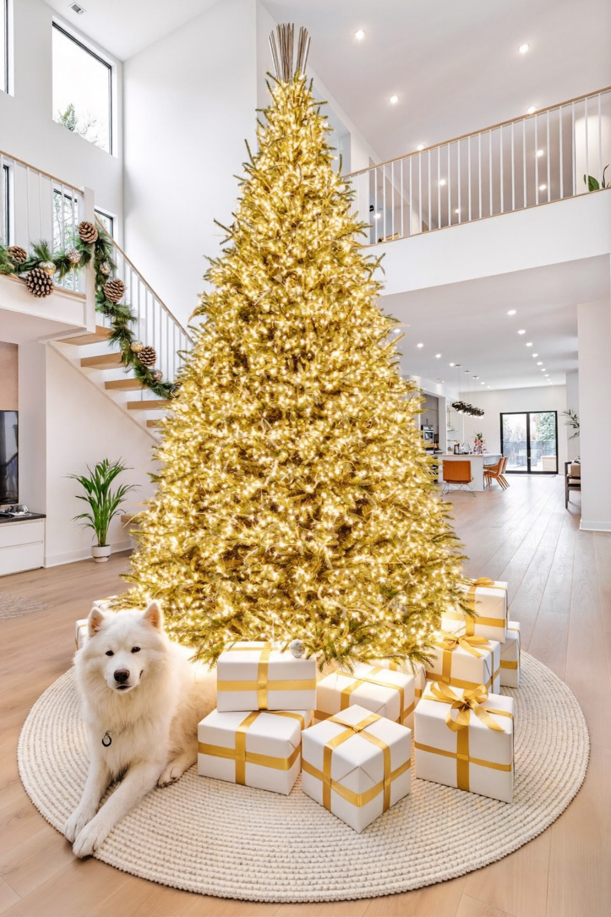
There are barely any visible ornaments on this tree, and that is the entire point. Dense warm white lights cover nearly every inch of the branches, turning the whole shape into one continuous glow rather than a tree you decorate piece by piece. Even the family dog gets upstaged by how much light is packed into one corner of the room.
Getting this effect takes far more lights than a standard tree calls for, wrapped tightly and evenly rather than draped loosely for accent. A sparse, twig like topper keeps the silhouette interesting at the top without introducing a solid shape that competes with all that glow. Most of the actual branch structure disappears entirely once the lights are on.
Doubling your usual light count is the starting point for this effect, since large ornaments would just interrupt the glow instead of adding to it. Simple white gifts wrapped in gold ribbon underneath keep the palette consistent instead of scattering it in different directions, and a plain woven rug underneath lets the glow stay the main event.
White as a Neutral Backdrop
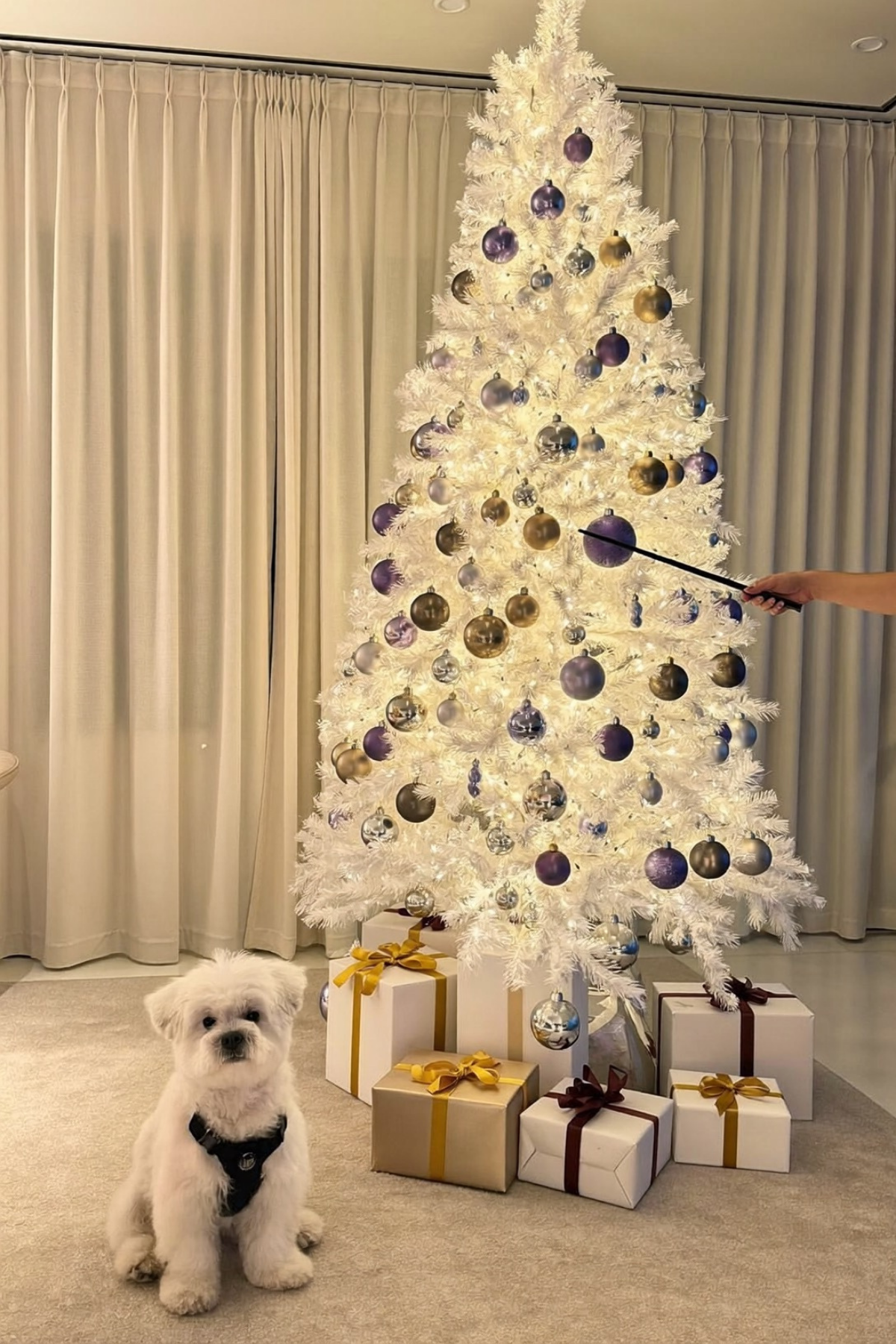
Spaces like this tend to feel more like a jewelry box than a living room, and a lot of that comes down to treating the white tree as a backdrop instead of the main event. Purple, gold, and silver ornaments do the actual color work, while the white branches just hold everything up.
Limiting yourself to two or three ornament colors against a neutral tree is what keeps this from tipping into busy. Every color chosen here sits in the same cool, slightly muted family, which is why nothing clashes even with that much going on.
A flocked or white artificial tree is the easiest way to get this base, and from there it is really about restraint. Pick one jewel tone plus gold and silver, skip anything warm toned, and let the white branches carry the quiet moments between ornaments instead of filling every gap.
The Best Trees Are the Ones You Would Never Copy
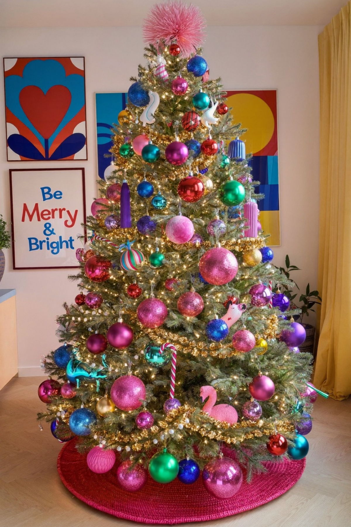
If there is one thing worth taking from all of this, it is permission. Permission to skip the matching ornament set, permission to hang something wildly impractical from the top, permission to build a tree that has nothing to do with anyone else’s living room.
None of these ideas were about spending more. They were about deciding early what the tree was actually for, whether that is a color story, a family ritual, a piece of art, or just a really good backdrop for photos, and then building every choice around that one decision instead of piling on extras.
So before you default to the same three ornament colors again this year, ask what you actually want walking into that room to feel like. The tree that gets remembered is rarely the safest one in the house.