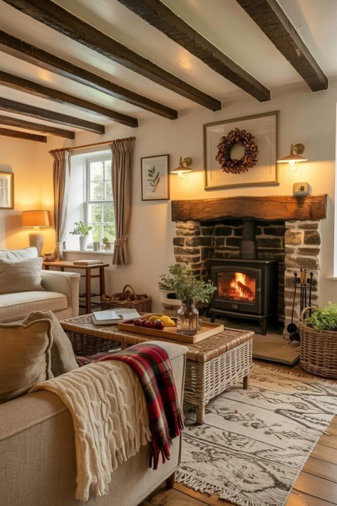

A Wall Full Of Plates Says More Than Most Gallery Walls Ever Could
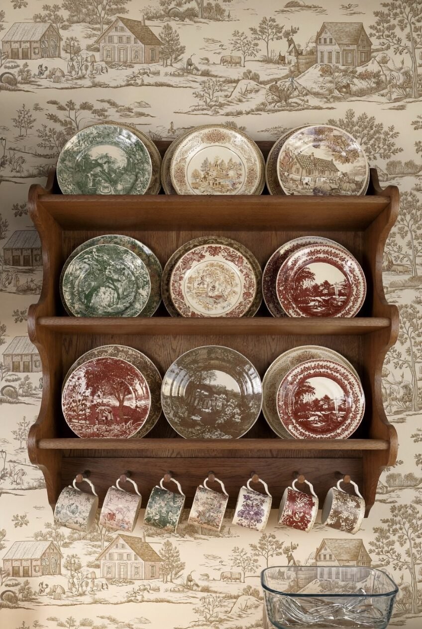
Every kitchen has a cabinet full of plates that only come out twice a year, for holidays or when someone finally visits. Meanwhile the wall above the console or sideboard sits empty, waiting for a framed print that never quite feels right. The fix has been sitting in that cabinet the whole time.
A plate wall rewards variety in shape and pattern far more than it rewards matching sets. Round platters, small saucers, oval trays, even the odd wall basket can all sit together once there is some thread, a color, a motif, a material, tying them back to one another.
What follows is a walk through some of our favorite plate walls, each one built around a different room, a different mood, and a different set of design instincts. Some lean formal, some lean chaotic, and every single one started with someone deciding a plain wall deserved better.
Kitchen Whimsy Belongs On Walls
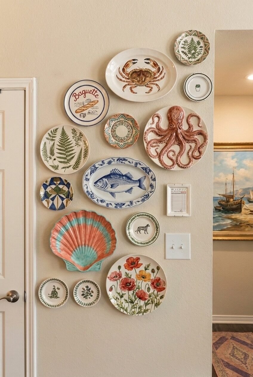
That patch of wall next to a doorway is usually the first thing skipped when people plan out a room, mostly because it is narrow and runs into a corner and does not fit a normal frame. This arrangement treats it like prime real estate instead, letting a crab platter and a glossy ceramic octopus take up space with total confidence.
What holds it together is not a color palette, since there is cream, blue, coral, and green all mixed in without much restraint. It is the subject matter doing the work. Baguettes, ferns, fish, shells: everything nods to food or the coast, so the eye reads it as one collection even when no two plates match.
If you want to try this in an odd corner of your own, start with one oversized plate as your anchor, something with real presence, then build outward with smaller rounds and ovals until the gaps close up. Let the shapes stay uneven; a rigid grid would kill the whole point.
Warm Light Makes Old Pottery Sing
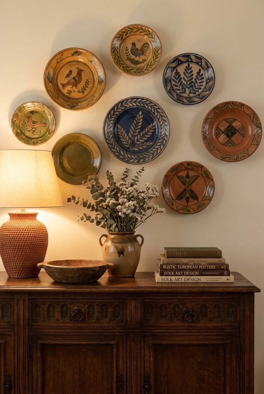
Put a warm-toned lamp directly under a plate display and something changes: the glaze on hand painted pottery starts to glow instead of just sitting there on the wall. That single light source is doing more work in this vignette than the plates themselves are, if we are being honest about it.
The color story goes olive, mustard, navy, and terracotta, all hues pulled from old European folk pottery, so nothing needs to match exactly in order to feel connected. Loose, slightly uneven spacing between the eight plates reads as gathered over time rather than bought in one trip to a shop.
Pair your plates with objects that share their materials, like a woven basket, a stack of hardcover books, or a stoneware jug, so the console underneath feels like part of the same story instead of a separate shelf doing its own thing. Warm bulbs over daylight ones make the biggest difference here.
Apothecary Charm Needs A Little Chaos
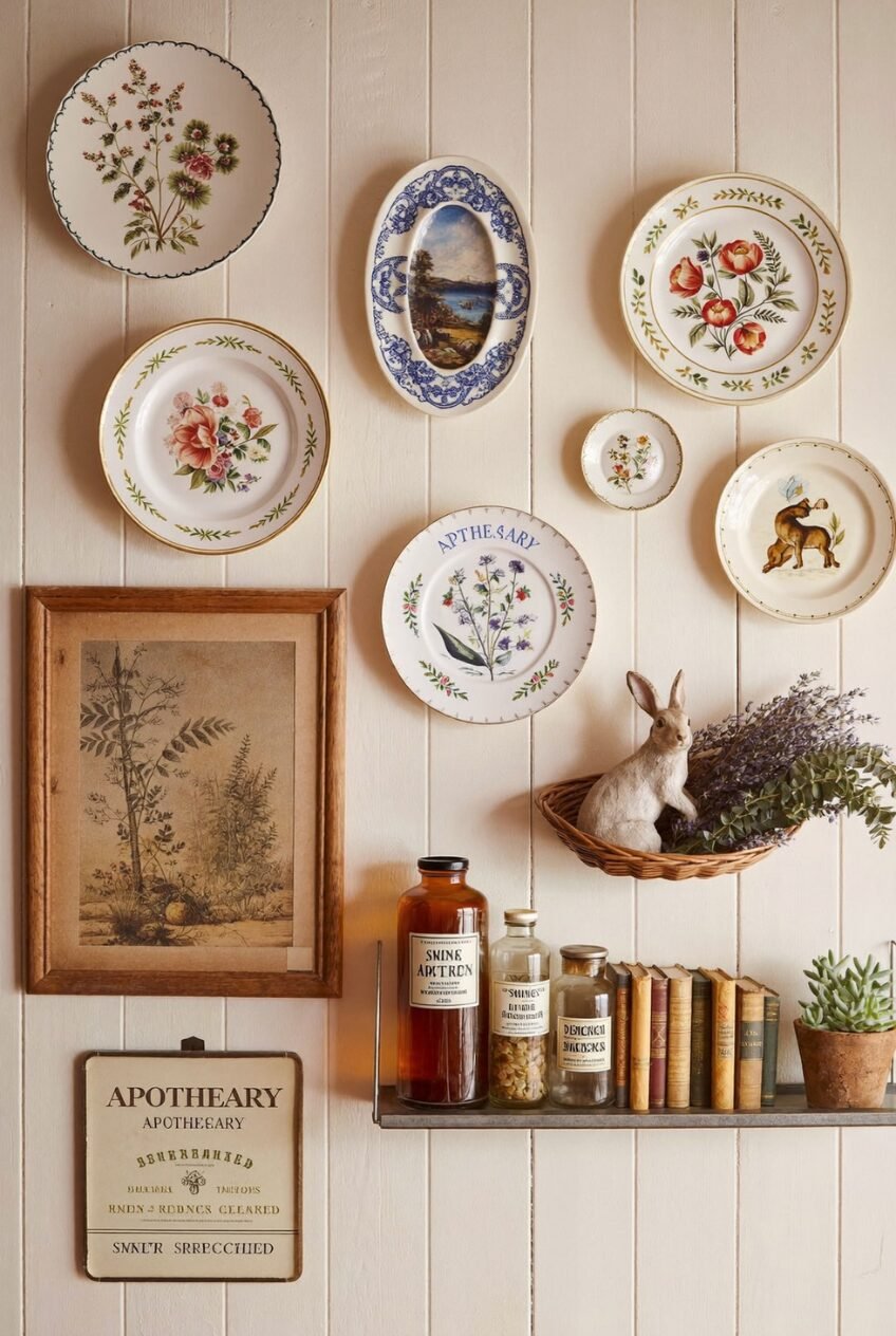
Botanical motifs repeat across nearly every piece on this wall, from wildflowers to ferns to a single illustrated branch, giving the eye a pattern to latch onto even as sizes swing from a tiny saucer up to a full sized dinner plate. That repetition is doing the heavy lifting that symmetry usually handles.
Not everything here is technically a plate either, and that is part of what makes it work. A framed botanical print and a hand lettered apothecary sign sit right alongside the china, which keeps the whole thing from reading as one matched set bought off a single shelf in an afternoon.
Hunt for pieces with a shared subject instead of a shared brand if you want this look, since flea markets rarely hand you a matching set anyway. Let a small shelf below hold the overflow: old books, glass jars, a stray plant, anything that keeps the story going past the wall.
Cover The Wall, Skip The Rules
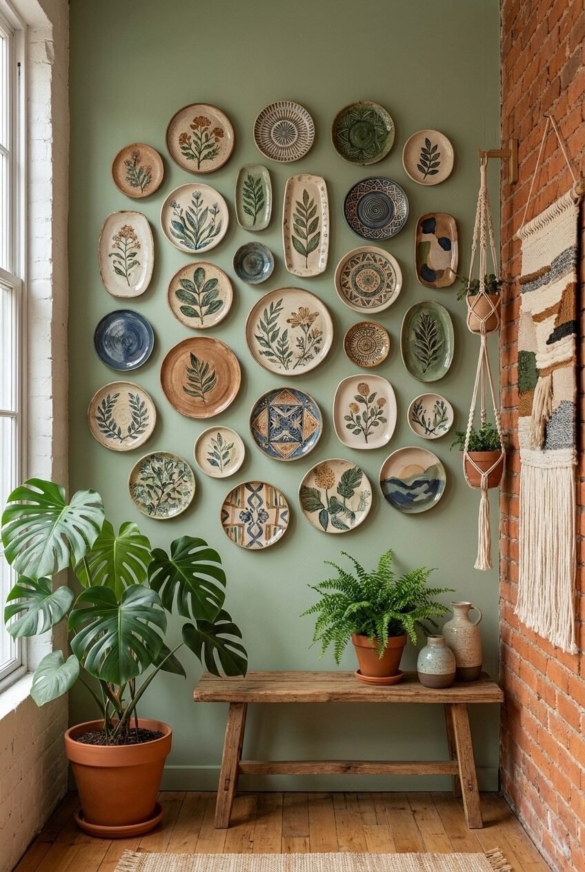
Density is the whole trick here. Dozens of small ceramic pieces climb almost the entire wall with barely a gap between them, which sounds chaotic on paper but reads as calm in person, mostly because the sage green wall behind them is not fighting for attention on its own.
Handmade texture matters more than pattern matching once a grid gets this large. Slightly wonky glazes, visible brushstrokes, and a mix of plates, ovals, and shallow bowls keep the wall from looking mass produced, even though the underlying layout is fairly ordered and grid-like once you step back.
Leave one bottom corner open for a plant, the way this space does with its monstera and trailing fern, so the wall has somewhere to breathe instead of feeling airtight. Building the grid loosely from the top down, adjusting spacing as you go and stepping back often to check the balance, tends to work far better than measuring every gap out on paper in advance.
Symmetry Still Wins In Formal Rooms
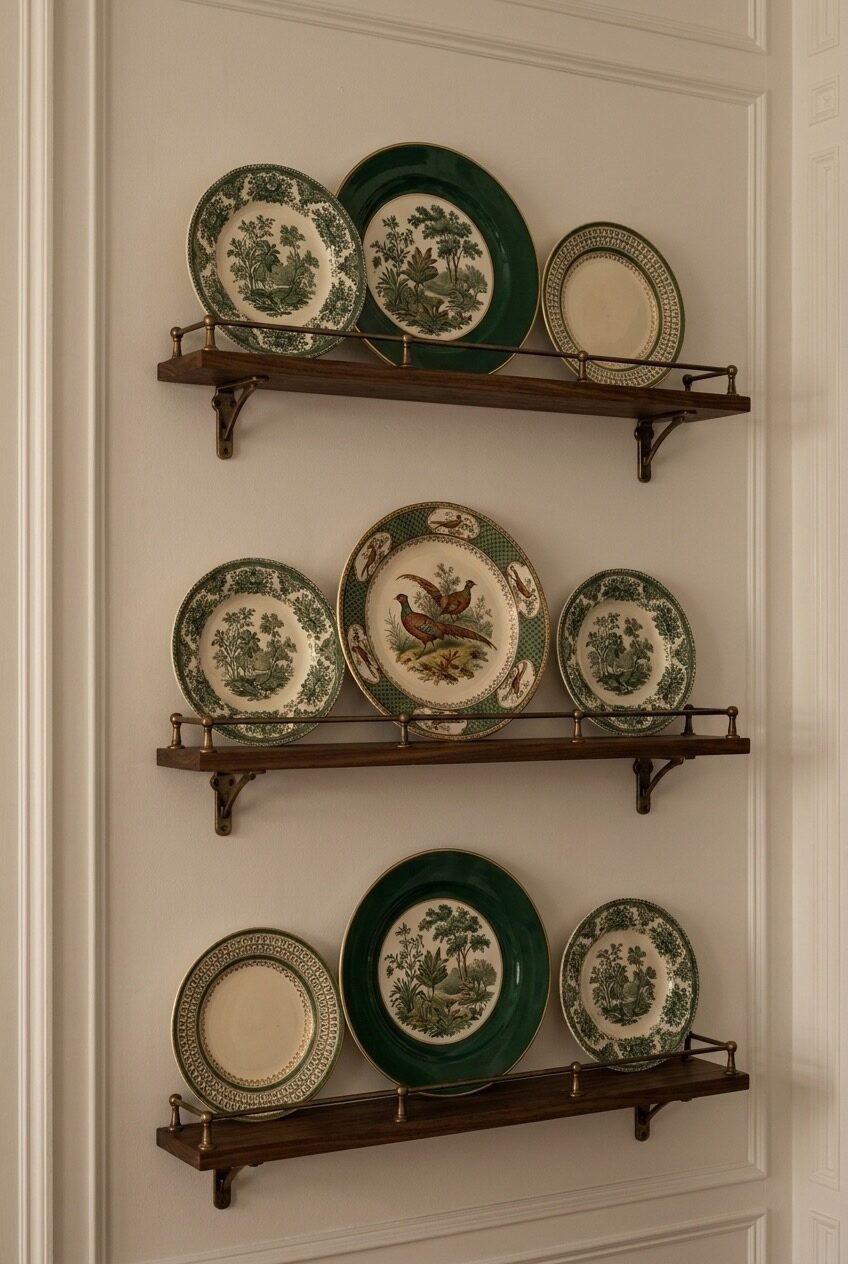
After a wall that ignores every rule, here is one that follows all of them closely. Three matching shelves, three plates on each, a bold pattern in the center flanked by two quieter ones on either side. Nothing here is left to chance, and that restraint is the whole appeal.
A narrow brass rail along each shelf is doing more than holding the plates upright and keeping them from sliding off. It reads as a small architectural detail in its own right, echoing the paneled wall behind it, so the whole setup feels built in rather than simply added on later.
This kind of symmetry only works if your plates actually match, so save it for an inherited or collected set rather than a pile of mismatched flea market finds. A picture rail or a plate shelf with a raised lip will hold everything steady without any hanging hardware at all.
Let Florals Meet Woven Texture
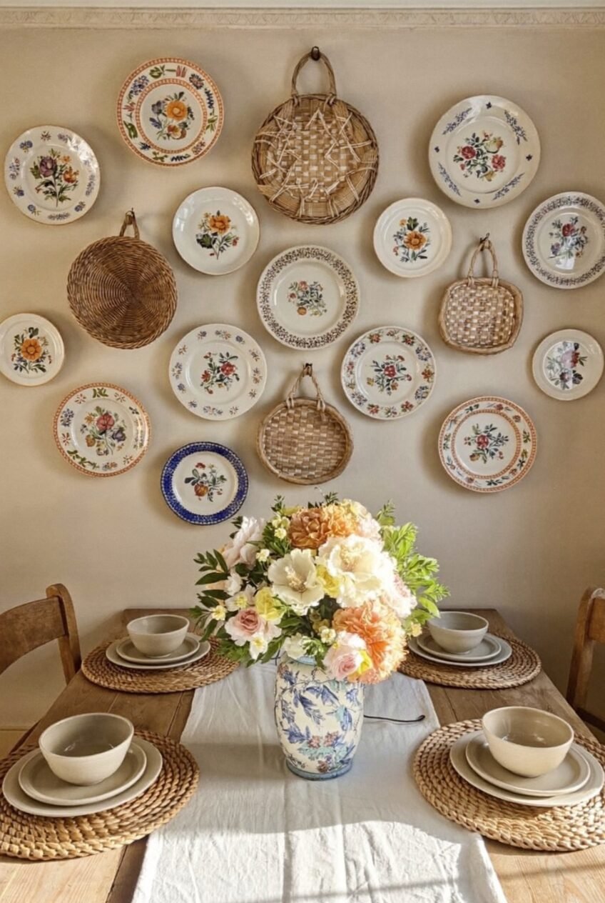
Morning light does a lot of favors for a wall like this one. Soft florals across a dozen mismatched plates catch the sun without competing with it, and the whole arrangement feels more like a backdrop for the table than a display that is asking for attention on its own.
Woven baskets tucked between the plates are the real reason this works as well as it does. Without them, a dozen floral patterns lined up in a row would start to blur together, but the rough texture of rattan gives the eye somewhere plain to rest between all that pattern.
Try alternating a basket or tray every third or fourth plate rather than clustering all your china together in one block, since that rhythm keeps a busy floral wall from feeling flat and repetitive. Round shapes throughout, plates and baskets alike, help everything sit together even without matching colors underneath, and a loose, uneven spacing keeps the whole wall feeling gathered rather than mapped out with a ruler.
Gold Frames Do The Heavy Lifting
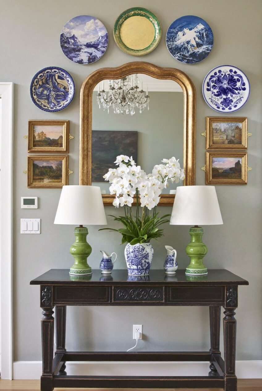
A mirror above a console usually gets propped up on its own, maybe paired with two matching sconces and little else. This version surrounds it instead, with landscape plates up top and small gilt framed paintings on either side, turning one mirror into the center of a much bigger moment.
Gold is the connective tissue running through the whole vignette from top to bottom. It shows up on the mirror frame, the tiny painting frames, and even flashes inside a green plate near the top, so the eye keeps finding the same finish no matter where it happens to land.
Match your frame finishes before you worry about matching your plates if you are building something similar at home. One consistent metal reads as pulled together even when the china patterns underneath vary quite a bit from piece to piece. Blue and white pieces in particular sit well next to warm gold tones, and a pair of matching lamps below only reinforces the symmetry running through the whole vignette.
Blue And White Never Really Left
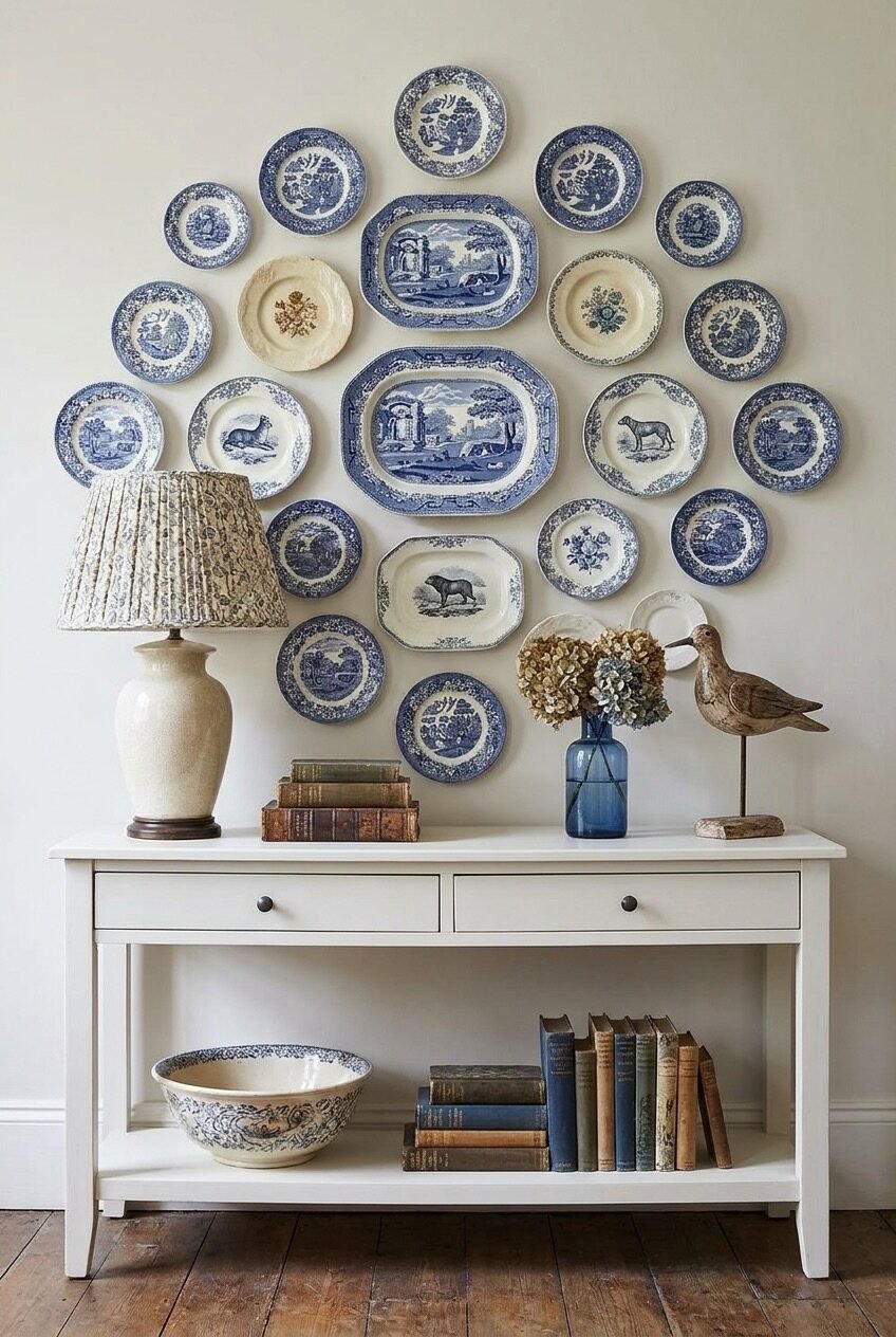
Twenty some plates on one wall could easily turn into visual noise, except every single one sticks to blue and white, so nothing here is fighting for attention. It is proof that color discipline alone can carry a layout that would otherwise be far too busy for most living rooms.
Two oval platters stacked in the middle rows act as the anchor for everything else, their rectangular shape breaking up what would otherwise be a wall of nearly identical circles. Smaller saucers fill the outer edges, tapering the whole arrangement into a rough, loosely symmetrical diamond shape overall.
Commit to one color family if you are nervous about mixing patterns, because blue and white china in particular comes in enough different motifs, willow scenes, florals, animals, that you will never run out of variety while still keeping the wall visually calm and easy to live with. Vintage shops and estate sales are full of it, usually for very little money.
Fruit And Florals Can Coexist Happily
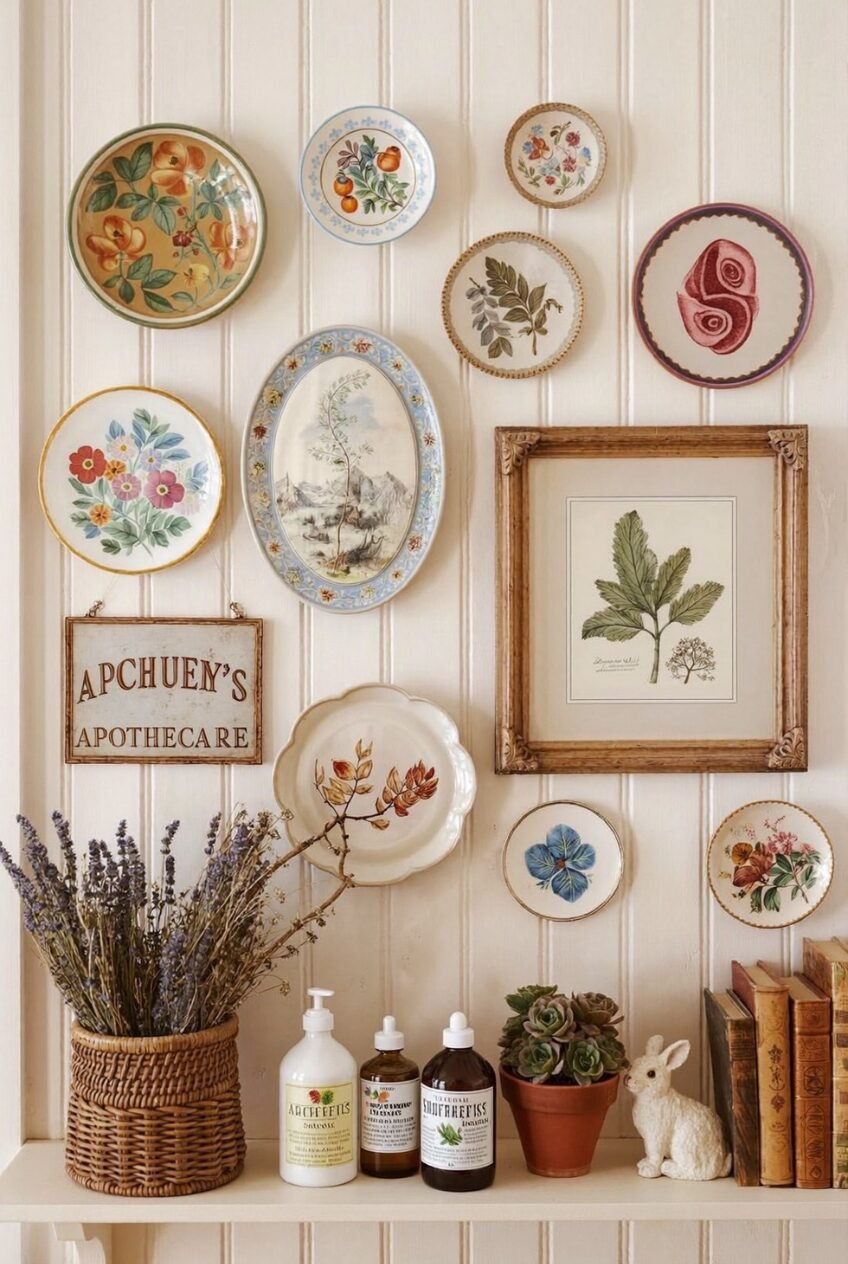
Do not feel locked into one motif if you are collecting plates for a wall like this one. Peaches and apricots sit two feet away from wildflowers and ferns here, and it still reads as a single cohesive grouping rather than two separate collections shoved awkwardly together at the last minute.
A single framed botanical illustration, larger than any plate around it, gives the whole cluster a scale anchor to organize around from the start. Without it, the eye would have nowhere obvious to land first among so many similarly sized round shapes competing for the same attention.
Group your fruit and floral pieces loosely instead of alternating them in a strict pattern, since a slightly clumped, organic layout feels more collected over time than a perfectly checkerboarded one ever could look. A shelf below with dried lavender, old glass bottles, and a small potted succulent keeps the vintage feeling going past the wall and onto the surface underneath it.
Stripes Turn A Bar Cart Playful
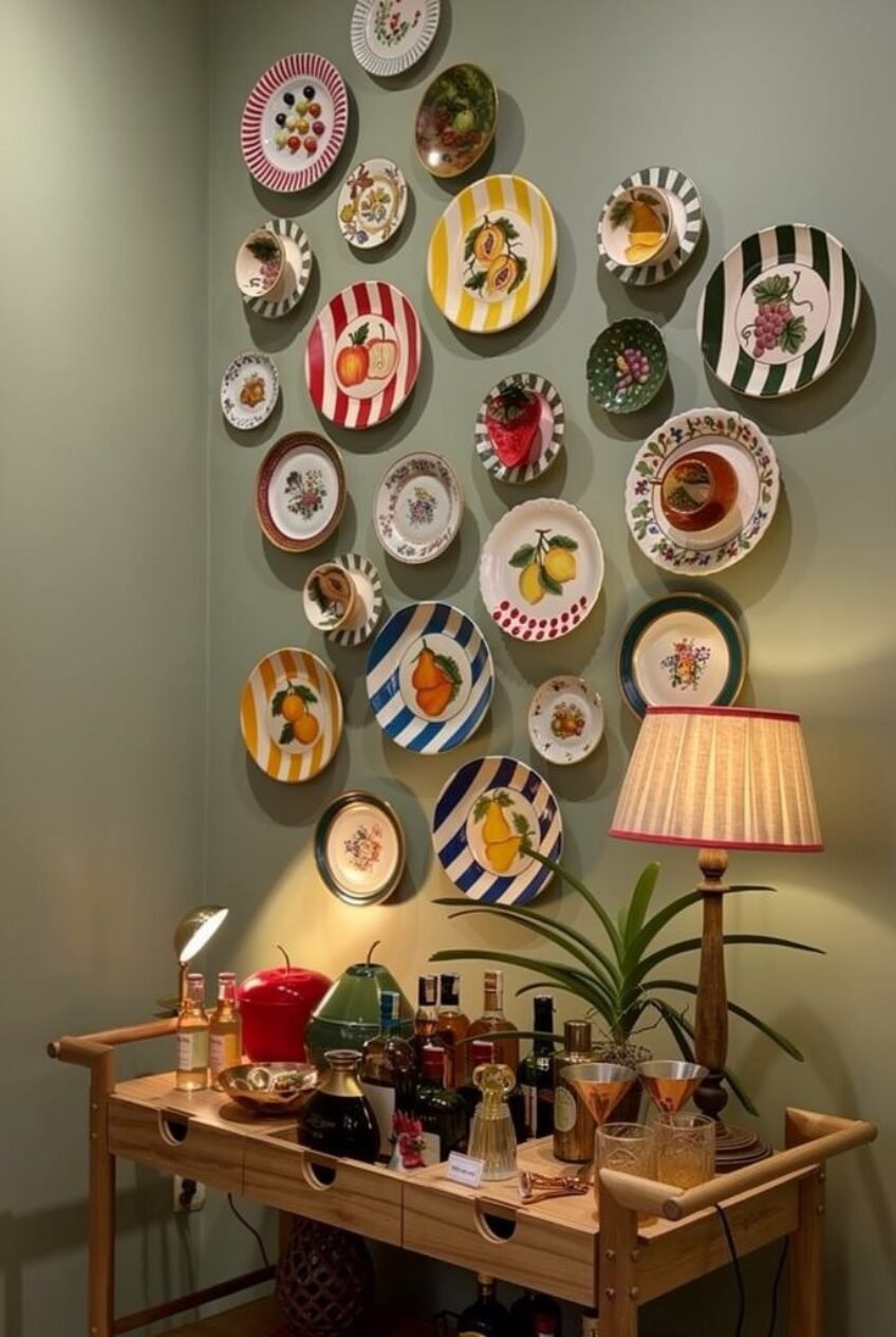
This is what happens when someone decides fruit plates alone are not quite loud enough. Bold striped plates in red, yellow, and blue sit between illustrations of lemons, pears, and grapes, and the combination somehow reads as fun rather than overwhelming once it is all up on the wall.
A muted sage wall behind all that color is doing quiet but important work here. Without a calm backdrop like that one, this many saturated stripes and bright fruit motifs would likely tip over into chaos instead of charm, especially in a smaller nook like this one tucked beside a cart.
Save your boldest, most colorful plates for a small, low traffic wall like the space above a bar cart or drinks table, where a little visual noise feels playful instead of overwhelming. Anchoring the whole thing with a warm lamp keeps it from feeling like a display case in a shop.
The Best Wall In Your House Might Be Empty
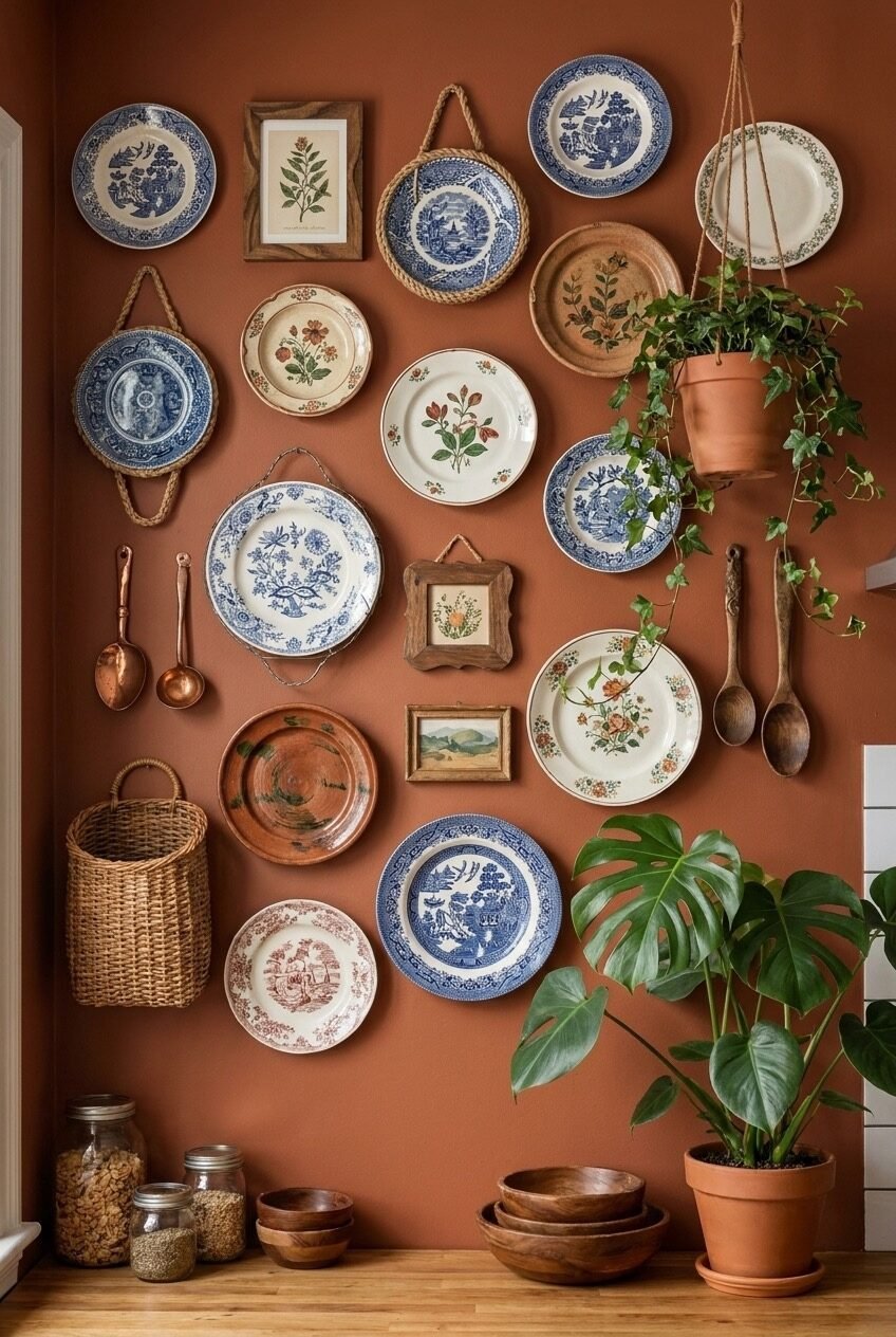
None of these walls happened because someone found a perfectly matching set of plates on one store trip. Every one of them is built from pieces gathered over months or years, from flea markets, family cabinets, and the occasional impulse buy that never quite made sense until it found its wall.
If you are starting from scratch, resist the urge to plan the whole thing out before you hang a single plate. Pick two or three pieces you already love, get them up on the wall, and let the rest grow slowly from there. Empty gaps for a few weeks are completely fine.
The plates sitting in your own cabinet right now are probably more interesting than you give them credit for. Pull a few out, hold them up against the wall, and see what happens next. Most of the walls above started with exactly that kind of small, uncertain first step.