How to Create a Kids Outdoor Area That Feels Like a Story, Not Just a Setup
We don’t just throw a swing set outside and call it a day anymore—kids’ outdoor spaces have officially entered their main character era. The magic happens when we start thinking like designers, not just parents. A great play area blends movement, creativity, and calm zones into one cohesive experience. That means mixing climbing structures, cozy corners, sensory elements, and imaginative setups so kids naturally flow from one activity to another.
The real secret? Balance. Too many features and it feels chaotic. Too little and they’re bored in ten minutes. We want layers—different heights, textures, and focal points that keep things visually interesting and functionally engaging. Zoning is everything, even outdoors. When we separate active play from quiet play, the space instantly feels bigger and more intentional.
And let’s be honest, we also want it to look good from the kitchen window. A well-designed play area isn’t just for kids—it’s part of the home’s overall aesthetic too.
Tire Tower Climber With Natural Play Layers
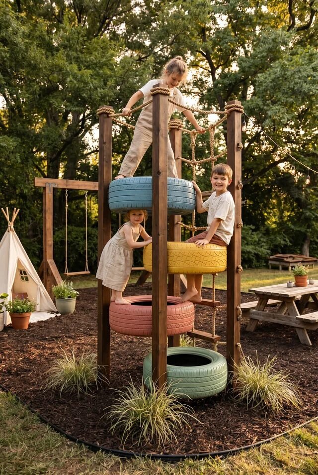
This setup is basically a playground glow-up using what most people would throw away, and we love that energy. The stacked tire tower creates vertical movement, which is huge for keeping kids engaged longer. Anytime we design play spaces, we want height variation—it adds challenge, flow, and keeps boredom out of the chat. The wood posts ground everything visually, while the rope elements soften the structure and make it feel more playful than rigid.
The color choice here? Low-key genius. Those muted pastel tires keep it whimsical without screaming “plastic playground.” If you’re recreating this, stick to a limited palette—think 3–4 tones max—so it feels curated, not chaotic. Repetition of material (wood + rope + rubber) keeps the design cohesive even with bold shapes.
Don’t skip the base layer either. Mulch or soft landscaping isn’t just safety—it visually anchors the structure. Add a small swing or teepee nearby to create zones, so kids move through the space instead of just climbing up and down like it’s leg day.
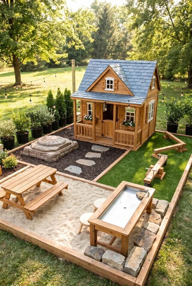
Cottage Playhouse With Whimsical Garden Path
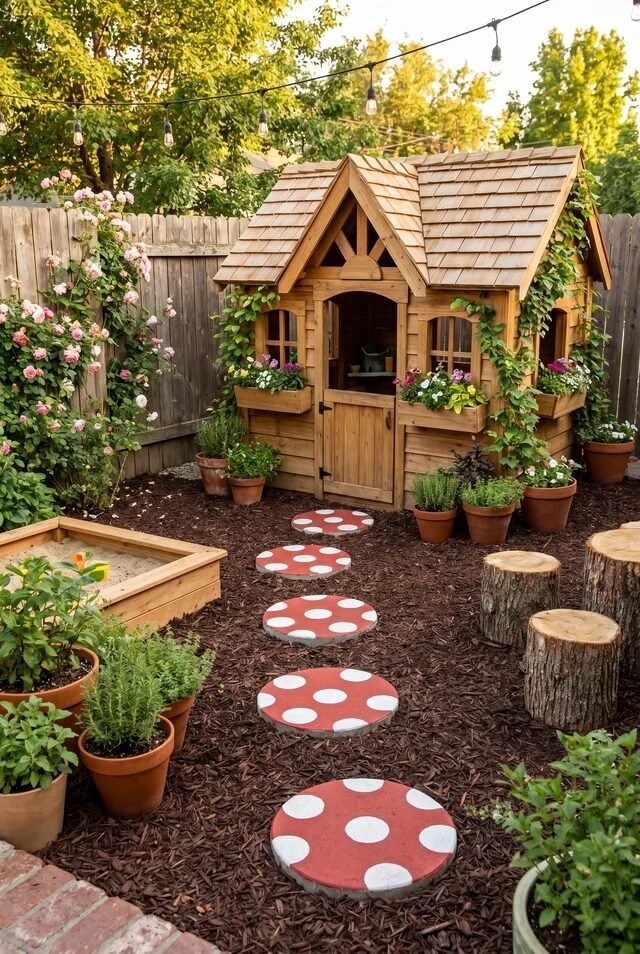
This is giving storybook main character energy, and honestly, we’re here for it. The tiny wooden house instantly becomes a focal point, but what really makes it work is the path leading to it. Design-wise, pathways create intention—they guide movement and make the whole setup feel like an experience, not just random objects in a yard.
Those mushroom stepping stones? Iconic. They introduce playful contrast against the natural wood and greenery. When recreating this, mix structured elements (like the house) with softer organic ones (plants, vines, flowers). That balance between structure and softness is what keeps it from feeling too staged.
Layering is doing heavy lifting here. Window boxes, climbing plants, potted herbs—everything stacks visually at different heights. If we’re copying this vibe, we don’t need a big yard. We just need smart layering and one strong focal point. Bonus: string lights overhead = instant magic hour every hour.
Cozy A-Frame Reading Nook Outdoors
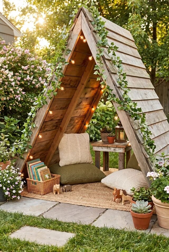
This is not just a play area, this is a personality trait. The A-frame shape creates a natural sense of enclosure, which makes kids feel cozy and safe while still being outside. When we design for kids, “cozy corners” matter just as much as active zones.
The texture game here is elite. You’ve got raw wood, woven rugs, soft cushions, trailing greenery—it’s basically a Pinterest board that came to life. Keep your palette earthy and warm so it blends into the garden instead of competing with it. Lighting is key too—soft string lights instantly shift this from daytime hangout to magical evening retreat.
If we’re recreating this, don’t overfill it. Leave breathing room so it feels calm, not cluttered. Add books, a basket, maybe a tiny side table, and call it a day. This becomes the “quiet zone” that balances out all the chaos from climbing and running. Yes, we’re designing emotional regulation into the backyard now.
Rustic Mud Kitchen With Play Zones
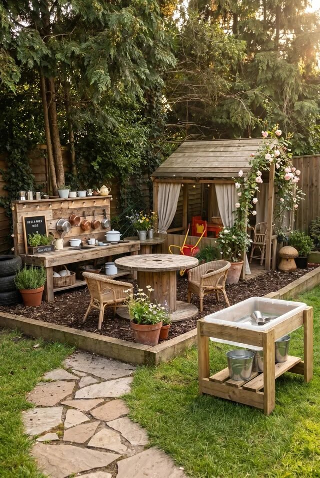
Okay this one? Peak childhood core memory material. A mud kitchen works because it mimics real-life spaces, which kids naturally gravitate toward. Imaginative play thrives when the setup feels familiar but slightly magical. That’s exactly what’s happening here.
The zoning is subtle but important. You’ve got a “kitchen” area, a seating zone, and even a washing station. When recreating this, think in mini zones instead of one big feature. It helps kids move between activities without losing interest. Zoning also keeps the space organized visually, which parents will appreciate more than they admit.
Material choice matters a lot here. Stick to weathered wood, metal buckets, and neutral tones to keep it cohesive with the outdoors. Add plants around the edges to soften everything. And yes, it will get messy—that’s literally the point. We’re designing for creativity, not perfection.
Garden Game Table With Natural Surroundings
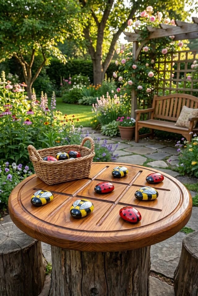
This is how you trick kids into “chilling outside” without them realizing it. A simple game table becomes a social anchor in the yard, especially when it’s surrounded by lush planting. Every play space needs a slower, grounding element—and this is it.
The circular table design is intentional. It encourages interaction from all sides, which is perfect for group play. If we’re recreating this, go for rounded shapes whenever possible—they feel more inviting and less rigid than sharp edges. The natural wood finish also keeps the focus on the activity, not the furniture.
What really elevates this setup is the backdrop. Flowers, pergola, soft greenery—it creates a sense of enclosure without walls. Add a few stools or tree stump seating, and suddenly it feels like a tiny outdoor room. It’s low effort, high impact, and honestly… adults will want to use it too.
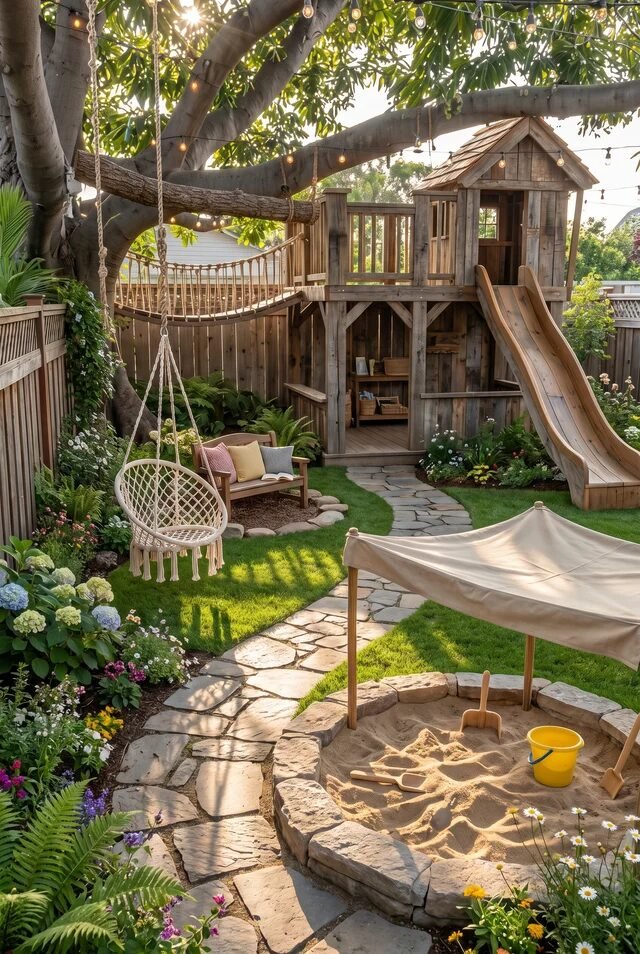
Elevated Treehouse Deck With Climbing Features
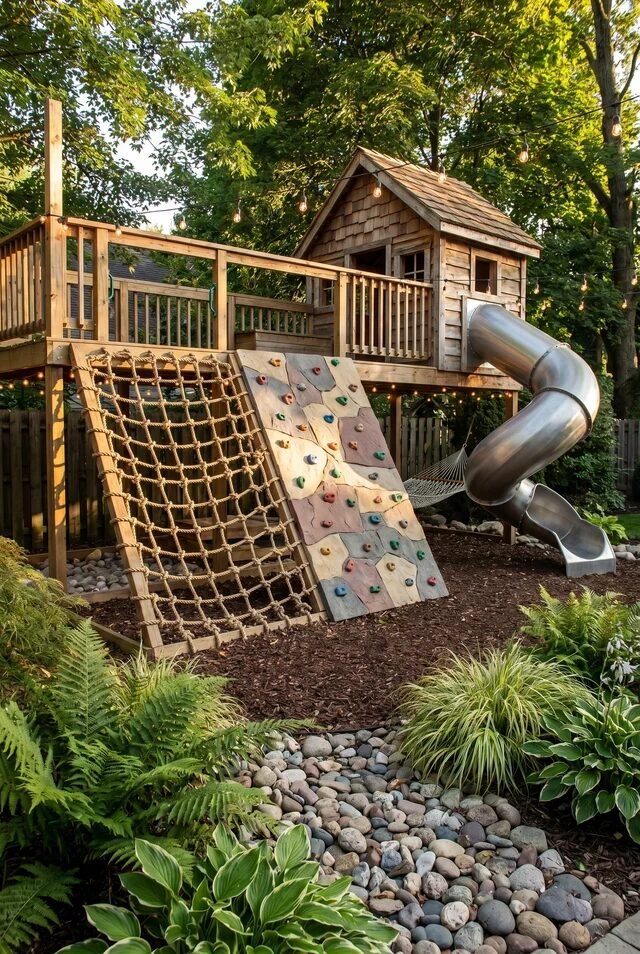
This setup is basically a full-on backyard adventure park, and yes… we’re a little jealous. The elevated deck creates instant hierarchy in the space, which is a core design move. When we add elevation, we’re not just building up—we’re creating zones, movement paths, and a sense of progression. Kids climb, pause, slide, repeat. It’s a whole experience loop.
What makes this extra smart is the dual access: rope net + climbing wall. That variation keeps it interesting while supporting different skill levels. If we’re recreating this, mix at least two types of climbing elements to avoid a one-note setup. Contrast in texture (rope vs wood vs metal) also keeps the design visually dynamic without adding clutter.
The landscaping underneath isn’t random either. Mulch, stones, and plants soften the structure and make it feel integrated, not dropped into the yard last minute. Add warm string lights and suddenly it’s giving “boutique playground,” not “weekend DIY chaos.”
Outdoor Chalkboard Wall Creative Zone
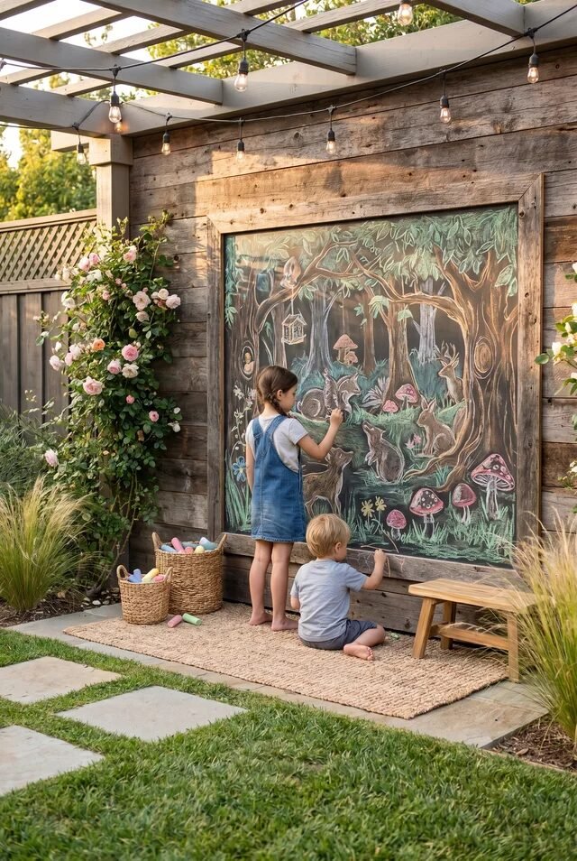
This is what happens when we give kids a blank canvas and say “go off.” The oversized chalkboard instantly becomes a focal point, but more importantly, it creates a creative zone separate from active play. Zoning like this is key—we want high-energy areas and calm, imaginative ones to coexist without competing.
Framing the chalkboard in wood was the right move. It visually anchors the piece and ties it into the fence, so it feels intentional. If you’re doing this at home, go BIG with the board. Scale matters—larger surfaces invite more creativity and feel way more immersive.
The styling around it is subtle but effective. Baskets, a small bench, soft rug—these details turn it into a mini outdoor studio. Bonus tip: place it in partial shade so it’s usable longer during the day. We’re basically designing a tiny art residency… but for kids with chalk and zero deadlines.
Covered Mud Kitchen With Organized Storage
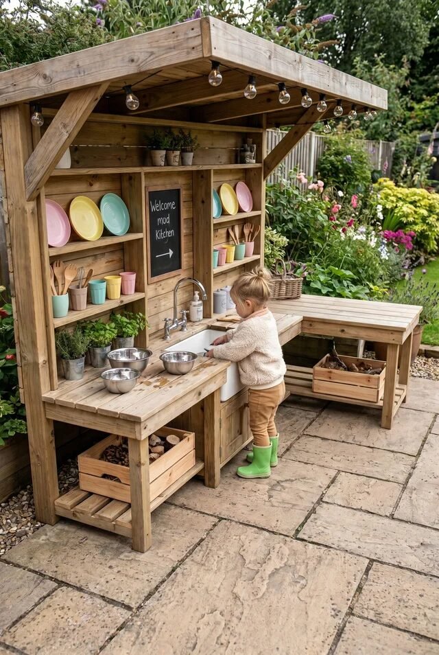
This one said “we love chaos, but make it aesthetic.” The covered structure is doing more than looking cute—it protects the setup so it actually lasts. Weather protection is one of those unsexy design decisions that makes a huge difference long-term.
Storage here is chef’s kiss. Open shelves, hooks, baskets—everything has a place, which keeps the visual noise down. If we’re recreating this, think vertical. Using vertical space keeps the footprint small while maximizing function, especially in tighter yards.
The color palette is soft and cohesive, which balances out the inevitable mess. Those pastel dishes? Adorable, but also strategic. They add color without overwhelming the natural wood tones. And yes, add a real working faucet if you can—it upgrades the whole experience from “pretend play” to “tiny Michelin star chaos.”
Wooden Stump Car Track Play Setup
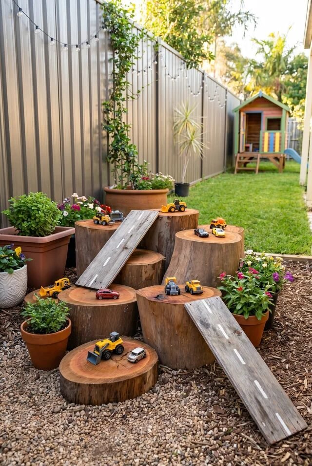
Okay this is low-budget genius and we’re obsessed. Using tree stumps creates natural levels, which instantly makes play more engaging. Variation in height = variation in play, and that’s a design win every time.
The little ramps connecting each stump are doing all the heavy lifting. They guide movement and create a clear play narrative (aka cars go zoom, obviously). If we’re recreating this, keep the layout slightly irregular. Perfect symmetry can feel boring—organic placement feels more playful and natural.
Gravel as the base layer is also a smart call. It drains well, defines the area, and contrasts nicely with the wood tones. Add a few potted plants around the edges and suddenly it feels like a mini landscape, not just a toy setup. Bonus: this is one of those rare ideas that looks good even when no one’s playing with it.
Multi-Playhouse Garden With Slides And Bridges
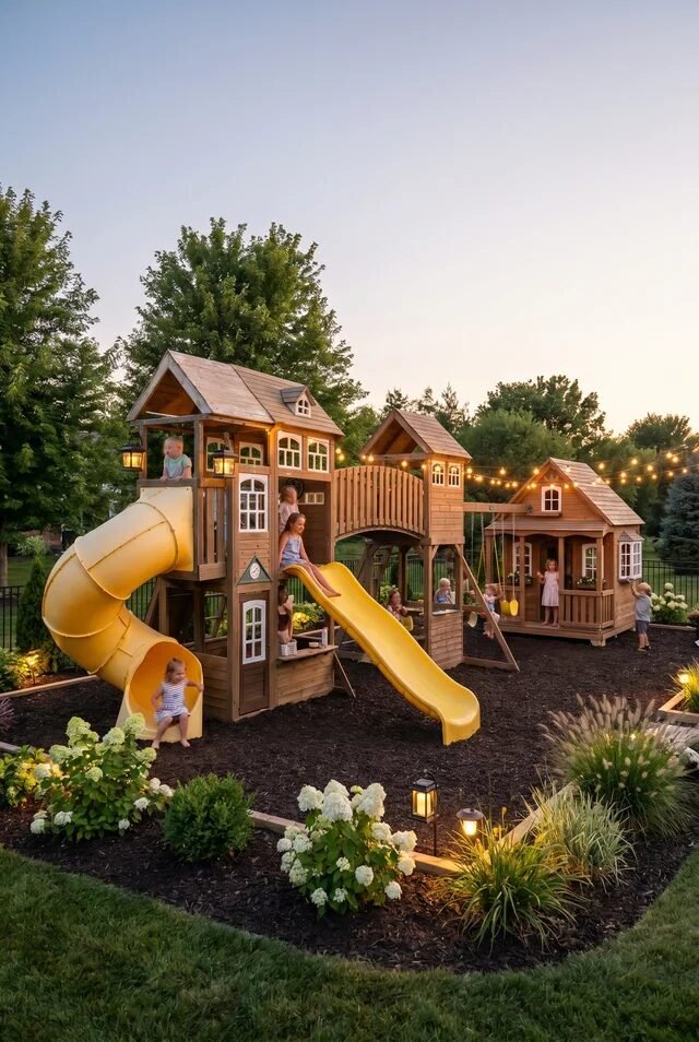
This is not a play area, this is a full-blown childhood dreamscape. Multiple playhouses connected by bridges create a narrative environment, which is next-level design thinking. When we design spaces like this, we’re not just adding features—we’re building a story kids can move through.
The repetition of materials keeps it cohesive. Same wood tones, similar rooflines, consistent detailing—it all ties together even though there are multiple structures. If we’re recreating this on a smaller scale, stick to one material palette and repeat it. Consistency is what makes complex setups feel intentional instead of chaotic.
Lighting is the secret sauce here. Ground lights, string lights, warm tones—it extends usability into the evening and adds that magical vibe. Pair that with soft landscaping around the edges, and suddenly the whole space feels like a tiny village. Honestly, we might need one too.
Designing Outdoor Spaces Kids Never Want To Leave
At the end of the day, the goal isn’t perfection—it’s creating a space kids actually use. And spoiler: they’re not impressed by expensive setups if the design feels off. What keeps kids engaged longer is variety, flow, and a sense of discovery. When we design with movement in mind—climb here, slide there, rest over there—we create an experience, not just a setup.
The beauty of these ideas is how adaptable they are. Whether it’s a tiny corner or a full backyard, we can scale the concept by focusing on materials, layering, and smart placement. Natural textures, soft landscaping, and warm lighting instantly elevate even the simplest play zones. Consistency in color and materials is what makes everything feel intentional, not thrown together.
So yes, we’re designing for kids—but we’re also designing spaces that feel calm, cohesive, and honestly… kind of Pinterest-worthy.