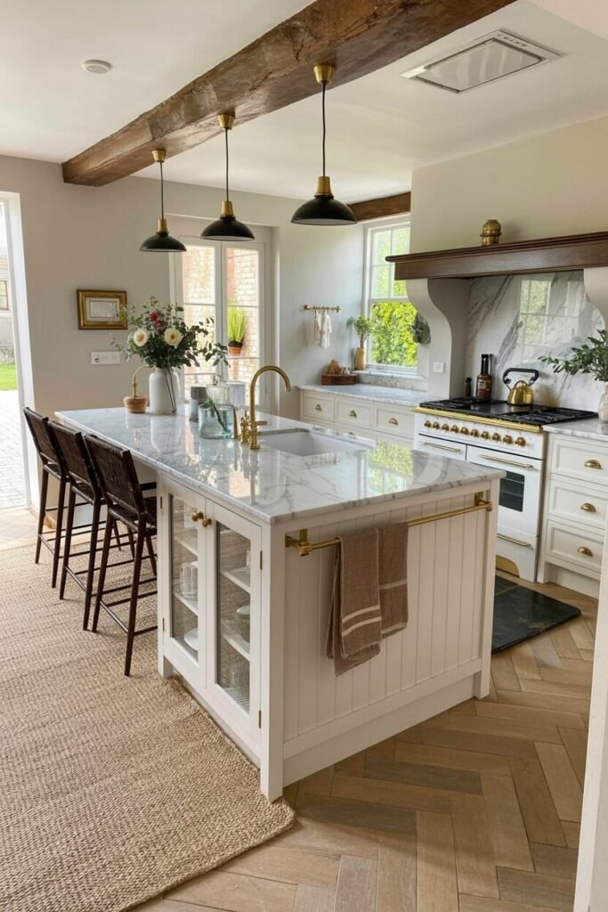

Honey Oak Kitchens Are Quietly Becoming The Warmest Interior Trend Again
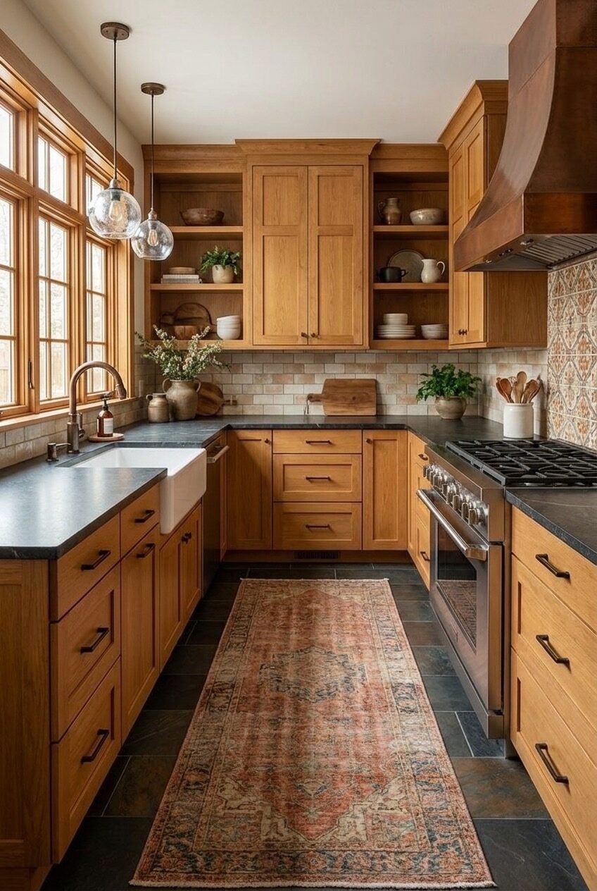
Honey oak cabinets spent a solid decade being the thing everyone wanted to rip out. Funny how that goes. Now those warm, golden wood tones are showing back up in kitchens that feel collected and lived in, not stuck in a 1998 catalog nobody asked for.
What changed is not the wood, it is what people are pairing it with. Dark countertops, colorful cabinetry, marble, tile in every hue imaginable. Honey oak turns out to be one of the most flexible backgrounds a kitchen can have, which is probably why it never really left.
We pulled together a set of real kitchens that show how differently this wood can read depending on what surrounds it. Some lean rustic, some lean bright, some go full color drenched. Scroll through and see which direction pulls you in the most.
Concrete Walls Meet A Living Island
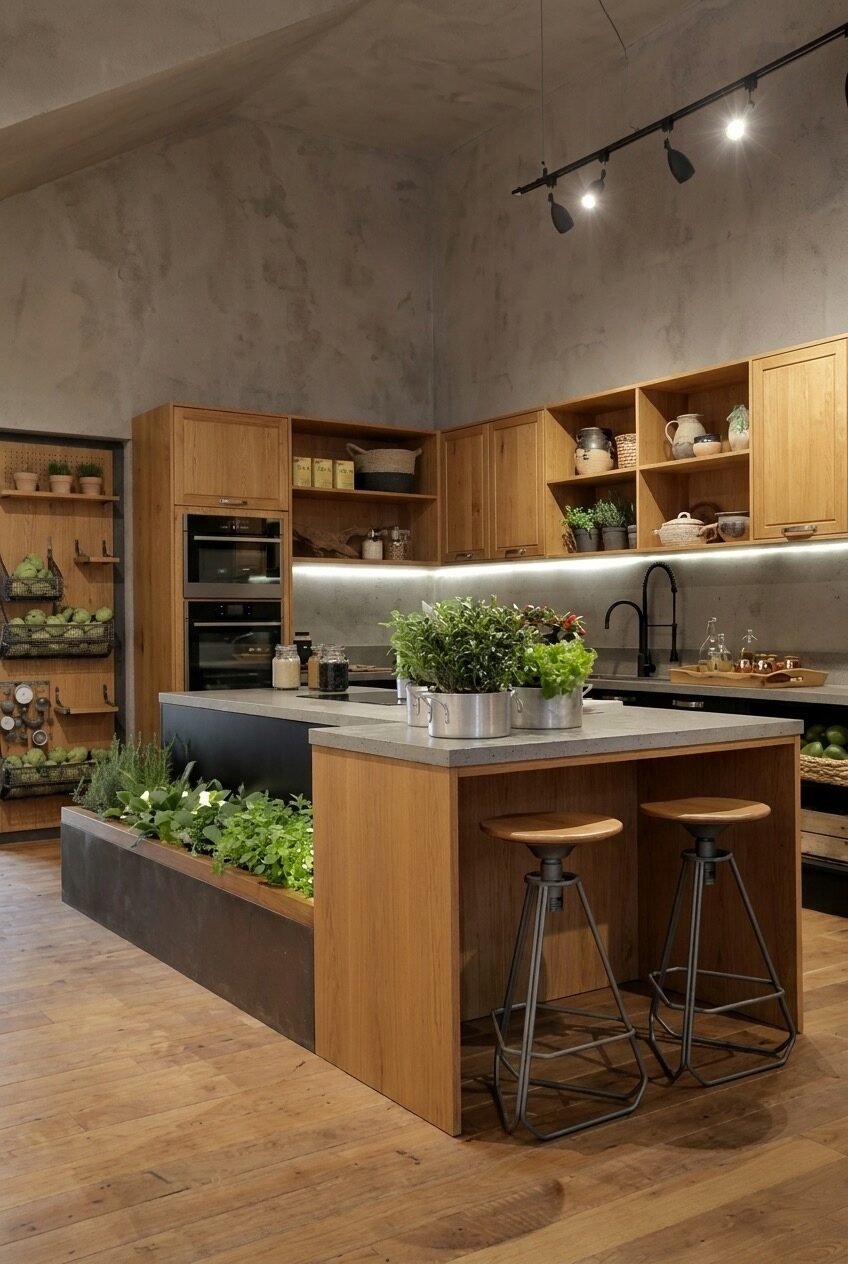
Concrete walls and honey oak cabinets should not work together on paper, but this kitchen makes the pairing look obvious. The raw, matte texture behind the wood keeps things from feeling like a catalog spread, more like a space someone actually built with their own two hands.
The real standout is the built-in planter running along the island, stocked with actual herbs instead of a single sad basil plant on the windowsill. Growing herbs within arm’s reach of the stove is one of those small design choices that changes how often you actually cook. It also means less plastic packaging piling up in the fridge drawer, a nice bonus nobody asks for but everyone appreciates.
If a full planter box feels like too much commitment, a narrow trough planter or a row of pots recessed into a countertop cutout gets you most of the way there. Track lighting overhead means you can point light exactly where the plants need it most.
Brass And Marble Warm Up Oak
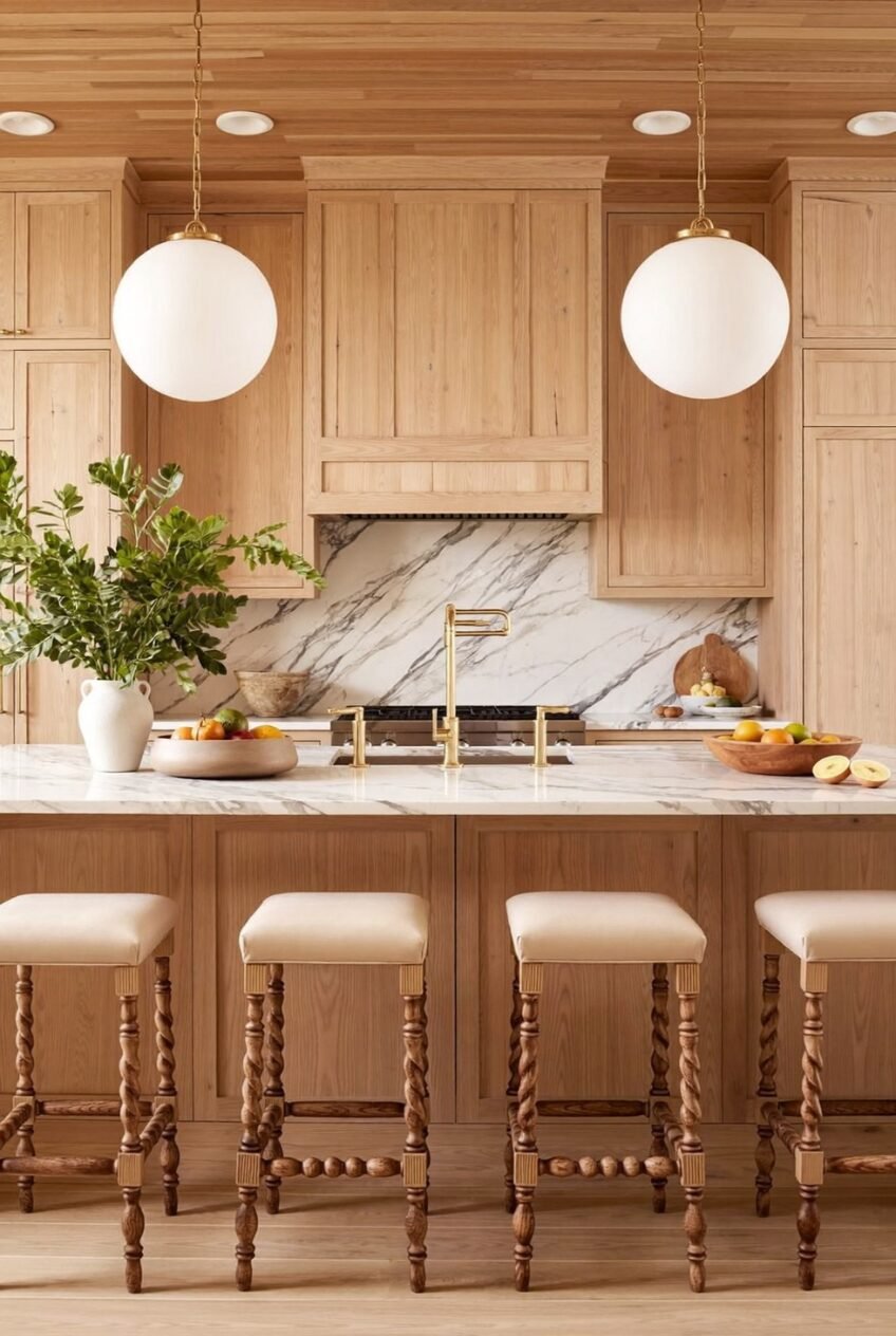
Light honey oak reads completely differently than the darker, more amber tones people usually picture. Paired with a marble slab backsplash and brass fixtures, this kitchen leans almost Scandinavian, proof that oak does not automatically mean rustic or heavy handed.
The wood ceiling matters here as much as the cabinets. Repeating the same tone overhead ties the whole room together instead of treating the ceiling as an afterthought. Matching your ceiling material to your cabinetry is an easy way to make a kitchen feel larger and more cohesive. The pair of oversized glass globe pendants also helps, since their simple shape does not compete with the wood grain running everywhere else.
Those twisted leg barstools add texture without adding another color to keep track of. If you are working with a similar light oak, look for brass or unlacquered fixtures over chrome. The warmth reads noticeably better against this particular wood tone.
A Yellow Table Steals The Room
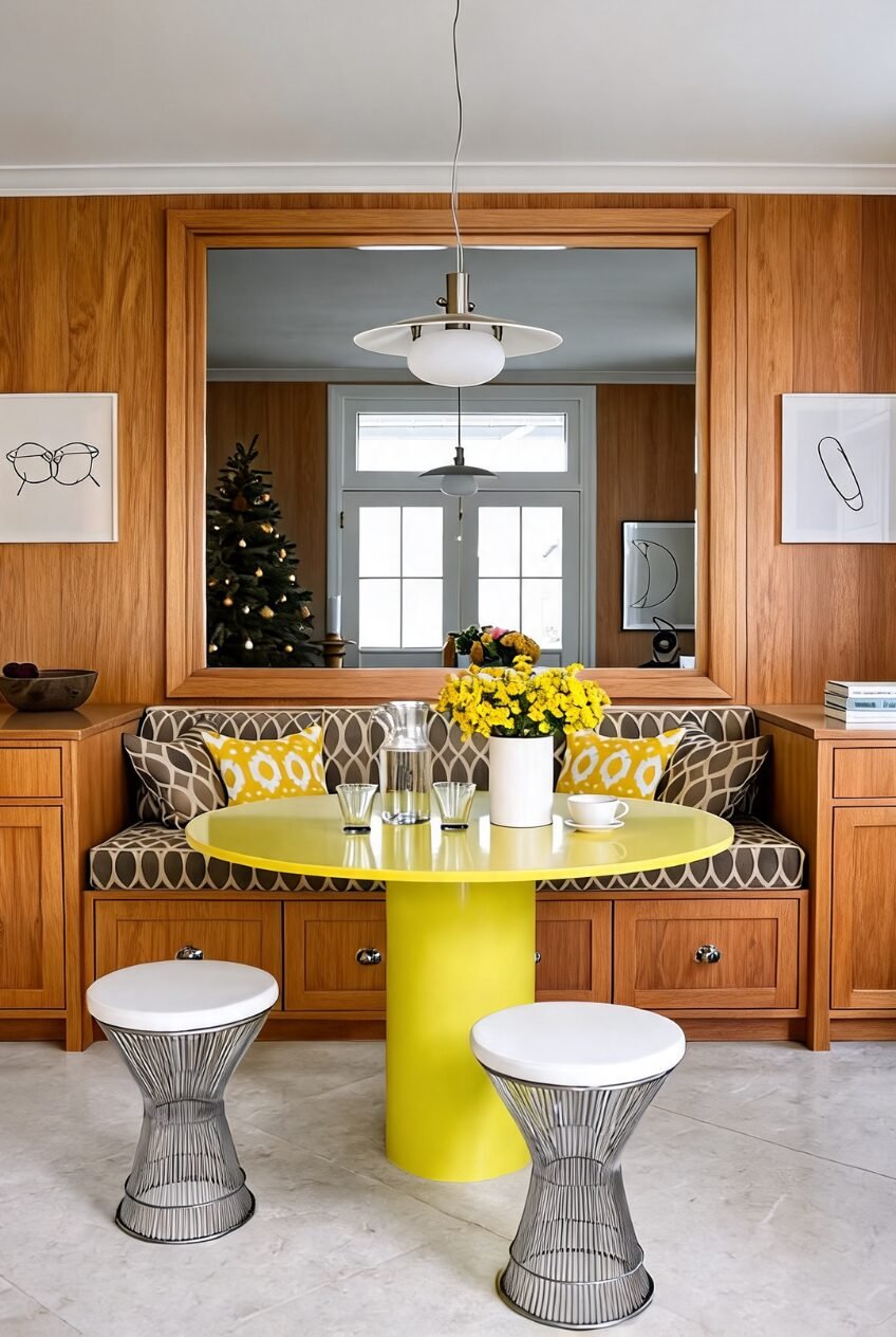
Most breakfast nooks play it safe. This one did not get the memo, and it is better for it. A saturated yellow pedestal table sits in front of walnut paneling like it was daring you to disagree with the choice, and honestly, it is hard to argue with the result.
The large mirror above the banquette is doing quiet, practical work behind the scenes. It bounces light around a windowless wall and makes the wood paneling feel less like a box. A well placed mirror can rescue a dark, enclosed nook faster than any paint color. It also happens to double the visual impact of that yellow table, which does not hurt either.
Notice how the patterned pillows repeat the yellow from the table instead of introducing a fourth color into the mix. If you want a similarly bold nook, pick one loud piece of furniture and let everything else echo it back rather than pile on new colors that compete for attention.
Copper Pots Turn Into Wall Art
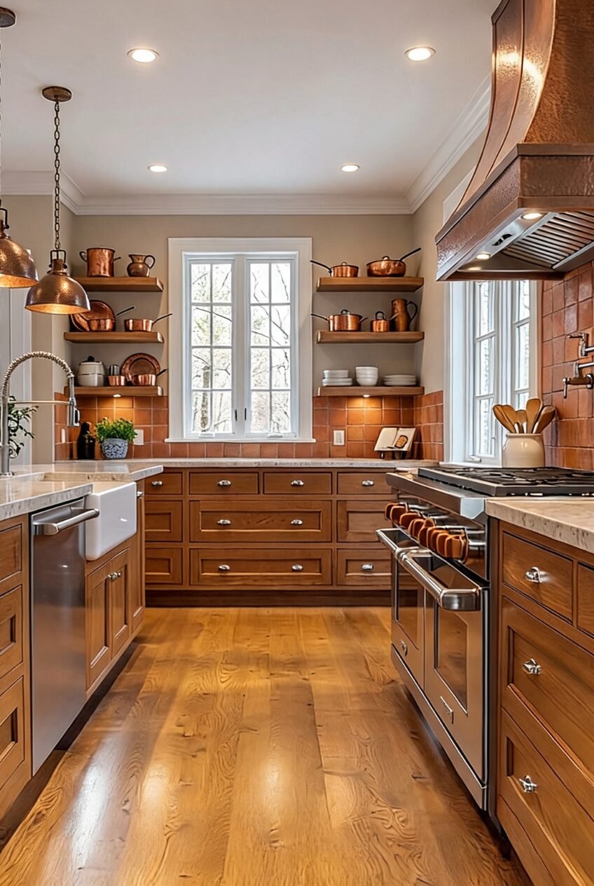
Open shelving only works if what is sitting on it earns its spot, and copper cookware is basically built for this job. The warm metal plays off the terracotta tile and honey oak so naturally that it barely reads as decor, more like tools that happen to look good.
A hammered copper range hood ties the whole collection together instead of leaving the pots looking randomly placed. Repeating one material across your hood, cookware, and hardware gives a kitchen a sense of cohesion without buying a single matching set. The terracotta tile backsplash underneath just adds another warm layer instead of introducing something that fights for attention.
If your own cookware is not exactly photogenic, this is a good excuse to slowly swap the mismatched pans for a few copper or stainless pieces you actually want sitting out on display, rather than stuffed in a cabinet. Secondhand shops are a surprisingly good source for this kind of thing.
Coastal Blue Meets Warm Wood Tones
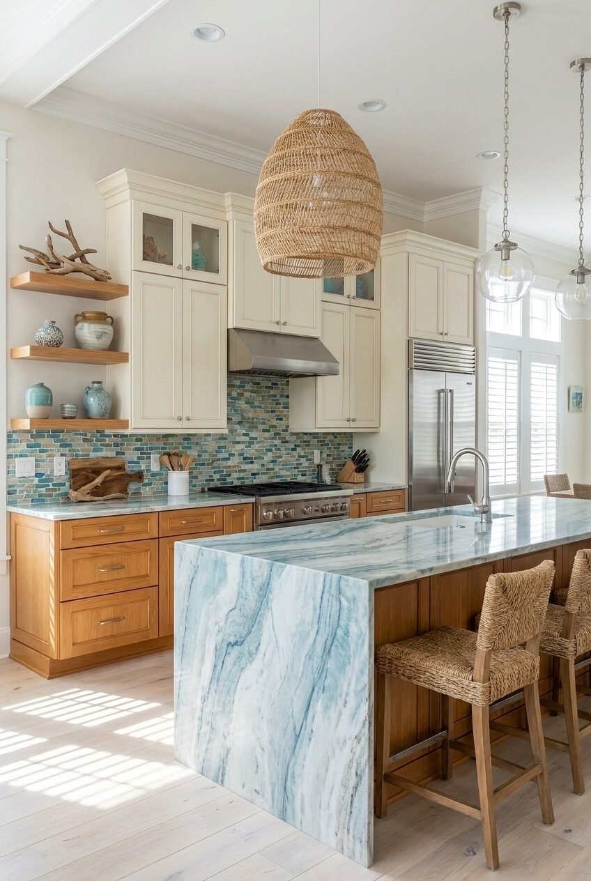
Honey oak and coastal blue is not the pairing most people reach for first, but the mosaic backsplash here makes the case for it. The tile pulls in teal, cream, and sandy tones that all read as beach adjacent without a single anchor or seashell in sight, which is honestly a relief.
Cream upper cabinets do a lot of the heavy lifting, giving the eye somewhere calm to land before it hits the busier tile and marble waterfall island below. Splitting your cabinetry into two tones, oak on the bottom and a lighter shade on top, keeps a coastal palette from feeling too matchy. The waterfall edge on the island adds a bit of movement without needing another pattern in the room.
The woven pendant and driftwood on the shelves are doing quiet work too. If you want this look, resist the urge to go full nautical. One or two natural, textural pieces read as coastal far better than a wall of starfish or a rope mirror ever could.
White Marble Cools Down Honey Oak
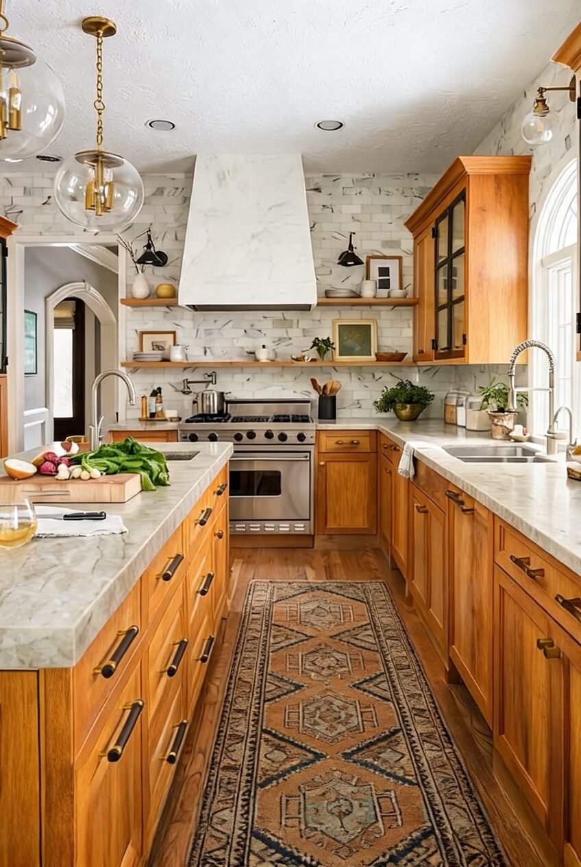
Oak cabinets can start to feel like a lot of the same warm tone if nothing steps in to balance them. A full marble slab running up the wall and wrapping the range hood is exactly that kind of relief here, cool and veined against all that gold toned wood. It also makes the hood itself feel sculptural instead of purely functional.
Open shelving in the same marble keeps the material consistent instead of introducing yet another texture to compete with. Extending your countertop material up the wall as a slab backsplash is one of the more expensive but genuinely worthwhile upgrades in a wood heavy kitchen. The brass and glass pendants overhead keep the whole thing from feeling too cold or clinical.
The patterned runner on the floor is not just there to protect the wood, it adds the one bit of pattern and color the room is otherwise missing. Layer one in if your own oak kitchen is feeling a little one note, and pick a rug with tones that pull from both the wood and the stone.
A Long Galley Still Feels Wide
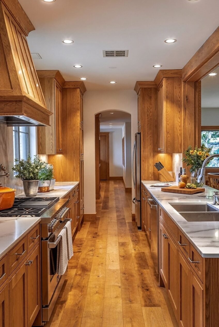
Galley kitchens get a bad reputation for feeling cramped, but keeping every surface in the same warm family, oak cabinets, matching plank floors, a wood clad hood, stops the narrow layout from feeling like a hallway with a stove parked in it. There is no jarring transition anywhere for the eye to snag on.
The marble countertops are the one contrast in the whole room, and that restraint is exactly why it works. A galley kitchen benefits more from consistent materials than from adding extra colors to fake a sense of width. The stainless appliances are left to be purely functional rather than another design statement competing for space.
Recessed lighting spaced evenly down the ceiling helps too, pulling the eye forward through the arched doorway instead of letting it stop halfway. If your own galley feels tight, check whether your lighting is doing that job before you blame the layout itself, since a poorly lit hallway kitchen will always feel smaller than it actually is.
This Kitchen Commits To Color
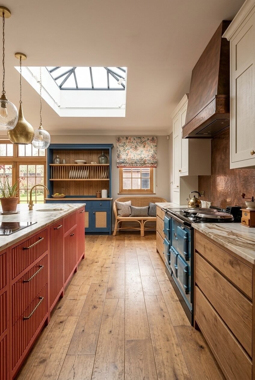
Most honey oak kitchens play it neutral and let the wood do the talking. This one had other plans, dropping in a red island, a navy blue plate rack hutch, and a copper range that all somehow agree with each other. Even the floral roman shade in the window gets to join the party instead of being an afterthought.
A skylight overhead is doing more than lighting the room, it is giving all that color somewhere to breathe instead of feeling closed in. Bold cabinet colors read as playful rather than chaotic when there is enough natural light bouncing around to soften them. Without that daylight, this same combination could easily tip into feeling heavy or overdone.
If you want to steal this approach, start smaller than a full island repaint. Try the plate rack hutch in one saturated color first, keep your actual cabinetry in the honey oak, and see how much personality that single piece adds before committing further to a bigger, harder to reverse decision.
Mustard Yellow Grounds The Golden Wood
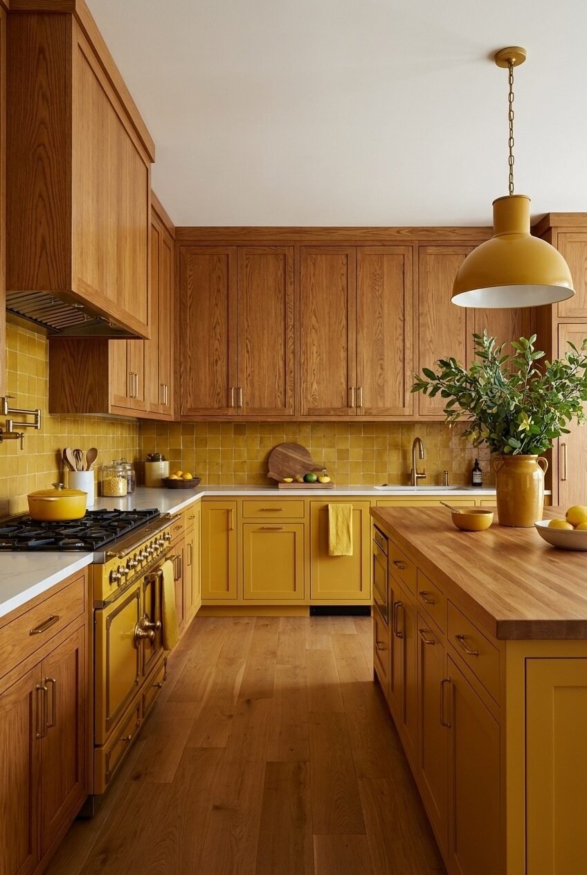
Pairing honey oak with another warm tone sounds risky on paper, everyone tells you to add contrast, but the mustard yellow lower cabinets here prove that leaning into warmth on purpose can work just as well as fighting it. The oversized yellow pendant overhead commits to the idea even further instead of second guessing it.
Zellige tile in the same yellow family carries the color up the wall without it feeling like a single loud accent wall. Choosing a lower cabinet color that sits close to your wood tone on the color wheel, rather than fighting it, creates a much calmer transition than people expect. White marble countertops elsewhere in the room step in to keep the whole palette from tipping into overload.
A butcher block counter on the island keeps things from tipping into overly polished territory. Try this pairing with a smaller piece first, a yellow ceramic pendant or a set of yellow tile samples, before repainting an entire run of cabinets you might regret committing to so quickly.
Dark Green Cabinets Balance Terracotta Tile
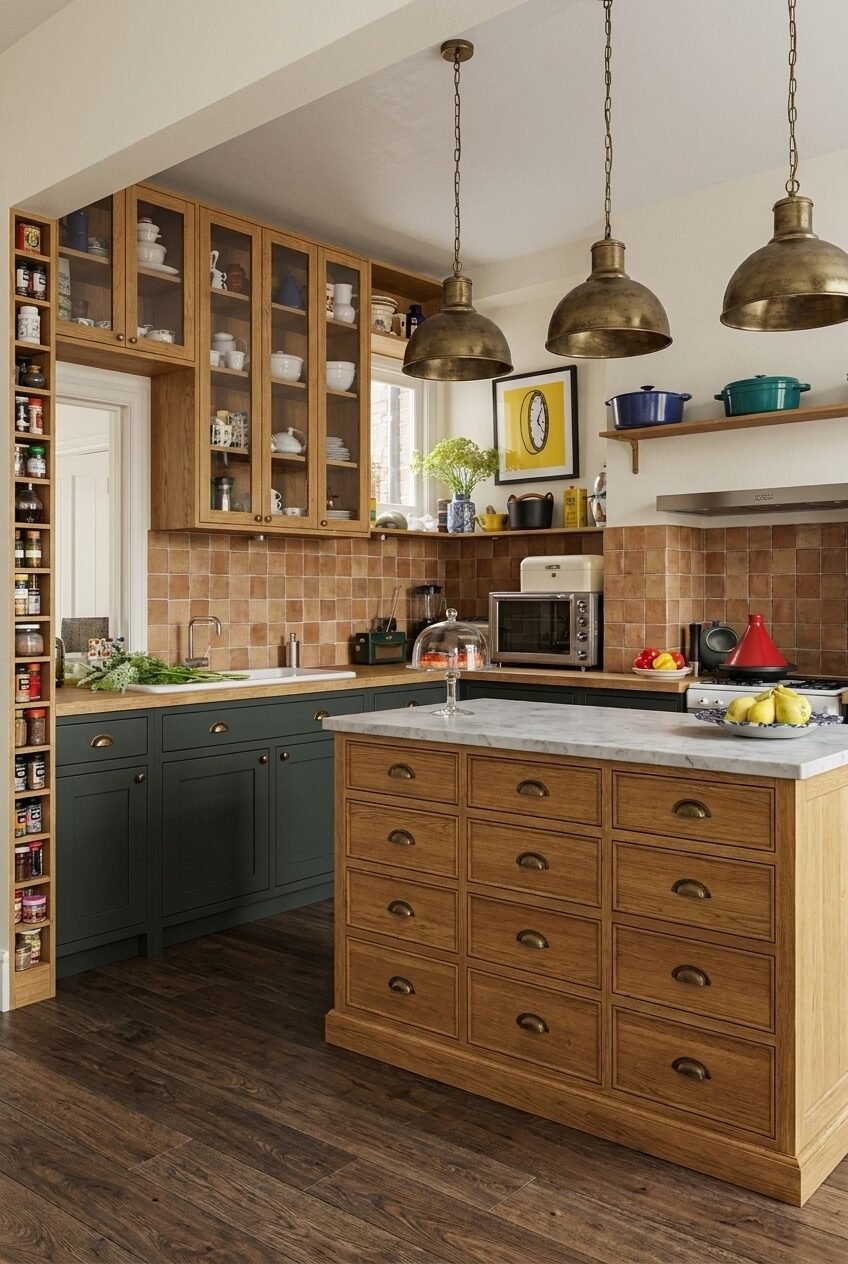
Dark green lower cabinets against a terracotta zellige backsplash could easily read as heavy, but the honey oak island sitting in the middle of the room keeps everything grounded instead of closed in on itself. Brass dome pendants overhead add a bit of shine that stops the whole palette from feeling too matte.
Glass front upper cabinets are doing quiet work here too, showing off dishware while keeping the top half of the room from feeling as saturated as the bottom half. A glass cabinet or two is an easy way to lighten a kitchen built around dark, moody colors. The marble counter on the island echoes that same lightness while everything below it stays deep and warm.
The built-in spice shelf tucked into the corner is worth copying regardless of your color scheme. Vertical storage like this uses a sliver of space most kitchens waste, and it keeps jars visible instead of buried behind a cabinet door somewhere, which makes actual cooking noticeably faster on a busy weeknight.
Your Honey Oak Kitchen Just Needs The Right Pairing
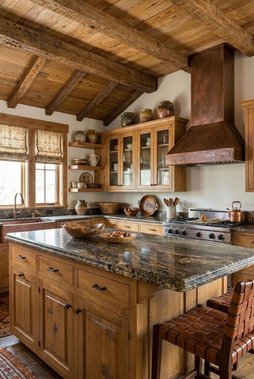
By now it should be clear that honey oak does not need to be fought against or covered up. The wood has more range than it gets credit for, and every kitchen above proves that the tone itself was never really the problem in the first place.
If you are staring at your own honey oak cabinets wondering where to start, pick one element from these kitchens rather than trying to copy the whole room. A countertop swap, a bold paint color on the island, or a patterned backsplash can shift the entire feel without a full renovation budget.
Wood tones move in cycles, and honey oak is proof that almost nothing stays out of style forever. Give it a fair shot before you reach for the paint sprayer this weekend.