Front Door Overhangs Worth Borrowing From Homes You Can’t Stop Staring At
The front door overhang is one of those exterior details that most people don’t think about until they’re standing in the rain fumbling for their keys — and then they think about it a lot. But beyond pure function, an overhang is one of the most expressive architectural decisions you can make for a home’s facade. It sets a tone before anyone steps inside. It signals care, character, and intention in a way that a fresh coat of paint simply can’t.
What makes overhangs particularly interesting from a design standpoint is that they sit at the intersection of structure and style. They have to work — shed water, provide shade, hold up under load — but they also get to be beautiful. The bracket shape, the roofing material, the ceiling treatment underneath: every one of those choices layers meaning onto the face of a house in ways that are hard to undo cheaply once committed.
We’ve been looking at a wide range of front door overhang designs — from deeply traditional to quietly modern — and what keeps surfacing is how much a single well-designed overhead structure can do for an entry. The difference between a front door that feels considered and one that feels like an afterthought is often this one element. Here’s what we found.
Brown Metal Roof With Barn Door Panels
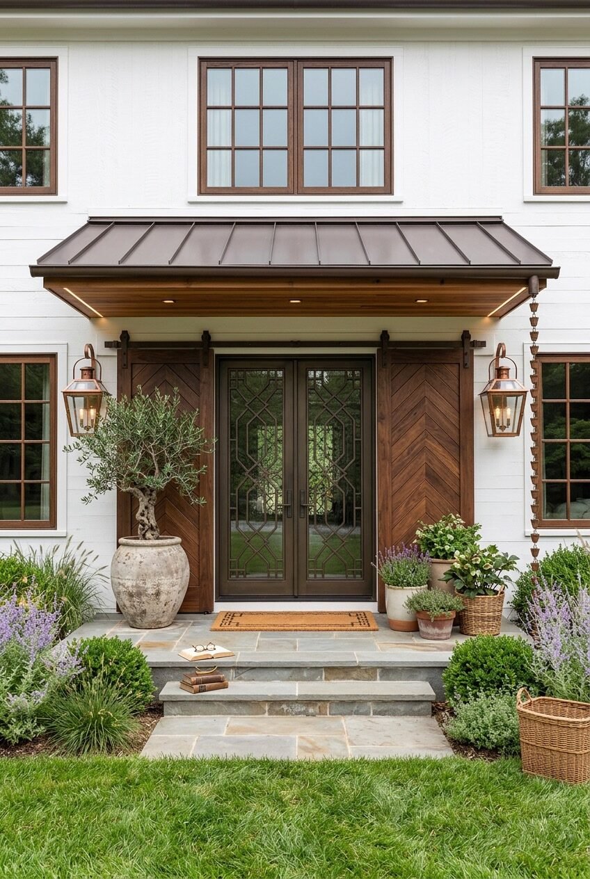
Start with the ceiling. On a flat-roofed, wide-span overhang like this, the underside is completely visible as you approach — and here, it’s clad in warm wood with recessed lighting tucked along the back edge. That detail alone changes the character of the entire entry. Most people forget about the soffit when planning an overhang, but it’s what you actually see when you’re walking up to the door, and leaving it unfinished or painted over is a missed opportunity.
The standing-seam metal roof in deep bronze does the structural heavy lifting visually: it reads dark, serious, and grounded against the white shiplap exterior. What saves it from feeling oppressive is the wood trim framing every window on the facade — that warm mahogany tone runs through the barn-door-style panels flanking the entry, the window surrounds, and the overhang soffit, so everything reads as a family. When you’re working with strong contrasts like dark metal against white siding, introducing a third material in a warm mid-tone is what keeps the palette from feeling too stark.
Flankng this entry with twin copper lanterns on either side adds warmth without competing with the structure’s weight. The styling around the base — an oversized olive tree in a stone planter, lavender, baskets, a coir mat — grounds the whole composition in something that feels genuinely lived-in rather than staged. If you’re adapting this approach, the key is letting the architectural elements do the heavy lifting and keeping the decorative layer loose and organic.
White Painted Corbels On Cedar Shingles
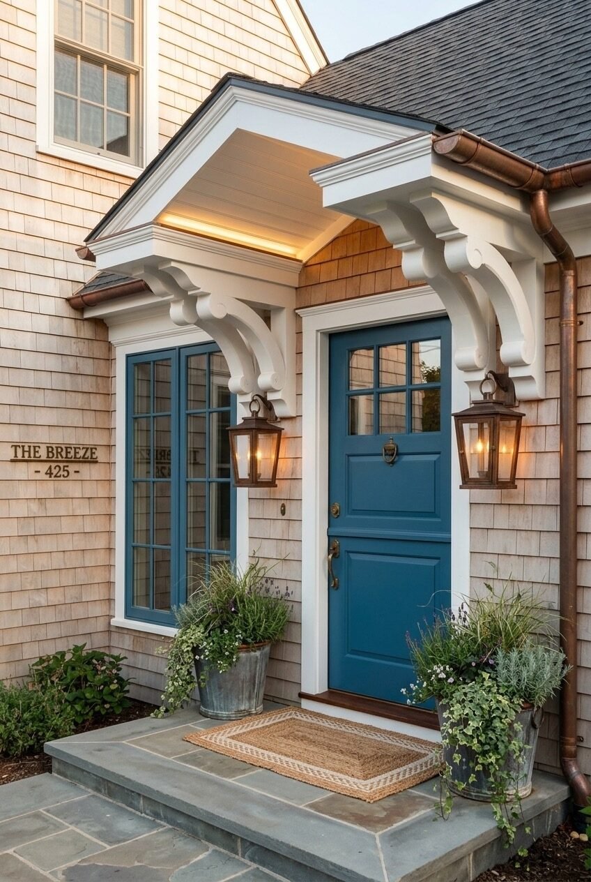
The corbels here are doing a lot. Scroll-cut, painted bright white, and scaled generously against the cedar shingle siding, they give a saltwater cottage the kind of Victorian-adjacent detail that feels right without tipping into pastiche. What makes them work rather than feel overdone is the restraint everywhere else: the overhang itself is simple, almost flat, and the only other embellishment is a copper gutter that develops its patina naturally over time.
Matching the door and the window trim in the same muted blue is a decision worth stealing. It creates instant visual coherence — the door doesn’t feel like a separate decision from the windows, and the whole entry zone reads as a composed set piece rather than a collection of individual choices. When a facade has a lot of natural texture going on (cedar shingles have tremendous visual noise), picking one accent color and committing to it consistently is what creates calm.
The lighting choice reinforces the nautical-adjacent mood: cage-style copper sconces mounted close to the door frame rather than high on the wall, which keeps the warmth at eye level where you actually feel it. Galvanized buckets planted loose with trailing greenery, a jute mat, and a named house sign add the kind of personal detail that photographs well but more importantly just makes a place feel like it belongs to someone specific.
Wrought Iron Arch Over A Stone Facade
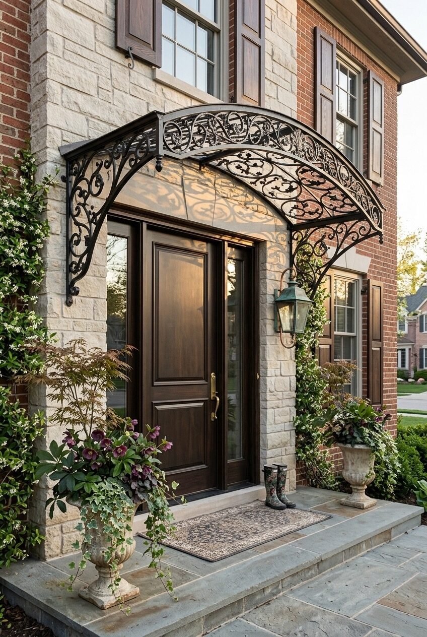
Wrought iron canopy work is one of those design choices that either lands completely or reads as an afterthought — and the difference usually comes down to scale and complexity. This one lands. The arched form spans confidently from wall to wall, the scrollwork is dense and deliberate without becoming fussy, and a translucent polycarbonate or glass panel above provides genuine weather protection while letting light through. The iron casts patterned shadows on the stone surround below, which on a sunny afternoon turns the whole entry into something that moves.
The material logic here is layered: cream limestone flanking the door, red brick on the outer facade, a dark walnut door with brass hardware, verdigris lantern, stone urns with lush plantings. Any one of those elements read as traditional in isolation, but together, they create a formal entry that still manages to feel organic rather than museum-like. The key is that nothing here is overly polished — the stone has texture, the plantings spill over their containers, the iron has depth rather than a flat powder-coat finish.
If you’re working with an existing brick-and-stone facade and want to add an overhang with this kind of character, the wrought iron arch is actually one of the more achievable approaches because it doesn’t require modifying rooflines or adding structural framing to the wall. It mounts to the facade with brackets. The real investment is in finding ironwork at the right scale — pieces that are too lightweight will look like garden accessories rather than architecture.
Slate Tile Roof With Cast Iron Brackets
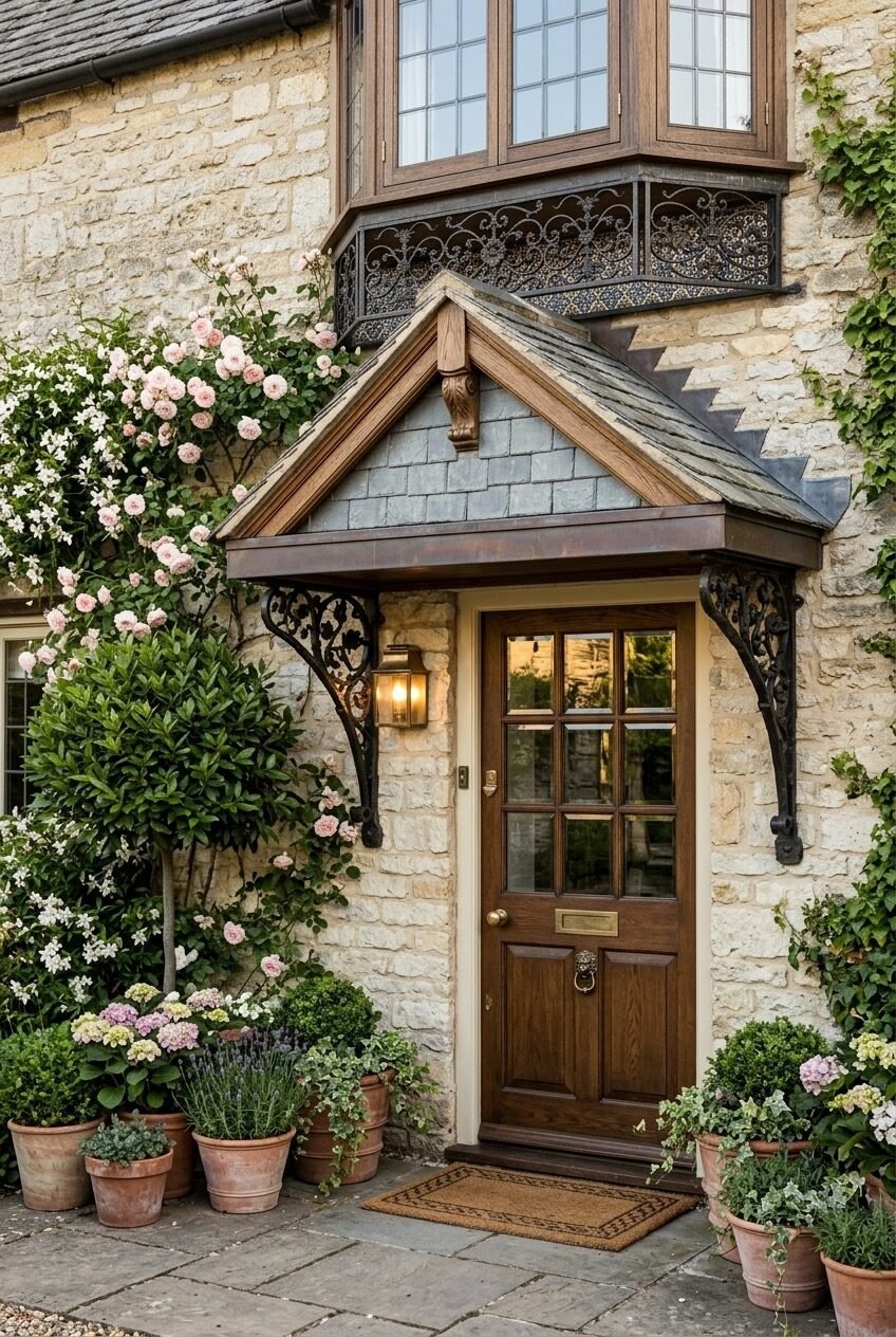
There’s a particular kind of English country cottage that shows up in dreams — stone walls, roses climbing to the second floor, a door that looks like it’s been opening and closing for three centuries. This entry is doing that, except it’s not accidental. The slate tile miniature roof on the porch canopy, the cast-iron scrollwork brackets, the six-panel oak door with its original brass letterbox and lion’s head knocker — these are specific, researched decisions that required someone to care very much about getting it right.
The slate is the anchor. It matches the texture and colour register of an aged roof without looking brand new, and its weight (visually) demands that everything else on the entry be equally considered. Pairing it with cast-iron brackets rather than painted wood keeps the vocabulary consistent — raw, aged, slightly formal — and avoids the visual confusion of mixing periods.
What makes the whole scene work as well as it does is the planting. Hydrangeas, lavender, jasmine, standard bay trees, and terracotta pots in various sizes cluster organically at the base of the entry. There’s no hard symmetry — the planting on the left is clearly heavier than the right, and that imbalance is what keeps it from feeling like a hotel entrance. Climbing roses softening the stone on one side are the kind of detail that takes years to achieve, which is worth noting if you’re starting from scratch: some aspects of this aesthetic genuinely cannot be rushed.
Terracotta Tile Canopy On Sage Stucco
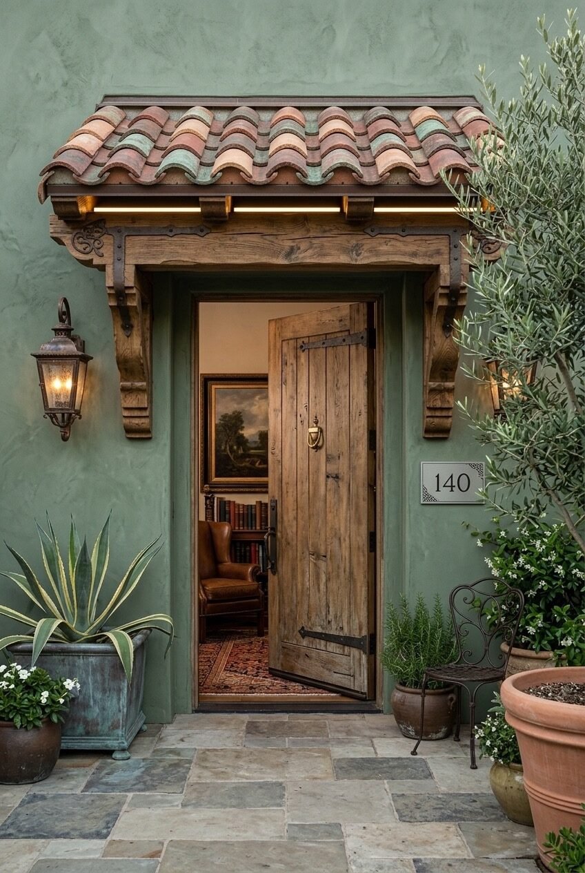
Pick up on the detail underneath the canopy before anything else: a strip of warm LED lighting runs along the back edge of the thick wood beam, tucked so it’s only visible as a glow, not a fixture. That decision is everything in a setting this warm and enclosed. The sage green stucco walls absorb light differently than brick or wood siding, and without that soft underlighting, this entry would feel much heavier and darker than it reads here.
The terracotta barrel tiles on the canopy roof are the move that makes this whole composition identifiably Mediterranean. Sourcing aged or hand-formed tiles rather than new machine-produced ones is worth the extra cost — the color variation and slight irregularity in aged tile is what reads as authentic rather than decorative. The rough-sawn wood corbels and beam carry the same logic: heavily textured, with iron strap hardware visible rather than concealed, which reinforces the idea that this structure has been here a while.
The door itself is a reclaimed-wood plank style with visible strap hinges and a simple brass knocker — open in the image, which reveals a glimpse of Persian rug, leather chair, and bookshelf beyond. That interior visibility is a design choice worth thinking about: a partially open door tells you more about who lives there than almost any exterior detail can. Flanking plants in mixed vessels (a zinc planter, terracotta pots, a wrought iron bistro chair) add to the sense that this space is genuinely used and not just arranged.
Copper Verdigris Roof With Arched Timber Frame
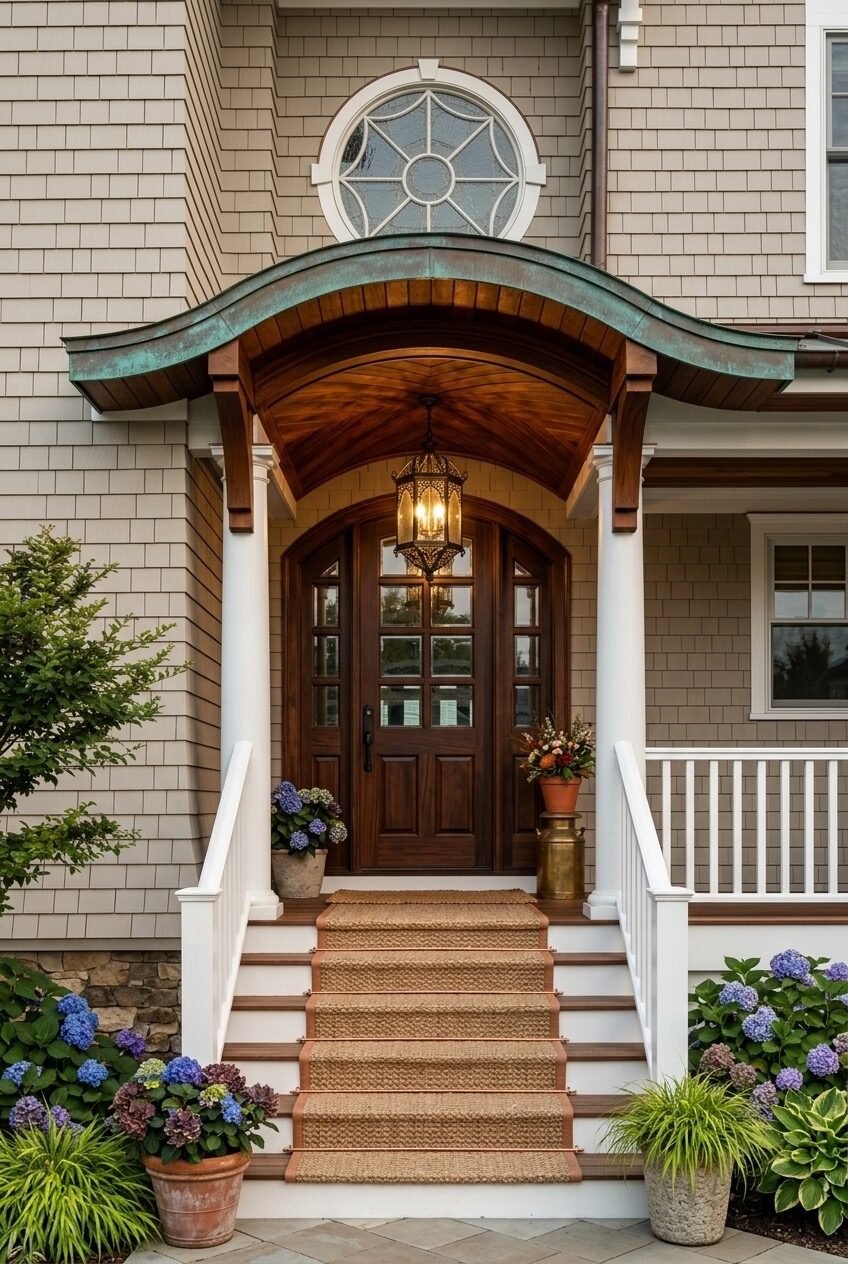
The arc is structural here, not decorative — a bent timber frame traces the curved underside of the overhang, and its geometry is echoed in the arched top of the mahogany entry door below. When the door arch and the overhang arch align, the effect is that of a gateway rather than just a door. It frames the entry vertically, draws the eye upward, and makes the arrival feel like something worth walking toward.
Above the timber frame, a standing-seam copper roof has developed a full verdigris patina — the blue-green against the warm cedar shingles of the house exterior is exactly the kind of material contrast that gets more interesting over time, not less. New copper starts orange-brown and shifts slowly toward teal over years of exposure; if you’re installing copper on a new build and want the aged look faster, there are chemical treatments, but they rarely replicate the gradation you get from genuine weathering.
The Moorish-style hanging lantern suspended from the apex of the arch is what seals the elevated character of this entry. It’s an unexpected material choice against the coastal shingle exterior — slightly exotic, deeply considered — and it works because the architectural bones are strong enough to absorb the eccentricity. White painted columns at the base, a jute runner on the stair treads, and hydrangeas in terra cotta pots keep the ground plane grounded while the overhead drama does its work.
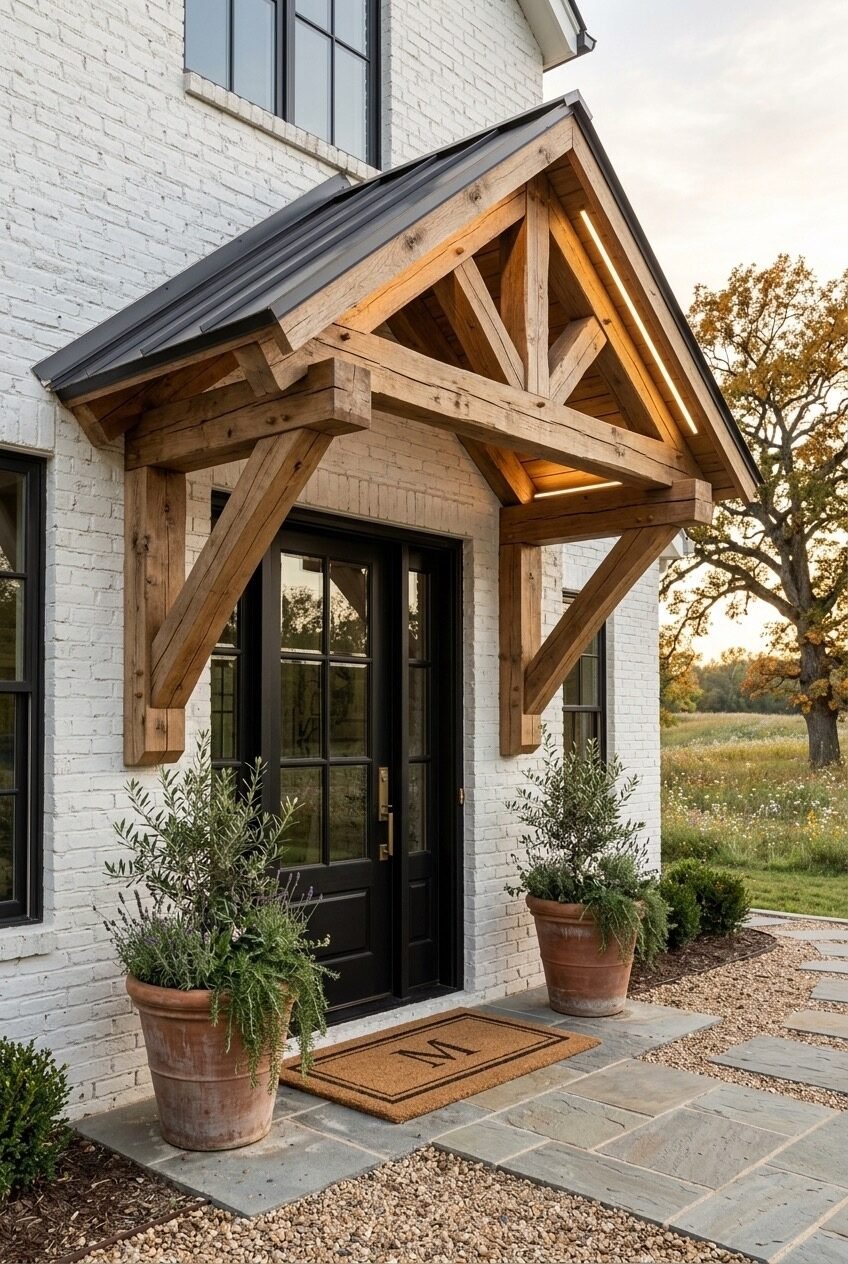
Georgian Portico With Ornate White Brackets
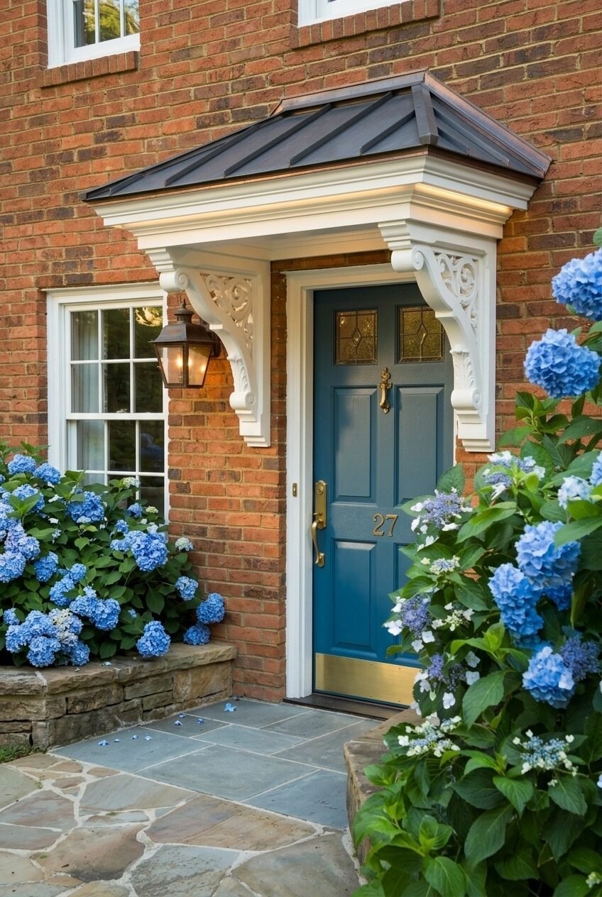
The proportions on this are worth studying. The overhang is not particularly deep, but it reads as significant because it’s framed with heavy painted millwork — a substantial fascia, deep crown molding returns, and decorative carved brackets that fill the visual space between the roofline and the brick wall below. The net effect is a portico that looks like it belongs to a house twice the size, which is a proportioning trick worth understanding if you’re working with a modest-sized entry.
Red brick is an unforgiving backdrop for exterior millwork — every profile and gap shows — which makes the precision of the white-painted framing here particularly impressive. The brackets feature scroll and acanthus leaf carving in relief, which catches afternoon light and adds depth without color. Against the flat red surface of the brick, those carved brackets create the only textural variation on the facade, which is why they need to be generous in scale to hold their own.
The styling choices at ground level are quiet and let the architecture speak: a blue door with leaded glass transom and brass house numbers, a single copper-finish wall lantern, and a generous planting of blue hydrangeas that bridge the gap between the structured millwork above and the natural stone paving below. The hydrangeas’ blue reads against the brick in a way that lavender or white blooms simply don’t — it echoes the door color and ties the whole composition into a palette that feels thought-through.
Flat Cantilevered Overhang On Modern Stone
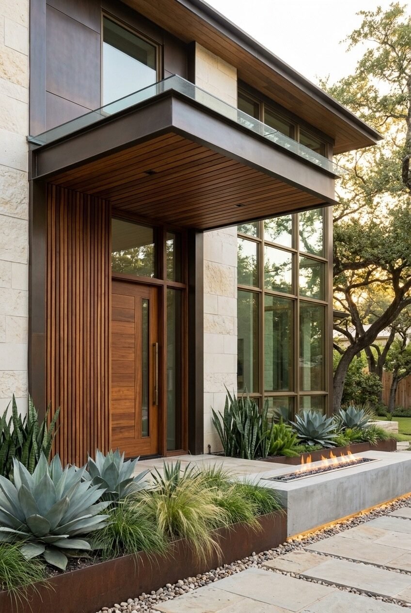
No brackets. No visible supports. The overhang here extends from a dark steel-clad upper story as a deep cantilever, with a tongue-and-groove wood soffit underneath and a glass guardrail on the roof deck above. The absence of visible structure is itself the design statement — a deliberate departure from every other entry approach where the support system is part of the aesthetic. Here, the engineering is hidden, and what remains is pure horizontal geometry.
The material palette is intentional in its restriction: limestone block walls, dark steel panel cladding, teak vertical-grain door with a long bar handle, bronze window frames on a two-story glazed facade. Every material is natural in origin and muted in saturation — nothing competes, everything contributes. The linear fire feature in a Corten steel trough at grade extends the horizontal emphasis from the overhang down to the ground plane, which is the kind of detail that makes a designed landscape feel like a real part of the architecture rather than an afterthought.
This kind of entry is genuinely hard to retrofit onto an existing house — the cantilever requires structural engineering and a building facade that can absorb the load cleanly. But the principle of pairing a wood soffit with a steel or concrete upper mass is adaptable. Even on a smaller overhang with conventional brackets, finishing the underside in tongue-and-groove cedar and keeping the exterior material palette tightly restricted produces results that share this composition’s restrained confidence.
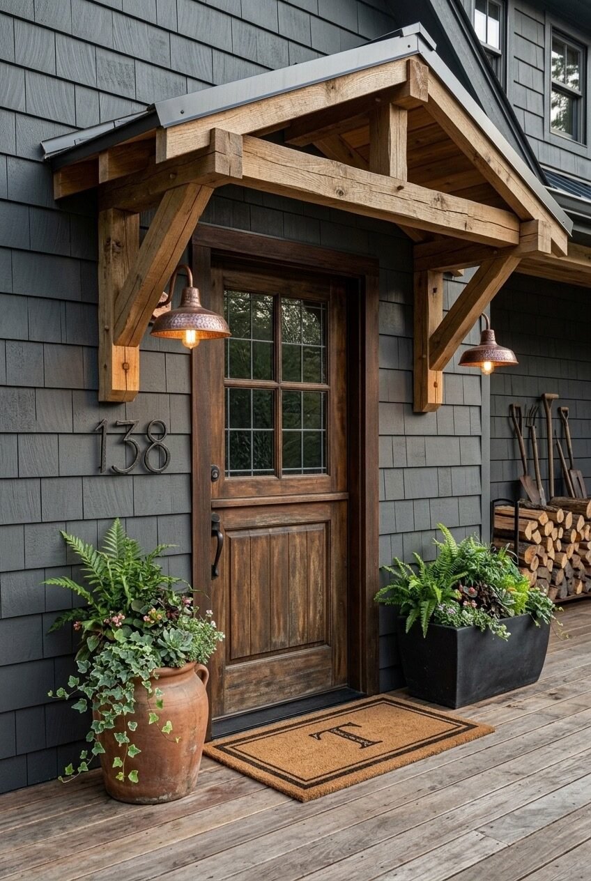
Simple Timber Frame Over Stucco and Brick
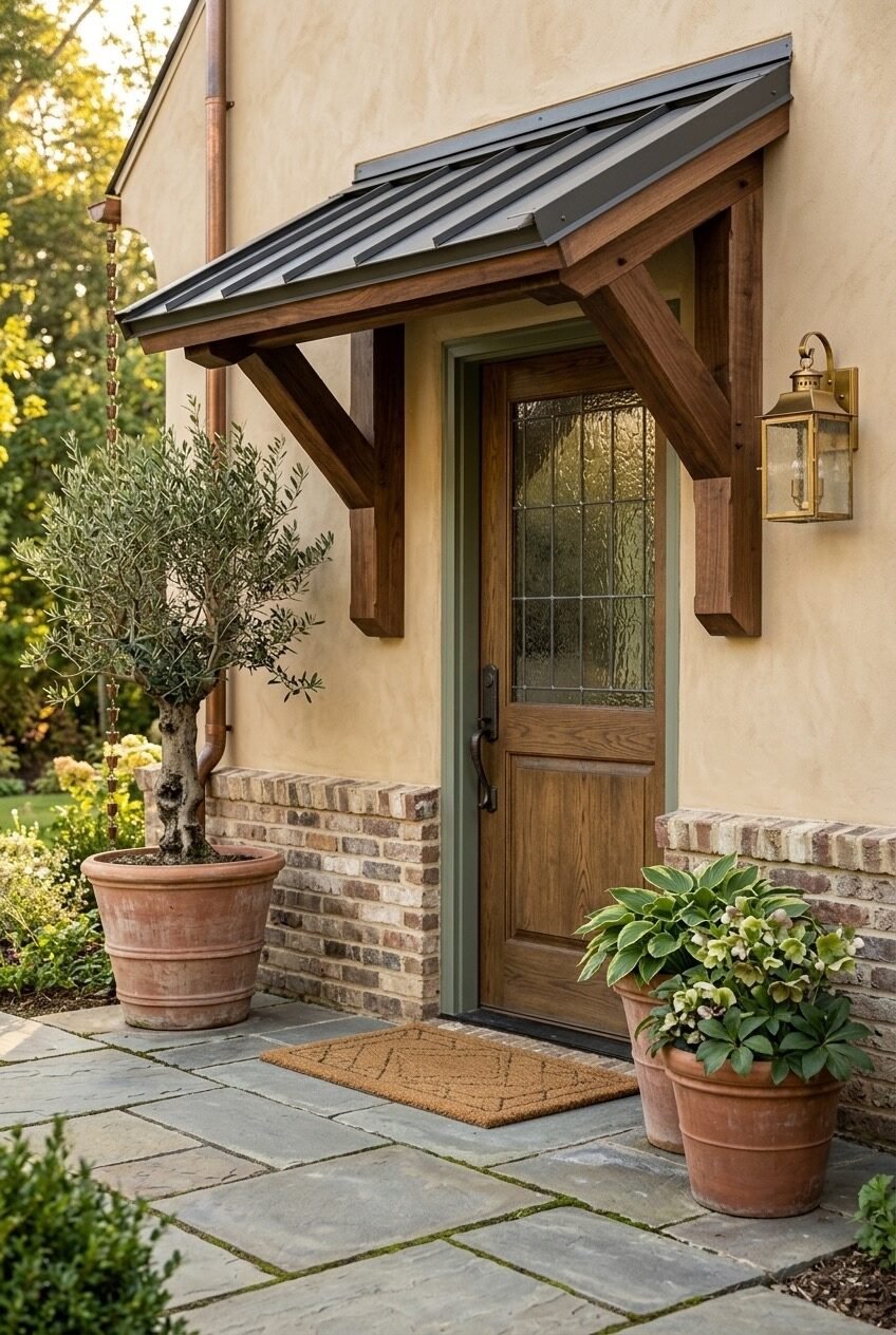
Sometimes the right move is to do less and do it well. This entry has a lean timber bracket overhang — three exposed posts, simple diagonal knee braces, a standing-seam metal roof — set against a warm plaster wall with a brick water table at the base. No carved details, no ornate hardware, no architectural complexity beyond the basic structural form. And it reads beautifully, precisely because every element has been chosen for material quality rather than visual elaboration.
The door is the center of gravity: oak with a leaded glass upper panel, dressed in a sage green frame that’s one of those paint decisions that seems subtle in a photo and then completely transforms a facade in person. The green frame bridges the stucco wall color and the timber overhang tone in a way that white trim would not — it creates a middle ground. A single brass lantern sconce on the right side provides the necessary warm light at night without trying to be a statement piece.
The planting strategy here is restrained and asymmetrical — a mature olive tree in a terracotta pot on the left, a bushy hosta with white blooms in a smaller pot on the right — and that imbalance is what gives the entry its organic, undesigned quality. The copper downspout on the left wall catches the eye and adds a finishing material note that ties into the metal roof above. It’s the kind of entry where you notice the care that went into it without being able to immediately say what it is that works — which is usually a sign that everything is in the right place.
Timber Frame Gable With Verdigris Copper Roof
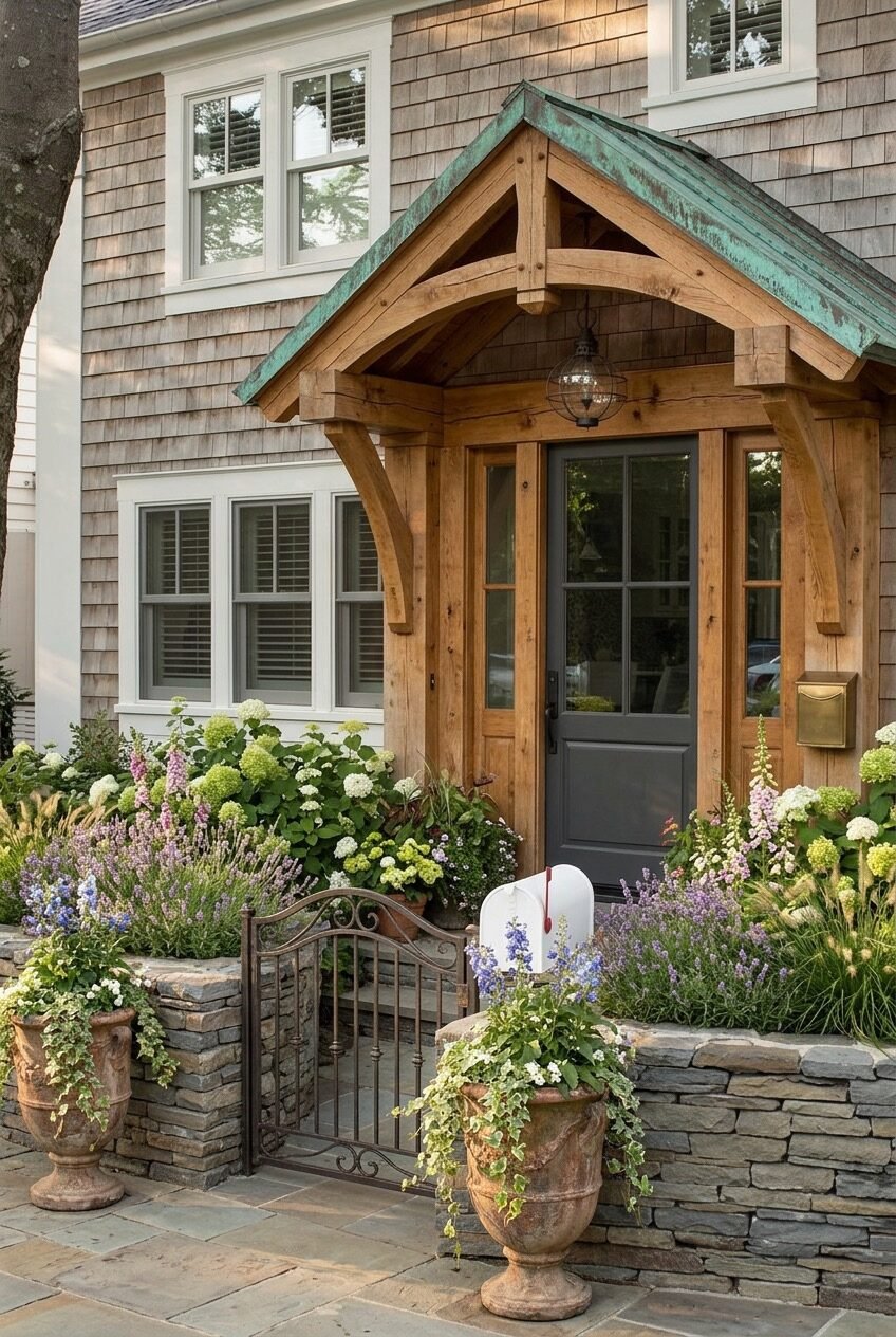
The garden is doing half the architectural work here, and that’s completely intentional. White hydrangeas, lavender, foxglove, ornamental grasses, and climbing perennials in terracotta urns have been allowed — or engineered — to reach a density that partially obscures the stone retaining wall and wrought iron gate in front. This creates a threshold experience: you pass through the garden before you reach the door, which changes the arrival completely. The overhang above becomes the punctuation at the end of that journey rather than the first thing you see.
The overhang itself is honest timber framing: exposed joists, substantial king post, curved knee braces cut from solid timber rather than built up from dimensional lumber. A verdigris copper roof caps the structure and reads as the one unexpected detail against the otherwise warm cedar shingle siding — that specific blue-green against the honey-colored wood is the kind of material tension that ages better than any trend.
The dark-painted door and sidelite with simple glass panel, a cage pendant hung from the apex, and a brass wall-mounted mailbox add the functional elements without overloading the entry. What holds the composition together is the color story: gray-green door, copper-green roof, green in the planting — one hue running through structure, hard landscape, and softscape simultaneously. It’s a coherence that’s worth planning deliberately rather than hoping happens by accident.
An Entry That Actually Earns Its Curb Appeal
A front door overhang is one of those investments that pays differently depending on what you’re after. If you’re thinking purely about resale, the material quality and proportion matter more than style — a well-built timber bracket overhang reads as value-added to almost anyone; an ornate wrought iron arch requires the buyer to share your taste. If you’re building something for yourself, that calculus flips entirely, and the specific details that make an entry feel personal are exactly the ones worth spending time on.
The most consistent thread across every design we looked at is that the overhangs that feel right are the ones where material choices run through the entire facade — not just isolated to the entry zone. A copper roof that has no relationship to other metal on the house, corbels that share no visual logic with the windows or door hardware, or a timber frame in a finish that doesn’t connect to anything else on the exterior: these are the versions that look added-on rather than considered. The hard work is in the connective tissue between elements.
Whatever direction you’re heading — whether it’s a minimal cantilever or a full gabled timber portico — the entry is the face of the house. It’s where you and everyone you’ve ever invited have stood for a moment before crossing the threshold. That pause deserves a backdrop worth standing in front of.