Blue and White Living Rooms That Know Exactly What They’re Trying to Say
There’s a reason blue and white keeps coming back. It’s not trend-driven — it’s almost primal, the way certain color combinations just feel right in a room. The contrast is sharp enough to feel intentional, but the palette is broad enough that two completely different spaces can share it and look nothing alike. A navy velvet sofa and a powder-blue linen armchair both belong to the same family, but they’re telling very different stories.
What makes blue and white work across so many styles — from collected English interiors to breezy coastal living rooms — is that it never demands a single mood from you. It can be formal or relaxed, minimal or maximalist, layered with pattern or stripped completely bare. The white creates the breathing room; the blue does the heavy lifting. Get the balance wrong and one cancels out the other. Get it right and the room feels like it arrived fully formed.
We pulled together a range of spaces that approach this palette from genuinely different angles — different blues, different proportions, different supporting materials. Some are easy to recreate on a budget. Others require commitment. All of them are worth looking at closely, because the details are usually where the real decisions are being made.
A Blue Cabinet That Anchors Everything
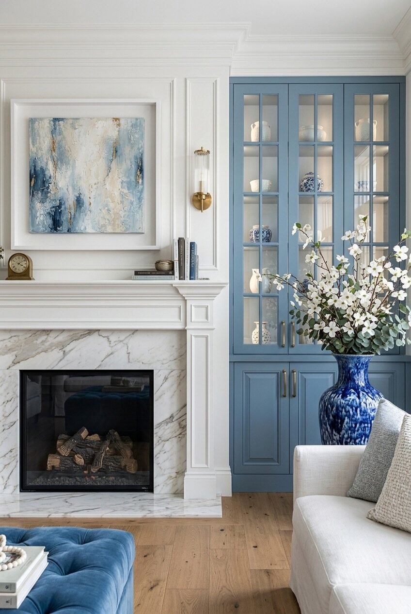
Start with the built-in cabinet in this room — painted in a soft, dusty blue that sits somewhere between slate and periwinkle — and you immediately understand how one piece of color-blocked millwork can do more work than an entire room full of blue accessories. The cabinet is both storage and statement, and the glass-fronted upper doors keep it from feeling too heavy by allowing the white ceramics inside to read as part of the display rather than hidden behind a solid surface. The brass hardware pulls the whole thing forward without overshadowing it.
The fireplace wall is deliberately kept in crisp white with panelling detail, which gives the blue cabinet room to breathe rather than compete. This is a genuinely useful principle: when you introduce a painted built-in in a saturated color, the surrounding walls need to stay restrained or the room starts to feel claustrophobic. The abstract painting above the mantel picks up the blue-gray tones loosely, which connects the two zones without forcing them.
For anyone considering this approach in their own space, the key decision is paint color. A blue that reads too bright in this context would feel jarring against all that white millwork. Look at muted, slightly greyed blues — something in the family of Farrow & Ball’s Brassica or Benjamin Moore’s Buxton Blue. Fill the shelves with white and cream ceramics almost exclusively; the restraint inside the cabinet is what makes the cabinet color pop.
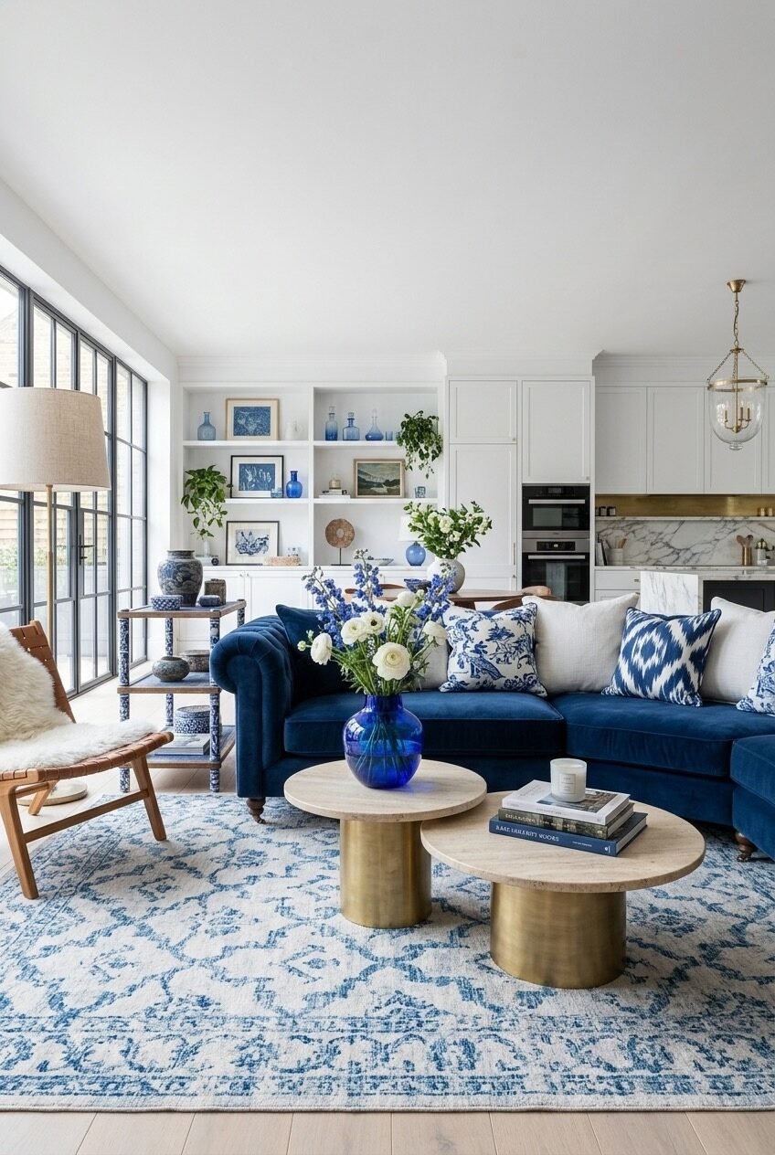
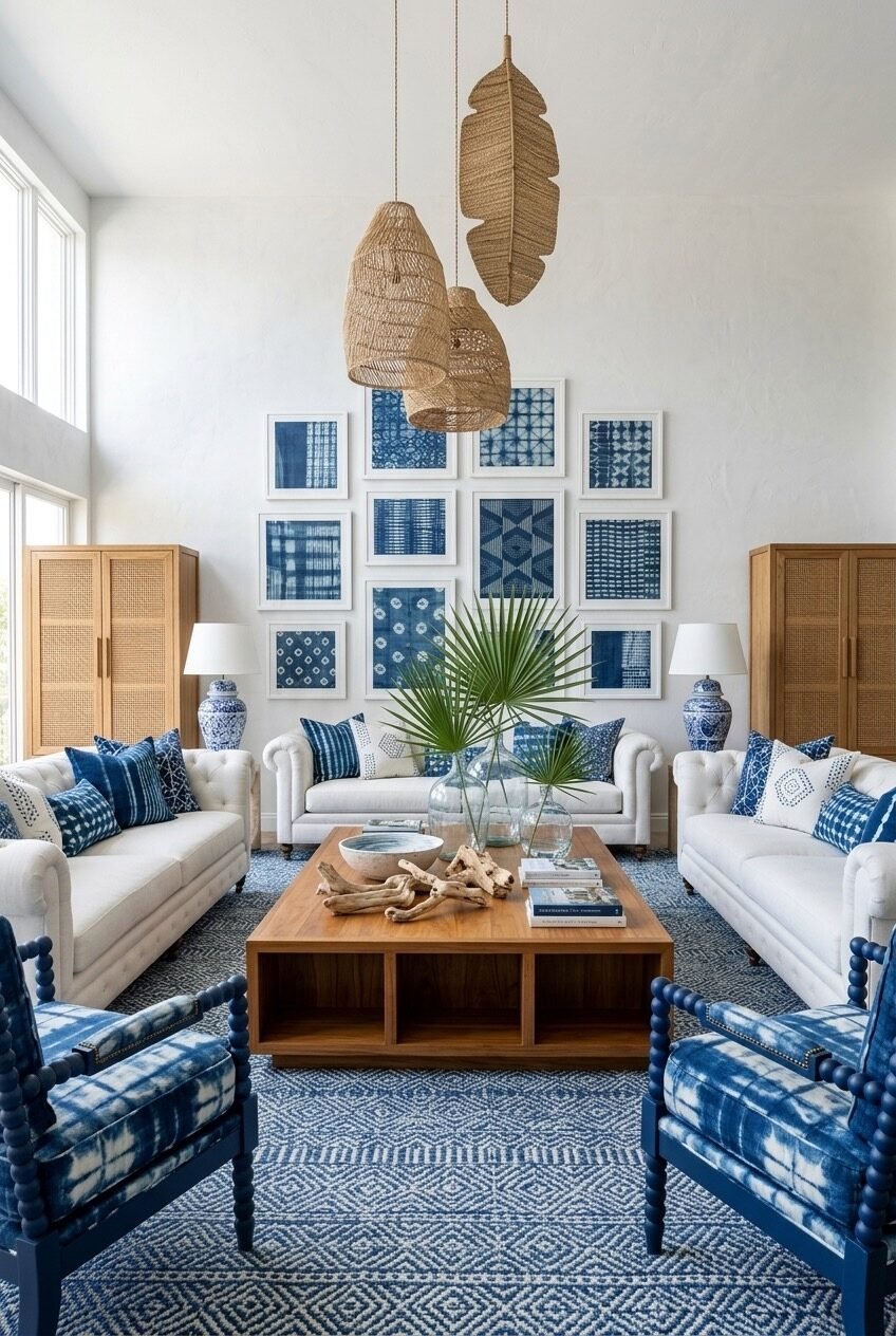
When Blue Saturates Every Surface
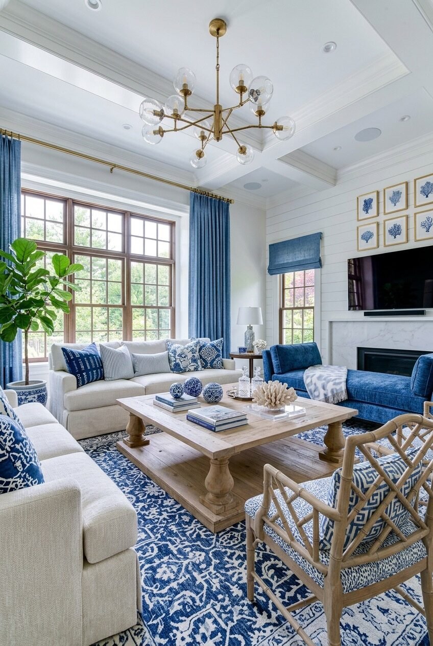
The rug is the thing to look at first here. A deep cobalt and white pattern covering almost the entire floor sets the chromatic temperature for the whole room before you even register the furniture. In spaces where the rug is this dominant, everything else needs to either echo it or deliberately step back — and this room chooses both strategies at once. The cream linen sofas step back. The blue velvet accent sofa echoes it. The bamboo-frame chairs in blue-and-white printed fabric echo it more quietly.
What keeps this from tipping into chaos is the ceiling — a coffered tray with wide white trim that acts as a visual reset above all the activity happening at floor level. The brass sputnik chandelier contributes warmth and some visual complexity up high, which balances the weight of the rug below without adding more color. Floor-length navy curtains on brass rods frame the windows and reinforce the vertical lines of the room.
If you want to recreate the energy here without the square footage, start with the rug — that’s genuinely the foundation. Everything else is chosen in relation to it. Buy the rug first, then build upward. A cream sofa is the most forgiving partner for a high-contrast blue and white rug because it keeps the furniture from competing with the floor pattern for attention.
Blue and White in a Dark Room
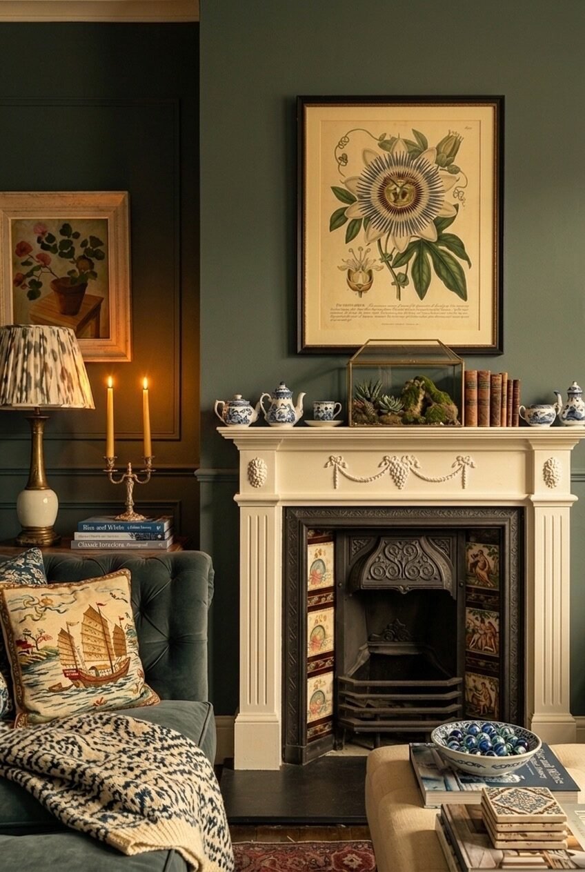
This is the kind of space that gets called a ‘dark room’ but really isn’t — it’s a moody room, which is different. The deep sage-green walls create a backdrop that makes every piece of blue and white porcelain on that mantelpiece glow almost from within. The blue and white collection here isn’t decorative in a casual sense; it’s used with real intention, with miniature teapots and ginger jars lined up on the mantel like a considered still life. The hand-painted fireplace tiles add another layer of pattern around the firebox itself.
What makes the blue and white elements read so well against the dark green is tonal contrast rather than color contrast. Green and blue are close enough on the spectrum that they don’t fight, but the white in the porcelain is what creates the visual pop. The ikat-patterned lamp shade and the chinoiserie-style embroidered cushion contribute to the layered, collected feel without needing to be blue specifically — they carry pattern and a similar period sensibility.
This approach is genuinely harder to pull off than it looks. Dark walls require confidence, and the blue and white accessories only work here because they’re grouped with intention rather than scattered. If you want to try this direction, commit to the wall color first, then build a mantel collection slowly. A mix of small and medium-scale pieces — a few teapots, a covered jar, a shallow bowl — reads far better than a single large statement piece sitting alone.
Floor-to-Ceiling Blue as Architecture
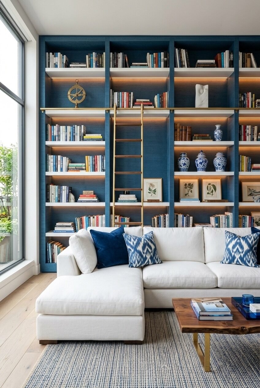
The grasscloth-backed shelving here is a full wall treatment, not just shelving — and the distinction matters. Painting both the shelving structure and the back panel in the same deep teal-blue creates a single architectural element rather than furniture placed against a wall, which is what gives this room its sense of intention. The LED strip lighting tucked under each shelf shelf adds warmth that prevents the blue from reading as cold or flat, a detail worth borrowing directly.
The brass rolling ladder is both functional and compositional — it breaks the grid of the shelves visually and introduces a vertical line that helps the eye travel up the full height of the wall. The objects on the shelves follow a loose logic: books mixed with blue and white ginger jars, framed botanical prints leaning rather than hung, a brass armillary sphere as a focal point. None of it is precious-looking, which is exactly right for a room this rich.
A white sectional placed directly in front of this wall creates maximum contrast, and the ikat-print cushions in blue and white connect the sofa back to the shelving without being too literal. The live-edge walnut coffee table is the grounding element that keeps the whole thing from feeling too designed. If you’re tackling a built-in like this yourself, the back panel color is the first commitment — choose something dark enough to read against the spines of mixed books, which tend to be chaotic in their own colors.
Chinoiserie Galore, Surprisingly Not Overwhelming
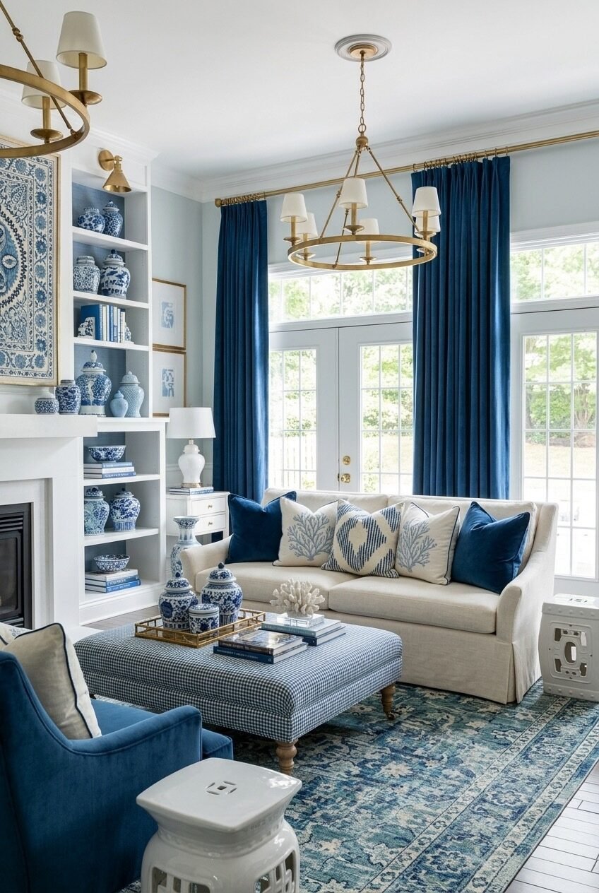
Somewhere around the third ginger jar, a room can start to feel like a shop. This one doesn’t, and it’s worth understanding why. The blue and white porcelain collection is distributed across three different zones — the built-in shelves, the side table, and the coffee table tray — which means it reads as a thread through the space rather than a pile-up in one corner. Each zone has its own hierarchy: the shelves are densest, the coffee table is most sparse, and the side table sits between them.
The navy velvet curtains hung floor to ceiling are pulling significant weight here — they set the chromatic anchor for all the other blue in the room and make the white sofa read as the neutral it needs to be. Without those curtains, the collection would feel lighter and less resolved. The gingham ottoman does something clever: it introduces pattern at the center of the room in a scale that doesn’t compete with the porcelain but still contributes to the overall layering.
For rooms with strong natural light like this one, porcelain collections work particularly well because the light picks up the white glaze and activates the blue pigment differently across the day. If you’re building a collection, don’t aim for matching sets — mix periods and scales. A Ming-style vase next to a Delft-influenced piece next to something more contemporary reads as genuinely collected rather than purchased as a bundle.
Where Blue Porcelain Becomes Furniture
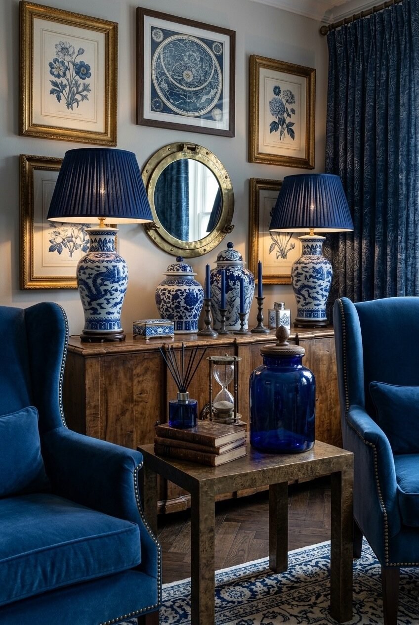
The two ginger jar lamps are the central object in this vignette — not the console table they sit on, not the gallery wall behind them. At this scale, with lampshades this dark and substantial, they stop being accessories and become anchoring furniture in their own right. The matching pair creates formal symmetry that references traditional interiors, but the mix of frames on the gallery wall — different sizes, different wood tones, different periods — deliberately roughens the formality back down. That tension is what makes the room feel considered rather than stiff.
The blue velvet wing chairs flanking the scene contribute to the symmetry while also adding the kind of upholstered depth that stops a heavily accessorized vignette from feeling decorative-only. Blue curtains in a printed paisley or floral further establish that this is a room comfortable with pattern-on-pattern — which is genuinely hard to calibrate. The dark wooden console grounds the whole arrangement without competing with the porcelain.
To get the lamp pairing right, the shade color has to match the dominant blue in the ceramic base — not approximately, actually match. This is harder than it sounds because ceramic blues shift in different lights. Order swatches before committing to a shade fabric, and consider having them made custom if the proportions matter to you.
Coastal Without Trying Too Hard
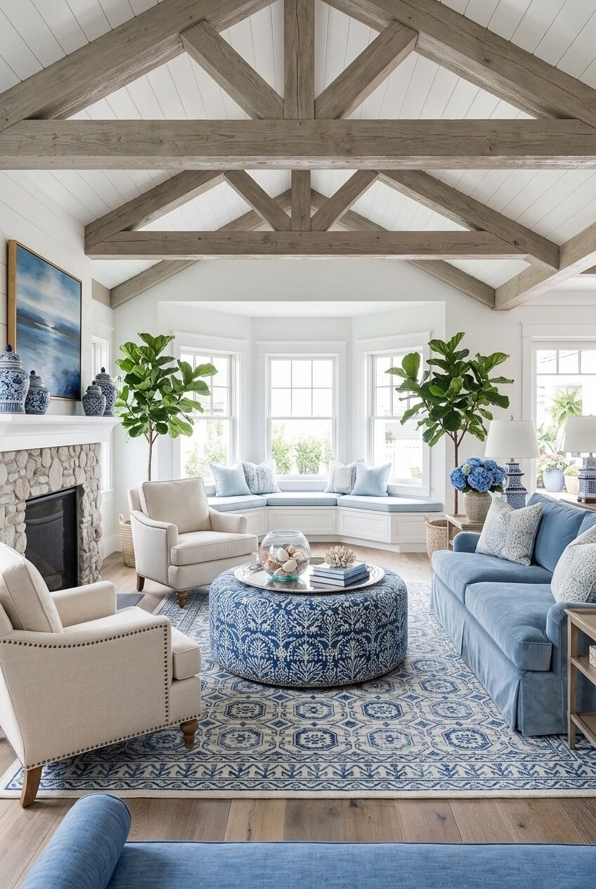
Exposed timber trusses in a cathedral ceiling are an architectural asset that most people underuse. Here, the weathered gray-brown of the beams does something specific: it introduces a natural, slightly driftwood-like material that connects the interior to a coastal sensibility without requiring a single piece of nautical decor. Pair that structural ceiling with a pale blue slipcovered sofa, a blue and white patterned ottoman as the room’s centerpiece, and matching blue and white area rug — and the room earns its coastal read through material and palette logic, not through anchors and rope.
The curved bay window seat at the back of the room is the design detail that makes this space feel genuinely considered. Built-in bench seating with simple light blue cushions turns what would otherwise be dead space behind the main furniture arrangement into an additional gathering zone — and it frames the view without blocking it. Two fiddle-leaf figs flanking the bay window add height and greenery that keeps all the blue and white from feeling flat.
A stone fireplace on the opposite wall introduces natural texture that balances the smoothness of the upholstered pieces. If you’re working toward a room in this spirit, the material variety is what carries it — linen upholstery, stone surround, weathered wood floor, wicker baskets as plant holders. The blue and white porcelain pieces on the mantel and side table can stay simple because the room’s texture palette is already doing enough.
The Monochromatically Blue Reading Corner
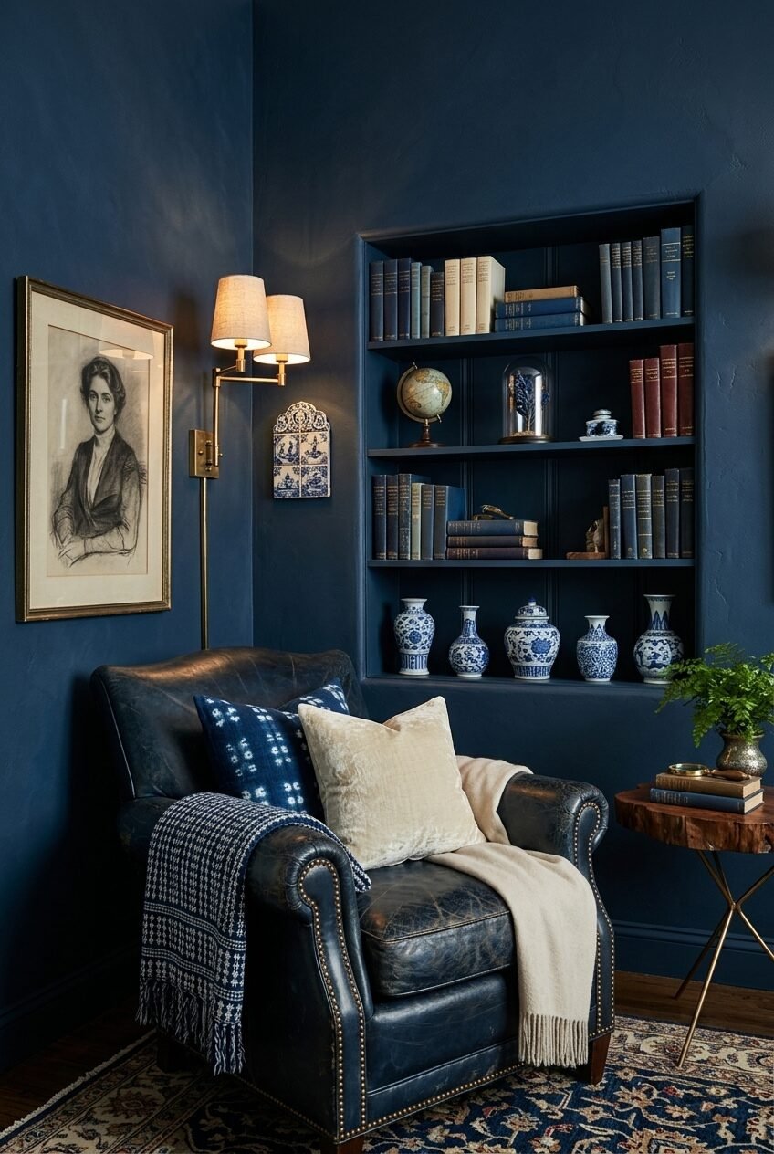
Going tone-on-tone in a deep navy — walls, built-in shelves, trim, all painted the same dark blue — is the kind of decision that photographs dramatically and feels either claustrophobic or deeply satisfying in person, depending on the scale and the lighting. This corner leans toward satisfying. A brass double-armed wall sconce provides warm light at exactly the right height for reading in the leather club chair below, and that warmth is non-negotiable; in a room this saturated with dark color, warm-toned artificial lighting isn’t a stylistic preference — it’s what stops the space from feeling like a walk-in closet.
The built-in shelf nook with the same navy interior as the walls is what makes the blue and white porcelain on the lower shelf read so sharply. When the background color matches the object’s body, the painted decoration becomes the foreground, and the effect is almost gallery-like. A small row of Delft-style vases in varying heights and profiles creates a collection that feels personal rather than purchased.
The vintage portrait print and the small decorative tile panel mounted near the sconce contribute period character without making the room feel costumed. A worn leather chair is the right upholstery choice here because its patina — a dark navy-brown — blends into the surrounding deep blue rather than jumping out, keeping the room’s mood quiet. If you want a corner like this, start with the paint and buy everything else after — the dark walls change how you perceive every other element.
Navy Shiplap and the Warmth Trick
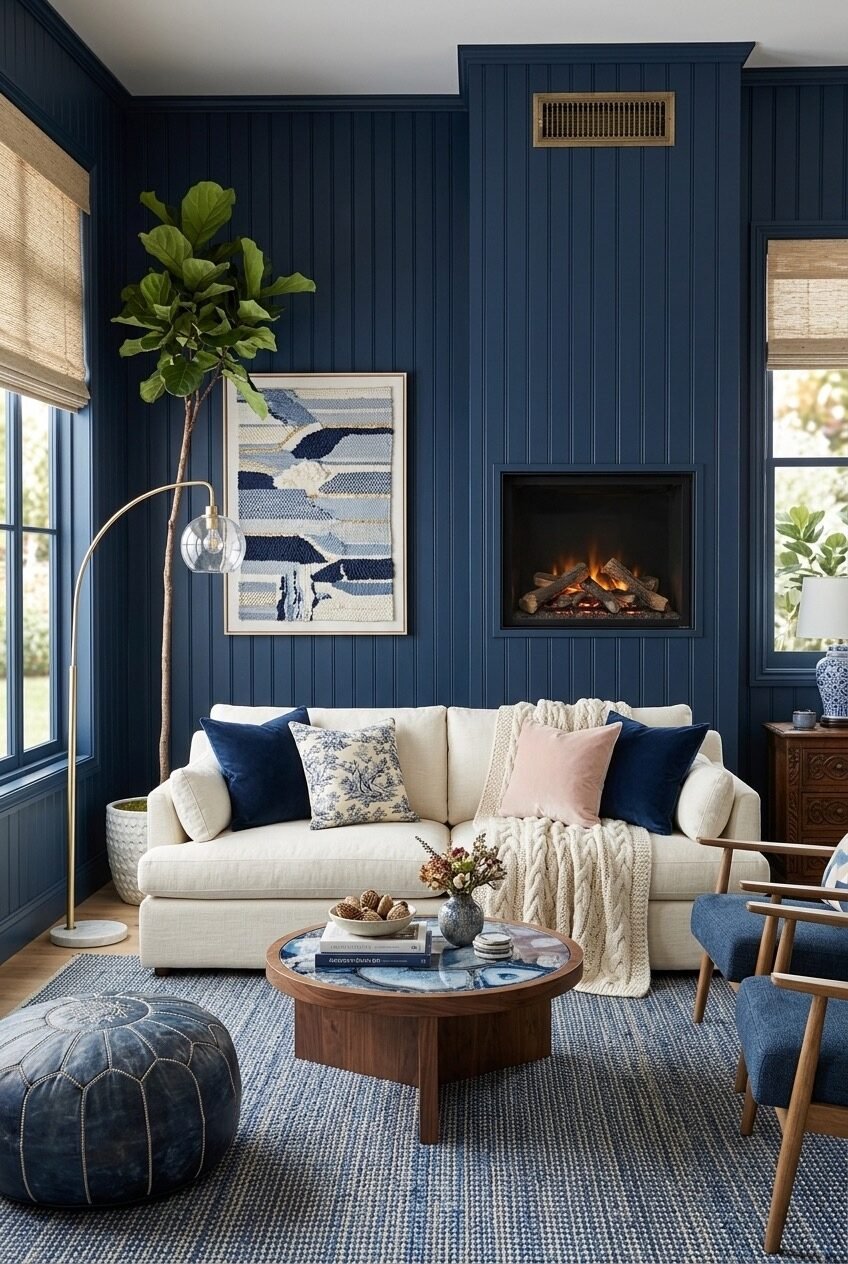
Shiplap painted navy — especially floor-to-ceiling on a fireplace wall — is a bolder move than it first appears. The color saturates the entire room’s atmosphere because of where it sits: directly behind the sofa, which means your eye hits it the moment you enter. What saves this from becoming oppressive is the decision to flood the flanking walls with natural light through large windows dressed in simple bamboo shades rather than curtains, which keeps the perimeter of the room feeling open even as the focal wall goes very dark.
The cream sofa is doing the expected contrast work, but look at what’s on it — a blush pink cushion alongside the navy velvet ones. That pink is a small but meaningful move; it introduces warmth into a cool, dark palette without undermining the blue and white theme. The walnut coffee table with its inset blue agate panel echoes the palette in an unexpected material, and the Moroccan-style leather pouf in worn blue adds another texture to the floor-level visual conversation.
A woven textile artwork in blue, white, and gold hangs above the sofa rather than a traditional painting, which softens the hard geometry of the shiplap behind it. The fiddle-leaf fig in the corner adds the greenery that almost every dark-walled room needs — green is the one color that reads as neutral against navy in a way that nothing else does. If you’re considering dark shiplap on one wall only, choose the fireplace wall or the wall directly opposite the entry point for maximum impact.
Cyanotype Art and Soft Blue Walls Together
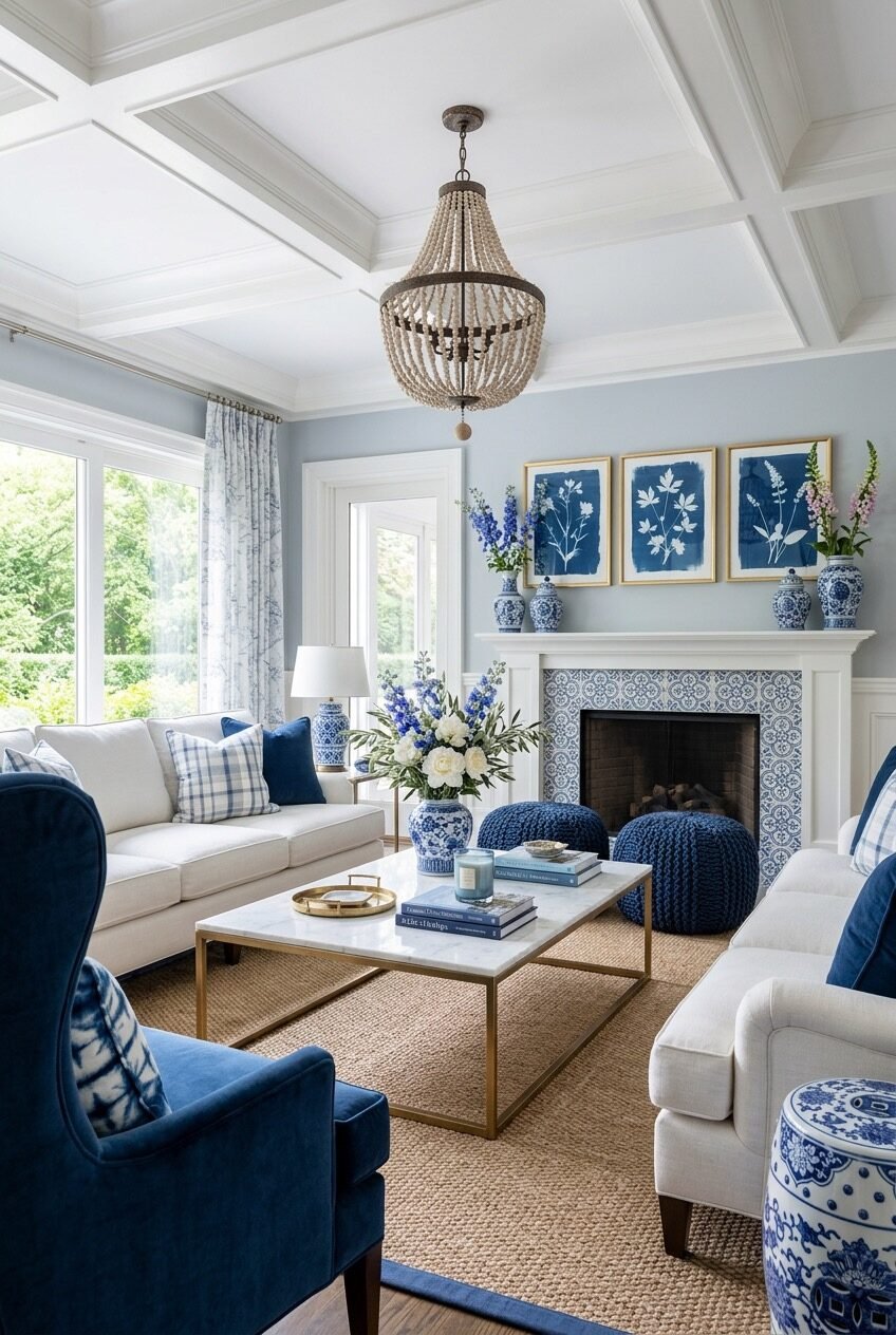
The three cyanotype botanical prints above the fireplace are arguably the most interesting design decision in this room. Cyanotypes — those deep Prussian blue photographic prints on white — are one of those art formats that feel genuinely at home in a blue and white palette because they’re made of the same colors rather than being chosen to match. Framed identically in gold and hung as a triptych above a white mantel dressed with blue and white ginger jars, they function as both art and pattern — botanical specimens as wall decor that bridges the room’s palette without being literal about it.
The walls are a soft, hazy blue — not quite powder, not quite grey — that keeps the room luminous rather than saturated. A wooden beaded chandelier introduces texture overhead that feels handcrafted and slightly bohemian against the coffered white ceiling, which is an interesting tension: formal ceiling architecture, relaxed pendant lighting. It works because both elements stay pale and light-toned.
A natural jute rug grounds the space and is genuinely the right call here — a blue and white patterned rug would compete with everything else, and a plain cream rug would disappear. The jute introduces a neutral organic texture that balances the crispness of the marble-top brass coffee table. Blue velvet accent chairs and knitted blue poufs near the fireplace add the casual seating that makes a room feel inhabited rather than staged.
The Palette Is the Starting Point, Not the End
Blue and white is patient. You can approach it from a dozen different directions — go dark and saturated, stay soft and airy, commit to porcelain, or let the paint do all the work — and the palette holds. What the spaces in this post have in common isn’t a single aesthetic; it’s the clarity of each room’s approach to the same two colors. They each have a point of view, and that’s what separates interesting rooms from merely pretty ones.
The harder work is figuring out which version of blue and white actually fits your space, your light, and your lifestyle. A room with low ceilings and north-facing windows needs a different blue than a sun-drenched coastal room with ten-foot ceilings. A household with children and dogs needs different upholstery choices than a quiet study built for one person to read in. The palette is forgiving in color terms, but it won’t compensate for choices made without that context in mind.
Start with whatever element you’re most certain about — a rug you love, a piece of inherited porcelain, a paint color you keep returning to — and build outward from there. The rooms that feel genuinely cohesive tend to have one thing they were designed around, not ten things selected simultaneously. Find your anchor and let the rest follow.