The Sunken Living Room Is Back and It Has Nothing to Prove
There’s a reason sunken living rooms keep coming back. Not as a trend, not as a retro callback — but as a spatial decision that genuinely changes how a room feels to be in. When the floor drops even a few inches, something shifts. The seating area stops being furniture placed in a room and starts being a destination. A room within a room. The kind of space where people actually sit down and stay.
The concept has roots going back to mid-century architecture, where designers were obsessed with defining zones in open-plan homes without building walls. A lowered floor did exactly that — it carved out territory through level change rather than partition. What’s interesting is how that same logic plays out in wildly different aesthetics, from raw concrete brutalism to soft desert plaster, from moody forest retreats to bright, art-filled family spaces.
What follows is a look at sunken living rooms across the full range of how this idea can be executed — different materials, different moods, different scales. Some are clearly architect-driven dream projects. Others are more within reach than you’d think. All of them make a strong case for why flat floors might be the most underrated design problem in residential interiors.
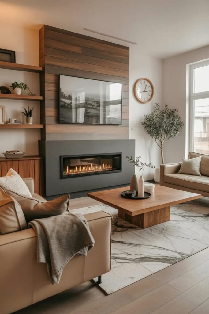
Wood-Wrapped Warmth With a Bar Corner
The lowered seating platform here is framed entirely in wide-plank hardwood, and that framing does a lot of work. The wood border acts as a visual threshold — you know exactly where the conversation zone begins and ends without a single wall or partition getting involved. The sectional itself sits slightly below the surrounding floor level, and the step-down detail reinforces the sense that you’re entering a specific place, not just walking across a room.
The feature wall behind the TV is the kind of thing that could easily go wrong. Wood panel arrangements in geometric, offset patterns have a tendency to look like an accent wall from a hotel lobby. What saves it here is the integration of LED strips within the panel grooves — not as decoration, but as the primary light source for the media wall. The warm amber glow coming from within the panels makes the whole composition feel architectural rather than decorative.
If you want to pull this off, the bar area in the background is worth paying attention to. The rattan bar stools against a dark marble counter introduce a tropical-resort quality that keeps the wood-heavy room from feeling too dense. That contrast — heavy warm timber against lighter woven rattan — is the detail that stops the whole space from becoming a single-note material story. Get the ceiling slatwork right first; everything else can follow.
Desert Plaster and a Curved Pit
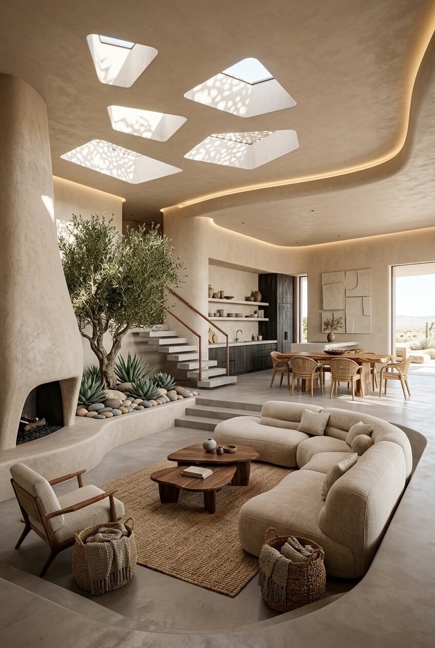
Start with the ceiling. Five irregular skylights punched through a curved plaster ceiling is the kind of architectural decision that either defines a space or overwhelms it — and here it defines it completely. The light patterns those openings cast on the walls throughout the day do more for the room’s atmosphere than any lighting fixture could. The curved, organic ceiling line softens what might otherwise be a very hard, minimalist space.
The sunken seating pit is delineated by the step change, but the curve of the sectional mirrors the ceiling’s organic geometry — and that coherence is what makes the room feel designed rather than decorated. A pit with a curved sofa in a room with curved walls and curved ceiling planes reads as intentional; the same sofa in a boxy room reads as awkward. The olive tree planted at the interior corner, against the kiva-style fireplace, brings the outside in through means that feel entirely natural to the architectural language of the space.
For anyone trying to approximate this without a full architectural renovation, the lesson is about material consistency. Limewash or micro-cement plaster on walls, a textured plaster ceiling (even just a single coved section), and natural fiber rugs and baskets — this palette is achievable without structural changes. The curve is harder to fake. But even a round sectional in a square room, if it’s flanked by enough organic material — living plants, woven textures, raw wood — can start to suggest the softness this image is built on.
Marble, Moss, and Mismatched Coffee Tables
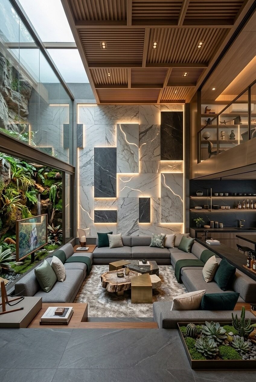
Two coffee tables is an underrated move. A live-edge wood slab and a brass geometric box sitting side by side — different heights, different materials, different visual weights — creates a centerpiece that draws the eye without requiring a single piece of art. The sunken pit here is generous enough to hold a full U-shaped sectional and still leave breathing room, which suggests a significant step-down depth rather than the shallow platform drop you see in more restrained applications.
The accent wall is the design risk of the room. Alternating panels of white marble and dark slate, backlit with strip lighting fitted between each slab — this is the kind of feature wall that requires a very committed contractor and a budget to match. The backlighting between stone panels creates depth that a solid marble wall simply cannot achieve; the light finds the veining and makes each slab look like it’s glowing from within. It’s genuinely difficult to execute, and the grout lines between panels need to be precise or the whole thing reads as a tile job rather than an architectural installation.
The indoor garden element at the lower right — succulents and moss embedded in what appears to be a shallow tray integrated into the floor level — is actually the most achievable detail in the whole image. A recessed planter flush with the floor, filled with low-maintenance drought-tolerant plants, brings a biophilic quality that connects to the full-height glazed garden wall on the left. You can build that planter detail into any renovation without structural complexity.
The Pop-Art Pit With a Pendant Fireplace
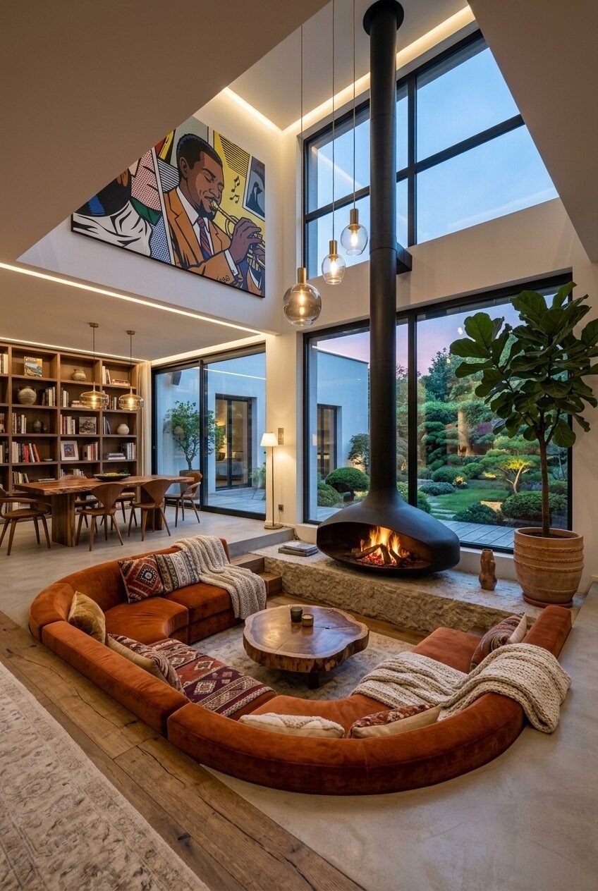
A suspended cylindrical fireplace centered on a sunken pit — with floor-to-ceiling glazing behind it looking onto a night garden — is a combination that takes real confidence to commit to. The fireplace hangs from the ceiling on a visible black flue pipe, and rather than hiding the pipe, the design leans into it as a vertical element that anchors the seating arrangement below. The pendant globe lights hanging at varying heights alongside it reinforce that vertical layering.
The pop-art mural high on the wall above the glazing is the detail most people would walk away from in a mood board and then not know how to use. Scale is everything with oversized art in double-height spaces — a canvas that would be dramatic at normal ceiling height just disappears at 6 meters, so the piece here is correctly enormous. The bold primary colors of the musician painting work precisely because the rest of the room — terracotta leather sofa, natural wood floor, neutral walls — asks very little of you color-wise until that moment of looking up.
The sunken platform itself is defined by a low stone ledge that doubles as the hearth surround and creates the step down into the seating pit. If a suspended fireplace isn’t structurally possible, a freestanding cylindrical wood-burner placed within a lowered seating platform achieves much of the same visual drama. The Kilim-style throw cushions and chunky knit blankets on the terracotta sectional are easy additions that warm the space considerably.
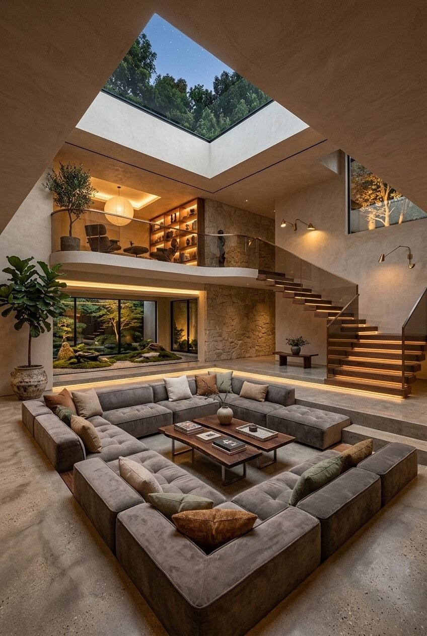
Dark Palette, Glass Pyramid, Forest View
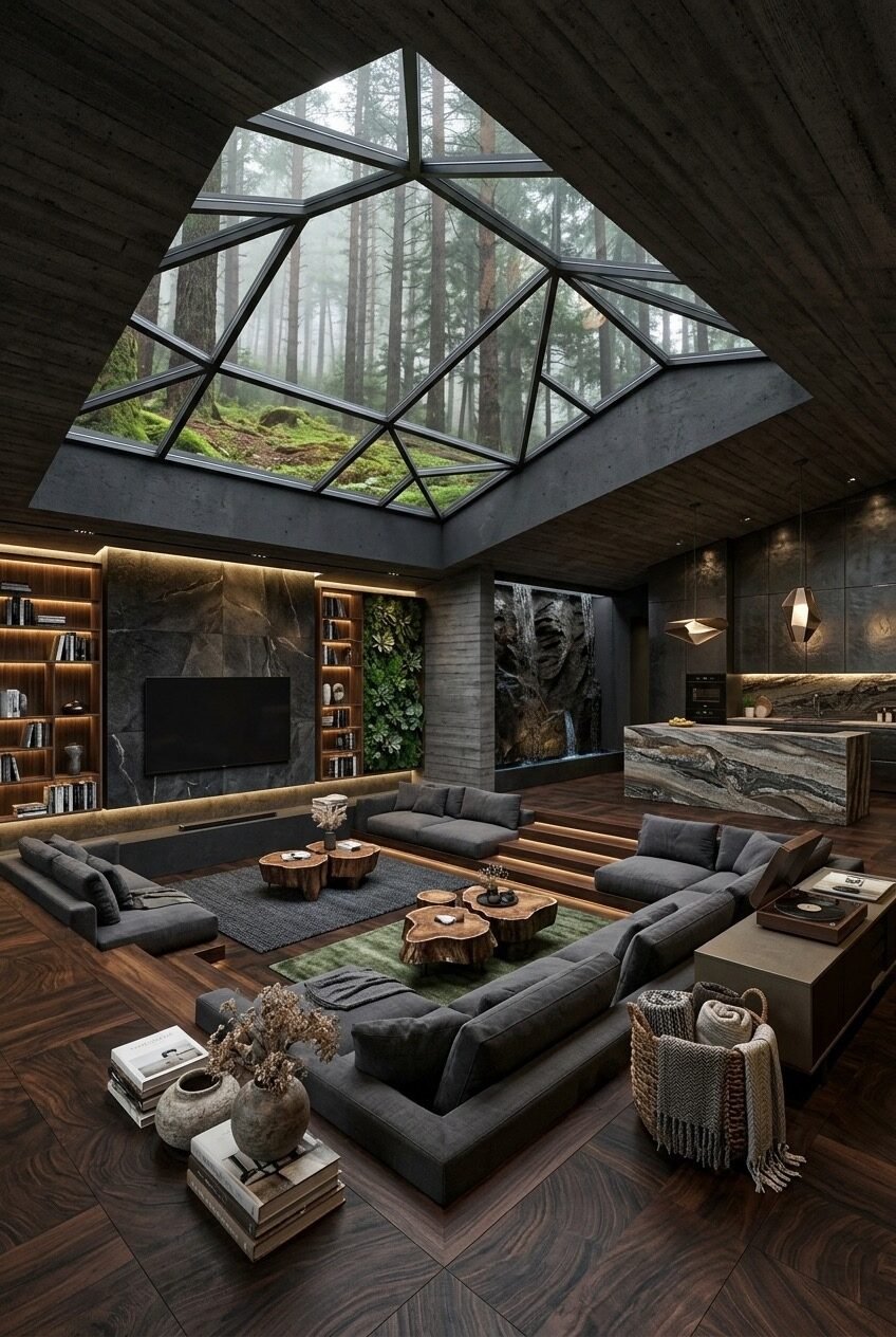
The glass roof here is the structural centerpiece — a geometric pyramidal skylight that frames the forest canopy above as if it’s a living painting on the ceiling. Every material in the room below follows the darkness of the surrounding pine trees: charcoal sectionals, dark hardwood floors in a chevron lay, slate-toned stone on the TV wall, and dark wood cladding overhead. It’s a room that doesn’t fight its context, it absorbs it.
A vertical garden panel, backlit and planted with ferns and moss, is set into the wall beside the TV unit. That panel works because the rest of the room’s lighting is warm-toned — the amber glow from the bookshelf strip lights and the LED toe-kicks on the stepped platform contrast against the cool green of the live plants in a way that feels almost theatrical. When a room is this committed to a dark material palette, the only things that read as fresh are natural — living plants, natural wood grain, the movement of fire or water.
The sunken seating arrangement here uses the step-down more dramatically than most, with what appears to be a full platform height of 40–50cm. That’s a meaningful architectural drop, not a symbolic one — it genuinely separates the living area from the surrounding floor and creates the sense that you’ve descended into the room. The wood slab cluster coffee tables at different diameters are the right call for a space this dark and substantial; anything with legs would feel too light and fidgety.
White Bouclé, Bonsai, and a Pond Garden
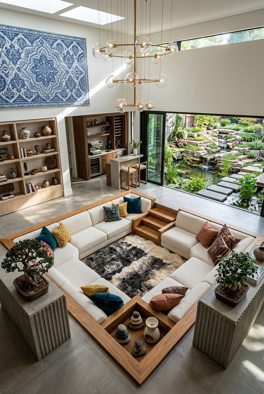
A framed garden view with a koi pond and rock waterfall as the backdrop of a sunken living room is genuinely hard to pull off without the room looking like a showroom. What prevents that here is the warmth and lived-in quality of the objects: a heavily patinated blue-and-white textile panel hung high on the wall, bonsai trees on either side of the pit at floor level, stoneware objects layered into open shelving. The ceramic vases and earthenware are clearly things someone actually collected, not things that arrived in boxes from a styling agency.
The sunken pit has a defining detail worth noting: a wood-framed ledge surrounds the entire seating area, slightly raised above the surrounding concrete floor. Rather than the floor dropping, the seating pit is effectively a wood-framed table-height surround with the sofa set inside — it creates the same visual enclosure as a true sunken room but without any structural excavation. This is the most replicable sunken-living-room technique for existing homes.
The eclectic pillow arrangement on the white bouclé sectional — teal, mustard yellow, rust, patterned Ikat — is a good reminder that a very neutral base opens up a lot of freedom with textiles. The multi-arm chandelier with glass globe shades ties together the clean white ceiling without competing with the garden view below. For anyone working on a room with a significant outdoor element, the lesson here is to let the outside do most of the talking and keep the interior layering focused on texture rather than color.
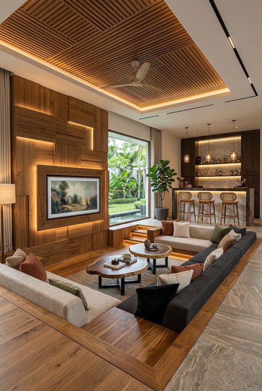
Leather, Exposed Beams, Onyx Table
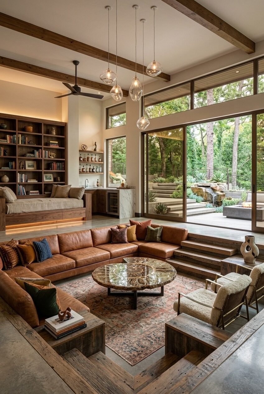
Cognac leather in a large sectional has a way of making a room feel settled — like it’s been there a while, like someone actually uses it. The material choice here is doing a lot of the tonal work: warm, earthy, slightly rough-edged, perfectly matched to the exposed reclaimed wood ceiling beams overhead. The combination of rough-hewn beam and polished leather shouldn’t work as well as it does, but the key is that neither material is precious. Both read as things that age well.
The coffee table is an onyx or heavily figured stone slab on a metal base, and it earns its place by being genuinely unusual. Stone coffee tables are common; a circular onyx table with visible layered mineral patterning is not. When a room is built on warm, muted tones — leather, linen, wood, aged rugs — one material that introduces a note of geological strangeness holds the eye in a way that a matching wood or marble table simply wouldn’t. It’s worth spending where it counts.
The step-down here uses raw wood planks as the transition material between the sunken seating area and the surrounding concrete floor — a detail that keeps the transition from feeling too polished. A built-in window seat with under-seat drawers and LED kick lighting sits against the back wall beside the bar area, and that combination of storage, reading nook, and ambient light is one of the most practical multi-purpose additions a living room can have. If you’re renovating and can only add one thing, a built-in window seat with LED lighting underneath it returns enormous value per square meter.
Global Textiles in a Minimal White Volume
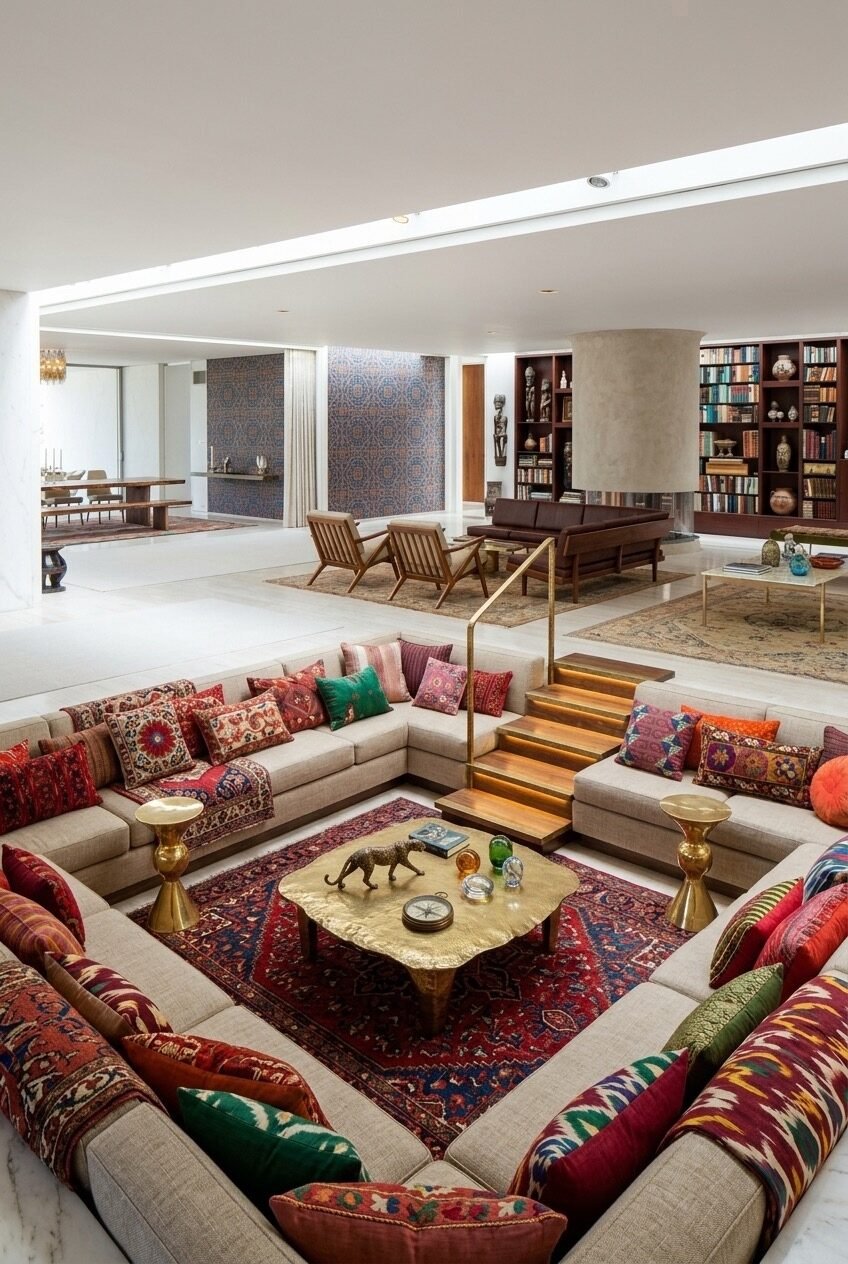
Most sunken living rooms rely on the architecture to carry the room — the step-down, the material contrast, the ceiling drama. This one asks the textiles to do that work instead, and it’s the most textile-forward sunken pit we’ve seen. The sectional upholstery in natural linen is almost neutral, but stacked across every surface are Suzani embroideries, Persian rug fragments, Ikat cushion covers in deep reds and greens, and kilim throws in orange and gold. The cumulative effect is dense and layered and completely deliberate.
The surrounding architecture is purposefully restrained — white walls, polished marble or stone floors, no ceiling detail, minimal millwork. A maximalist textile scheme like this only holds together when the architecture it sits inside has essentially nothing to say; the moment the walls compete, the whole thing tips into chaos. The restraint is the structural decision that makes the boldness work.
Gold-toned brass accent tables at varying heights sit around the perimeter of the pit instead of a central coffee table, and the brass carries through to the stair railing hardware as the eye travels from the sunken area back up to the open-plan living level. For anyone inspired by this but anxious about the volume of pattern, the reliable approach is to anchor the floor with one dominant rug — a large, high-quality Persian or Moroccan piece — and then let the cushions build outward from there. The rug becomes the reference point that stops everything from reading as random.
Forest Green Velvet in Reclaimed Wood
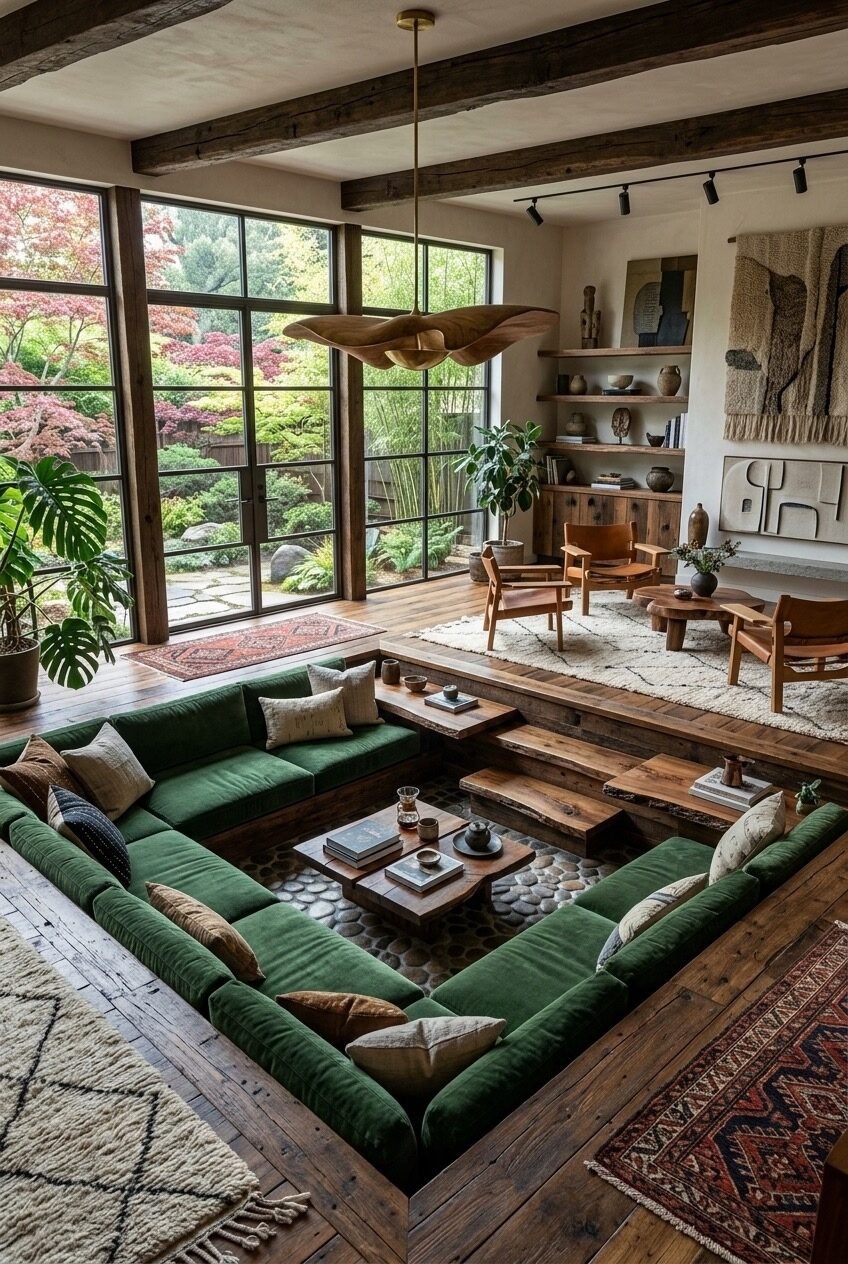
Forest green velvet is a commitment. It’s the kind of upholstery choice that defines the room’s personality outright — it’s not a neutral base that works with anything. Here it works because the rest of the room shares the same orientation: raw wood everywhere, a reclaimed pebble floor embedded at the base of the pit, dark-stained ceiling beams, handwoven wall textiles, ceramic vessels. It’s a room that’s decided it wants to feel like the forest outside the window, and the deep green sectional is the most direct expression of that.
The raw wood step-down edging is structural and aesthetic at once — solid chunky timber used as both the riser and the ledge, wide enough to hold a coffee mug or a book, which means the perimeter of the pit functions as extra seating or table surface. A solid wood coffee table inside the pit, low and flat with natural live edges visible, keeps the material story consistent without looking like a furniture catalog.
The inspired detail here is the pebble or cobblestone flooring material embedded within the pit itself, visible at the base level — a material you’d expect to find in a garden or a spa, brought entirely indoors. It creates a textural contrast with the wood platform surround that draws your attention downward, reinforcing the sunken quality. In a raised-platform version of this pit, that same pebble inlay could be placed within the plinth area rather than underfoot, as a decorative border. Pair with a waved organic-form pendant light as shown and the whole room feels like it grew there.
The Circular Pit With a Zen Garden View
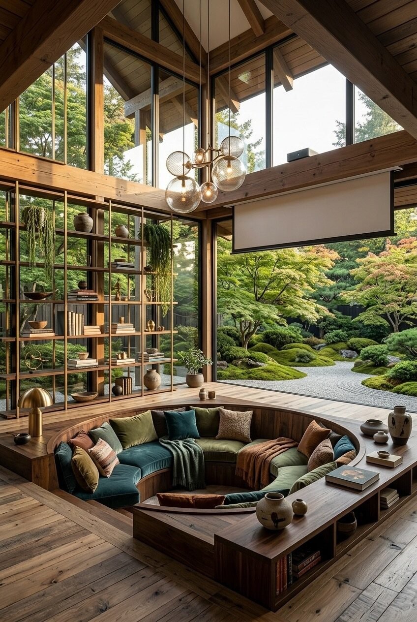
A circular sunken seating pit is the most architecturally committed version of this idea. Unlike a square or rectangular pit that slots into a standard room layout, a circle demands that everything around it be designed in relation to it. The wood platform surround is square, but the seating inside is fully round — and the contrast between those two geometries is what makes the pit feel like an object within the room rather than just a floor detail.
The view is doing heavy lifting: a Japanese garden with raked gravel, shaped moss mounds, and mature trees framed by floor-to-ceiling glazing on three sides. The open shelving unit positioned against the glazing — in brass and warm wood, stocked with ceramics and books — is partially transparent, so the garden reads through it. Using an open-frame shelving unit as a partial divider in front of a glass wall is a technique that layers depth into the view without blocking it; you’re looking at objects and landscape simultaneously.
The velvet cushion palette inside the pit — dusty teal, forest green, terracotta, rust — is specific enough to feel considered but not so matched that it looks styled. A dropped projector screen visible at the top of the frame suggests this room doubles as a home cinema, and the high gabled ceiling with exposed timber structure overhead has the acoustics for it. If a full circular pit isn’t structurally feasible, an arched or half-moon banquette built into a corner with a raised wood surround achieves a similar sense of contained intimacy.
Lower the Floor, Raise the Whole Room’s Character
What these spaces share — across all their different materials, scales, and moods — is a commitment to the idea that architecture should do some of the emotional heavy lifting. When a floor drops, even subtly, it creates a psychological boundary that furniture arrangement alone never quite achieves. People settle in differently. Conversations get closer. The room stops being a pass-through and becomes a place.
The practical side of this is worth taking seriously. Sunken living rooms require structural planning, and in some homes that’s a significant undertaking. But the lowered platform approach — where a raised surround creates the visual impression of a sunk space without excavation — is far more accessible than most people assume. The step-down detail, the LED toe-kick, the built-in ledge that doubles as a side table: these are elements that can be added to an existing renovation with the right contractor and a clear vision.
The bigger takeaway is really about intentionality in spatial design. Whether you go full architectural with a concrete pit or simply define the seating area with a dropped platform and a wraparound sectional, the goal is the same: make the living room feel like it was designed for living in, not just furnished.