What Makes These Minimalist Decor Ideas Feel So Effortlessly Stylish
Minimalist decor has come a long way from the cold, ultra-stark interiors that once dominated design magazines. Today’s approach is less about removing everything and more about choosing better. The most successful minimalist homes aren’t empty at all—they’re intentional. Every piece serves a purpose, contributes to the overall mood, or brings a sense of comfort to the people living there.
Throughout these ideas, we can see how thoughtful styling, natural materials, layered textures, sculptural forms, and carefully curated accessories work together to create spaces that feel calm rather than boring. Minimalism isn’t a decorating shortcut. In many ways, it requires more discipline because every object becomes more noticeable. That’s why principles like balance, scale, proportion, focal points, texture variation, and negative space play such important roles.
Whether we’re styling a gallery wall, arranging shelves, incorporating statement lighting, or refining an entryway, the goal remains the same: creating a home that feels visually peaceful and easy to live in. Minimalist decor isn’t about having less for the sake of less—it’s about making room for what matters most.
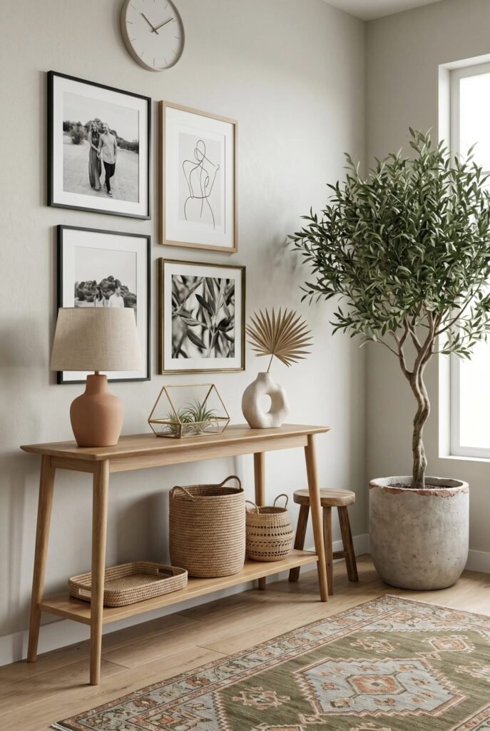
Create A Curated Black-And-White Gallery Wall
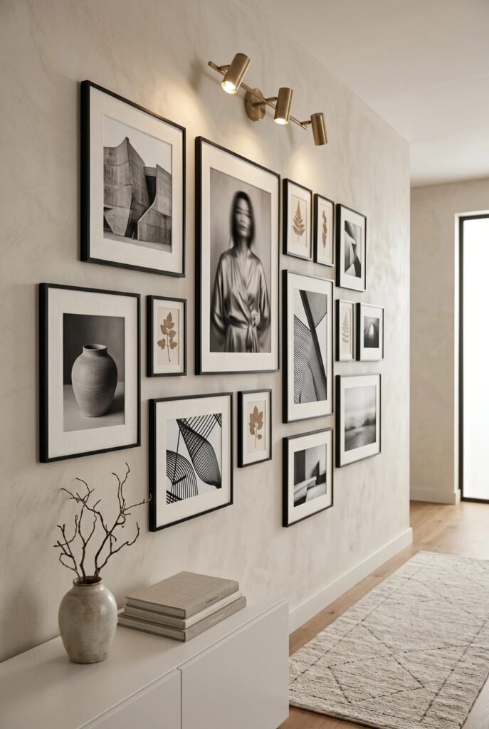
A gallery wall is one of those minimalist decor moves that looks effortless but secretly relies on good planning. The image works because the frames share a consistent black border while the artwork varies in scale and subject matter. That balance creates visual interest without turning the wall into chaos. Repeating one frame color is a simple design principle that instantly makes a collection feel intentional. We often assume minimalism means fewer pieces, but this setup proves that many items can still feel calm when they follow a clear visual system.
The spacing is doing a lot of heavy lifting here too. Notice how the frames sit relatively close together, allowing them to read as one composition rather than separate decorations fighting for attention. The oversized portrait acts as the focal point while the smaller botanical and abstract pieces provide rhythm around it. That’s classic hierarchy in action.
If you’re recreating this look, lay everything out on the floor first before touching the wall. Stick to a neutral color palette, mix photography with abstract prints, and resist the urge to add random colorful artwork. A gallery wall succeeds when it feels collected, not crowded.
Let Sculptural Lighting Become The Main Character
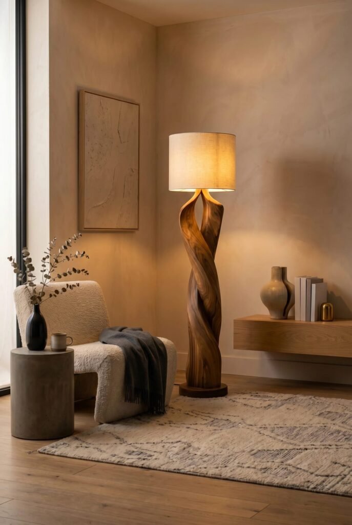
Sometimes the decor isn’t the decor. Sometimes the lamp steals the entire show, and honestly, we’re not mad about it. This corner demonstrates how a single sculptural floor lamp can become a focal point while keeping the room incredibly minimalist. The twisted wood base introduces movement and organic texture, preventing the neutral palette from feeling flat or sterile.
A key principle here is contrast through form rather than color. Everything surrounding the lamp has soft, simple shapes: the boucle chair, the round side table, and the clean-lined floating console. Because the supporting elements are visually quiet, the lamp naturally commands attention. Minimalist rooms often feel strongest when one statement piece carries the personality.
The warm ambient glow also softens the entire corner. Lighting is frequently overlooked when people recreate minimalist interiors, but it can completely change the mood of a space. Instead of relying solely on overhead fixtures, layer in a sculptural floor lamp with warm-toned bulbs. The result feels cozy rather than clinical. Minimalism should feel like a calm exhale, not a waiting room.
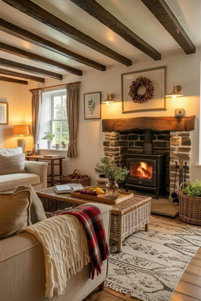
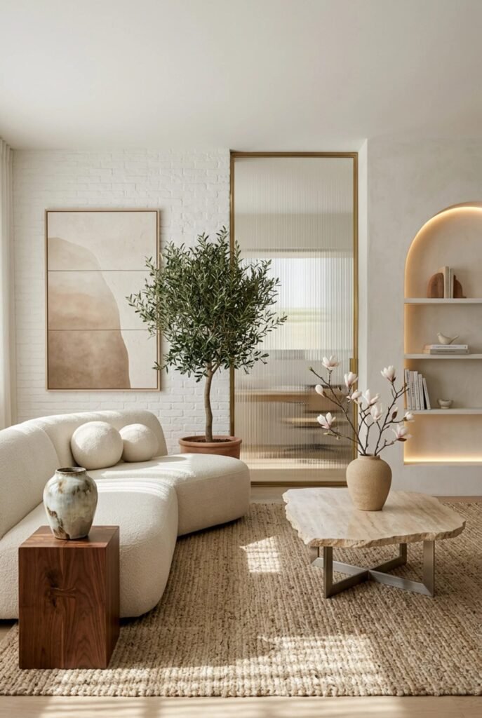
Style An Entryway With Natural Layered Textures
This entryway proves that minimalism and warmth can absolutely coexist. The design relies heavily on natural materials, including light wood, woven baskets, pottery, linen shades, and greenery. These elements create depth without requiring bold colors or excessive decoration. Texture is often the secret ingredient that keeps minimalist spaces from feeling unfinished.
The console table acts as the visual anchor while the artwork creates vertical balance above it. Notice how the frames vary slightly in style but stay within a restrained color palette. This consistency helps maintain harmony throughout the vignette. Meanwhile, the large olive tree introduces organic shape and height, preventing the arrangement from feeling overly structured.
When recreating this idea, think in layers rather than objects. Start with a furniture piece, add artwork, introduce texture through baskets or ceramics, and finish with greenery. That’s usually enough. The biggest mistake people make is continuing to add accessories after the composition already feels complete. Good minimalist styling often requires knowing when to stop decorating, which is admittedly harder than Pinterest makes it look.
Use An Organic Mirror To Expand Space
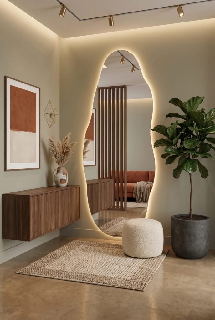
If regular mirrors are the reliable friend, organic mirrors are the stylish friend who somehow looks amazing in every photo. This asymmetrical mirror instantly becomes the focal point because it breaks away from the straight lines surrounding it. The curved shape introduces softness and visual movement, making the entire entryway feel more dynamic.
Beyond aesthetics, the mirror serves an important functional purpose. Mirrors reflect light, increase brightness, and visually expand smaller spaces. That’s why they’re a favorite tool among interior designers. A well-placed oversized mirror can make an entryway feel significantly larger without moving a single wall. The integrated backlighting amplifies that effect by creating a subtle glow around the perimeter.
The floating walnut cabinet reinforces the minimalist aesthetic because it exposes more floor area, making the room feel less cluttered. Combined with the textured rug and simple plant, the composition feels balanced and airy. If you’re trying this look at home, keep surrounding decor minimal. An organic mirror works best when it has room to breathe. After all, even the main character needs a clean stage.
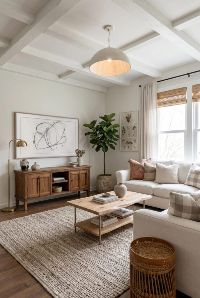
Decorate With Functional Objects That Feel Artistic
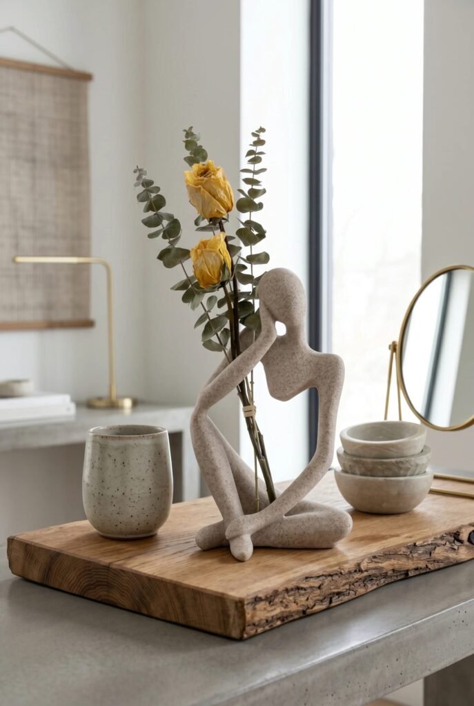
One of the easiest ways to embrace minimalism is by choosing everyday objects that double as decor. This tabletop arrangement demonstrates that beautifully. The sculptural figure, ceramic cup, stone bowls, and floral stems are all simple individually, but together they create a thoughtful composition. Minimalist styling often focuses on fewer objects with stronger visual impact rather than filling surfaces with accessories.
The live-edge wooden tray is especially important because it visually groups the items into one cohesive arrangement. Designers often call this “creating a vignette.” Instead of several unrelated objects floating across a countertop, the tray establishes boundaries and organization. The result feels curated rather than accidental.
Another principle worth stealing is the mix of materials. Smooth stone, raw wood, soft florals, and matte ceramics create contrast while staying within a restrained palette. That variation keeps the eye engaged. When styling your own surfaces, aim for odd-numbered groupings and varied heights. If every object is the same size and material, the arrangement tends to fall flat faster than our motivation to organize the junk drawer.
Style Open Shelving With Purposeful Restraint
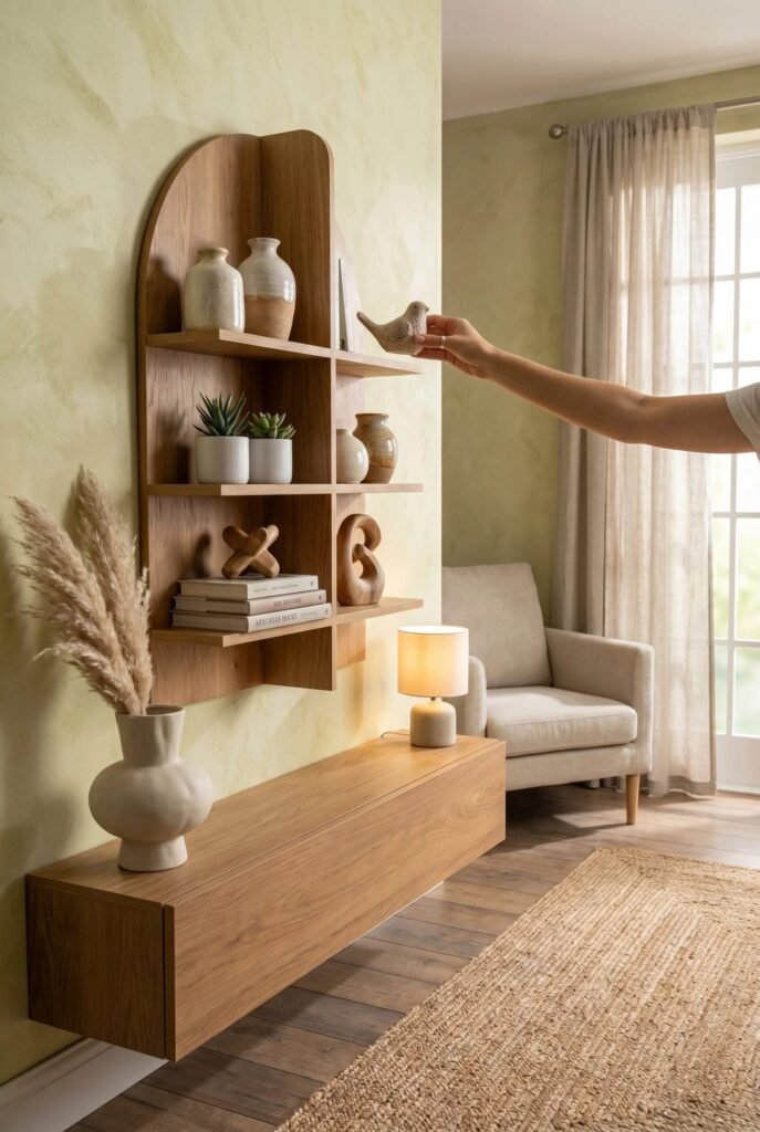
Open shelving can go from Pinterest-perfect to thrift-store-chaos surprisingly fast. This setup succeeds because every item earns its place. The warm wood shelf introduces natural texture while the accessories remain limited to ceramics, books, greenery, and sculptural objects. Nothing feels random. One of the most important minimalist principles is editing relentlessly until only meaningful pieces remain.
The design also relies on visual balance. Notice how larger objects sit opposite smaller groupings, preventing the shelf from feeling heavier on one side. The curved top softens the straight lines of the cabinetry below, creating subtle contrast without introducing visual noise. This is a great example of how shape variation can add interest when color palettes remain restrained.
If you’re recreating this look, think in odd-numbered groupings and leave intentional empty space. Empty space is not wasted space. In minimalist design, it allows the eye to rest and helps decorative pieces stand out. A shelf that is only 70% full often looks more expensive than one packed to 100%. Sometimes less really is more, and this shelf understood the assignment.
Turn Everyday Function Into Wall Art
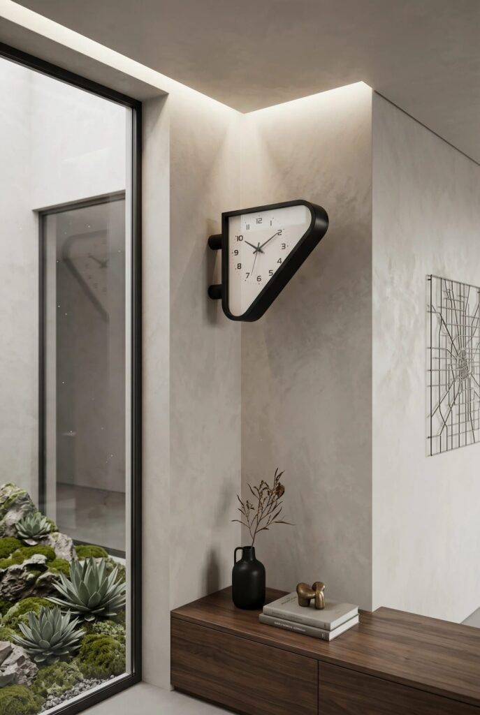
Most clocks exist quietly in the background. This one clearly woke up and decided to become decor. The unusual wall-mounted clock instantly creates a focal point because it introduces an unexpected silhouette within an otherwise calm interior. Minimalist spaces often benefit from one surprising element that captures attention without overwhelming the room.
What makes this composition effective is the contrast between geometric forms and organic textures. The angular clock, clean architectural lines, and minimalist console are balanced by the natural textures visible in the indoor rock garden and decorative branches. Good minimalist interiors rarely rely on one texture alone. Layering smooth and organic surfaces creates depth without clutter.
Another lesson worth stealing is the use of negative space. The wall remains largely empty, allowing the clock to command attention. Many people rush to fill every blank surface, but restraint often creates a stronger visual impact. If you choose one sculptural statement piece, let it breathe. Your decor should feel curated, not like it’s competing in a talent show for attention.
Add Tiny Details With Unexpected Whimsy
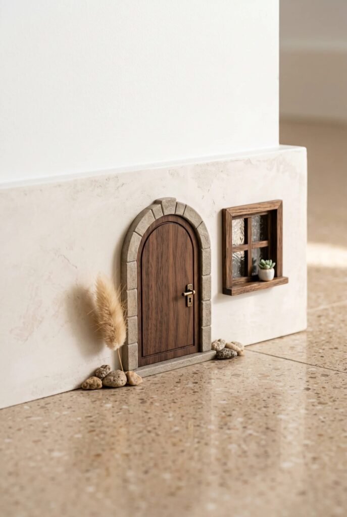
Minimalism sometimes gets accused of being serious, but this adorable miniature door proves otherwise. Tiny decorative moments like this add personality while barely taking up any physical or visual space. The scale contrast immediately creates curiosity, turning an overlooked architectural detail into a conversation starter.
From a design perspective, this idea works because it respects proportion. The miniature door feels believable thanks to the stone arch surround, tiny window, and carefully placed decorative elements. Together they create a complete visual story. Successful decor often relies on storytelling rather than simply accumulating objects. Even small accents can create emotional connection when they feel intentional.
This approach is especially useful for renters or homeowners who want character without major renovations. A whimsical detail placed near baseboards, bookshelves, or reading nooks can inject warmth into a minimalist home. Just avoid scattering tiny decorative items everywhere. The charm comes from surprise. Think of it as an Easter egg for your house—one delightful little detail people discover when they least expect it.
Layer Texture Through Minimal Wall Decor
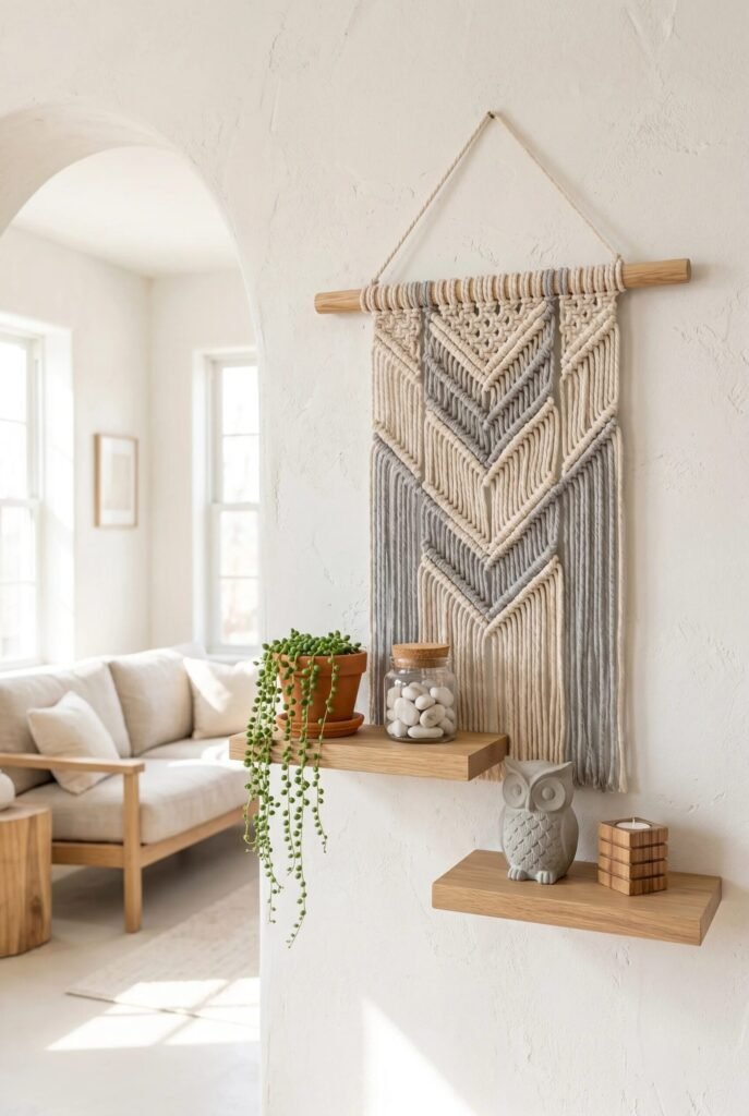
Wall decor doesn’t always need oversized artwork or dramatic gallery walls. Sometimes a single textile piece can completely transform a blank surface. This macramé hanging introduces softness, movement, and texture while maintaining the neutral palette that minimalist interiors love so much. Texture often creates more visual richness than color ever could.
The floating shelves underneath strengthen the composition by adding horizontal balance. Together, the shelves and wall hanging create a layered arrangement that feels complete without appearing busy. Notice how the decor pieces remain simple: a trailing plant, ceramic owl, glass jar, and wooden accents. Each object contributes a different material, which keeps the eye engaged without overwhelming the space.
Natural light also plays a huge role here. The woven fibers create subtle shadows throughout the day, giving the wall dimension and depth. If you’re recreating this idea, prioritize materials like cotton, linen, wood, and ceramics. These textures naturally complement minimalist interiors. A room with varied textures feels cozy and inviting, while a room with only smooth surfaces can feel a little too “freshly assembled furniture showroom.”
Build A Calm Entryway Around Symmetry
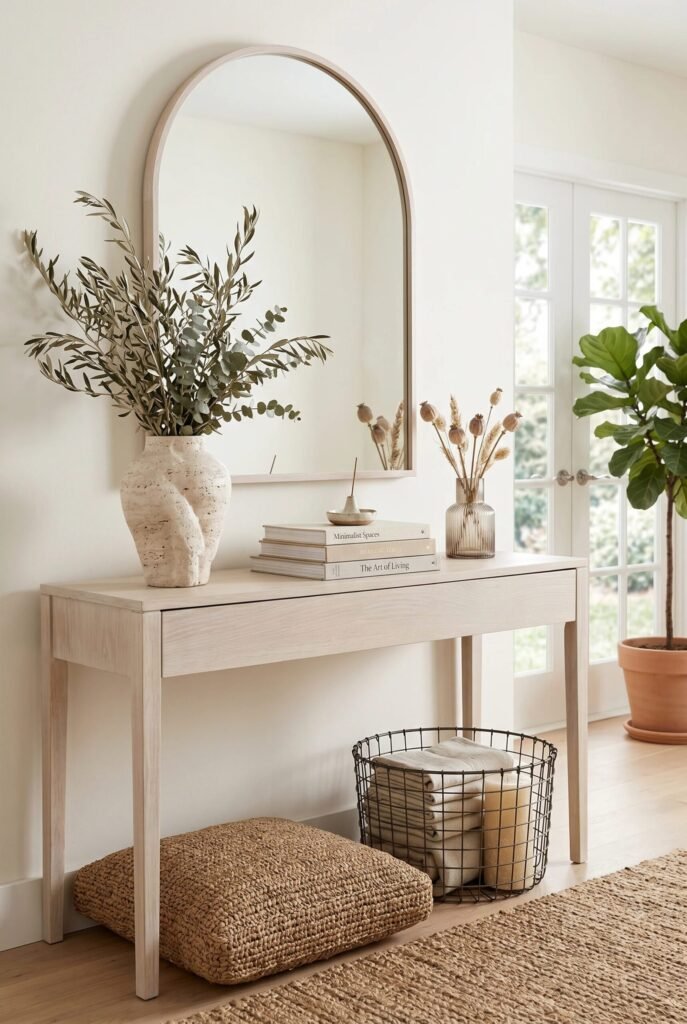
There is something incredibly satisfying about an entryway that feels balanced the moment you walk through the door. This arrangement achieves that feeling through symmetry, proportion, and a carefully curated neutral palette. The arched mirror establishes a strong vertical focal point while the slim console grounds the entire composition below.
One reason this setup feels so peaceful is the consistency of materials. Light wood, woven fibers, glass, ceramics, and greenery all share similar earthy undertones. Nothing competes for attention. Color harmony is one of the easiest ways to make a space feel more expensive and cohesive. When every piece belongs to the same visual family, the room naturally feels calmer.
The styling is equally restrained. A stack of books, a sculptural vase, and a small arrangement of dried stems are enough to create interest without overcrowding the tabletop. The basket and floor cushion underneath maximize functionality while keeping visual clutter hidden. If you’re styling an entryway, remember that first impressions matter. The goal isn’t to impress people with more decor; it’s to create a space that instantly feels welcoming, organized, and effortlessly put together.
Fewer Things, Better Choices, More Beautiful Living
The beauty of minimalist decor is that it adapts to different personalities, homes, and lifestyles while still maintaining a sense of clarity and calm. Some people express minimalism through sculptural furniture and clean architectural lines, while others embrace it through natural textures, warm woods, handcrafted accessories, and meaningful decorative pieces. The common thread is intention.
As we’ve explored these ideas, one lesson appears again and again: great minimalist spaces rely on thoughtful decisions rather than large decorating budgets. Strategic lighting, cohesive color palettes, balanced compositions, and carefully selected focal points often have a bigger impact than constantly buying new decor. In fact, knowing what not to add is often just as important as knowing what to include.
As you recreate these ideas in your own home, focus on editing before purchasing, layering textures before introducing more color, and prioritizing quality over quantity whenever possible. The most inviting minimalist interiors don’t feel unfinished—they feel effortless, functional, and beautifully curated for real life.