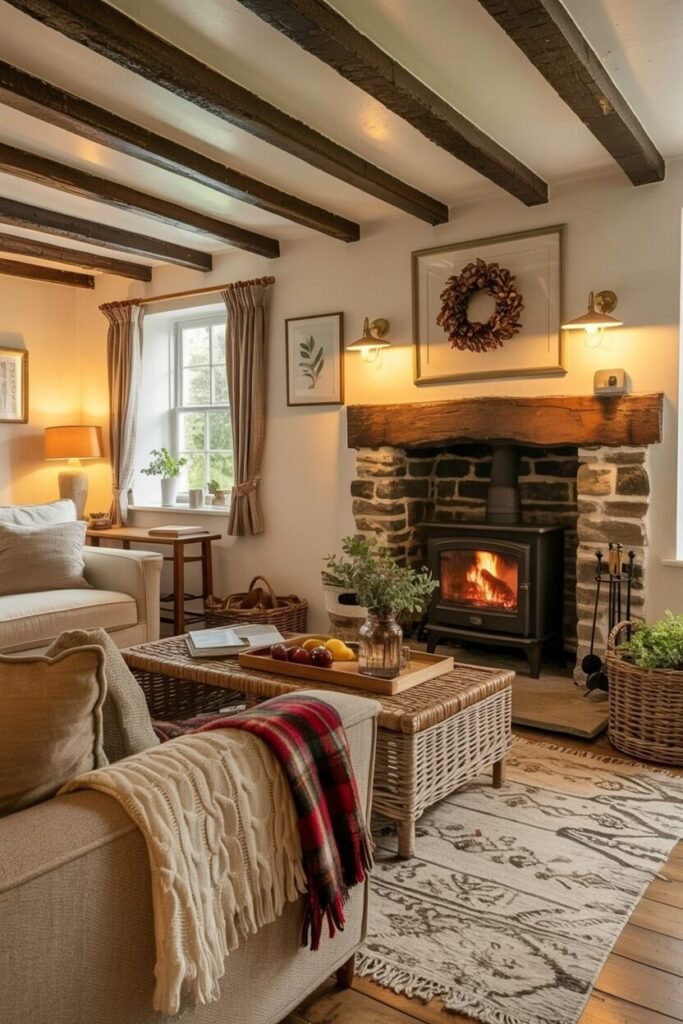

Best Pinterest-worthy Practical Magic House Ideas This Year
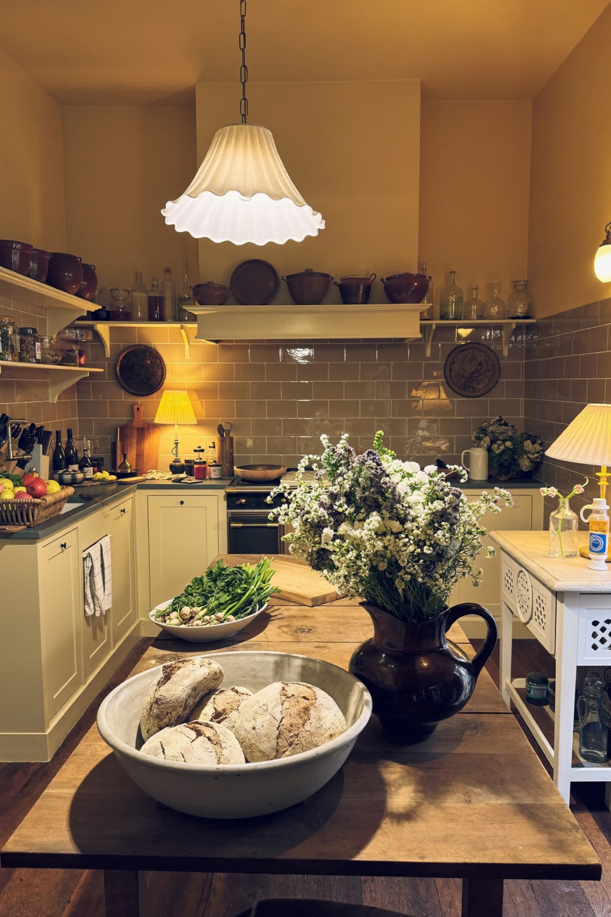
Not every home upgrade needs a contractor. Some of the best transformations come from a bowl of good bread, a jug of wildflowers, and a light fixture that actually flatters the room instead of just lighting it. That is the version of magic we are talking about here.
We pulled together ten spaces that prove the point. None of them rely on a single showstopping renovation. They lean on smaller decisions repeated with confidence: a color that gets used twice, a texture that gets layered instead of matched, a light source that gets chosen on purpose.
Some of these rooms are quiet, some are loud, and a few genuinely surprised us with how much personality they packed into a corner. Walk through them with us and steal whatever fits your own house best.
Mix Rattan Texture With Unexpected Plaid
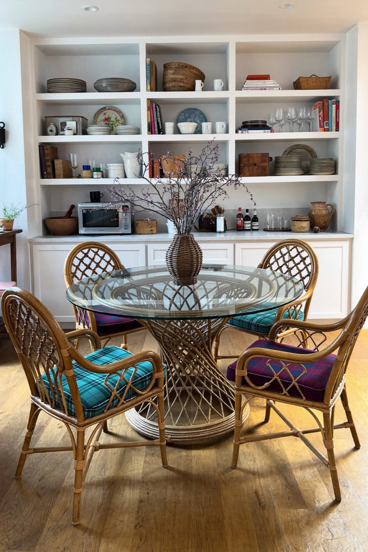
A glass-topped table on a woven rattan base already reads a little formal and a little relaxed at once, and that tension is exactly what makes this dining corner work. Then the tartan cushions show up and pull the whole thing somewhere more playful, proving that a preppy pattern and a beachy material can share a room without a fight.
The shelving behind it does its own quiet work. Plates are stacked, glassware is grouped, books are leaned rather than lined up, and everything gets room to breathe instead of being crammed edge to edge. Give your open shelves negative space and they will read as styled instead of stored.
If you are working with plain wood or rattan furniture already, do not reach for more neutral textiles to soften it. Pick one graphic pattern, plaid or otherwise, and let it repeat across every seat cushion so it reads as a decision and not an accident.
Make That Dead Corner Cozy
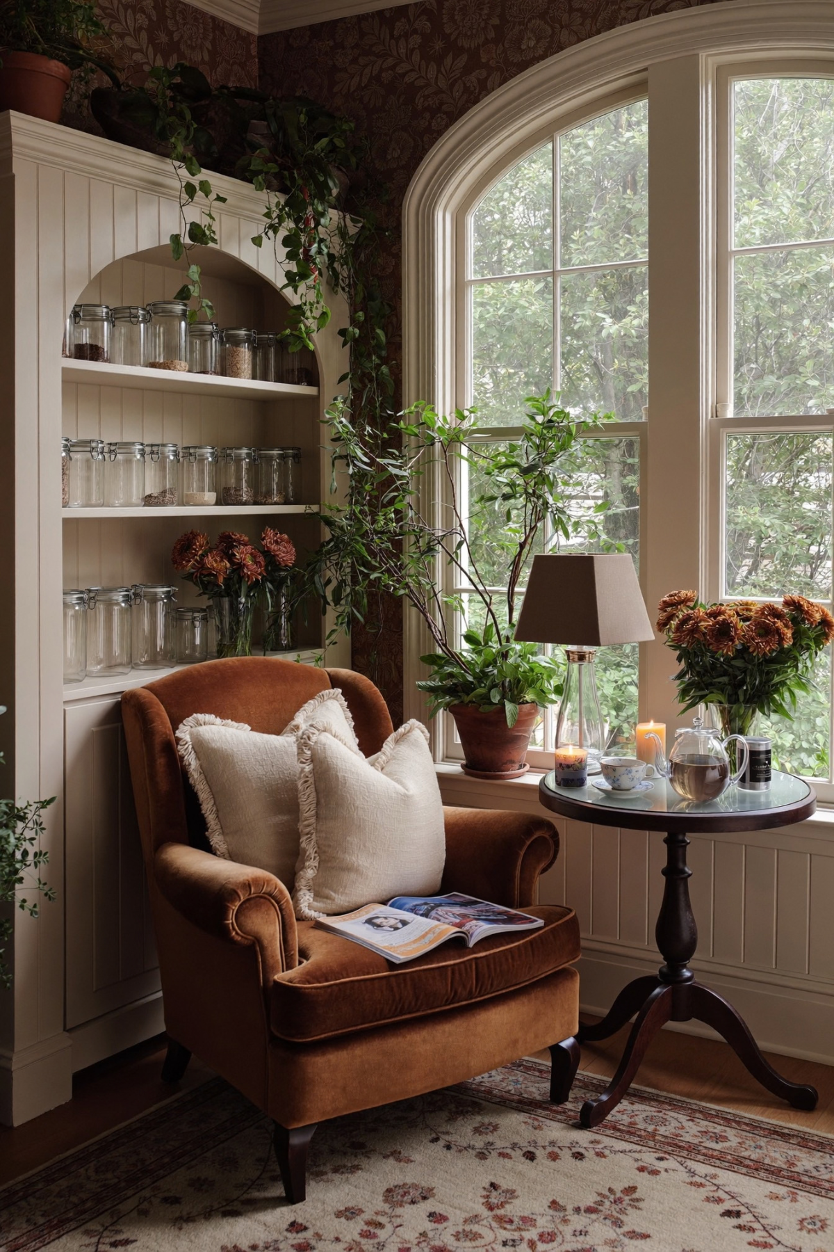
Every house has one spot that never quite earns its keep, usually somewhere near a window with an awkward built-in beside it. Here that dead zone becomes a full reading corner, and the trick is simpler than it looks: a single oversized armchair, a round table that fits nothing bigger than a teacup, and a lamp that runs on its own switch.
The arched shelving stocked with matching glass jars is doing more visual work than the chair itself, since repetition at that scale reads as intentional styling rather than pantry overflow. Dried florals and trailing ivy soften the hard lines of the cabinetry without hiding it.
Steal this by auditing your own house for a corner with natural light and a wall nearby. You need less furniture than you think, just one chair with real presence, a small table, and a lamp you would actually want to read under after dark.
Layer Metals And Lighting Without Fear
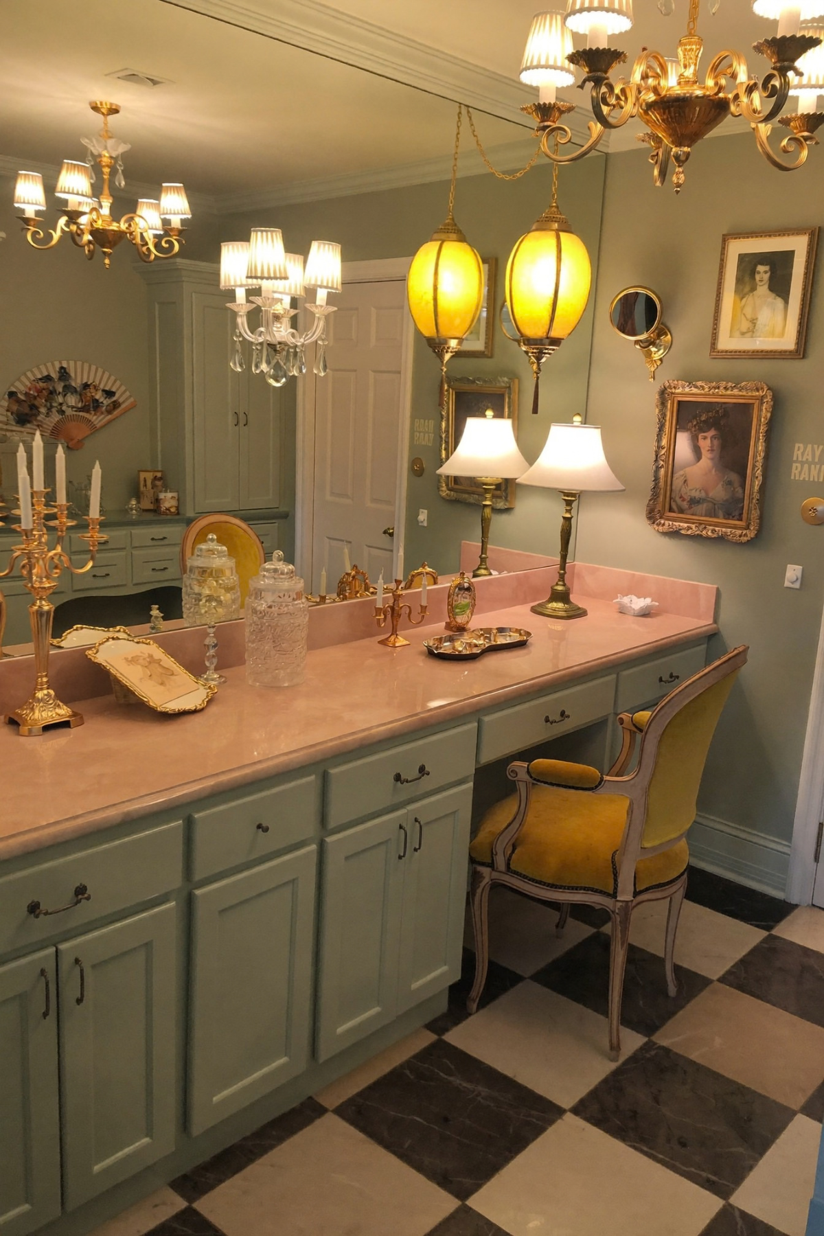
This is a room that refuses to pick a single metal finish, and it is better for it. Brass candelabras sit beside crystal chandeliers, amber glass lanterns hang low over a pink stone counter, and none of it feels accidental because the sage green cabinetry gives every metallic something calm to sit against.
The gallery of gilt-framed portraits above the counter is what really sells the old world glam angle, turning a functional vanity into something closer to a dressing room in an old estate. A checkerboard floor grounds all that ornament with one graphic, repeating pattern.
Layer at least three light sources in a room like this rather than relying on one overhead fixture, and stop worrying about matching your brass to your gold. Vintage finishes were never meant to match exactly, and the slight variation is part of what reads as collected over time.
Make Pantry Storage Look Intentional
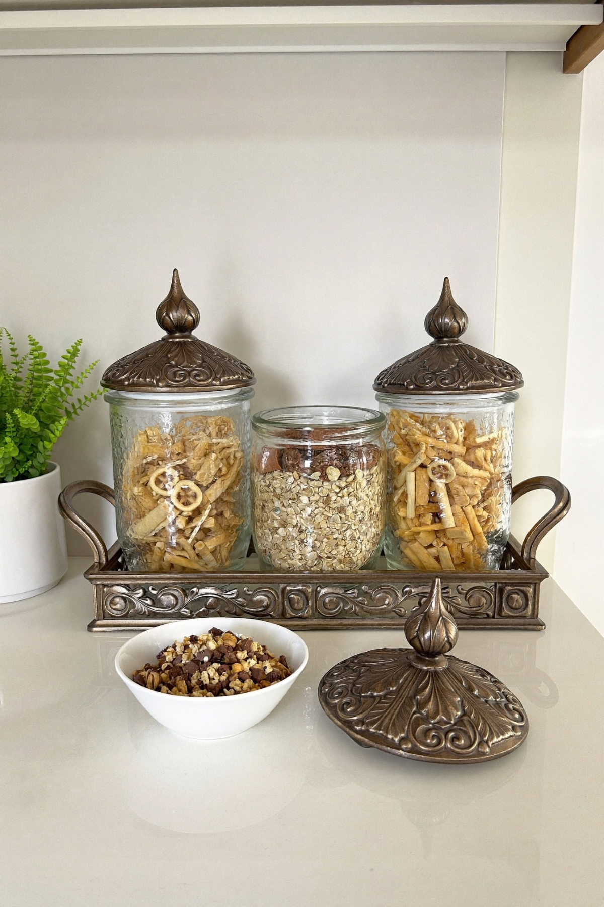
Dried pasta and rolled oats are not glamorous ingredients, yet a matching set of bronze-lidded jars on a footed tray makes them look like something worth photographing. That is the entire lesson of this idea: presentation does more heavy lifting than the object itself ever will.
Notice how the jars are not identical in what they hold, but they are identical in shape and finish, which is what keeps the grouping from feeling like clutter. A tray under any collection of small objects instantly reads as a deliberate vignette instead of countertop overflow.
You do not need matching everything to pull this off at home. Start with two or three jars in the same material, decant whatever pantry staple you reach for most, and set them on a tray so your eye treats them as one grouped object rather than several loose ones scattered across a shelf. It works because the storage stops apologizing for itself, and once a jar has a lid worth looking at, nobody minds what the thing inside was going to sit out anyway.
String Lights Are Not Just Christmas
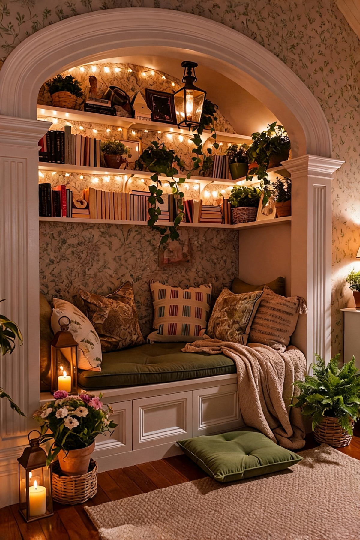
We tend to pack fairy lights away after December, which is honestly a waste, because a warm string tucked along the underside of a shelf does more for a room’s mood than almost any lamp can. This arched nook uses them like architectural trim, outlining the shelves instead of the whole ceiling.
Underneath, the actual seating cushion earns its keep through pattern layering rather than color matching. Striped pillows sit against floral ones, a faux fur throw gets tossed rather than folded, and a floor cushion nearby means the nook can fit a second person without adding real furniture.
Leave your string lights up year round and just change what they are illuminating. Run them behind books, along a headboard, or under open shelving, anywhere you want a softer glow than an overhead fixture provides after sunset. A warm bulb temperature matters more than the brand, so check that before you buy a string and assume it will look cozy out of the box.
Let One Chair Carry The Room
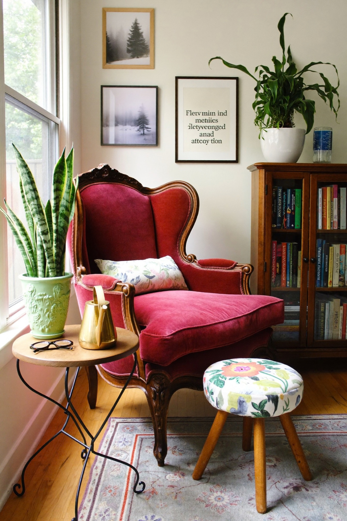
Raspberry velvet on a carved antique frame is not a subtle choice, and it does not need to be, because a single bold seat is often enough personality for an entire corner. The walls, floor, and cabinet all stay quiet on purpose so the chair has somewhere to be loud.
Above it, the gallery wall mixes framed photography with a typographic print, proving that a wall grouping does not need matching frames or a single subject to hold together. A tall snake plant adds height where the bookcase leaves a gap, and a smaller potted one echoes it at table level.
If your rooms tend toward beige, this is the fix. Thrift or reupholster one chair in a color you would never choose for a whole sofa, then let every other surface in the room go quiet around it. One loud piece reads as confidence, while three or four scattered accent colors just reads as indecision.
Cocoon A Bed With Sheer Drapery
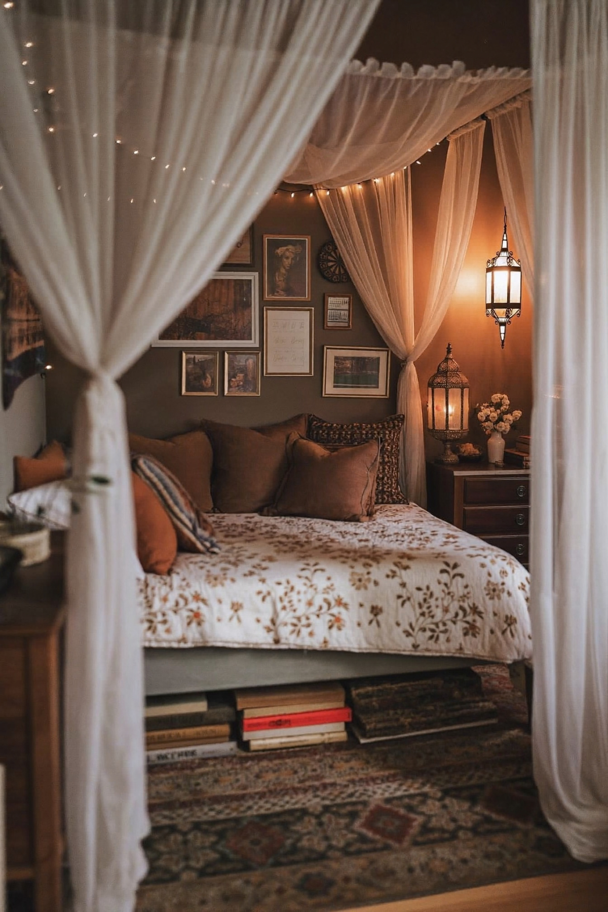
Wrapping a bed frame in sheer curtains does something a headboard never quite manages: it turns a piece of furniture into a room within the room. Here, gauzy panels catch the warm light from a pierced metal lantern and a string of fairy lights woven along the canopy rail, and the effect is closer to a tent than a bedroom corner.
Dark, moody wall paint is doing quiet work behind that gallery of small framed pieces, since a saturated background makes warm brass and amber light glow instead of getting washed out. A floral quilt against that dark backdrop keeps the whole setup from feeling heavy.
You can recreate the canopy effect with a simple curtain rod mounted above any bed frame and a few yards of sheer fabric. Skip the four-poster if you do not have one already, the drapery does most of the visual work on its own.
Style A Coffee Table With Blooms
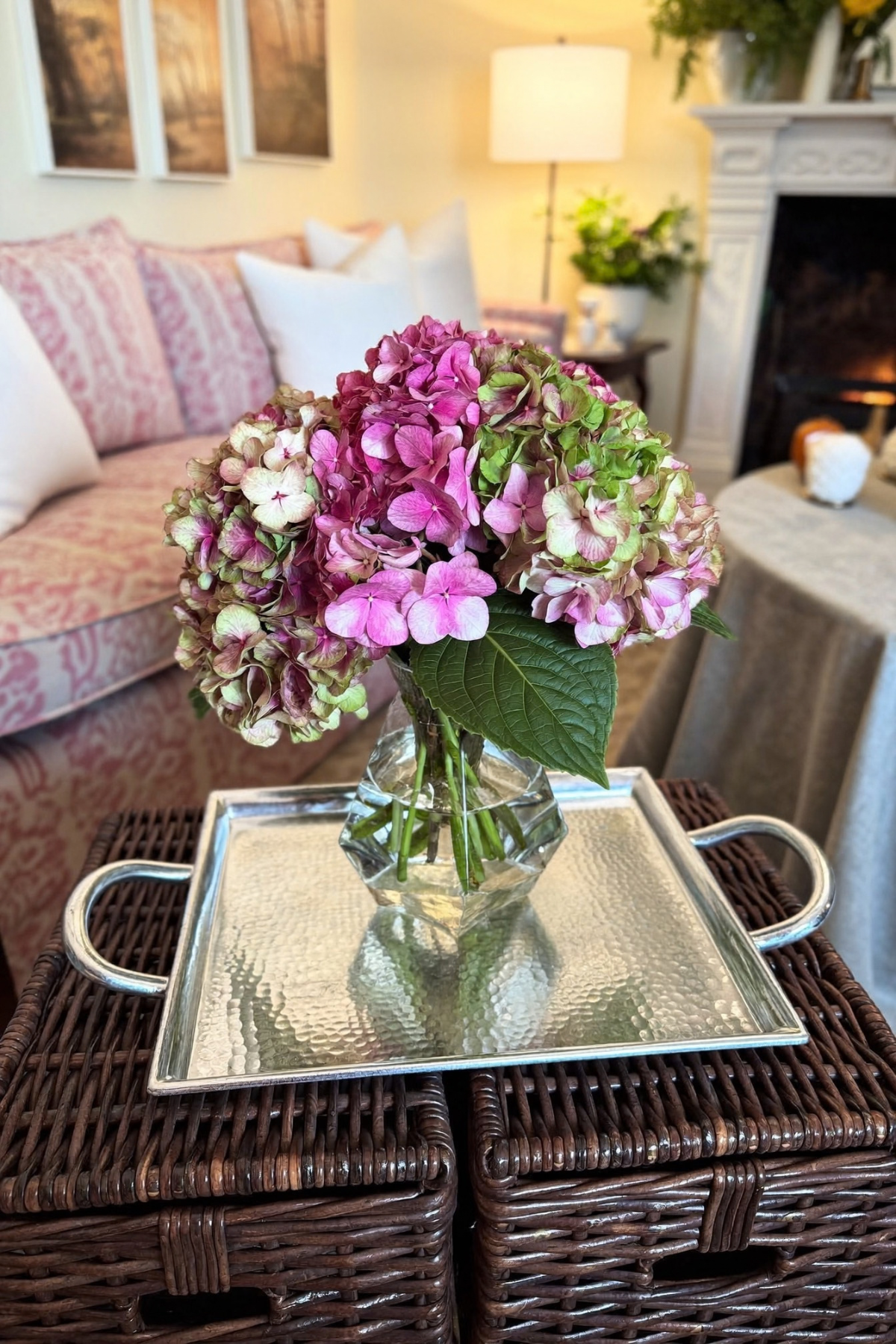
One oversized hydrangea bouquet in a faceted glass vase does more for a coffee table than a handful of smaller arrangements ever could, mostly because the scale matches the room instead of disappearing into it. Sitting on a hammered silver tray, it reads as a finished vignette rather than a random vase someone set down.
Notice how the dusty pink and green tones in the flowers echo the toile fabric on the sofa behind it, tying a fresh, temporary element to something permanent in the room. A tray under any centerpiece gives it a defined edge and stops the surface beneath from looking cluttered.
Buy one generous bunch of whatever is in season rather than several small bouquets, set it on a tray on your largest flat surface, and let the color pick up something already in the room instead of introducing something new. It takes five minutes and costs less than most decor purchases, yet it changes how the whole table reads.
Give Open Shelves A Real Job
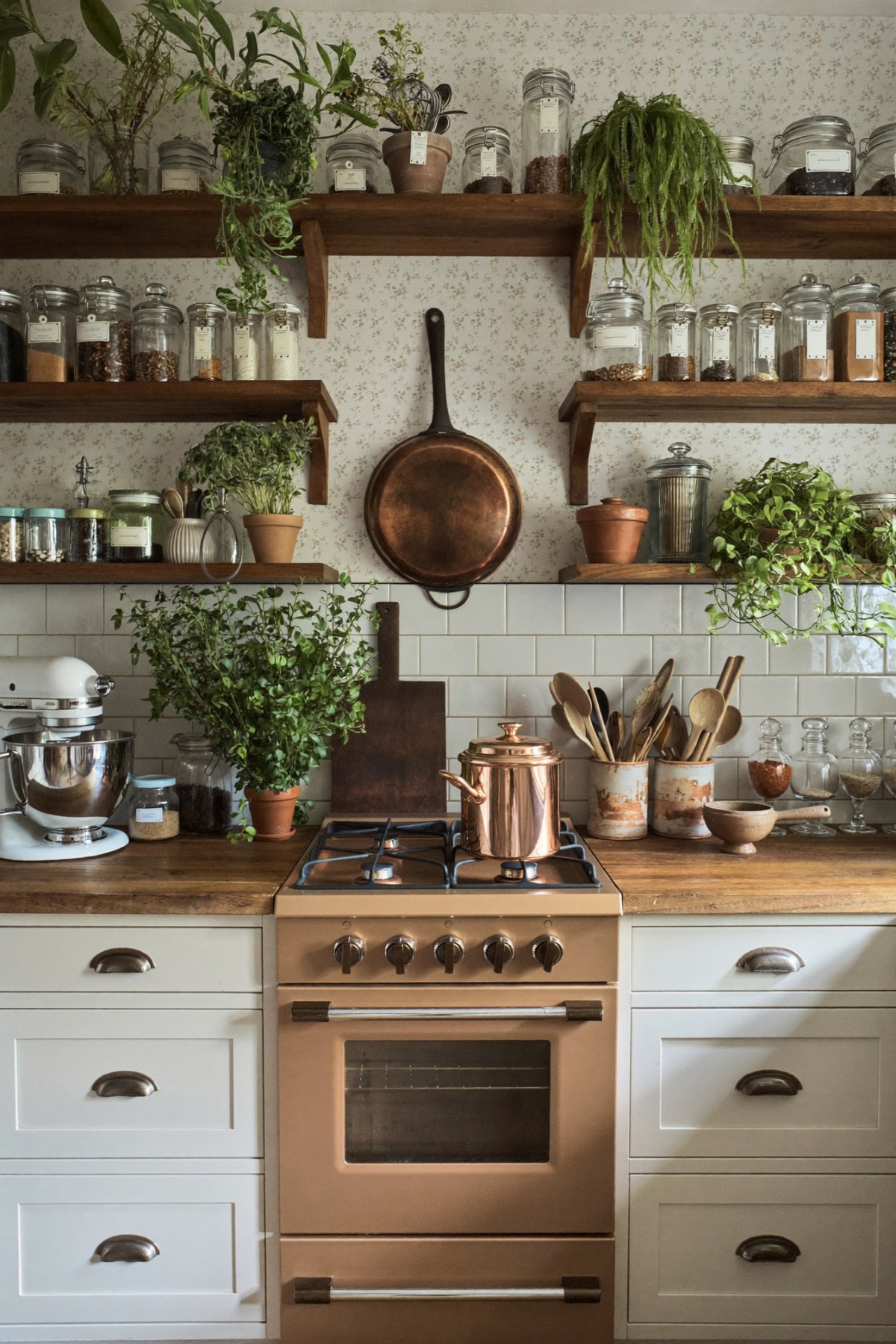
Open shelving only works when it earns its spot, and this kitchen wall proves it with labeled glass jars, trailing plants, and a single copper pan hung like a piece of art above the stove. Nothing here is purely decorative, which is exactly why it does not feel staged.
Copper cookware against black iron hardware and warm wood counters is a small metal-mixing move that pulls the whole wall together without anyone consciously noticing it. Plants trailing off the edge of a shelf soften every hard line the subway tile and cabinetry create.
Label your jars in a consistent font or handwriting so the wall reads as one system rather than a collection of mismatched containers, and hang your prettiest pan where you would otherwise put artwork. Function and decoration do not need to be separate categories, and a kitchen you actually cook in tends to look better for it, not worse.
Shop Vintage Lighting In Pairs
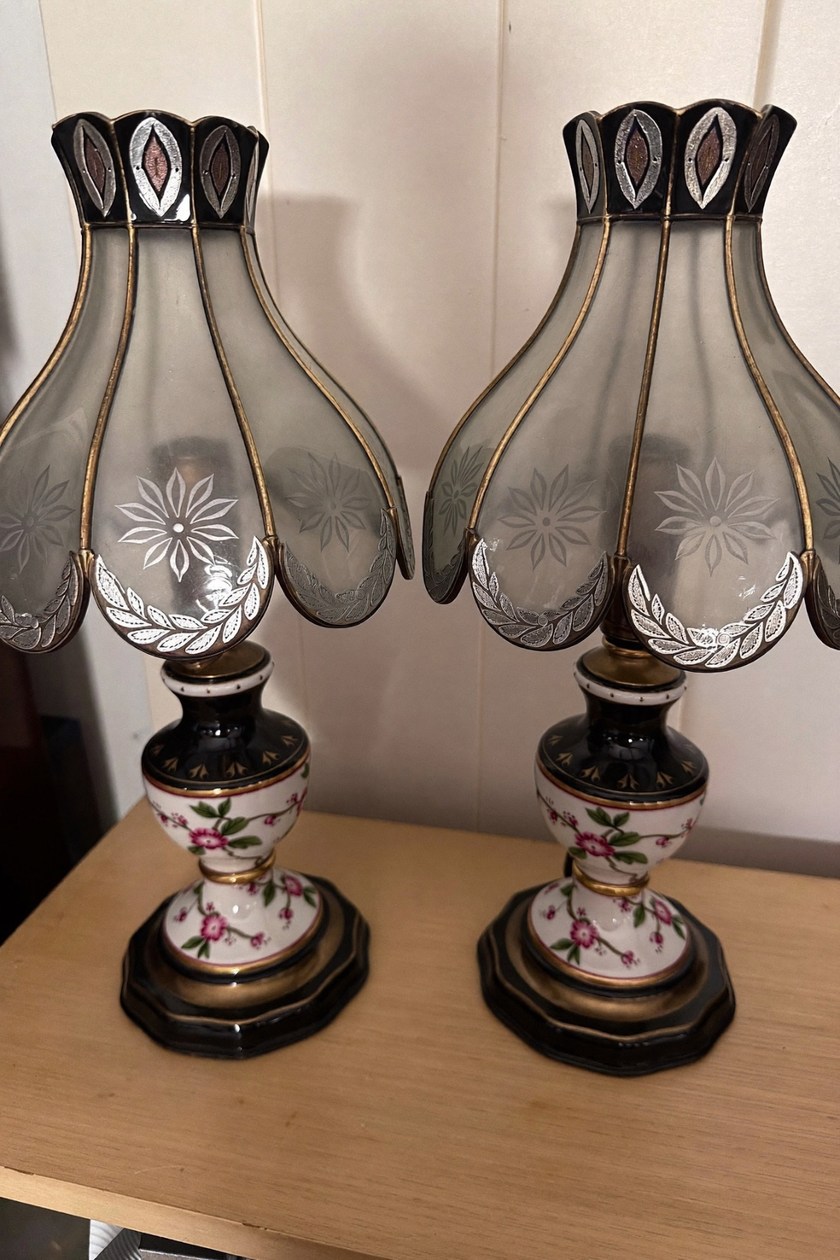
A single vintage lamp is a find. Two of them, set on either end of a console or dresser, are an instant sense of order that nothing else in a room can quite fake. These hand-painted floral bases with their etched glass shades carry enough pattern and detail that everything nearby can afford to stay simple.
The shades themselves are almost jewelry-like, cut glass catching light through small painted flowers along each panel, which is a level of detail you would never notice on a single overhead fixture. Symmetry is one of the cheapest design moves available, and a matched pair of lamps delivers it instantly.
Flea markets and estate sales are the easiest place to find pairs like this, and they do not need to be identical twins, just similar enough in scale and finish to read as intentional. Set them on any narrow surface and let them do the formal heavy lifting.
House Magic Was Never About The Big Renovation
Look back at everything here and the common thread is not a single expensive material or a full gut renovation. It is repetition, restraint in some spots, more in others, and lighting that gets chosen rather than left to whatever bulb came with the fixture.
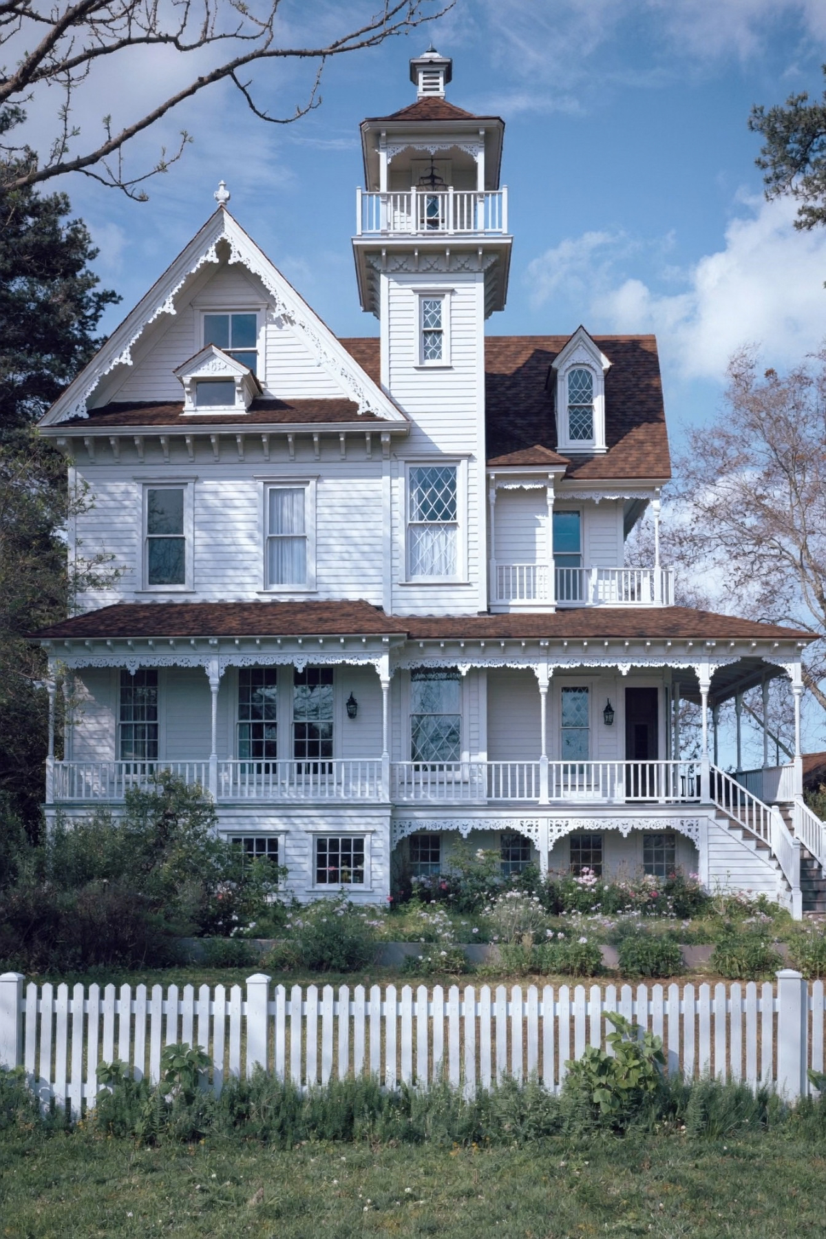
A house with a tower room and gingerbread trim earns its magic honestly, but so does a kitchen counter with a good jar of oats on it. Scale changes, the underlying instinct does not: put a little more thought into the objects you already touch every day.
We hope at least one of these ten ideas gave you something to try this weekend. Start small, start with the corner that already bothers you every time you walk past it, and let the rest of the house catch up from there.