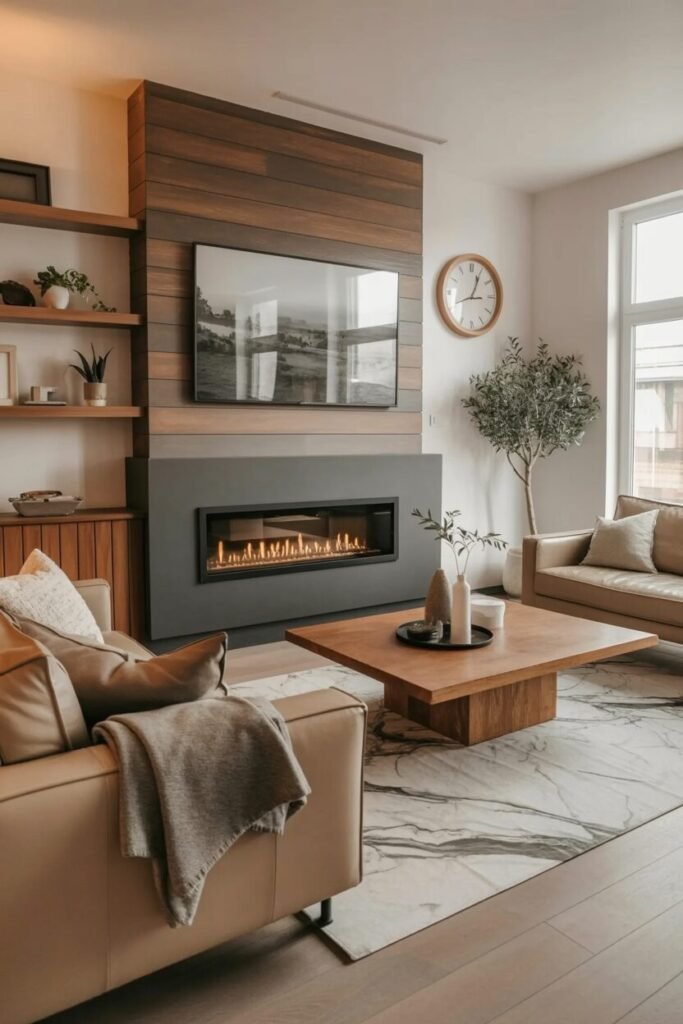
What These Colorful Living Rooms Teach You About Committing to Your Own Aesthetic
Somewhere along the way, a lot of us got talked into safe. Greige walls, neutral sofas, one accent pillow in a “pop” color — as if the whole point of a living room was to photograph well for someone else’s feed. But the spaces that actually feel good to be in, the ones you remember long after you’ve left, tend to be the ones where somebody made a real decision about color.
Colorful living rooms are not the same thing as chaotic ones. That’s the part worth sitting with. Color becomes overwhelming when it has no logic — when every piece is fighting for attention and nothing is grounded. But when you understand how hues relate to each other, how texture absorbs or amplifies saturation, and where your eye needs to rest, a bold room stops feeling loud and starts feeling alive.
What follows are real spaces — different in scale, budget, and style — that all share one quality: someone committed. Whether that commitment was a deep teal sofa against a blush wall or a hand-painted ceiling in two competing hues, the result is a room that has a point of view. We’re breaking each one down so you can borrow whatever works for where you live.
When the Ceiling Becomes the Statement
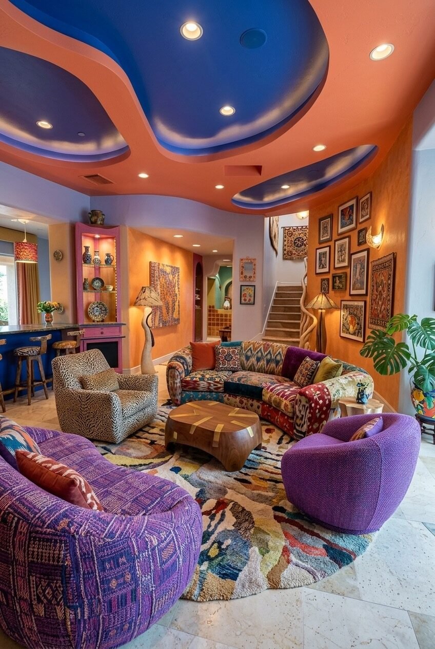
Start at the top — because this room does. The ceiling here is painted in interlocking waves of terracotta orange and cobalt blue, a move that most decorators would call risky and this designer clearly called necessary. The ceiling-as-canvas principle works because it frees every other surface from having to carry the drama. The walls can hold their warm amber without competing, and the furniture can be as pattern-heavy as it wants because the visual weight is already distributed overhead.
The seating arrangement is worth studying. A curved ikat-patterned sofa anchors the center, flanked by a leopard-print armchair and pod-shaped purple accent chairs — a combination that should not work as well as it does. The reason it holds together is the round abstract rug underneath, which pulls orange, blue, brown, and cream into one plane and effectively acts as the room’s color key. Every piece upstairs references something in that rug.
If you want to try a multi-color ceiling without the full commitment, start with just one drop zone — a recessed section painted in a single contrasting hue. Pair it with walls in a warm, high-saturation color like ochre or burnt sienna, and let the furniture lean into pattern freely. The wood coffee table with marquetry detailing here is a good reminder that one calm, natural-material piece gives the eye somewhere to land without breaking the energy of the room.
The Peachy Base That Holds Everything
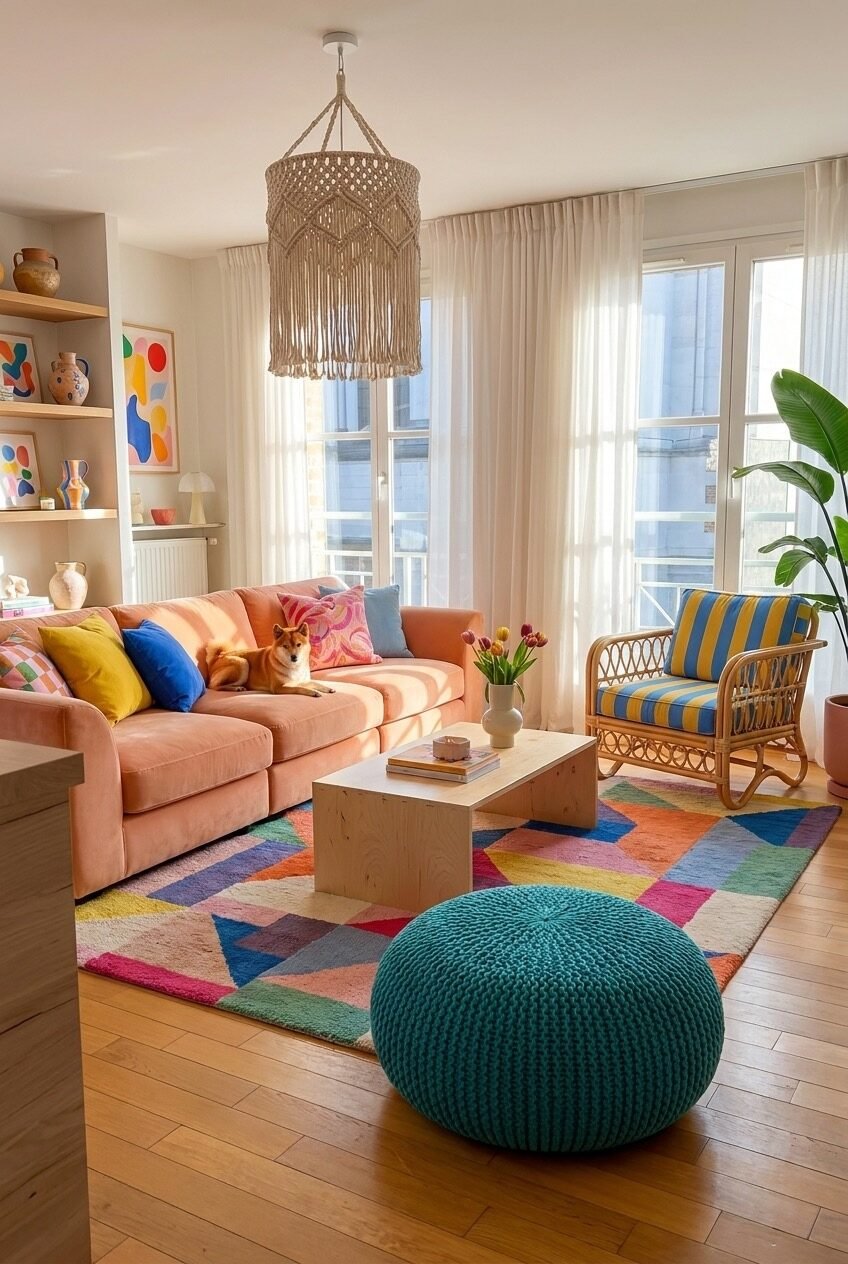
Pick up the peach sofa first and figure out the rest from there — that seems to be exactly the thinking behind this room. A salmon-pink velvet three-seater is the room’s warm core, and everything else radiates out from it in varying degrees of contrast. Yellow and cobalt blue cushions sit directly on the sofa without blending into it, which is an important distinction: the pillows are meant to pop, not harmonize. That kind of deliberate contrast is what separates a colorful room from a pastel one.
The macramé pendant light is doing real structural work here. In a room with this much color and pattern on the lower half — a geometric multicolor rug, a rattan chair upholstered in bold yellow-and-blue stripes, a teal knitted pouf — the hanging textile overhead brings a neutral, handmade texture into the vertical space and prevents the room from feeling bottom-heavy. It’s also one of the more affordable ways to add visual interest to a ceiling that isn’t architecturally interesting on its own.
Sheer white curtains are the unsung hero of colorful rooms. They flood the space with diffused natural light, which keeps saturated colors from looking muddy or closed-in, and they provide a literal blank margin that gives the eye a moment of pause. The floating shelves on the left, styled with abstract art prints and ceramic vessels, show how a controlled vignette can add color without adding chaos — keep the objects varied in shape but limited in number.
Teal Sofa, Pink Walls, Zero Hesitation
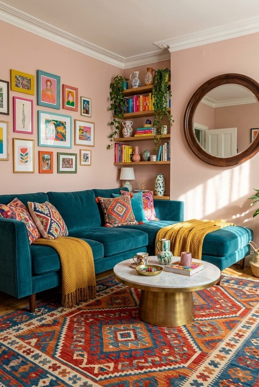
The combination of a deep teal sectional against a dusty blush pink wall is the kind of pairing that feels counterintuitive until you see it in person — or in a photograph this clear. These are complementary colors in the loosest sense, but what makes them work here is the temperature difference. The cool, jewel-toned sofa grounds the warmth of the pink without neutralizing it. Neither color is begging for attention; they’re just genuinely good together.
The mustard yellow throw draped casually over the chaise is the third color in this room’s main palette, and its placement is worth noting. It’s not a pillow or a focal point — it’s almost incidental, the way a real person would actually use a blanket. That casualness matters. Rooms that feel too decorated often suffer from props that look placed rather than lived with. The brass-based marble coffee table adds metallic warmth without introducing another hue into the mix, which keeps the palette from expanding beyond what the room can absorb.
The gallery wall here works because the frames vary — gold, teal, pink, white — and the art is bright and illustrative rather than photographic or subdued. Matching the frame color to existing room elements is a low-effort way to make a gallery wall feel connected rather than just hung. The round dark-wood mirror over the shelves is the quiet anchor point — its circular shape and deep tone stop the eye from drifting out of the frame entirely.
Portrait Gallery as the Room’s Personality
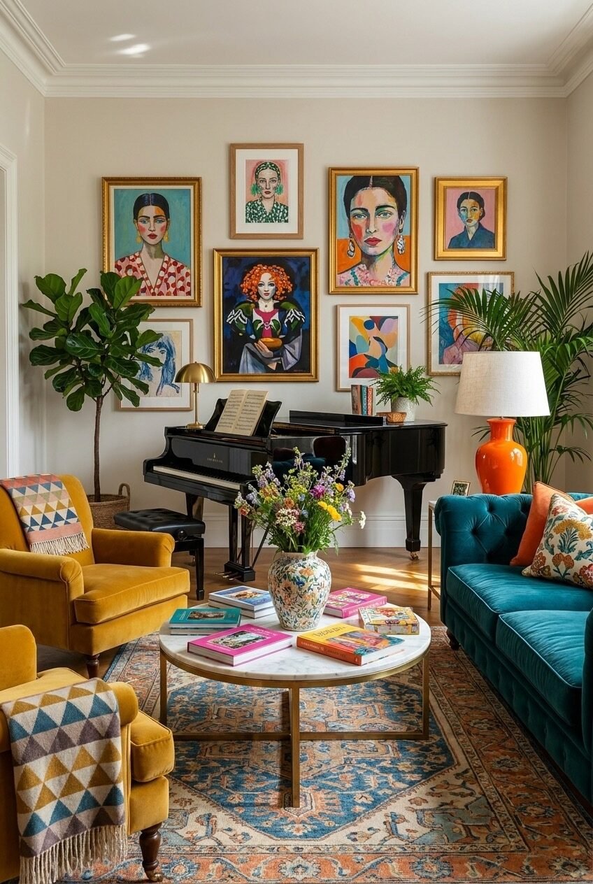
Six large-scale figurative paintings hung in gold frames — all women, all rendered in bold, graphic color — and suddenly a room with an otherwise restrained palette feels like it has something to say. The wall itself is off-white. The furniture is teal velvet and mustard yellow. The rug is a vintage-style Persian. None of those things are unusual on their own. What’s unusual is the decision to let the art be the loudest thing in the room and build everything else in deference to it.
The practical side of this arrangement is that it genuinely doesn’t require much else. The upright piano occupies the corner not as a decorative choice but as a functional one — and yet it slots perfectly into the room’s aesthetic because its lacquered black surface reads as a grounded anchor point against all that expressive color above it. Large indoor plants on both sides of the seating area do the same thing greenery always does in a colorful room: introduce a living, slightly unpredictable element that softens the hard edges of furniture arrangement.
For anyone trying to recreate this specific energy, the key is selecting figurative art with a consistent illustrative style across all pieces — not a mix of photography, abstract, and illustration, but one visual language. The orange ceramic lamp base is a perfect example of how one unexpected accent color can read as an exclamation point rather than a distraction when everything else is already bold enough to contextualize it.
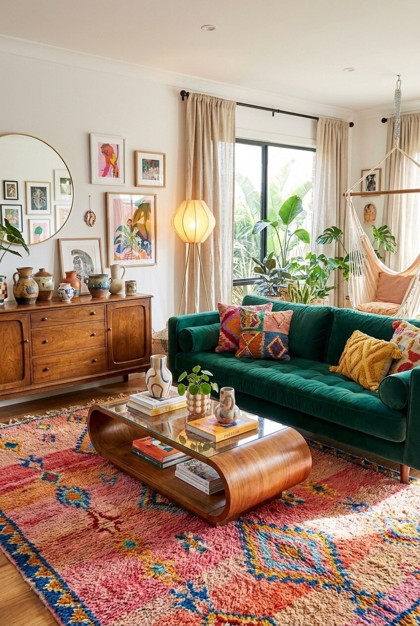
Deep Teal Walls With Warm-Toned Soul
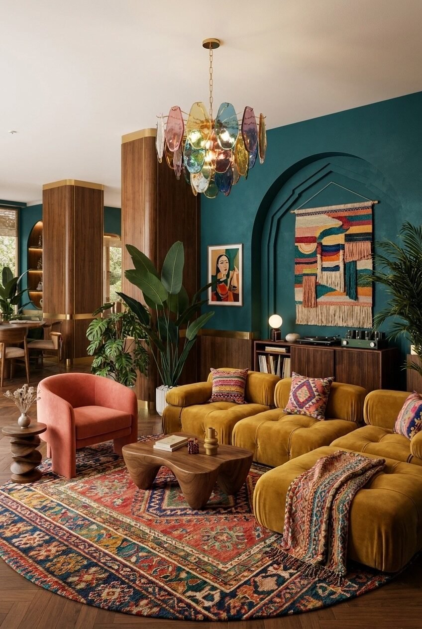
There’s a specific kind of confidence in painting all your walls in a deep teal-green and then filling the room with warm woods, mustard velvet, and a Persian rug in rusted reds. The two temperature zones — cool wall, warm furniture — shouldn’t feel this resolved, and yet they do. The secret is saturation parity: every element is equally rich, equally committed, so nothing reads as an afterthought or a mismatch.
The multi-colored Murano-style chandelier is the most expensive-feeling decision in this room, but it’s also the most conceptually right one. In a space with warm-cool tension running through every surface, a chandelier with petals in pink, amber, green, and blue essentially resolves the entire conversation from overhead. It’s the one piece that holds both sides of the palette simultaneously. If sourcing something similar is out of range, a simpler multi-arm chandelier with colored glass shades achieves a version of the same effect.
The arched niche in the wall — painted the same deep teal and framing a woven textile wall hanging — gives the room an architectural moment that breaks the flatness of a plain painted wall. A hand-woven wall textile, especially one with horizontal bands of color, introduces texture that paint alone can’t provide. The modular tufted sofa in deep mustard is the room’s best furniture decision: low-profile, wide-seated, and covered in a color that pulls warmth from the rug without matching it.
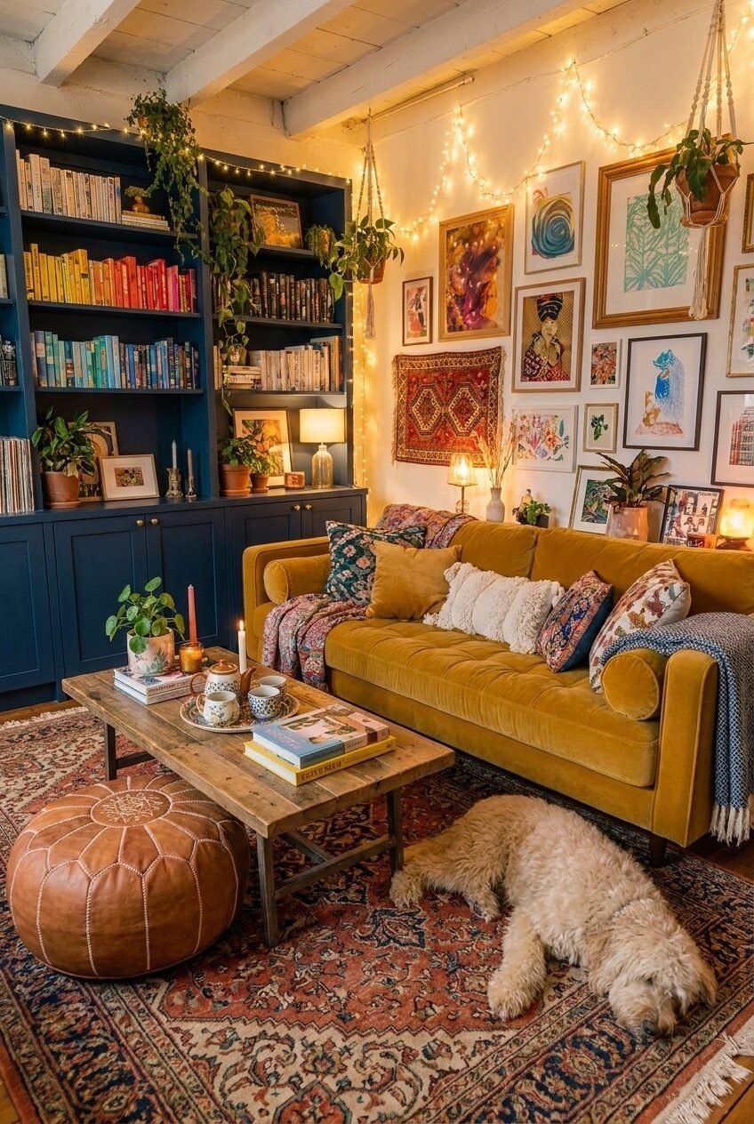
Shelf Life and String Lights After Dark
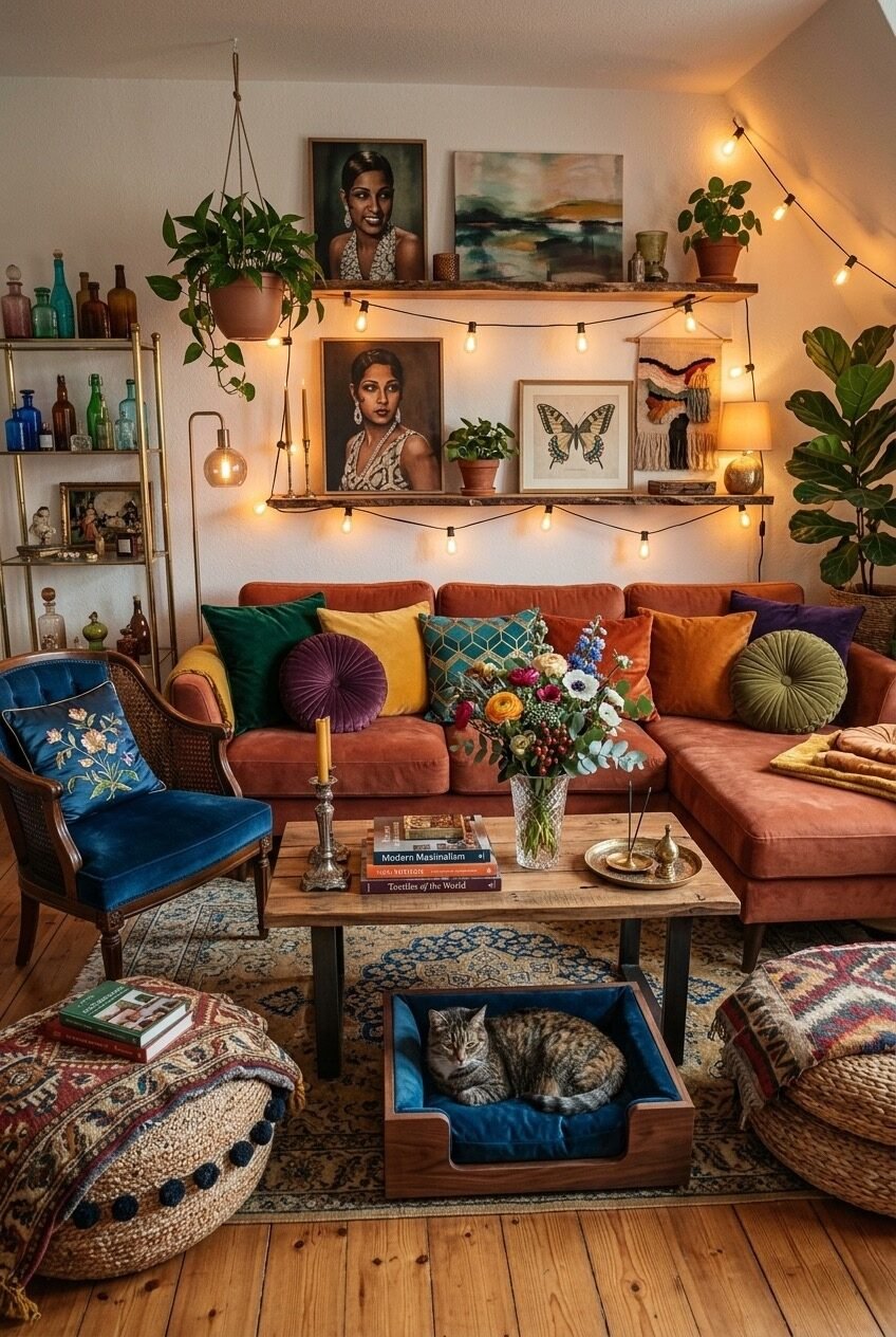
String lights strung along a floating shelf loaded with portrait art, hanging plants, colored glass bottles, and a sleeping cat — this room leans all the way into its own maximalist tendencies and manages to make them feel personal rather than performative. The russet-orange sectional sofa is the furniture anchor, and the depth of that color is what keeps the room from reading as too light or too playful. It’s a warm, serious hue that can hold the weight of everything happening around it.
What this setup gets right is the layering of light sources. The string lights provide ambient warmth at mid-height, the table lamp on the left does focused task lighting, and the candlesticks on the coffee table add a third, most intimate layer closer to floor level. Colorful rooms need considered lighting because saturated hues shift dramatically depending on whether the light is cool or warm. Warm bulbs deepen reds and oranges and make teals look almost brown, which can work beautifully in a room like this one.
The blue velvet wingback chair with its cane back detail is a good lesson in how one antique or vintage-adjacent piece can give a colorful room its sense of history. It doesn’t need to match anything — in fact, it’s better if it doesn’t. The coffee table with a built-in cat bed underneath is a practical detail that looks designed, which is the best kind of practical detail: functionality that adds character instead of subtracting from it.
Warm Gold, Rounded Forms, and Collected Shelves
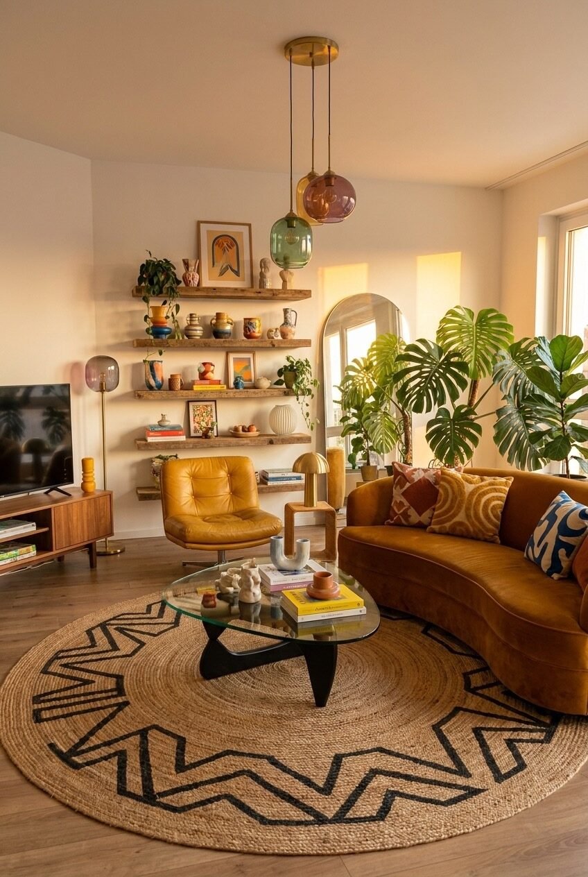
The curved mustard velvet sofa is the first thing you notice, but the shelves are where this room actually lives. Three floating wooden shelves span the full height of one wall, and they’re loaded in the way that only works when someone has genuinely accumulated things over time: ceramic vessels in earth tones, small framed prints, trailing plants, stacked books with colorful spines, and sculptural objects at irregular heights. It’s dense without being cluttered, which is a balance most people underestimate how hard it is to achieve.
The pendant lighting cluster here — three glass globes in amber, rose, and jade hanging from a single brass ceiling canopy — is a low-commitment way to introduce multiple colors overhead without painting anything. Each globe casts a slightly different colored glow at night, which means the room literally changes color after dark. That kind of atmospheric shift is something even expensive renovations struggle to deliver, and it comes from three pendant shades.
The Noguchi-style coffee table in glass and lacquered wood is the right choice for a room this warm and materially dense — its transparency prevents the center of the room from becoming too heavy. The round jute rug with its bold geometric border pattern connects the natural-material warmth of the wood shelves to the floor plane without adding more color. In a room already saturated with ochre, rust, and green, a rug that relies on texture rather than hue is exactly the right call.
Books, Birds, and a Teal Corner Couch
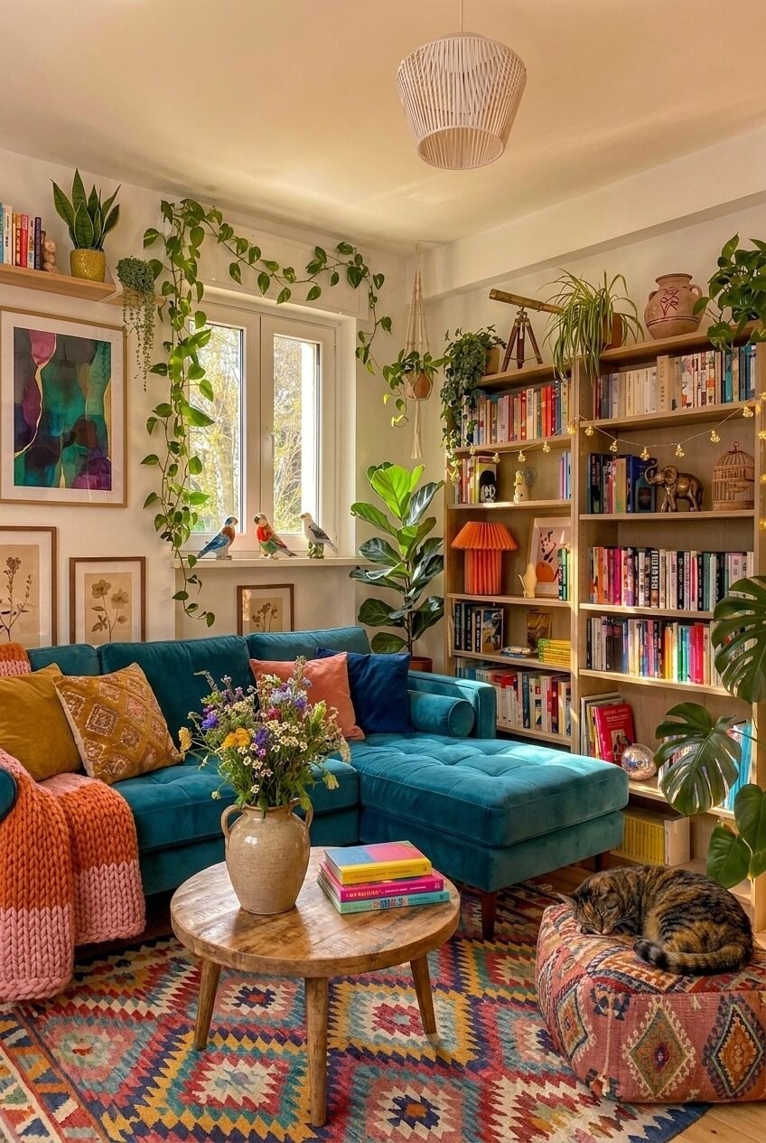
Floor-to-ceiling bookshelves are always a design choice and a lifestyle choice simultaneously, and this room owns both. The tall wooden bookcase on the right is packed with color-spined books, small figurines, a brass telescope, and string lights threaded through the shelves at the back — adding ambient warmth that a standard shelf lamp couldn’t. The teal L-shaped sectional in front of it isn’t fighting with the bookcase; it’s framing it, making the whole corner feel like a contained world.
Trailing vines and pothos draping over the window and down the wall are doing architectural work that no amount of art could replicate. They break up the hard angle of the window frame, introduce movement into a static composition, and cost almost nothing compared to the visual return. The small ceramic birds perched on the windowsill are an easy detail to overlook but worth noting — they give a room like this its specific personality, the sense that whoever lives here notices and collects small things.
The kilim-style rug in multicolor geometric shapes is the floor’s contribution to the color story, and it’s a big one — it links the warm orange knit throw on the sofa arm to the pink cushion to the yellow pillow without any of those colors having to directly reference each other. A well-chosen rug in a colorful room functions less like a floor covering and more like a color bridge. The wooden tripod coffee table with its round top is humble by design, which is exactly right for a room already this abundant.
Rattan, Tropical Print, and a White Fireplace
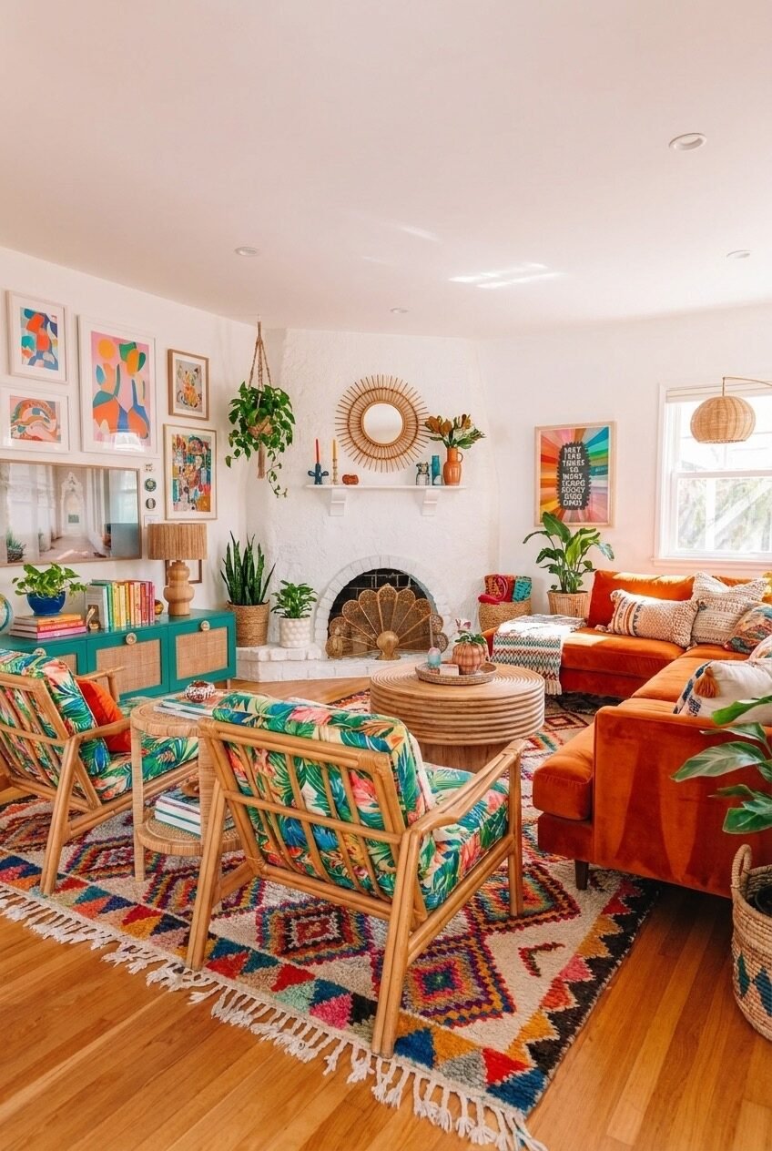
White painted walls and a white brick fireplace are not the obvious foundation for a colorful room — and that’s precisely why this works so well. The white acts as maximum contrast for everything placed against it: the bold tropical-print rattan chairs, the orange velvet sectional, the stacked-drum rattan coffee table, the green fireplace screen with its peacock-fan shape. Every colorful element reads at full intensity because there’s nothing competing with it on the walls.
The rattan chairs here are upholstered in a lush tropical fabric — green, teal, pink, and yellow florals on a cream ground — which is a very specific aesthetic risk that pays off because the bones of the chair (the exposed rattan frame) are neutral enough to hold it. Fabric like that on an upholstered sofa would be harder to live with; on a rattan frame with some visual air around it, the print feels right-sized.
The sunburst rattan mirror above the fireplace mantel and the woven pendant light in the corner are the room’s textural bookends, both natural-material pieces that soften the whole composition from their respective positions. The gallery wall on the left mixes abstract colorful prints in natural wood frames — keeping the frames consistent in material if not in size is a reliable way to make a mixed collection look considered rather than random. The teal-painted credenza in the back is a strong accent piece that holds the left side of the room without demanding too much attention.
Rust Velvet and the Sunburst Mirror Moment
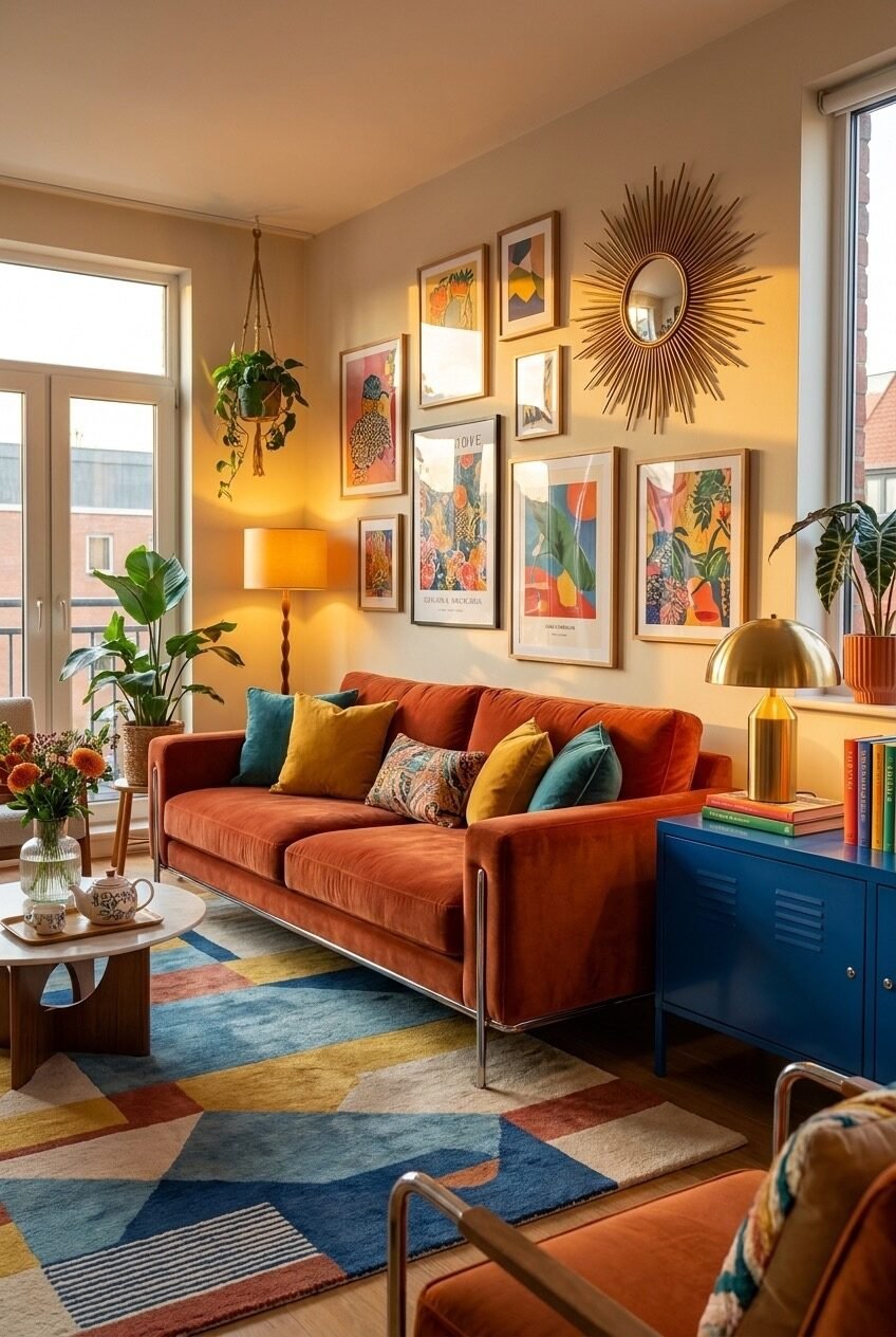
A warm room with natural light flooding in from two windows has an unfair advantage, but this space earns what it’s got. The rust-orange velvet sofa is a choice that ages well — that particular red-orange sits in a color temperature range that looks good under both warm tungsten light and cool daylight, which not every saturated sofa color can claim. The chrome-legged frame keeps it from feeling too heavy, giving the piece a mid-century quality that suits the overall direction of the room.
The gallery wall behind the sofa is anchored by a gold sunburst mirror at the upper right — a detail that does double duty as both art and light-reflection, bouncing natural light back into the room from its position near the window. The art prints are botanical and abstract in bright oranges, pinks, blues, and greens, all framed in warm natural wood. What makes this gallery wall work where others fail is the scale variety — two large prints flanking smaller ones — which creates a visual rhythm rather than a flat grid.
The cobalt blue metal locker-style cabinet on the right is the room’s most unexpected element and probably its best one. It introduces a flat, industrial color and material into a space full of warm textures — velvet, wood, ceramic — and that contrast is exactly what stops the room from becoming a single uninterrupted mood. The geometric block-color rug in blue, yellow, rust, and cream ties everything together at floor level without being the most complicated thing in the room.
Color in Your Home Is Not a Risk Worth Avoiding
Every room shown here started with a decision — sometimes a sofa, sometimes a wall color, sometimes just a rug someone couldn’t leave behind. The color came first, and the rest followed. That’s the part that’s easy to get backwards: waiting until everything else is settled before committing to color, as if bold choices have to be earned. They don’t. They just have to be made.
None of these rooms are for everyone, and they’re not supposed to be. A space plastered in figurative portraiture and flanked by a grand piano is not a universal vision of home. Neither is a teal wall with a modular mustard sofa. But they’re honest, and they’re specific, and they show clearly that the person living there made choices that meant something to them. That quality — specificity — is what every truly good interior has in common, regardless of palette.
The practical truth is that color is more forgiving than most people expect once you understand a few basic principles: ground it with texture, give the eye somewhere to rest, keep the saturation levels roughly consistent across pieces, and don’t confuse brightness with boldness. Start with one piece you actually love. The room will tell you where to go from there.