Vibrant Living Room Inspiration for People Ready to Commit to Something Real
There’s a version of vibrant that’s just loud — too many colors competing, no hierarchy, nothing for the eye to land on. And then there’s the kind of vibrant that has actual logic behind it, where every bold decision is backed by an understanding of how color, scale, and material interact. The difference between the two is more technical than people give it credit for.
What makes a living room feel genuinely alive rather than chaotic usually comes down to a few things: a clear dominant color, at least one surface that provides visual relief, and objects that have enough personality to hold their own without overwhelming each other. Get those three things right and you can push the color further than you’d think.
The rooms ahead cover a wide range — from maximalist pattern mixing to sculptural furniture with oversized art, from jewel-toned walls to open-plan spaces built entirely around shape. Each one has something worth understanding, and we’ve tried to break down not just what you’re seeing but why it works.
Maximalist Floral With Brass Fireplace Symmetry
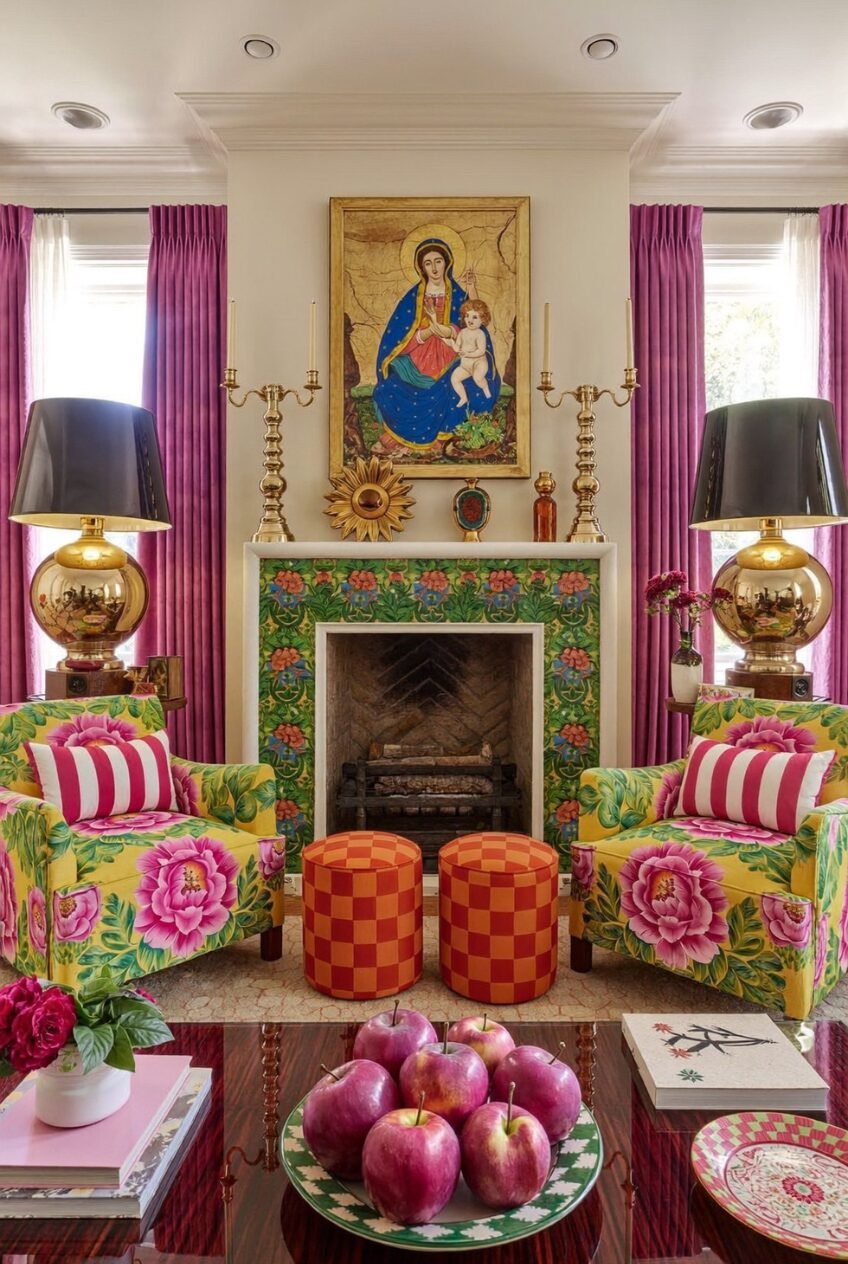
Symmetry is usually the tool of the restrained room — matching lamps, paired chairs, balanced compositions. What this room does is apply that same symmetrical structure to a maximalist palette, and the result is controlled chaos that reads as intentional rather than accidental. Two identical floral-upholstered armchairs flanking a tiled fireplace, two matching brass globe lamps on either side, magenta silk curtains at each window — the repetition creates enough order to hold all the pattern together.
The fireplace surround tiled in a lush green-and-pink floral pattern is the room’s most committed decision, and it pays off precisely because the surrounding walls stay cream. Without that breathing room, the tile would fight with the chair fabric instead of complementing it. The orange-and-red checked poufs between the chairs introduce a third pattern at a smaller scale, which is the right move — varying pattern scale prevents any single print from dominating.
For anyone working with a fireplace as a focal point, the lesson here is to treat the surround as upholstery rather than architecture. Choose a tile pattern in the same color family as your largest furniture pieces, and let the walls stay neutral so the whole composition reads as a unit. The brass candelabras and gold-sphere lamps keep the metallic tone consistent across the room, which is what stops the pattern mixing from becoming visually exhausting.
Gold Wallpaper and Maximalist Pattern Collision
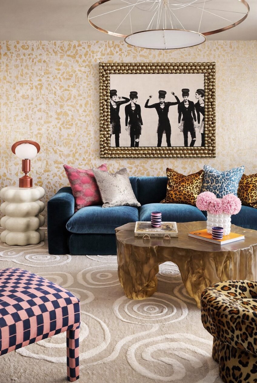
Gold textured wallpaper covering every wall sounds like it could go badly wrong, and in most rooms it would. Here it works because the wallpaper’s pattern is abstract and tone-on-tone — gold on cream — which means it reads as texture from across the room rather than as a competing print. That distinction matters enormously: the wallpaper is the room’s neutral, despite being neither white nor grey.
Against that gold backdrop, a deep teal velvet sectional loaded with leopard-print, magenta, and metallic cushions occupies center stage. The organic-form brass coffee table — fluid, almost molten in shape — sits below it and introduces a sculptural element that no standard table could provide. A bubble-form white pedestal side table and a pink-and-navy checker ottoman complete a seating arrangement where every piece has a distinct personality.
The black-and-white figurative artwork in a heavily ornamented gold frame is the visual anchor for the whole room. In a space this maximally textured, a monochromatic artwork in a maximalist frame is the right call — it gives the eye a place to land that doesn’t add another color but does add another layer of visual interest. If you’re building a similarly layered room, the principle to follow is: let the walls do the texture work, let the furniture do the color work, and let one large artwork do the composition work.
Tropical Whimsy Built From Collected Joy
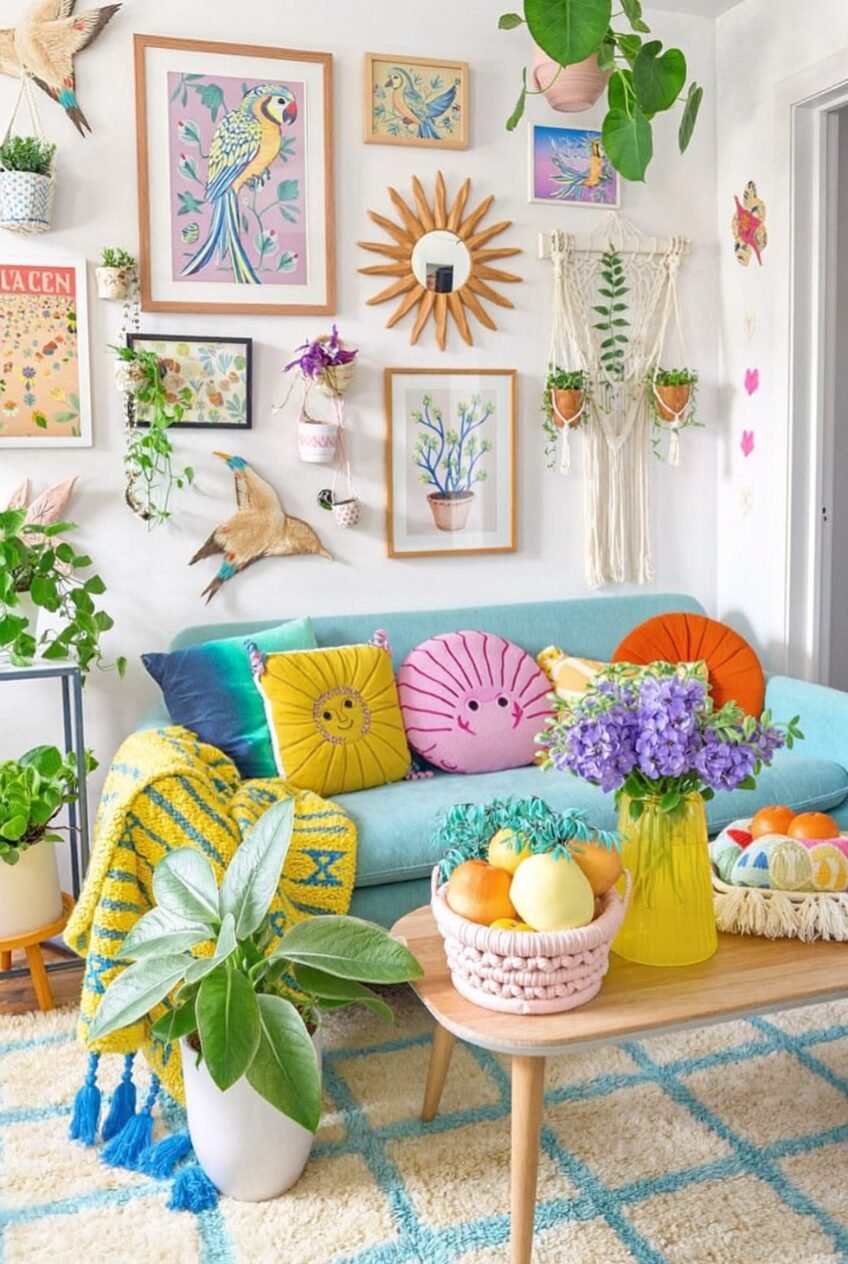
Every square inch of wall in this room is doing something — bird illustrations, botanical prints, a sunburst mirror, a macramé hanging, wall-mounted ceramic pots with trailing plants, decorative bird sculptures perched at different heights. What prevents this from reading as overwhelming clutter is the consistent color story running through every piece: teal, yellow, pink, and green appear in almost every framed print and in the sofa below, which makes the wall feel curated in a way that grids and matching frames never could.
The teal sofa is the room’s anchor, and it’s doing heavy lifting. It’s not the most saturated thing in the room — the wall pieces collectively outshout it — but its scale and solid color make it the piece the eye returns to after scanning the wall above. Round novelty cushions in sun and shell shapes, a yellow knit throw, and a teal velvet pillow pile up on it with the kind of happy-go-lucky layering that only works when the base sofa is a clear, committed color.
Building a wall like this requires starting with a color palette first and sticking to it obsessively as you collect pieces over time. Mixing art styles — illustration, photography, abstract, typographic — is encouraged, but every piece should pull from the same family of four or five colors. The wall-mounted mini ceramic pots with live trailing plants scattered throughout the composition are the detail that makes this feel like a living wall rather than a gallery.
Oversized Sculptural Wall Art in Open Plan
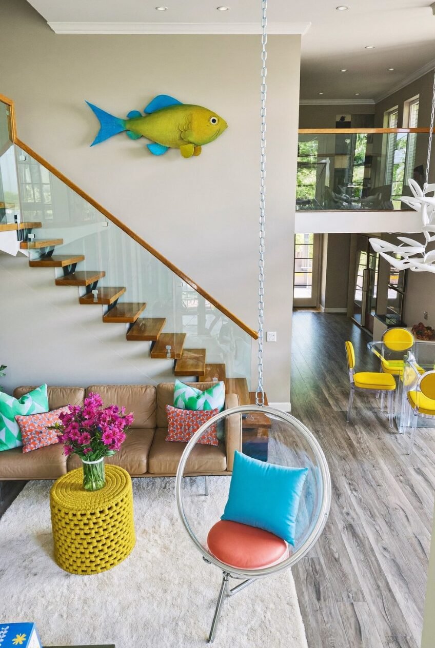
Hang a large-scale sculptural fish — yellow-green body, turquoise fins, roughly two feet long — on a plain greige wall above a staircase, and suddenly that wall has a personality. The fish here isn’t ironic or kitschy in context; it’s placed with enough space around it on a generous double-height wall that it reads as you’d read a painting in a gallery. Scale and placement are what separate decorative objects from wall art, and this one gets both right.
The living area below works on a different principle: a tan leather sofa with colorful geometric and printed cushions, a yellow crocheted side table used as a coffee table, and a hanging bubble chair in clear acrylic with a coral cushion. The bubble chair is suspended from the ceiling on a visible chain, which in an open-plan space acts as a vertical element that breaks up the horizontal spread of furniture. It also introduces transparency into a room that otherwise has a lot of material density.
In an open-plan space, the challenge is making the living zone feel distinct without walls to define it. The rug here — a large cream shag — does that work at floor level, creating a boundary that the furniture respects. Carrying a single accent color — here, the yellow of the crocheted table — into the adjoining dining area through the bar stools ties the two zones together without making them feel identical.
Organic Shapes and a Wave-Print Rug
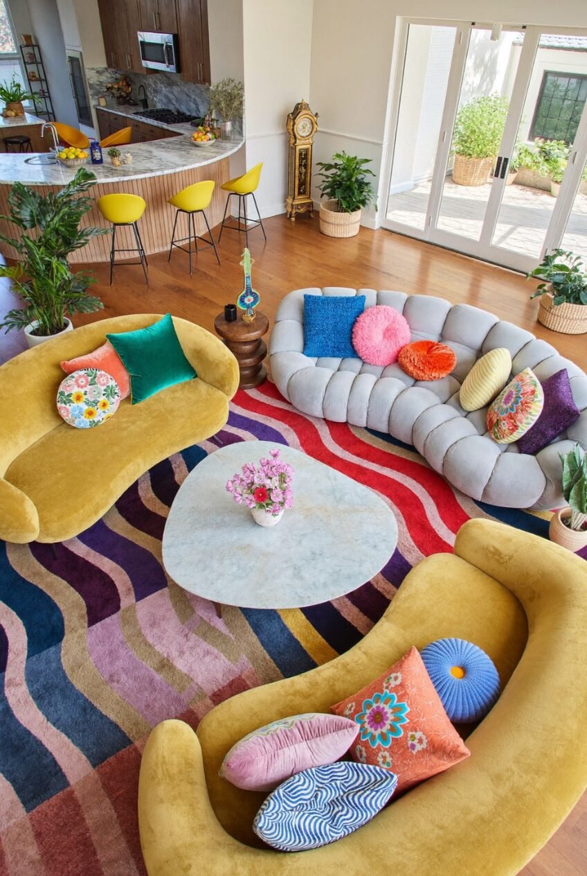
From above, this seating arrangement looks like two amoebas facing a marble pebble — and that’s genuinely what was designed here. Curved mustard-yellow sofas in organic, blob-like silhouettes wrap around a biomorphic marble coffee table, all sitting on a rug with a bold wave print in red, purple, blue, and blush. The bubble-tufted grey sectional curves to complete the conversation circle. No piece of furniture in this room has a straight edge, and that consistency of form is what makes such a chaotic color combination feel resolved.
The cushions scattered across all three seating pieces are equally committed to the playful direction: round velvet cushions in orange and pink, floral prints, striped bolster shapes, a blue diamond-print oval. There’s no restraint in the cushion choices, which works because the furniture forms are already so specific that the cushions feel like accessories to a deliberate aesthetic rather than afterthoughts.
For anyone attempting a room built around organic furniture forms, the entry point is the rug. An abstract or painterly rug with strong color sets the vocabulary for every other piece to respond to. The mustard-yellow bar stools visible in the adjoining kitchen — matching the sofa color — demonstrate a useful principle: carry your living room’s dominant accent color into adjacent spaces at least once to visually connect zones without making them identical.
Rainbow Glassware as Living Room Color Story
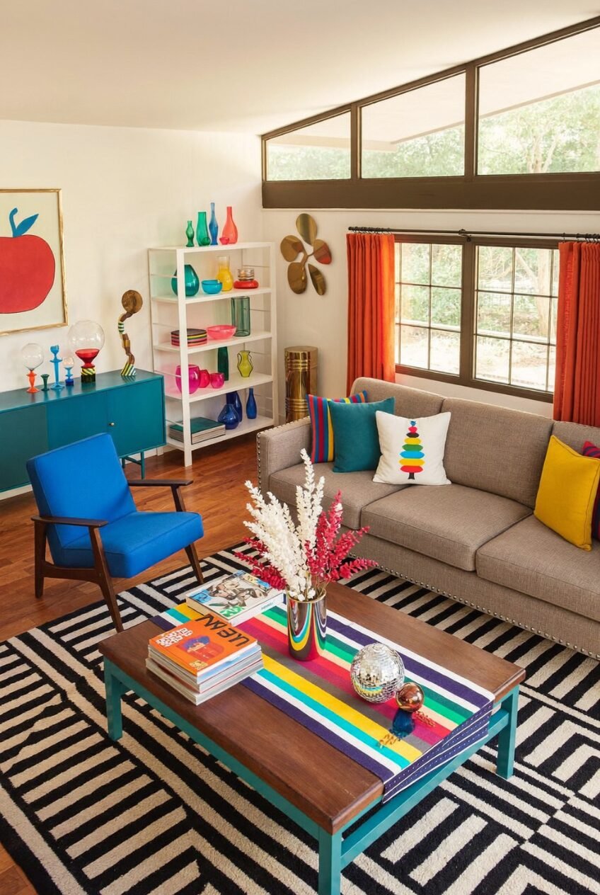
The most interesting color decision in this room isn’t the orange curtains, the teal credenza, or the cobalt blue armchair — it’s the white open shelving unit filled entirely with colored glass objects. Every color in the room appears somewhere on those shelves: teal, yellow, pink, red, green, blue, orange. The shelving unit functions as both storage and a color key, previewing every hue in the room’s palette before your eye lands on any individual piece of furniture.
The sofa itself is a deliberately calm greige, which creates the necessary contrast for all the saturated color happening around it. Without that neutral anchor, the orange curtains and blue chair and teal credenza would fight each other for dominance. The graphic black-and-white striped rug handles the floor in the same spirit — strong pattern, no color — so the room’s palette is entirely contained to the furniture and accessories.
The rainbow-striped coffee table surface (painted or wrapped in a striped graphic) is the room’s most DIY-accessible element and one of its most effective. Updating a plain coffee table with bold horizontal stripe painting in the room’s existing colors is a relatively low-cost way to add a statement piece that connects every other element. The mid-century modern bones of the space — clerestory windows, simple wood floors, classic furniture profiles — provide a structural contrast to all the pop color that keeps the room from feeling unmoored.
Dark Teal Walls and a Yellow Fringe Ceiling
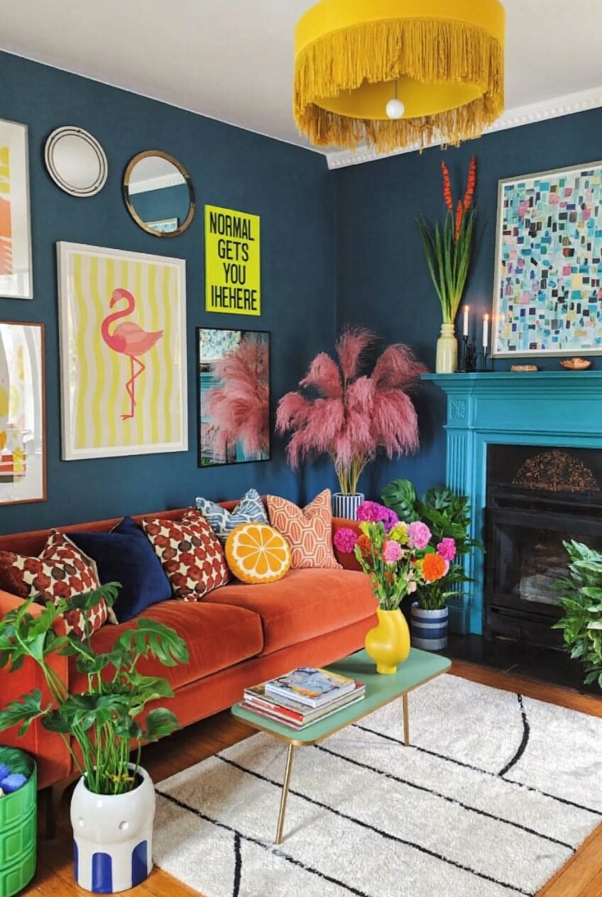
Paint all four walls in a deep teal-blue, then hang a yellow fringe drum pendant from the ceiling, and you’ve immediately set up one of the most high-contrast color relationships possible — deep cool vs. saturated warm — in the most architecturally significant surfaces of the room. It could easily go wrong. What stops it is the fireplace, painted in a vivid turquoise that sits between the two dominant colors on the spectrum, bridging the visual gap and making the whole composition feel deliberate rather than accidental.
The rust-orange velvet sofa is the third major color in this room, and it works against the dark teal wall the way a warm fire looks right in a blue-twilight sky. Pink pampas grass in a blue-and-white striped vase sits in the fireplace opening, adding a soft organic texture that tempers the hard paint surfaces around it. A neon yellow-green typography print among the gallery wall pieces provides the single most electric accent note in a room that’s otherwise operating in jewel tones.
Dark wall rooms require significantly more light sources than standard rooms — this one works because there are multiple warm-bulb lamps at varying heights supplementing whatever natural light comes through. The white shag rug with a linear pattern is doing the same job the neutral sofa did in the previous space: giving the eye somewhere to rest that isn’t another saturated surface.
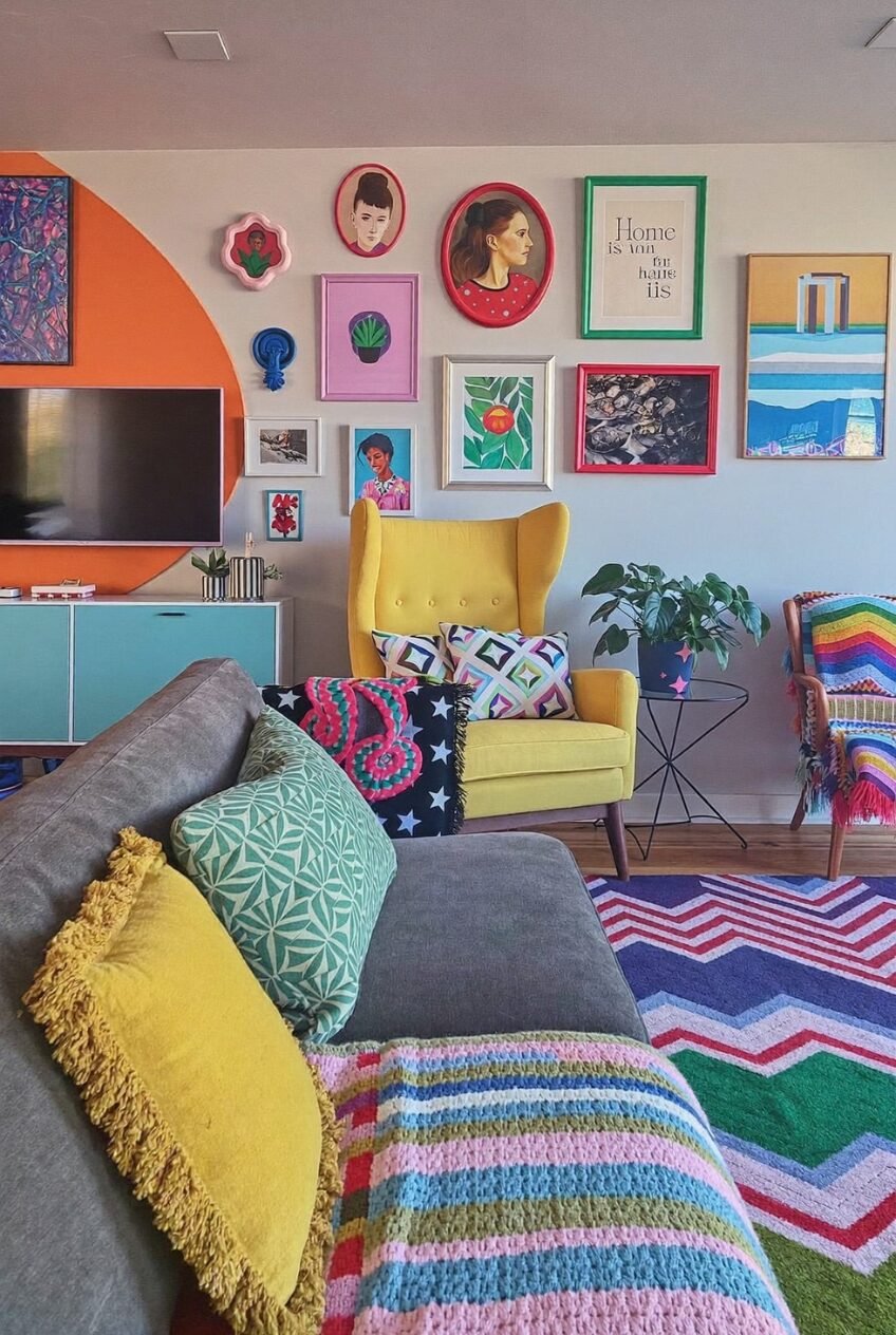
Floor-to-Ceiling Gallery Wall as Personal Archive
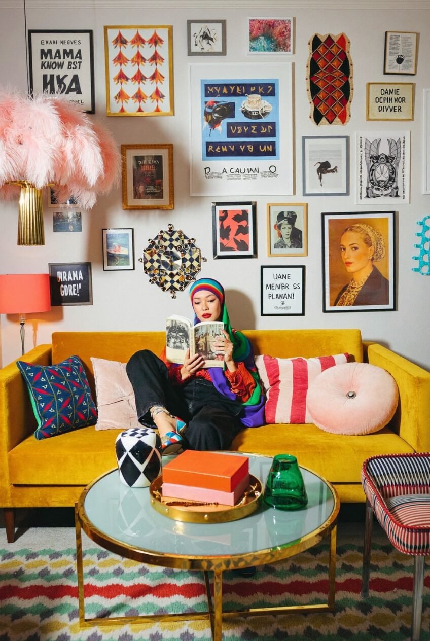
Typography prints, portrait photographs, geometric textiles, abstract paintings, illustrated posters, and decorative objects mounted directly to the wall — this gallery arrangement covers nearly the entire wall behind the sofa from baseboard to near-ceiling height, and the organizing principle is not aesthetic cohesion but personal significance. The variety of frame styles, art media, and content is the point: this is a wall that reads as a life rather than a collection.
The mustard yellow velvet sofa below it is the right choice for this context — it’s bold enough to not disappear beneath the visual density above it, but its solid color doesn’t compete with any individual piece on the wall. The brass-framed glass coffee table with its reflective surface keeps the center of the room from feeling heavy. A pink feather pendant lamp and a coral-shaded table lamp add warmth at two different heights, preventing the room from reading as flat-lit.
For anyone building a similarly personal gallery wall, the key principle is density without symmetry. Avoid leaving more than about four inches of wall visible between any two pieces once the arrangement is complete — gaps read as indecision at this scale. The multicolor chevron rug at floor level brings the room’s palette — yellow, red, blue, green, pink — into the floor plane without requiring any of those colors to repeat on the sofa or walls.
Zebra Print, Expressive Art, and a Hand Chair
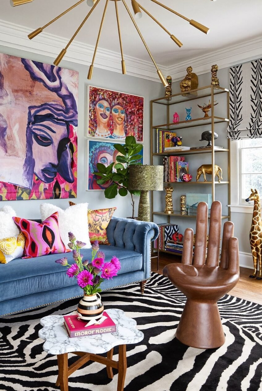
A zebra-print rug scaled large enough to cover most of the floor, zebra-print Roman shades at the window, a large-scale figurative painting dominating one wall, and a sculptural hand chair in walnut-finish resin — this room is operating at full maximalist commitment, and it earns the right to do so because every bold element has clear spatial boundaries. The zebra print stays on the floor and window; the large art stays on the wall; the sculptural furniture stays in its corner. Nothing is bleeding into another element’s territory, which is what keeps the room from tipping into sensory overload.
The slate-blue Chesterfield sofa is an interesting anchor choice — not a neutral, but a sufficiently complex color that sits comfortably between the black-and-white graphic intensity of the zebra pattern and the fuchsia-and-purple saturation of the art. The brass Sputnik chandelier handles the ceiling without adding another color, just metallic warmth. Gold-framed open shelving carries a mix of colorful books, art objects, and gilded animal sculptures that reinforce the eclectic, collected quality of the space.
For a room with this much going on, the marble coffee table top — organic in shape, quiet in color — is exactly the right centering piece. Sculptural furniture like the hand chair works best when it’s given genuine space around it rather than surrounded by other statement pieces; place it where someone might actually use it, and the room’s personality reads as functional rather than decorative.
Novelty Furniture and Wavy Mirror Confidence
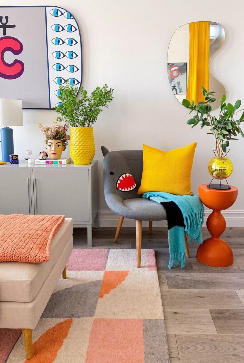
The shark-face armchair with its appliqué teeth and button eyes is either the best or worst decision a living room can make, and in this context it’s definitively the former. What makes it land is the surrounding environment: a wavy-outline mirror, a face-shaped planter, a disco-ball-base vase, an orange hourglass side table. Every other object in the room is equally committed to novelty, so the shark chair reads as a design choice rather than a joke.
Notice what the room does with the walls and floor to make this work. The walls are plain white. The grey painted sideboard is low-key. The rug is geometric in muted peach, grey, and cream tones. All the visual noise is concentrated in the objects and furniture, while the structural surfaces provide maximum breathing room. That’s the fundamental principle of novelty-heavy decorating: the quieter your backdrop, the louder your objects can be without the room becoming unreadable.
A large graphic print — here a rounded rectangular frame with eye motifs in blue and red — anchors the left wall without requiring a gallery arrangement. The yellow ceramic pot with a green plant on the credenza, the wavy mirror reflecting a yellow curtain, the orange side table — these are three separate accent colors that work because they’re all high-saturation and similarly weighted. Mixing novelty objects with a neutral base is the most accessible entry point into this kind of decorating: start with one genuinely weird piece and build the rest of the room to support it.
Vibrant Rooms Are Made by People Who Commit to Their Instincts
Every room in this post has one thing in common: someone made a decision and followed it through without hedging. That’s harder than it sounds. The instinct when things feel bold is to pull back — to add a neutral, to swap a pattern for a solid, to choose the quieter version of the color you actually wanted. Vibrant rooms are the ones where that instinct gets overruled.
The practical reality is that color confidence usually develops through small experiments that work. One strong piece, one bold wall, one unexpected fabric choice — and then the room starts to build its own momentum. Once you understand that a deep teal wall needs more lamps rather than less color, or that a novelty chair needs a quiet backdrop rather than a busy one, the decision-making becomes cleaner.
We don’t think there’s one right version of a vibrant living room — the spectrum here runs from refined art-driven spaces to full-send maximalist pattern rooms, and both approaches are valid. The question worth asking isn’t how much color is too much. It’s whether the color you’re using is doing something specific, and whether the room around it is set up to let it.