What Makes a Home Feel Like It Belongs in a Nancy Meyers Film
There’s a very specific feeling certain houses give you on screen, the kind where the light always looks like late afternoon and every room seems lived in by someone with excellent taste and zero rush. We’re talking about that warm, layered, slightly imperfect look that’s become shorthand for a whole aesthetic.
What makes it work isn’t expensive furniture or a designer on speed dial. It’s restraint mixed with personality, neutral bones dressed up with pattern, books that actually get read, flowers that aren’t perfectly arranged, and lighting that flatters everyone in the room. None of it screams for attention, which is exactly why it holds yours.
We pulled together ten rooms that capture this mood in completely different ways, from kitchens to bathrooms to a patio you’d want to live on. Each one teaches a slightly different lesson about how to make a house feel this good without it feeling staged.
Built-In Bookshelves Make a Statement
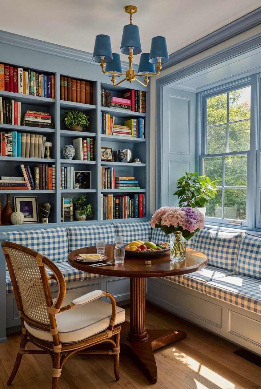
Painted millwork is doing a lot of heavy lifting here. The bookshelves, window trim, and wall paneling are all the same soft blue, which turns what could’ve been a plain breakfast nook into something that feels architectural. Color continuity is the trick, when trim and built-ins share one shade, even a small room reads as planned design instead of an afterthought.
The books themselves matter too. Mixed spine colors, a few plants tucked between rows, some framed photos and small ceramics, none of it is styled to perfection, and that’s the point. A shelf that looks too fussed-over stops feeling like a place where someone actually lives.
If you’ve got built-ins sitting in a neutral white, a saturated paint color is the cheapest upgrade available to you. Pair it with a gingham or check fabric on the seating and brass fixtures overhead, and you’ve got a corner of the house people will linger in longer than they planned to.
A Kitchen Built for Hosting
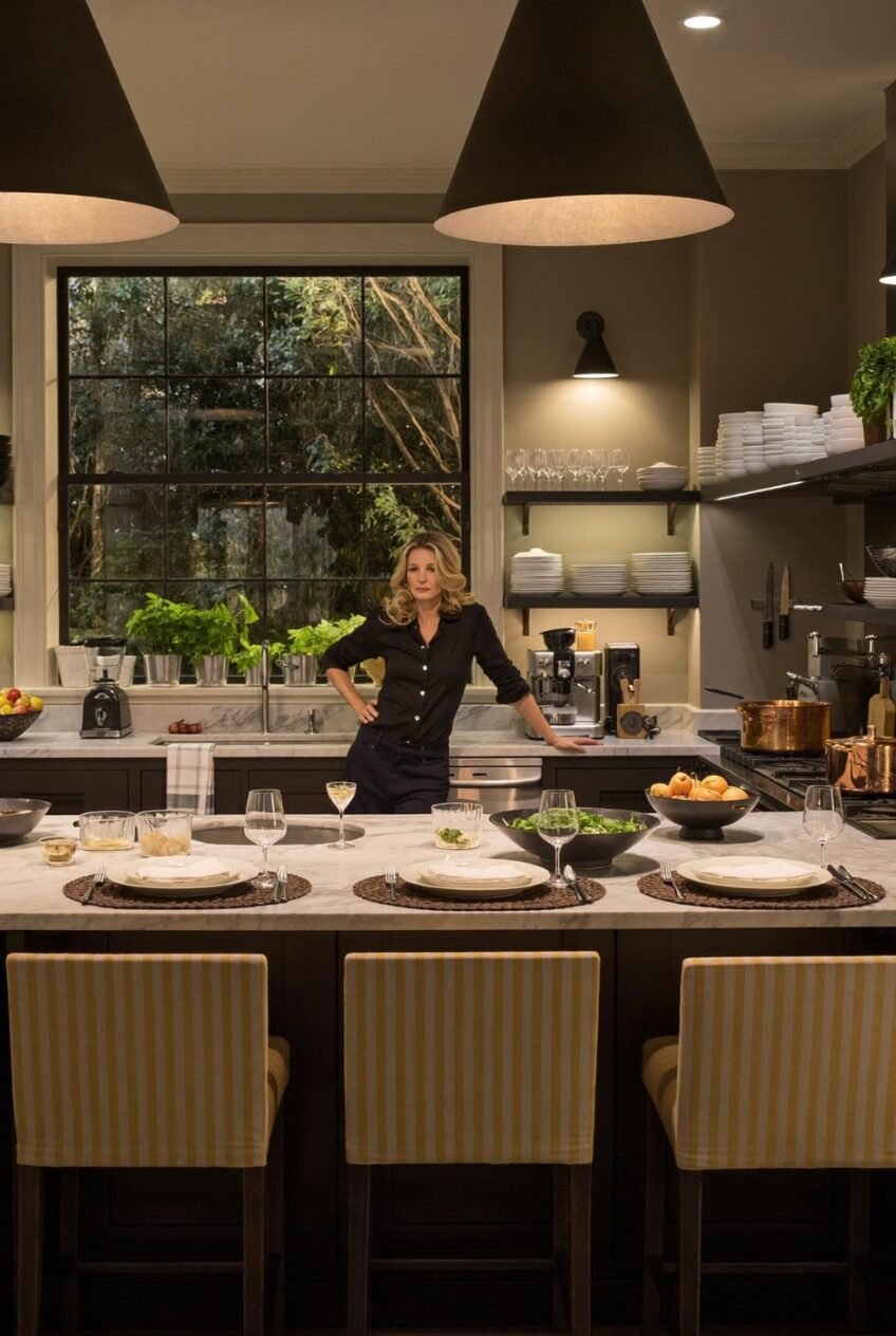
Dark cabinetry gets a bad reputation for making kitchens feel small, but this one proves the opposite when the lighting is right. Two oversized cone pendants drop low over the island, throwing warm pools of light onto the marble while the rest of the room stays moody and quiet. It’s a kitchen that photographs like a restaurant and functions like one too.
Open shelving stacked with plain white dishware keeps the whole thing from feeling heavy, and the striped barstools add just enough color so the space doesn’t read as one flat tone. A kitchen this dark needs contrast somewhere, whether that’s brass hardware, copper pans, or a window full of greenery.
Notice the table is already set, plates down, wine glasses out, before anyone’s arrived. That’s the real lesson, a kitchen built for entertaining looks ready before the guests show up, not scrambled together once the doorbell rings.
Outdoor Rooms Deserve Real Furniture
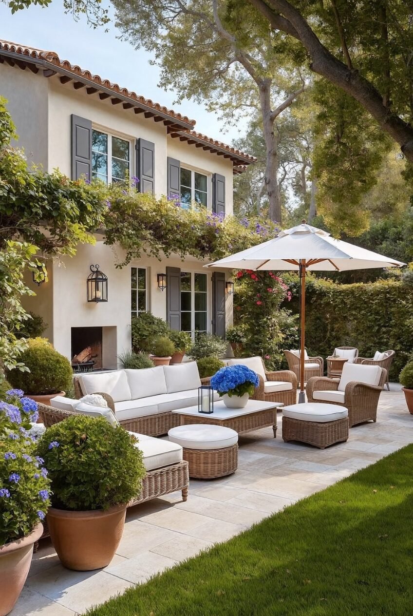
Treat the patio like an extra living room and the whole house gets better. Deep wicker sofas, a proper coffee table, ottomans for kicking your feet up, an umbrella big enough to actually block the sun, none of this is folding-chair-on-a-deck energy. It’s furniture that suggests you might be out here for hours, not just for a quick coffee.
The terracotta pots, climbing vines, and grey shutters against warm stucco do a lot of the visual work too, but honestly the furniture is what sells the room. Comfortable seating outdoors changes how often people actually use the space.
A built-in outdoor fireplace stretches the season further than most people realize, letting the patio stay functional into cooler months instead of getting boxed up every October. If your outdoor area only has a grill and a couple of mismatched chairs, this is the upgrade path worth following first.
Pendant Lights Set the Mood
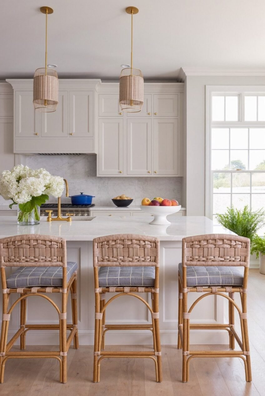
Two woven rattan pendants on slim brass rods turn an otherwise minimal white kitchen into something with real texture. Without them, this island would read clean but a little flat and a touch generic. With them, there’s warmth and a touch of coastal ease that the marble alone couldn’t deliver on its own.
Counter stools matter just as much. The woven backs here echo the pendant material, creating a quiet connection between the lighting and the seating that most people register without ever consciously noticing it. Repeating one material in two places ties a room together far more than buying everything from a matching set ever could.
A blue dutch oven left out on the stove and a low bowl of fruit on the island keep things from feeling showroom-perfect. White kitchens can go cold fast if every surface stays bare, so leave a few daily-use objects out where you’ll actually see and use them every morning.
Symmetry Calms a Busy Room
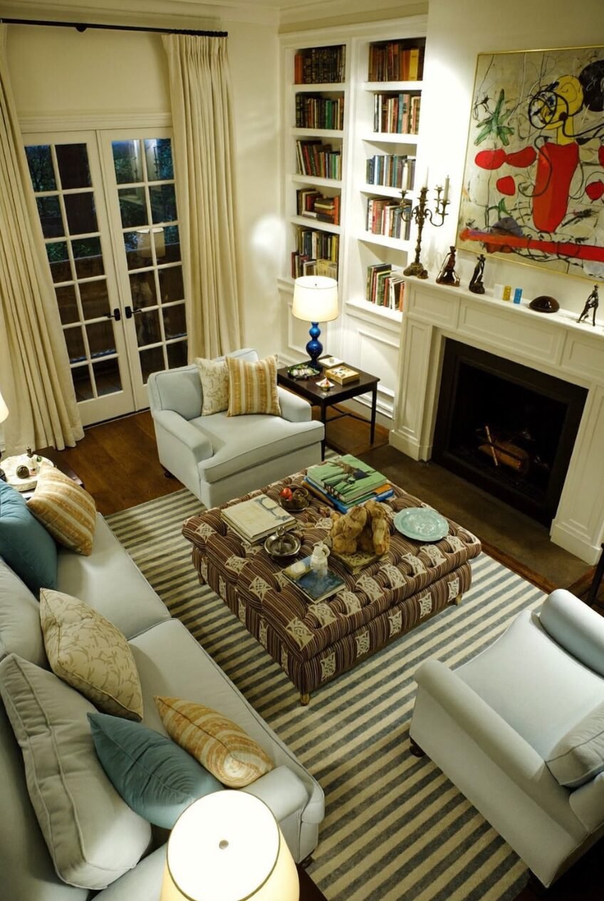
Two matching pale blue armchairs flanking one heavily patterned ottoman is a layout that shows up again and again in rooms that feel calm despite having a lot going on. The striped rug, the bold red-and-yellow art over the mantel, the mix of pillow patterns on the sofa, it’s a lot of visual information, and the symmetry is what keeps it from feeling chaotic.
Built-in bookshelves on either side of the fireplace add another layer of balance, framing the art instead of competing with it. Symmetry is the easiest way to make a busy room feel composed rather than cluttered.
French doors at the far end let in enough light that none of the deeper tones in the rug or upholstery feel heavy. If your living room has a strong pattern moment somewhere, anchor it with a pair of matching pieces nearby instead of trying to balance everything with more pattern.
Pattern Mixing Takes Real Confidence
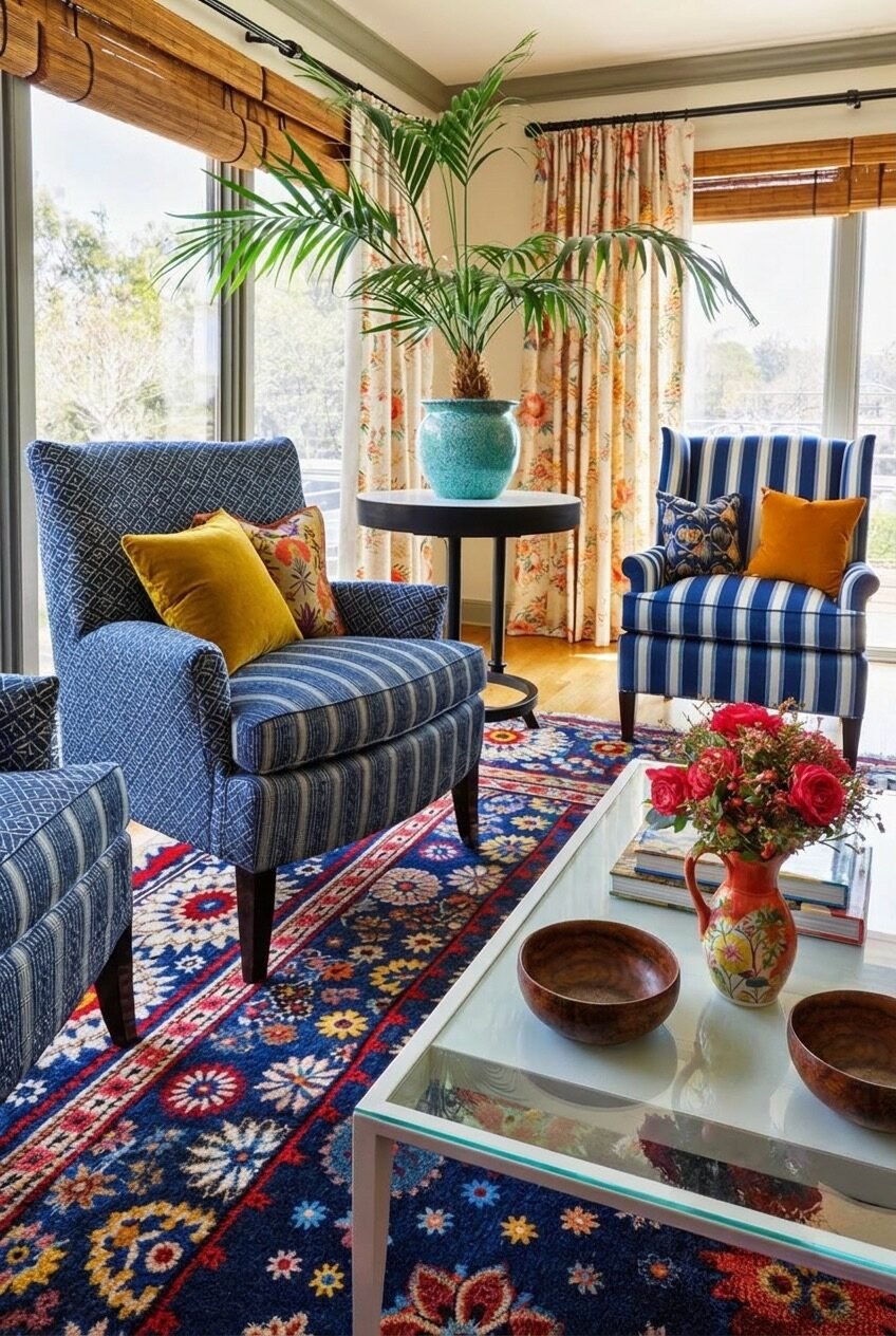
Striped chairs, a suzani-style rug, floral curtains, mustard and orange pillows, on paper this sounds like too much, and somehow it isn’t. The unifying thread is a consistent blue running through nearly every fabric in the room, which is the only reason this combination doesn’t fight itself.
A potted palm in a glass-glazed turquoise pot adds height and a little drama in the corner, while the glass coffee table keeps the lower half of the room from feeling crowded. One repeated color across multiple patterns is what makes mixing actually work, rather than each piece just doing its own thing.
If pattern mixing has always felt intimidating, start the way this room did. Pick one color and commit to it across rug, curtains, and upholstery, then let the patterns themselves be as different as you want. The color is doing the organizing so the patterns don’t have to.
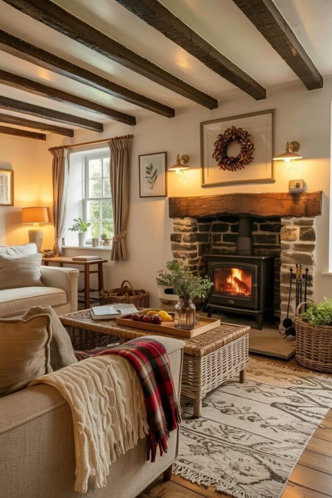
Wood Beams Bring Genuine Warmth
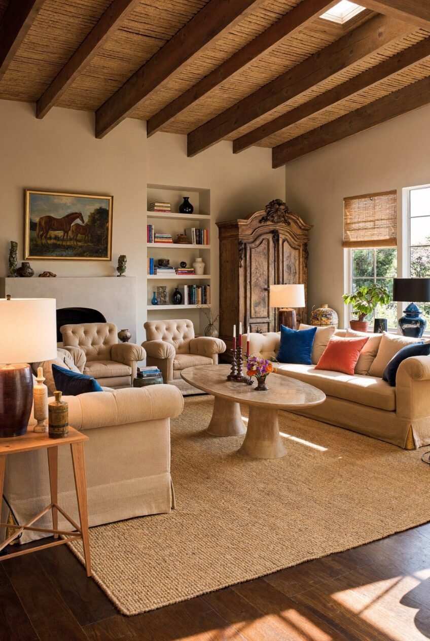
Exposed wood beams overhead change the entire feeling of a tall ceiling, taking it from cold and cavernous to something closer to a farmhouse or villa. They’re doing structural-looking work even if they’re purely decorative, and that visual weight up top balances out the airiness a high ceiling usually brings.
Below them, the room leans into texture over color: a jute rug, linen-covered sofas, a carved wooden armoire that looks like it’s been in the family for generations. Neutral furniture lets the architecture stay the star while pops of blue and coral on the pillows keep it from going flat.
An oval stone coffee table grounds the seating area without competing with anything else going on. If your ceilings are tall and your living room still feels echoey, beams plus natural materials like jute and stone are the fix worth trying before adding more furniture.
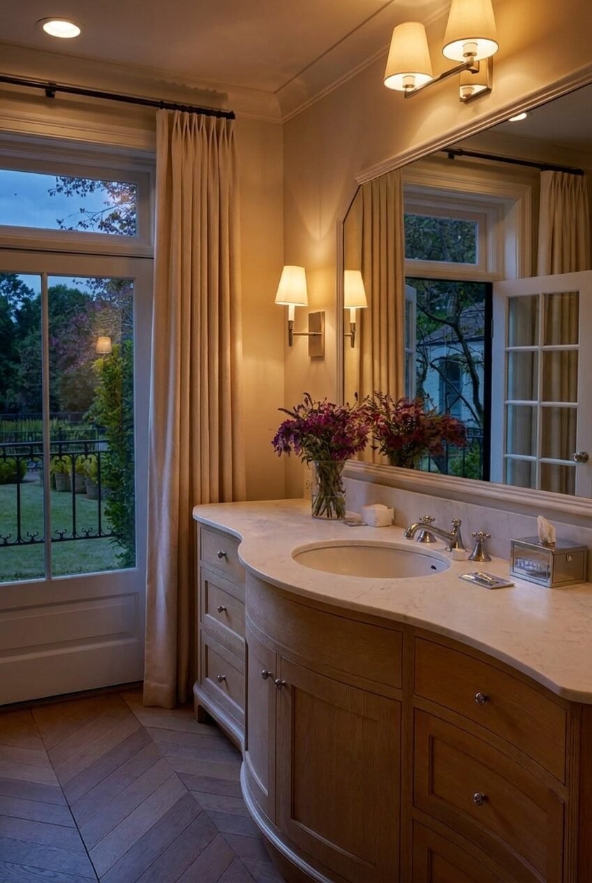
Small Bathrooms Can Feel Grand
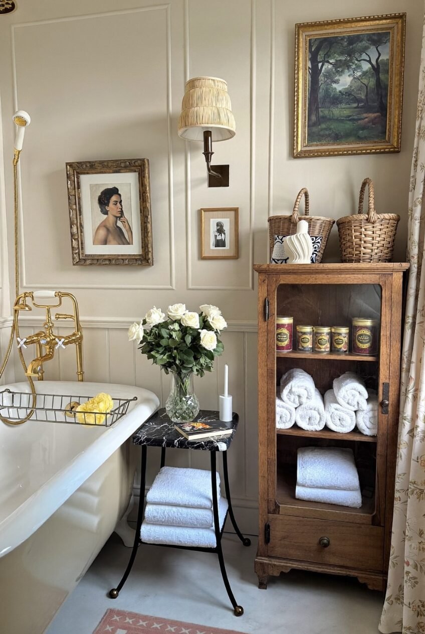
A clawfoot tub with gold fixtures already does most of the heavy lifting in this bathroom, but it’s the gallery wall and antique cabinet that push it from nice to genuinely special. Framed portraits, a landscape painting, and a woven sconce shade fill the wall above the tub the way you’d dress a living room, not a typical bathroom.
Rolled towels stacked behind glass cabinet doors turn basic storage into something worth looking at, and a small marble-topped table doubles as both a tub-side surface and extra towel storage. Small bathrooms benefit from furniture, not just fixtures, a proper side table does more for the room than another shelf ever could.
Fresh white roses and a lit candle finish the scene, but they’re easy to skip on a regular Tuesday. The cabinet, the gallery wall, and the brass hardware are the parts actually worth copying if square footage is tight.
White Kitchens Still Have Soul
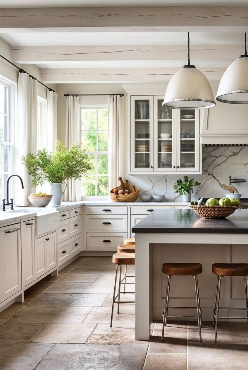
White kitchens get accused of feeling sterile fairly often, and this one is proof that the material choices underneath the white paint are what actually decide that outcome. Whitewashed wood beams overhead, a stone floor with real variation in tone, and a marble backsplash with visible veining keep the room from ever reading flat.
The island breaks the all-white rule on purpose, with a dark wood countertop that gives the eye somewhere to land. A single contrasting surface keeps an all-white kitchen from feeling like a blank page, and here it’s doing exactly that job.
Leaning cutting boards, a basket of green apples, and a loose bunch of branches in a pitcher are the kind of styling that costs almost nothing and adds the most warmth. Stone floors and wood beams are a bigger commitment, but the styling choices are something anyone can borrow this weekend.
Flowers Make the Whole Room
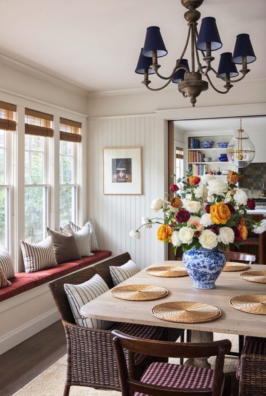
A single oversized arrangement of garden roses and ranunculus in a blue-and-white vase is genuinely doing more for this dining nook than any single piece of furniture in the room. The colors in the bouquet, deep red, gold, and cream, pull directly from the striped window bench cushion and the woven placemats, tying the whole table together in one easy move.
A navy chandelier with fabric shades adds a more formal note above a setup that’s otherwise pretty relaxed: wicker chairs, a window bench, mismatched striped and plaid cushions stacked together without much fuss. Mixing one formal element into a casual room keeps it from feeling too undone, and the chandelier here is carrying that weight on its own.
Buying fresh flowers every week isn’t realistic for most people, but the underlying lesson still travels well regardless of budget. One large, slightly imperfect arrangement read as far more special than several small, fussy vases scattered around the table ever could manage.
This Is What Comfortable Luxury Actually Looks Like
None of these rooms are perfect in the polished, untouchable sense, and that’s really the whole appeal. Books get pulled off shelves, towels get used, flowers wilt by the end of the week. The houses that give off this feeling aren’t frozen for a photo shoot, they’re built to be lived in fully while still looking this good.
What ties all ten ideas together is a willingness to mix textures and eras instead of buying one matching set. Antique cabinets next to modern lighting, painted millwork against woven baskets, a striped rug under a floral curtain, the layering is what reads as collected over time rather than purchased all at once.
You don’t need a Mediterranean patio or a clawfoot tub to borrow from this look. Pick one room, commit to a real color story, mix in a few worn-in pieces, and let the rest build slowly from there.