
Why Students Should Stop Waiting Until Later to Decorate Their College Apartment
Moving into your first real apartment hits different. One minute you are hauling boxes up three flights of stairs, and the next you are standing in an empty room wondering how bare walls turn into somewhere you actually want to come home to.
We put together a lineup of real rental spaces that prove small square footage is not the enemy. Some lean warm and cluttered, others go moody and minimal, but every one works within the limits every renter knows too well, white walls, questionable lighting, and a landlord who will not let you touch the plumbing.
Think of this as less of a mood board and more of a permission slip. You are allowed to hang things on the wall. You are allowed to spend twenty dollars on candles instead of a coffee table book. Grab whatever room you are staring at and let us walk through what actually works.
Black Fixtures Make Rental Bathrooms Moody
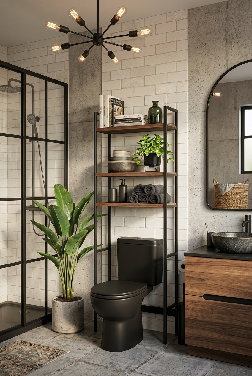
Matte black fixtures are doing a lot of heavy lifting here, and it might be the single easiest way to make a builder grade space feel designed on purpose. Swapping a chrome toilet or faucet for black costs less than you would think and instantly reads as a choice rather than whatever came standard.
Above the toilet, an open ladder shelf in dark wood and black metal turns wasted vertical space into storage and a bit of a personality flex. Rolling towels instead of folding them and mixing in a small plant with a stack of books makes an open shelf feel considered rather than empty. Pair that with a leafy plant on the floor, and a tiny bathroom gains actual depth.
The sputnik style chandelier overhead is a lighting upgrade that gets overlooked in bathrooms specifically, but warm filament bulbs change the mood of the room after dark. If your lease allows swapping fixtures, keep the original boxed up and reinstall it before you move out. If not, a plug in sconce or a warm smart bulb gets you most of the way there for under thirty dollars.
A Peg Rack Solves Entryway Chaos
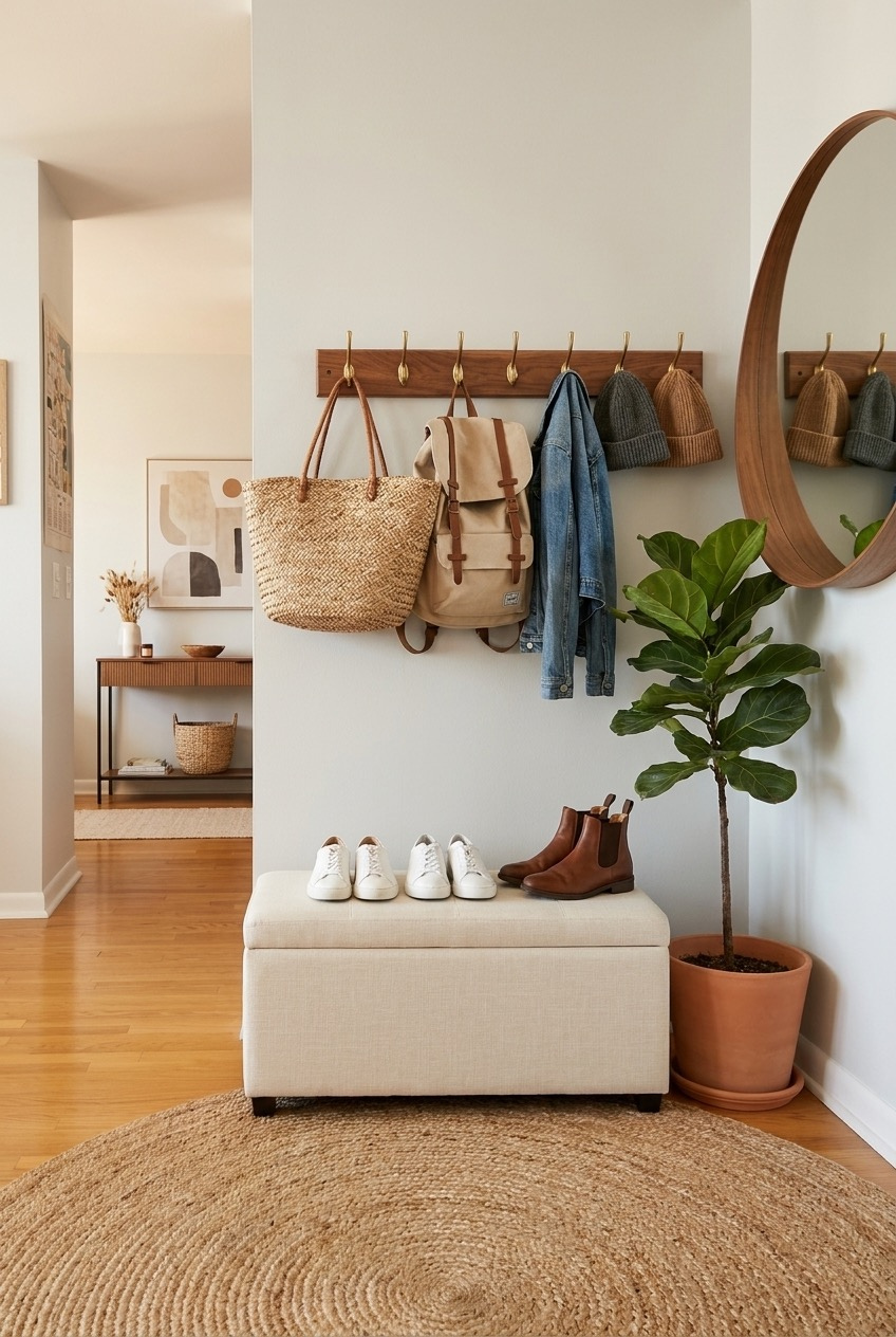
If you have ever tripped over a pile of shoes the second you walk through the door, a wall mounted peg rack fixes that faster than almost any other purchase you could make. This one uses brass hooks on a walnut stained board, holding everything from tote bags to beanies at a height where nothing ends up on the floor.
Underneath, a fabric storage bench does double duty as a place to sit while you put your shoes on and a hidden bin for the stuff you do not want visible, extra chargers, mail, whatever piles up by the door otherwise. A round mirror hung nearby means you can do a last look before you leave without walking to the bathroom.
A fiddle leaf fig by the door and a round jute rug soften what could otherwise feel like a hallway full of gear. None of this requires a single hole in a wall you cannot patch, since most peg racks and hooks come in versions with strong adhesive backing built for renters. Command strips rated for a few pounds each will hold coats and bags just fine.
Print Curtains Can Replace Boring Tile
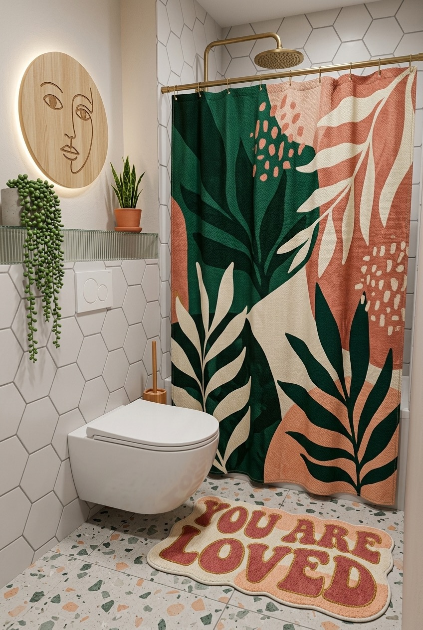
A rental bathroom with plain white tile is basically a blank canvas that most people never touch, which feels like a waste when a shower curtain can change the entire personality of the room for less than fifty dollars. The bold tropical print here does more visual work than anything else in the space.
Matching the shower curtain colors to smaller accents, like the peach and green tones picked up in the bath mat and the wooden line art piece on the wall, keeps a loud pattern from feeling random. Hexagon tile and a terrazzo look floor already bring texture, so the curtain gets to be the loudest thing in the room without competing with anything else in it.
A brass shower rod and rainfall showerhead attachment are both things you can bring with you when you move, which makes them worth the investment even in a place you do not plan on staying in forever. Add a trailing string of pearls plant on a nearby shelf, and a windowless bathroom stops feeling like an afterthought.
Style A Cart Like A Bookshelf
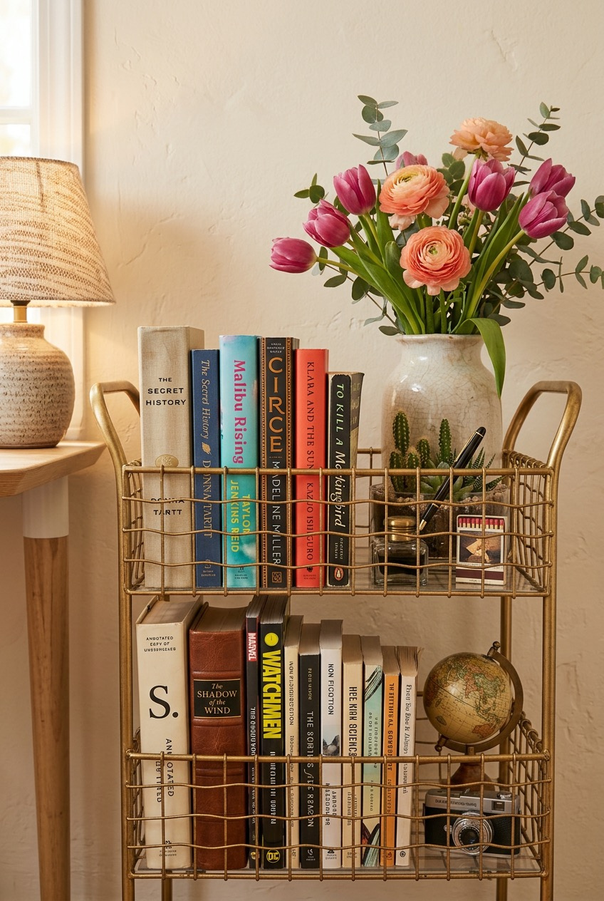
A gold wire cart is usually sold as a bar cart, but nothing says it has to hold liquor. Here it works as a compact, movable bookshelf, and honestly it might be a smarter use of the format for anyone who reads more than they drink on a given weekend.
Grouping books by spine color instead of alphabetically turns a random stack into something that looks styled on purpose, even if the system behind it is basically nonexistent. A small vase of fresh flowers, a vintage camera, and a tiny globe fill in the gaps between books without making the whole thing look like clutter.
The best part of styling a cart like this is that it needs zero wall space and zero commitment, so it works in a shared apartment where you cannot exactly hang anything permanent. Swap in fresh flowers every week or two, and rotate whichever books you are actually reading to the front so the display keeps evolving instead of turning into dusty background noise.
String Lights Still Work In Adulthood
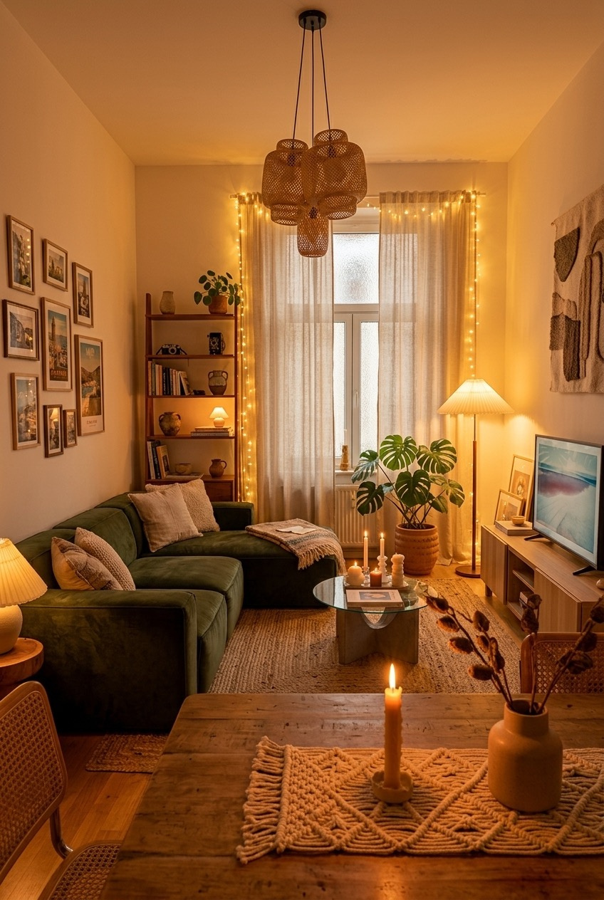
String lights get a bad reputation as a college dorm cliche, but wrapped along a window frame and curtain edge like this, they read as ambient lighting rather than a leftover freshman year decoration. It is all about where you put them and what you pair them with in the room.
A rattan pendant light, a floor lamp, and a cluster of taper candles on the dining table mean this room never has to rely on one harsh overhead bulb. That kind of layered lighting is one of the biggest differences between a space that feels flat and one that feels like somewhere you would actually want to sit after dark.
The gallery wall of travel photos next to the bookshelf gives the whole room a lived in feeling without a single matching frame in the bunch, which takes off a lot of the pressure to get everything perfectly coordinated. A monstera in a terracotta pot and a woven table runner under the candles round it out, proving that warm and layered beats sparse and matchy almost every time.
Turn Your Fridge Into A Gallery
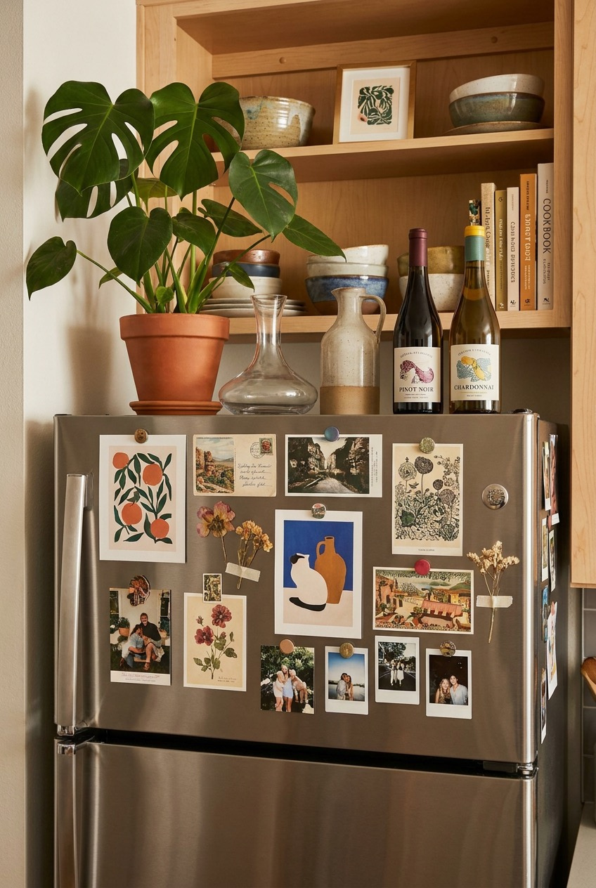
Every rental kitchen comes with a stainless steel fridge nobody asked for, and most people just ignore it. This one gets treated like actual wall space, covered edge to edge with postcards, botanical prints, and photos held on with cheap magnets instead of tape or command strips.
A magnet gallery wall is one of the only pieces of decor in a rental that costs almost nothing, damages nothing, and can be rearranged in about five minutes whenever you get bored of the layout. Mixing printed art with actual photos of friends keeps it from looking like a Pinterest board and more like an actual life in progress.
Above the fridge, the open shelving holds a cookbook, mismatched bowls, and a framed print, while the top surface gets a monstera plant, a carafe, and a couple of wine bottles left out like they are decor rather than groceries. It is a reminder that storage does not have to be hidden to look good, sometimes putting things on display is the whole point of a shelf.
Layer Textures For A Boho Bedroom
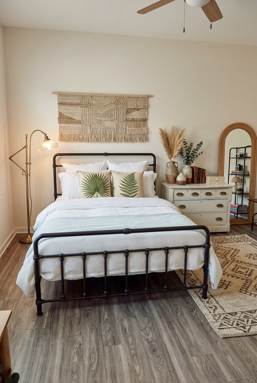
A black metal bed frame against a neutral wall automatically pulls a bedroom together without needing much else, since the dark frame acts like a border for the whole layout. Everything softer in the room, the waffle knit bedding, the fern print pillows, gets to feel a little more deliberate by comparison.
A woven macrame wall hanging above the headboard fills the empty space over the bed without needing a single nail beyond the one already holding a mirror or shelf, since most hanging pieces work off a simple dowel and cord. A vintage feeling dresser nearby, styled with dried pampas grass and a stack of old books, adds the kind of texture that new furniture almost never has on its own.
A patterned area rug layered over vinyl plank flooring hides the parts of a rental floor you did not choose and never would have, while a brass floor lamp adds warm task lighting without eating up nightstand space. If your budget only stretches to one splurge in the bedroom, put it toward the rug. It touches more square footage than anything else in the room.
Grid Walls Beat One Big Print
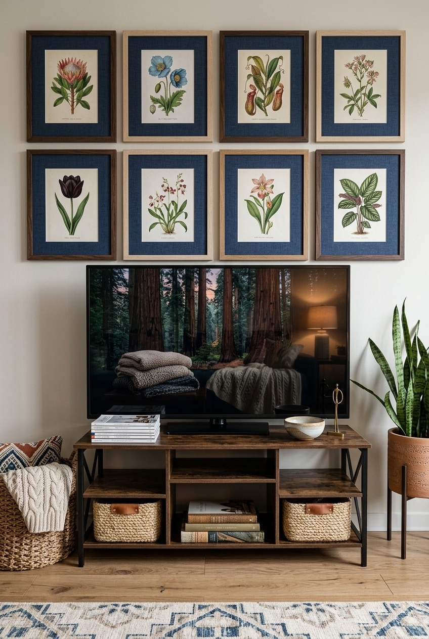
Eight matching frames arranged in a tight two by four grid above the TV is one of the most foolproof gallery wall formats there is, mostly because the hard part, spacing everything evenly, gets solved automatically once you commit to a grid instead of an organic scatter.
Keeping every frame and mat identical is what makes eight completely different botanical prints read as one cohesive piece instead of eight random purchases. You could fill the same layout with thrifted prints, pages pulled from an old book, or even printed photos, and it would still hold together as long as the frames match each other.
Below it, a reclaimed wood console with woven baskets hides remotes and cables while a snake plant in the corner adds height the flat screen alone cannot. It is proof that a TV wall does not have to be the least interesting part of a living room, it just needs one strong visual anchor above it and a little bit of styling underneath.
Mismatched Frames Can Still Feel Cohesive
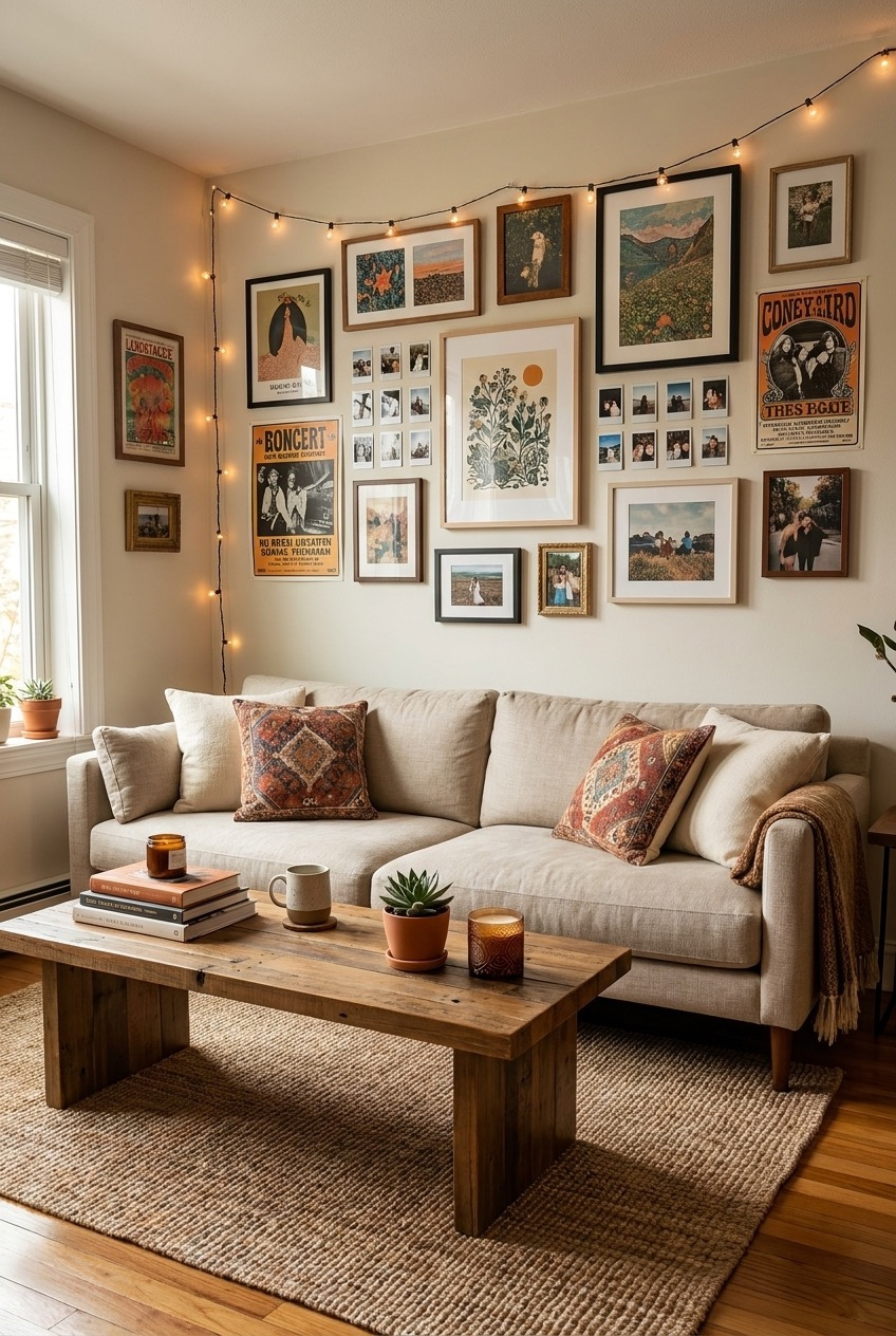
Nothing about this gallery wall matches, and that is exactly the point. Vintage concert posters sit next to family photos, a botanical print, and a grid of small polaroids, all in different frame styles and sizes, and somehow it still reads as one considered collection instead of a random pile of things.
Starting with one larger anchor piece, like the big botanical illustration near the center here, gives everything smaller something to orbit around instead of floating in an even grid with no focal point. From there, work outward with smaller frames, filling gaps as you go rather than planning the whole wall out on paper first.
String lights woven along the top edge of the gallery add a soft glow at night without a single extra outlet, and kilim print pillows on an otherwise plain sofa tie back into the warm, worn in colors running through the posters and photos. A jute rug underneath keeps all that visual noise grounded instead of letting the room tip into chaos.
Pink Walls Work Harder Than Expected
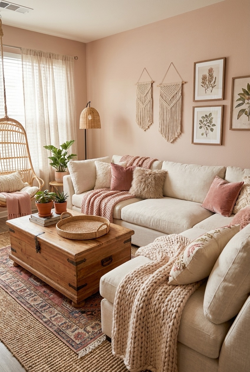
Blush pink on the walls is one of those colors people assume will feel too sweet or too young, but paired with warm neutrals instead of bright whites, it settles into something closer to grounded than girly. This whole room proves the point pretty clearly.
A rattan hanging chair by the window becomes the kind of seat everyone actually fights over, adding a shape and material that a standard sofa and armchair combination never could. Layering in a cream sectional with dusty rose and chunky knit pillows keeps the pink wall from being the only soft thing in the room.
A pair of macrame wall hangings and framed botanical prints break up the wall without fighting the paint color, while a wood trunk doubling as a coffee table adds storage and a bit of weight against all that softness. Layering two rugs, a flatter jute base under a patterned vintage style layer, is a trick that instantly makes a rented living room look far more established than it actually is.
Small Rented Apartments Can Still Feel Like Home
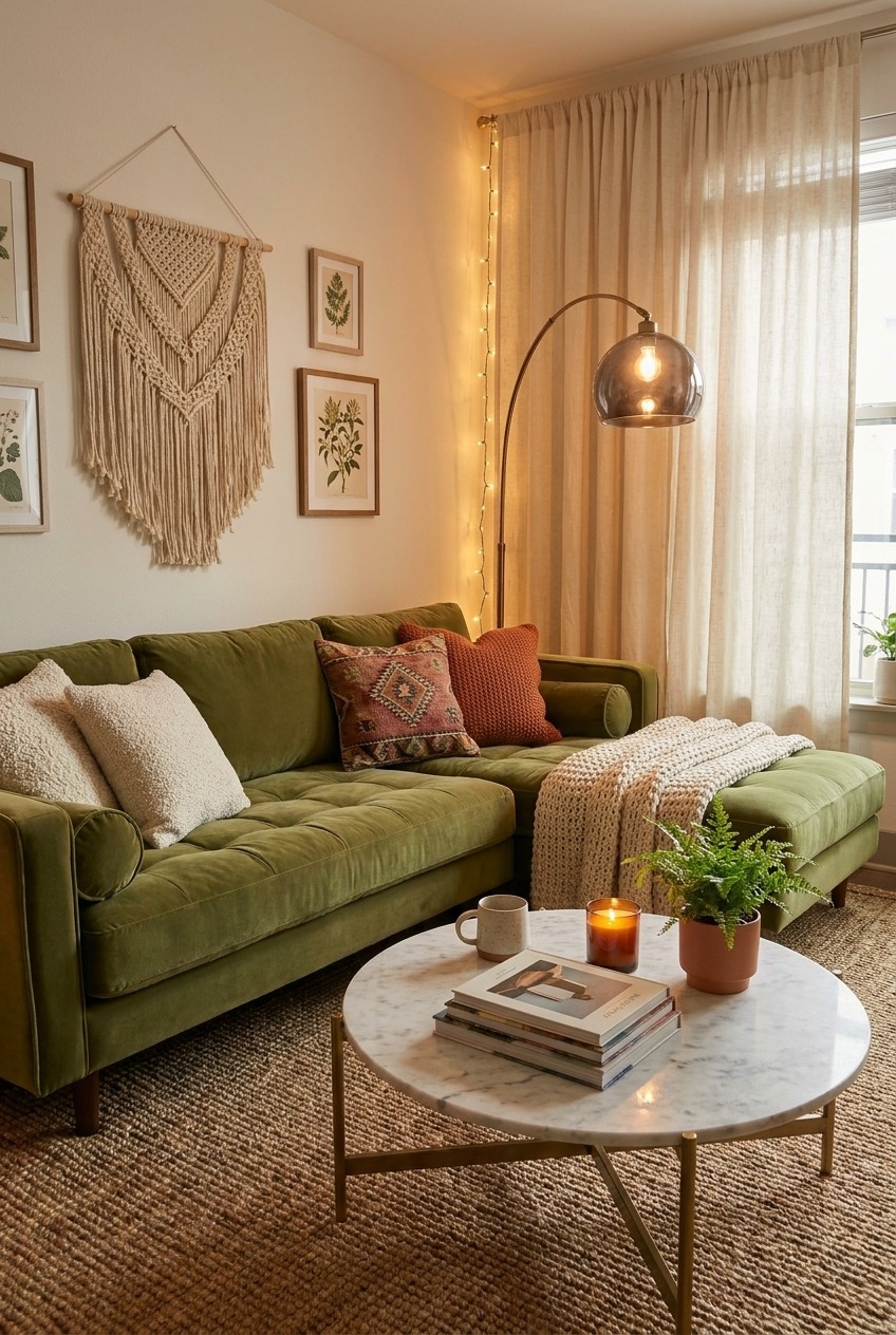
None of the rooms above needed a renovation, a big budget, or permission from a landlord to feel finished. Most of what makes them work comes down to layering, lighting, and a willingness to put things on the wall instead of leaving it blank because you are scared of a security deposit.
We think the biggest mistake people make in a first apartment is treating it like a waiting room for the place they will actually decorate someday. Buy the plant. Hang the print. String the lights. You are allowed to like where you live right now, not just where you will live eventually.
Start with whichever room feels most unfinished to you and pick one idea from above to try this weekend. Small changes add up faster than you would expect, and before long the apartment that felt like a blank box starts to feel like somewhere you actually chose to live.