
Retro Apartments Show What Happens When You Actually Trust Your Own Taste
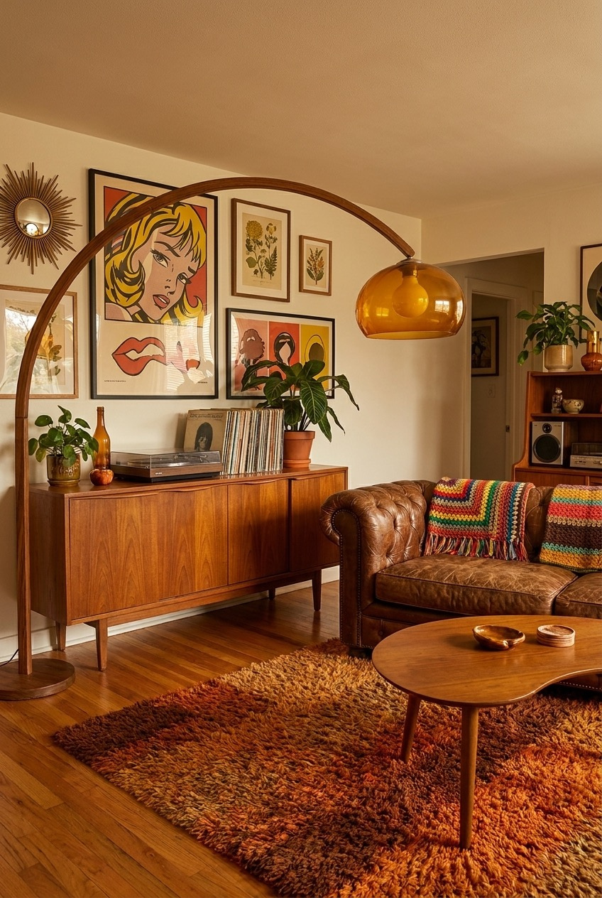
Open enough apartment tours lately and everything starts to look the same: white walls, a beige sofa, one sad plant in the corner. Retro apartments refuse to play along. They pull in color, pattern, and texture all at once, and somehow the whole thing still feels like a place you would actually want to sit down in.
We keep gravitating toward this era because it treats decorating like an actual creative decision instead of a checklist. Burnt orange velvet sitting next to teal tile next to a wall of old movie posters should not work on paper, and yet walking through these rooms, it clearly does.
Below, we are pulling apart specific rooms to show the real logic behind why the color and pattern choices hold together instead of turning into visual noise, plus how to borrow the same moves in your own space, room by room.
Pink And Teal Actually Get Along
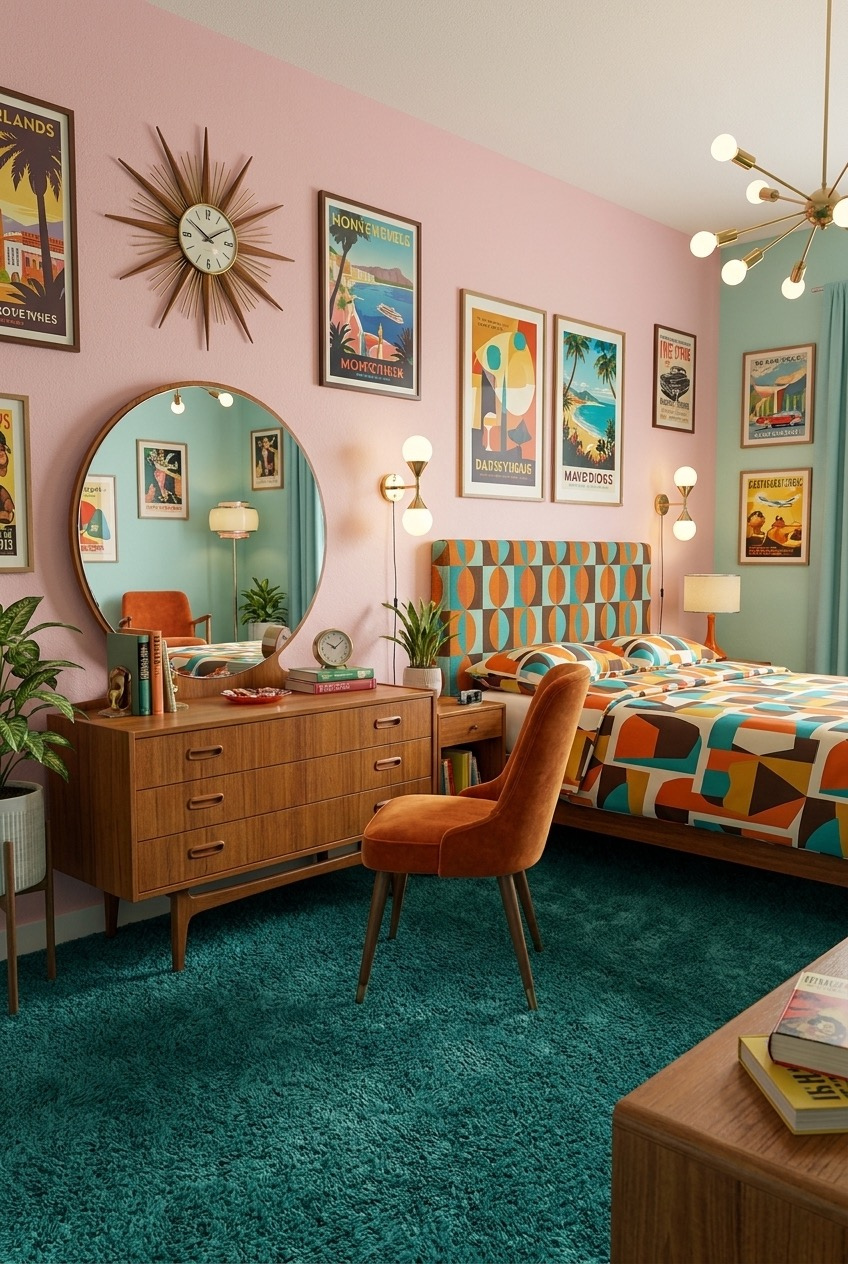
Pink and teal sound like a fight waiting to happen, but this bedroom settles it by keeping one color as the backdrop and the other as a supporting accent. The pink covers the bigger wall behind the headboard, while teal shows up in smaller doses across the trim, the curtains, and the thick shag carpet underfoot.
The real trick is the gallery wall of vintage travel posters stacked above the dresser and around the round mirror. Each poster brings its own mini color story, so the wall reads as one big collage instead of a mismatched pile of frames, and the sunburst clock breaks up all those straight edges.
If you are trying this at home, pick your loud color first and treat the second color like trim, not competition. A teak dresser and an orange velvet chair give the palette something warm and grounded to rest against, so the brights never tip into overwhelming.
Vintage Posters Set The Whole Tone
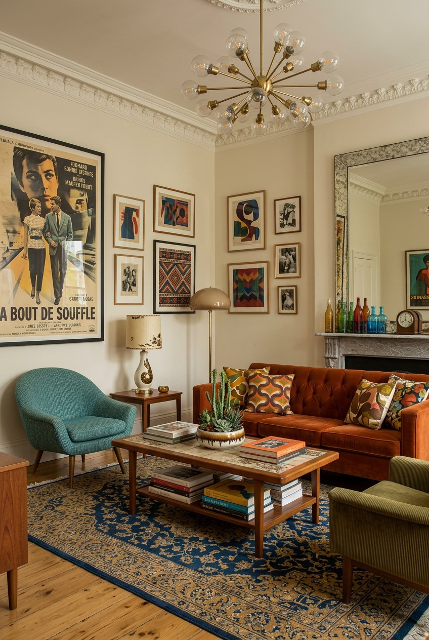
A single oversized vintage poster can anchor an entire room, and this living room leans on that idea hard. The black and white film poster by the doorway sets a slightly moody, cinematic tone that the rest of the space quietly follows, even with all that orange velvet in the mix.
Look at how the sofa color repeats in smaller pieces around the room: the pillows, a few book spines, even the wood tones in the coffee table. That repetition is doing more work than any single statement piece, and it is why the room feels pulled together instead of randomly furnished.
For a similar look, start with one large piece of art you actually love and build your color palette from it, letting a mix of velvet, corduroy, and wool carry the rest. The sputnik chandelier overhead adds sparkle without competing with everything happening at eye level.
Wallpaper Can Carry A Small Nook
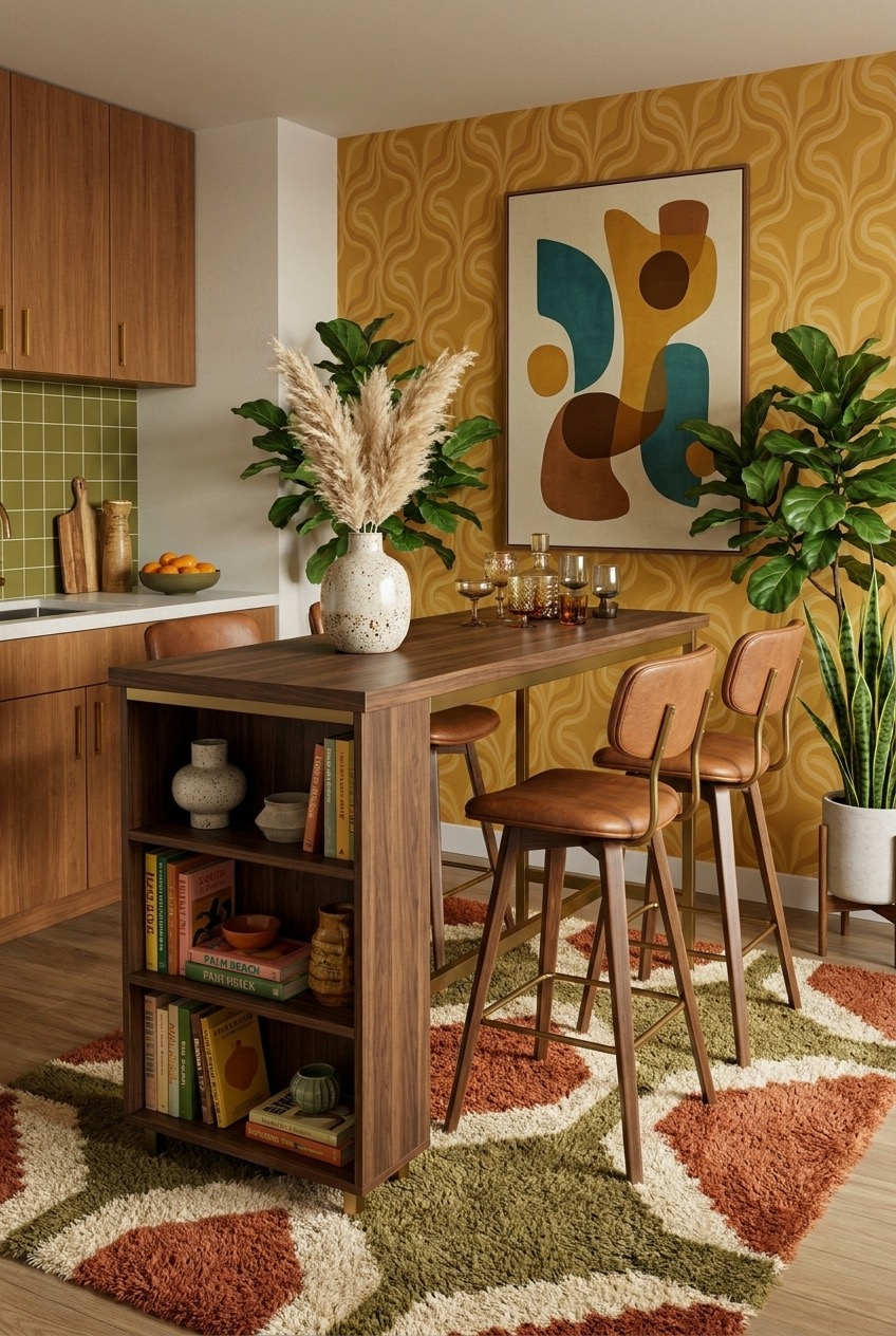
If you only have one wall to work with, make it count. This little dining nook commits fully to a mustard wallpaper with a wavy, almost psychedelic print, and because every other surface stays fairly neutral, the wallpaper gets to be the star instead of fighting for attention.
The abstract art print above the bar height table picks up the same yellow, teal, and rust tones from the wallpaper, which keeps the eye moving smoothly instead of jumping around the room. Cognac leather stools with brass legs add a little shine without pulling focus from the pattern behind them.
Small kitchens and nooks are actually the easiest place to try a bold wallpaper since the commitment feels lower than covering a whole living room. Pair it with simple wood tones and one graphic rug, and the space still feels calm despite all that pattern happening on one wall.
Let Your Collections Live Out Loud
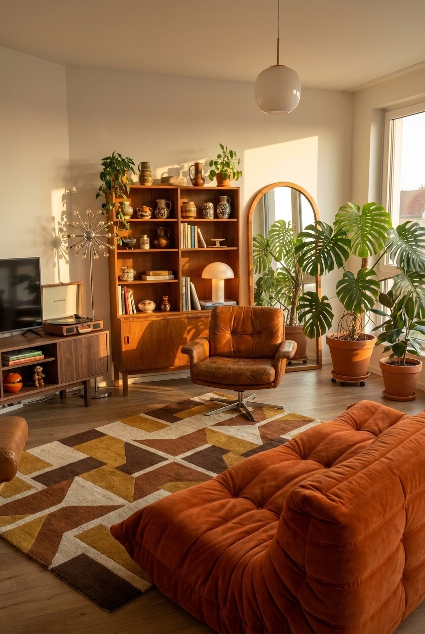
That wood wall unit stacked with pottery, vases, and travel finds is doing more heavy lifting than the furniture in this room. Instead of hiding collected objects behind cabinet doors, everything sits out on open shelves, grouped loosely by height and color so it reads as a real display, not clutter.
Warm evening light does a lot of favors here too, but even without perfect sun, the mix of cognac leather, brushed brass, and a mushroom-shaped lamp keeps the room feeling lived-in. The oversized monstera plants soften all those straight shelf lines and stop the space from feeling too rigid.
If your own shelves are looking bare, resist the urge to buy matching sets. Mix ceramics, small jars, and stacked books at different heights, leave a little breathing room between groups, and let a swivel chair or two invite people to actually sit close and look at everything.
Terracotta Walls Need Dark Wood Beams
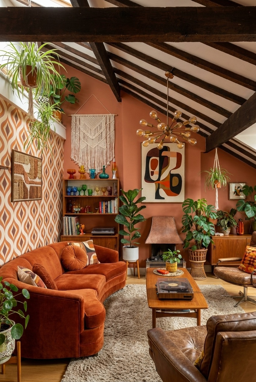
Dark wood beams against a terracotta wall could easily feel heavy, but the vaulted ceiling gives the whole combination room to breathe. The angle pulls your eye upward, so the deep rust color on the walls reads as warm instead of closing in on you the way a low, flat ceiling might.
A strip of retro geometric wallpaper on one wall adds pattern without covering the whole room, which matters when you already have exposed beams doing so much visual work. Hanging plants and a macrame piece soften the hard lines of both the beams and the wallpaper’s sharp repeating shapes.
Rooms like this tend to feel like the kind of place you settle into for a whole afternoon. If you have sloped ceilings or exposed structure, lean into it with a saturated wall color rather than fighting it with white paint, and let leather and velvet furniture add softness back.
Bold Wallpaper Meets Colorful Vintage Dishware
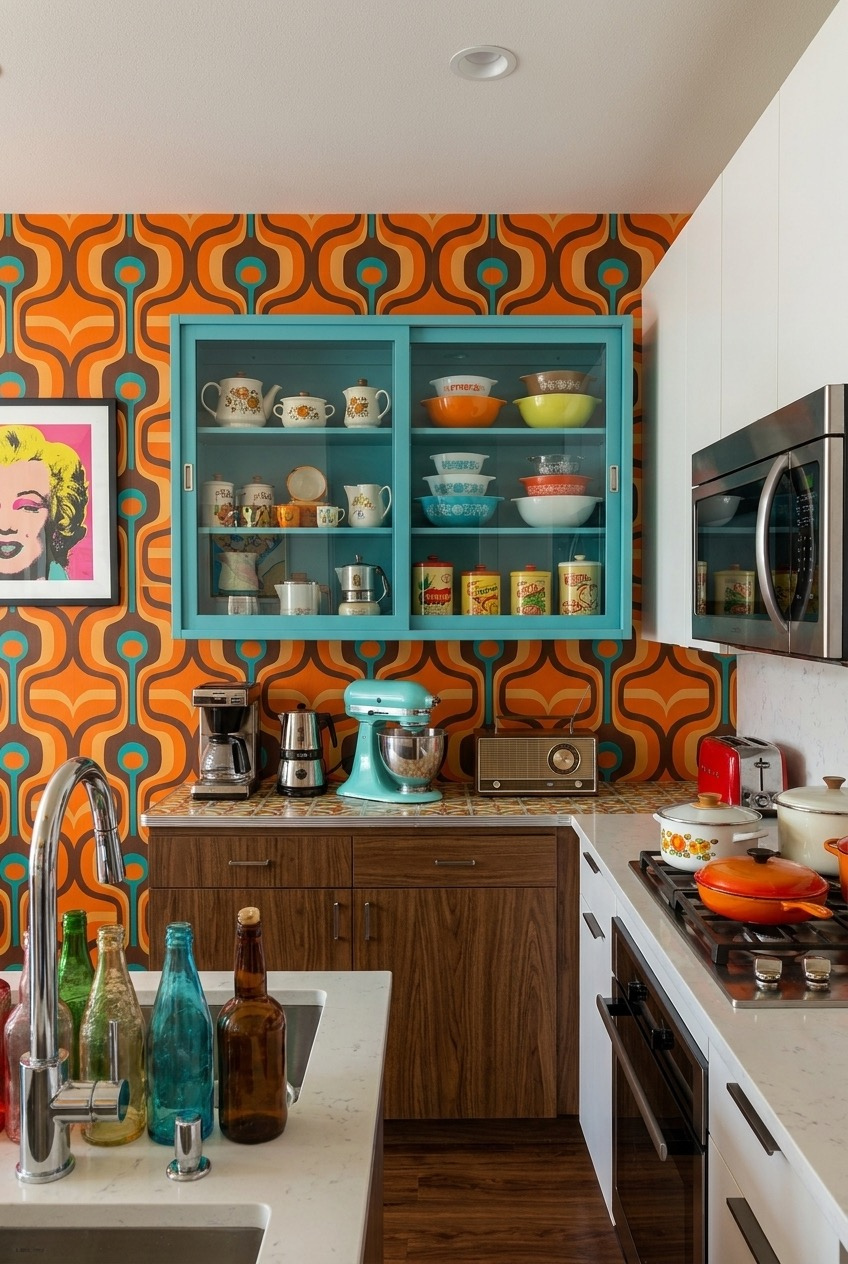
Repainting a kitchen is a commitment, but wallpaper is not, and this kitchen uses that to its full advantage with a loud, swirling orange and teal print covering the entire wall. Because the print already has so much going on, the cabinetry stays a simple wood tone instead of adding a third pattern to the mix.
The glass-front teal cabinet is basically doing double duty as storage and as a display case for a collection of colorful vintage bowls and canisters. Grouping dishware by color instead of by function turns everyday kitchen items into something worth looking at every time you walk past.
A red toaster and a teal stand mixer might sound like too much color for one counter, but against a wallpaper this busy, small appliances in bright colors actually blend in rather than standing out. Save your neutral pieces for the countertop and let the wall do the loud talking.
Colored Tile Still Beats Plain White
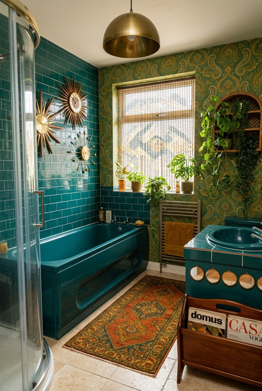
White subway tile will always be the safe bathroom choice, and that is exactly why a deep teal tub and matching tile feel so much more memorable here. The color runs from the tub straight up the wall, so the whole space reads as one confident decision instead of a bunch of separate finishes.
A gold and green paisley wallpaper covers the upper walls, which could clash with the teal, but a shared warm undertone in both patterns keeps things from fighting. Layered sunburst clocks add a bit of movement and break up what would otherwise be a very flat wall of pattern.
Vintage-colored fixtures are getting easier to find secondhand, so if a full teal tub feels like too big a leap, start smaller with tile or a colored vanity top. A brass dome pendant light and a well-worn rug make the room feel finished rather than half-renovated.
Wood Paneling Deserves A Second Chance

Wood paneling gets a bad reputation, mostly because of how it looked under fluorescent lighting in the eighties. Warmed up with natural light and paired with saturated orange velvet chairs, the same paneling here looks deliberate instead of dated, proving the material was never really the problem in the first place.
A checkered linoleum floor in warm browns and creams keeps the whole room from feeling too monochrome, and a hanging shelf in the window holds plants and amber glass bottles at a height where sunlight can pass straight through them. The sputnik chandelier adds height without blocking that light.
If your rental has existing wood paneling, do not rush to paint over it. Bring in a patterned rug with rust and cream tones, add a few pieces of velvet furniture in a saturated color, and the paneling starts to feel like a backdrop you chose instead of one you are stuck with.
A Neon Sign Sets The Mood
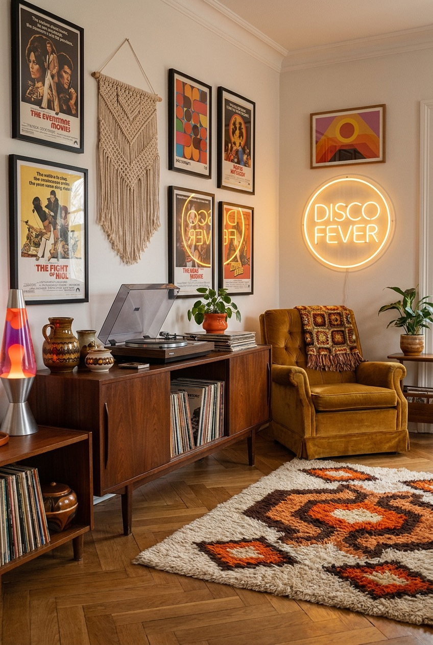
That glowing Disco Fever sign is a bold move, but it works because everything else in the corner stays fairly quiet in comparison. The mustard velvet armchair, the teak credenza, and the herringbone floor all sit in warm, muted tones, so the neon gets to be the one loud, glowing focal point.
A gallery wall of vintage movie posters covers most of the wall space, mixing different eras and styles without much visible order, which somehow makes it feel more personal than a carefully matched set would. A lava lamp on the lower shelf adds one more layer of glow to the corner.
One statement lighting piece, whether that is a neon sign or a lava lamp, can carry a whole corner of a room on its own. Keep the surrounding furniture in earthy, low-saturation colors so the light source does not have to compete with anything else for attention.
Arched Shapes Soften A Bold Palette
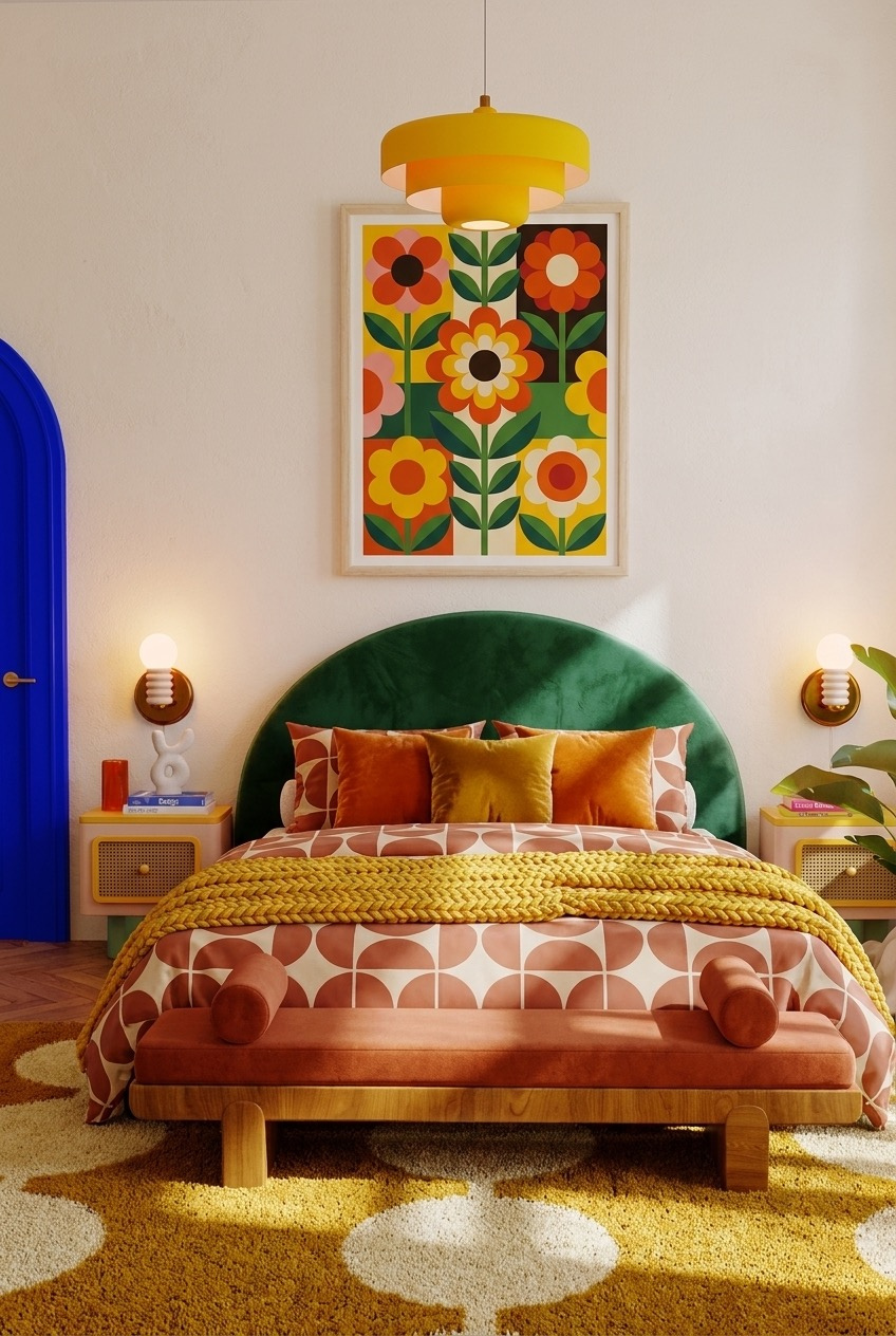
Curves are doing a lot of quiet work in this bedroom. The arched green headboard echoes the arched blue doorway across the room, and that repeated shape keeps two very saturated colors, forest green and cobalt blue, from feeling like they were picked at random and placed on opposite walls.
A bold floral print above the bed pulls orange, yellow, and pink into the mix, and the geometric bedding underneath repeats those same tones in a completely different pattern. Mixing a floral with a geometric print usually works as long as the color palette between them stays consistent throughout the room.
A mustard pendant light hangs low enough to feel like part of the composition rather than just a fixture, and matching wall sconces on either side balance the wall out. If you want a similarly playful bedroom, pick two saturated colors and echo one shape between two pieces, then let patterned textiles carry the rest.
Good Design Just Means Committing To Something
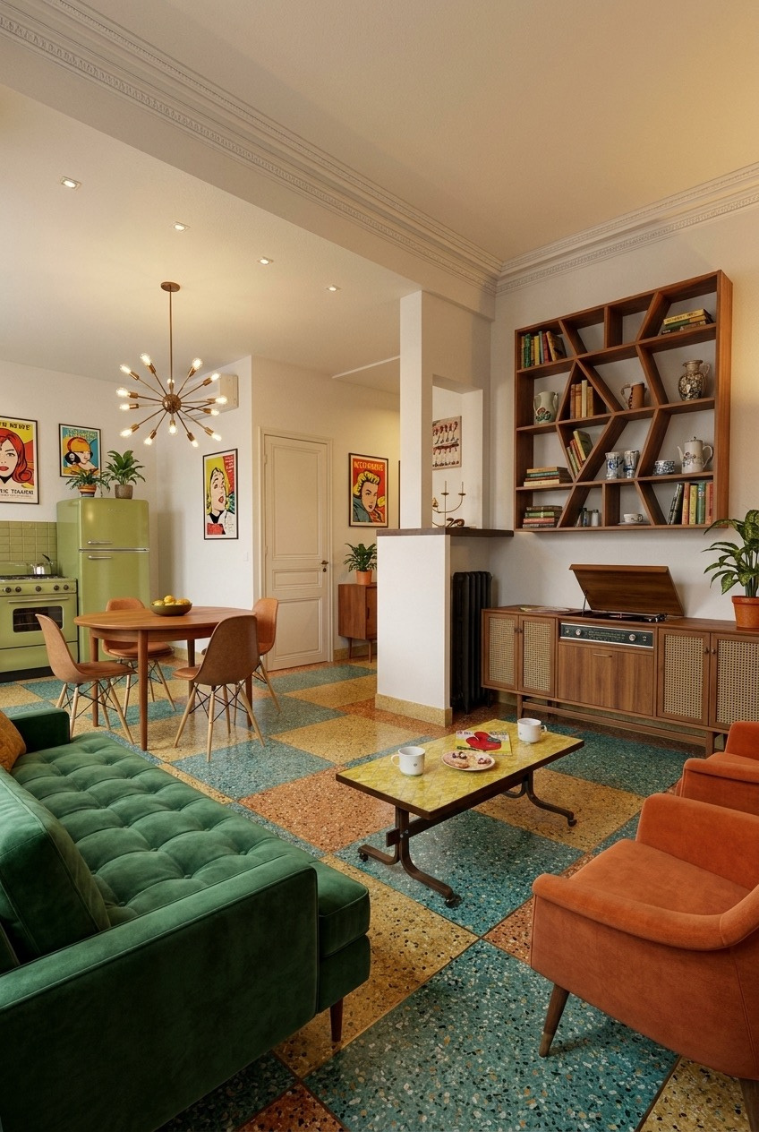
What ties every one of these rooms together is not a specific color palette, it is a willingness to commit. None of these spaces are playing it safe with beige walls and matching furniture sets, and that is exactly what makes them memorable instead of forgettable a year from now.
Retro design also tends to reward things most of us already own or can find secondhand: old pottery, real wood furniture, patterned textiles picked up over years instead of bought all at once for a single room. That slower, collected feeling is hard to fake with anything brand new off a showroom floor.
Pick one room, pick one bold move, whether that is a wallpaper, a color, or a single great piece of furniture, and build outward from there. The rest tends to fall into place once you stop trying to make every single choice feel safe.