
Why Some Blue Bedrooms Feel Calm And Others Feel Like A Hotel Suite
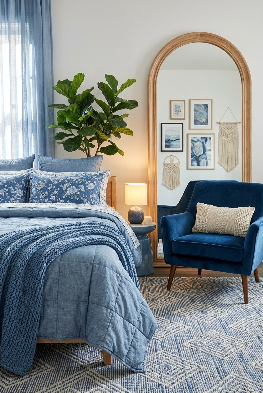
Blue gets treated like the safe choice, the color you pick when you cannot agree on anything else. That reputation is not fair. Depending on the shade and what sits next to it, blue can read as a held breath, a slow morning, or a hotel suite booked for an occasion.
The bedrooms ahead pull from different versions of blue. Some go almost navy, wrapping walls and bedding in one saturated tone until the room reads as a decision rather than a default. Others stay pale, closer to fog than ocean. A few mix blue with wood or rust so nothing matches too neatly.
What matters more than the paint chip is why each room works. Texture, lighting, and how much contrast you can live with all carry weight. Take what fits your space and leave the rest, no rulebook required.
When One Wall Does The Talking

A photo-real wave mural is not a subtle move, and this room does not pretend otherwise. The trick is that everything surrounding it plays quiet. White washed wood, plain linen sheets, a jute rug with a single navy stripe. When one surface is doing that much visual work, the rest of the room needs to step back and let it.
Anchor print pillowcases and a whale-shaped lamp lean into the theme without turning the space into a gift shop, mostly because they stay in muted navy and white rather than bright primary tones. Glass jars of shells on the shelf read as collected rather than staged, which helps sell the whole bit.
If you want to try a mural or a large scale print of your own, pick a wall the bed does not face directly, so you see it when you walk in rather than staring at it all night. Keep the furniture simple and low contrast, and resist adding a second loud pattern anywhere else in the room.
Layer Pattern Without Losing The Plot
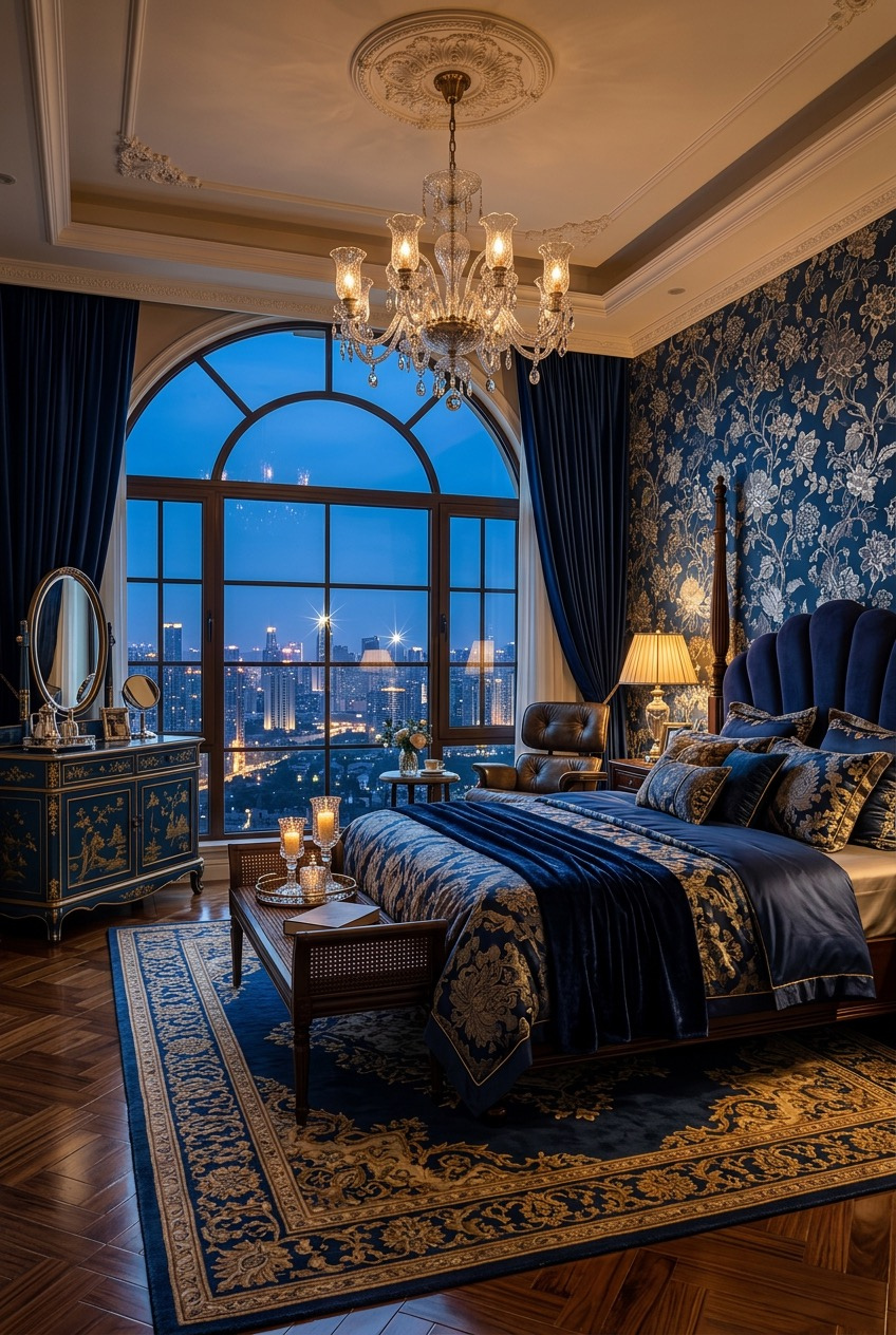
Some rooms use one pattern. This one uses four, maybe five if you count the drapery trim, and it still holds together because every pattern stays inside the same navy and gold family. Floral damask wallpaper, a medallion rug, a tufted velvet headboard, and patterned bedding all sit on the same color story instead of competing for attention.
That restraint on color is doing more work than people give it credit for. Mixing multiple patterns only reads as put together when the palette stays tight enough that your eye is not asked to process five different color decisions at once. The gold hardware, lamp bases, and chandelier crystal give the eye somewhere to land between all that pattern.
At home, cap yourself at two or three patterns and keep the biggest piece of furniture, usually the headboard or a large upholstered chair, in a solid fabric so there is somewhere for the eye to rest. Warm lighting helps too. Cool white bulbs would flatten all that richness fast.
Let Neutral Walls Set Up Blue
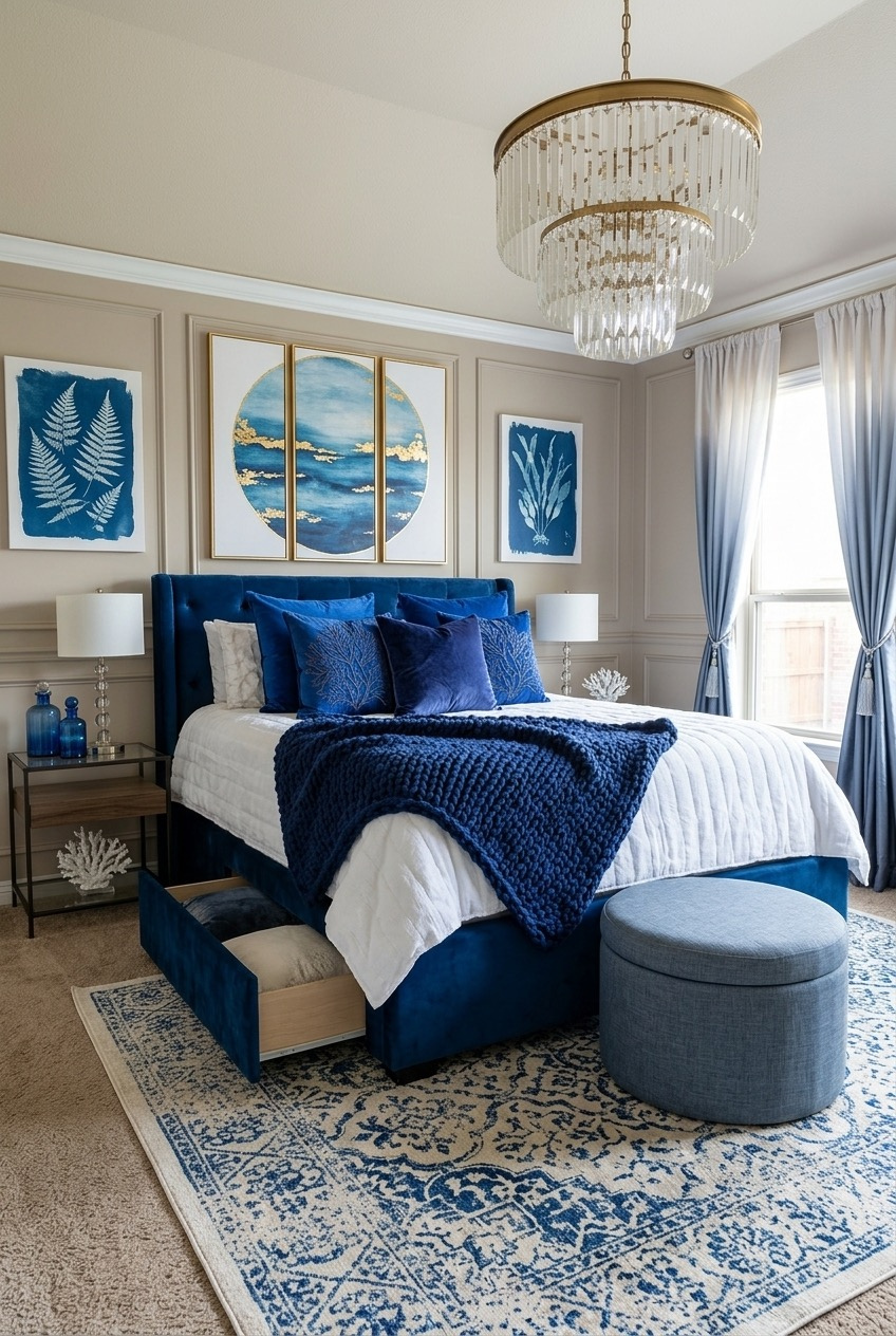
Start with a wall color you would never describe as exciting on its own, then let the furniture do the talking. The taupe walls in this room barely register at first glance, which is exactly the point. They exist to make the navy velvet headboard and the trio of framed art look more saturated than they technically are.
Wall paneling adds a bit of architectural texture without introducing another color, and the layered rug in blue and cream repeats the palette on the floor so it does not feel like an afterthought. A neutral backdrop is often what makes a bold piece of furniture look expensive instead of overwhelming.
If your walls are already a safe beige or greige, you do not necessarily need to repaint. Add one large saturated piece, a velvet headboard, a bench, a big upholstered chair, and let it carry the color. Round it out with a mixed metal light fixture for a bit of sparkle against all that softness.
Navy Walls Need Warmth In Return
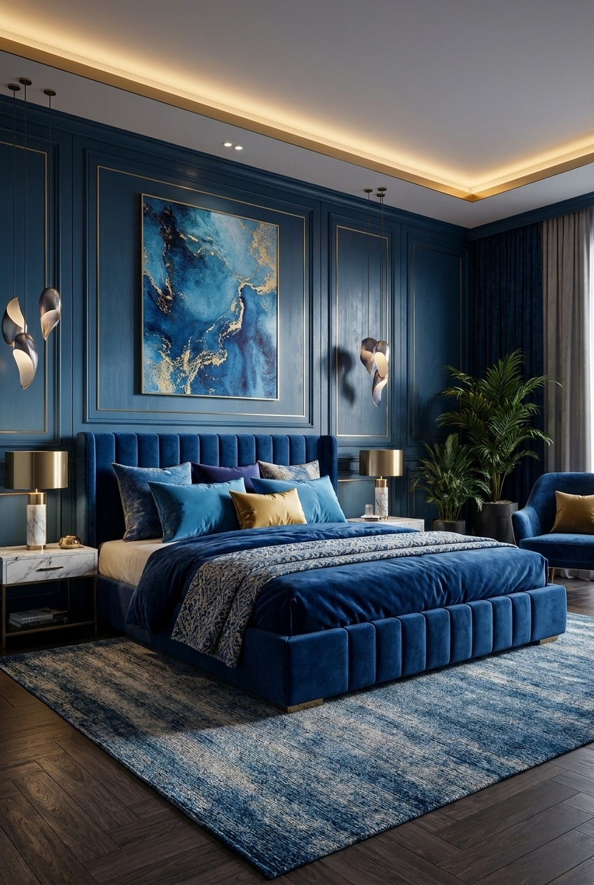
Paint an entire room navy and there is a real risk it starts feeling more like a cave than a retreat. This one avoids that by pairing the saturated color with warm light from every direction: a gold cove light along the ceiling line, brass table lamps, and wall sconces that throw soft pools of glow across the paneling.
The wall paneling itself matters more than it looks like it should. Flat navy paint on a flat wall can feel heavy, but molding breaks the surface into smaller shadowed sections, which keeps the color from reading as one giant block. An abstract painting with gold veining ties the metal accents back into the art.
If you are going fully saturated on the walls, budget for lighting at more than one height rather than relying on a single overhead fixture. Warm bulb temperatures matter here too. Anything close to daylight white will make navy feel cold instead of rich.
Rough Textures Soften A Bold Blue
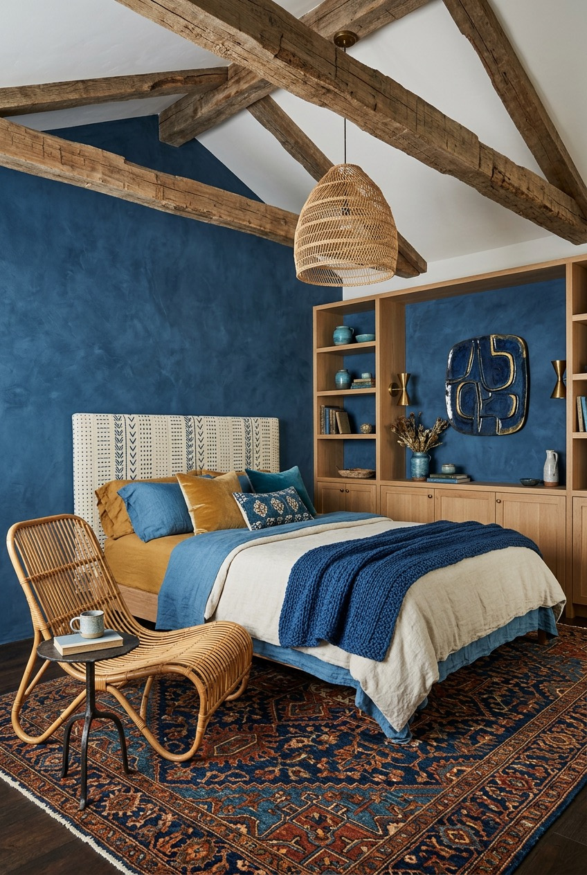
A deep, textured blue wall next to raw wood ceiling beams should not work as well as it does, but the roughness of one material keeps the saturation of the other from feeling too polished. This is a color combination that leans on contrast in finish rather than contrast in hue.
Mustard and cream linens on the bed keep the palette from tipping fully cool, and the rattan chair and woven pendant light bring in a natural, slightly imperfect texture that a smooth painted wall alone would not have. Built in shelving with a blue backed niche repeats the wall color in a smaller, more controlled dose.
A limewash or textured paint finish reads very differently from a flat coat, so if you are drawn to a saturated color like this, look for finishes with visible brushwork or variation. Mix in at least one or two natural materials, rattan, jute, unfinished wood, so the room does not feel purely decorative.
Pale Blue Still Needs A Gallery
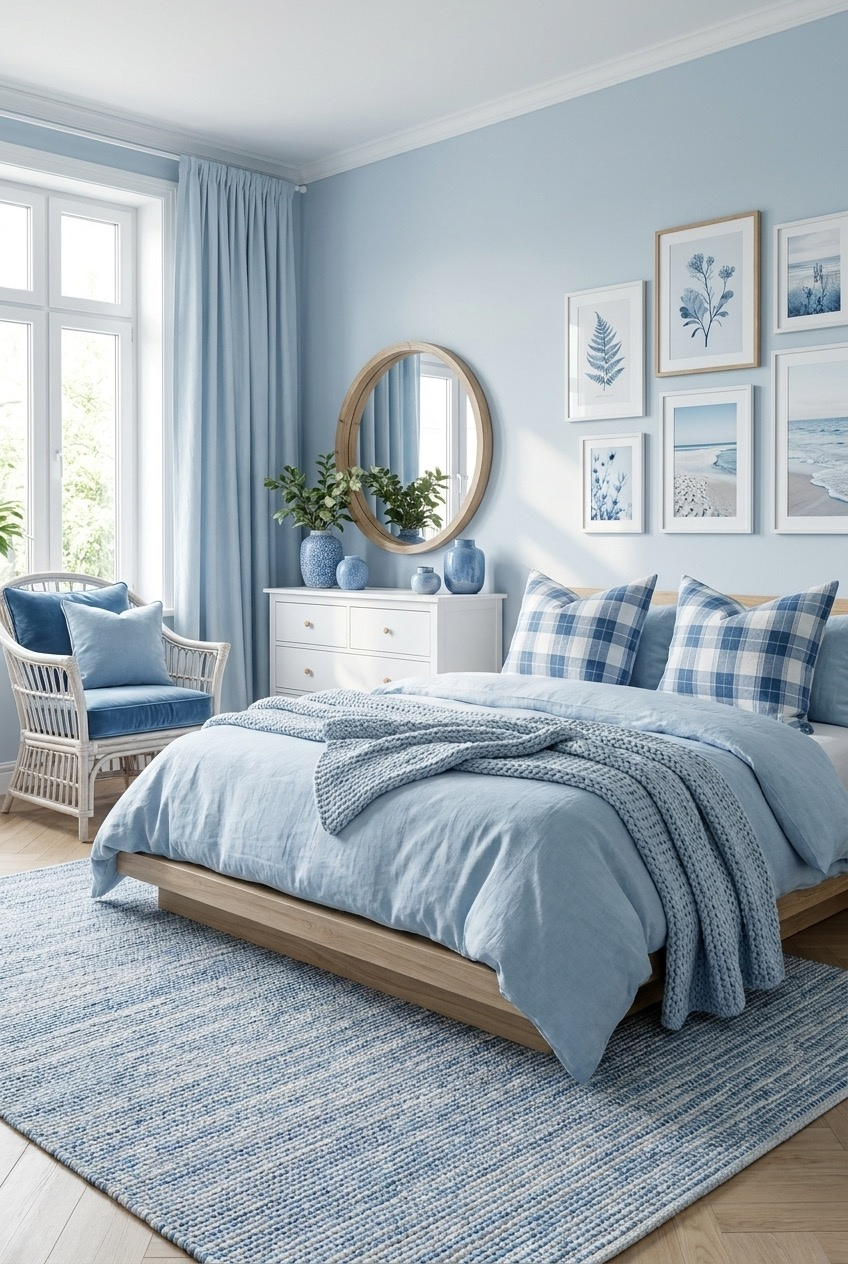
Powder blue can drift into forgettable territory if you let it, mostly because pale colors do not carry a room on their own the way saturated ones can. This bedroom compensates with a gallery wall, six botanical and coastal prints in matching wood frames, arranged in a tight, even grid that gives the pale walls something to organize around.
Layering matters just as much here. A chunky knit throw over linen bedding and plaid pillows in a slightly darker blue add texture without adding a second color family, and a round mirror bounces light back into the room, which pale colors need more than saturated ones do.
Keep gallery wall frames uniform in material and spacing if you want the pastel version of this look, since mismatched frames tend to read as clutter rather than a display. A wicker or rattan accent chair keeps the whole thing from feeling too precious, and a striped rug grounds the softness without adding weight.
Blue As The Loudest Accent Color
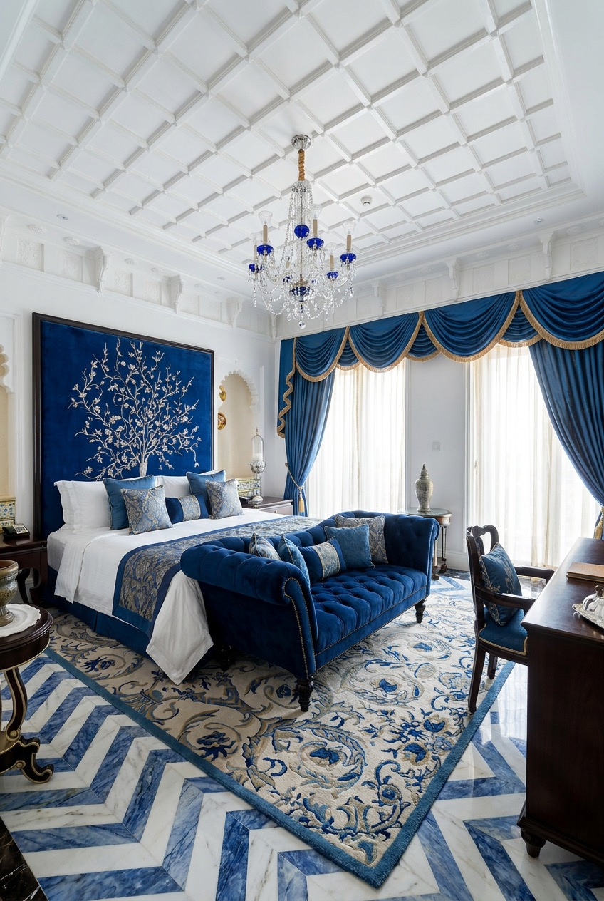
An embroidered tree climbing up a royal blue velvet headboard is not something most of us are installing this weekend, but the underlying logic is worth borrowing. Everything architectural in this room, the ceiling, the walls, the marble floor, stays white or ivory, which frees up the blue pieces to carry all of the visual drama on their own.
Swag drapery in the same blue as the headboard repeats the color at a second scale, and the patterned rug pulls both blue and white together so the chevron marble floor does not feel disconnected from the softer textiles above it. Keeping large architectural surfaces neutral is often what lets a saturated accent color read as luxurious rather than loud.
You do not need marble floors to borrow this idea. Keep walls and ceiling pale, then commit to one or two genuinely saturated pieces, a headboard, drapery, a bench at the foot of the bed. Choose a rug with both colors in it to hold the whole room together.
One Blue Head To Toe
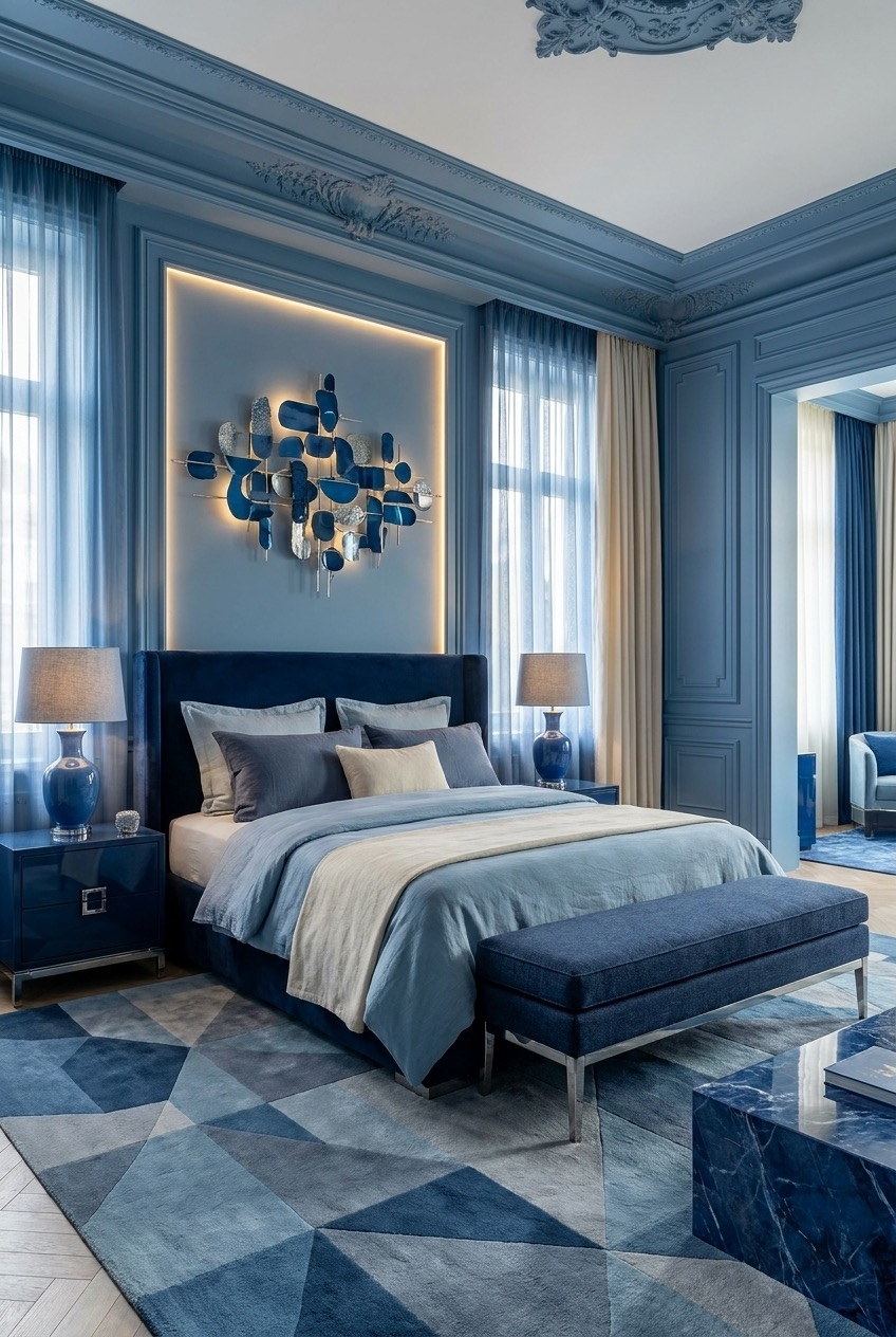
Walls, trim, crown molding, even the recessed art niche here all share the same blue grey, which is a very different move than pairing a colored wall with white trim. The tonal approach removes contrast almost entirely and asks texture, not color, to do the work of keeping the room visually interesting.
That is where the velvet headboard, sheer curtains, and marble side table earn their place. Each material catches light differently even though they are close to the same hue, so the room still reads as layered rather than flat. A geometric rug in varying blue tones adds movement across the floor without introducing an outside color.
To try this at home, pick one blue and use it on walls, trim, and any built in millwork rather than switching to white trim as a default. Lean on fabric and finish, velvet, marble, sheer linen, to create depth instead of reaching for a second or third paint color.
Blue Bedrooms Can Double As Closets
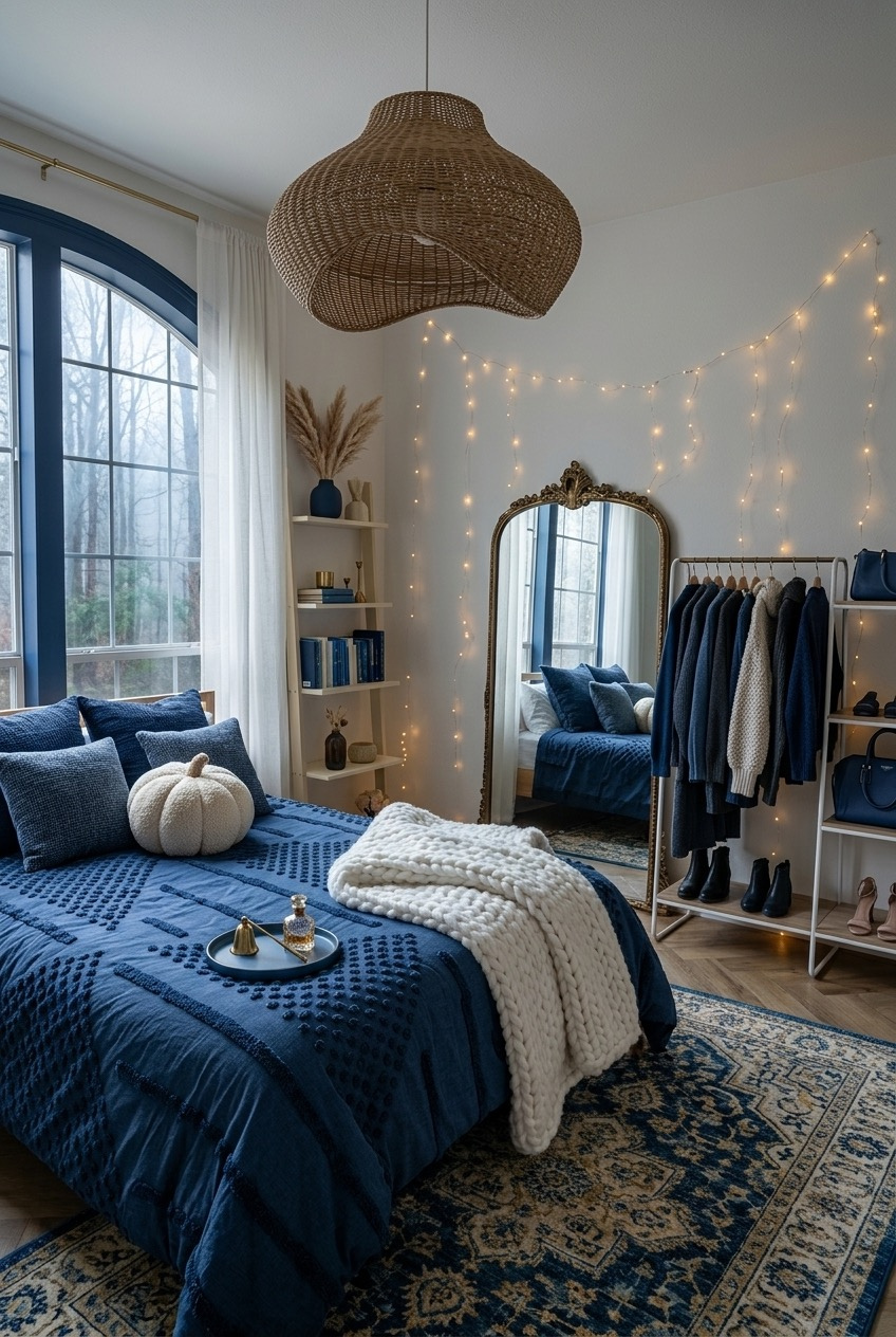
There is something a little funny about a bedroom that also functions as an open wardrobe, but it works here because the hanging clothes, bags, and boots all stay within the same navy and neutral palette as the bedding. Nothing hanging on that rack fights with the room, which is really the entire trick.
String lights draped along the wall do a lot of the ambient work, softening what could otherwise feel like a very utilitarian setup, and the arched window with navy trim adds architectural interest that a plain rectangular window would not. An ornate vintage mirror anchors the far wall and keeps the whole thing from feeling like storage on display.
This only works if your wardrobe is genuinely color coordinated, since an open rack of mismatched clothing reads as mess rather than decor. If your closet leans navy, cream, and denim already, a slim rolling rack and a strand of warm string lights can turn dead corner space into part of the room’s design.
Rust Is Blues Best Friend
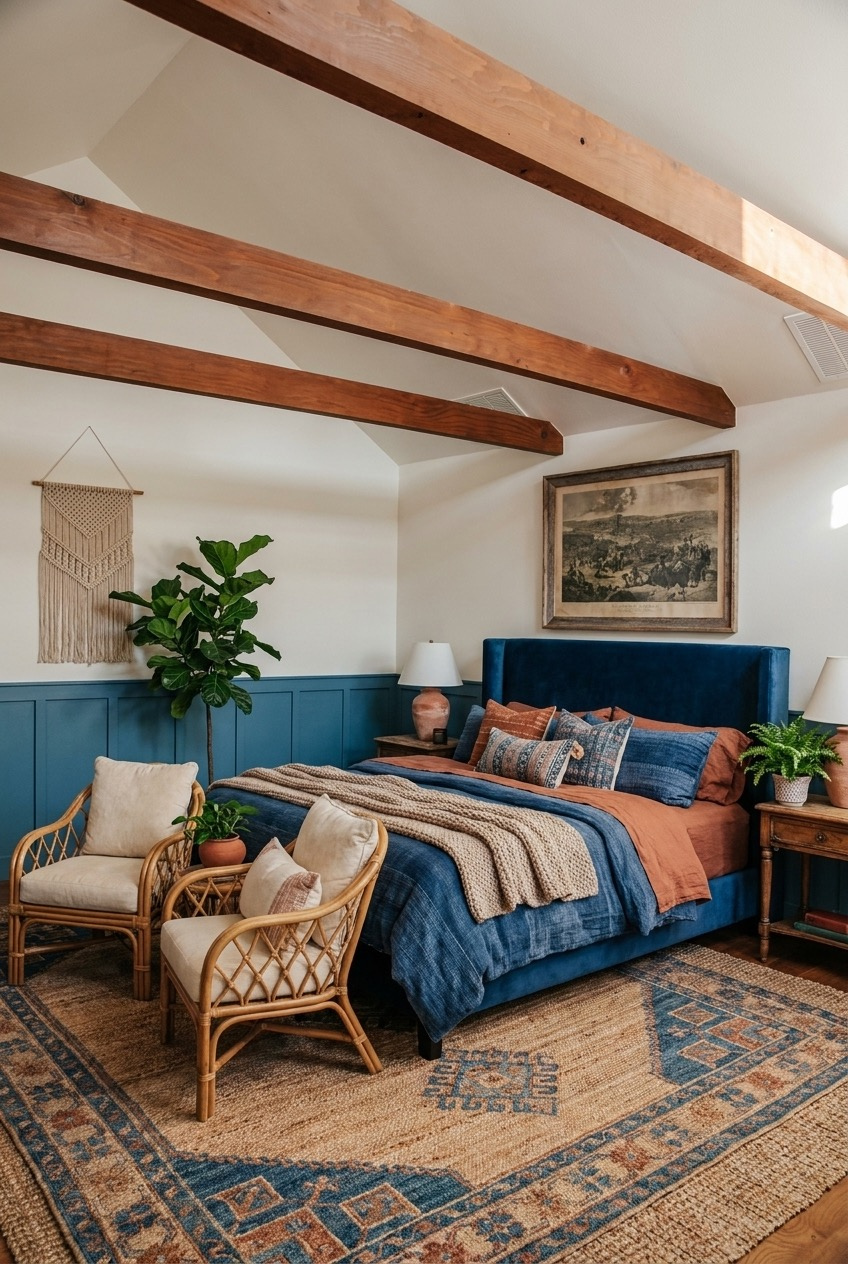
Navy and rust sit almost opposite each other on the color wheel, which is exactly why the pairing works so well on a bed layered with velvet, linen, and a chunky throw. The warm terracotta tones keep the navy from reading as cold, something pure blue and white rooms can struggle with.
Painting only the lower half of the wall in blue, leaving the upper portion and ceiling white, is doing more than it might seem. A two-tone wall treatment like this lowers the visual weight of the color without losing any of its presence, and it pairs naturally with the exposed wood ceiling beams overhead.
Rattan chairs and a jute rug with a blue medallion pattern keep the earthy thread going into the seating area. If you want to try this combination, pick one warm accent, rust, terracotta, or ochre, and use it in your textiles rather than trying to match it exactly to the wall color.
Pick The Blue That Matches Your Pace
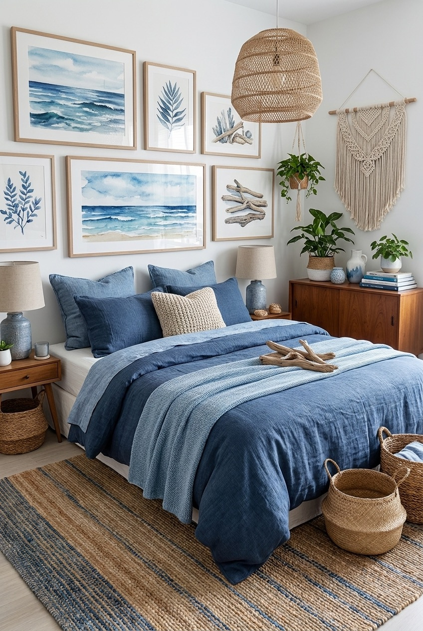
None of these rooms chase the same version of blue, and that is the point. One leans into a full navy wall with gold sconces, another stays pale enough to photograph like an overcast morning. Blue is flexible in a way beige rarely is, which is probably why it keeps showing up across so many styles.
Before committing to a full wall, live with a sample for a few days if you can. Blue shifts with the time of day and bulb temperature, and a swatch that reads calm at noon can go darker by evening. Try an accent wall or a small nook first.
Mix freely between what you have seen here. A pale wall with a saturated headboard, a textured finish with warm brass, rust paired with navy linen. The rooms that hold up over time are built from a few decisions made on purpose, not one trend followed exactly.