
Homeschool Rooms That Skip The Classroom Look Entirely For Something Warmer
Homeschool setups used to mean a folding table shoved into whatever corner had a free outlet. That’s changed. Parents are treating these rooms with the same care they’d give a kitchen, which means better lighting, real storage, and walls that actually hold a kid’s attention.
We pulled together a mix of setups, from wood-paneled attic corners to color-blocked dining nooks, each one built around a different kid’s attention span. Some lean into chalkboard walls and galaxy rugs. Others go quieter, with linen curtains and a single map on the wall.
None of these require gutting a room or hiring a contractor. What makes them work comes down to storage a kid can actually reach, a surface for spreading out papers, and a focal point that makes the space feel like theirs instead of a leftover corner.
Floating Shelves Turn Walls Into Lessons
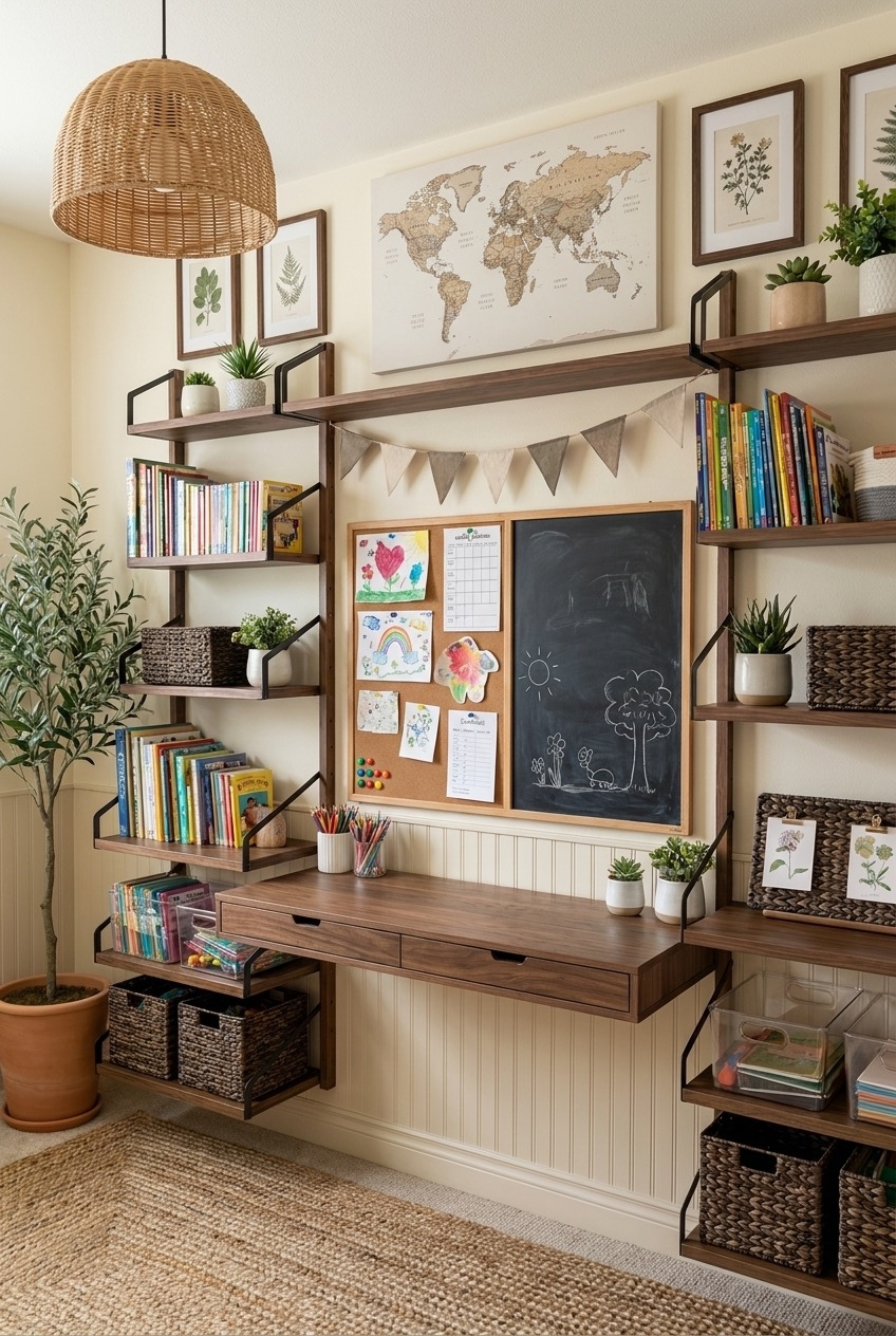
Notice how little of this setup sits on the floor. The shelving climbs the wall in staggered rows, which means the desk below stays clear for actual work instead of becoming a dumping ground for books and bins. Even the pendant light overhead is doing double duty, throwing warm light across the desk without eating into the surface with a lamp base.
The trick here is mixing open shelving with a few closed baskets. Books and a rotating map or art print go on display, while pencils, glue, and the stuff that looks messy in bulk get tucked into woven bins with lids. A cork-and-chalkboard duo mounted at kid height gives them a spot for schedules and their own drawings without anyone reaching for tape.
If you’re working with a narrow wall, skip a single bulky bookcase and build up instead. Ladder shelving units are easy to find secondhand, and staggering the depth keeps the wall from feeling like a solid block of wood. A potted olive tree or a fern in the corner softens all the hard edges of wood and metal without adding another thing to dust.
Mismatched Chairs Bring Personality To Learning
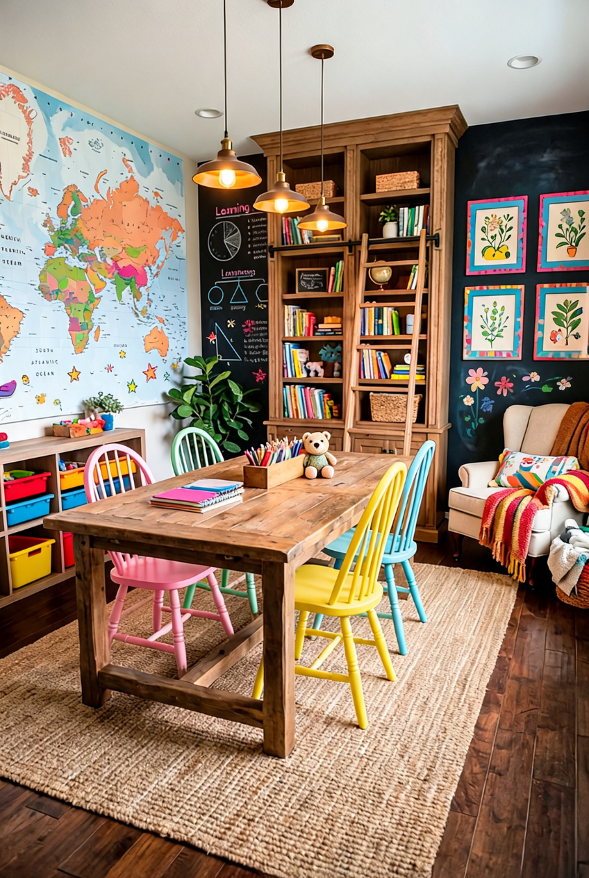
Matching furniture sets are easy, but a run of pink, mint, yellow, and blue chairs around the same worn wood table does something a matching set never could. It reads like the room grew over time instead of arriving in one delivery box, which is a hard feeling to fake with anything new.
This is a color theory trick more than a decorating one. Keep the wood tones consistent across the table and bookshelf so the room has an anchor, then let the chairs go wherever your paint samples take you. A big chalkboard wall for daily lessons gives the space room to change with whatever unit you’re teaching that week, no new decor required.
Secondhand chairs are the easiest way in. Pick up a handful of mismatched wooden chairs at a thrift store or estate sale, sand them lightly, and paint each one a different color from the same saturation family so nothing clashes. A tall wooden hutch behind the table keeps books contained so the color doesn’t spill into total chaos.
A Chalkboard Galaxy Sets The Schedule
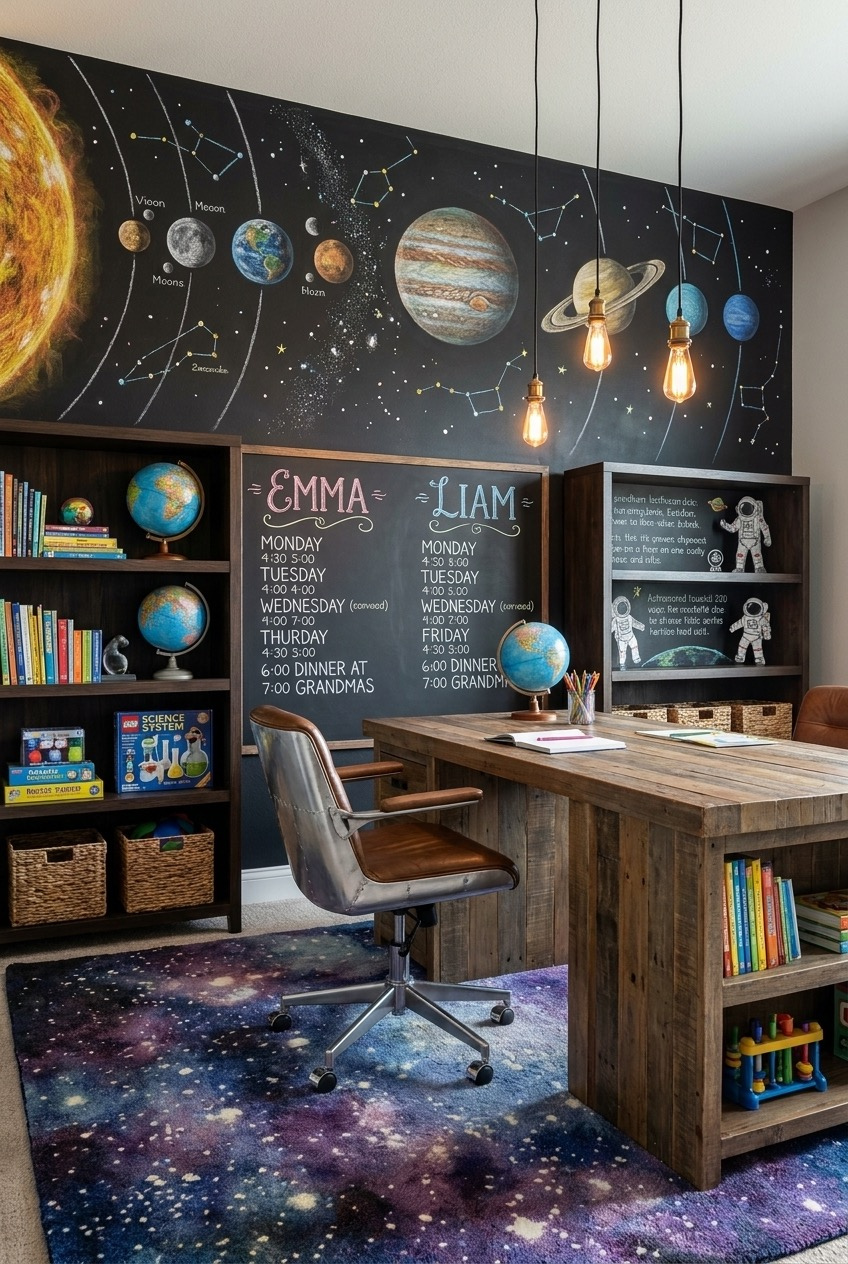
Paint one wall with chalkboard paint and you’ve got a mural that changes with the unit, a solar system this month, a map of constellations the next. It’s a low-cost way to make a lesson feel bigger than a worksheet, and redrawing it becomes part of the lesson itself.
Below the mural, a simple two-column chalkboard tracks each kid’s schedule by name, which cuts down on the who’s-doing-what questions that eat into actual teaching time. A galaxy-print rug and a couple of hanging bulbs pull the theme down to floor level without turning the whole room into a costume party. The reclaimed wood desk keeps things grounded when the walls are doing a lot.
Start small if a full mural feels intimidating. Chalkboard contact paper covers a section of wall without commitment, and pendant bulbs on a plug-in cord give you the warm glow without an electrician. Even a secondhand office chair works fine once you swap in a soft cushion for smaller bodies.
Primary Colors Make Learning Feel Fun
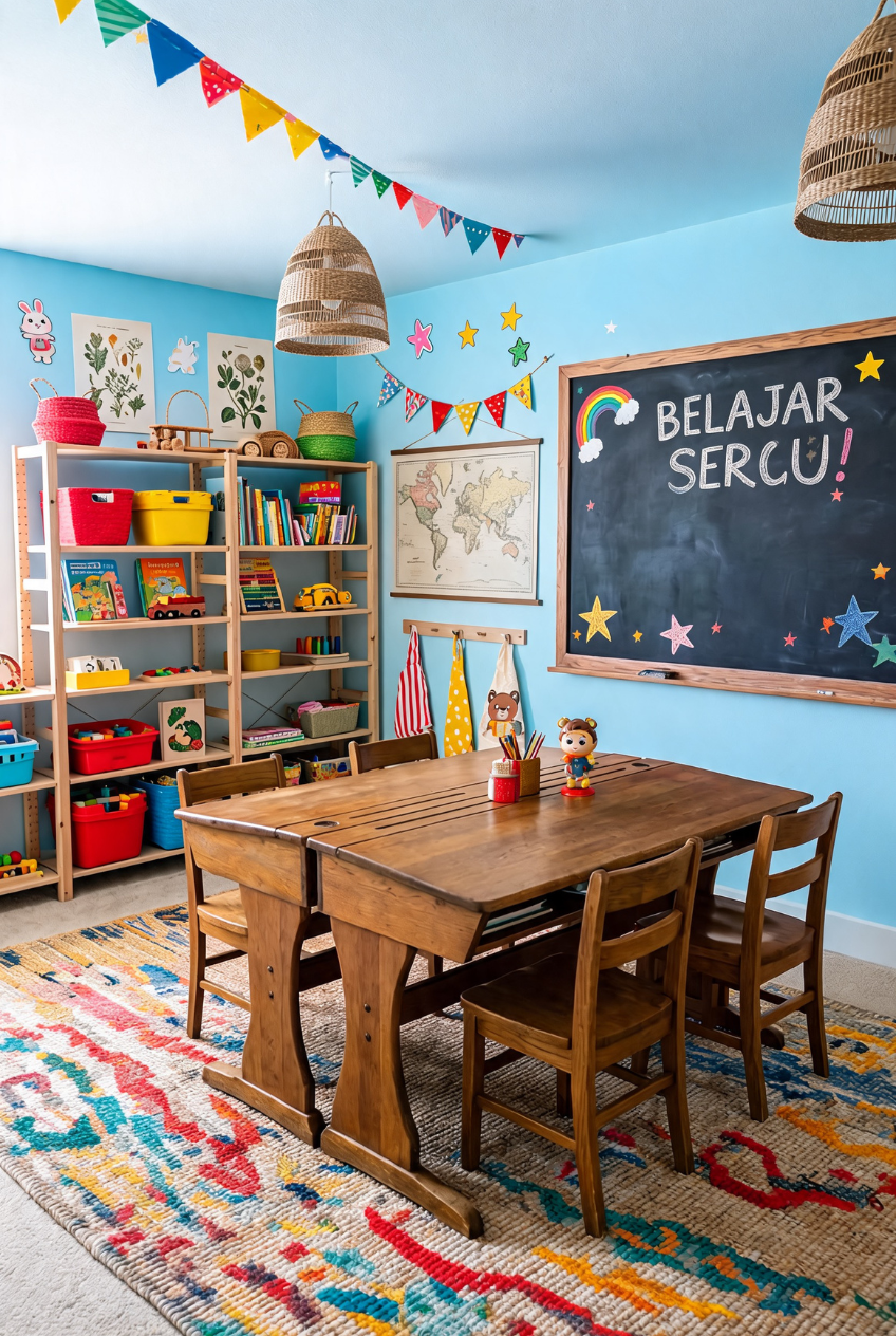
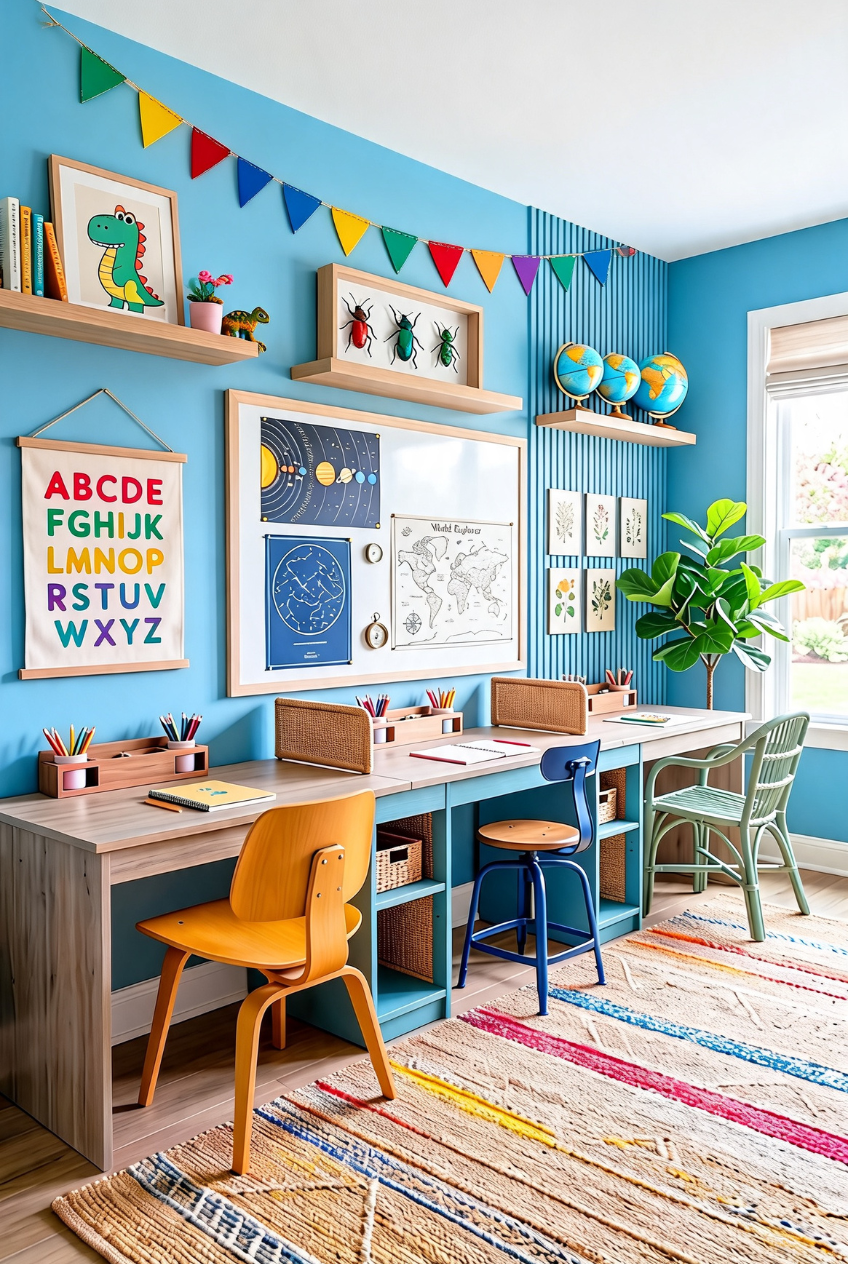
Blue walls, red baskets, yellow shelving, and a rainbow of paper bunting overhead, this room doesn’t hold back on color and it works because everything sits on the same primary palette instead of drifting into a dozen random shades that fight each other for attention.
A cheerful hand-lettered chalkboard sign anchors one wall, the kind of thing that gives a room a sense of humor without needing actual decor budget. Open bins in matching colors keep art supplies sorted by type, so cleanup is closer to a game than a chore, and a wooden table low enough for small chairs keeps everything at kid scale.
If your kid’s room already leans colorful, don’t fight it with neutral furniture. Pick two or three primary shades, stick to them across bins, chairs, and wall art, and let the bunting and chalkboard do the rest of the personality work. It costs less than repainting and undoes just as easily.
A Room That Multitasks Without Trying
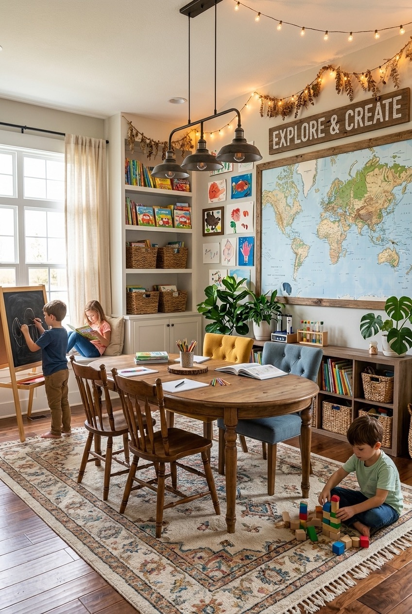
Not every family has a spare room to dedicate to school. This one solves that by folding learning into a living space that still works as a living space, oval table, tufted chairs, a map on the wall instead of a whiteboard, string lights instead of fluorescent tubes.
A wood sign reading Explore and Create sets the tone without turning the room into a classroom. Baskets tucked into the built-in cabinetry hide worksheets and art supplies when the table needs to become a dinner table again, which is really the whole point of a dual-purpose room. A tabletop easel on wheels can roll off to the side once handwriting practice is done for the day.
Lean on furniture that already does double duty. A big farmhouse table, a bench with hidden storage, and a rug that hides crayon marks will get you further than anything marketed specifically as school furniture, and none of it looks out of place when guests come over.
Color Coding Keeps Supplies Actually Organized
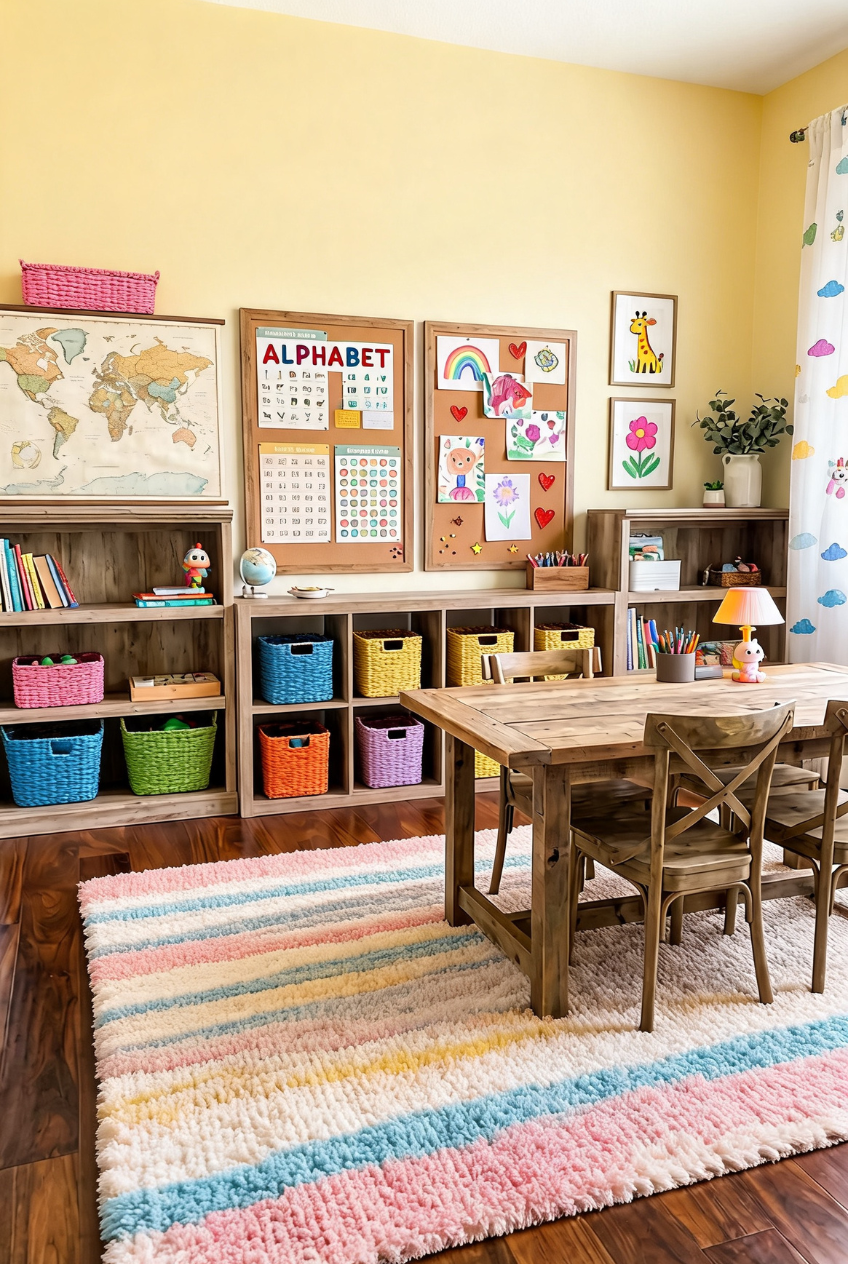
Every basket in this room is a different color, and that’s not just for looks. Pink for one kid’s supplies, blue for another’s, yellow for shared art materials, it turns cleanup into a matching game instead of a negotiation over whose job it actually was.
Soft yellow walls keep the room from feeling like a daycare even with all the color happening at floor level. The alphabet chart and corkboard sit at a height a kid can actually reach and rearrange, which matters more than most wall decor choices. Color-coded cubby storage does most of the organizing heavy lifting here, and the pastel striped rug hides a lot of daily wear.
Assign a color per kid or per subject before you buy a single basket, then shop for storage that fits that system rather than picking bins first and sorting out logic later. The cubbies themselves can be as plain as unfinished wood since the baskets are carrying the visual load.
An Attic Corner Built For Focus
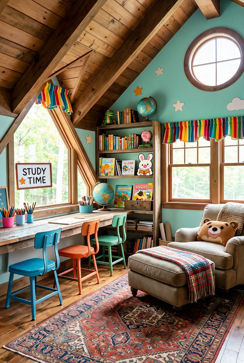
Slanted ceilings usually get written off as wasted space, but this loft desk tucks right under the angle and uses the low wall as a natural boundary for the work area. The round window above adds light without competing for wall space, and a small STUDY TIME sign hung nearby marks the spot without needing a door to close.
Three small stools in different colors line the built-in desk, easy to pull out for a group lesson and easy to tuck back for one kid working alone. A worn rug and an oversized chair in the corner give the room a second gear for reading once the worksheets are done, plaid throw included for the colder months.
Attics and lofts work well for a reading corner because the ceiling height naturally drops toward the walls, which makes a low chair and ottoman feel planned rather than squeezed in. Paint the slanted ceiling to match the walls so the angles disappear instead of standing out, and let the exposed wood beams stay bare for contrast.
A Dining Table Doubles As Homeroom
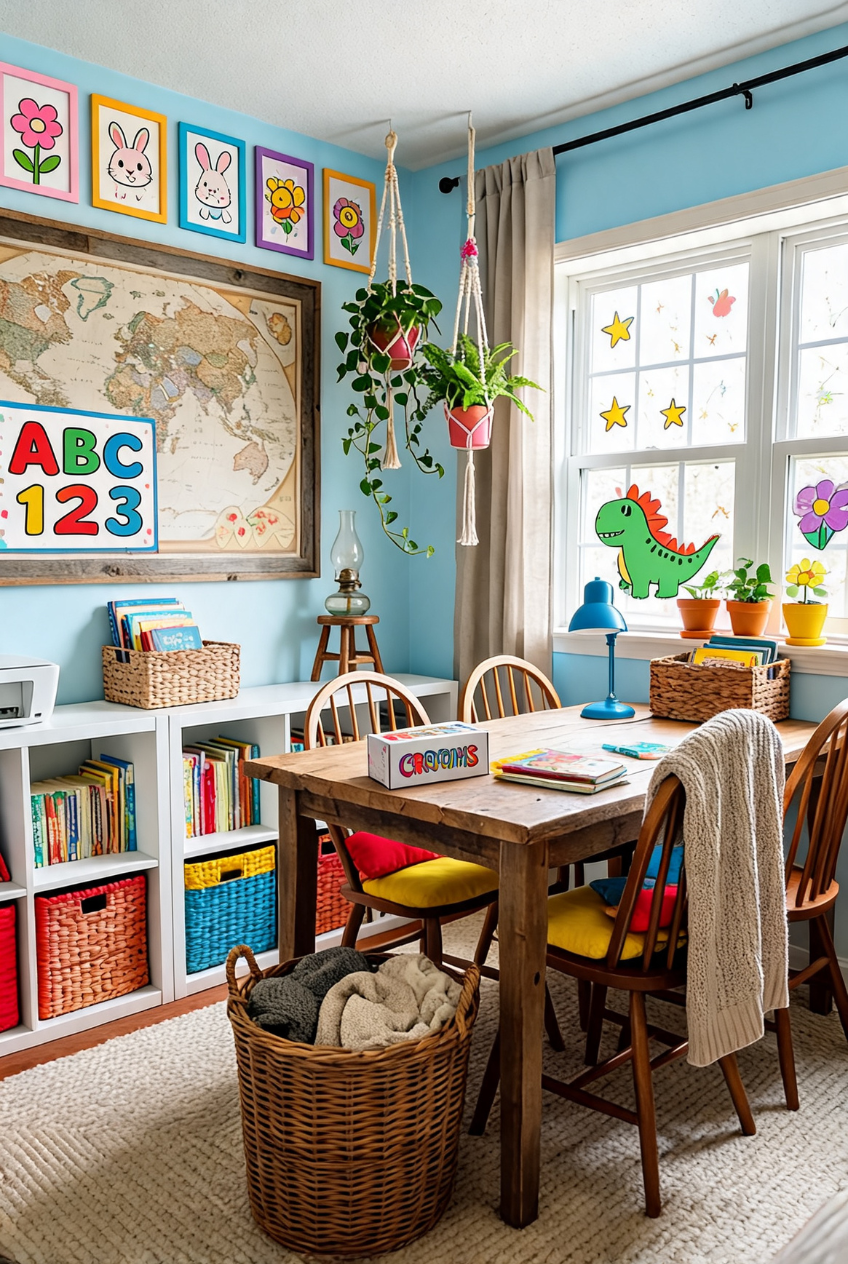
A big painted ABC and 123 sign hung above the storage cubbies is doing a lot of work in this room, it tells a kid exactly what this space is for the second they walk in, no explanation needed, no separate classroom required.
The farmhouse table and mismatched wooden chairs came straight from a dining set, proof that you don’t need furniture labeled for school to make school happen here. Macrame plant hangers and a vintage map soften what could otherwise feel like a strict setup, and a basket of crayons on display turns supplies into decor instead of clutter shoved into a drawer.
If you’re repurposing a dining room, keep the table itself as the anchor and build storage around the edges instead of on top of it. Window decals and rotating art keep the room feeling fresh without any real renovation, and everything peels off clean when the school year ends.
Floor Seating Makes Room For Movement
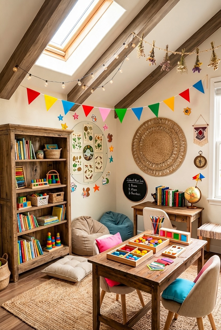
Young kids don’t sit still in chairs for long, and this room seems to know it. Bean bags and floor cushions replace half the seating, giving a kid somewhere to sprawl out with a book between actual desk time, no chair required at all.
A skylight does most of the lighting work here, which matters in an attic where windows are often small or angled oddly. Wooden sorting trays with colorful blocks sit low on the table, built for hands that are still learning fine motor control rather than worksheets alone. That’s the whole idea behind floor-level activity stations, they meet a kid where their body actually wants to be, string lights and dried florals overhead just for the mood.
A secondhand kids’ table paired with two floor cushions and one low bookshelf covers most of what this room is doing, and none of it requires a skylight to pull off, though the extra daylight certainly doesn’t hurt on a gray morning.
Low Tables Change How Kids Sit
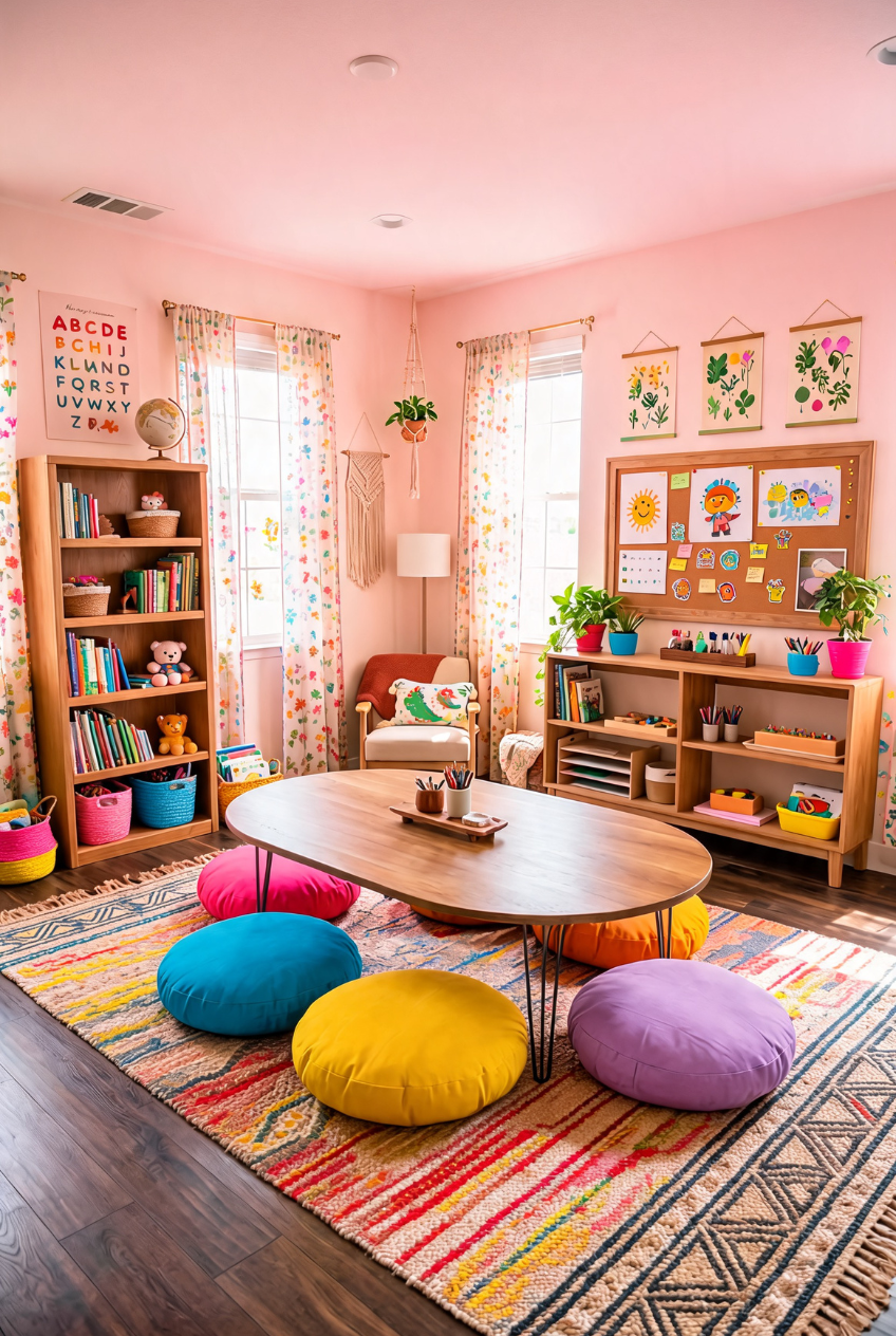
Swap a standard desk and chair for a low oval table ringed with round floor poufs and the whole room shifts in feel, less office, more living room floor picnic, which is closer to how a young kid actually wants to work anyway most days of the week.
The poufs in pink, blue, yellow, purple, and orange do the same job chairs would, minus the scraping-across-the-floor noise, and they’re light enough for a kid to drag into a reading circle on their own. Behind them, a low shelf stocked with trays and bins keeps materials within arm’s reach without towering over the seating, so nothing needs to be handed down from above.
This setup works best in a room already carpeted or rugged, since floor seating asks a lot of whatever’s underneath it. A thick woven rug under the whole arrangement makes the low table feel grounded instead of like furniture that’s missing its legs, and it forgives a dropped crayon far better than bare wood.
Building A Space Kids Actually Want To Learn In
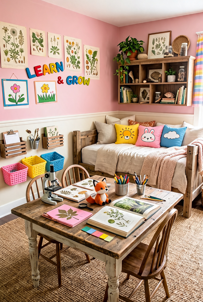
What ties every one of these rooms together isn’t a specific color or furniture brand, it’s that someone thought about how a kid actually moves through a day of learning. Storage sits low. Surfaces are big enough for a project to sprawl across. There’s somewhere to sit that isn’t a hard chair.
You don’t need to copy any of these exactly. Pull the chalkboard idea from one, the floor seating from another, and leave out whatever doesn’t fit your kid or your square footage. A rented apartment can borrow the removable decal version of a wall map just as easily as a house can commit to a full chalkboard mural.
Start with whatever’s already bothering you, the desk that never gets used, the supplies that end up on the floor, and build outward from there. A room built around one kid’s actual habits will always beat one copied wholesale from a photo.