The Fall Porch Decor Breakdown That Goes Way Deeper Than Pinterest Boards
Fall is that one season where decorating outside feels just as satisfying as decorating inside — maybe more so. There’s something about that first crisp morning when you look at your front porch and think, yeah, this needs to change. Not because it’s bad, just because the season is calling and your porch should answer.
The good news is that fall porch decor has genuinely evolved past the sad single pumpkin by the door era. There are so many directions you can take it now — maximalist harvest chaos, moody and minimal, playful and colorful, cottage-core romantic — and each approach has its own logic worth understanding before you start shopping.
We put together a deep dive into some of the most inspiring fall porch setups out there, breaking down what actually makes each one work — the design principles, the layering techniques, the small choices that separate a porch that looks intentional from one that just looks like a trip to the craft store exploded.
When More Is Actually More Outside
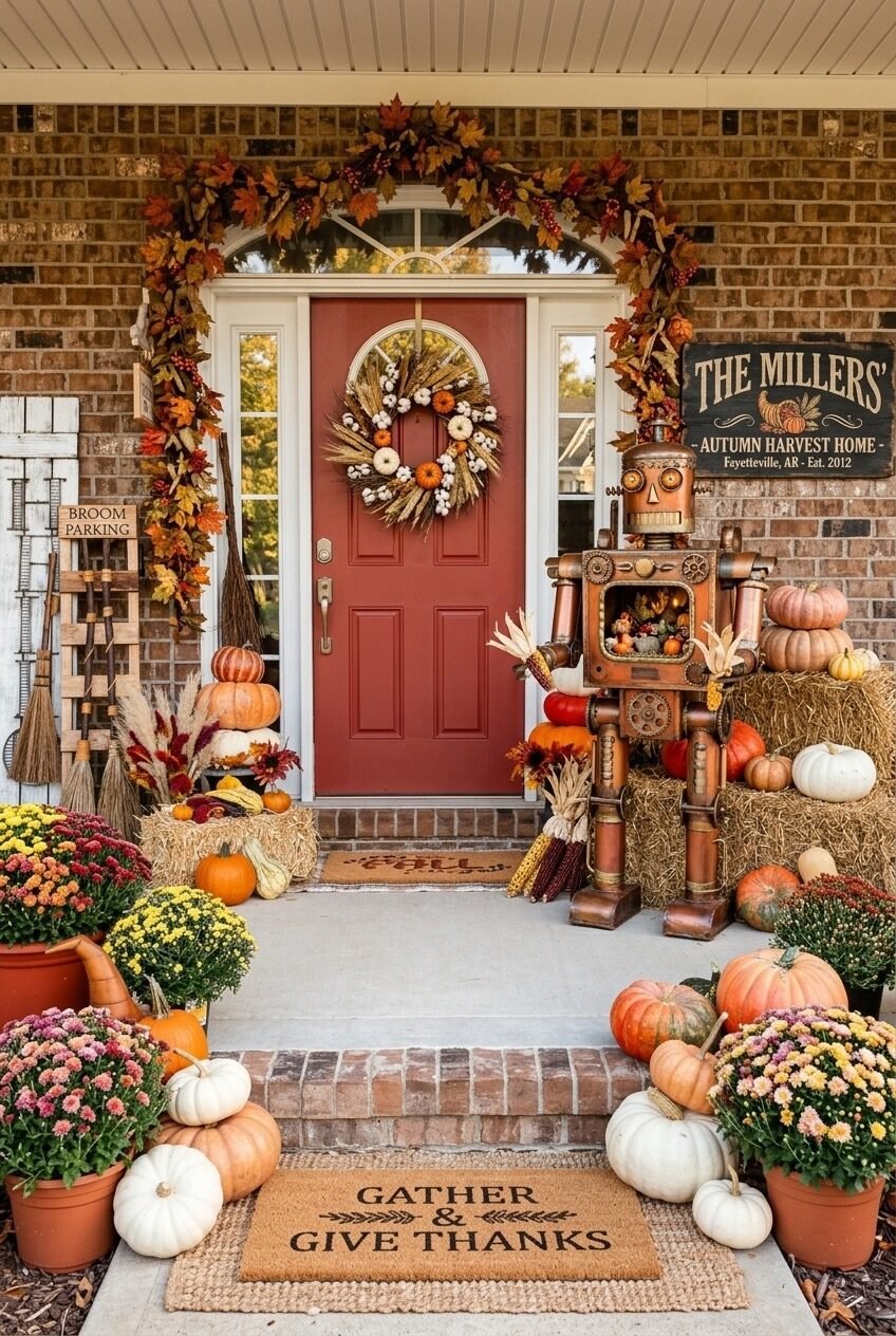
The maximalist harvest porch is a study in controlled abundance — and this setup nails the formula. The red door anchors the whole composition with a single bold chromatic statement, letting everything else orbit around it. Brick red and orange are analogous colors, meaning they sit close together on the color wheel, which is exactly why the mums, pumpkins, and foliage all feel cohesive rather than chaotic despite the sheer volume of stuff happening here.
What keeps it from tipping into overwhelming is the use of varying heights and textures. Hay bales create a mid-level platform, pumpkins stack vertically on one side, and mums cascade at ground level. The garland arching over the door frames the entire entry like a stage — your eye naturally moves from the ground display up along the arch and back down the other side. It’s a circular visual journey, and that’s not an accident.
The unexpected star here is the custom family signage. Personalized elements like a vintage-style harvest sign with your family name and founding year give a maximalist display an identity rather than making it look like a generic fall catalog page. If you want to recreate this scale, start with the door color — a saturated red or burnt orange door is the scaffolding everything else hangs from.
A Scarecrow Setup Worth Actually Keeping
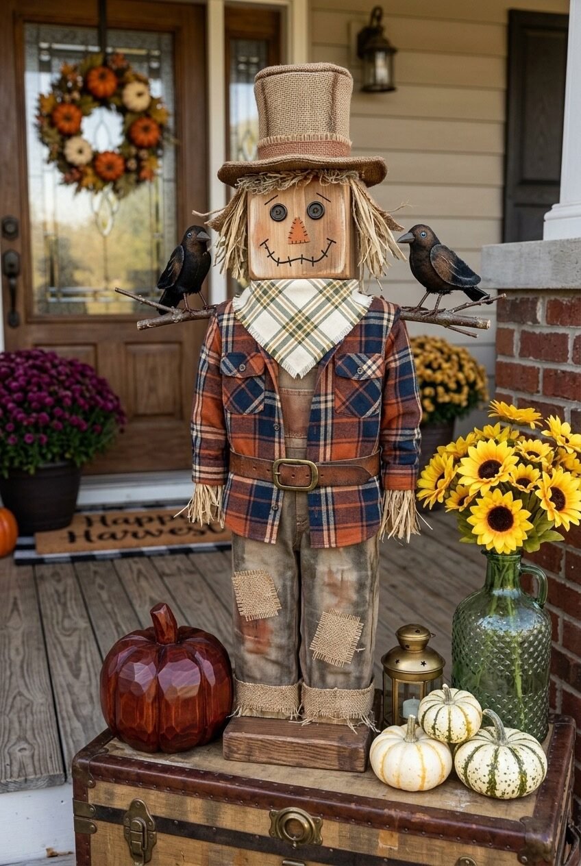
Forget the floppy fabric scarecrows that look like they gave up. This one is a fully realized character — a wooden figure dressed in an actual plaid flannel shirt, leather belt, and burlap-cuffed pants, with two black crow props perched on branch arms. The craftsmanship here matters because it shifts the piece from Halloween prop to fall sculpture, which is a completely different design category.
The key principle at work is narrative layering — every element tells a small piece of a larger story. The vintage trunk it stands on, the mini pumpkins grouped beside it, the dark red decorative pumpkin, the sunflowers in a green glass jug, the brass lantern. Nothing is just filling space; each object has a role. Behind it, you can catch a glimpse of the porch wreath and mums — the scarecrow is designed to be a foreground focal point with the porch itself acting as a soft-focus backdrop.
For a DIY version that hits this quality level, the trick is investing in one well-made centerpiece figure rather than a bunch of medium-quality decorations spread around. Source or build a wooden scarecrow form, then dress it with real fabric — thrifted flannel shirts work perfectly. Style the surrounding vignette tightly on a raised surface (an old trunk, a wooden crate, a bench) to give it the feel of a composed still life rather than porch clutter.
Quirky Characters Beat Generic Decor Every Time

A tiered wooden display shelf on the porch, filled with colorful illustrated Halloween character cut-outs wearing snapback hats and beanies — this is fall decor that has a point of view, and honestly, it’s refreshing. The design principle here is collector’s-shelf thinking applied to outdoor decorating: use a structured display unit to give visual order to a collection of eclectic pieces.
The palette is the real departure from typical fall. Instead of rust, mustard, and orange, this porch leans into jewel-toned brights — teal, yellow, red, purple — against white brick. The heirloom pumpkins and pine cones at the base ground it just enough so it doesn’t float off into pure whimsy. Notice the candle sticks flanking the shelf — that’s a deliberate formal gesture that gives the whole display a symmetrical anchor.
If you’re someone who finds traditional fall decor a little boring, this is permission to do something different. The shelf display approach is also extremely practical — a three-tiered plant stand or baker’s rack works perfectly, and the character cut-outs can be sourced from Etsy or made with a Cricut. The navy door and white brick backdrop are doing a lot of heavy lifting here too, so if your exterior is neutral and clean, bold character decor will read even stronger against it.
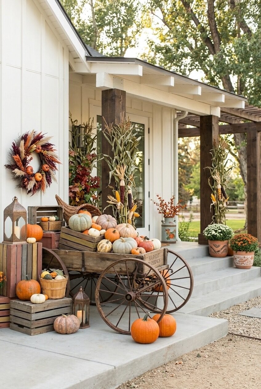
Brick Architecture Earns Its Fall Moment Here
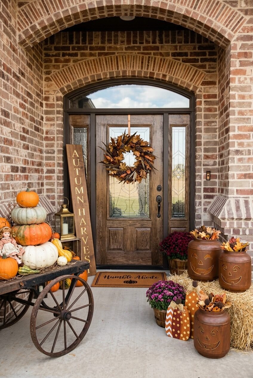
The arched brick entryway in this photo is doing so much structural work that the decor barely needs to try — and yet it does, wisely. The deep-toned wooden door with arched transom glass and decorative sidelights is a natural focal point. A textural fall wreath built from dried oak leaves, pheasant feathers, pine cones, and small gourds hangs right in the sweet spot where the glass begins, hitting the eye immediately.
The left side features what might be the most underrated fall prop available: the wooden porch welcome sign. Tall, leaning, vertical typography is a great way to add height to a porch display without building upward physically. Pair it with a stacked pumpkin tower beside it and a brass lantern, and you’ve got a full left-side composition in three objects. On the right, the jack-o’-lantern carved jugs stacked on hay bales introduce playful warmth without veering into cheap Halloween territory — the material (ceramic or clay) keeps them elevated.
The cart full of heirloom pumpkins pulls the whole arrangement together as a harvest centerpiece. The variety of pumpkin colors — dusty teal, sage, cream, orange — demonstrates something worth knowing: color range within a single decor element reads as more sophisticated than matching everything exactly. When you’re sourcing pumpkins, buy across the color spectrum, not just orange.
The Screened Porch That Feels Like a Hug
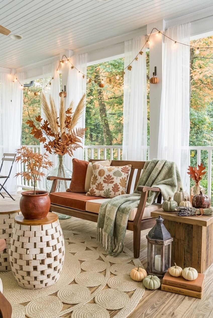
This is the fall porch that prioritizes living in the space over just looking at it — and the distinction matters. The wooden bench with burnt orange cushioning, the sage green throw, the leaf-printed pillow, the stacked autumn books on the side table beside a candle lantern — all of these are objects that invite you to sit down and stay a while. Spaces like this feel less decorated and more inhabited, which is a specific and underrated quality.
The botanical arrangement is the design highlight. Pampas grass, dried ferns, dried Japanese maple branches, and fall-toned foliage are combined in a large glass vessel — this is called a dried botanical arrangement, and it requires zero maintenance while lasting the entire season. The terracotta pot with a smaller branch arrangement on the wicker stool beside it creates a deliberate height variation that gives the corner depth.
The bistro lights strung across the ceiling with tiny pumpkin ornaments threaded between the bulbs is the kind of detail that photographs beautifully but also genuinely transforms the mood of a space at dusk. The circular woven rug brings the whole floor composition together — it’s large enough to define the seating zone clearly. If you have a covered porch and want a fall refresh, start with the textiles and lighting, then add botanicals. Everything else will follow naturally.
Hanging Pumpkins Change the Whole Game
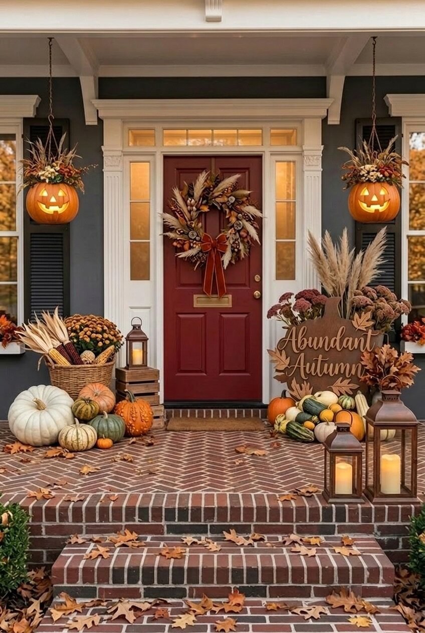
Most people decorate at ground level. This porch said no. Two carved and glowing jack-o’-lanterns hang from the porch ceiling on either side of the entry like outdoor chandeliers, and it immediately reframes how the entire front of the house reads. Vertical plane decor — things that occupy the middle height of a space rather than just the floor or the door — is one of the most underleveraged moves in exterior decorating.
The color story is tight and intentional: crimson door, gray exterior, warm Edison-lit interior windows, and deep red mums with dried pampas and sedum on both sides. The dried grass wreath on the door with a velvet ribbon is perfectly calibrated — it’s rich without being flashy. The ‘Abundant Autumn’ wooden sign tucked into the right-side arrangement adds a readable focal point that doesn’t compete with the door.
The brick steps scattered with fallen leaves — whether placed or genuinely fallen — contribute to the layered horizontal ground plane that pulls everything downward and roots the composition. If you want to recreate the hanging jack-o’-lanterns, look for large foam pumpkins rated for outdoor use, carve them, and use battery-operated fairy lights inside. Hang them on heavy-duty ceiling hooks with twine or jute rope to keep the material palette consistent.
Old Stuff Collected Just Right
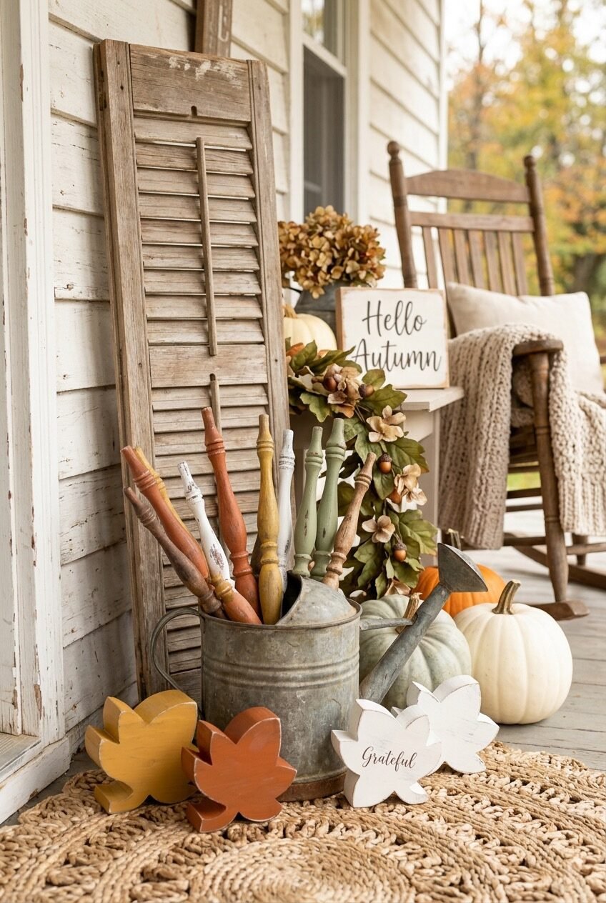
There’s a design principle called the ‘found object’ approach, and this farmhouse porch is a masterclass in it. An old wooden shutter leans against the house. A galvanized metal bucket holds a collection of painted wooden spindles in fall tones. Chunky carved wooden leaf shapes in mustard, rust, and white sit on a natural fiber rug. A garland of dried hydrangeas and acorns drapes loosely on the left. The ‘Hello Autumn’ framed sign is vintage-style on a rocking chair cushion.
Nothing here is trying hard. That’s the entire point — the aesthetic is built on restraint and texture rather than volume and color. The pumpkins are cool-toned (dusty blue-green and cream), which keeps the palette from going warm-overload. The chippy white shutter and galvanized bucket add an industrial-farmhouse edge that keeps it from feeling too precious or craft-fair-ish.
The practical takeaway here is to look at what you already own before buying anything new. Old architectural salvage — shutters, balusters, spindles — reads as incredibly expensive when styled right on a porch, and most of it costs next to nothing at estate sales. Pull objects in fall’s earth-tone family, mix your pumpkin tones to lean cool and cream rather than all-orange, and let things lean rather than stand perfectly upright. Imperfection is the whole vibe.
Pumpkin Urns Are Having Their Moment
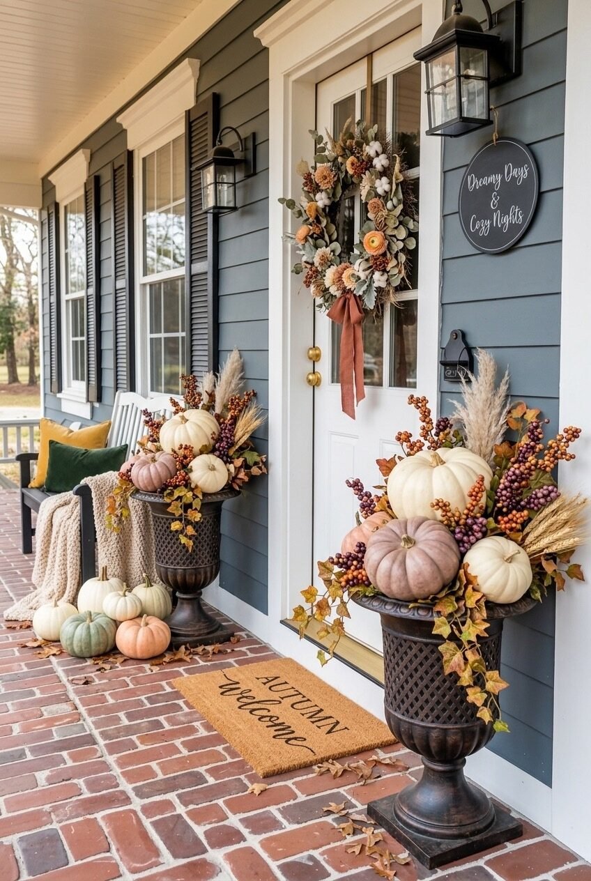
Tall cast iron urns filled with layered fall arrangements flanking a front door — this is formal garden design logic applied to seasonal decorating, and it’s worth understanding why it works so well. Urns create verticality and symmetry simultaneously, two things that make any entry feel more considered and architecturally complete. The arrangements inside them here are built like floral designs: pumpkins as the ‘blooms,’ dried grasses and pampas as the filler, berry branches and fall foliage as the cascading trailing elements.
The color palette is soft and sophisticated — blush-toned pumpkins, cream, dusty purple, burgundy berries, wheat, and sage eucalyptus. Against the cool navy-gray lap siding and white trim, it reads as genuinely elegant. The door wreath picks up the same tones: dried dahlias, cotton bolls, dusty orange ranunculus, and a terracotta ribbon. The ‘Dreamy Days & Cozy Nights’ round sign adds a personal note without overpowering the composition.
If you want this look, the urns are the investment piece — cast iron or heavy resin garden urns in black or antique bronze are the most versatile. Fill the bottom with floral foam or crumpled newspaper, then build your arrangement starting with the pumpkins and working outward with dried and faux botanical elements. The smaller scattered pumpkins at the base of each urn extend the display down to ground level and tie the vertical arrangement into the horizontal plane.
Farmhouse Porch Swing Done Properly
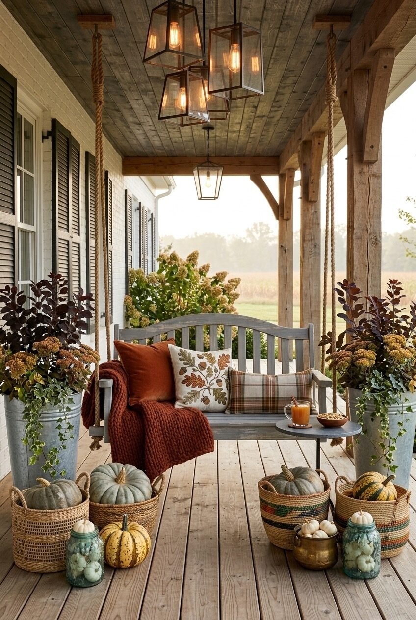
Edison bulb lantern pendants hanging from a raw timber ceiling, a weathered gray porch swing flanked by galvanized metal buckets planted with trailing ivy, hydrangea, and dark-leafed shrubs, woven baskets of heirloom pumpkins scattered across the deck floor, a small side table with a mug and bowl — this is a porch that’s been designed to function as a room, not just a threshold.
The lighting is the decision that makes everything else land. Pendant lights with Edison bulbs hanging at different heights from a ceiling create pools of warm amber light that turn a porch from daytime decor into an actual evening destination. They also draw the eye upward, making the outdoor space feel more enclosed and intimate despite being open on three sides.
The pillow mix on the swing follows the classic layering rule: one solid (burnt orange velvet), one pattern (embroidered oak leaf), one plaid (rust and olive tartan). Three pillows, three different patterns, all within the same tonal range — that’s the exact formula for a seating arrangement that looks put-together without being matchy. The woven baskets as pumpkin vessels rather than just leaving them on the floor is also a small but meaningful move; it gives even rough-skinned heirloom pumpkins a finished, styled quality.
Non-Traditional Fall Palettes Hit Different
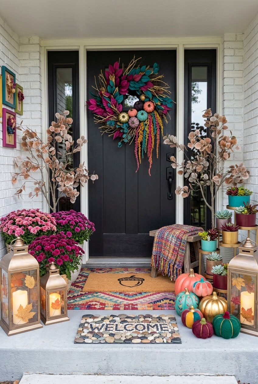
Jewel tones for fall? Absolutely yes. This porch takes the conventional orange-and-brown formula and replaces it with magenta, teal, gold, and deep plum — and the result is fall decor that actually stands out on the block rather than blending into every other porch within a five-mile radius. The centerpiece is a bold asymmetrical wreath in hot pink and teal foliage with trailing amaranthus, metallic branches, and jewel-toned mini pumpkins. It’s dramatic against the matte black door.
The pumpkins themselves are painted or crafted in teal, coral, gold, burgundy, and deep green — not carved, just colored. Clustered on the right side of the stoop, they read as a sculptural installation. The succulent tower in jewel-toned pots — gold, teal, burgundy — echoes the wreath colors on the right. On the left, bright pink mums in a white ceramic pot and gold lanterns with pressed leaf panels create a warm counterbalance.
The pebble mosaic ‘Welcome’ mat and the kilim-style layered rug beneath it demonstrate that groundwork matters just as much as eye-level decor. Colorful botanical prints in bright frames on the white brick wall extend the display vertically. If the idea of non-traditional fall colors intrigues you, start with the wreath — it sets the whole palette — and then pull objects that match those exact tones rather than defaulting to what the seasonal aisle tells you fall should look like.
Your Porch Doesn’t Need Everything, Just the Right Things
Fall decorating is genuinely one of the most forgiving seasonal projects because the raw material — pumpkins, dried grasses, fallen leaves, warm textures — is already beautiful on its own. The design work is really just about arrangement, proportion, and knowing when to stop. Spaces like these work because someone made a decision about what the porch was trying to say and committed to it fully.
Whether you go maximalist harvest or quiet farmhouse minimalist, the principle stays the same: anchor with one strong focal point, build outward with layered heights, and let texture do more work than color. Pick a lane that fits your house’s architecture and your own personality — a mismatched approach is usually what makes a porch feel half-finished.
We hope this gave you more than just pretty pictures to scroll past. Take the design logic with you when you’re at the nursery picking mums or hunting for the right wreath. Knowing why something works makes you a much better decorator than just copying it — and honestly, your own version will probably be more interesting anyway.