From Doorstep to Bookshelf: Fall Decor Ideas That Cover the Whole Home
Okay so fall decor has this reputation for being either super basic (three pumpkins on a doorstep, done) or completely over the top in a way that looks more like a Halloween store exploded in your living room. Neither extreme is really the vibe most of us are going for. The sweet spot is somewhere in the middle — warm, layered, and genuinely seasonally appropriate without screaming “I bought everything from one display at HomeGoods.”
The good news is that fall is probably the most forgiving season to decorate for. The color palette basically writes itself — burnt orange, deep burgundy, warm amber, dried wheat tones — and natural materials like wood, burlap, wicker, and dried botanicals are cheap, widely available, and look genuinely good together without much effort. You don’t need a big budget. You need a point of view.
We put together a range of fall decor approaches that cover everything from the front door to the bedroom, from outdoor vignettes to bookshelf styling. Some are quick and low-commitment; others take a little more thought. All of them are worth your time.
Retro Character Mantel Display
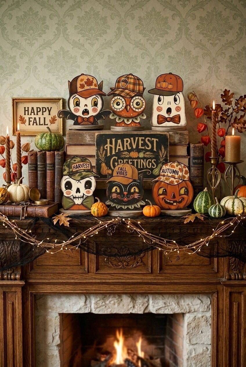
When in doubt, lean into personality. This fireplace mantel is covered in vintage-style illustrated characters — a cute white creature, an owl, a jack-o-lantern, a black cat, all wearing baseball caps and bow ties — and honestly? It works because it commits completely. The key design principle here is controlled chaos: every single element on this mantel belongs to the same illustrated, retro-Halloween universe, so even though there’s a lot going on, nothing feels random. Stack old books for height variation, mix in real mini pumpkins and gourds for organic texture, and let twinkle-lit black garland drape across the front of the mantle for that moody evening glow.
A chalkboard-style “Harvest Greetings” sign acts as the visual anchor in the center — something with typography always helps ground a busy display because it gives the eye a place to land. Tall taper candles in brass candlesticks add vertical contrast to all the shorter, rounder shapes. The damask wallpaper behind this one is doing a lot of quiet work too; a patterned wall makes the display feel more period-appropriate and less like floating objects on a shelf.
To pull this off without it looking cluttered, group items in odd numbers and vary height deliberately. Put your tallest items (the stacked books with characters on top) in the center-back, medium items to the sides, and let gourds and small accessories fill the gaps at the front. Twinkle lights threaded loosely through everything tie it together without trying too hard.
A Doormat With Actual Personality
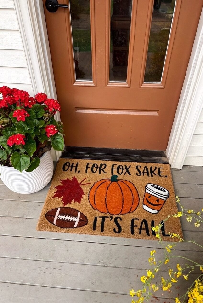
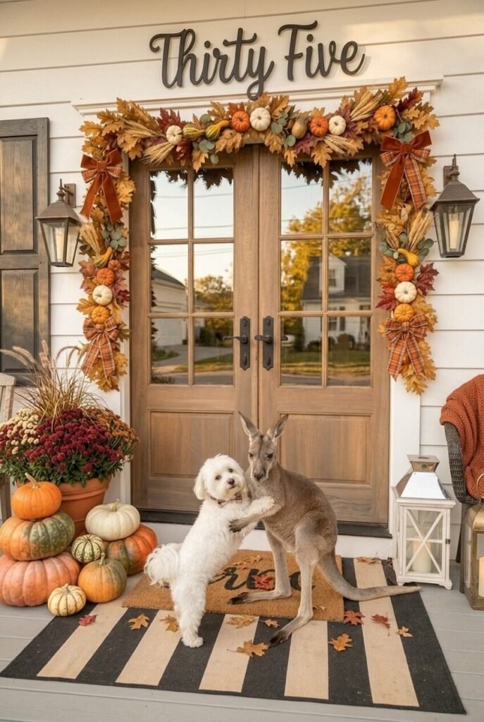
Your front door is doing first impressions duty from October through November, and a plain coir mat with a leaf on it is… fine. But a mat that says “Oh, for fox sake. It’s fall.” with illustrated icons of a maple leaf, a pumpkin, a football, and a PSL cup? That’s the kind of thing that makes people smile before they even knock. Novelty doormats with fall-specific humor are genuinely one of the lowest-effort, highest-impact seasonal swaps you can make — they’re inexpensive, they don’t require any styling skill, and they communicate a whole personality in about two square feet.
The orange front door in this photo is doing a lot of supporting work. If your door is a neutral color, a bold mat like this pops even more because there’s nothing competing with it. Pair it with a simple potted mum or two in a clean white planter on the side — red mums here, which work nicely against the warm orange door — and you’ve got a complete entryway moment without any effort.
For the design principle side of things: the front entry benefits from the “one statement piece” rule. Either the door is the statement, or the decor is. Here the mat and the door color are working together because they’re both warm-toned. If your door is already a bold color, a simpler mat might serve better — but if your door is white, gray, or black, go wild with the mat. It’ll carry the whole look.
The Classic Outdoor Harvest Vignette
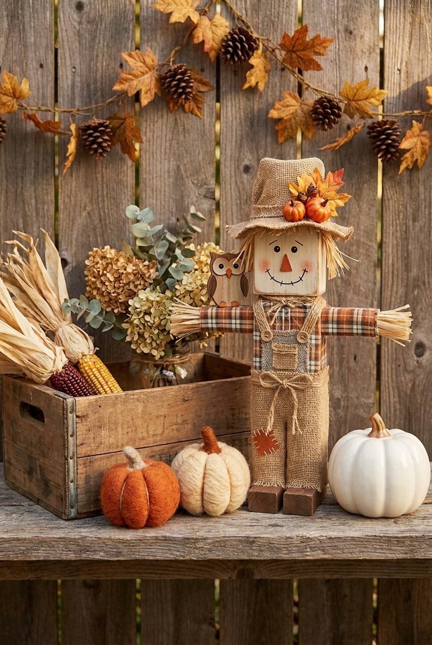
Dried corn, a wooden scarecrow figure dressed in burlap and plaid, felt and yarn pumpkins in rust and cream, a real white pumpkin, a wooden crate overflowing with dried hydrangeas and eucalyptus — this is fall decor in its most classic form, and there’s nothing wrong with that. The reason this arrangement reads as charming rather than generic is texture variety: every single item in this vignette has a different surface — woven burlap, rough-hewn wood, dried botanicals, felted wool, smooth ceramic — and that tactile layering is what gives it depth.
The pine cone and maple leaf garland hanging on the weathered fence behind it acts as a backdrop that frames the scene without requiring a wall. If you’re creating an outdoor display on a porch, balcony, or garden table, always think about the vertical plane behind your arrangement — even a simple garland can transform a flat collection of objects into an actual scene.
For sizing and proportion: the scarecrow figure is the tallest element here, and it sits off-center rather than dead-center, which makes the whole composition feel more organic. Place your tallest piece about a third of the way from one side, let the wooden crate anchor the other side at a lower height, and fill the foreground with the smaller soft pumpkins and scattered natural elements. Straightforward, but it works every time.
Tray Styling Is Genuinely Underrated
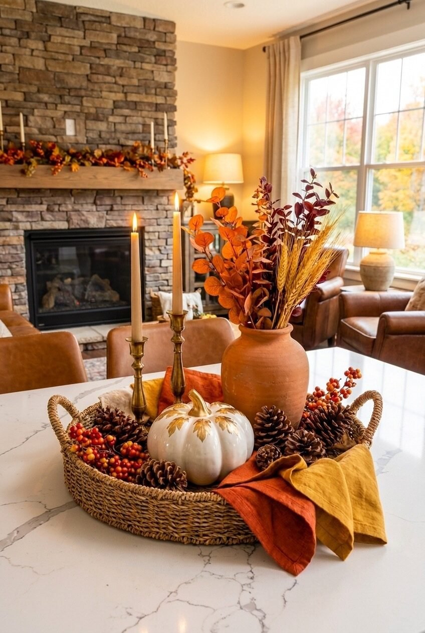
A wicker tray with handles might be the most useful fall decorating tool in existence and not enough people talk about it. What’s happening in this kitchen island display is actually a masterclass in containment styling — everything with a fall connection gets placed inside the tray, and the tray sits on the marble countertop as a single, unified decorative object. Terracotta vase with dried burgundy eucalyptus and wheat stalks, a decorative painted pumpkin, brass candlesticks with ivory tapers, pine cones, orange berry branches, rust and mustard linen napkins — all of it lives inside the tray.
The tray creates a visual boundary that tells the eye “this is the decorated zone” rather than having fall objects scattered across the whole counter, which would read as clutter. It also makes the display incredibly easy to move when you actually need to use your kitchen island, which is a practical win that decorating content rarely acknowledges. Beyond function, the round wicker shape introduces natural texture against the cool marble surface — a contrast that makes both materials look better.
The fireplace in the background with its own garland and candles creates depth and tells you this room is committed to the season throughout — not just in one spot. If you’re going for this style, keep your tray color neutral (natural wicker, dark wood, or aged metal) so the fall elements inside it do the color work.
A Lit Cabin Figure on Your Shelf
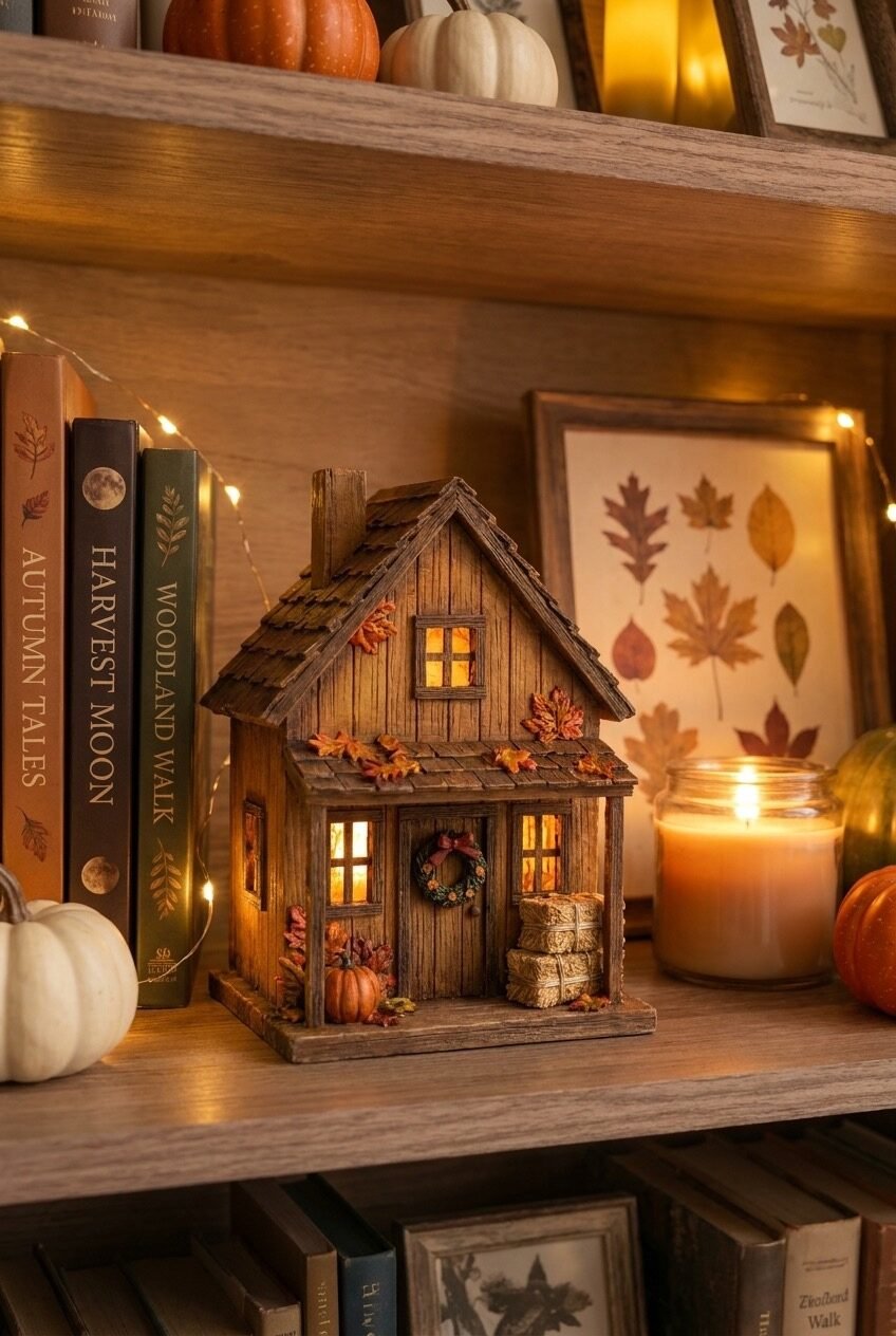
Okay this is the thing we didn’t know we needed: a miniature lit autumn cabin on a bookshelf surrounded by fall-themed books, a pressed leaf art print, fairy lights, a jar candle, and small pumpkins. The cabin itself has tiny glowing windows and a little wreath on the door, and when you see it in person in a dimly lit room, it genuinely creates this whole other-world feeling. The design principle at play here is creating a micro-scene within your shelf styling — rather than displaying objects, you’re building an atmosphere in miniature, and that shift in intention is what makes shelf styling feel considered instead of decorative.
The books chosen here aren’t random — spines that read “Autumn Tales,” “Harvest Moon,” and “Woodland Walk” are either styled or very deliberately selected to reinforce the seasonal narrative. You can absolutely do this yourself by facing books spine-out that happen to have warm colors or relevant titles, or by wrapping neutral books in craft paper and handwriting autumn-themed titles on them. It’s a low-budget move that has a surprisingly large visual effect.
Fairy lights woven through the shelf — not just draped but actually threaded behind and around the books — create the ambient warmth that ties everything together. Add the jar candle nearby and the whole shelf zone glows. Just make sure your fairy lights are warm white (2700K or lower), not cool white. Cool white kills the autumn mood instantly.
The Fall Bedroom Tray Moment
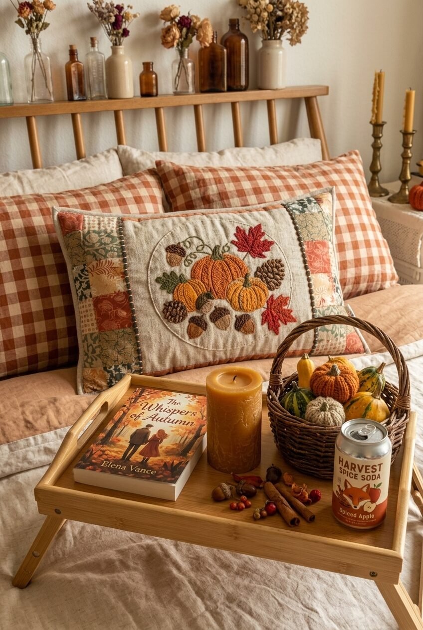
Whoever decided a bamboo bed tray was just for breakfast in bed was sleeping on its decorating potential. This bedroom setup uses a portable bed tray as a styled autumn vignette: a fall novel, a beeswax pillar candle, a wicker basket of decorative mini gourds, cinnamon sticks, a can of harvest spice soda, and scattered acorns. It’s an entire autumn afternoon in tray form, and the principle here is experiential styling — arranging objects not just to look good but to suggest an activity or a feeling.
The bedding behind it is doing serious work too. Rust and cream buffalo check pillowcases layered with a patchwork embroidered throw pillow featuring a harvest motif create a textile story that’s both cozy and visually rich without requiring any additional decor on the walls. The wood-spindle headboard and a shelf displaying mixed-height amber and cream bud vases with dried florals complete the vignette above the bed.
For recreating this bedroom approach: start with your bedding as the base and choose two fall patterns that share a color — here it’s the gingham and the patchwork, both using rust and cream. Then your tray styling can be looser because the bed itself is already doing the seasonal work. Brass candlesticks on a side table, a beeswax candle, and one or two small pumpkins is all you need beyond that.
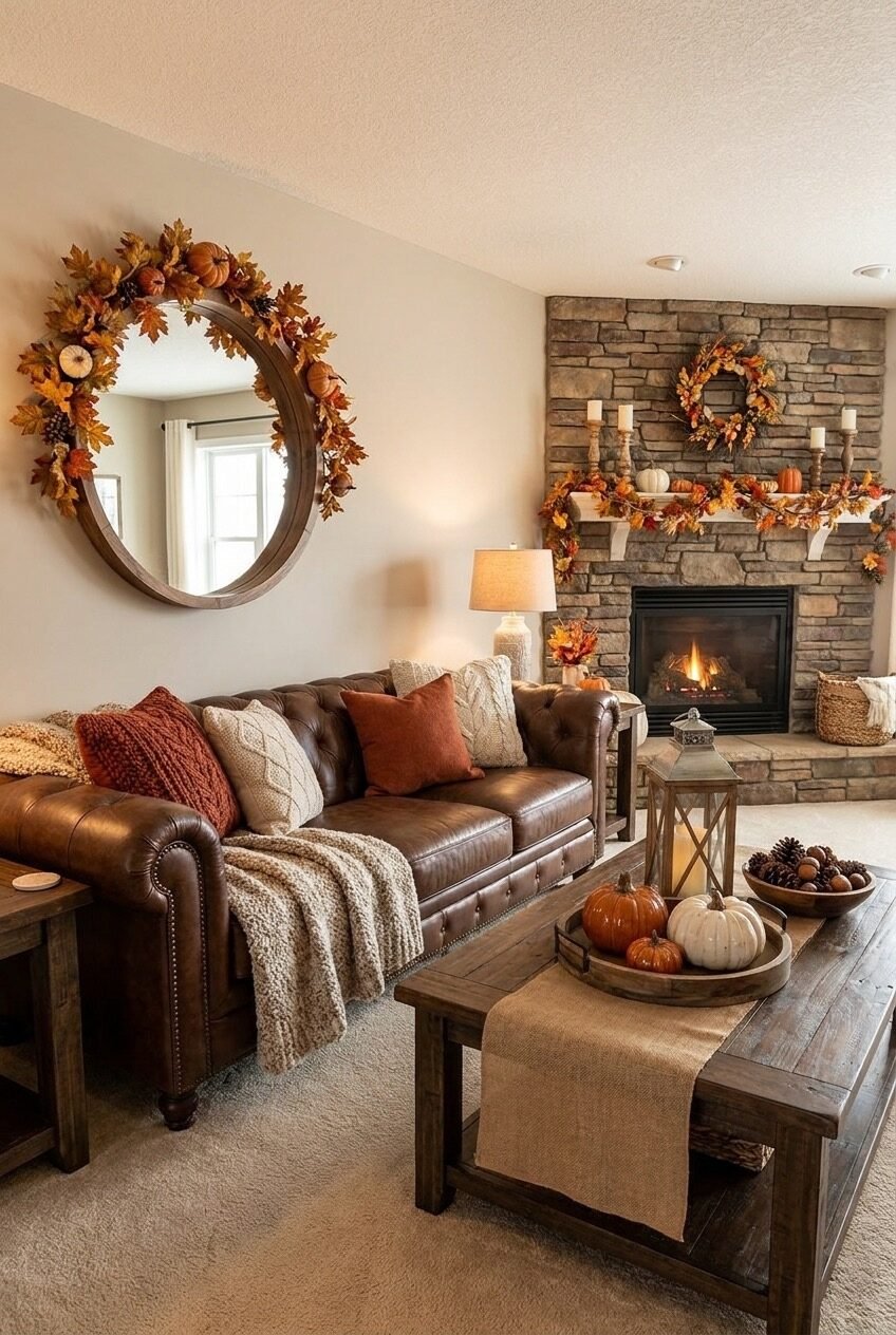
String Lights Are Fall Decor’s Secret Weapon
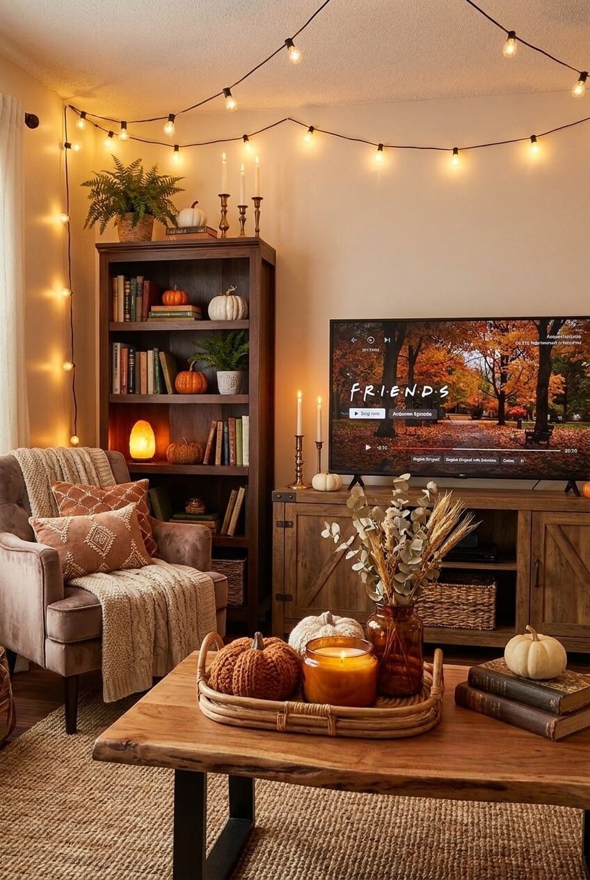
Edison string lights strung across a living room ceiling — not tacked perfectly in rows but loosely draped from corner to corner in that casual, just-happened-this-way arc — do something to a room’s atmosphere that no other lighting choice quite replicates. This living room has them running wall to wall above the sofa and bookshelf corner, and paired with a Himalayan salt lamp on the bookshelf and actual candles near the TV console, the room has like four separate warm light sources happening simultaneously. Layering light at different heights and from different sources is the single most impactful thing you can do to make a room feel like fall, full stop — it’s more powerful than any individual decor object.
The bookshelf in this room is a great study in low-effort fall styling: pumpkins tucked between books at different heights, a fern plant, brass candlesticks on top, and a Himalayan salt lamp providing ambient base light on a lower shelf. None of these require swapping out your whole shelf; you’re just adding seasonal objects to what’s already there.
On the coffee table: a rattan tray holds knitted mini pumpkins, an amber glass candle, and that’s basically it. Simple. The live-edge wood table, the jute rug, the chunky cable-knit throw on the chair — every material in this room is warm-toned or natural, which means the string lights and pumpkins feel like the obvious finishing touches rather than add-ons.
A Fall Table Runner Does the Heavy Lifting
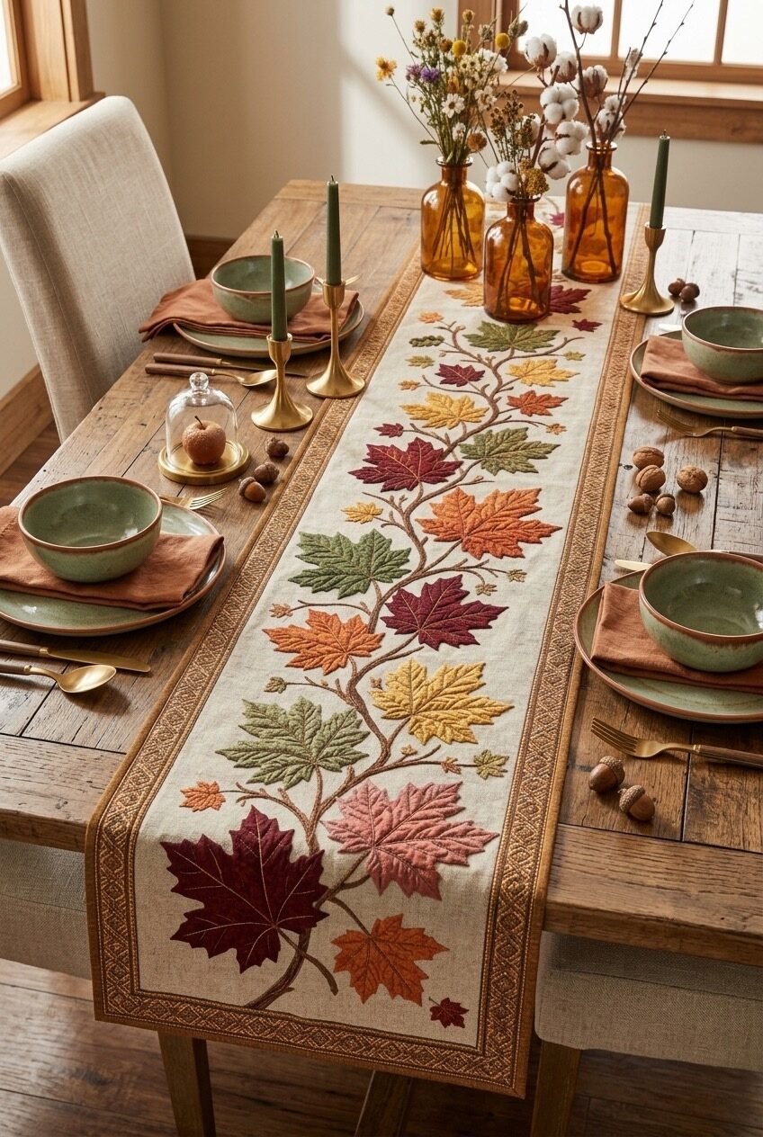
Sometimes the table itself is the decor, and this is one of those cases. A wide embroidered linen table runner with a full maple leaf branch illustration in every fall color — burgundy, orange, gold, green, rust, pink — runs the length of a raw wood dining table and sets the entire visual tone before a single dish is placed. The place settings (sage green ceramic bowls, rust linen napkins, gold flatware, amber glass bud vases with cotton stems and wildflowers) are chosen specifically to pick up individual colors already present in the runner.
This is called the color echo principle, and it’s genuinely one of the most reliable ways to make a table setting feel cohesive. You identify the colors in your hero piece — in this case the runner — and then make sure every other element on the table reflects at least one of those colors back. The green bowls pull the green from the leaves. The rust napkins pull the orange-red tones. The amber bottles pick up the gold. Nothing clashes because everything is already pre-approved by the runner’s color story.
Scattered acorns and walnuts on the raw wood surface between place settings are the low-budget texture detail that makes this feel genuinely styled rather than just set. Grab a bag of mixed nuts from the grocery store in November and you have instant table decor. Brass candlestick holders with tapered forest green candles add height and reinforce the earthy palette.
Vintage Spindles in a Basket, Seriously
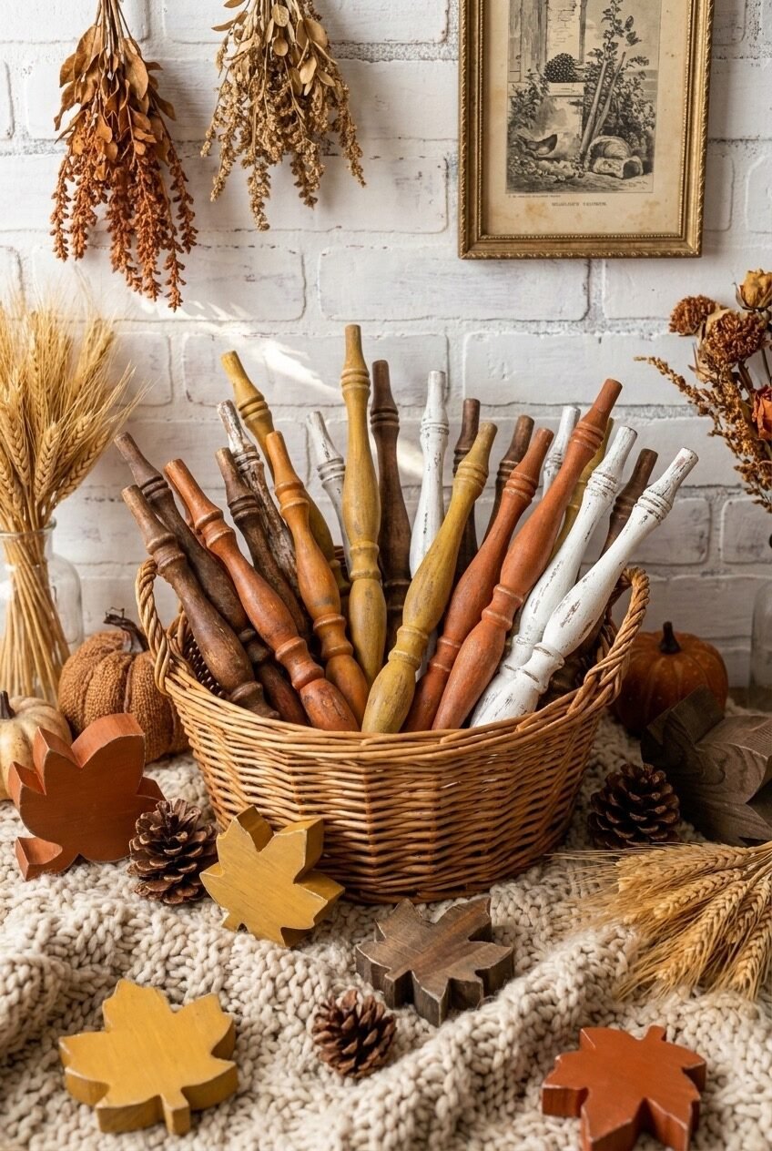
This one might seem unconventional, but stay with us. A wicker basket overflowing with vintage wooden spindles — the kind salvaged from old stair railings or chair backs — in varying shades of brown, rust, mustard, white, and natural wood tones, surrounded by pine cones, wooden leaf cutouts, dried wheat, and autumn botanicals against a white brick wall. It shouldn’t work as a fall display. It absolutely does.
The reason it works is that the spindles, despite being architectural salvage pieces, carry an autumn color palette entirely on their own — the aged wood tones range from warm honey to deep mahogany to chalky white, which maps almost perfectly onto a fall color scheme. This is a great example of using non-decorative objects as decor based on their material and color properties alone — the spindles aren’t autumn objects, but they look like autumn, and that’s enough. It’s the principle behind collecting objects for how they look rather than what they’re supposed to be.
For recreating this approach without hunting down vintage spindles specifically (though thrift stores and salvage shops are great for this), think about what other collected wooden objects could work the same way — old rolling pins, wooden spools, driftwood pieces, carved wooden tools. Fill a wide wicker or wire basket loosely so the items fan outward at the top, add pine cones and dried stems around the base, and hang a few dried herb bundles on the wall above. Simple, weird in the best way, and very fall.
Light a Candle, Make It Count
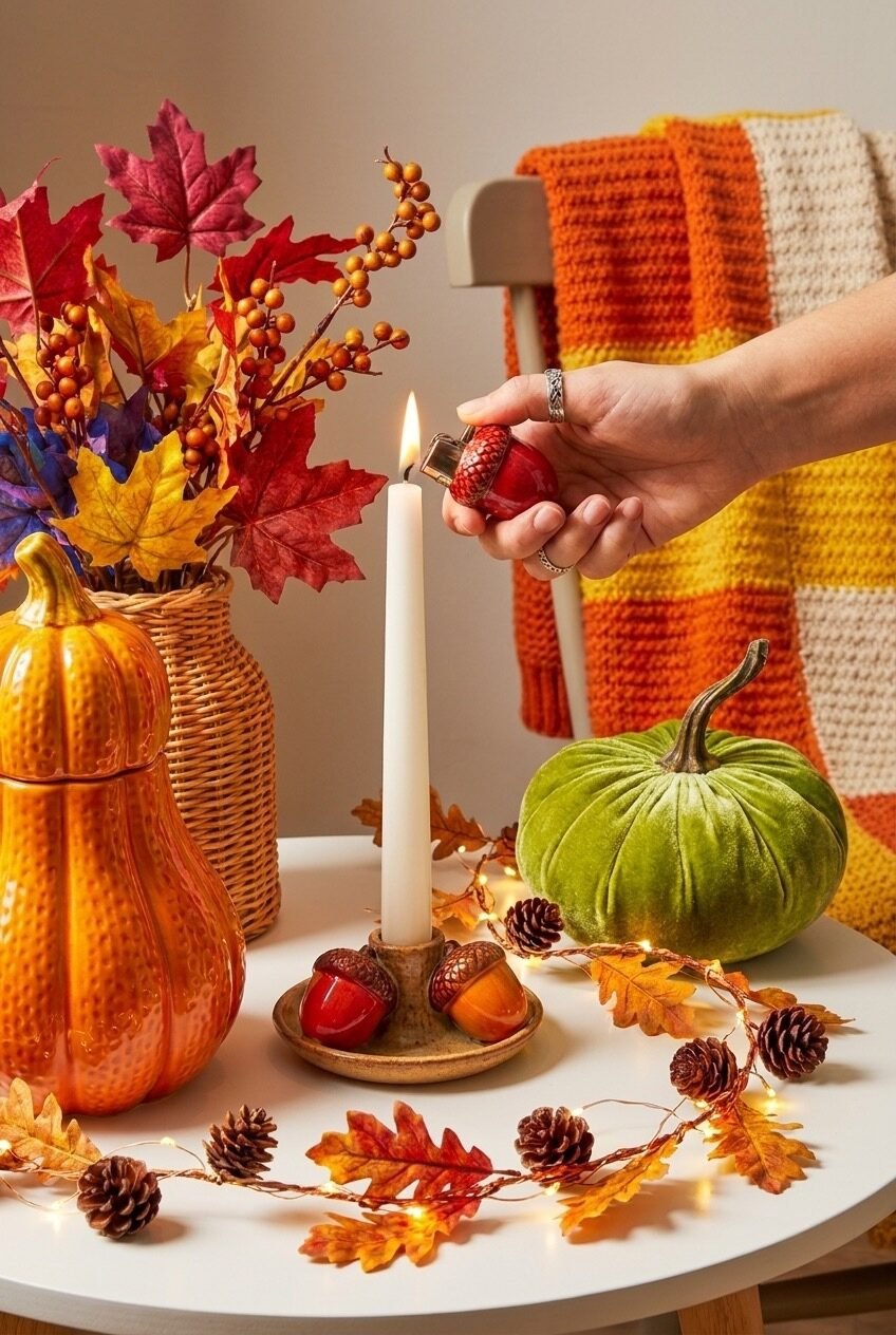
The most fall thing about this vignette isn’t actually the velvet green pumpkin or the orange ceramic pumpkin cookie jar or the wicker vase of faux maple leaves and berry branches — it’s the hand reaching in to light a taper candle with an acorn-shaped lighter. It’s action. It’s the moment the decor becomes alive, and that’s actually a useful design reminder: fall decor doesn’t fully exist until there’s a flame somewhere in it.
The acorn candleholder here — a small ceramic dish with acorn figurines holding a single ivory taper — is a good find. Tiny, specific, not expensive, and it grounds the whole vignette because it introduces a fine-detail scale that contrasts with the larger, bolder pumpkin shapes around it. A leaf and pine cone fairy light garland scattered loosely across the white table surface does what fairy lights always do in fall setups: it adds warmth at the floor level of the display, below all the taller objects.
When building a small side table or coffee table vignette like this, the principle to follow is scale variation — one large object, one medium, one small, and then a loose surface element like a garland or scattered pine cones. Here: large orange pumpkin jar, medium green velvet pumpkin, small acorn candleholder, loose leaf garland. Add the orange and cream crocheted blanket draped on the chair behind it and the warm wall tone, and this vignette punches well above its weight for the effort involved.
Fall Decor Is About Feeling, Not Just Looking
Here’s the thing about decorating for fall that nobody really says directly: the goal isn’t to make your home look like a photo. It’s to make it feel like October. That means warm light, natural textures, scents that actually register when you walk in (candles, dried botanicals, warm spices), and objects that make you slow down for half a second when you notice them. The visual stuff is in service of that feeling, not the other way around.
You also don’t need to do everything at once. Some of the most lived-in, genuinely autumn-feeling homes we come across are just doing two or three things really well — a styled mantel, a coffee table tray, a string light situation in the living room — rather than having fall decor in every single corner. Restraint reads as confidence. Decoration everywhere reads as trying too hard.
Pick the spots in your home where you spend the most time and start there. A bedroom tray situation costs almost nothing. A doormat swap takes thirty seconds. A basket of pine cones on a shelf is basically free. Fall decorating is one of those rare cases where doing less often produces a better result than doing more — and that’s genuinely good news for the rest of us.